The elegant simplicity of Arts & Science's Aoyama flagship
Designed by Atelier Tsuyoshi Tane Architects (ATTA), Arts & Sciene's new Aoyama flagship in Tokyo, offers a play between curves and lines
Daici Ano - Photography
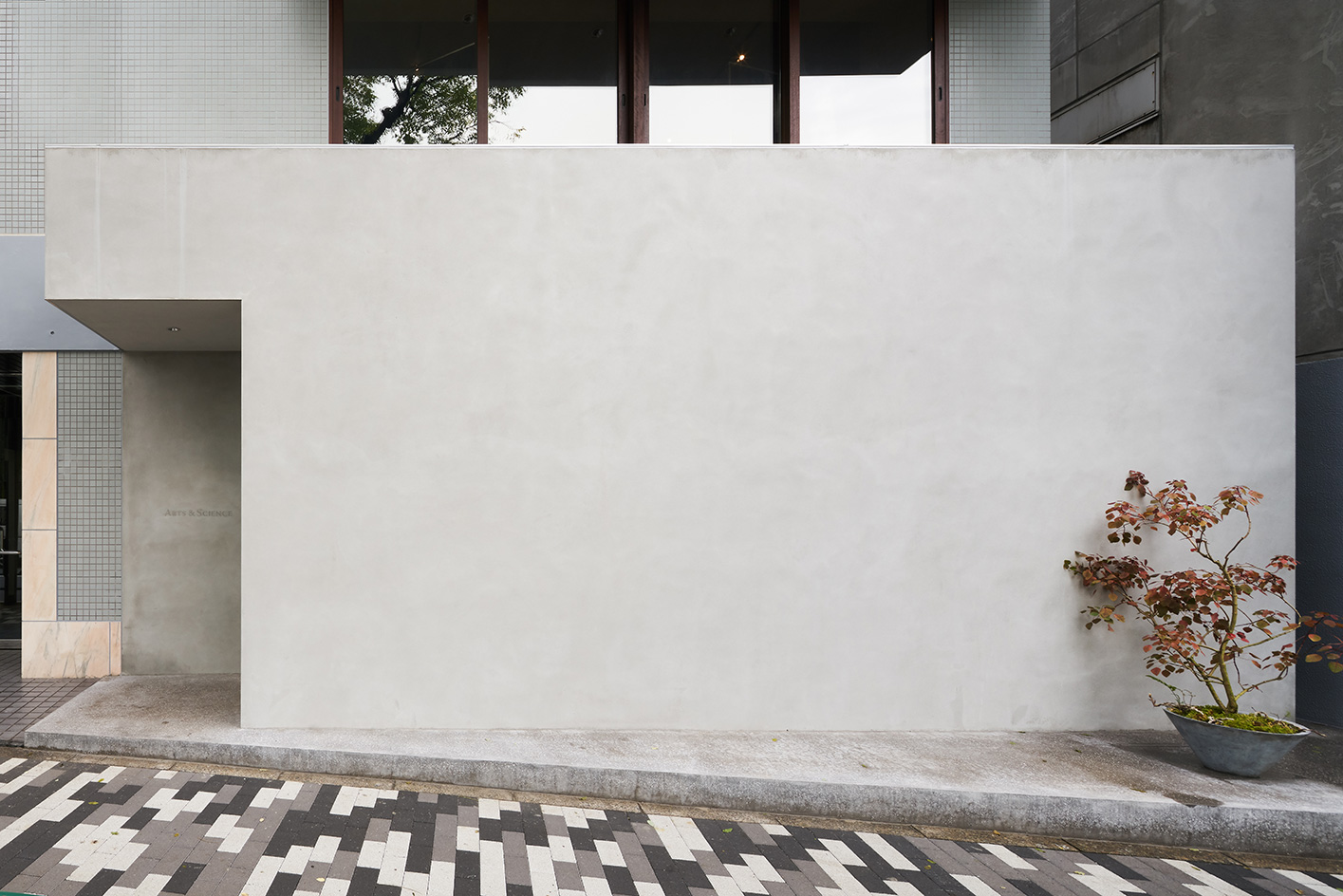
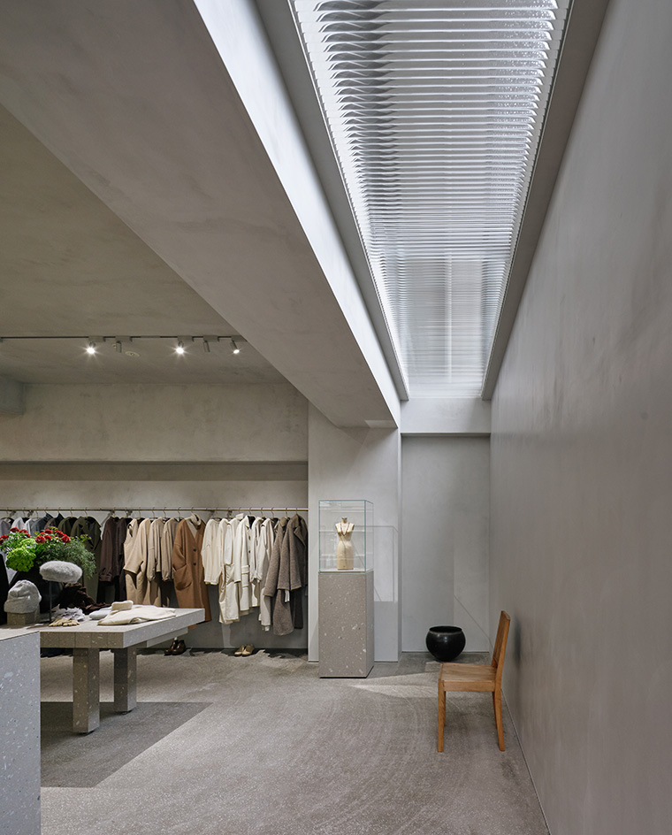
The façade, set on a quiet central Tokyo street, is as low-key as it is simple: a windowless block of smooth, grey concrete, with a cut-out segment leading to a side entrance. Forget eye-catching shop windows. Conventional retail concepts are eclipsed in favour of a more discreet approach at Arts & Science, the Japanese select store and brand known for its pitch-perfect good taste, which recently opened a new flagship in the Aoyama district.
Designed by Atelier Tsuyoshi Tane Architects (ATTA), the closed concrete exterior hides a serene and intimate two-level haven of natural light, with perfectly balanced curves and lines in textured shades of greys and browns. ‘The facade is a way to express the image of a brand,' explains Paris-based Tsuyoshi Tane. ‘The expression of absence is a way to display the shop façade, in order to be more intriguing for the visitor and contrast with the open and transparent.' The new store – a relocation of its original Aoyama flagship just down the road – is a perfect fit with Arts & Science.
It was in 2003 that creative director and longtime Tokyo resident Sonya Park opened the first Arts & Science store in a quiet lane in Daikanyama. Her motivation was simple: born from her frustration at not finding the things she wanted in Tokyo, she set out to source and create the clothing and lifestyle products she loved, using high-quality materials and craftsmanship. With a name inspired by the idea that the perfect product is a balance of both art and science, today, there are 11 stores (including one café) in Tokyo and Kyoto showcasing products made mainly in Japan, but also crafts, arts and textiles that have caught Park’s discerning eye across the globe.
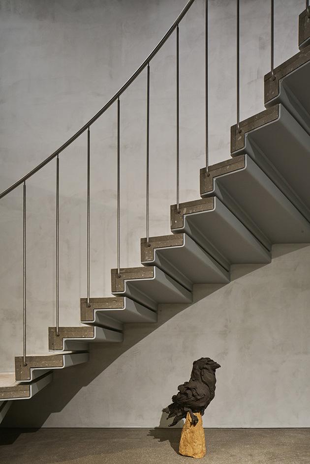
The new flagship is in an exercise in elegant simplicity. Central to its concept? A play between curves and lines: more precisely, the freedom of ‘arts' is represented in the arcs and curved walls of the first floor; while the straight lines of the ground floor interior are inspired by the discipline of ‘science'. Entering the store, the ground floor is a serene space with clean lines of smooth, light grey concrete, with curated clothing hanging on metal rails, accessories displaced in minimal glass and steel cabinets and a rectangular block counter. Despite the absence of a shop front window, natural light flows easily into space via a narrow skylight made from a strip of glass rods from Germany in the ceiling, while a lightweight curved staircase – a black raven in sculptural clay by artist Stephanie Quayle sitting beneath it – steals the show on the rear wall.
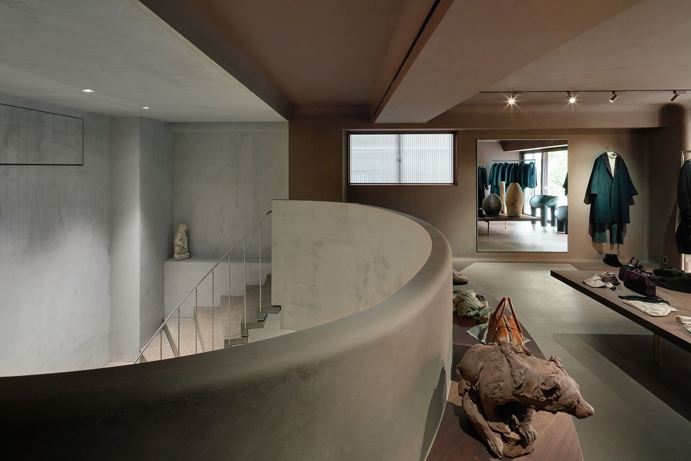
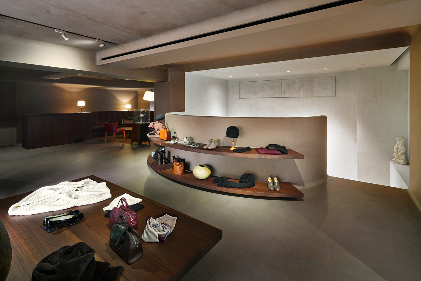
‘Natural light is the essence of the space,' says Tsuyoshi. ‘In order to bring the natural light, we created a sky light on the ground floor and also opened a large void in order to bring the light from the upper floor.' Upstairs, the atmosphere shifts into softness: straight lines and corners are replaced by gently curved walls while the space is cocooned in a warmer palette of earthy brown shikkui plasterwork, woods and brass.
‘We researched the shared origins of art and science throughout history and where they may have started diverging,' explains Tsuyoshi. ‘We then conceptualised our idea into: art as "arc” and science as “straight”, which is the fundament of geometry.' The interior on the ground floor (science) has straight lines and greys; and the upper floor (arts) has arcs, curves and shades of brown.' Scattered throughout the store are hints of craftsmanship and design that perfectly complement the Arts & Science philosophy; the simplicity of the organically-grained wood chairs by late Swedesh designer Axel Einar Hjorth and the smooth modern curves of Faye Toogood’s Roly-Poly dining chairs among them.
Other touches recently on display range from the exquisitely abstract lines of Ernst Gamperl’s wooden bowls to a black lacquer-layered ceramic vase containing a yellow burst of spring buds by Japanese artist Kenta Anzai. ‘Shopping should be a very intimate and private experience,' explains Park. ‘I think that being able to see in from outside through a huge window would make our customers feel a little too exposed. I wanted the whole experience to feel a little extraordinary and outside of a normal daily environment. Something between a boutique and a gallery.'
INFORMATION
Wallpaper* Newsletter
Receive our daily digest of inspiration, escapism and design stories from around the world direct to your inbox.
Danielle Demetriou is a British writer and editor who moved from London to Japan in 2007. She writes about design, architecture and culture (for newspapers, magazines and books) and lives in an old machiya townhouse in Kyoto.
Instagram - @danielleinjapan
- Daici Ano - PhotographyPhotography
-
 All-In is the Paris-based label making full-force fashion for main character dressing
Part of our monthly Uprising series, Wallpaper* meets Benjamin Barron and Bror August Vestbø of All-In, the LVMH Prize-nominated label which bases its collections on a riotous cast of characters – real and imagined
By Orla Brennan
-
 Maserati joins forces with Giorgetti for a turbo-charged relationship
Announcing their marriage during Milan Design Week, the brands unveiled a collection, a car and a long term commitment
By Hugo Macdonald
-
 Through an innovative new training program, Poltrona Frau aims to safeguard Italian craft
The heritage furniture manufacturer is training a new generation of leather artisans
By Cristina Kiran Piotti
-
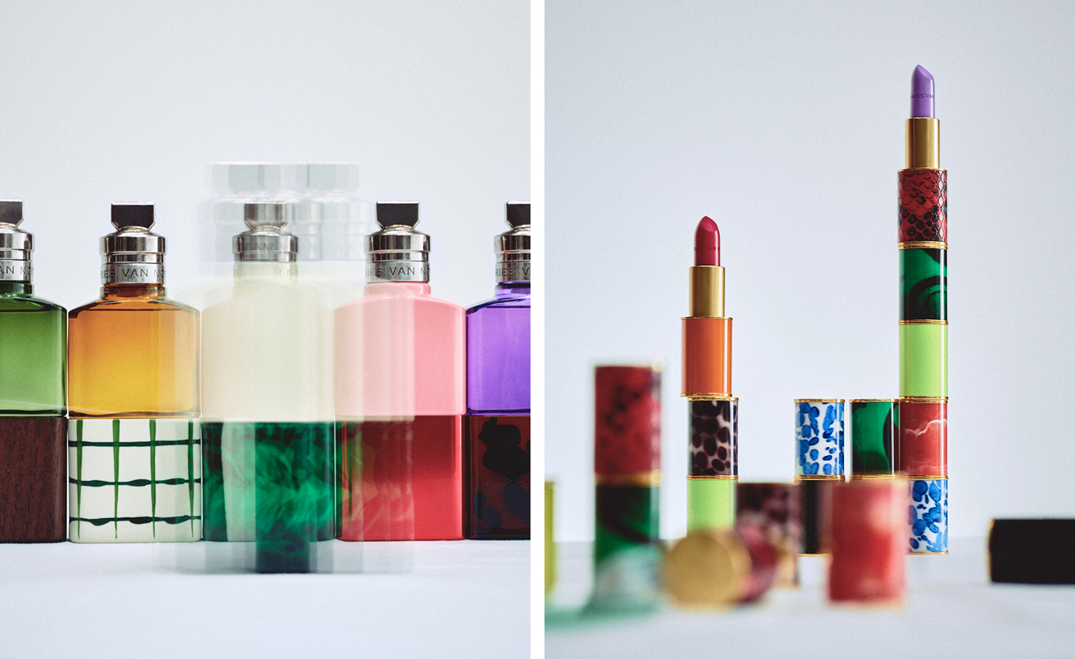 Exclusive interview: Dries Van Noten on launching his new beauty line
In an exclusive interview, the Belgian designer shares the story behind the creation of Dries Van Noten Beauty
By Mary Cleary
-
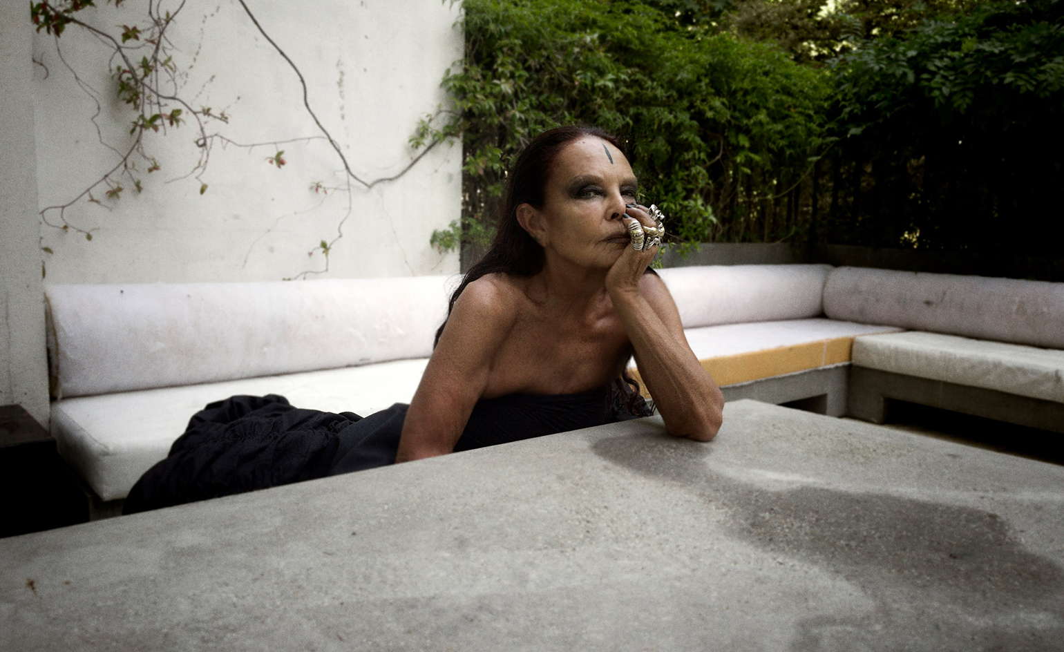 Michèle Lamy, agent of change, on the artists to lead us into the future
Co-founder of Owenscorp, artist, performer, agent of change: Michèle Lamy on her conduits to co-creation, and five creatives who can lead us into the future – whom she champions as part of Wallpaper’s 25th anniversary ‘5x5’ project
By Dal Chodha
-
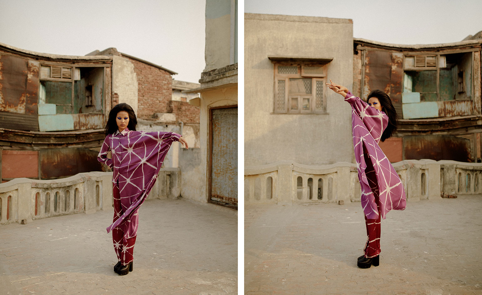 Riya Gupta on empowered femininity
Studio Rigu – the New Delhi-based label – founded in 2017 by Riya Gupta, has forward thinking footing
By Dal Chodha
-
 Alber Elbaz on AZ Factory: ‘fashion for a reason, not a revolution'
On 25 April 2021, it was announced that the ebullient and beloved fashion designer Alber Elbaz had passed away. Earlier in 2021, we spoke to him about his new brand AZ Factory
By Laura Hawkins
-
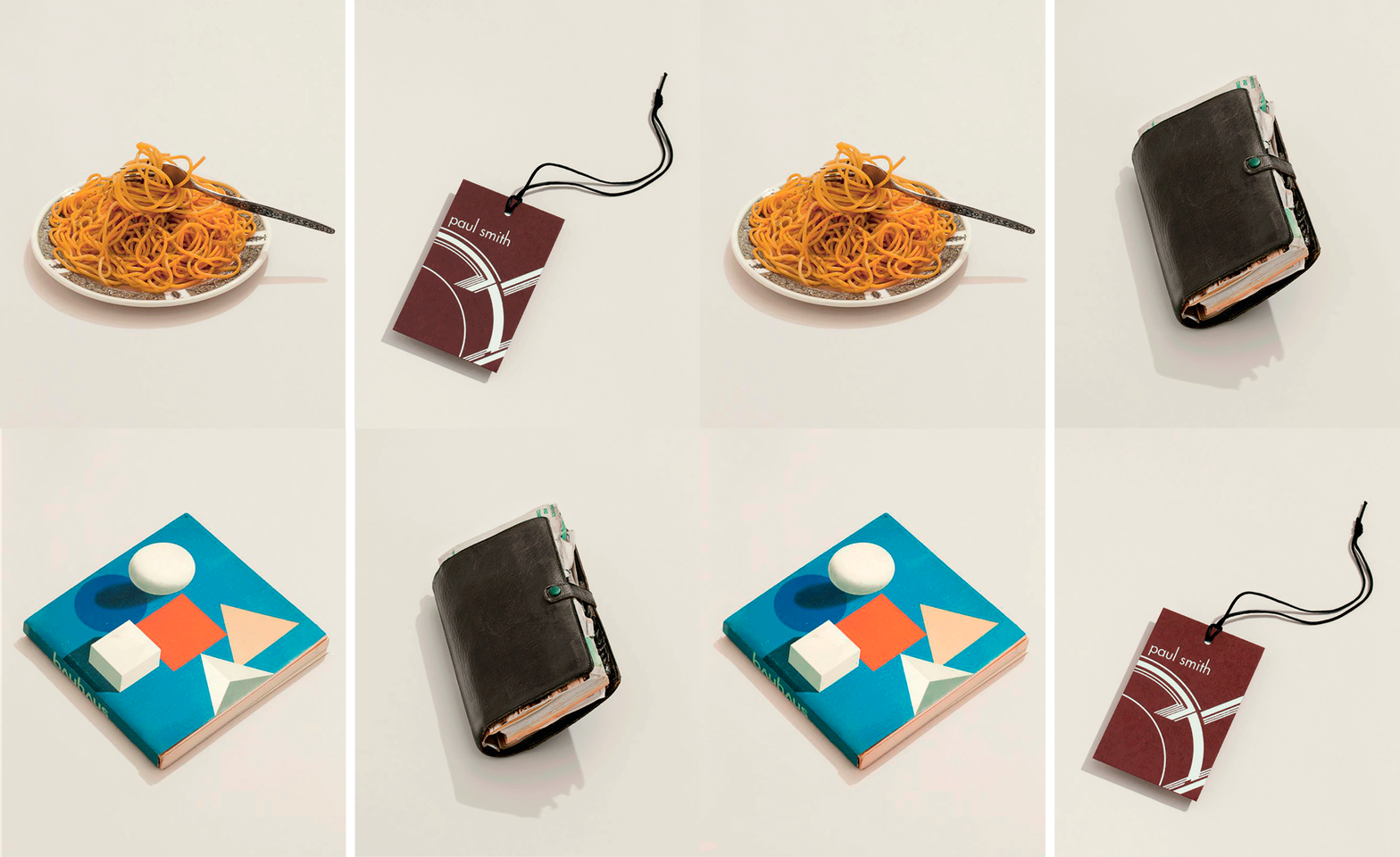 Paul Smith on a few of his favourite things
Fashion designer and inveterate collector Paul Smith shares a few of his favourite things in a new book, and here with his friend and travelling companion Deyan Sudjic
By Deyan Sudjic
-
 Issey Miyake and Tadanori Yokoo’s pop-culture inspired collaboration
Tarzan, Jaws and Marilyn Monroe all feature on a series of men's blousons which ‘give a sense of hope and look to the future'
By Danielle Demetriou
-
 Introducing Merlette, the eco-aware brand elevating easy dressing
Merlette’s fluid, billowing dresses in easy-to-care-for natural fabrics feel relevant and desirable – and are ideal for wearing year-round at home. No wonder the Brooklyn-based brand is having a moment
By Tilly Macalister-Smith
-
 Good jeans: how Levi's mastered the art of reinvention
By Elly Parsons