Carlo Brandelli constructs a new flagship and vision for Kilgour on Savile Row
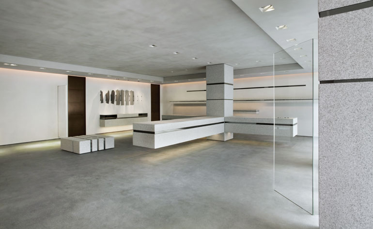
Kilgour's new Savile Row flagship, opening on 16 June during London Collections: Men, takes the brand into new retail territory, building on the bold forms and clean lines of its 2007 store. Then and now, the man behind the design is Carlo Brandelli, Kilgour's creative director, back at the helm of a revitalised company, ready and willing to take it to another aesthetic level.
'With the first incarnation of Kilgour I made the brand modern, but with this store I want it to be as contemporary as possible,' Brandelli explains from the top floor of 14 Savile Row, the brand's temporary home within the former personal apartments of Hardy Amies, whose eponymous company has occupied this elegant Georgian townhouse since 1945. Amies and Kilgour now share the same owners, giving Brandelli an unprecedented amount of freedom to shape the next stage of the brand. 'You have to go as far forward as you possibly can,' he says.
Above all, the new store is designed to express the ethos and approach of the brand. 'The DNA of Kilgour is bespoke,' says Brandelli. With this in mind, the new space is dominated by three contemporary granite-clad cutting tables, cantilevered off the single structural column in the centre of the space. Each table is wide enough to cut on, although the space will function as a showroom first and foremost as well as serving as a backdrop for shoots.
Brandelli's eye for detail manifests itself at every level. 'You have to make the space interesting from an engineering point of view,' he explains, pointing out the various materials that have been brought together to make up the palette. The dominant feature is a bespoke floor comprising of sprinkled steel shavings, developed by a Swiss company as an experimental process. According to Brandelli, it's 'almost indestructible - it's a live floor, but it's made of steel. It's very matt but the more you polish it the more shine you get'. This grey is combined with Cornish granite flecked with silver - 'I wanted to keep as many of the materials as English as possible' - as well as grey limestone render and thin slivers of mirror incorporated into the shelving.
Throughout the new space, the lighting choices are subtle, almost ambient. Brandelli promises a light installation at the heart of the store to animate it when not in use. 'In the evening when the space is closed, some of the columns will be lit in a very interesting way - a way that focuses on the architecture.'
For all the craft and complexity, there is a toughness that recalls the architecture and engineering of a suit itself. 'British steel is a link to engineering - I like that,' says Brandelli, 'I've always had a colour palette and it's really suited to this new space. The new pieces are more architectural and that's the connection - bespoke tailoring is engineering - it's the same thing. Guys want great cars to look beautiful but they also want the engineering behind it.'
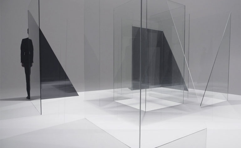
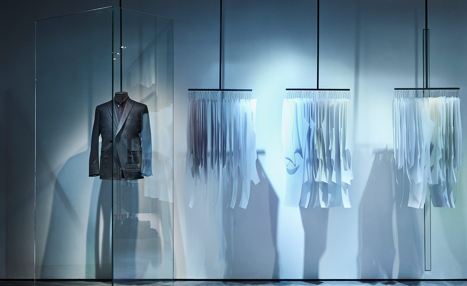
The space also expresses Brandelli's ongoing fascination with glass and transparency. 'It's always been important to me,' he says, 'it recalls contemplation and thought.' To this end, one of the first projects he initiated when arriving back at the brand was a collaboration with the photographer Nick Knight. The resulting film used a bespoke set constructed entirely from glass, a moody evocation that played with transparency, depth, perception and form. The strong diagonal lines evoke cut cloth (although there's not a stitch of clothing to be seen) with abstract, moody music by Tara Ferry.
The glass set lives on in two display areas in the new store, and the bold forms will return in the architectural structure of Brandelli's first collection. At our meeting, he's wearing his own grey flannel prototype, with an asymmetric front - what Brandelli terms 'incision pockets', evoking the slashed canvases of Italian artist Lucio Fontana - and a clean back vent. 'It's about symmetry, proportion, and balance, all the things you also think about when working on a building,' he says, 'Bespoke is modern engineering for men just like couture is for women. We're just trying to do something different that's really contemporary.'
The new shop will also see a rebranding applied across Kilgour, from the subtly tweaked logo to the new packaging with its meticulous perforations. Rigorous application is a Brandelli trademark. 'Everything is very considered, from the building to the packaging to the semiotics,' he admits, adding that 'you get this transient notion of man - I'm tired of brands shooting men in aspirational locations. Intelligent men don't need these messages.'
Despite the juxtaposition between hard granite and the pure surface of the mirror, there's fragility in the pairing as well. With the light installation and the collection in place, 5 Savile Row will truly come to life. Space to display Bespoke products and collaborations are integral to his vision (Tara Ferry and Peter Saville are rumoured to be future collaborators for the space). 'For a long time, Savile Row was starting to be viewed as a museum, but in the wrong way,' says Brandelli, and it's clear that the need to move on is a driving force behind his creative hand. 'A lot of Savile Row today looks like Kilgour did 7-8 years ago,' he notes, 'we need to keep the craft exactly as it should be but communicate it in a very contemporary way.' Like the clothes themselves, the new Kilgour store is cut from a very different cloth.
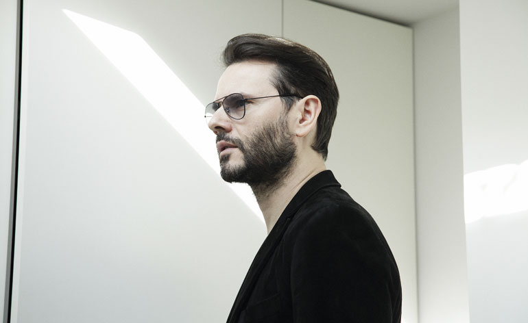
'With the first incarnation of Kilgour I made the brand modern, but with this store I want it to be as contemporary as possible,' explains Brandelli
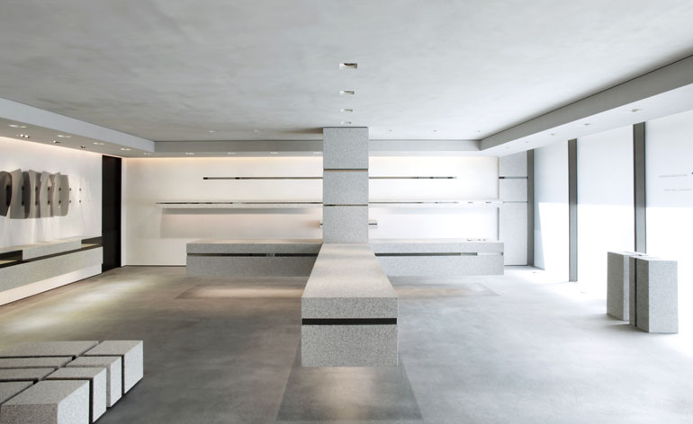
Brandelli has built on the bold forms and clean lines of his 2007 store for Kilgour, taking the brand into new retail territory
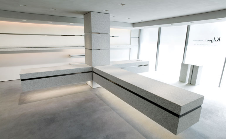
The new space is dominated by three contemporary granite-clad cutting tables, cantilevered off the single structural column in the centre of the store
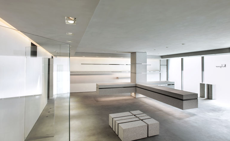
Each table is wide enough to cut on, although the space will function as a showroom first and foremost as well as serving as a backdrop for shoots
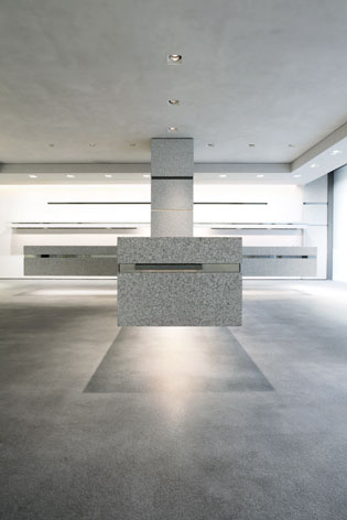
The store's dominant feature is a bespoke floor comprising of sprinkled steel shavings, developed by a Swiss company as an experimental process. According to Brandelli, it's 'almost indestructible - it's a live floor, but it's made of steel. It's very matt but the more you polish it the more shine you get'
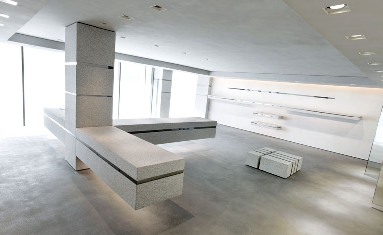
Throughout the new space, the lighting choices are subtle, almost ambient, while Brandelli's eye for detail manifests itself at every level: 'You have to make the space interesting from an engineering point of view,' he explains
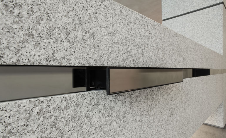
For all the craft and complexity, there is a toughness that recalls the architecture and engineering of a suit itself. 'British steel (used throughout) is a link to engineering - I like that,' says Brandelli
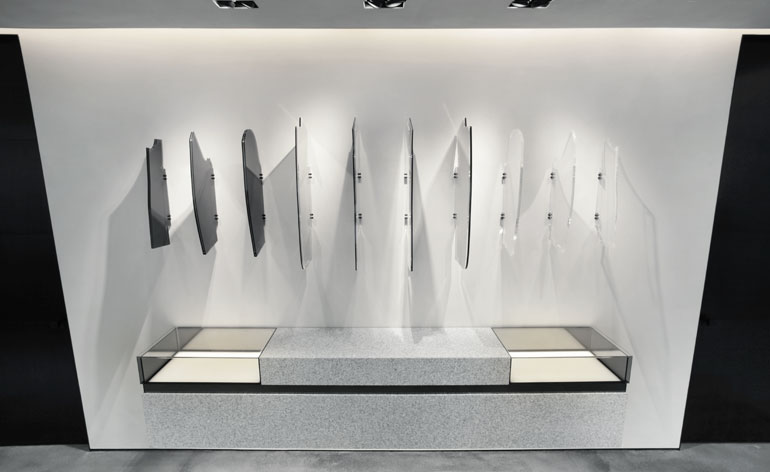
The store also expresses Brandelli's ongoing fascination with glass and transparency. 'It's always been important to me,' he says, 'it recalls contemplation and thought'
3621355826001
To this end, one of the first projects he initiated when arriving back at the brand was a collaboration with the photographer Nick Knight. The resulting film used a bespoke set constructed entirely from glass, a moody evocation that played with transparency, depth, perception and form
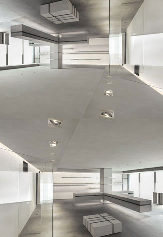
'It's difficult to gauge whether the space looks better upside down,' says Brandelli of this mirrored image. 'This ties in with the brand philosophy - reflection'
ADDRESS
Kilgour
5 Savile Row
London W1S 3PD
Wallpaper* Newsletter
Receive our daily digest of inspiration, escapism and design stories from around the world direct to your inbox.
Jonathan Bell has written for Wallpaper* magazine since 1999, covering everything from architecture and transport design to books, tech and graphic design. He is now the magazine’s Transport and Technology Editor. Jonathan has written and edited 15 books, including Concept Car Design, 21st Century House, and The New Modern House. He is also the host of Wallpaper’s first podcast.
-
 At the Regent Street Sensorium, architectural jelly sculptures are designed to ignite the senses
Delve into the history of London’s Regent Street through a jellyscape, a fragrance cloud and more – plus, for the event’s final week, two new immersive workshops (ends 27 April)
By Tianna Williams
-
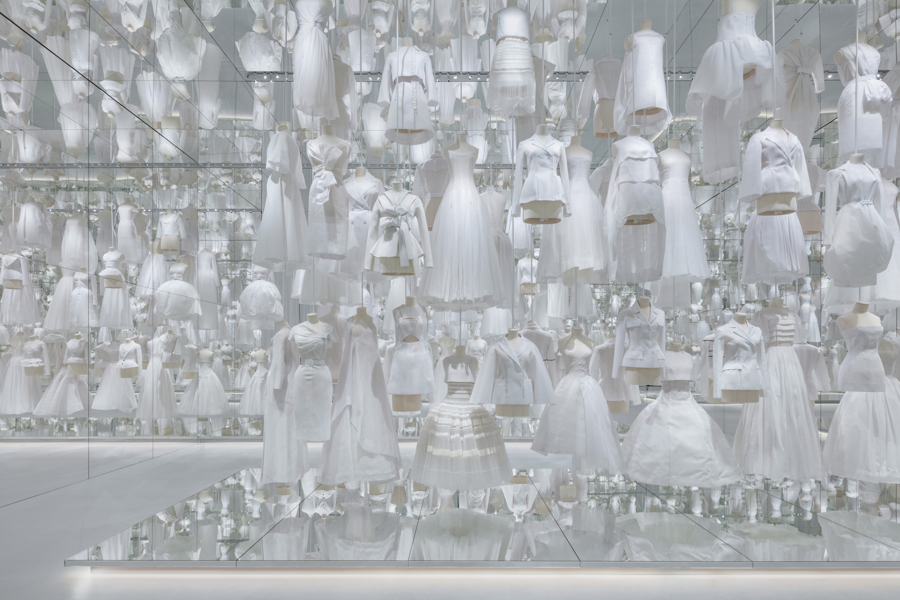 With scenography by OMA, Dior’s ‘Designer of Dreams’ exhibition in Seoul is ‘a piece of theatre’
OMA partner Shohei Shigematsu catches up with Wallpaper* about the dramatic show design for the latest iteration of ‘Christian Dior: Designer of Dreams’, which opened in Seoul this weekend
By Daven Wu
-
 Mercedes-Benz previews its next-gen people mover with an ultra-luxury EV concept
The Mercedes-Benz Vision V Concept is an art deco picture palace on wheels, designed to immerse passengers in parallel worlds as they travel
By Jonathan Bell
-
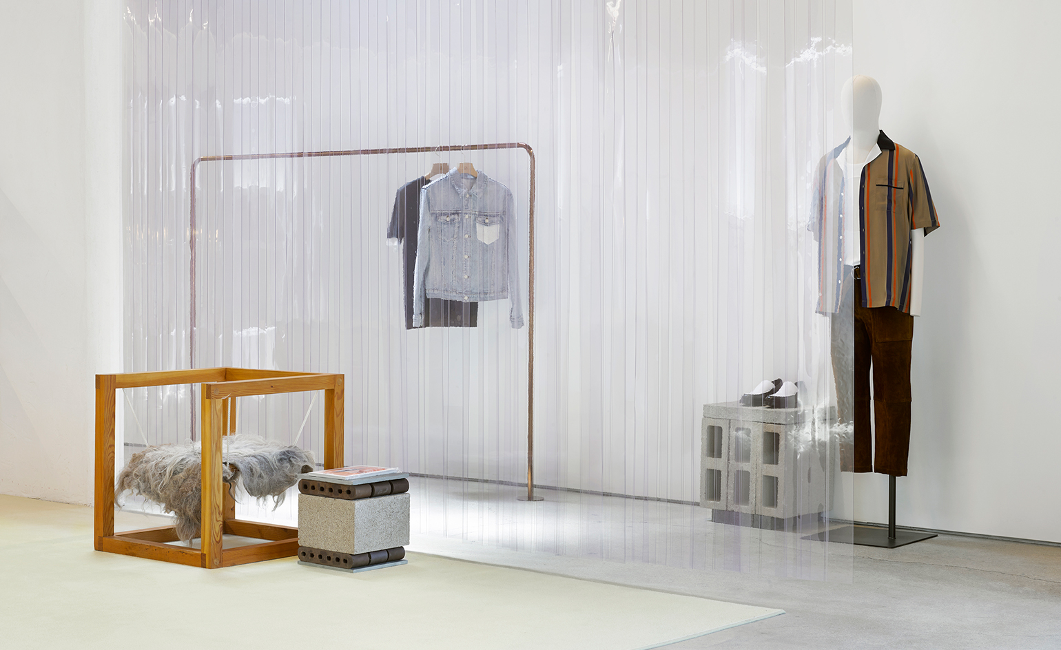 LA confidential: Phillip Lim’s inaugural concept store is a triumphant homecoming
By Ali Morris
-
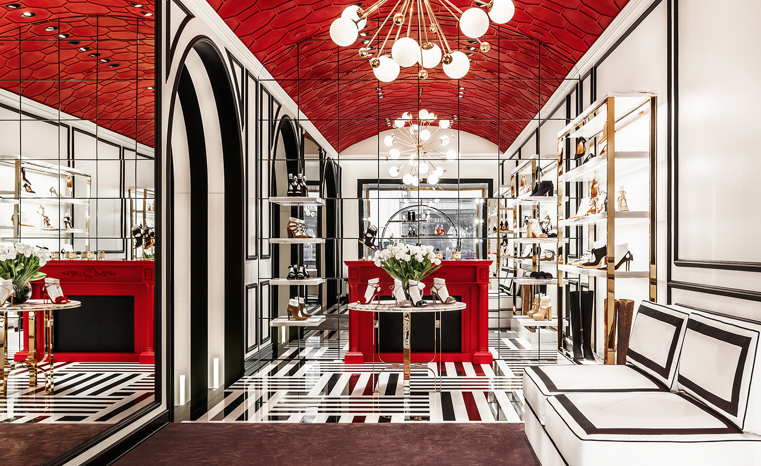 Moscow mule: Aquazzura and Casa Do Passadiço paint the town red
By Ali Morris
-
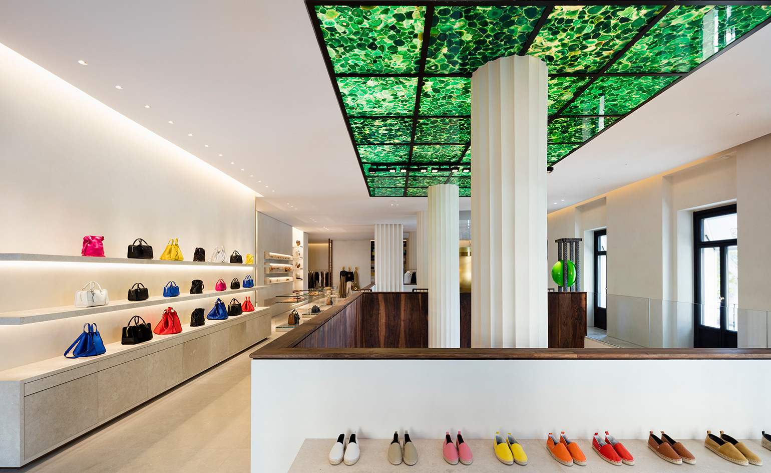 Loewe celebrates its past, present and future with a new flagship in Madrid
By Siska Lyssens
-
 Eytys' striking new Stockholm flagship is an ode to brutalism
By Ali Morris
-
 Leather system: bags of style at Tsatsas’ new Frankfurt showroom
By Yoko Choy
-
 Kilgour A/W 2016
By Katrina Israel
-
 House warming: Want Les Essentiels opens its first global boutique in NY
By Pei-Ru Keh
-
 Hussein Chalayan opens his first flagship in London
By Ali Morris