Colour by numbers: Julio Le Parc and Hermès have fun with 14 hues for Hermès Éditeur scarf collection
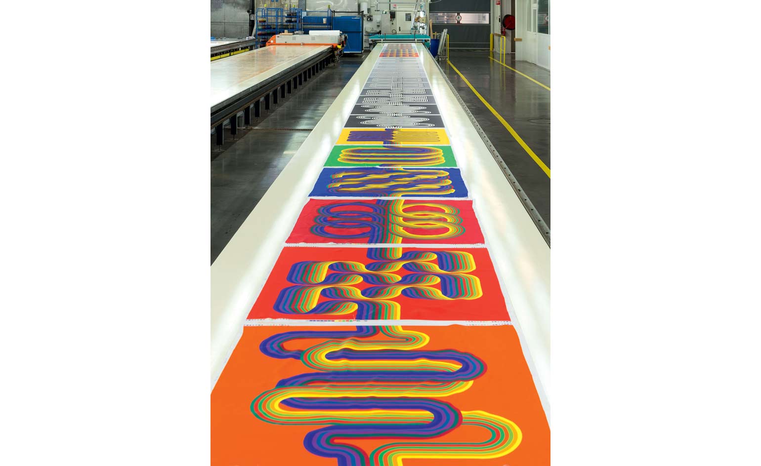
Walking out of Julio le Parc's 2013 solo exhibition at the Palais de Tokyo in Paris, Pierre-Alexis Dumas trembled with impatience. 'I was thinking, I have to meet him,’ he recalls. Dumas, the artistic director of Hermès had a specific reason in mind.
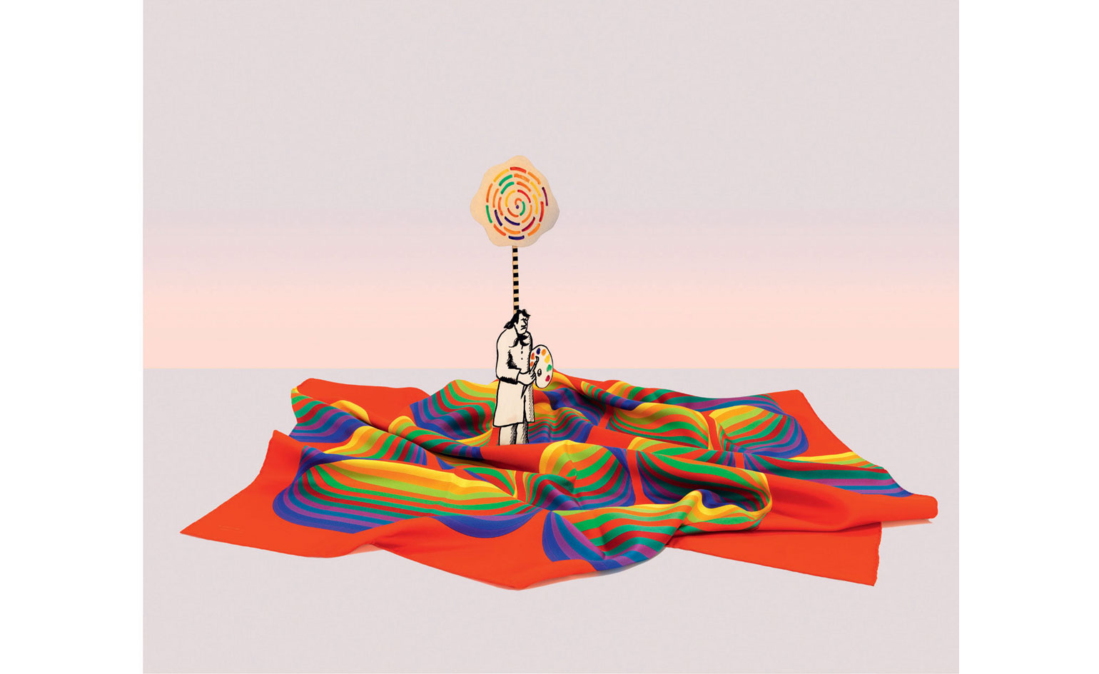
In 2008, he had launched a project called Hermès Éditeur, producing rare collections of the house’s iconic silk scarves in conjunction with renowned contemporary artists. 'I dreamed of collaborating with artists on limited editions,' he explains in the June 2015 edition of Wallpaper* (W*195). 'I wanted something spectacular, exquisite, challenging, that would awaken curiosity and awareness of the art of printing silk.'
Each Hermès Éditeur edition takes two years to realise, and the latest collection numbers 60 unique pieces in all. The project’s first iteration was based on works by the late Josef Albers; this was followed with editions by living artists – Daniel Buren in 2010 and Hiroshi Sugimoto in 2012.
When Dumas entered the Palais de Tokyo and saw Le Parc's work, he immediately knew that the artist should design the fourth edition. ‘He is a great master of abstraction and colour – of using colour to enter the language of our emotions,’ he explains.
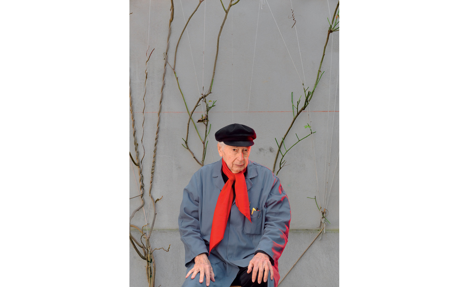
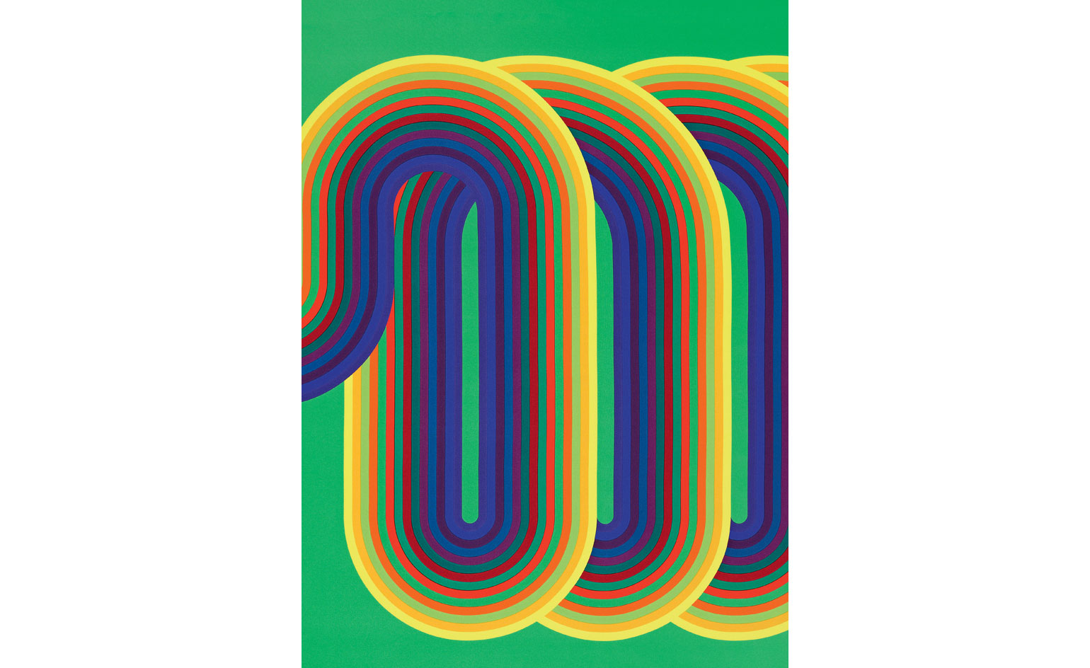
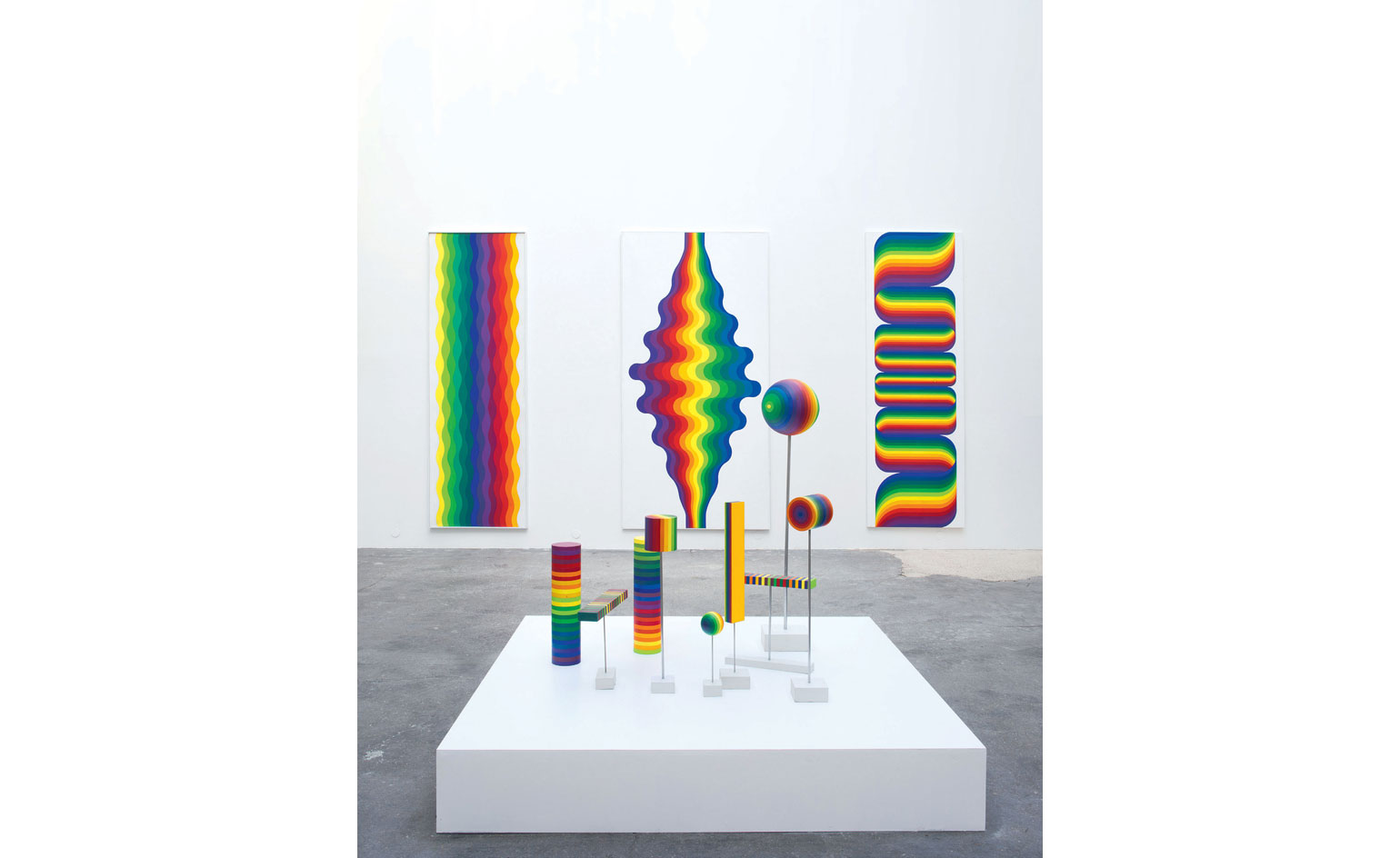
Born in Argentina in 1928, Le Parc attended the School of Fine Arts in Buenos Aires, where he studied under Lucio Fontana. Fascinated with colour, in 1959 he chose the 14 prismatic shades he felt represented all the possible variations of chromatic mixtures, and has restricted himself to this palette ever since. Though his rules are strict – he applies colour using pre-determined systems, repetition and geometry – they allow for an almost unlimited amount of combinations.
Several weeks after seeing Le Parc's exhibition, Dumas visited the artist at his family home and studio in the Paris suburb of Cachan. He realised there was a chance Le Parc might decline the collaboration (in 1972, he refused an invitation to show a retrospective of his work at the Musée d’Art Moderne de la Ville de Paris) but, luckily, the two hit it off right away. It was, says Le Parc, a 'coup de foudre' – love at first sight.
The two men spent hours looking through the artist's paintings and archives, searching for the best work to adapt to silk. In fact, Dumas already knew which work he wanted for Hermès Éditeur. 'I was thinking of La Longue Marche but didn’t dare ask,' he admits. Fortunately, when it came up, Le Parc agreed.
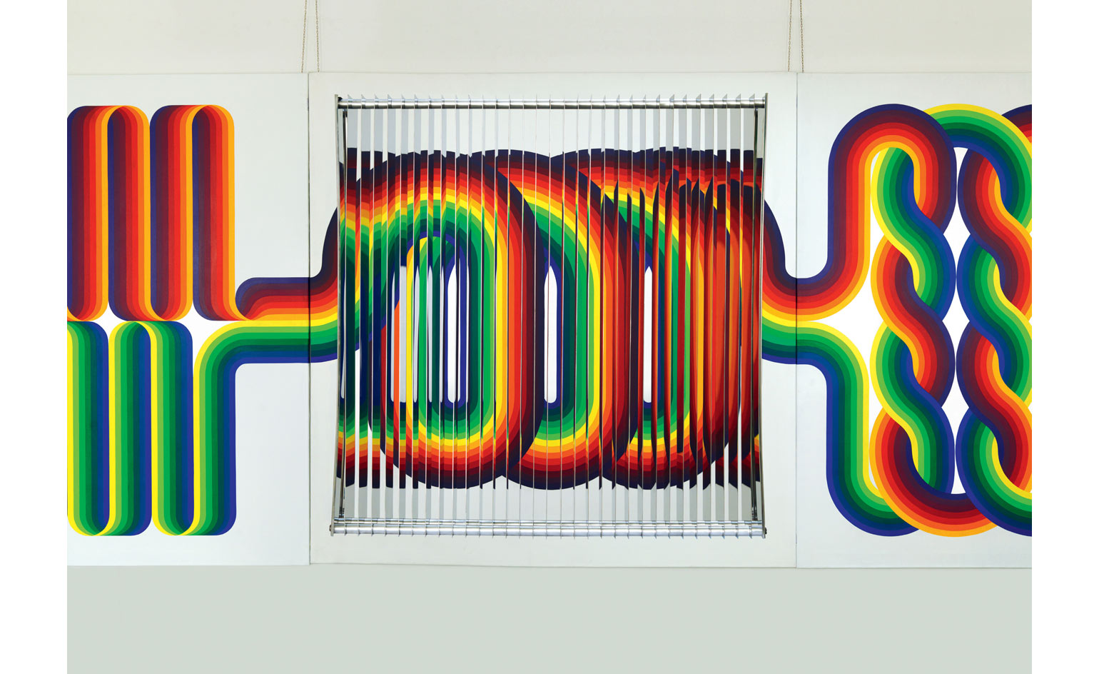
The artist originally created La Longue Marche in 1974–75: it was a monumental horizontal work of ten panels of two sq m. Le Parc’s 14 colours, lined up in parallel bands on a white background, enter each frame from the right or left and exit again on the other side, weaving and twisting into diverse shapes across the canvas and forming an original composition in each square. 'The title worked well,' he says. 'It’s a long, open-ended progression with stages.'
For Hermès Éditeur, the artist opted to research new variations rather than simply copying the original work. Dumas already knew what potential his atelier could offer. 'The strength of silk printing is in the permutation of colours,' he says. 'Once we chose La Longue Marche, I knew we would really have fun.'
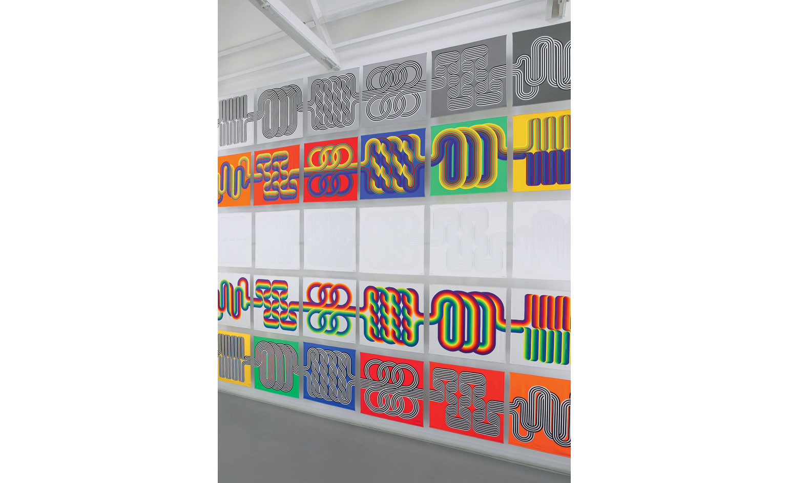
Le Parc riffed off six of the square paintings in La Longue Marche, plus three 'non-colours' (black, white and grey), ultimately coming up with ten series of six motifs. The first series is true to the original work. Another is similar, but with backgrounds that vary from light to dark grey. In others, the parallel strips of colour change position, or become black and white bands on solid backgrounds. The ninth series is all black and white – as is the tenth – but with very finely drawn lines.
Dumas says he has no idea who the next artist for Hermès Éditeur will be. He claims he has no wish list, but knows instinctively when he comes across the right person. 'I hope in 20 years we’ll look at all the different editions and say "it's like a literary collection, novels with their individual expressions that can stand next to each other",' he says. 'This,' he adds with a smile, 'is my own personal longue marche.'
For the unabridged version turn to page 094 of W*195
Wallpaper* Newsletter
Receive our daily digest of inspiration, escapism and design stories from around the world direct to your inbox.
Jack Moss is the Fashion Features Editor at Wallpaper*, joining the team in 2022. Having previously been the digital features editor at AnOther and digital editor at 10 and 10 Men magazines, he has also contributed to titles including i-D, Dazed, 10 Magazine, Mr Porter’s The Journal and more, while also featuring in Dazed: 32 Years Confused: The Covers, published by Rizzoli. He is particularly interested in the moments when fashion intersects with other creative disciplines – notably art and design – as well as championing a new generation of international talent and reporting from international fashion weeks. Across his career, he has interviewed the fashion industry’s leading figures, including Rick Owens, Pieter Mulier, Jonathan Anderson, Grace Wales Bonner, Christian Lacroix, Kate Moss and Manolo Blahnik.
-
 Nature sets the pace for Alex Monroe’s first sculpture exhibition
The British designer hops from jewellery to sculpture for his new exhibition at the Garden Museum, London. Here, he tells us why nature should be at the forefront of design
By Tianna Williams
-
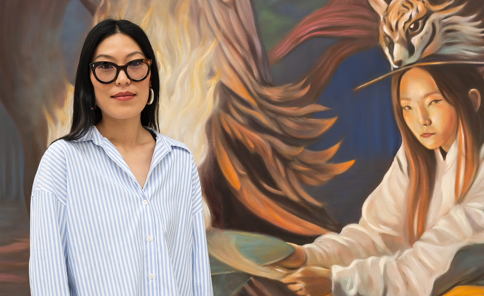 Meet the Turner Prize 2025 shortlisted artists
Nnena Kalu, Rene Matić, Mohammed Sami and Zadie Xa are in the running for the Turner Prize 2025 – here they are with their work
By Hannah Silver
-
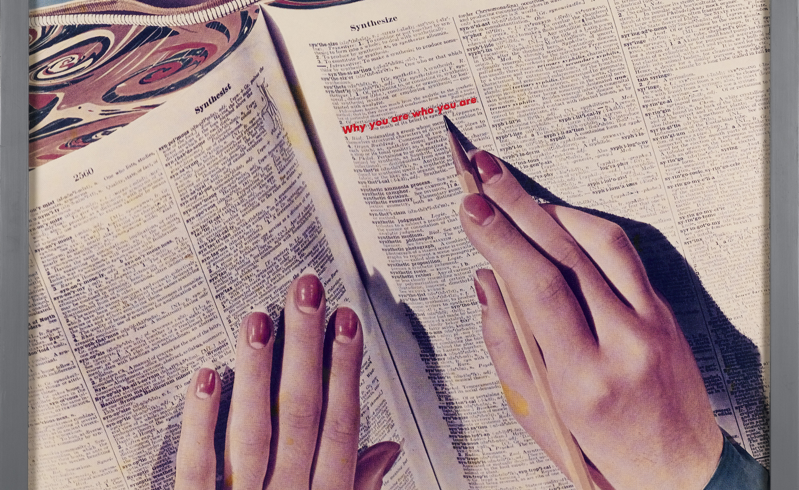 Take a rare chance to see the astonishing Ringier Collection of artworks in Düsseldorf
From Barbara Kruger to Sylvie Fleury: publishing mogul Michael Ringier opens his private art collection to the public, sharing 500 works, and tells us what makes great art
By Harriet Quick
-
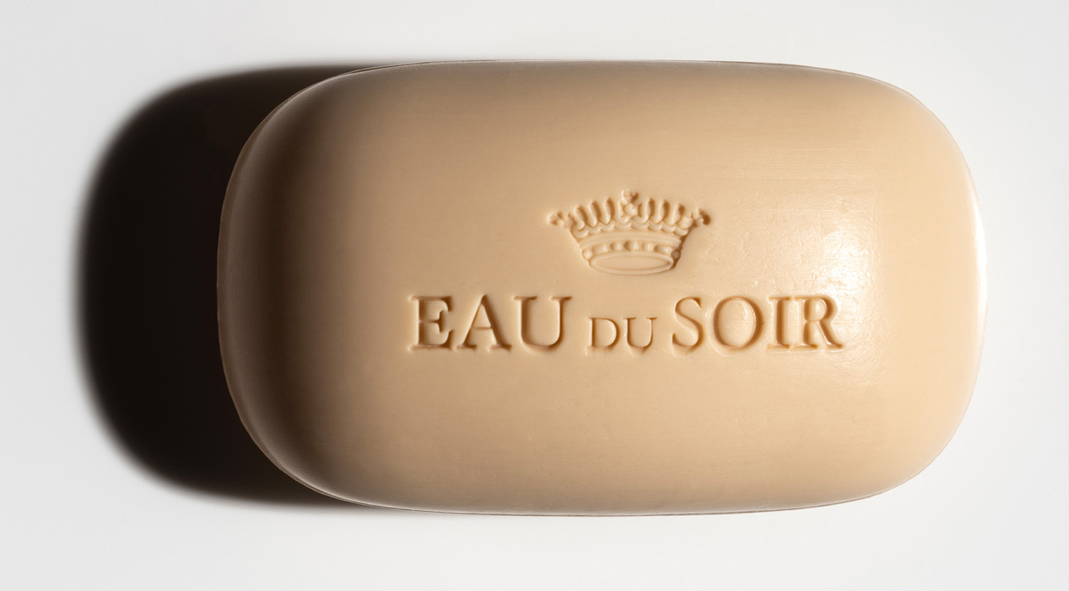 Unboxing beauty products from 2024, as seen on the pages of Wallpaper*
Wallpaper's 2024 beauty picks included Chanel lipstick, Bottega Veneta perfume and solid soap from the likes of Aesop, Celine, Diptyque, Hermès and Sisley
By Hannah Tindle
-
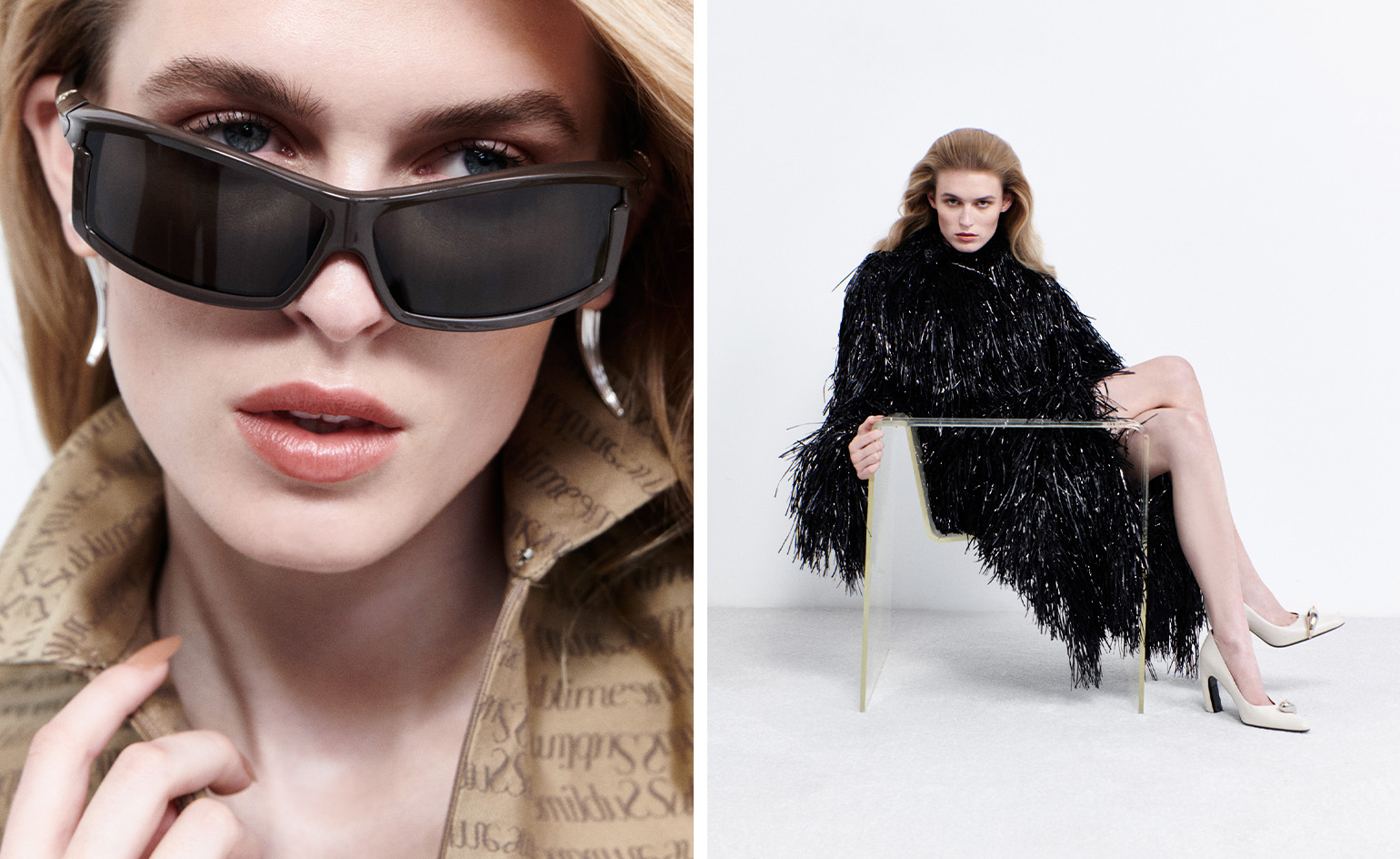 These illuminating fashion interviews tell the story of style in 2024
Selected by fashion features editor Jack Moss from the pages of Wallpaper*, these interviews tell the stories behind the designers who have shaped 2024 – from Kim Jones to Tory Burch, Willy Chavarria to Martine Rose
By Jack Moss
-
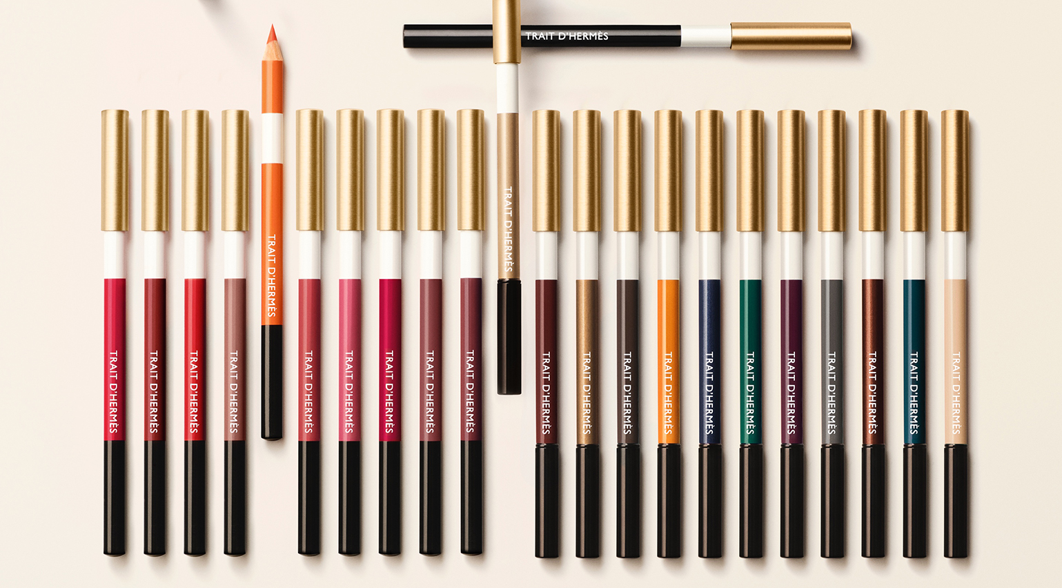 Hermès Beauty’s eye and lip pencils invite playfulness with colour and texture
Hermès Beauty’s creative director Gregoris Pyrpylis has added to the ‘Trait d’Hermès’ collection with a set of eye and lip liners in kaleidoscopic colours. Here, he speaks to Wallpaper* about their playful design
By Hannah Tindle
-
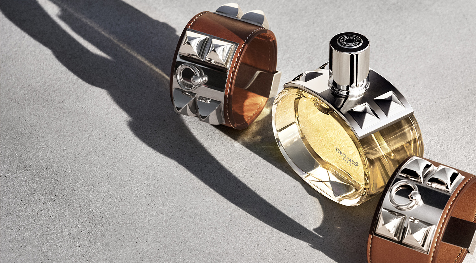 The story behind Hermès’ ‘Barénia’, a perfume that took nearly ten years to make
Hermès’ ‘Barénia’ is the house’s first-ever chypre fragrance. Christine Nagel tells Wallpaper* why it was almost ten years in the making
By Hannah Tindle
-
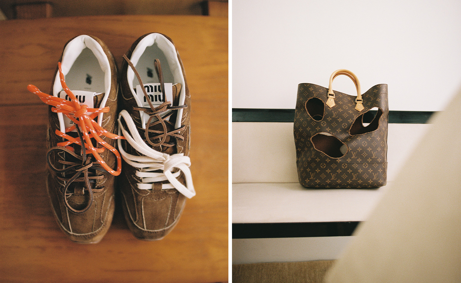 Sourcewhere is the app helping you find the rarest fashion grails
Sourcewhere uses a network of experts and personal shoppers to source rare vintage and limited-edition fashion, from Phoebe Philo’s Céline to Margiela-era Hermès. Here, founder Erica Wright tells Wallpaper* why it’s reflecting a wider change in the way people shop luxury fashion
By Mary Cleary
-
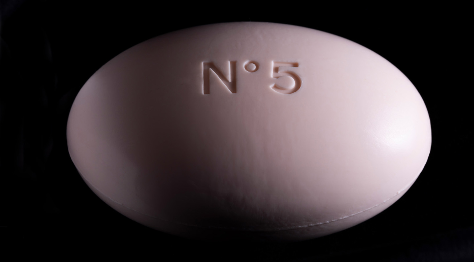 Why solid soap is the most pleasurable object to bathe with
Solid soap provides a tactile bathing experience like no other. Hannah Tindle explores why in the September 2024 Style Issue of Wallpaper*, with soaps by Chanel, Celine, Diptyque, and more, photographed by Sophie Gladstone
By Hannah Tindle
-
 The best sunscreens for your face, selected by the Wallpaper* beauty editors
This list of the best sunscreens for your face has been compiled by Wallpaper* editors Mary Cleary and Hannah Tindle, who are highly selective about SPF
By Mary Cleary
-
 ’What is the life of a woman?’: Nadège Vanhée on a decade of womenswear at Hermès
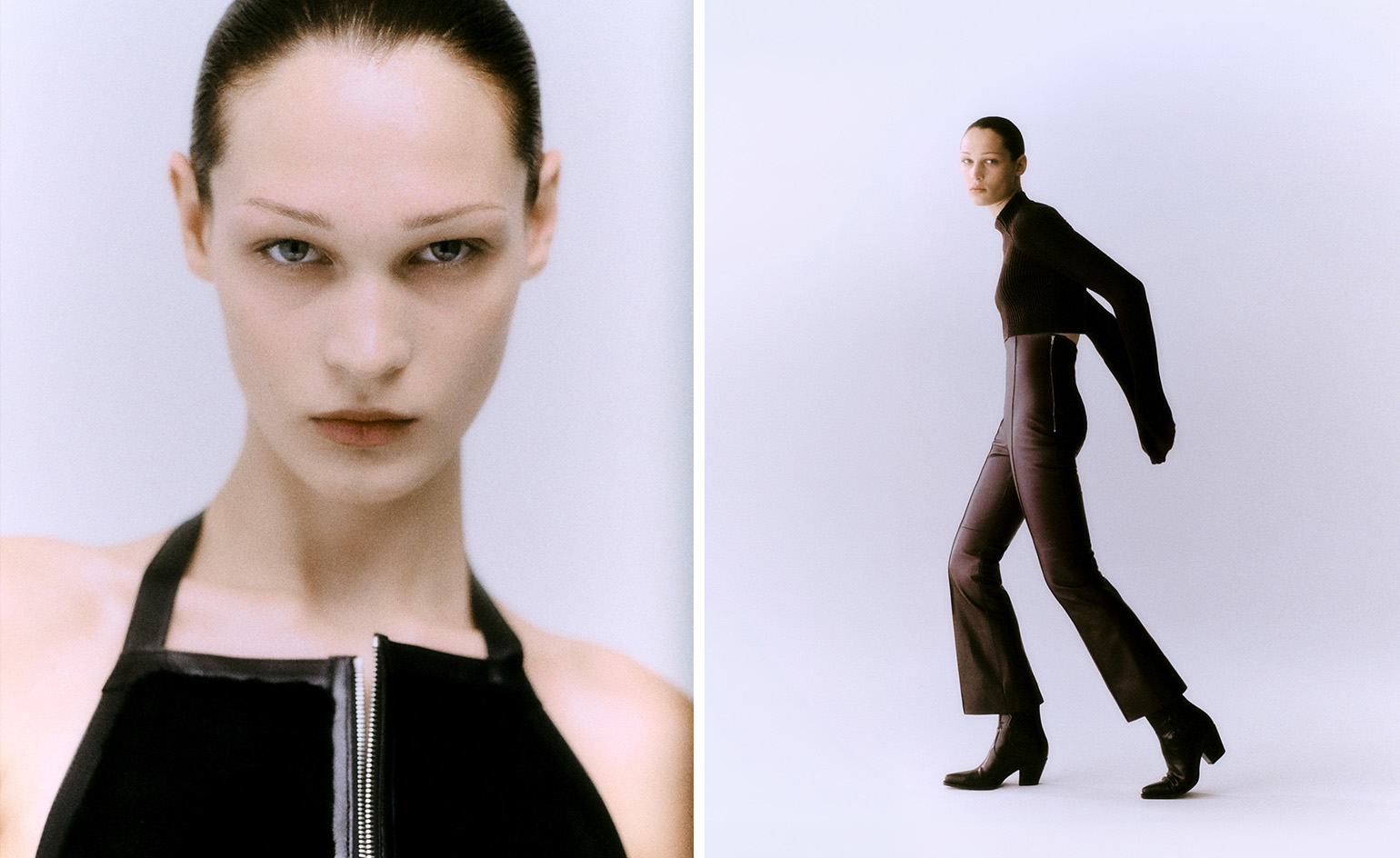
For the past ten years, Nadège Vanhée, head of womenswear at Hermès, has steered the French maison on a quietly rebellious path, exploring notions of contemplation, liberation and sensuality. Speaking to fashion features editor Jack Moss, she unpacks her evolution
By Jack Moss