
... and our pick from the Paris menswear shows

Givenchy: Each season, Givenchy sends out a limited-edition artwork by M/M Paris to guests. This printed illustration in black and white, with the house's logo in gold foil on the reverse, was folded into an elaborate envelope

Dolce & Gabbana: This invitation was laid out in a booklet format. Show details alternated with delicate flower compositions on thin paper, the bouquets referencing some of the collection's prints

Hermès: A booklet printed with elegant graphic details in black and orange

Ann Demeulemeester: For her Paris show, Ann Demeulemeester sent out a humble white handkerchief with a screen-printed motif and show details in simple black type

Z Zegna: A pentagonal motif referenced the collection's graphic textures, and the brown card had a contrasting black flock

Marni: The bold fluorescent-pink Marni invitation got a punky treatment in matt black with asymmetrical design detail

Ballantyne: The Ballantyne logo and crest stood out from an elegantly understated white card, with show details in basic black

Maison Martin Margiela: A fan of the novelty feature, Margiela sewed a garment tag to a simple white card, with the show details on the reverse

Calvin Klein Collection: This simple card from Calvin Klein displayed the details of the show in matt red foil

Salvatore Ferragamo: On the front of a plike card, the Maison's logo was embossed in black gloss; show details were printed on the back

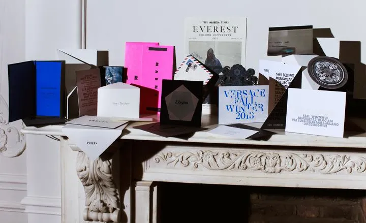
Versace: Bold Klein-blue lettering was interwoven with a sophisticated baroque design on a thick, blue-edged card

Gucci: The substantial mail-out from Gucci featured a darkened-gold face and edge. On the reverse, a matt black surface was embossed with metallic lettering

Moncler: The no-frills invitations from Moncler always contrast with the flamboyant narratives of the label's shows. This season's dinner invitation was handwritten on a plain white card

Diesel Black Gold: The 'Cosmic Tour' collection was announced with the delivery of a fantastical stage motif, intricately laser-cut to evoke the brand's psychedelic rock tour theme

Bally Everest: Over in London, the mid-century Mount Everest explorations recalled on this Bally 'newsletter' celebrated the collection's central theme

Armani: The two invitations for the Armani brands followed a similar theme. Giorgio Armani's felt envelope, closed with a button strap, revealed a simple black card inside. Emporio Armani's charcoal leather envelope was sealed by a magnet and carried a delightfully contrasting electric-blue card

Fendi: This heavy metal offering came printed with only the most essential of show venue information

Alexander McQueen: Classic with a hint of drama, the Alexander McQueen show was heralded on a thick blue card with show details in gold foil

Margaret Howell: An abstract black form making a play of shadows was the prelude to the Margaret Howell show

Richard James: More abstract imagery - this time in festive colour from Richard James
Prada: This invitation featured a teaser of the special set design which previewed a furniture collaboration between OMA and Knoll. The small booklet included compositions of blurred shots inspired by the interiors of the Milanese set

Ports 1961: The simple but sturdy invitation from Ports 1961 was printed on a duplex card with black edging

Saint Laurent: Hedi Slimane eschews standard invitations in favour of art booklets. For the latest, designer Brian Roettinger produced a series of black and white abstract ink prints, which were bound in a sleek black journal

Viktor & Rolf: The invitation design from Viktor & Rolf was driven by a playful typographic illustration on a simple white card

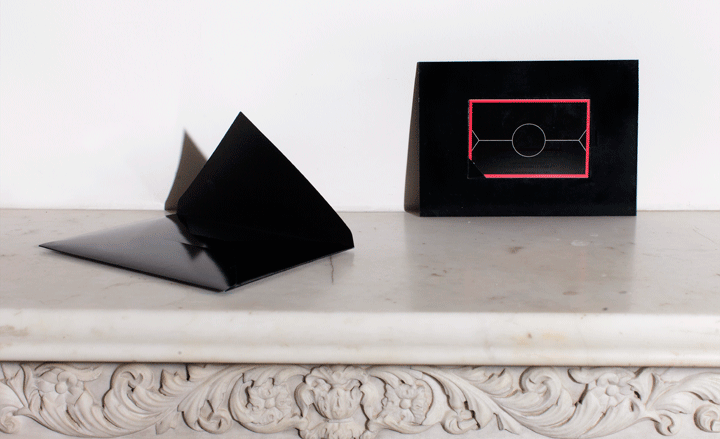
Mugler: A midnight-blue card with a graphic cut-out introduces Mugler on the front, and his show details on the back

Yohji Yamamoto: Is there any dog more glamorous than the Afghan hound? Here he is, front and centre on the Yohji Yamamoto invitation

Dries Van Noten: A tangerine drop shadow gave this black lettering a contemporary feel at Dries Van Noten, while the accompanying envelope was lined with the same hue
Dior Homme: A sleek black card came with two smaller pull-out tags containing the show details

Paul Smith: With the show taking place at the Centre Pompidou, Paul Smith reproduced a negative of the building as seen from above; it doubled as a map for guests

Louis Vuitton: Always working alongside the art world, Louis Vuitton commissioned Dinos and Jake Chapman to design a baroque print. They mined the house's archives and Himalayan imagery for their intricate print, debossed on silver mirrorboard for the invitation

Comme des Garçons: As per the house style for Comme des Garçons invitations, unassuming typography was printed on a sheet of A4 - this season in aqua

Junya Watanabe: A cheeky photograph of a child in fancy-foil dress introduced Junya Watanabe's Paris show

Kenzo: Kenzo sent out a holographic image of clouds passing through the sky, referencing the collection's dreamy prints

Neil Barrett: A fold-out card for Neil Barrett mixed matt black gatefold with foil block lettering

Berluti: For its presentation at Paris' grand Galerie de L'Evolution, Berluti chose an elegant thick black card with silver edging and block lettering

Kris Van Assche: A poster-sized invitation displayed the title of Van Assche's collection in bold black type. The message referenced 'Trainspotting' and Katherine Hamnett's 1980s slogan T-Shirts

Lanvin: Rounded edges, gold accents and refined calligraphy are trademarks of the Lanvin invitation

Rick Owens: A rectangle cut from particleboard was printed with black and white graphic blocks for Rick Owens

Etro: This season Kean Etro drew inspiration from Celtic symbols for the family brand's collection. The invitation turned them into a spinning 'circle of life' calendar

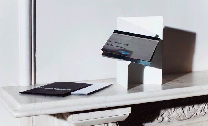
Jil Sander: Matt and glossy black contrasted on the Jil Sander card, which came with bold debossed type and a thick coloured edge

Y3: The art was in the envelope at Y3's invitation to its first men's fragrance launch, sleek and black with a geometric motif
-
 All-In is the Paris-based label making full-force fashion for main character dressing
Part of our monthly Uprising series, Wallpaper* meets Benjamin Barron and Bror August Vestbø of All-In, the LVMH Prize-nominated label which bases its collections on a riotous cast of characters – real and imagined
-
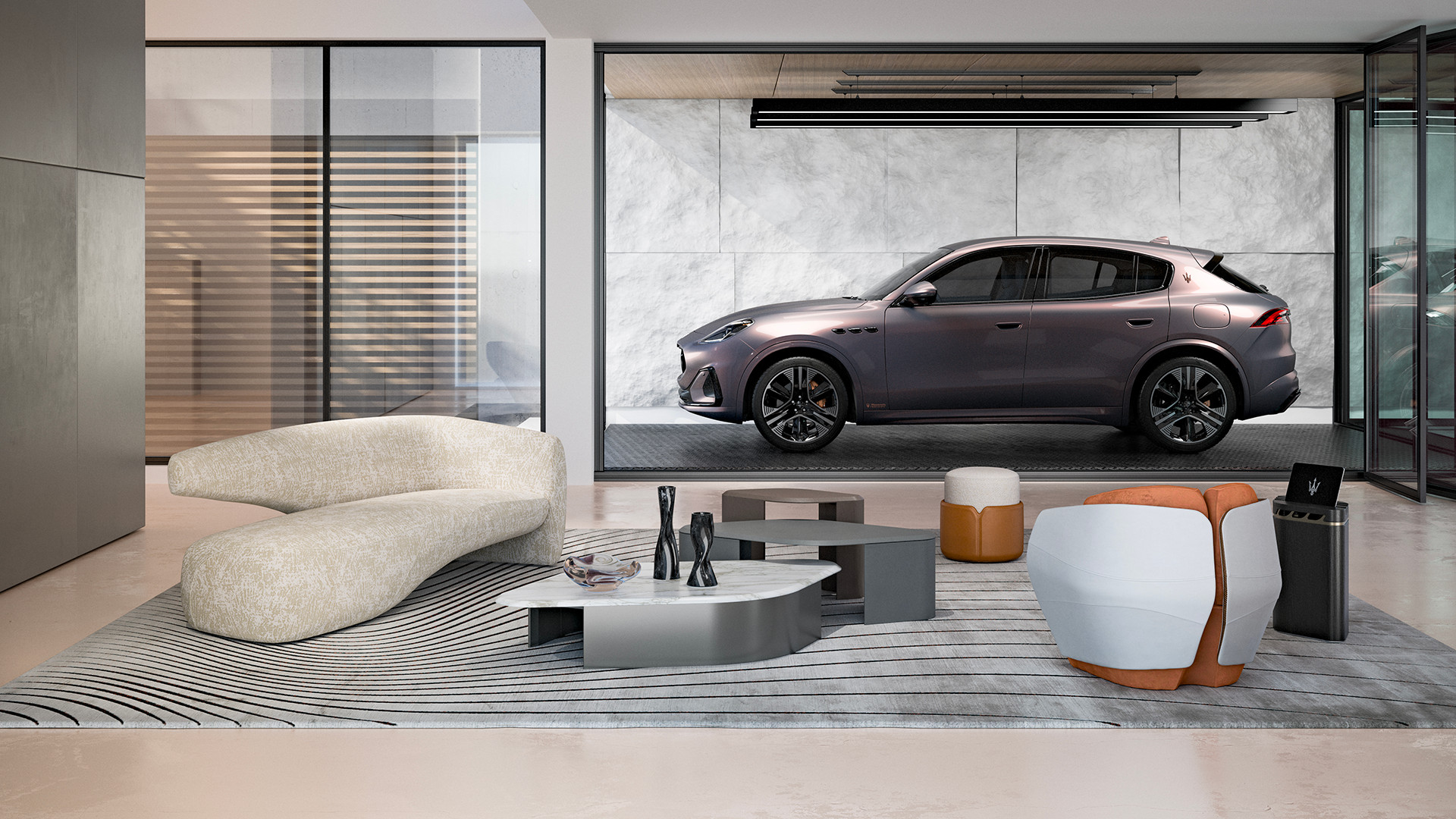 Maserati joins forces with Giorgetti for a turbo-charged relationship
Announcing their marriage during Milan Design Week, the brands unveiled a collection, a car and a long term commitment
-
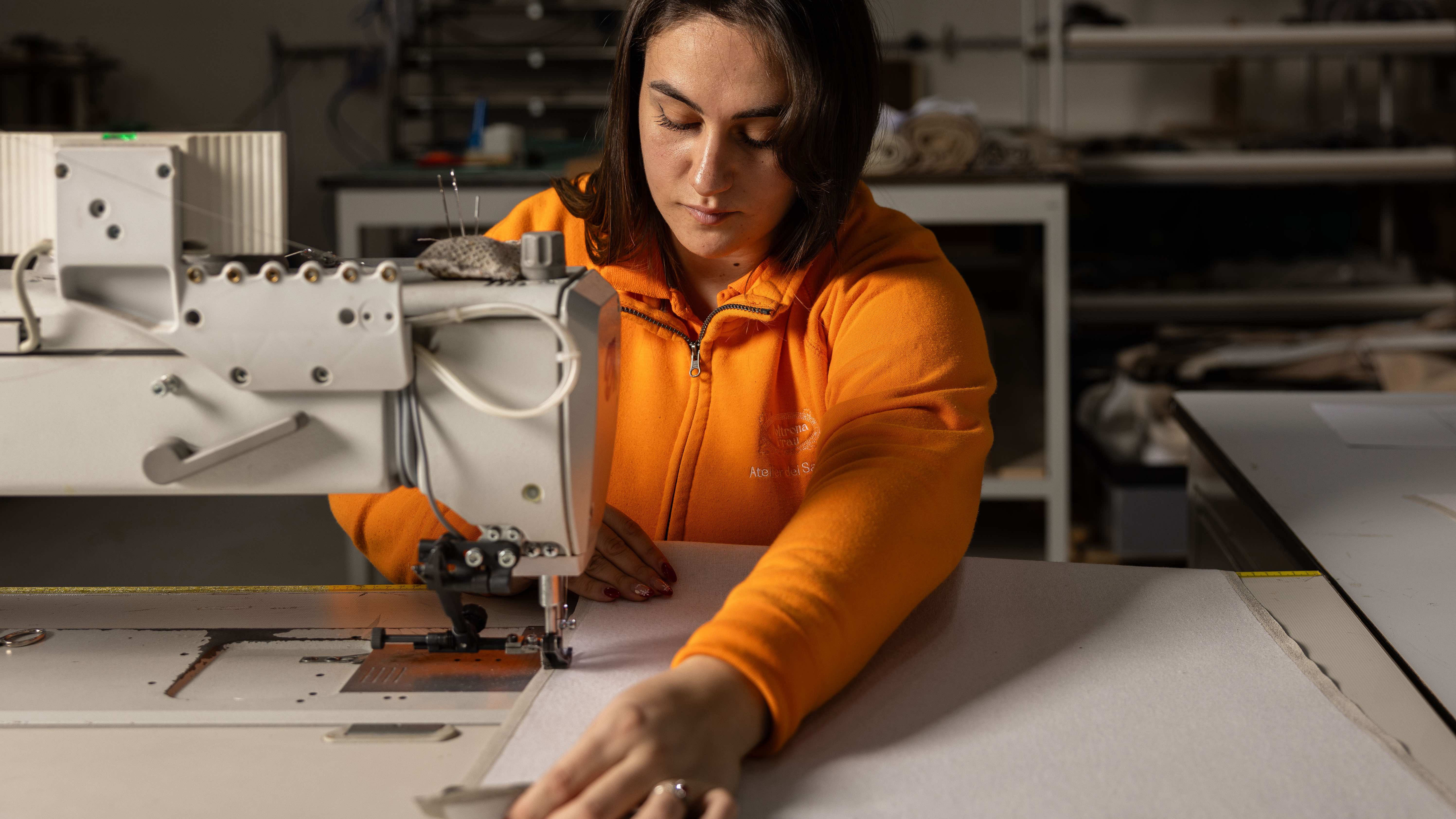 Through an innovative new training program, Poltrona Frau aims to safeguard Italian craft
The heritage furniture manufacturer is training a new generation of leather artisans


