Fashion week S/S 2014 invitations: menswear collections
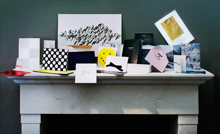
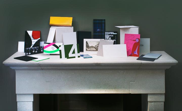
...and a few favourites from the menswear shows in Milan
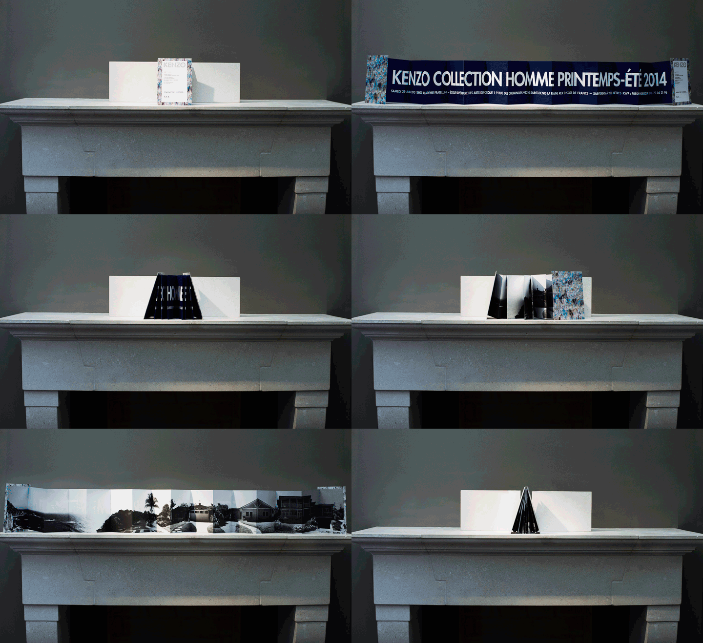
Kenzo: Show details were printed in bold lettering on an accordion poster, with a black and white landscape photograph of California (the designers’ main influence this season) appearing on the reverse
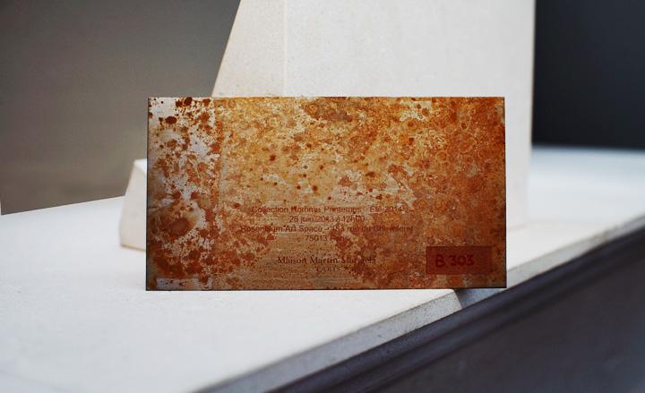
Maison Martin Margiela: A pleasingly heavy, rusted metal invitation hinted at the 'Marks of Time and of Memories' theme of the collection
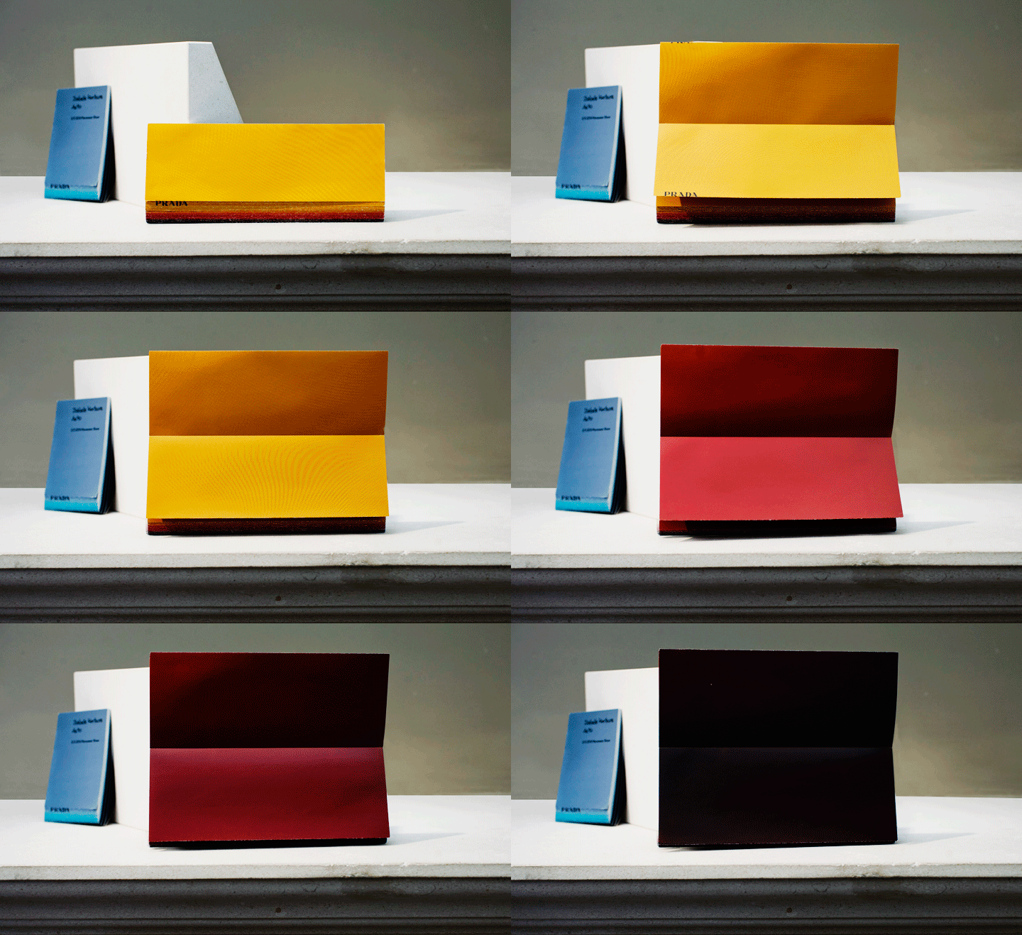
Prada: The invitation came in the form of a French-folded booklet in an ombre palette, with the brand's black logo printed on the fore edge. Guests found a smaller version on their seats, executed in blue
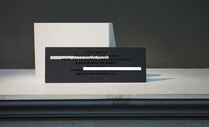
Rick Owens: The designer sent out this rectangular card, featuring a combination of monochrome graphic elements, to announce his Paris show
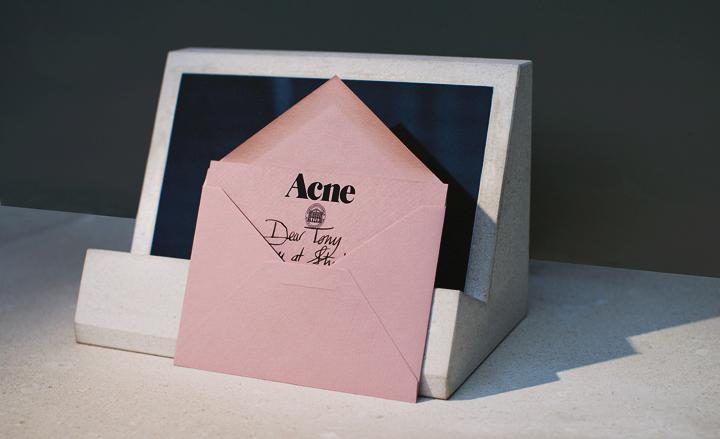
Acne Studios: A delicate, mauve envelope and card bore a handwritten message with details of the Acne presentation
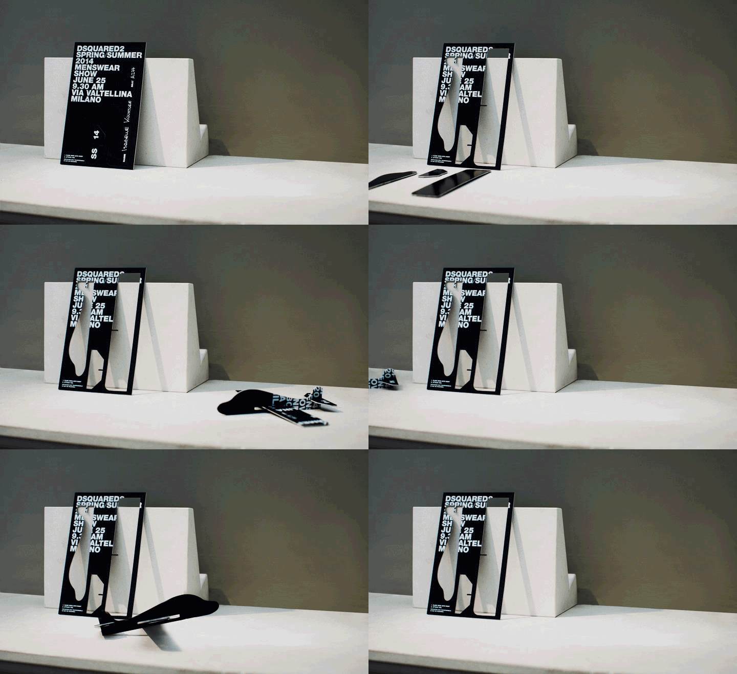
Dsquared²: A balsa wood invitation from the Caten twins revealed push-out pieces of a DIY plane, referencing a favourite pocket-money toy of yesteryear. We tried it. It works

Louis Vuitton: The die-cut, ivory invitation referenced both the house’s Damier check logo and the show set, which was designed in the same cut-out style
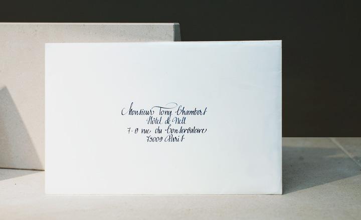
Louis Vuitton: The house's invitation came encased in an envelope bearing exquisitely rendered calligraphy
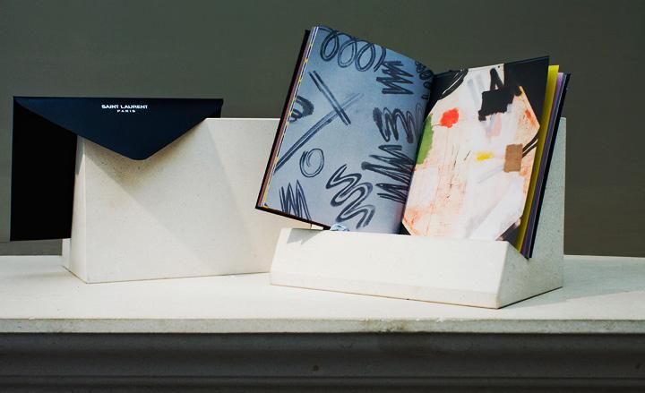
Saint Laurent: Each season, Hedi Slimane chooses an artist to create a limited-edition booklet for show guests. His latest collaboration was with American artist Matt Connors, who splashed his bold, abstract illustrations across the luxurious book
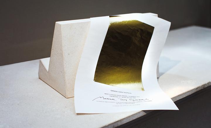
Dries Van Noten: This gossamer-thin invitation was printed in gold foil, an allusion to the all-gold set that would greet show goers at Halle Freyssinet
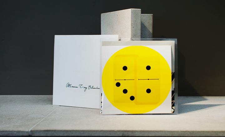
Dior Homme: Dior's graphic offering - bearing a yellow domino motif - was housed in a clear, plastic 7-inch record sleeve
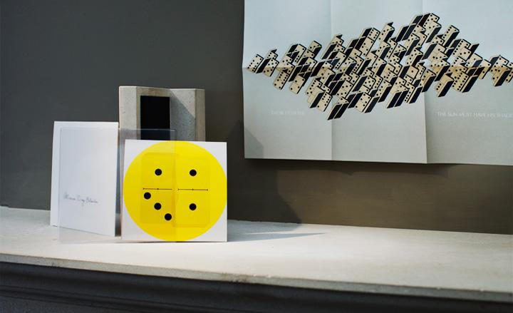
Dior Homme: Inside, a folded poster printed with a maze of domino pieces referenced the show’s labyrinthine set
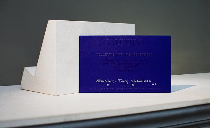
Valentino: Pierpaolo Piccioli and Maria Grazia Chiuri delivered much of their latest menswear collection in an exquisite shade of blue, which they replicated on the embossed invitation card
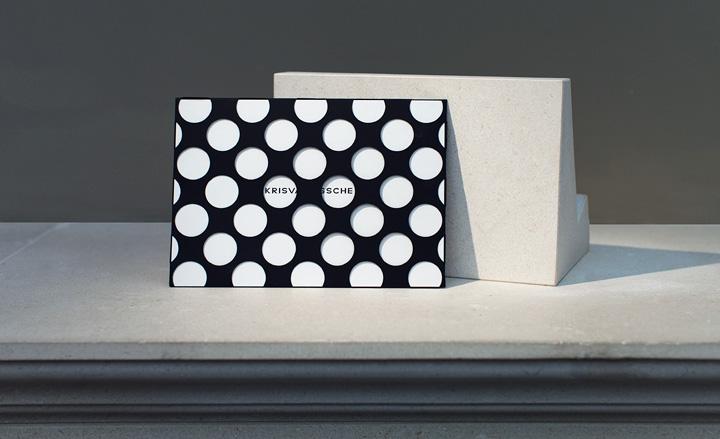
Kris Van Assche: The invitation was delivered inside a die-cut, black envelope, creating a striking, polka dot effect
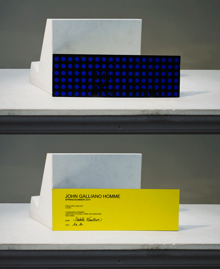
John Galliano: Another polka dot motif in black and navy bedewed the invitation card. The reverse featured black lettering on a contrasting yellow background
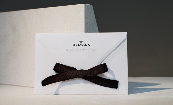
Delvaux: The house's invitation was sealed with a sombre grosgrain ribbon, tied so perfectly that it was with great reluctance our Editor-in-Chief was persuaded to open the envelope
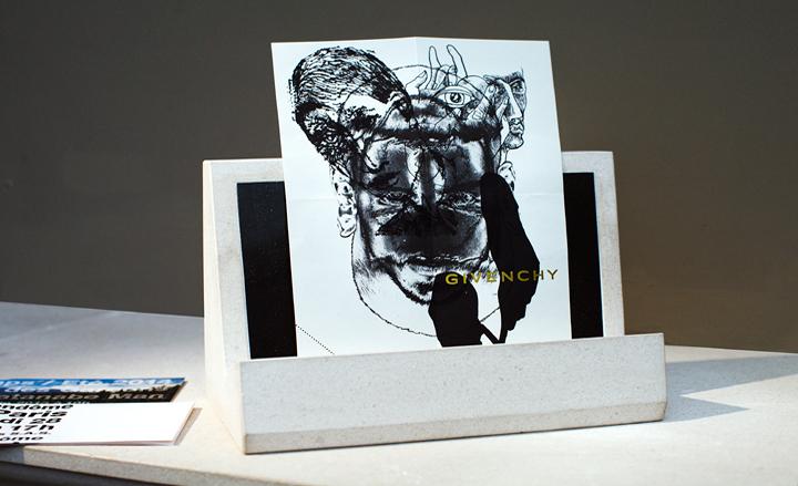
Givenchy: Once again, Givenchy delivered its show details on a small, Rorschachian limited-edition print by M/M Paris, stamped with the house’s gold-foiled logo
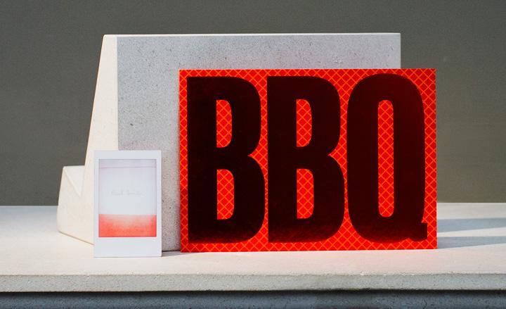
Paul Smith: The Rothko-esque invitation came in the shape of a minuscule Polaroid-like card (a photographic medium favoured by the British designer), while the barbeque party he held in town the same week was announced through oversized type, set against a chequered background
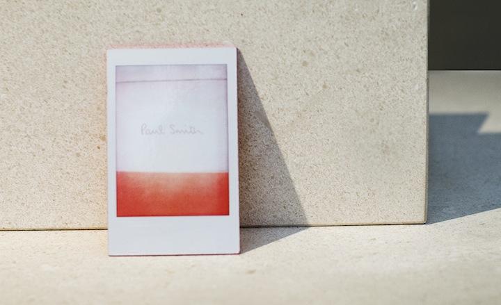
Paul Smith: A close-up of Smith's Rothko-esque invitation
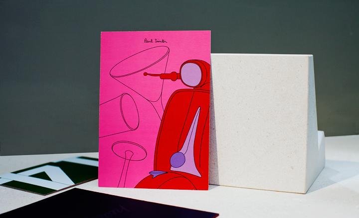
Paul Smith: This season, all of Sir Paul's invitations played with the colour pink, a shade that also featured heavily in his collection. He chose a playful illustration of a Vespa - the ultimate Italian icon - in bold Pop Art hues to invite the Milanese crowd to his summer cocktail party
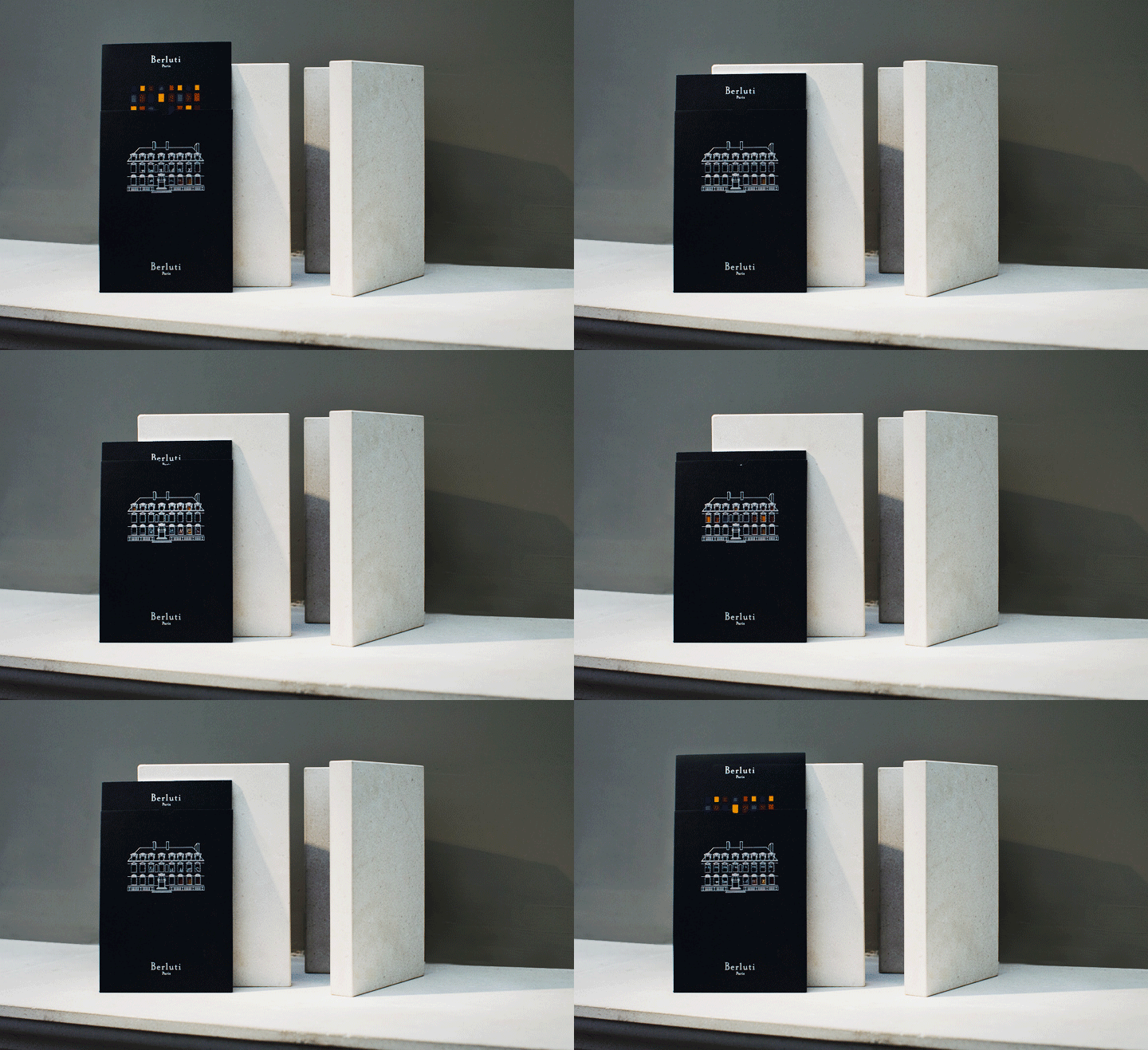
Berluti: The Hotel de Sully (the Parisian hôtel particulier that hosted the presentation) was depicted in silver on the envelopes sent to guests. Inside, the pull-out card was printed in bold colour-blocks that peeped through the die-cut hotel windows of the envelope
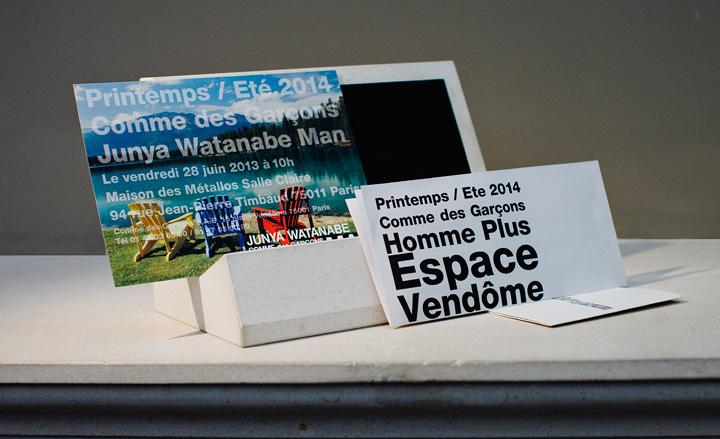
Comme des Garçons and Junya Watanabe: Invitations for these two Japanese brands featured their usual, bold typographic style. Comme des Garçons employed a restrained use of black text on white paper, while in contrast Junya Watanabe’s invite was superimposed on a summery mountain lake image - a clue to the collection’s outdoors explorer theme
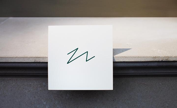
Lacoste: Art director Peter Saville collaborated with Lacoste on an anniversary collection, reworking the 80-year-old crocodile logo in 160 unique ways. The invitation echoed his redesign work with a stylized version of the logo emblazoned on one side
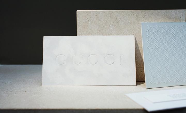
Gucci: The Milan show was announced by a thick board, with a marbled effect on white velvet and the house’s bold logo embossed on one side. The white textured card effect was also used by Bally (right)
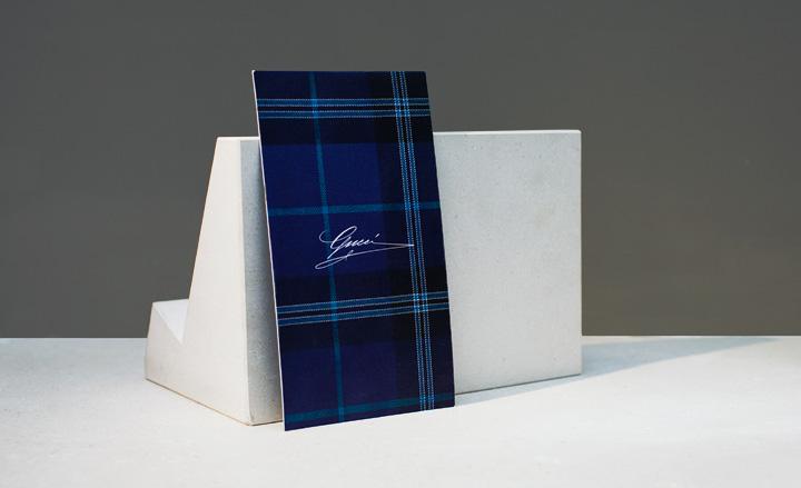
Gucci: Lapo Elkann and Frida Giannini invited guests to celebrate the Italian socialite’s capsule collection at the new Menswear Store. A blue tartan featured on a coat from the collection was replicated on the simple invitation card
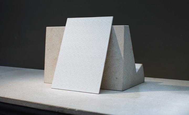
Bally: A simple but elegant offering, consisting of a thick white board debossed with a graphic, modular motif
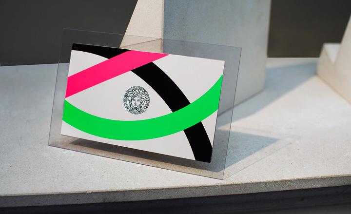
Versace: The fluorescent bands decorating the perspex invitation were part of an overarching theme for the house, also appearing on the clothes, the set, and even the models’ skin
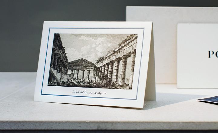
Dolce & Gabbana: This season, Domenico Dolce and Stefano Gabbana’s ongoing celebration of Sicily looked at the Greek mythology which shaped the history of the Italian island. Images of the Grecian temples found in Sicily were printed on shirts and suits, and the simple invitation card featured a similar eighteenth century image of the Segesta temple by French illustrator J.C.R. De Saint Non
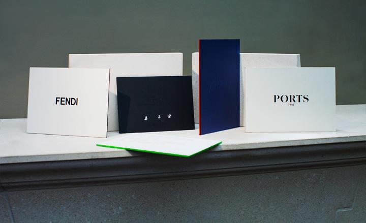
Many of the Milanese brands chose an old-fashioned stiffy to deliver their show details. From left: Fendi, Jil Sander, Calvin Klein Collection, Brioni, Ports 1961
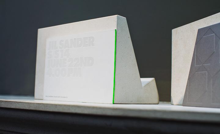
Jil Sander: As usual, Sander’s logo was embossed on the thick invitation with a foil, ton-sur-ton effect. This season’s card also bore a fluorescent green, vertical edging
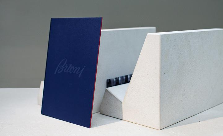
Brioni: This offering featured a silk-covered card in a luxurious shade of blue, with the brand’s signature red on the edging
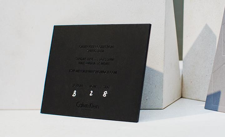
Calvin Klein Collection: It doesn't get more minimalist than a thick black stiffy, subtly embossed with black foil in san serif font
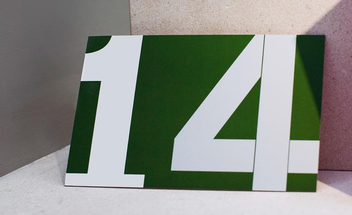
Salvatore Ferragamo: The forest green shade that Massimiliano Giornetti employed throughout his athletic collection was also chosen for the invitation card. On one side a white, stenciled number indicated the current season - again referencing the garments, which were printed with oversized digits in the same style
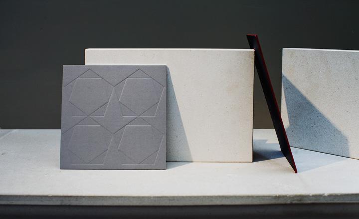
Z Zegna: A discreet grey square with a silver-foiled edge was the invitation of choice for this Milanese show. The front of the card sported a debossed pattern, made of the house’s double pentagon logo
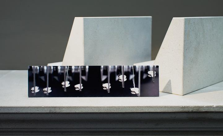
Emernegildo Zegna: Guests received a glimpse of the short film that was to be played during the collection’s presentation, depicting the house’s luxurious wool being woven
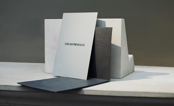
Emporio Armani: For his Emporio show, Armani sent out a soft, grey leatherette envelope concealing an elegant card with the event’s details printed in black foil lettering
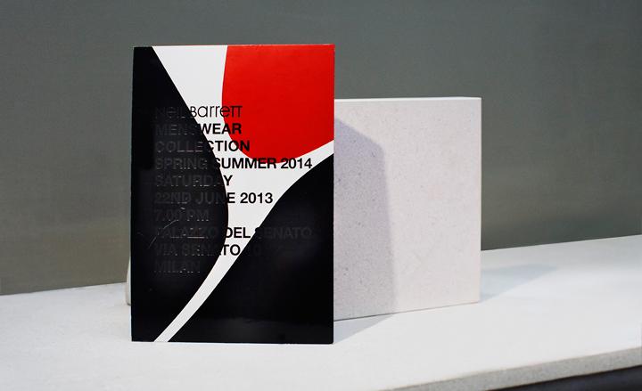
Neil Barrett: The English designer’s signature layered bold graphics were printed on a ply-board card, with a thick UV varnish creating a debossed effect
Wallpaper* Newsletter
Receive our daily digest of inspiration, escapism and design stories from around the world direct to your inbox.
Jack Moss is the Fashion Features Editor at Wallpaper*, joining the team in 2022. Having previously been the digital features editor at AnOther and digital editor at 10 and 10 Men magazines, he has also contributed to titles including i-D, Dazed, 10 Magazine, Mr Porter’s The Journal and more, while also featuring in Dazed: 32 Years Confused: The Covers, published by Rizzoli. He is particularly interested in the moments when fashion intersects with other creative disciplines – notably art and design – as well as championing a new generation of international talent and reporting from international fashion weeks. Across his career, he has interviewed the fashion industry’s leading figures, including Rick Owens, Pieter Mulier, Jonathan Anderson, Grace Wales Bonner, Christian Lacroix, Kate Moss and Manolo Blahnik.
-
 At the Regent Street Sensorium, architectural jelly sculptures are designed to ignite the senses
Delve into the history of London’s Regent Street through a jellyscape, a fragrance cloud and more – plus, for the event’s final week, two new immersive workshops (ends 27 April)
By Tianna Williams
-
 With scenography by OMA, Dior’s ‘Designer of Dreams’ exhibition in Seoul is ‘a piece of theatre’
OMA partner Shohei Shigematsu catches up with Wallpaper* about the dramatic show design for the latest iteration of ‘Christian Dior: Designer of Dreams’, which opened in Seoul this weekend
By Daven Wu
-
 Mercedes-Benz previews its next-gen people mover with an ultra-luxury EV concept
The Mercedes-Benz Vision V Concept is an art deco picture palace on wheels, designed to immerse passengers in parallel worlds as they travel
By Jonathan Bell