Fashion week S/S 2014 invitations: womenswear collections
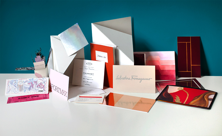
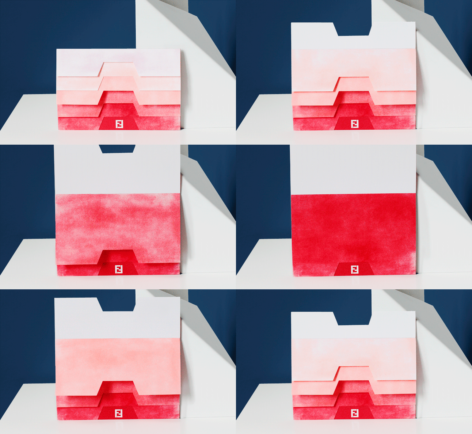
Fendi: Abstract layers, sprayed in different shades of pink, created a gradient effect
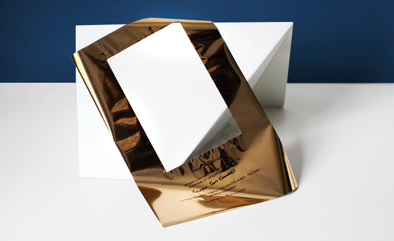
Dries Van Noten: Negative space was used to differentiate between Dries Van Noten's S/S 2014 men's and women's collection invites. In delicate gold leaf, this exquisitely thin acetate sheet was the womenswear mate to the corresponding menswear invitation
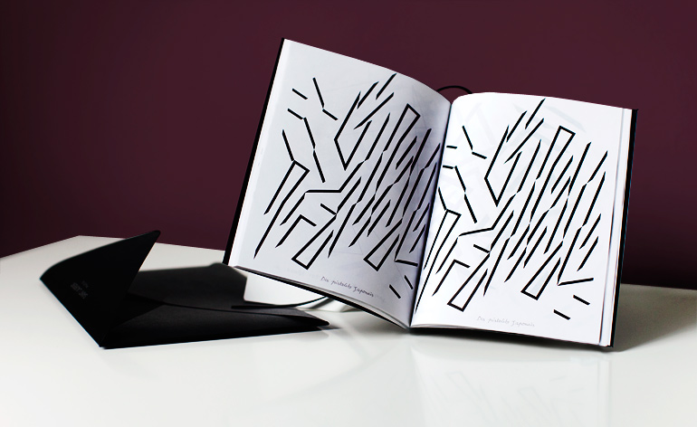
Saint Laurent: Along with a complete rebrand of the historic house, new creative director Hedi Slimane introduced an invitation art booklet to Saint Laurent. This season it features the works of Guy de Cointet (1978-1982) who went to high school with Yves Saint Laurent
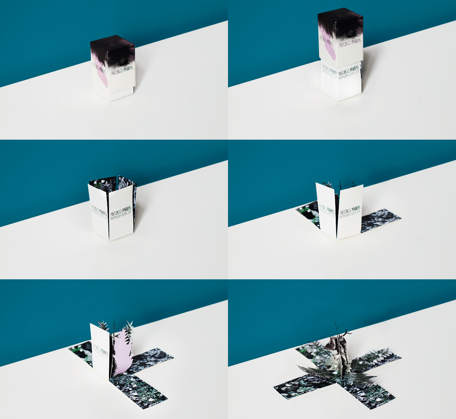
Antonio Marras: Perhaps the most creative invite of the season, this small box opens to reveal a pop-up deer-girl hybrid, camouflaged by paper vegetation. Inspired by metamorphosis, Marras looked to artist Kathy Ruttenberg's 'Nature of the Beast' exhibit at the Stux Gallery in New York for this collection
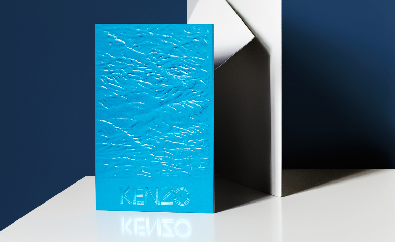
Kenzo: The brand's ocean-conscious collection for S/S 2014 was reflected in its textured invitation, with 3D waves rippling across the vivid blue card
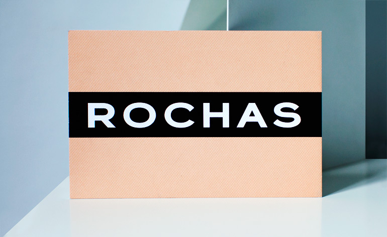
Rochas: A strip of black vinyl tape ran through the centre of Rochas' printed peach card, breaking up the softness of the gravure finish
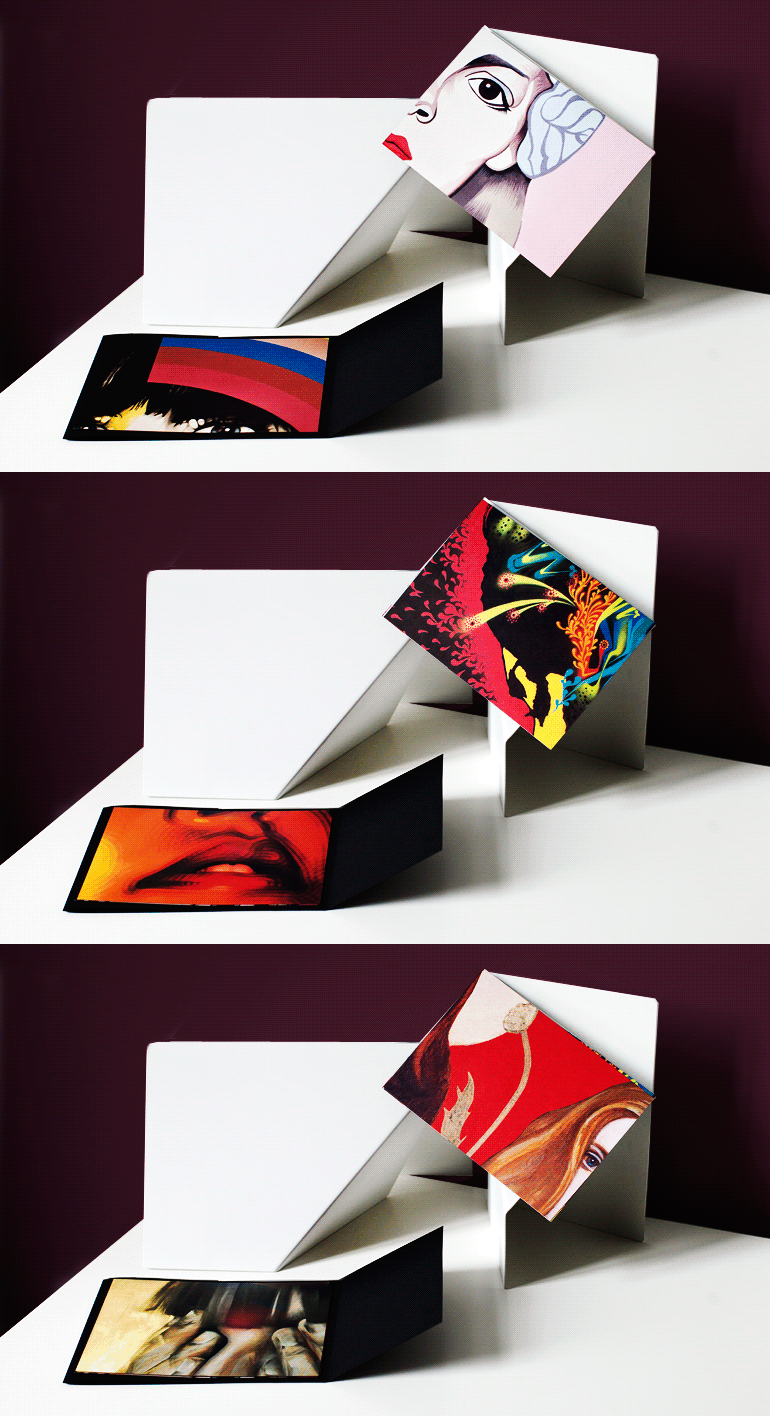
Prada: For her 'In the Heart of the Multitude' project, Miuccia Prada commissioned artists to create works that engage themes of femininity, representation, power and multiplicity. A black package embossed with the logo contained cards printed with works by El Mac, Mesa, Gabriel Specter, Stinkfish and illustrators Jeanne Detallante and Pierre Mornet
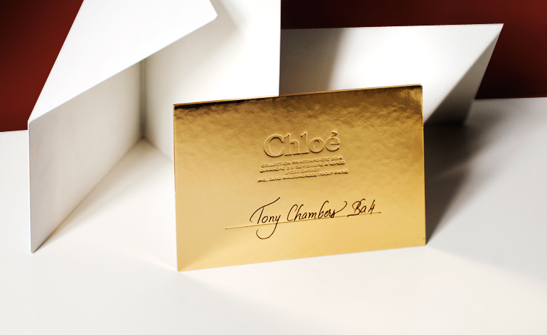
Chloé: Chloé's golden ticket was ostentatious yet minimal. Embossed with little detail, the mirrored card drew attention by reflecting light from all angles
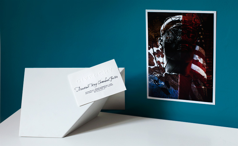
Givenchy: Each season Givenchy sends a limited-edition print with its invitation packet. For S/S 2014, guests were sent 'Flag/Givenchy' by M/M (Paris), 2013. Wallpaper* received the uniquely stamped edition number 241 out of 1,000
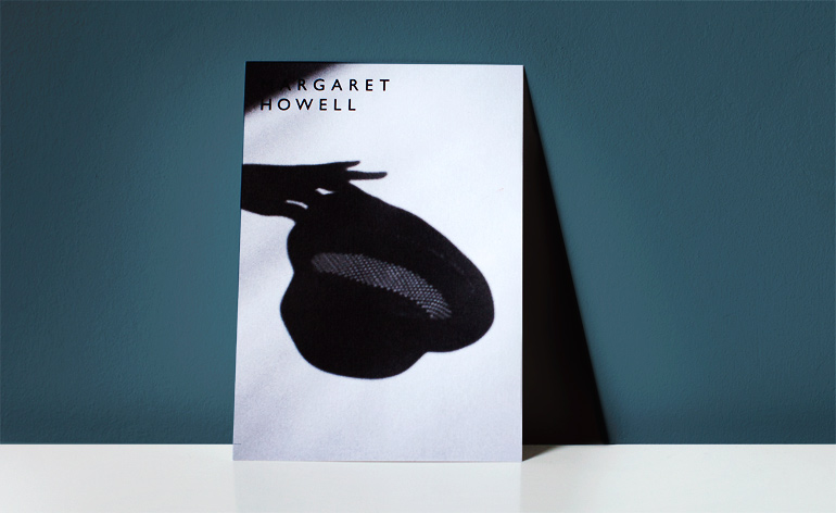
Margaret Howell: On A5 card, this invitation captures the shadow of a hand holding a hat worn by Howell's models. The reverse revealed details of the London studio show
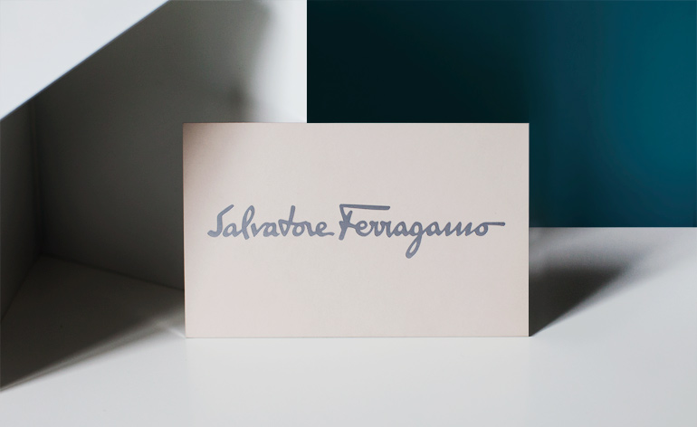
Salvatore Ferragamo: The ivory card from Ferragamo had a milky smoothness from its textured matte finish, which more than made up for the lack of detail printed on the invitation
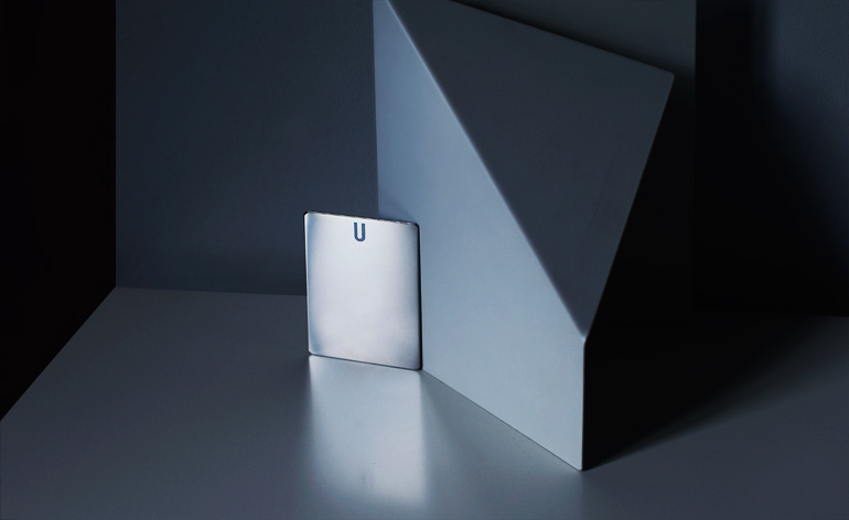
Topshop Unique: Experimenting with new materials, Topshop Unique used a strikingly minimal slice of polished steel, complemented by the unusual weight of the space-age metal object
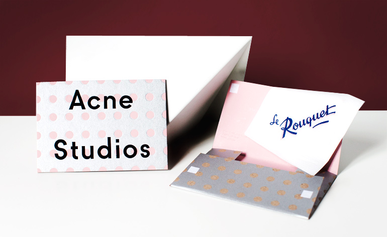
Acne Studios boutique opening: In contrast to its minimal show invite, Acne sent an invitation to the opening of its new Paris store. Complete with a napkin advertising the drinks reception venue, the pink and silver polka dot-themed package provided a vintage clinquant appeal
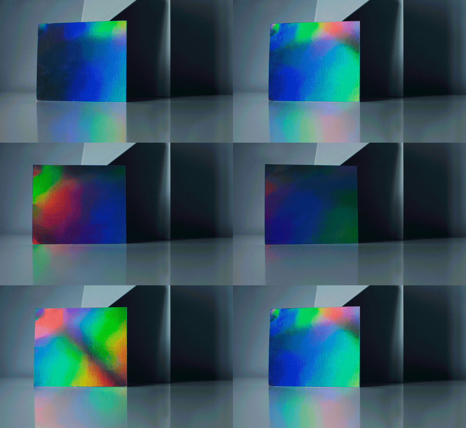
Alberto Guardiani: On iridescent card, this chromatic invite was highly impactful considering the lack of text or embellishment
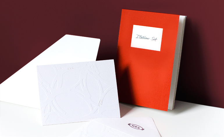
Tod's: The invite and matching envelope came de-bossed with an abstract circular pattern. Included was an invitation into Alessandra Facchinetti's design process. Featuring her sketches, notes and even a laser-cut leather swatch, the mock sketchbook bound in orange textured card provided insight into the 'Italian Set' theme of the show
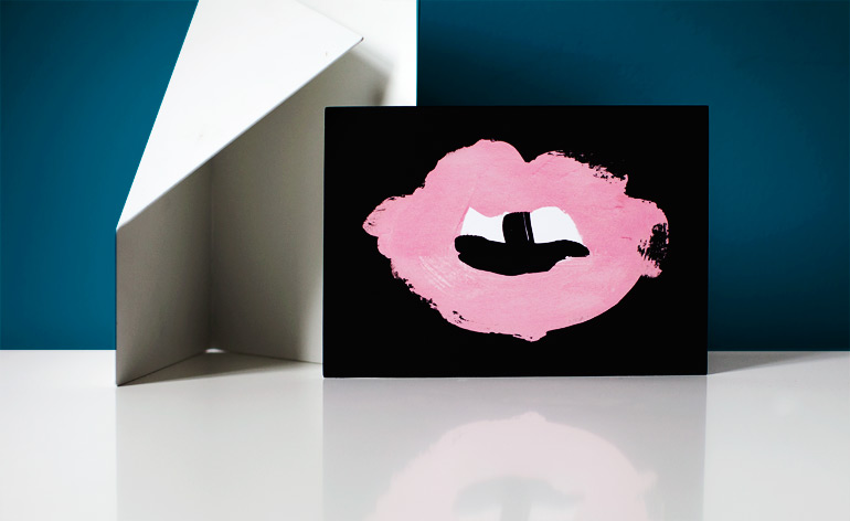
Giles: The card's black textured-matte finish created a bold leather effect. Giles used this in combination with the pink lips that appeared intermittently throughout his collection - here in UV-varnish to create a contrasting surface
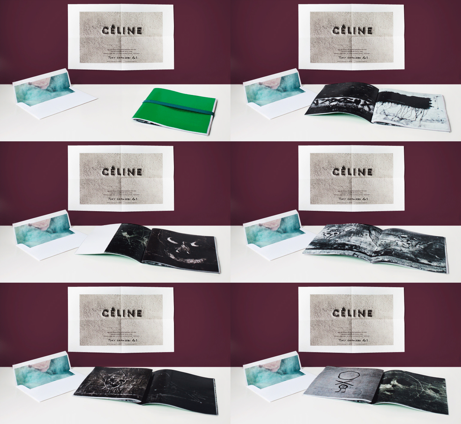
Céline: A fibre-infused sheet folds out revealing an image of the Celine logo imprinted in cement. With the textured invite came Phoebe Philo's mood book, containing images of graffiti shot by Hungarian photographer Brassaï
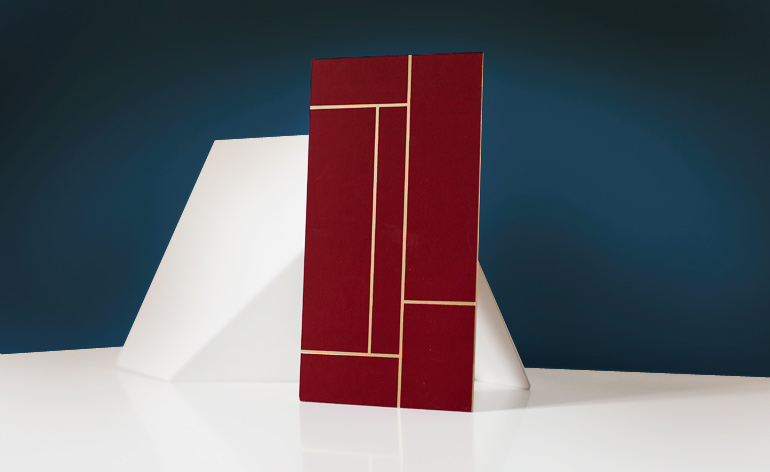
DSquared²: A UV-varnished card with gold foil edging featured a Mondrian-esque geometric pattern in maroon and gold
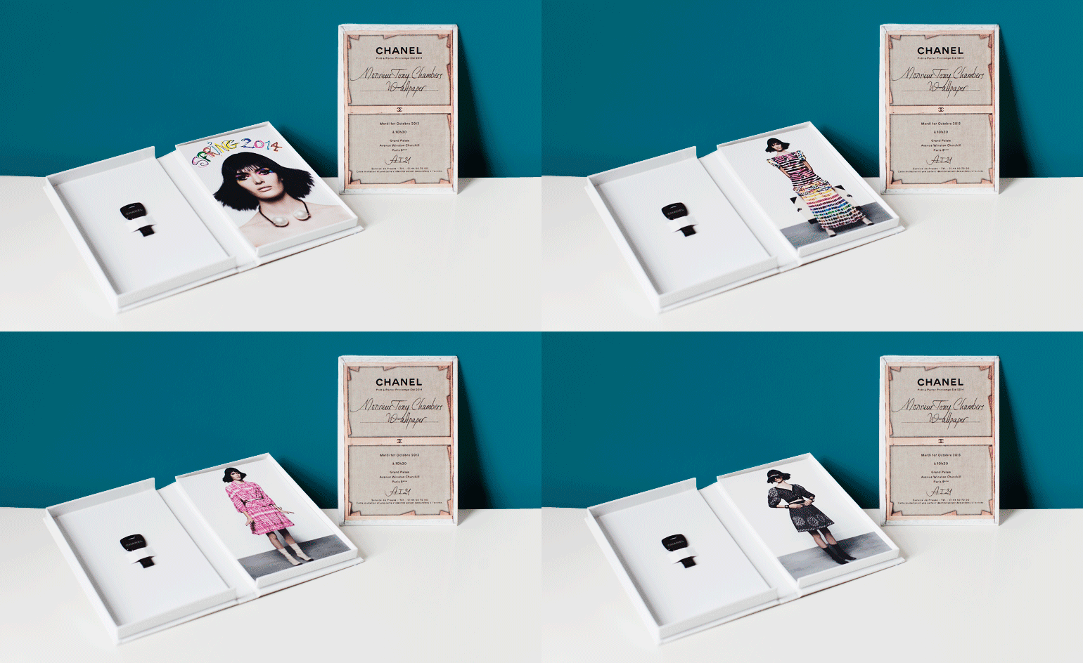
Chanel: Inside a book-like buckram case, Chanel presented its 'Art…' collection look book on individual cards and a USB key. The invitation itself was printed on buckram-covered mount board, with show details printed on the back, made to look like the back of a painting canvas
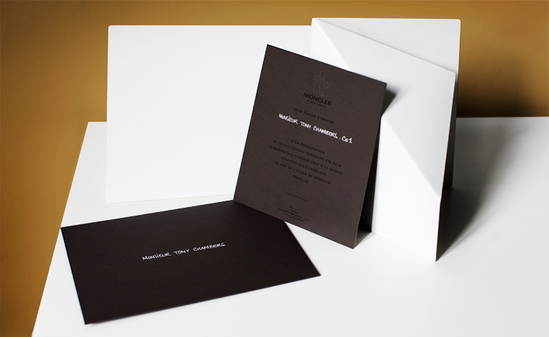
Moncler Gamme Rouge: An envelope and card the colour of hearth-warming peat featured de-bossed Moncler branding and foil-printed text
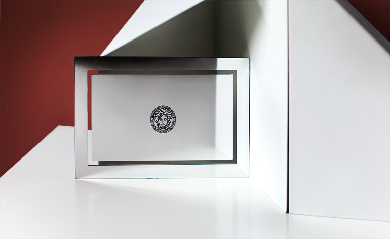
Versace: Reflecting the theme of this season's menswear invitation, flexible Perspex was printed with silver and featured a transparent window border. Versace's logo stood solo on the front
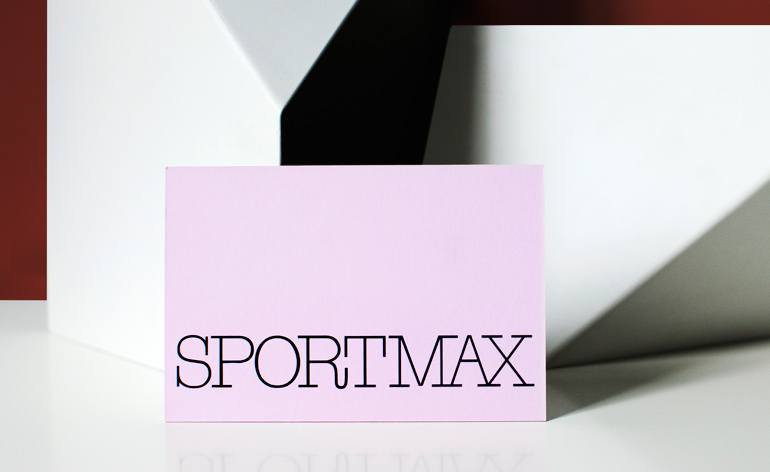
Sportmax: Printed powder pink, this triplex invite alluded to the S/S 2014 collection's feminine palette
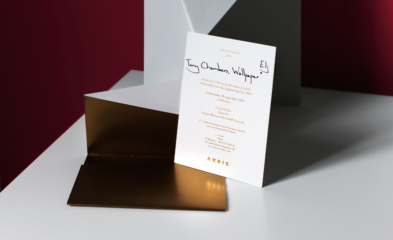
Akris: Trapezoidal gold paper unfolded to reveal a gold foil-embossed invitation on white card
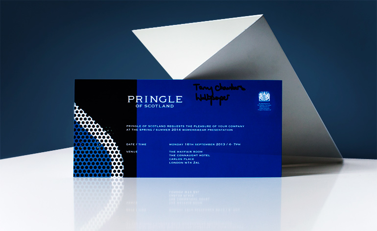
Pringle of Scotland: Symbolic of the sports luxe approach taken for the house's S/S 2014 collection, Pringle's royal blue triplex styrofoam invitation was printed with a detail shot of sports-mesh
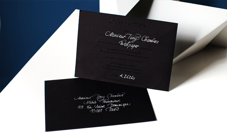
Louis Vuitton: An all-black invitation was a direct reference to Marc Jacobs' noir finale collection for Louis Vuitton. The rough texture added a contrasting surface to the black foil typeface
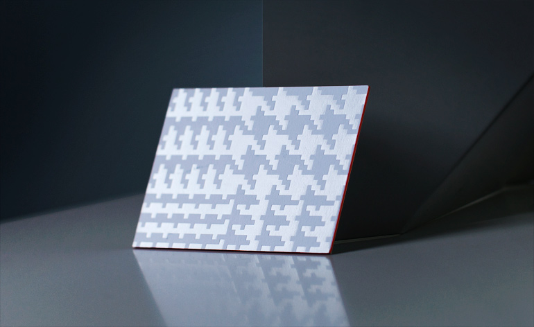
Paul Smith: Houndstooth often plays an essential role within Paul Smith's collections. For S/S 2014 his invitation was embossed with the duo-textured pattern in silk foil on mount board with bright orange edging. The opposite side featured screen-printed show details in contrasting luminous green
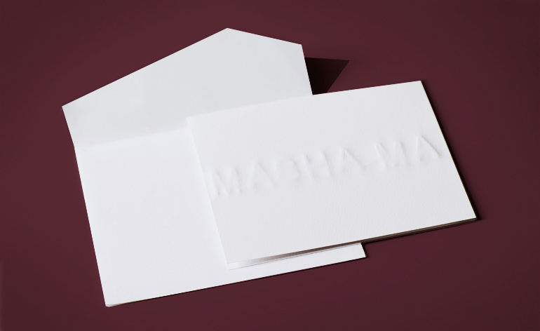
Masha Ma: Masha Ma delivered an arrestingly minimal invitation. A primitive de-bossing technique on white paper raised the letters far off the card, creating a three-dimensional texture. All in white, the folded card and off-kilter envelope were pristinely simple
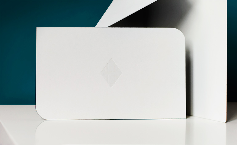
Hermès: Alternate dye-cut rounded edges create the illusion of a parallelogram. The front of the card was embossed with a distinctly modern H logo
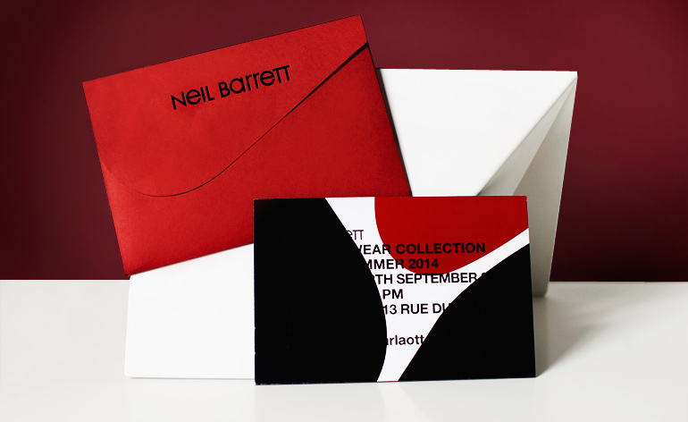
Neil Barrett: Almost identical to the men's invitation, this black mount-board was printed with a bold graphic in vinyl and UV-varnish, creating an alternating texture throughout the text. The same graphic appeared on garments in the collection
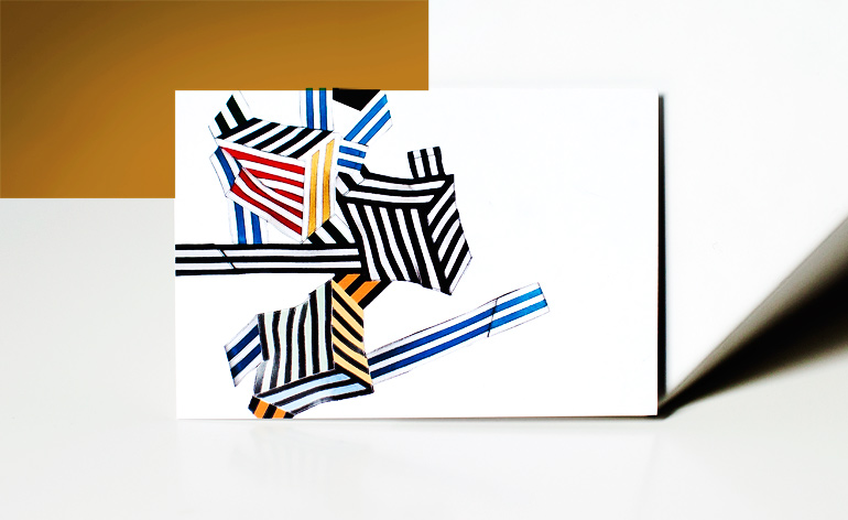
Pierre Hardy: A colourful abstract illustration was printed on white card. The flip side revealed an invitation to view the designer's latest women's shoe and bag collection
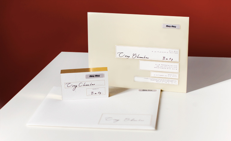
Miu Miu: Using the same format as past seasons, Miu Miu adorned each component of the invite with a cloth label. An MDF 'seating block' allocation was edged in gold and coated with white textured paper, while the invitation itself was coated in a rubbery vinyl with gold-leaf detail
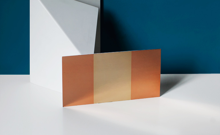
Gucci: Gold and rose gold foil fronted this UV-varnished invitation from Frida Giannini. The minimal two-tone facade was echoed on the opposite side in white with gold foil text
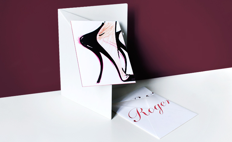
Roger Vivier: Delivered in an envelope swathed with a red foil logo, Roger Vivier's mount-board invitation was graced with an illustration of a stiletto heel and detailed with matching red foil
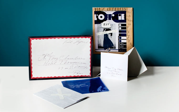
A collection of unusual envelopes highlight the different calligraphic styles and sizes used this season
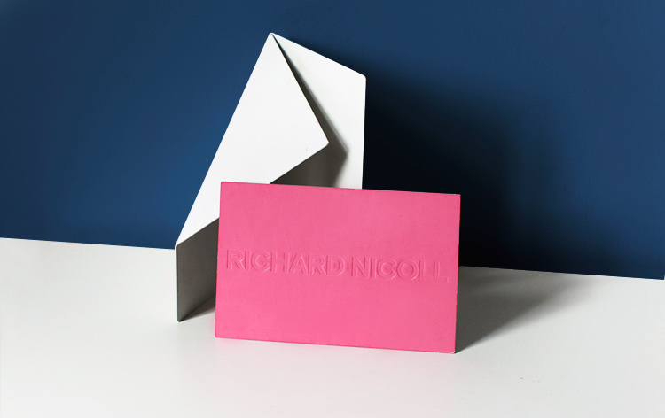
Richard Nicoll: The UV-varnished card was the same shade of pink seen throughout Richard Nicoll's collection. De-bossed with the designer's name, the simple invite matched many of the minimal looks on the catwalk
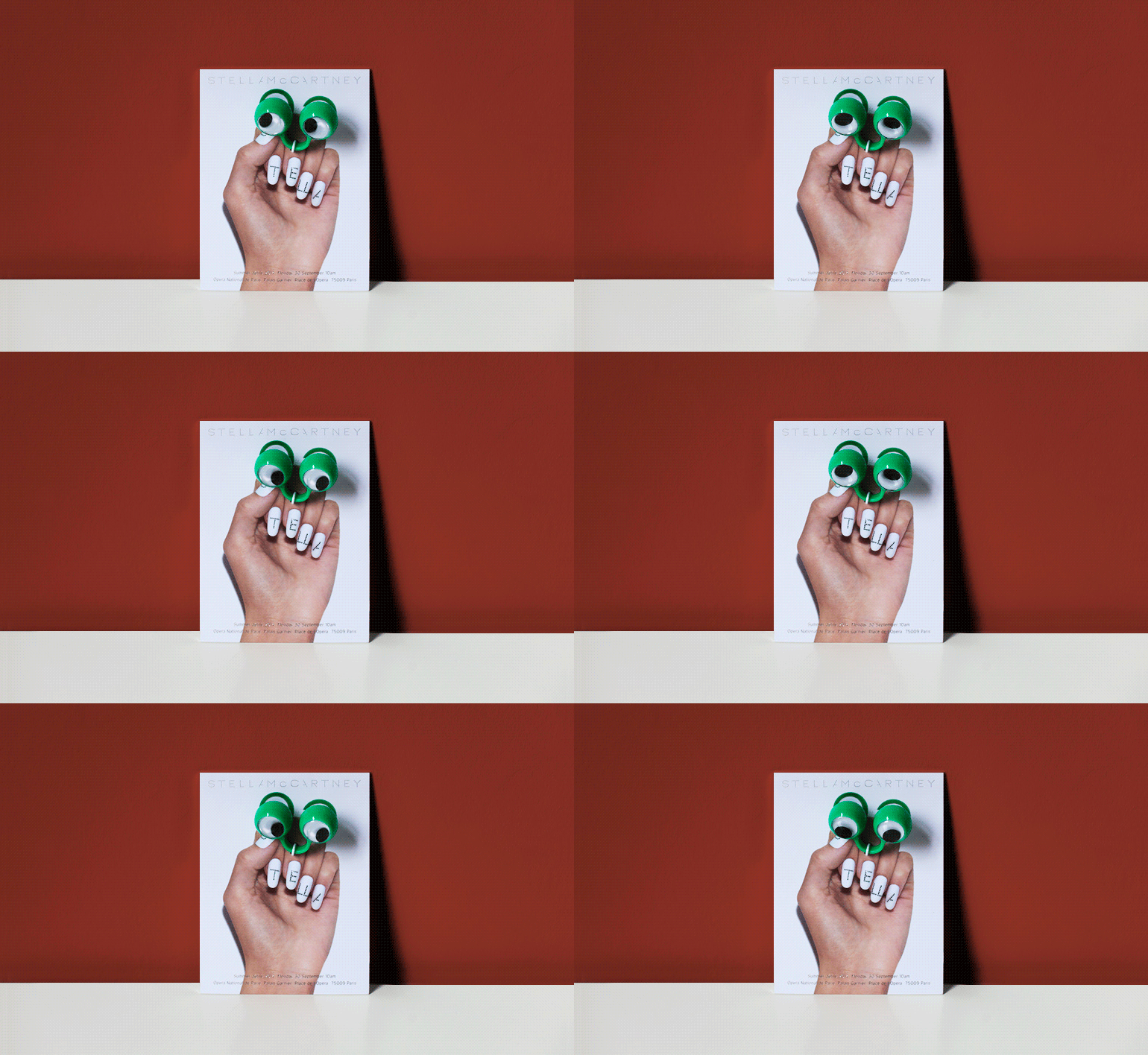
Stella McCartney: Known for attaching gifts to her invitations, Stella McCartney gave out green googly-eye rings this season. Affixed to the card, the ring is arranged on a hand featuring logo-adorned nails
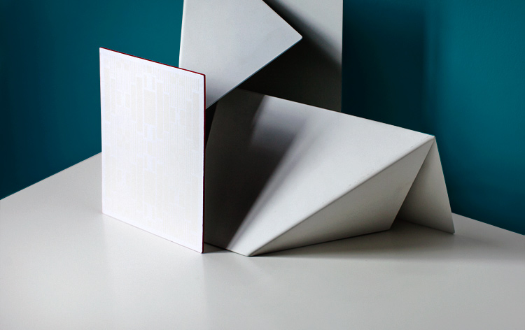
Alexander McQueen: A faintly de-bossed Art Deco pattern in matte white foil ornamented this white card with red edges. The pattern popped up frequently during the catwalk show, too
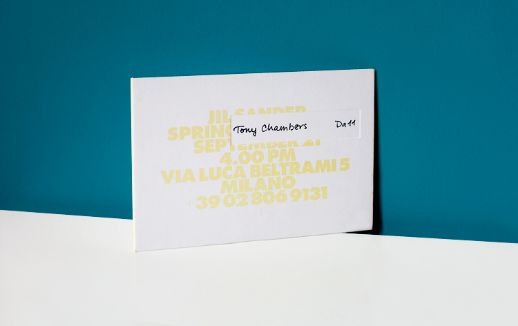
Jil Sander: Repeating the format from seasons past, Jil Sander's robust card reflected the brand's minimalist aesthetic. The type embossed on the back gave the illusion that the text had been pushed through the card and was printed in lemon sorbet yellow foil on the front
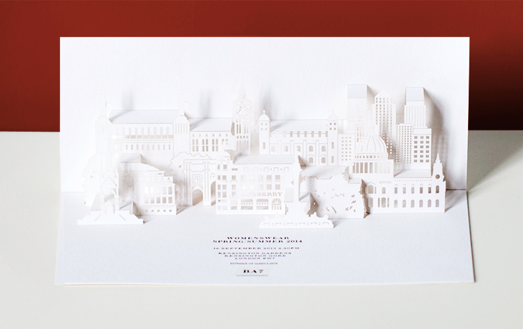
Burberry Prorsum: London landmarks emerge from inside Burberry Prorsum's laser-cut pop-up invitation. In the centre of the busy skyline is the British brand's Horseferry road headquarters
Wallpaper* Newsletter
Receive our daily digest of inspiration, escapism and design stories from around the world direct to your inbox.
Jack Moss is the Fashion Features Editor at Wallpaper*, joining the team in 2022. Having previously been the digital features editor at AnOther and digital editor at 10 and 10 Men magazines, he has also contributed to titles including i-D, Dazed, 10 Magazine, Mr Porter’s The Journal and more, while also featuring in Dazed: 32 Years Confused: The Covers, published by Rizzoli. He is particularly interested in the moments when fashion intersects with other creative disciplines – notably art and design – as well as championing a new generation of international talent and reporting from international fashion weeks. Across his career, he has interviewed the fashion industry’s leading figures, including Rick Owens, Pieter Mulier, Jonathan Anderson, Grace Wales Bonner, Christian Lacroix, Kate Moss and Manolo Blahnik.
-
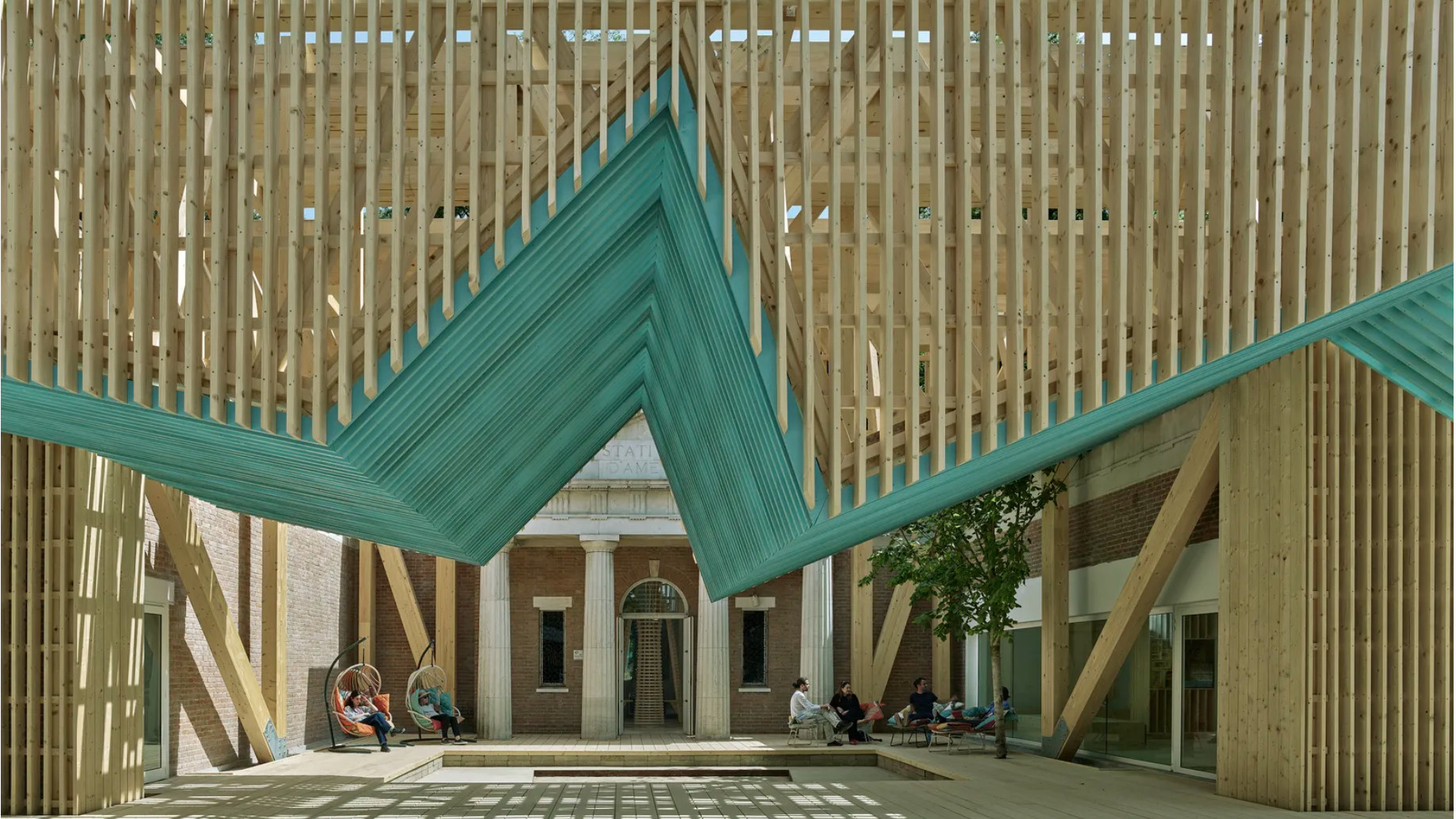 This year's US Pavilion asks visitors to gather round
‘PORCH: An Architecture of Generosity’ is a celebration of togetherness
-
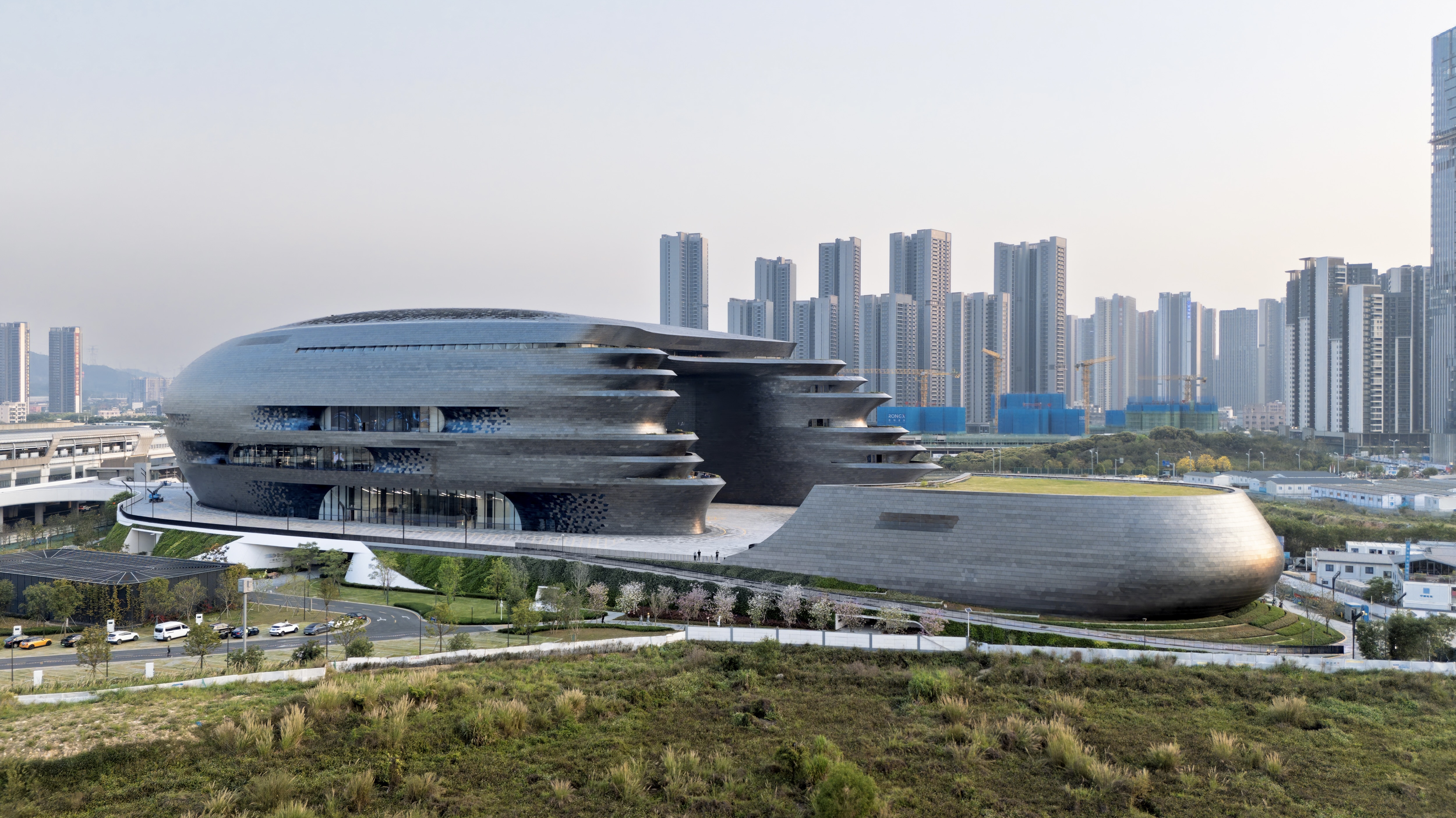 Zaha Hadid Architects’ spaceship-like Shenzhen Science and Technology Museum is now open
Last week, ZHA announced the opening of its latest project: a museum in Shenzhen, China, dedicated to the power of technological advancements. It was only fitting, therefore, that the building design should embrace innovation
-
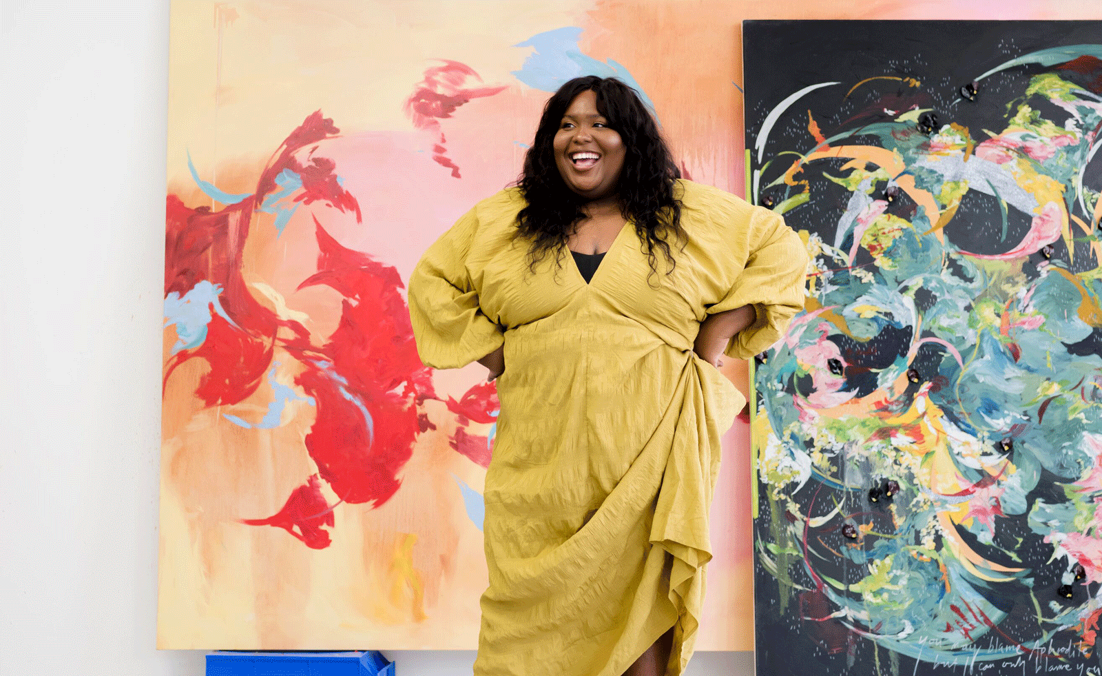 ‘The work is an extension of myself’: Michaela Yearwood-Dan on her debut show at Hauser & Wirth
London-based artist Michaela Yearwood-Dan continues her rapid rise, unveiling monumental new paintings in ‘No Time for Despair’
-
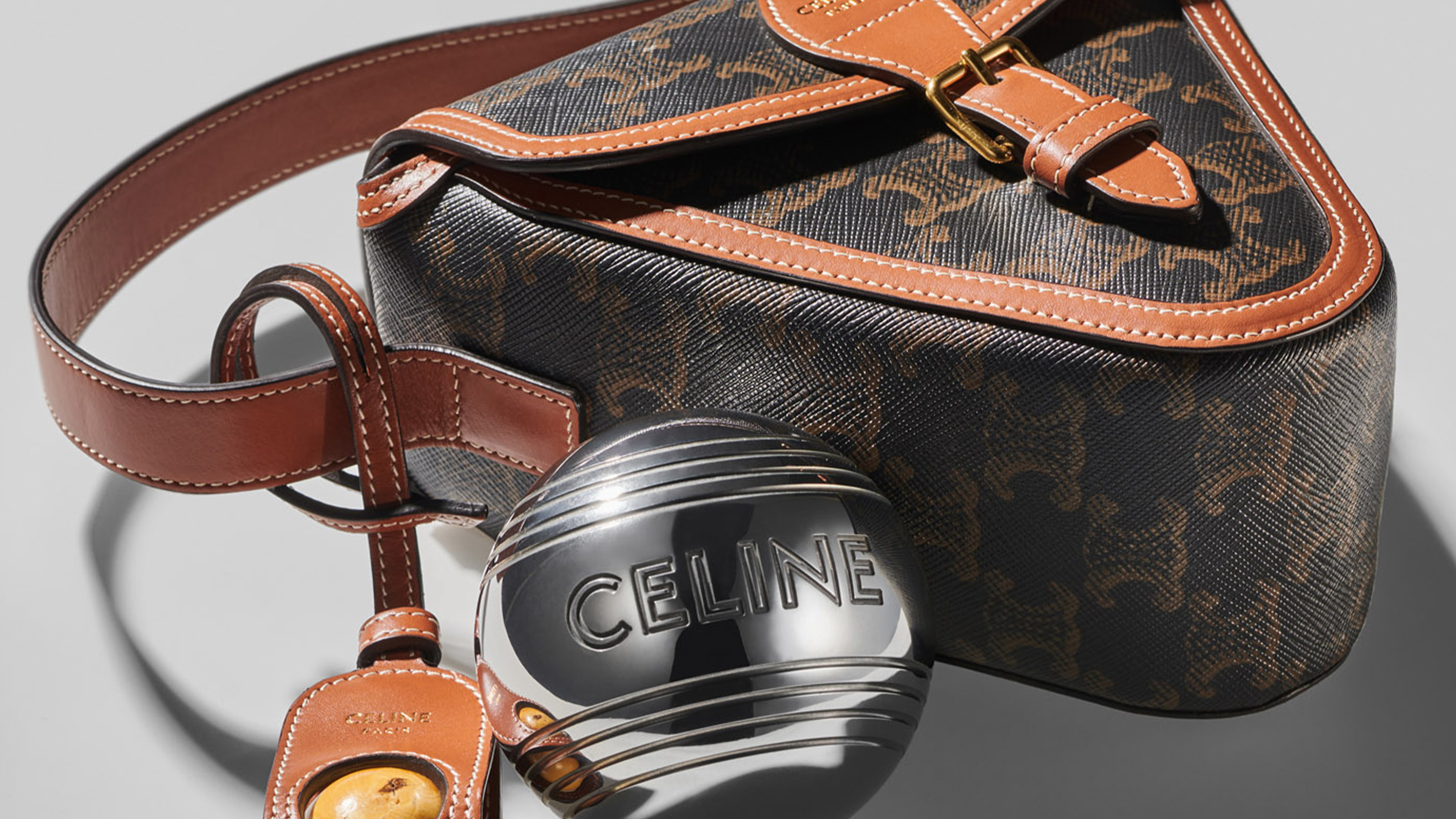 Summer games, from pétanque to pool floats, get a fashionable spin
From a luxurious pétanque set to pool floats and playing cards, summer games and toys from the world’s best-known fashion houses
-
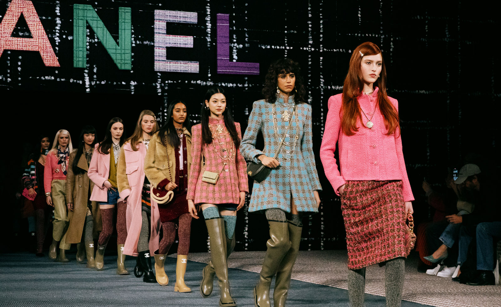 Paris Fashion Week A/W 2022: Chanel to Miu Miu
In this extended report, Wallpaper* updates you live from Paris Fashion Week A/W 2022 shows, with rolling coverage as runway events unfold
-
 Scene-stealing runway sets from S/S 2022 womenswear shows
From giant roulette wheels to Olympic diving boards and multi-city synchronized extravaganzas – our pick of the best fashion show sets from S/S 2022 womenswear
-
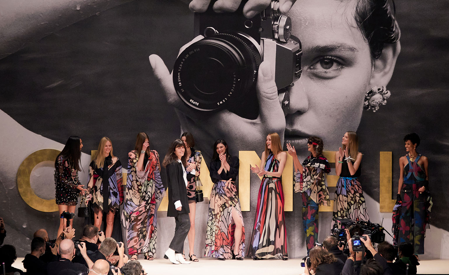 Paris Fashion Week S/S 2022: Loewe to Chanel
Fashion Week returns to form in the French capital. Here is everything you need to know about Paris Fashion Week S/S 2022
-
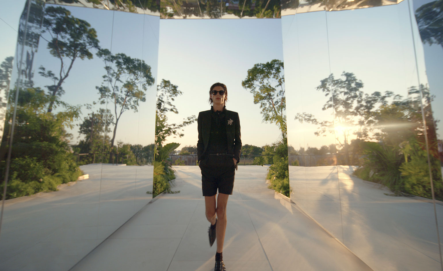 Doug Aitken creates reflective artwork for Saint Laurent in Venice
For the Saint Laurent S/S 2022 show, the brand’s first physical catwalk presentation since the Covid-19 pandemic began, American artist Doug Aitken created the living artwork Green Lens, on Venice's Isola della Certosa
-
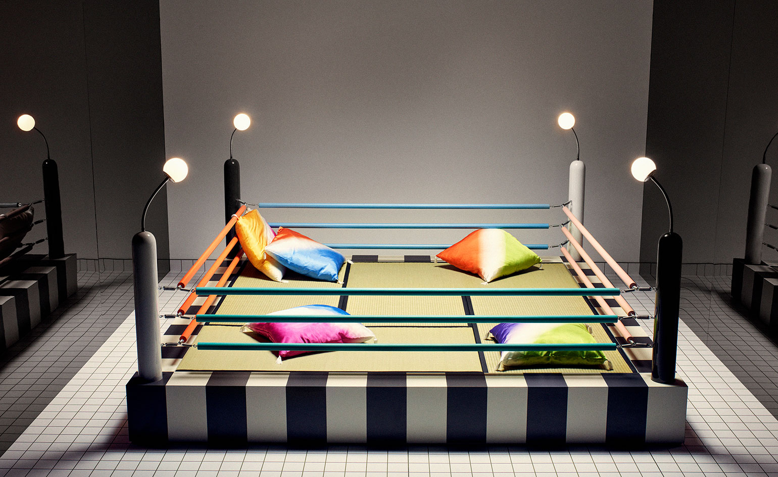 Saint Laurent celebrates 40 years of Memphis Group
Memphis Group's milestone birthday is celebrated with a series of colourful furniture installations across the French maison's concept boutiques
-
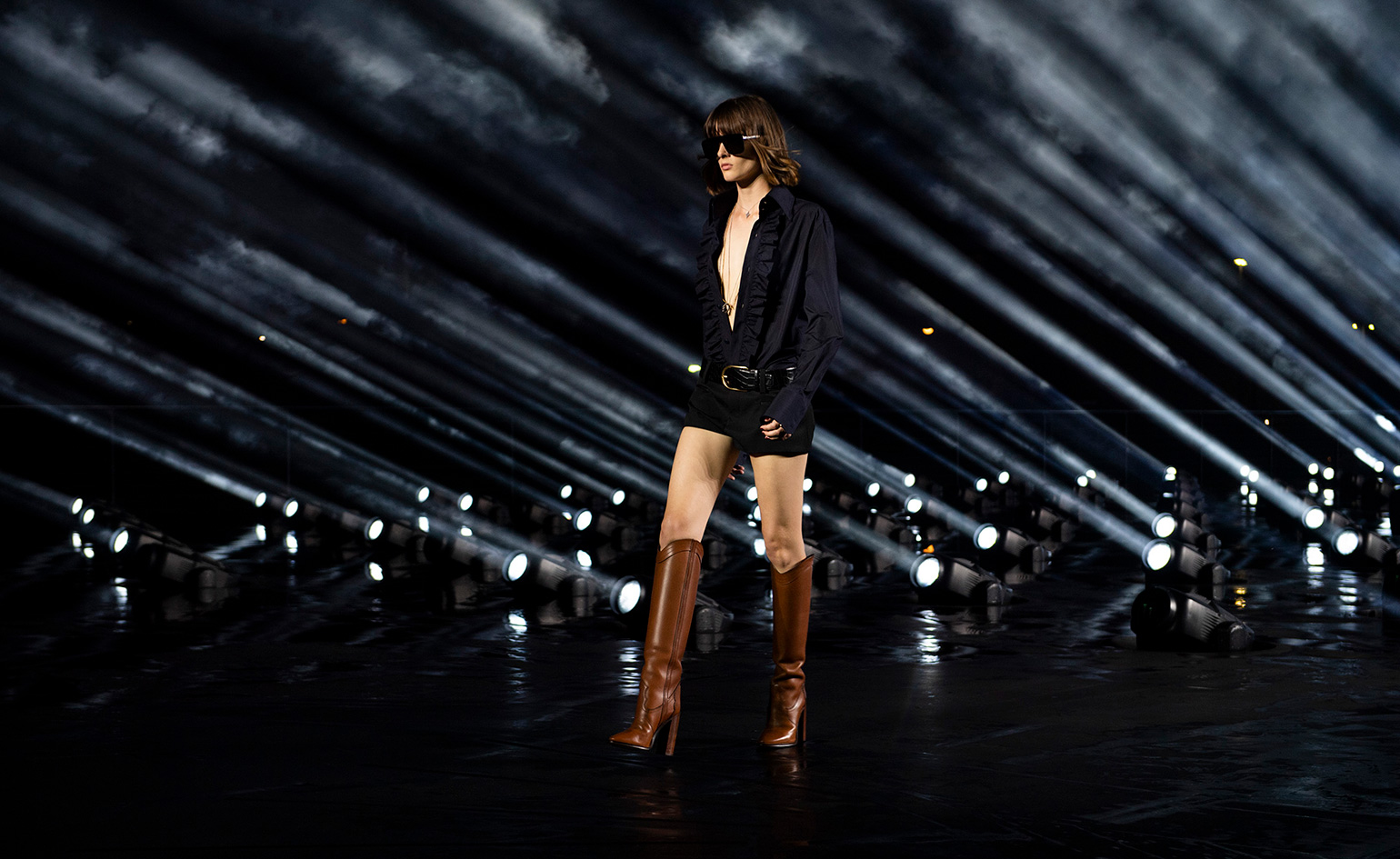 Saint Laurent S/S 2020 Paris Fashion Week Women's
 -
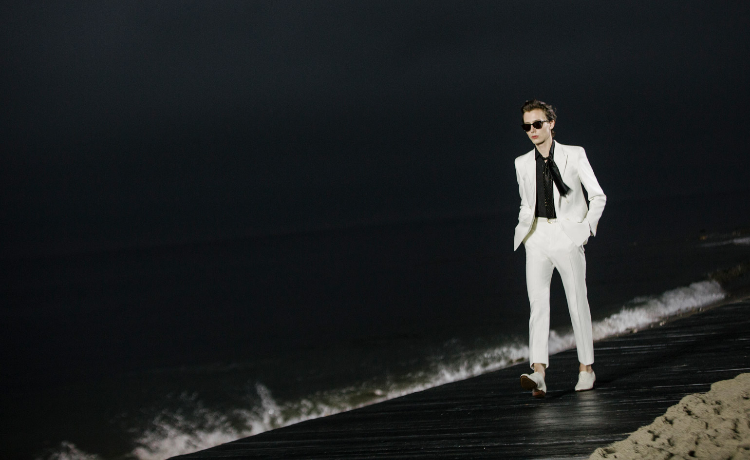 Saint Laurent Men's S/S 2020