Fashion week venues A/W 2013: womenswear collections
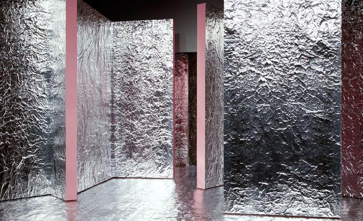
Acne: Jonny Johansson set his Fall collection against a backdrop of silver-foiled panels with thick, powder-pink edges, which came asymmetrically arranged to frame the models' entrance.
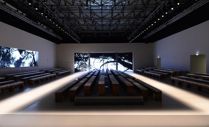
Salvatore Ferragamo: For the past few seasons, the focus of Ferragamo's set design has been on projected images. Fall's outing was no exception, and Massimiliano Giornetti presented his sober collection against black and white silhouettes of trees, suggestive of a menacingly wintry setting.
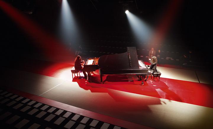
Nina Ricci: Referencing the palette of Peter Copping's runway collection, Nina Ricci's set design revolved around monochromatic variations of black, red and powder pink. Taking centre-stage on the red-carpeted runway were two grand pianos lit with white and red beams, featuring sister duo Katia and Marielle Labèque performing Philip Glass' 'Two Movements for Two Pianos'.
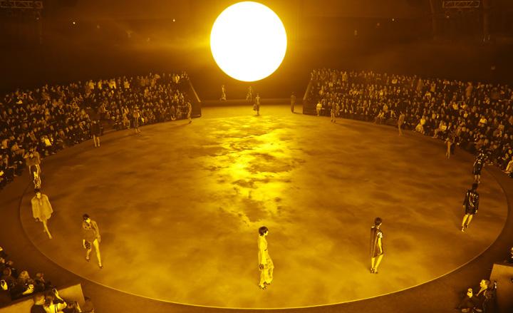
Marc Jacobs: This season, Marc Jacobs' set was was inspired by artist Olafur Eliasson's 2003 'The Weather Project' installation, where a gigantic sun was suspended over the Tate's Turbine Hall, shining a dusty, yellow light on the space. Jacobs' team recreated this glow in the spaces of the Lexington Avenue Armoury: 180 low-pressure sodium vapour lamps were set up on a 24-inch circular structure, shining a warm light over the orbital concrete catwalk.
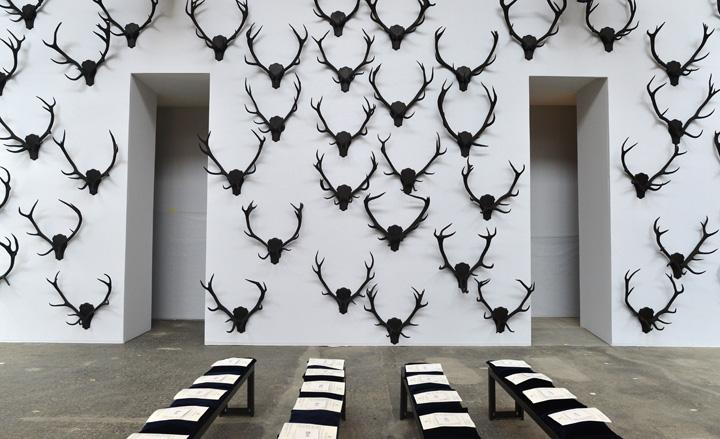
Trussardi: The set at Trussardi was intended to reflect the life of a woman who divided her time between the city and the country manor. To illustrate this dichotomy, Milanese design studio Storage dressed the whitewashed walls of the Garage Art Gallery with spidery, black antlers, while rows of minimal black benches were lined on the concrete floors.
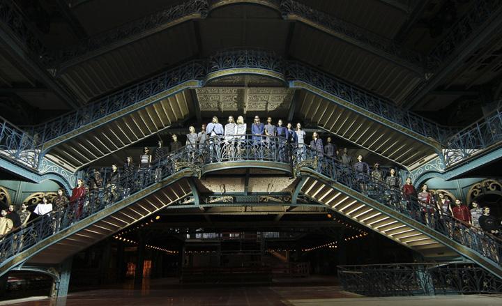
Kenzo: Since taking over the maison Kenzo, Humberto Leon and Carol Lim have made sure that every show is spectacular. This season, they chose the interiors of La Samaritaine, a former Parisian department store, and staged their show under the magnificent art deco terraces of the building, with models walking down the dramatically-lit blue and green cast iron stairs.
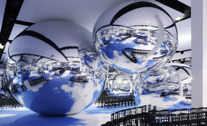
Christian Dior: Yet another impressive Christian Dior set conjured up by the skilled minds at Bureau Betak. Upon entering the grand tent at Les Invalides, show goers were transported into a sci-fi-esque world, with a blue cloudy sky lining the floor and giant silver spheres reflecting the surroundings.
Wallpaper* Newsletter
Receive our daily digest of inspiration, escapism and design stories from around the world direct to your inbox.
Diesel Black Gold: Over in New York, the set at Diesel Black Gold appeared a simple affair until light artist Thierry Dreyfus' three sets of winged fixtures began emanating a rhythmic, stroboscopic light show from above the runway.
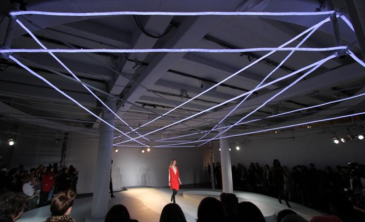
Edun: The compact catwalk at Edun was topped by a geometric set of neon tubes, which radiated a purple glow in the all-white space.
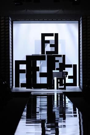
Fendi: The show backdrop was a geometric composition, featuring the house's F logo in sleek black against a bright panel, reflected onto a mirrored catwalk. The walls of Milan's Fondazione Arnaldo Pomodoro were also given a makeover with a Fendi wallpaper.
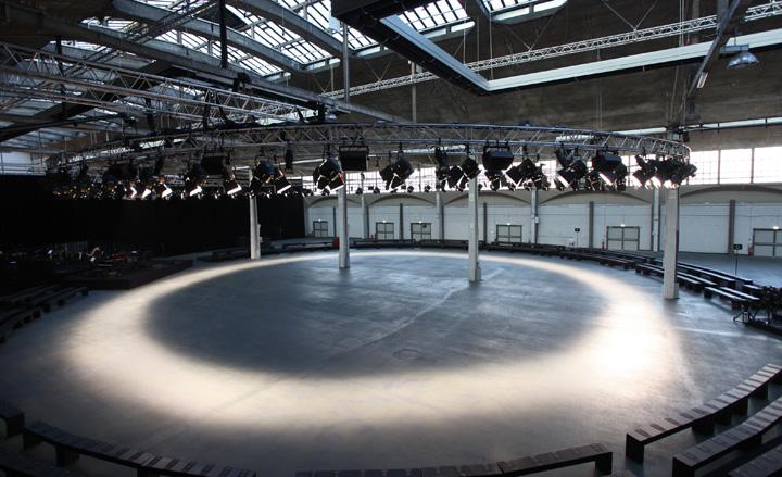
Givenchy: Drawing from a similar visual cue as his menswear show in January, Riccardo Tisci once again chose a circular catwalk, which was marked with a path of light on the concrete floors.
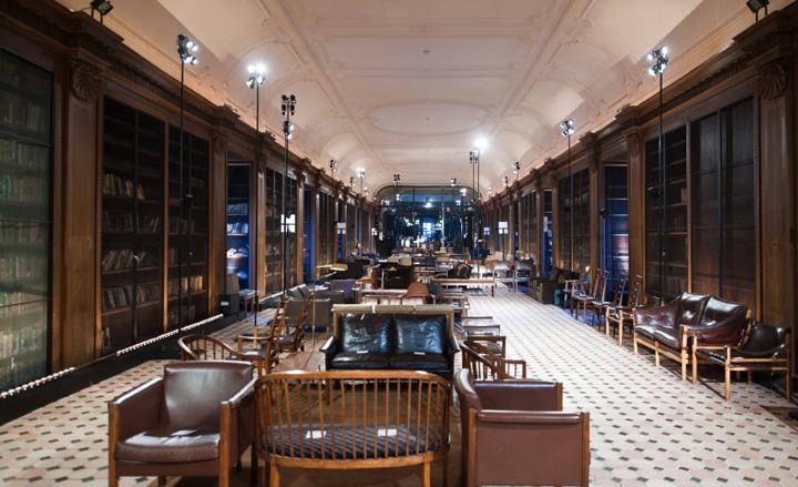
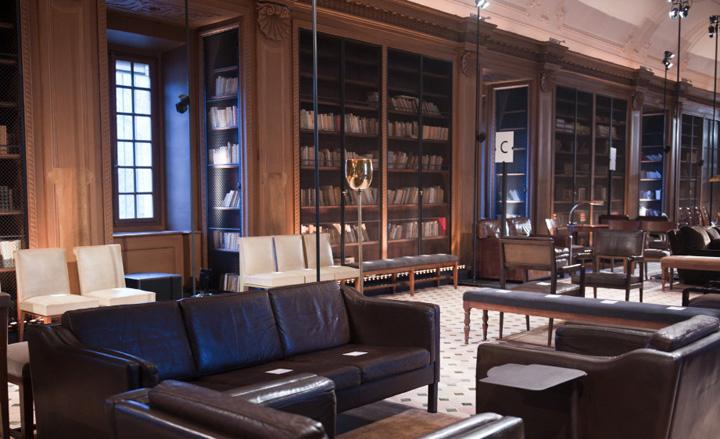
Hermès: Christophe Lemaire chose to present his latest effort for Hermès in the halls of the Lycée Henri-IV's library. The models walked through the rooms on a white and green tiled floor, flanked by book cabinets and leather furniture.
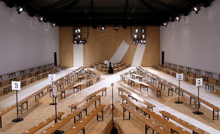
Maison Martin Margiela: Yet another variation on a theme at Margiela - the theme being the house's signature white. This season, the space was covered in raw plywood and the models' paths were marked with thick white brushstrokes that ran from the floor to the walls.
Lacoste: When designing his latest collection for Lacoste, Felipe Oliveira Baptista looked at the shapes of icebergs, whose structures also inspired the three-dimensional geometric backdrop to the catwalk. The intimate lighting enhanced the dramatic composition.
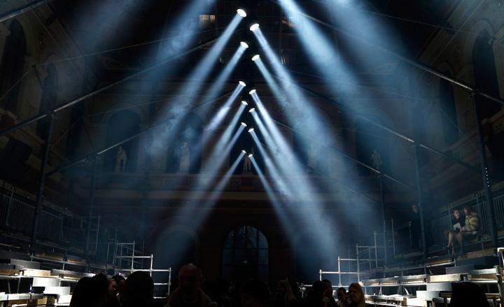
Lanvin: The grand hall the Ecole Superieure des Beaux Arts, transformed into Lanvin's atmospheric catwalk space for Fall
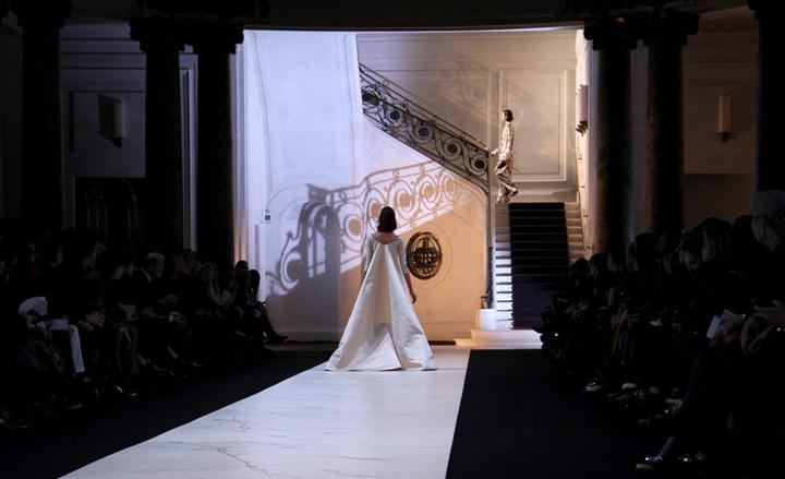
Rochas: Marco Zanini’s sophisticated models made a grand entrance as they descended the majestic Espace Cambon staircase. Thierry Dreyfus’ subdued lighting emphasised the space’s architecture, with the wrought iron details of the handrails eerily projected onto the 17th century marbled surroundings.
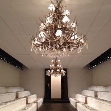
Ralph Lauren: Ralph Lauren’s all-American opulence was toned-down for his Fall set. The intimate white space was kept minimal and decorated with intricate antler-and-diamond chandeliers, while the models entered through a dark portal onto a slim, parquet runway.
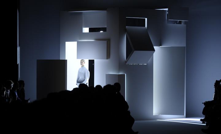
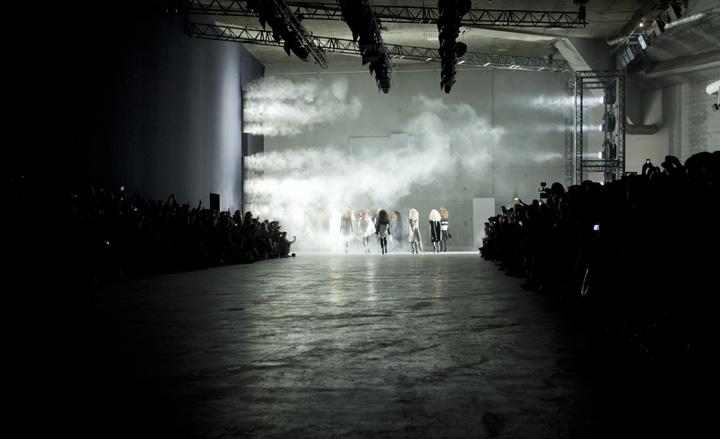
Rick Owens: Models at Rick Owens made an otherworldly entrance onto the wide, concrete-clad hanger of the Salle Marcel Cerdan, their apparition accompanied by a brightly lit blast of steam.
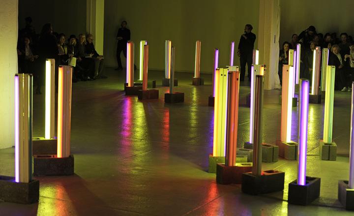
Rodarte: With their latest collection, Kate and Laura Mulleavy took the audience on a trip to their hometown Santa Cruz. Bureau Betak recreated the town’s boadwalk with a set of multi-coloured fluorescent neon strips installed in concrete bricks, which mimicked the pier’s lights reflecting in the ocean.
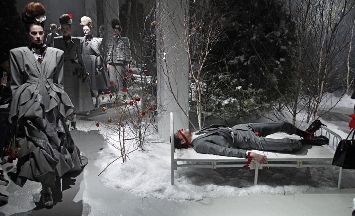
Thom Browne: Thom Browne’s models walked through a snowy forest, with red rose bushes providing pops of colour in a set reminiscent of a Grimm's fairy tale. Always fond of a theatrical element, the designer scattered male models around the space, tying their arms down to military cots with red ribbon and clothing them in grey flannel suits from his Men's collection.
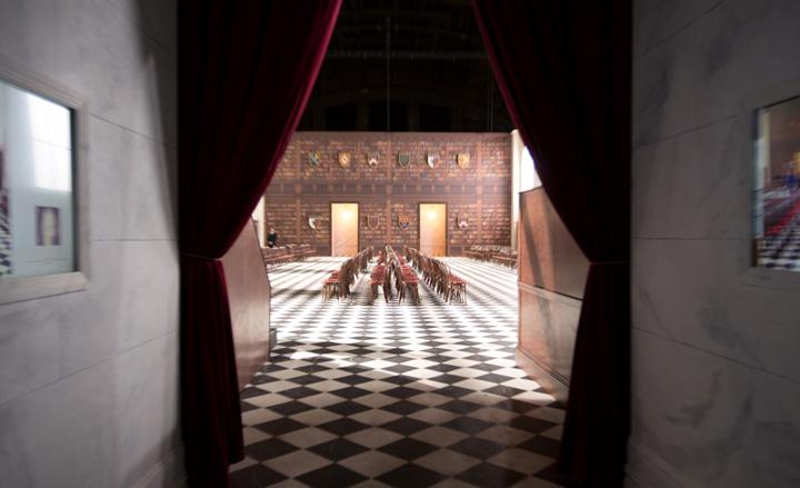
Tommy Hilfiger: For his 'Savile Row meets Ivy League' show, Tommy Hilfiger dressed the Park Avenue Armory spaces up as a mock-library, the walls bearing a set of the fashion house’s imagined insignia.
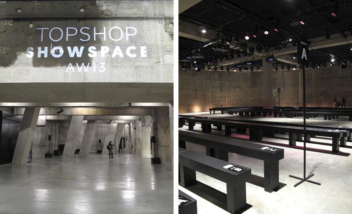
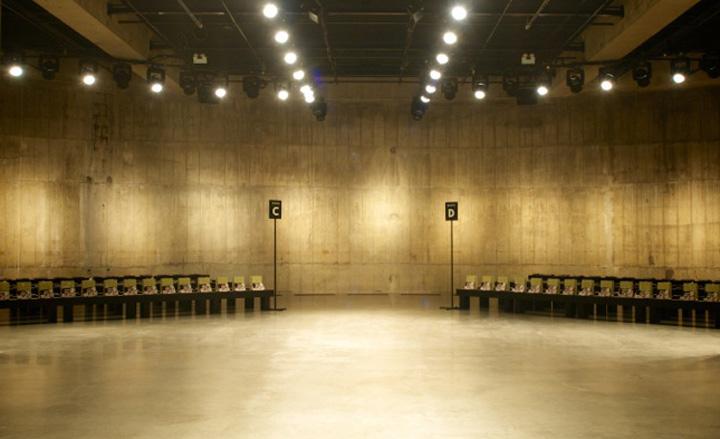
Topshop: Opened last year, the Tate Tanks space has quickly established itself as a favourite amongst London's showing brands. This season, Topshop chose the concrete circles to host the shows of its protégés, with the likes of Richard Nicoll, Peter Pilotto, J.W. Anderson and Simone Rocha taking over the raw subterranean space.
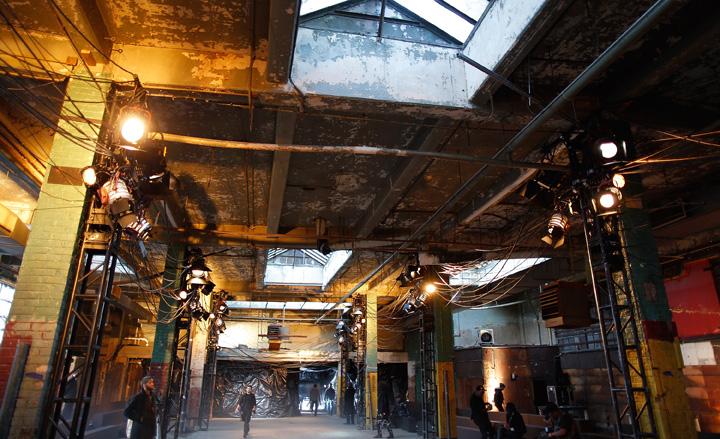
Y-3: Yohji Yamamoto's 'Future Thrift' collection for his Y3 label was shown in a seemingly disused warehouse on Manhattan's lower east side. The cavernous space's rough elements - paint-scraped walls, exposed wires, uneven surfaces - provided a dystopian backdrop for the designer's sinister 'walking back into the future' concept.
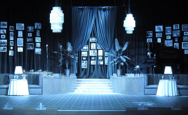
Dsquared²: The Canadian twins' sets are always theatrical affairs, interlocking with the show's narrative. This season, they recreated the 1940s club used for menswear to echo the masculine silhouettes and glamour in the collection, inspired by the same period. The faithful reproduction of the era came complete with a grand piano on one side, leather seats, chandeliers and black and white pictures.
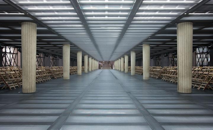
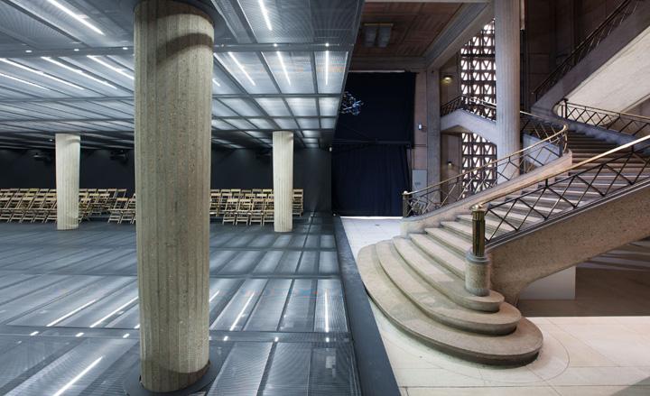
Miu Miu: For the second season running, AMO and Miu Miu staged a takeover in August Perret's Palace D'Iena. The team installed black metal mesh panels backed with fluorescent lighting tubes to create a compressed catwalk space. The result was a graphic box-like space that contrasted with the more curvaceous elements of the hall.
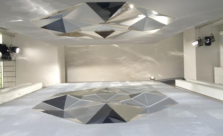
Jil Sander: The German designer cited 'Oscar Niemeyer's curves and Mandelbrot`s fractals' as her inspirations. Light artist Thierry Dreyfus skilfully transformed these references into a crystalline geometric artwork, glimmering at the centre of a stark white catwalk.
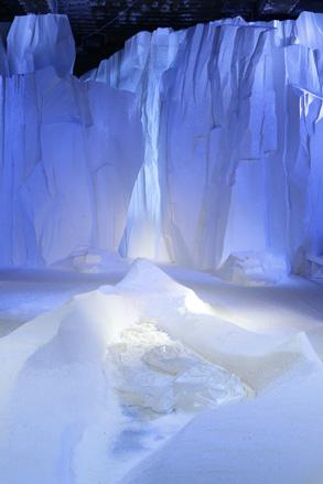
Moncler Gamme Rouge: Over in Paris, Giambattista Valli's latest collection for Moncler took us into a winter wonderland with icebergs and a snow-covered catwalk in the mix, setting the perfect scene for the fur-clad models to walk through.
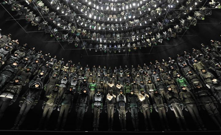
Moncler Grenoble: This season, it was the models themselves who created the set for the presentation in New York. Standing motionless on the circular steps of Gotham Hall's main foyer, the Grenoble ski army's military green attire was kaleidoscopically reflected by the mirrored ceilings, creating a magnificent spectacle.
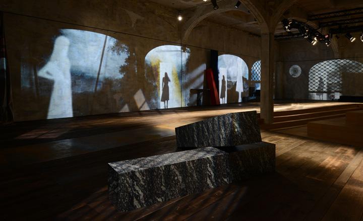
Prada: AMO's theatrical set for Prada featured a 'reclaimed space' concept, where projections on the walls of the via Fogazzaro hall poetically alternated industrial and bucolic imagery. Guests were seated in a central island looking out towards the surrounding landscape, while models walked on a catwalk of burnt wood and metal boards.
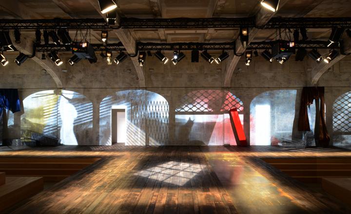
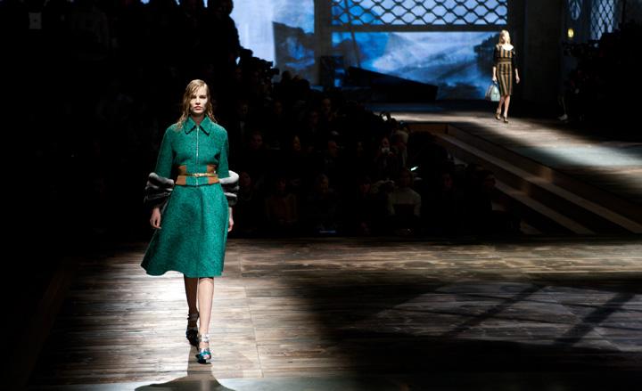
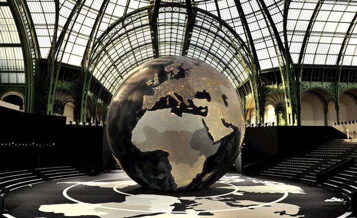
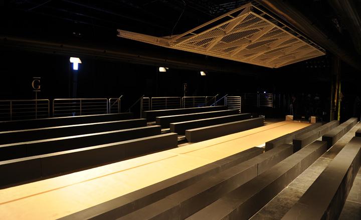
Saint Laurent: The wide, bare catwalk installed at the Grand Palais worked perfectly with the grunge attitudes of Hedi Slimane's latest womenswear collection. As is becoming customary for the designer, great attention was put on the lighting, and a geometric set of lights installed at the top of the catwalk bathed models in a warm glow.
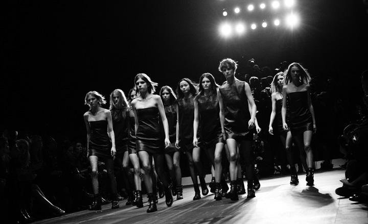
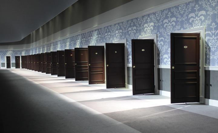
Louis Vuitton: Guests at Louis Vuitton were seated in front of a dimly-lit, wallpapered corridor, which featured a line of doors from which models exited onto the runway.
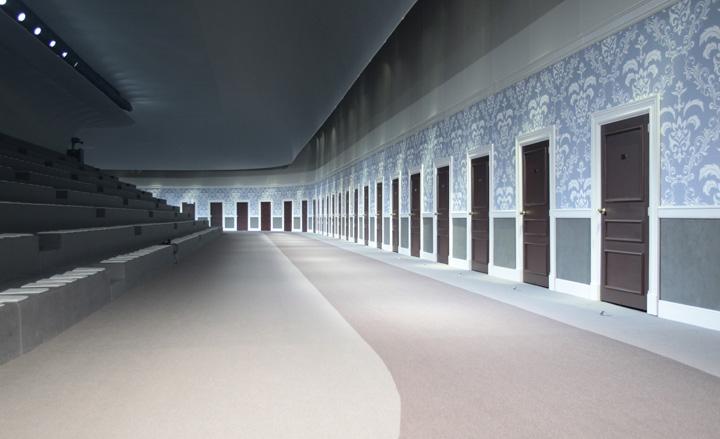
Paul Smith: For the first time in its history, the Tate Britain opened its doors to host a fashion show during London fashion week. Paul Smith's show, which was held in one of its galleries, saw models walking down the dark marble catwalk, framed by a series of blue, purple and red light panels, which matched the collection's rich hues.
Jack Moss is the Fashion Features Editor at Wallpaper*, joining the team in 2022. Having previously been the digital features editor at AnOther and digital editor at 10 and 10 Men magazines, he has also contributed to titles including i-D, Dazed, 10 Magazine, Mr Porter’s The Journal and more, while also featuring in Dazed: 32 Years Confused: The Covers, published by Rizzoli. He is particularly interested in the moments when fashion intersects with other creative disciplines – notably art and design – as well as championing a new generation of international talent and reporting from international fashion weeks. Across his career, he has interviewed the fashion industry’s leading figures, including Rick Owens, Pieter Mulier, Jonathan Anderson, Grace Wales Bonner, Christian Lacroix, Kate Moss and Manolo Blahnik.
-
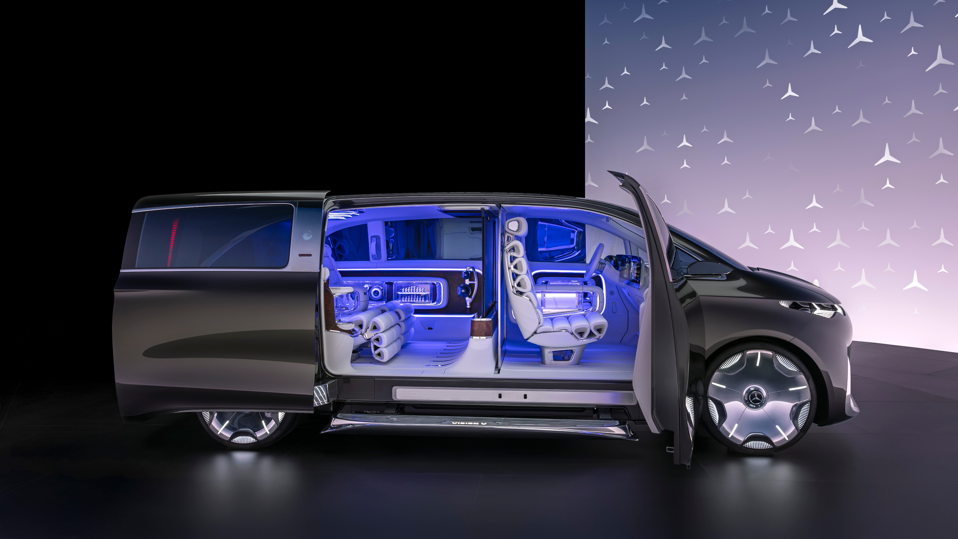 Mercedes-Benz previews its next-gen people mover with an ultra-luxury EV concept
The Mercedes-Benz Vision V Concept is an art deco picture palace on wheels, designed to immerse passengers in parallel worlds as they travel
By Jonathan Bell
-
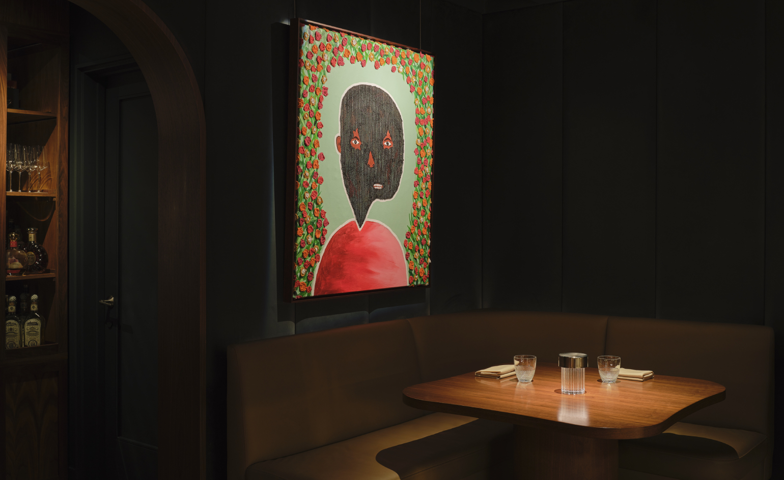 Visit this Michelin-star New York restaurant that doubles as an art gallery
Artist Mr.StarCity is exhibiting his emotionally charged yet optimistic ‘Bloomers’ portrait series at Frevo, a Greenwich Village hidden haunt
By Adrian Madlener
-
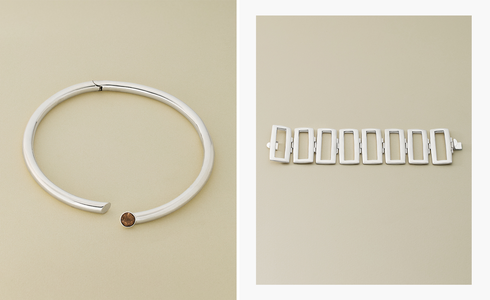 Nina Runsdorf brings classic jewellery back to life to mark 20 years
New York-based jewellery designer Nina Runsdorf celebrates her eponymous brand’s anniversary with a new jewellery collection, ‘Archive’
By Hannah Silver