Brioni S/S 2016
Brioni's Brendan Mullane marries the sartorial with the utilitarian by way of graphic brush strokes
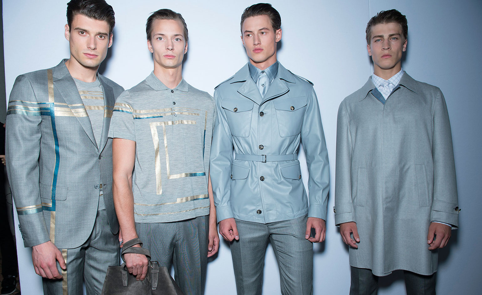
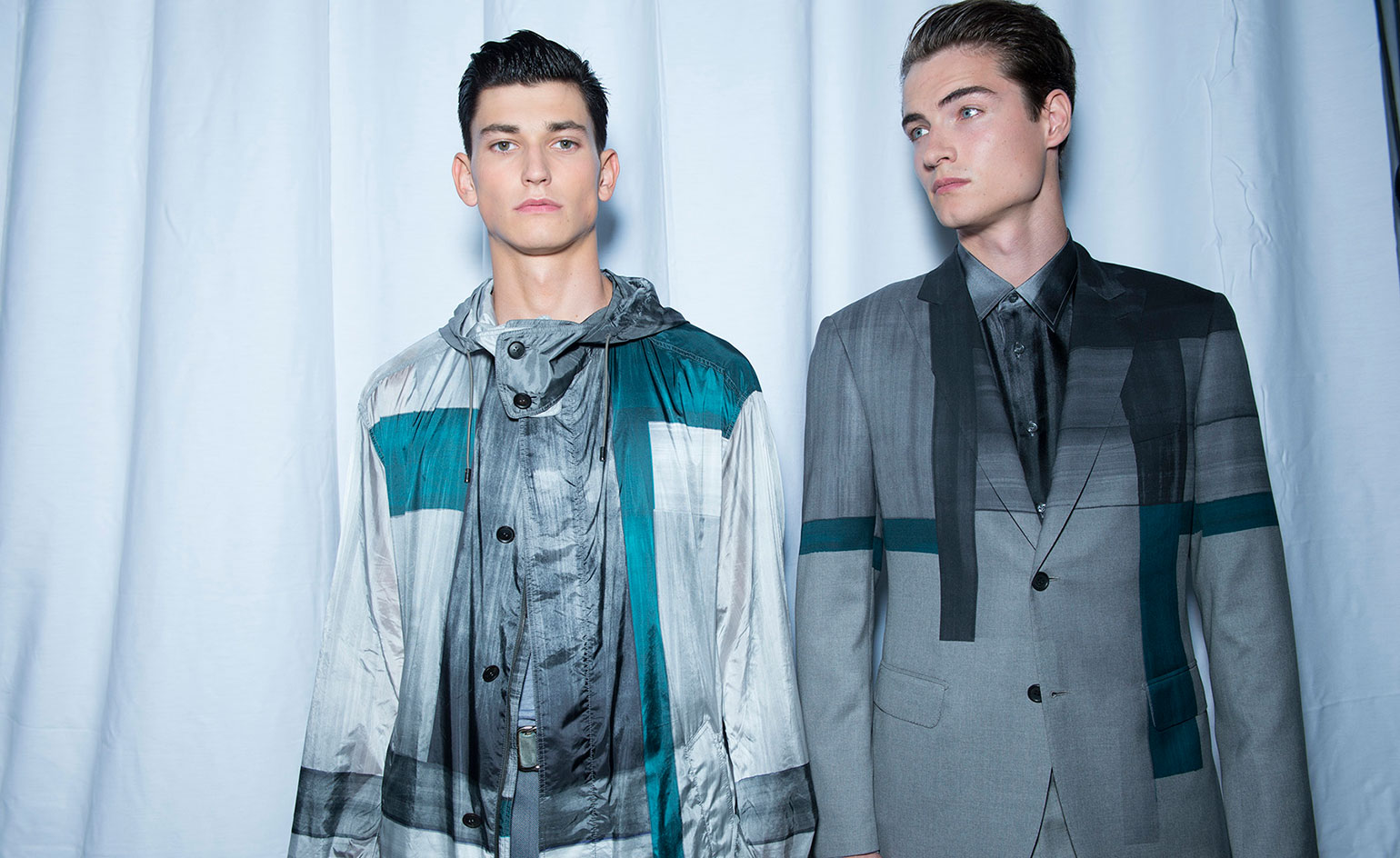
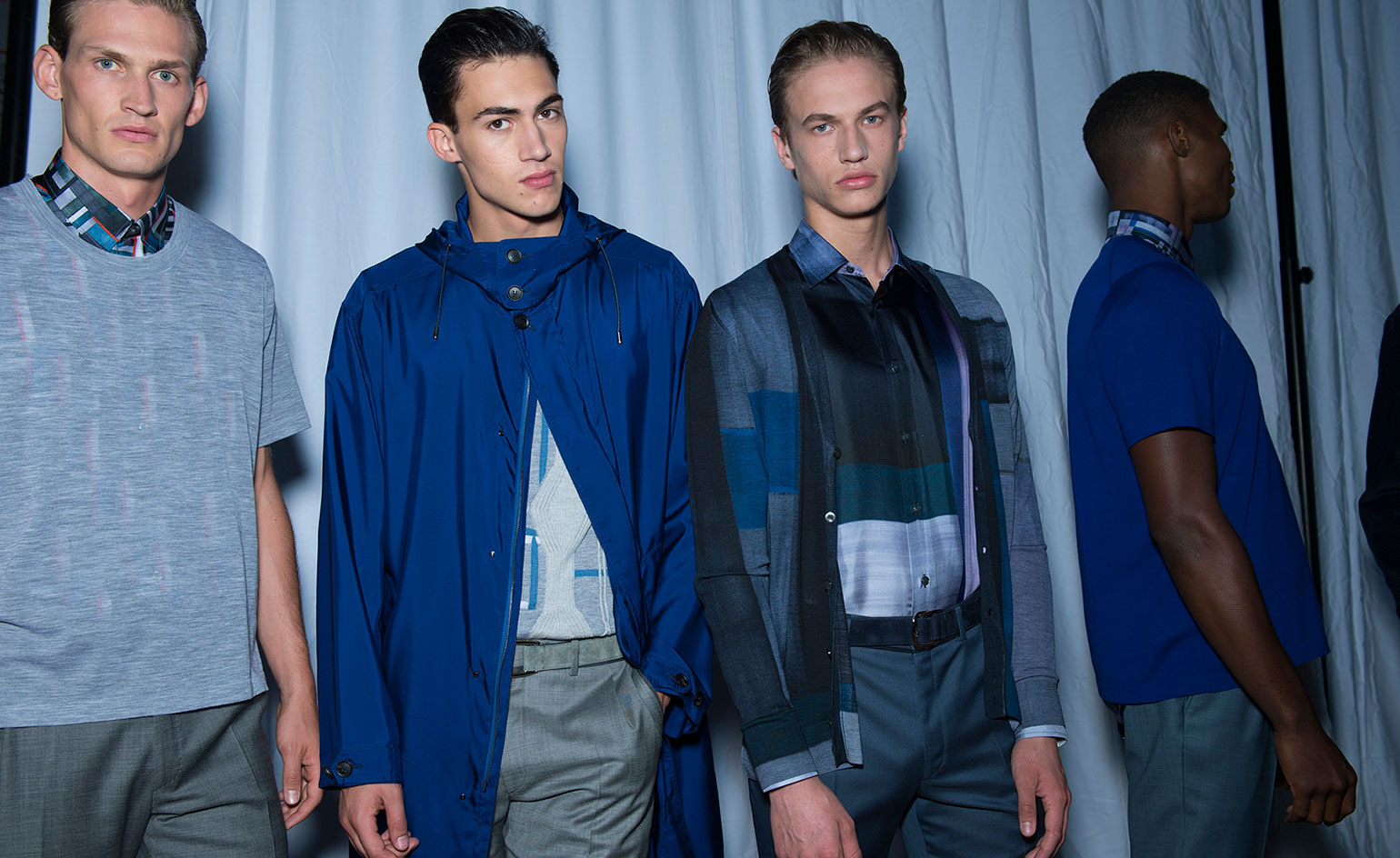
Scene setting: Though creative director Brendan Mullane name-checked architect Carlo Scarpa and referenced Venetian glass paintings as a source of inspiration, it was really the enormous horizontal box (the size of a giant truck) sitting in the center of the Brioni show space that most closely tied in with his spring collection. The same rectangles that were sliced out of the box's body to create negative space were recreated using brush strokes in the clothing. The wonderful graphic accents transformed silk suiting from the ordinary to the exceptional.
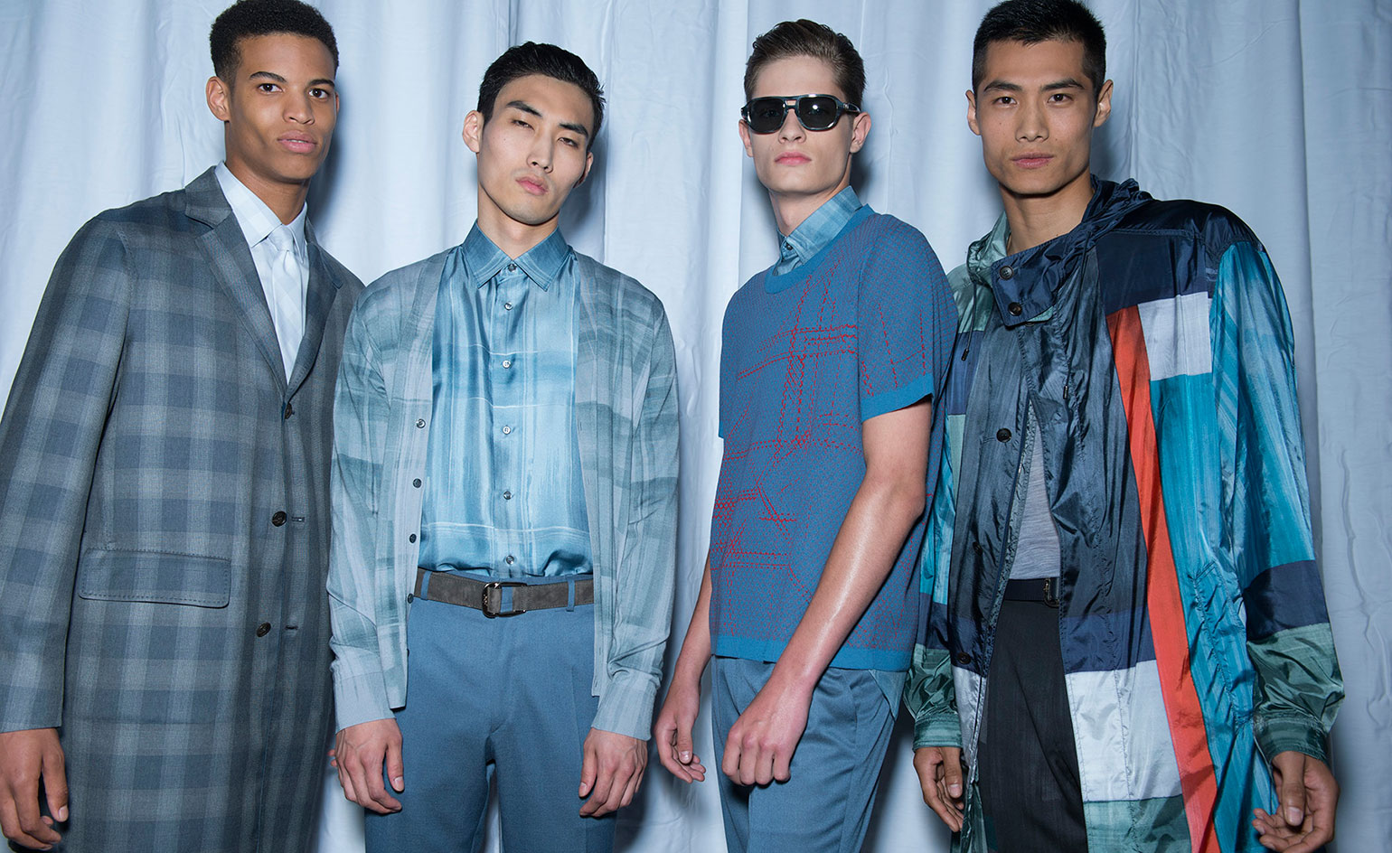
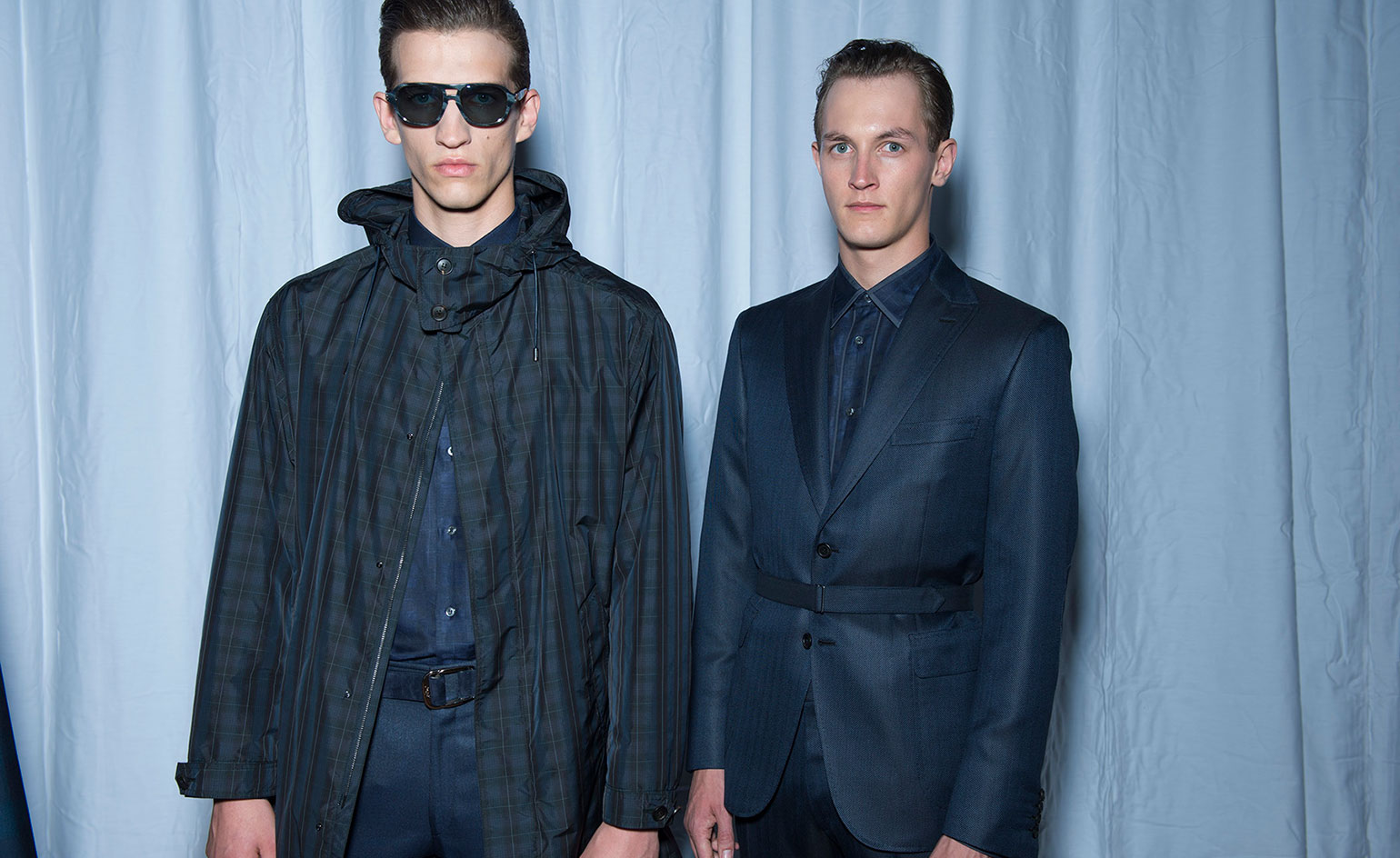
Best in show: Mullane proves that sophisticated sartorial clothing need not be snooze worthy. He treated us to formal wool jackets in grey green tones with brown suede pockets, fluttering silk shirts and high tech Japanese nylon anoraks that billowed like sails.
Finishing touches: No matter how formal things got – and formal they were; tuxedos, after all, remain Brioni’s bread and butter – everything looked cool thanks to the simple two strap sandals (without socks, finally!) that were worn with every look.
Photography: Jason Lloyd-Evans
Wallpaper* Newsletter
Receive our daily digest of inspiration, escapism and design stories from around the world direct to your inbox.
JJ Martin
-
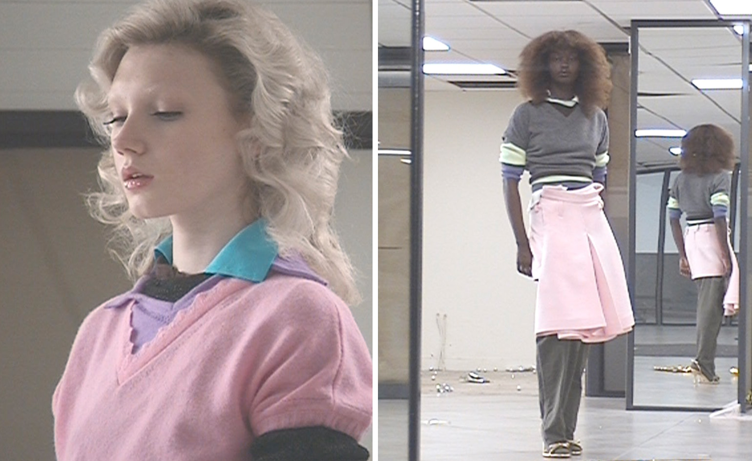 All-In is the Paris-based label making full-force fashion for main character dressing
Part of our monthly Uprising series, Wallpaper* meets Benjamin Barron and Bror August Vestbø of All-In, the LVMH Prize-nominated label which bases its collections on a riotous cast of characters – real and imagined
By Orla Brennan
-
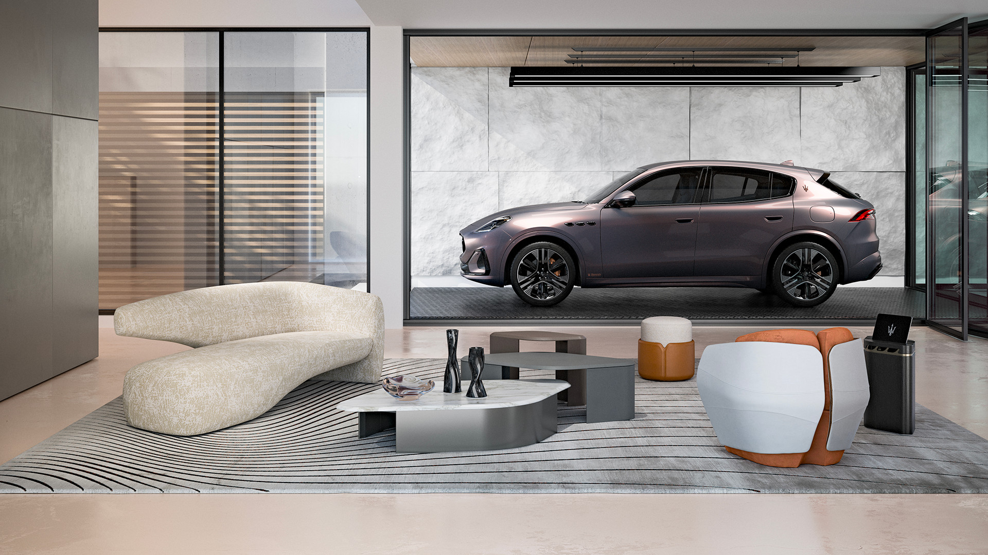 Maserati joins forces with Giorgetti for a turbo-charged relationship
Announcing their marriage during Milan Design Week, the brands unveiled a collection, a car and a long term commitment
By Hugo Macdonald
-
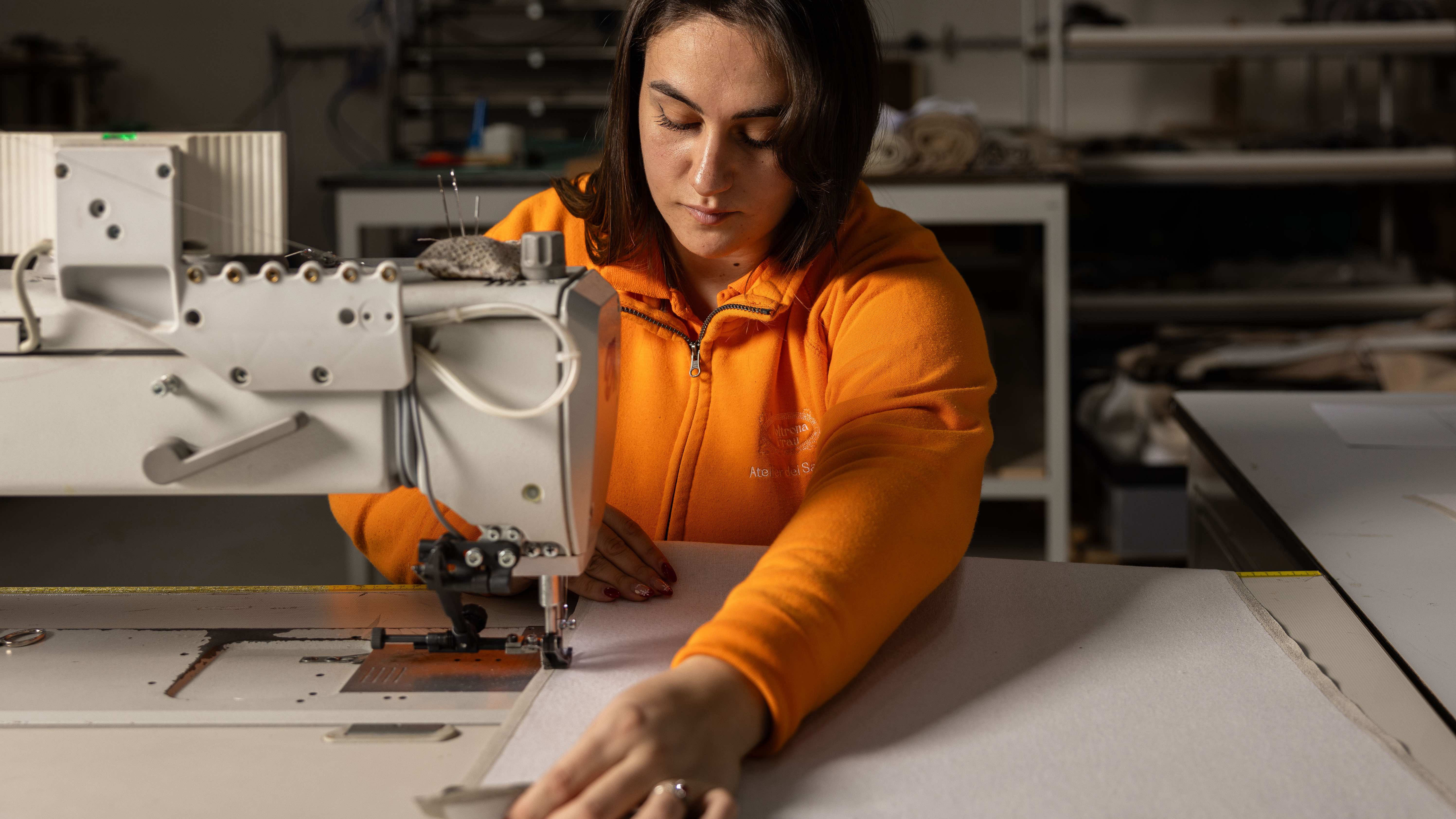 Through an innovative new training program, Poltrona Frau aims to safeguard Italian craft
The heritage furniture manufacturer is training a new generation of leather artisans
By Cristina Kiran Piotti
-
 Milan Fashion Week Men’s S/S 2023: Fendi to Prada
From Prada’s exploration of archetypal menswear garments to JW Anderson’s much-anticipated debut in the city, the best of Milan Fashion Week Men’s S/S 2023, as it happens
By Jack Moss
-
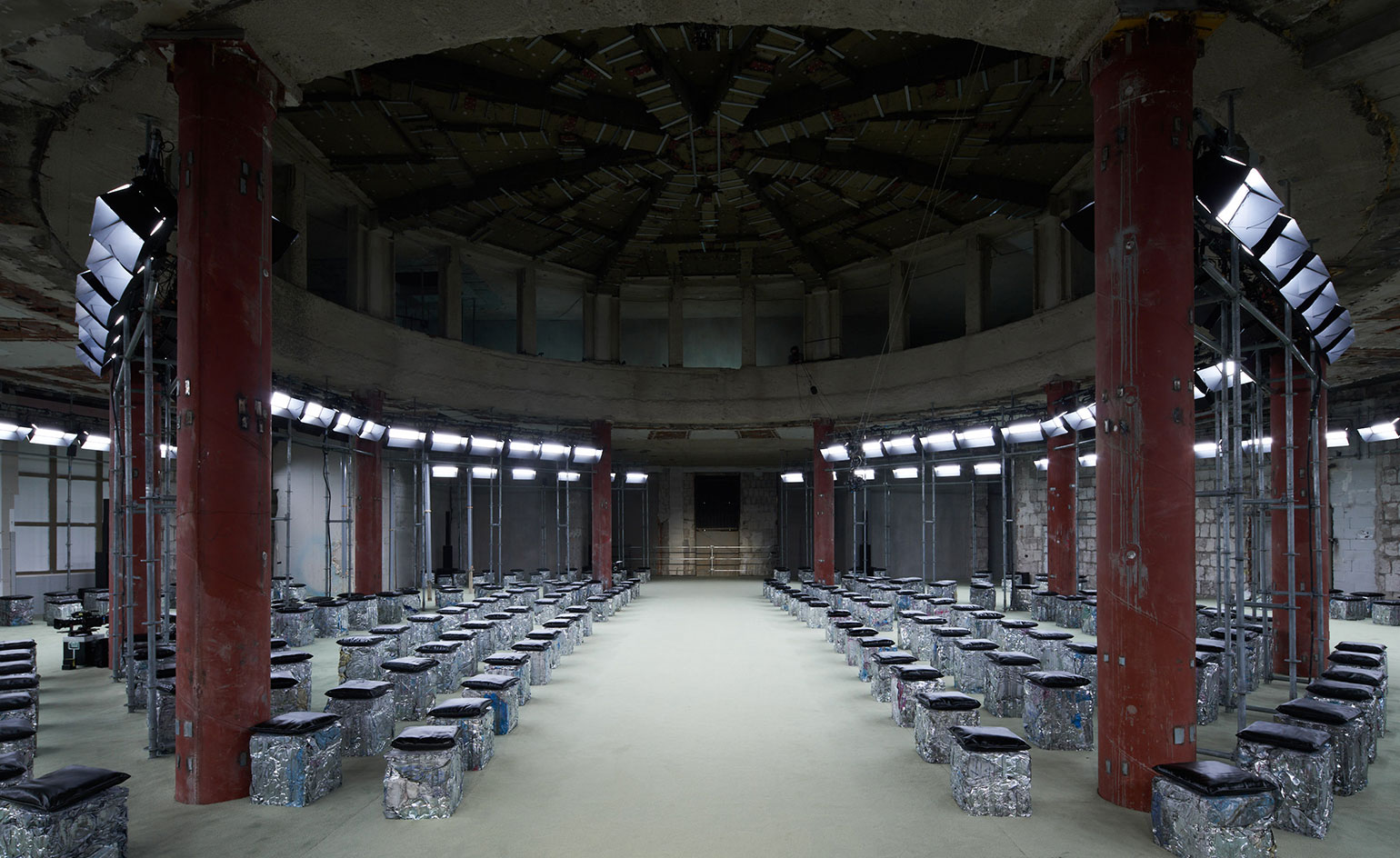 Milan Fashion Week A/W 2022: Prada to Bottega Veneta
In this extended report, Scarlett Conlon reports live from the Milan Fashion Week A/W 2022 shows, with rolling coverage as they take place on the runway
By Scarlett Conlon
-
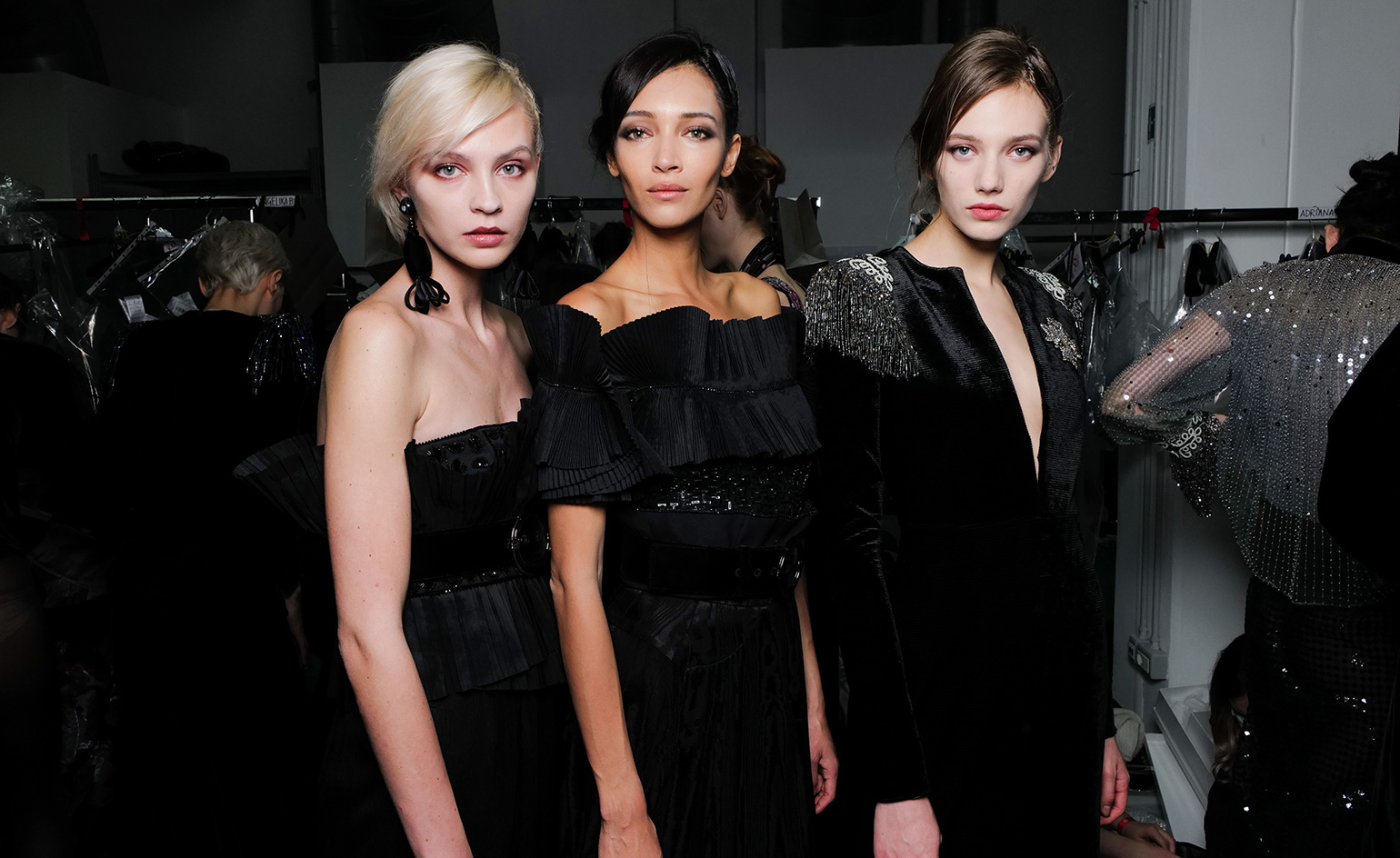 Giorgio Armani A/W 2020 Milan Fashion Week Women's
By Laura Hawkins
-
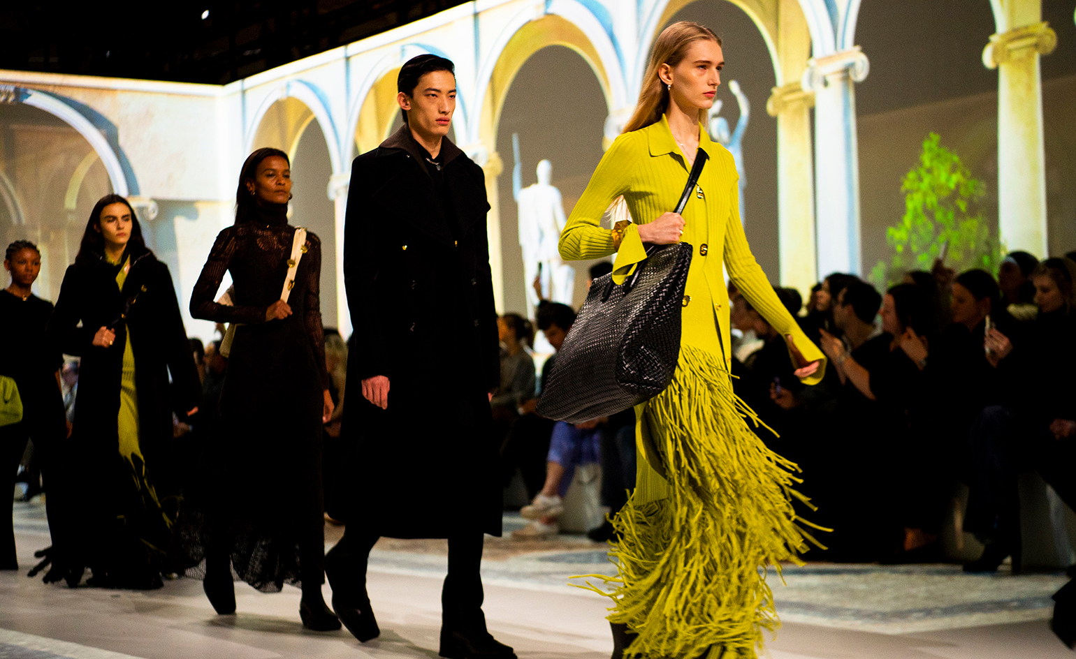 Bottega Veneta A/W 2020 Milan Fashion Week Women's
By Laura Hawkins
-
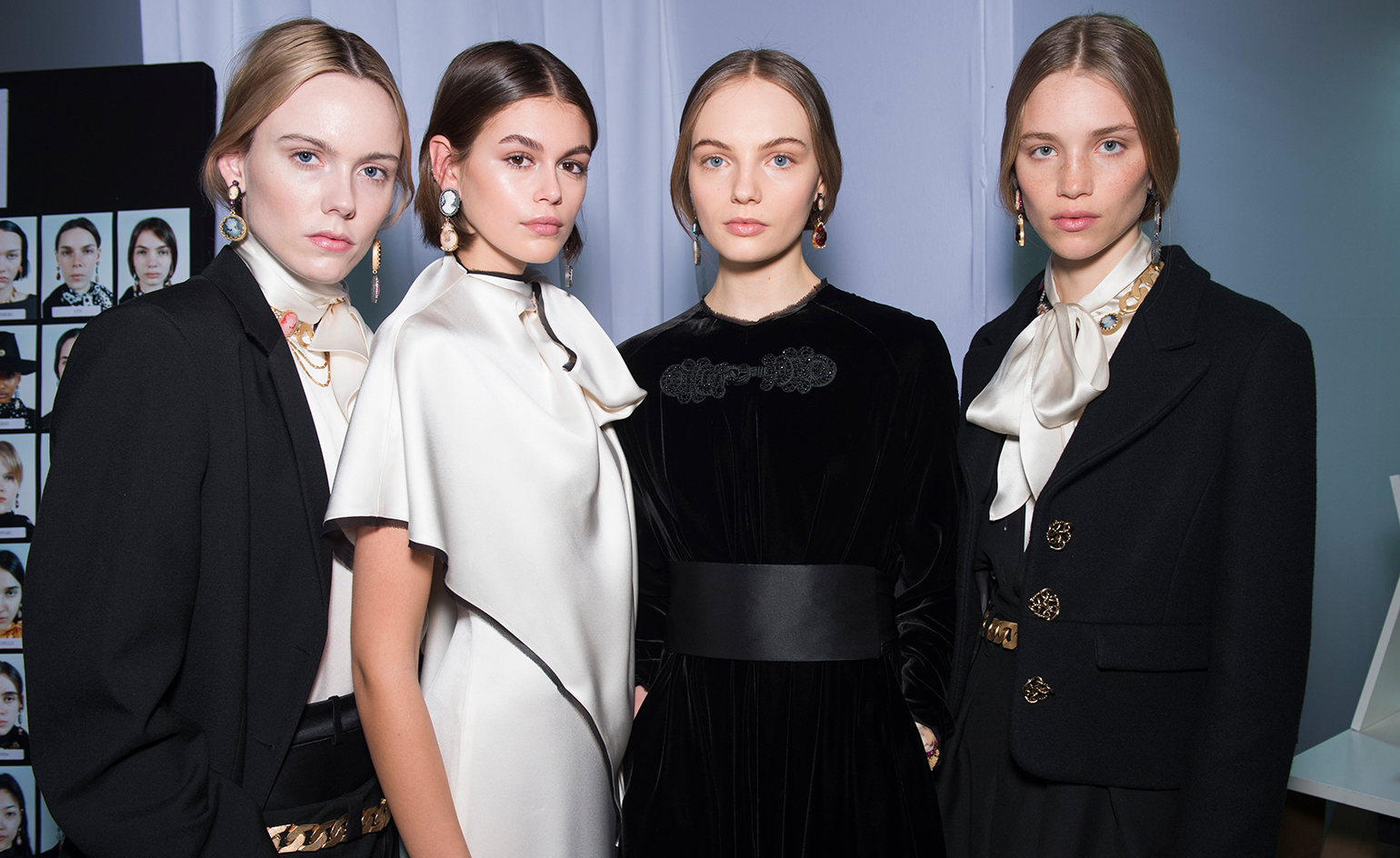 Ports 1961 A/W 2020 Milan Fashion Week Women's
By Laura Hawkins
-
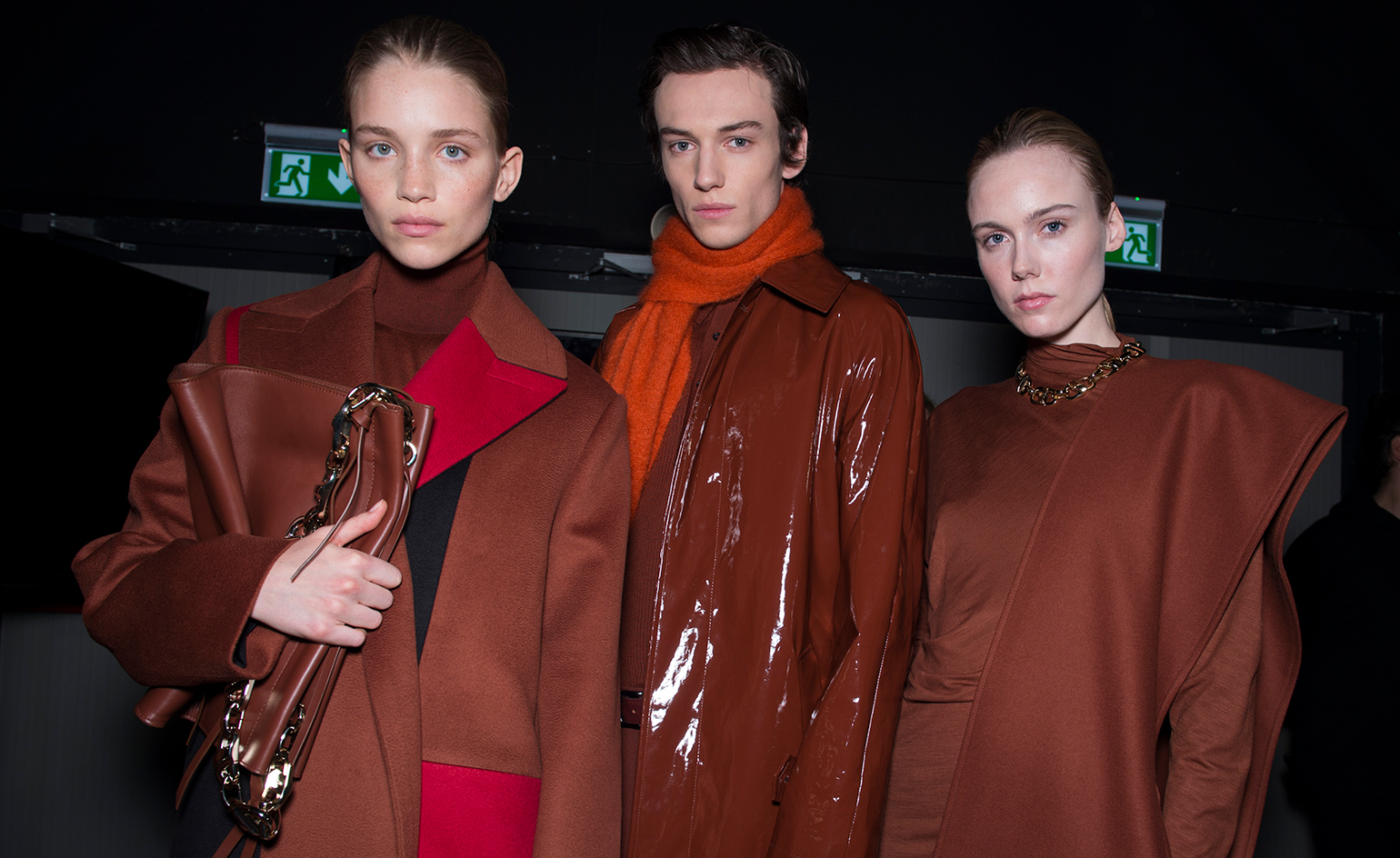 BOSS A/W 2020 Milan Fashion Week Women's
By Laura Hawkins
-
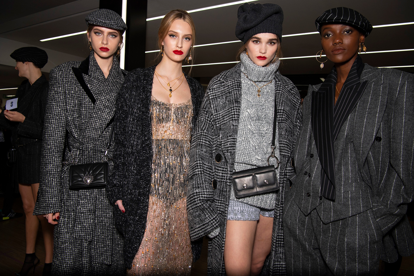 Dolce & Gabbana A/W 2020 Milan Fashion Week Women's
By Laura Hawkins
-
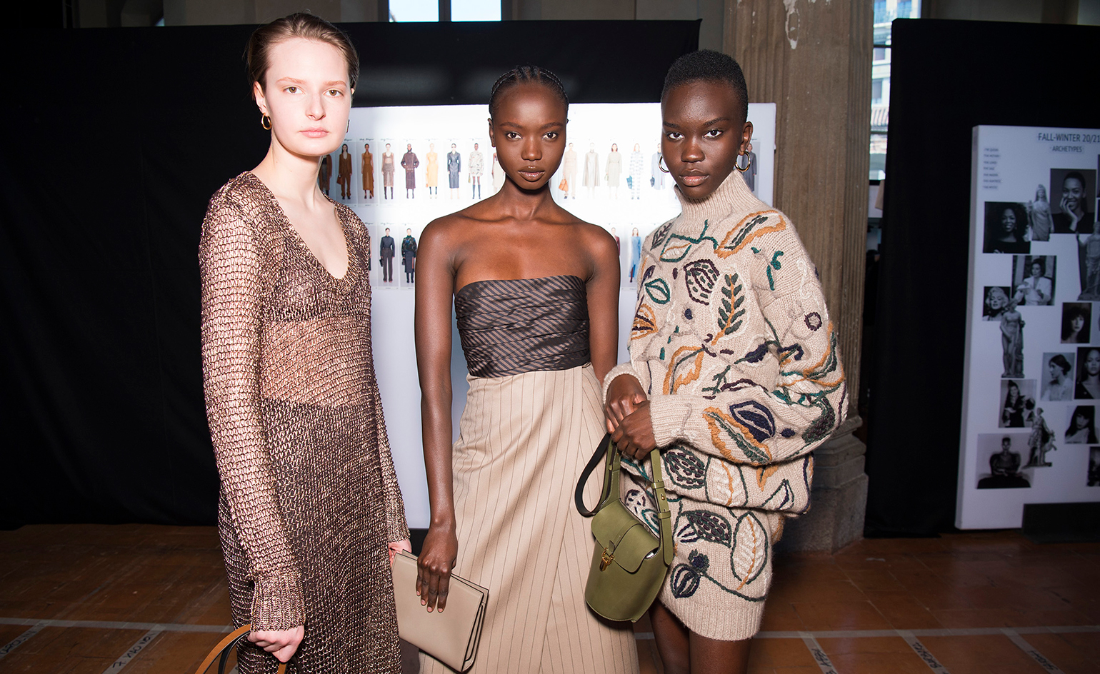 Salvatore Ferragamo A/W 2020 Milan Fashion Week Women's
By Laura Hawkins