
Mood board: In his second show for the house, Kris Van Assche ramped up its métier. ‘There was colour in January, but there is way more now,’ he said backstage. ‘It’s all about tradition and being contemporary. I refuse to think that Berluti should only be about timeless luxury, I think that’s in there, but it’s also supposed be for now.’ Slim suiting came with green and jade accents around shoes; trousers split at the front to reveal diamond sculpted boots. Wide palazzo pants in bright orange had pep. Cotton bikers were worn over suiting. For his debut last season, Van Assche drew inspiration from the stained marble tables on which the Berluti craftsmen in the Ferrara manifattura hand-dye the brand’s classic patina shoe. ‘The colours all come from the inks that are used. This time I wanted to make it into a fashion proposition. Last season was a photograph of reality. Now I’m putting more acid in there,’ he said.
Best in show: The colours were bold and bright – fluro orange and mustard, cobalt blue, navy and vivid violet. Standout were pieces onto which Van Assche had embossed the maison’s heritage ‘scritto’ motif, a largely indecipherable 19th-century manuscript sacred to the Berluti archives. For S/S 20, it is inscribed onto leather suiting, written on the lining of jackets and used like a shadow on pin-striped tailoring. It is the logo of the house. Leather blazers were punched with nail-head embellishments: ‘When I went to the factory where they hand-make the shoes, what struck me is that they put the nails in their mouths as they are working. It struck me that these boot makers do that. This know-how is underneath the sole of the shoe – I wanted to use that as an embellishment to show what’s inside,’ Van Assche said.
Sound bite: The look was more playful than the house has usually been accustomed. ‘I am still making a new interpretation of the heritage, the patina, the embossed leather, but pushing things forward, almost making archive pieces that didn’t exist,’ Van Assche said. ‘It’s more Berluti than I could be, and it’s also more fashion.’


-
 Anni Albers' weaving magic offers a delightful 2-in-1 modernist showcase in Milan
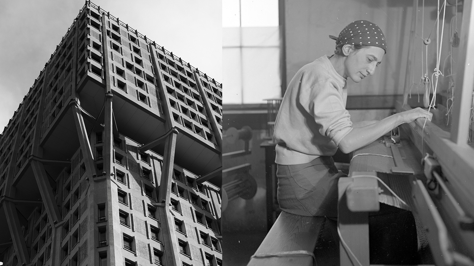
A Milan Design Week showcase of Anni Albers’ weaving work, brought to life by Dedar with the Josef & Anni Albers Foundation, brings visitors to modernist icon, the BBPR-designed Torre Velasca
-
 The Milanese Motor Show, or how Milan Design Week got friendly with four-wheels
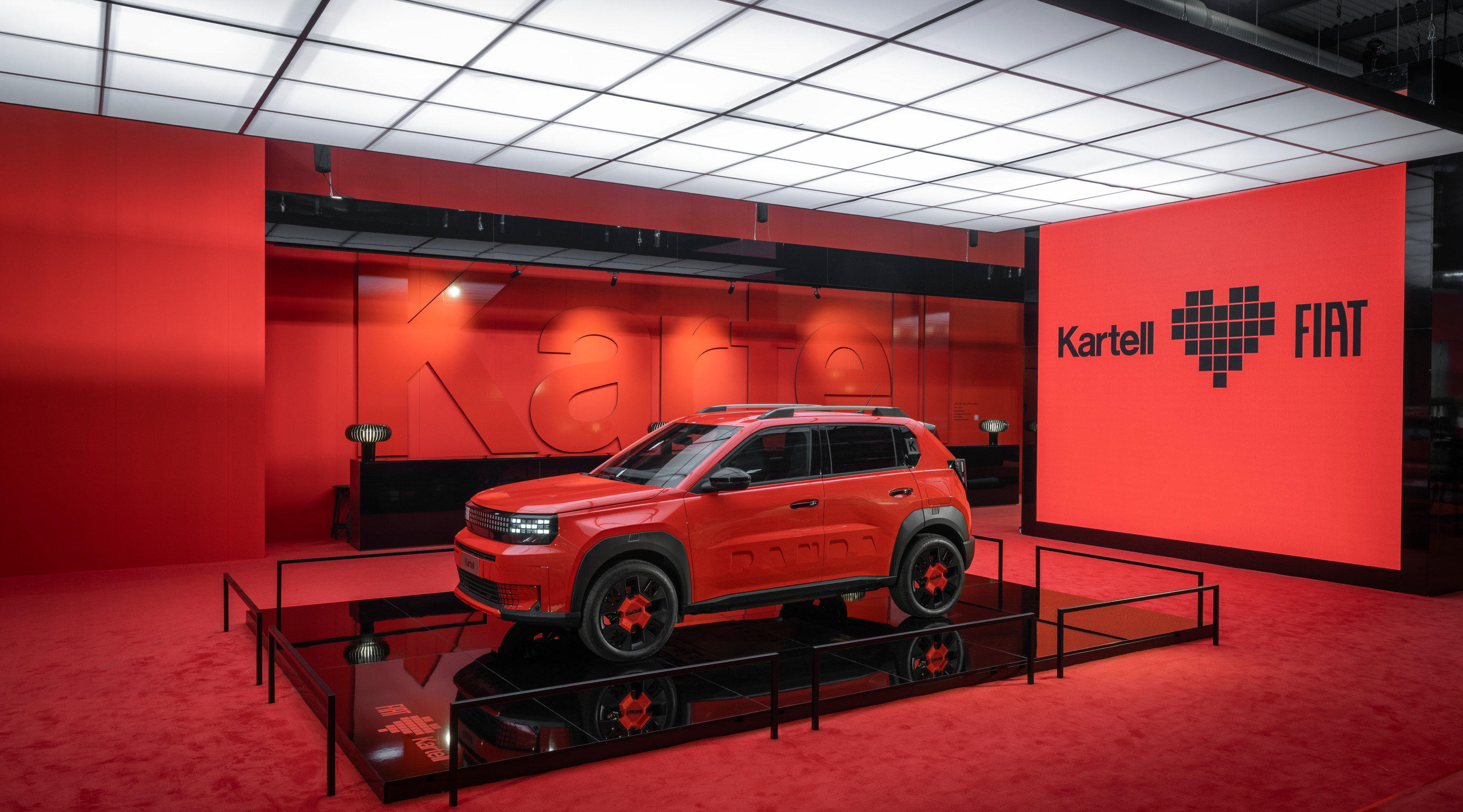
The motor industry’s take-over of MDW continues apace. We’ve trawled the halls and assembled our own auto show to explore below
-
 Tokujin Yoshioka’s ephemeral ice furniture is made to melt in Milan
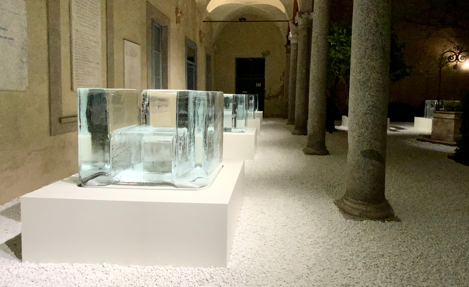
Transparent chairs of frozen water slowly disappear during Milan Design Week 2025, in an expression of light by Japanese artist Tokujin Yoshioka


