Hermès re-invents its Beverly Hills boutique
Receive our daily digest of inspiration, escapism and design stories from around the world direct to your inbox.
You are now subscribed
Your newsletter sign-up was successful
Want to add more newsletters?
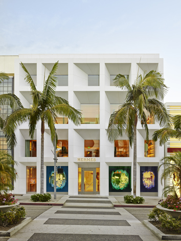
Hermès made its first foray into the United States in 1972 with the opening of a boutique in none other than Beverly Hills. Over 40 years and one move down the street later, the luxury house has just unveiled its entirely re-imagined home, complete with a bold new façade that articulates Los Angeles' modernist design heritage.
RDAI's Denis Montel, the fashion house's long-time design partner (see our W*174 Architects of Fashion story) has created an abstract storefront, featuring a grid of angled, recessed windows, which allows light to filter into the store while offering shelter from its intensity. Instead of Hermès' usual choice of beige stone, the Beverly Hills boutique is constructed from white Carrara marble, which takes on an added lustre in the Californian sunshine.
'It was a challenge to design a store without changing the existing space,' mused Montel. The refurbishment of the Beverly Hills boutique - set back from Rodeo Drive - was in progress for 18 months. 'I tried to design a type of cella architecture, but in the same way as the Modernists from the 1950s and 60s. It's very deep, very architectonic.'
Indoors, the boutique has undergone an equally dramatic makeover. RDAI has ingeniously expanded the shop's square footage to a whopping 17,000, despite it occupying the same address since 1997. An undulating, sculptural staircase stands at the core of the space, connecting each floor with a beam of light travelling down from an invisible membrane skylight on a seemingly roofless roof.
On the ground floor, which houses leather goods and silk accessories, mosaic tiles in Hermès' signature brown and white are arranged in the house's logo and initials. The first floor showcases menswear, a bespoke suit atelier as well as the women's collection and fine jewellery, which is seductively displayed in curved, unpolished cherrywood cases - another Hermès signature.
The top floor is given over to the house's equestrian range, furniture and home offerings. Pieces including a leather-covered wooden desk designed by Enzo Mari and a slender valet designed by Philippe Nigro stand next to a display of Shigeru Ban's wall tile system and Hermès Maison's expansive selection of Dedar-made fabrics.
No new store would be complete without some special city-specific merchandise, and Hermès certainly doesn't disappoint. Playing up to the locals' predilections for a pool, the house has also created a capsule collection, from ties to swimsuits and even a bull calfskin basketball, in a vibrant turquoise.
Of course, there had to be a scarf too. Designed by Benoit Pierre Emery, artistic director of Objects and Tableware, the commemorative print depicts the dappled floor of a sun-drenched swimming pool, completed with palm trees and rippling water.
Hermès also commissioned graphic designer, Anthony Burrill, to create a special graphic identity for the store that was in turn transformed into an animation that flawlessly captures the distinctive façade, along with Los Angeles' unique flavour.
In addition, the house appointed the young French duo Zim & Zou to design a series of Atlantis-themed shop windows. Inspired by the city's beach-centric culture, the pair created intricate city scenes, made from paper, that includes the boutique and local icons, such as the Staples Centre.
In honour of the grand reopening, Hermès hosted an incredible, interactive gala in a film studio in Culver City that united French flair and Hollywood nostalgia in perfect harmony. The multi-faceted event saw Burrill's illustrations turn into the actual backdrop for the party, with guests meandering in and out of its abstract cityscape.
Emery's scarf design also stunningly came to life as swimwear-clad dancers twirled on a mosaic pool floor underneath a watery, hologrammed ceiling. Other areas of the venue included an Hermès film set that staged and broke consecutive Jazz Age dance numbers, and a Parisian al fresco dining area where guests could enjoy duck confit and Croque Monsieur by the light of a large fake moon.
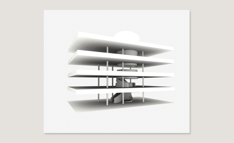
A rendering of the reinvented inside of Hermès Beverly Hills. 'People hate to climb staircases in a shop, so the idea was to have some kind of a ramp,' Montel explains. 'We chose a more organic shape [for the staircase] so that it feels easier to climb'
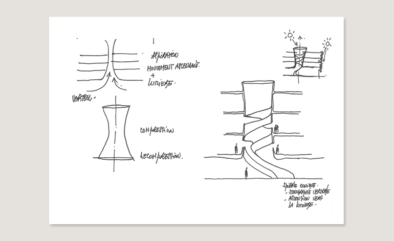
Continues Montel: 'On top of the staircase you have a large skylight and once again, light helps you to go up. It's a natural circulation in a way'
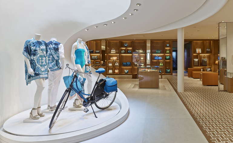
The boutique's ground floor showcases the boutique's new bespoke collection, featuring the store's signature pool-inspired print designed by Benoit Pierre Emery, artistic director of Objects and Tableware. 'The turquoise blue is the common thread, so you have everything to go on the beach: beachwear, bicycle and a saddle bag.' says Hermès artistic director Pierre-Alexis Dumas. This floor also houses women's accessories and leather handbags. 'We wanted the handbag showcase to be a bit like a cabinet of curiosities; a series of small boxes that emphasises each product'
The boutique's ground floor showcases the boutique's new bespoke collection, featuring the store's signature pool-inspired print designed by Benoit Pierre Emery, artistic director of Objects and Tableware. 'The turquoise blue is the common thread, so you have everything to go on the beach: beachwear, bicycle and a saddle bag.' says Hermès artistic director Pierre-Alexis Dumas. This floor also houses women's accessories and leather handbags. 'We wanted the handbag showcase to be a bit like a cabinet of curiosities; a series of small boxes that emphasises each product'
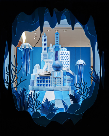
Paper specialists Zim & Zou were tasked with creating a fantastical world for the windows of the new boutique. Co-founder Thibault Zimmerman explains: 'The story of these windows is based on Atlantis. The three windows offer three different angles on the city. The first presents a view from afar; you discover the overall shape. The second you enter the city and see the details, and the third shows when you are in the city and discover the stairs in the boutique'
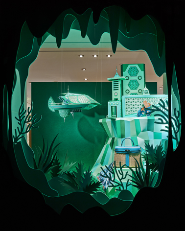
This scene offers a closer view of the imaginary underwater city. The display showcases a few of Hermès Beverly Hills' exclusive turquoise accessories, including a Kelly Picque-Nicque, thus named for its woven basket exterior
Hermès also commissioned graphic designer, Anthony Burrill, to create a special graphic identity for the store, which was in turn transformed into an animation that flawlessly captures the distinctive façade, along with Los Angeles' unique flavour. Explains Burrill: 'The concept was for a very simple grid of two squares that subdivided, which was informed by the façade. There is a bit of a David Hockney reference as well. It all felt like it fitted together really nicely for the story. I wanted to make something with a very simple colour palette. It's very reduced down: white sunlight, blue sky and then the white of the building.'
Hermès also commissioned graphic designer, Anthony Burrill, to create a special graphic identity for the store, which was in turn transformed into an animation that flawlessly captures the distinctive façade, along with Los Angeles' unique flavour. Explains Burrill: 'The concept was for a very simple grid of two squares that subdivided, which was informed by the façade. There is a bit of a David Hockney reference as well. It all felt like it fitted together really nicely for the story. I wanted to make something with a very simple colour palette. It's very reduced down: white sunlight, blue sky and then the white of the building.'
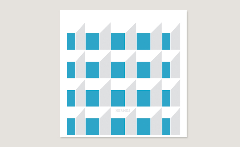
A detail from Burrill's series of animations that depicts the recognisable façade of the Beverly Hills boutique. This was later adapted into a life-size set for the celebratory gala that evening.
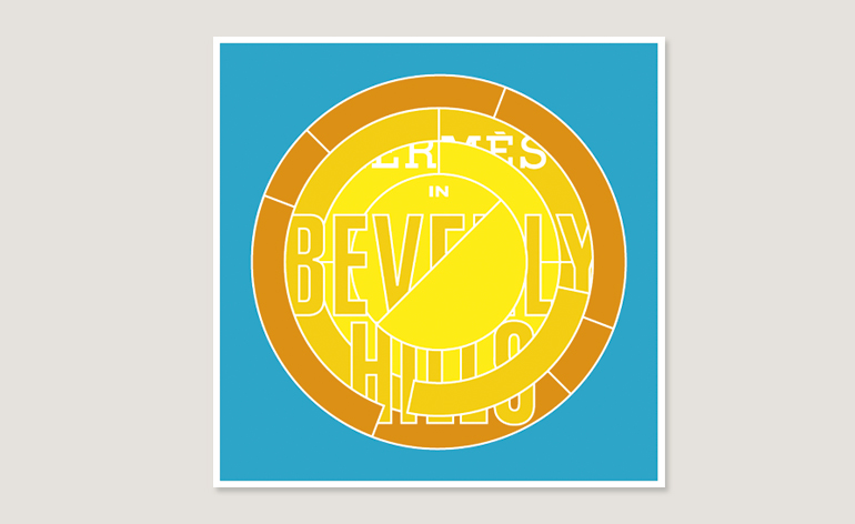
A Burrill-designed logo for the store

A closer look at the commemorative carré print designed by designed by Benoit Pierre Emery. It depicts the dappled floor of a sun-drenched swimming pool, completed with palm trees and rippling water.
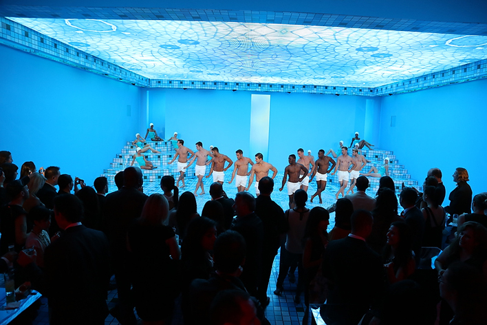
Emery's scarf design also stunningly came to life at the Hermès gala (marking the opening of the store) in a film studio in Culver City. Swimwear-clad dancers twirled on a mosaic pool floor underneath a watery, hologrammed ceiling
Receive our daily digest of inspiration, escapism and design stories from around the world direct to your inbox.
Pei-Ru Keh is a former US Editor at Wallpaper*. Born and raised in Singapore, she has been a New Yorker since 2013. Pei-Ru held various titles at Wallpaper* between 2007 and 2023. She reports on design, tech, art, architecture, fashion, beauty and lifestyle happenings in the United States, both in print and digitally. Pei-Ru took a key role in championing diversity and representation within Wallpaper's content pillars, actively seeking out stories that reflect a wide range of perspectives. She lives in Brooklyn with her husband and two children, and is currently learning how to drive.