Flight of fancy: Paola Navone breathes new life into Hong Kong boutique Joyce
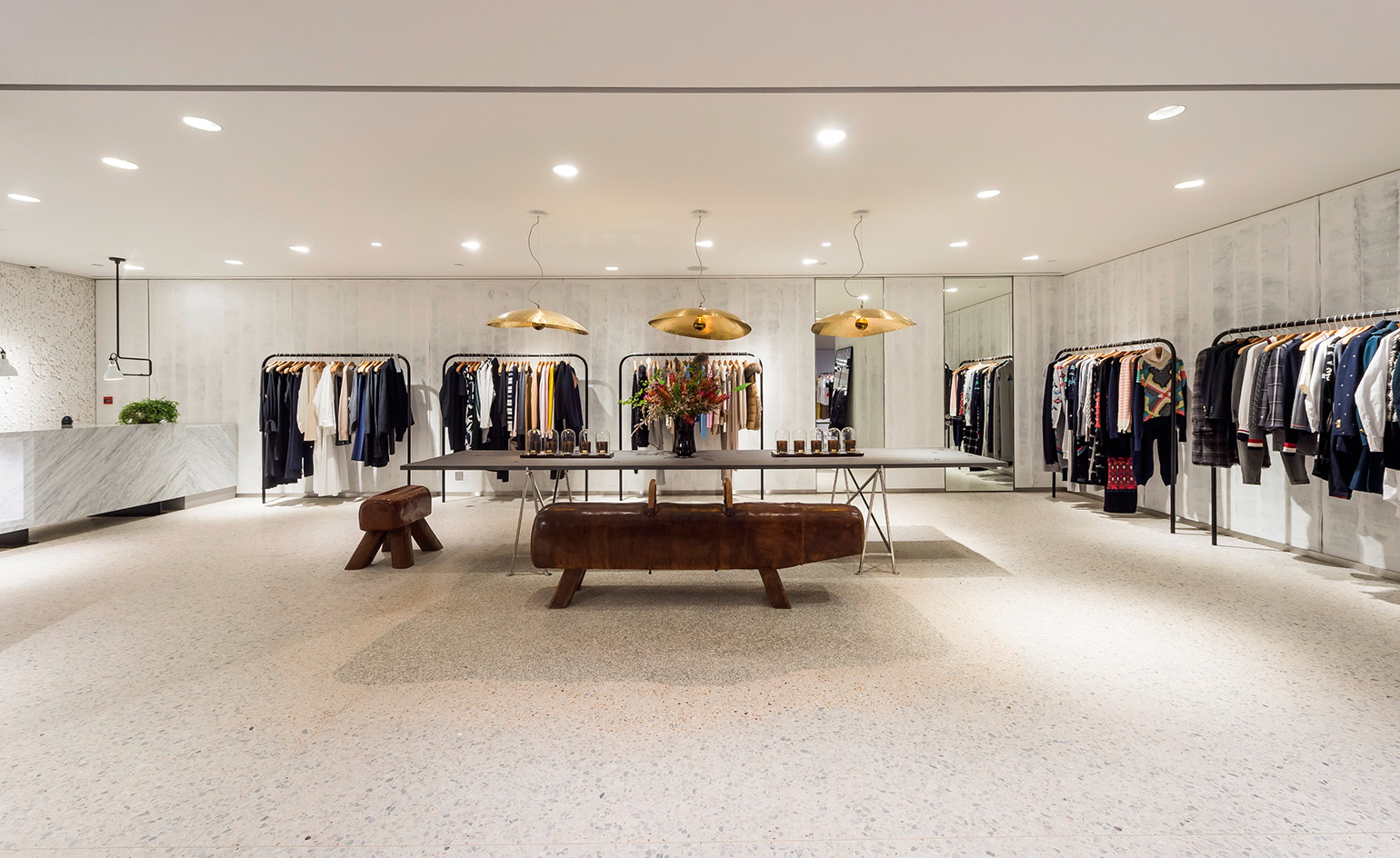
Since 1970, Chinese luxury retailer Joyce has been the go-to place for curious shoppers. For Italian architect and designer Paola Navone, Joyce’s prestigious outpost in Hong Kong is similarly significant. She lived in the city during a formative period in her career and, after calling both Asia and Africa her home, currently lives between Milan and Hong Kong.
When Joyce turned to Navone for the refurbishment of its Central branch, the designer was spurred by the thought of transforming a familiar space. She explains: 'Joyce is the most interesting shop in Hong Kong – it’s a point of reference with a very strong identity. I wanted to merge a new vision and spirit with the old one.'
Using her signature tham ma da (Thai for 'everyday') technique, Navone’s design connects Joyce’s four floors by filling the space with seemingly ordinary elements taken from the everyday, and elevating them to points of interest. In the lower ground floor's menswear section, Navone lets her favourite colour (blue) and her trademark fish motif catch the eye. Here, the rich hue contrasts with the industrial finish on wooden floorboards and metal piping.
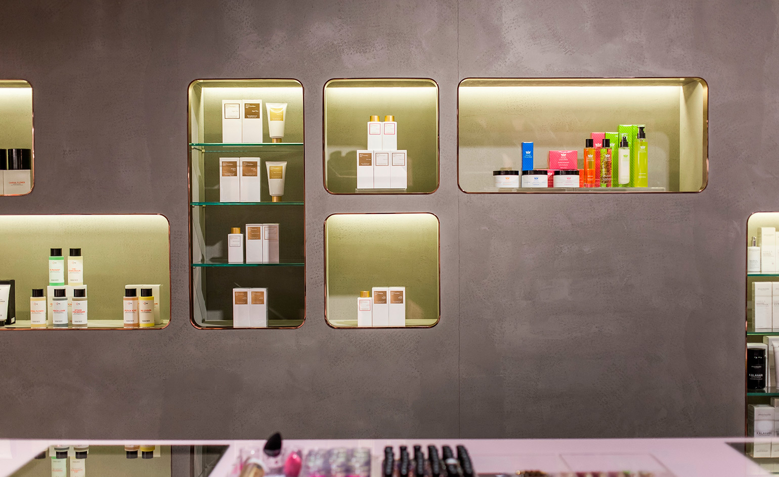
The first floor displays shoes and beauty products as well as featuring a VIP loft with treatment room
The ground floor begins with the womenswear experience in a low-ceilinged space that’s hung with tinsel, which leads into a bright main retail area. Sinuous wrought-iron rails anchored by sandbag-like weights, a vintage gym-horse that passes for a bench and whitewashed jute wall linings are examples of Navone’s eye for turning the ordinary into something intriguing. Scalloped, illuminated rails and a price-tag wall behind the shop counter are playful touches that hint at her tendency to mix and match a variety of shapes and textures into her spaces.
‘I like to put very different things together that are simple but expressive,’ says the designer. The first floor, which displays shoes and beauty products as well as featuring a VIP loft with treatment room, is the apex of that aesthetic. Its striking floor, in yellow, white, grey and pink poured resin inspired by spilled nail polish, is completely unique. 'I prefer to work with materials in which you can still see the imprint of the person handling it’, explains Navone of the process – the results depends on who pours it and how.
The terrazzo floor on the ground level, which was sanded to highlight its flaws, and the imperfectly hand-painted polka dot walls in the staircase leading to the additional mezzanine exhibition space, are other expressions of Navone’s philosophy. To her, it’s all an exercise in celebrating imperfection – this time in a place dedicated to unhurried shopping, in a metropolis with a hasty pace.
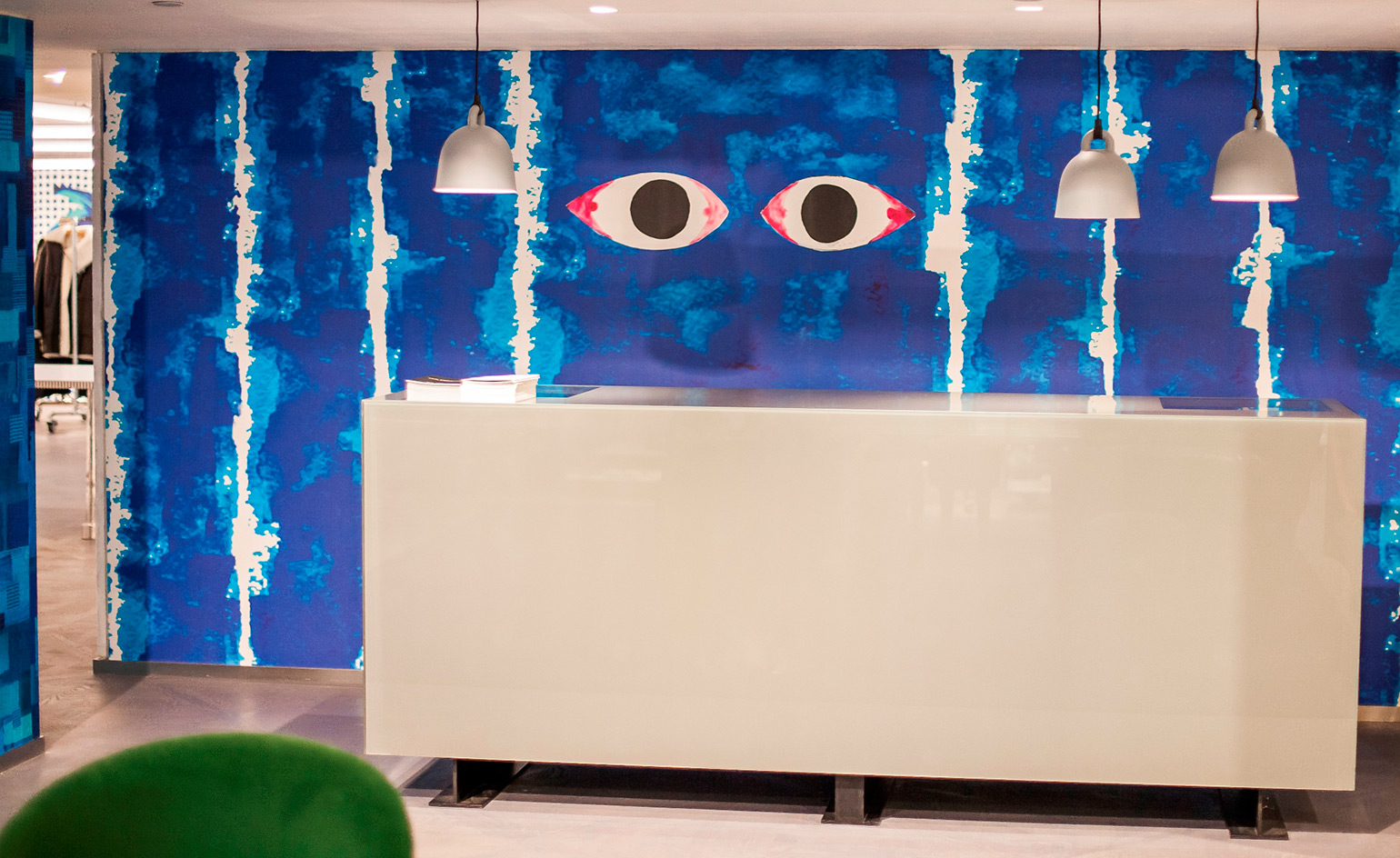
In the lower ground menswear section, Navone's favourite shade of blue catches the eye
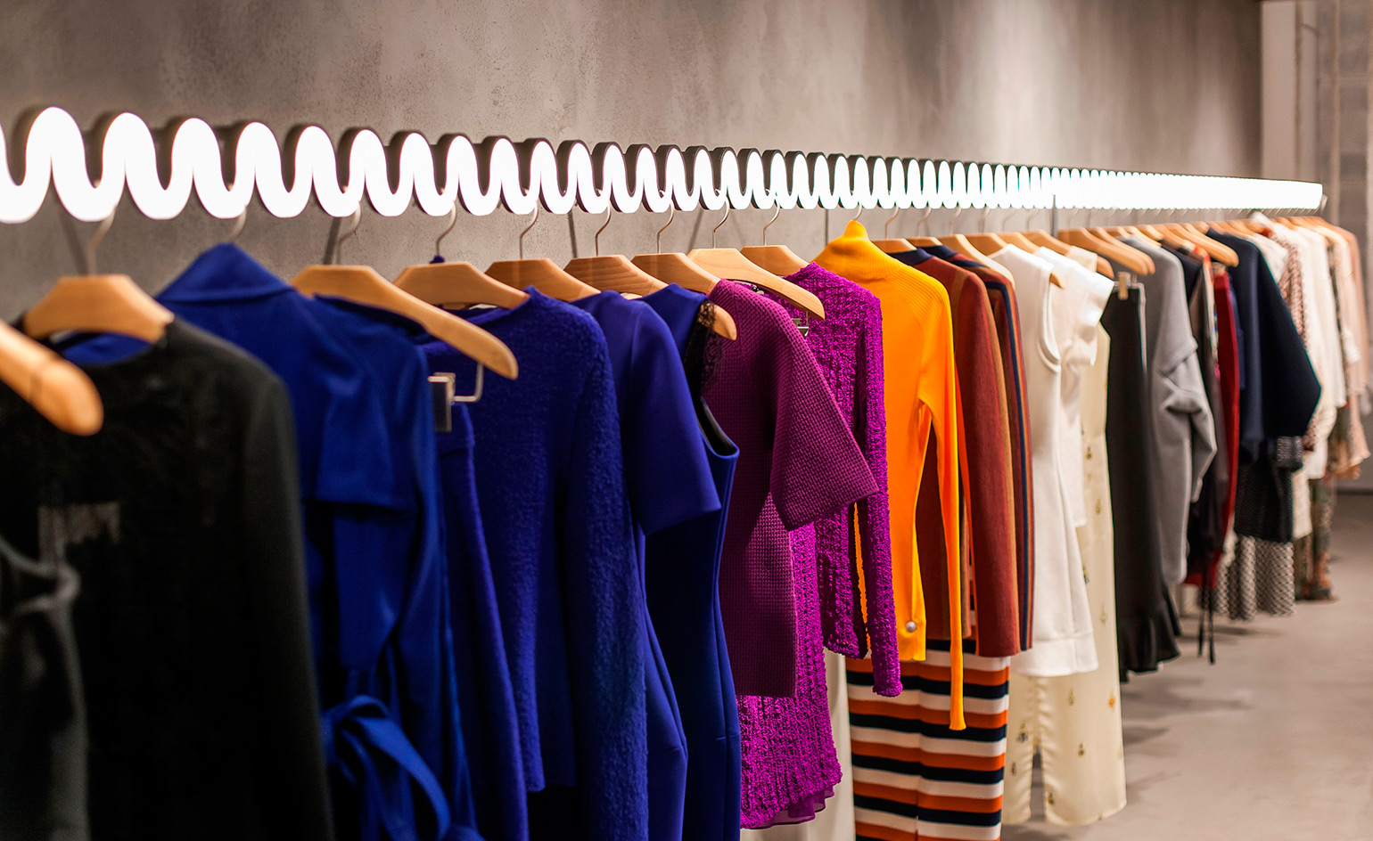
Scalloped, lit-up rails are one of the playful ways Navone incorporates a variety of shapes and textures into her spaces
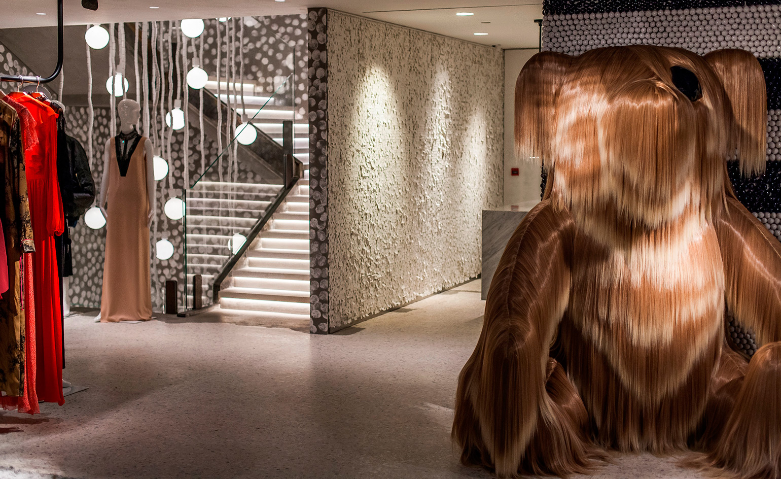
‘I like to put very different things together, that are simple but expressive,’ she states
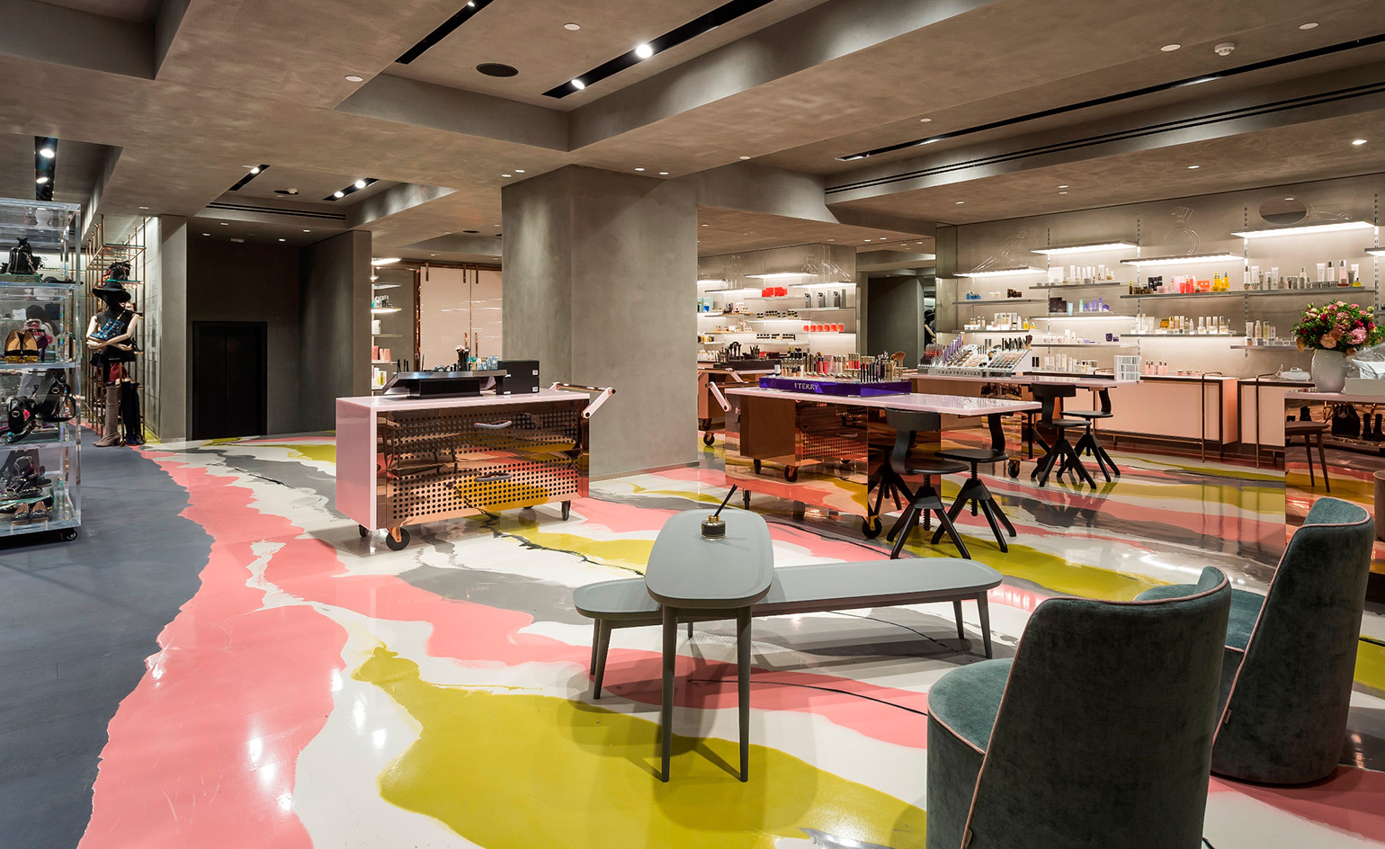
For the beauty floor, Navone designed a striking surface in yellow, white, grey and pink poured resin, inspired by spilled nail polish
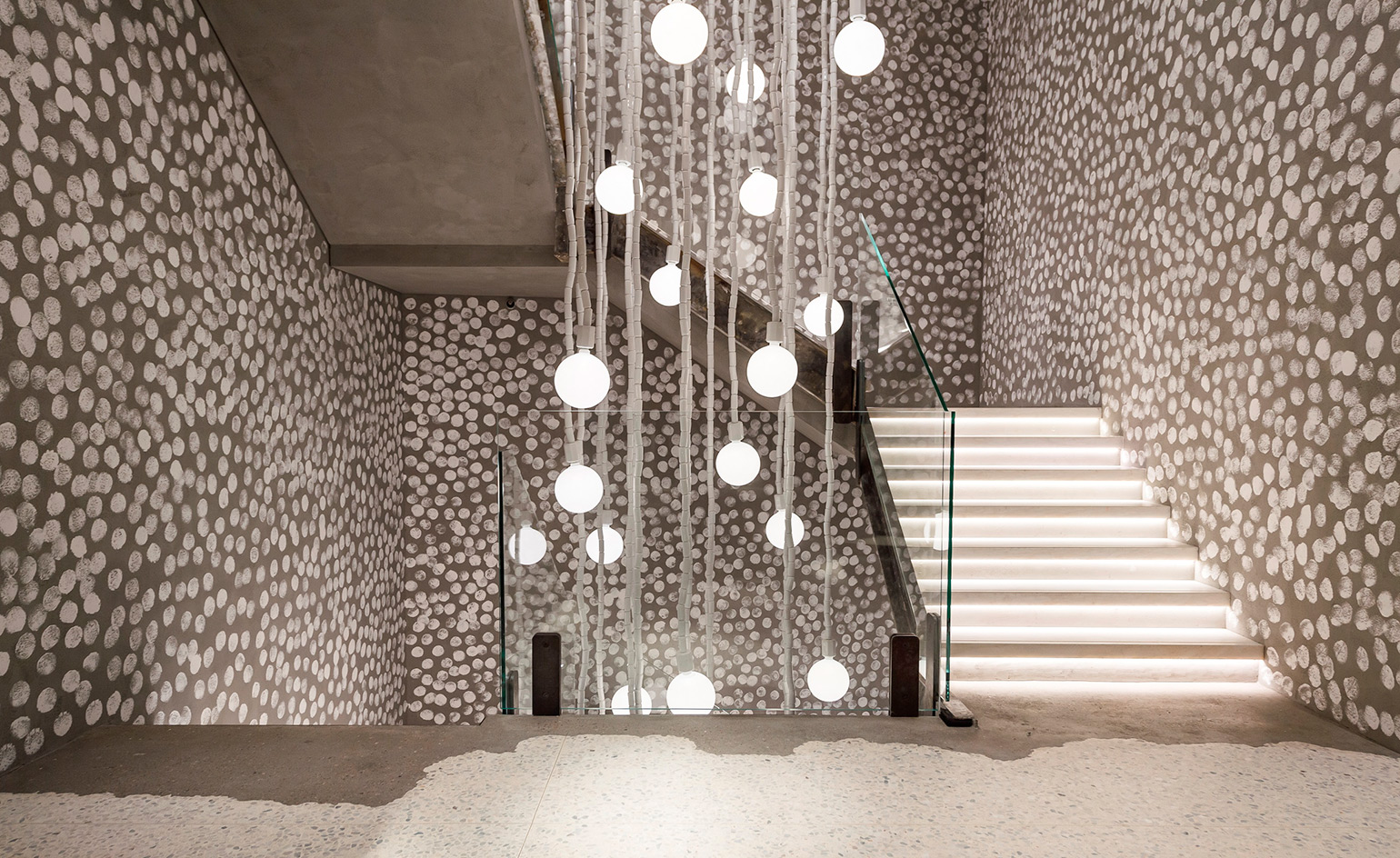
Imperfect polka dots were hand-painted on the walls of the staircase, leading to an additional mezzanine exhibition space
INFORMATION
For more information, visit the Joyce website
ADDRESS
G/F, New World Tower
16-18 Queen's Road
Central
Hong Kong
Wallpaper* Newsletter
Receive our daily digest of inspiration, escapism and design stories from around the world direct to your inbox.
Siska Lyssens has contributed to Wallpaper* since 2014, covering design in all its forms – from interiors to architecture and fashion. Now living in the U.S. after spending almost a decade in London, the Belgian journalist puts her creative branding cap on for various clients when not contributing to Wallpaper* or T Magazine.
-
 ‘Independence, community, legacy’: inside a new book documenting the history of cult British streetwear label Aries
Rizzoli’s ‘Aries Arise Archive’ documents the last ten years of the ‘independent, rebellious’ London-based label. Founder Sofia Prantera tells Wallpaper* the story behind the project
By Jack Moss
-
 Head out to new frontiers in the pocket-sized Project Safari off-road supercar
Project Safari is the first venture from Get Lost Automotive and represents a radical reworking of the original 1990s-era Lotus Elise
By Jonathan Bell
-
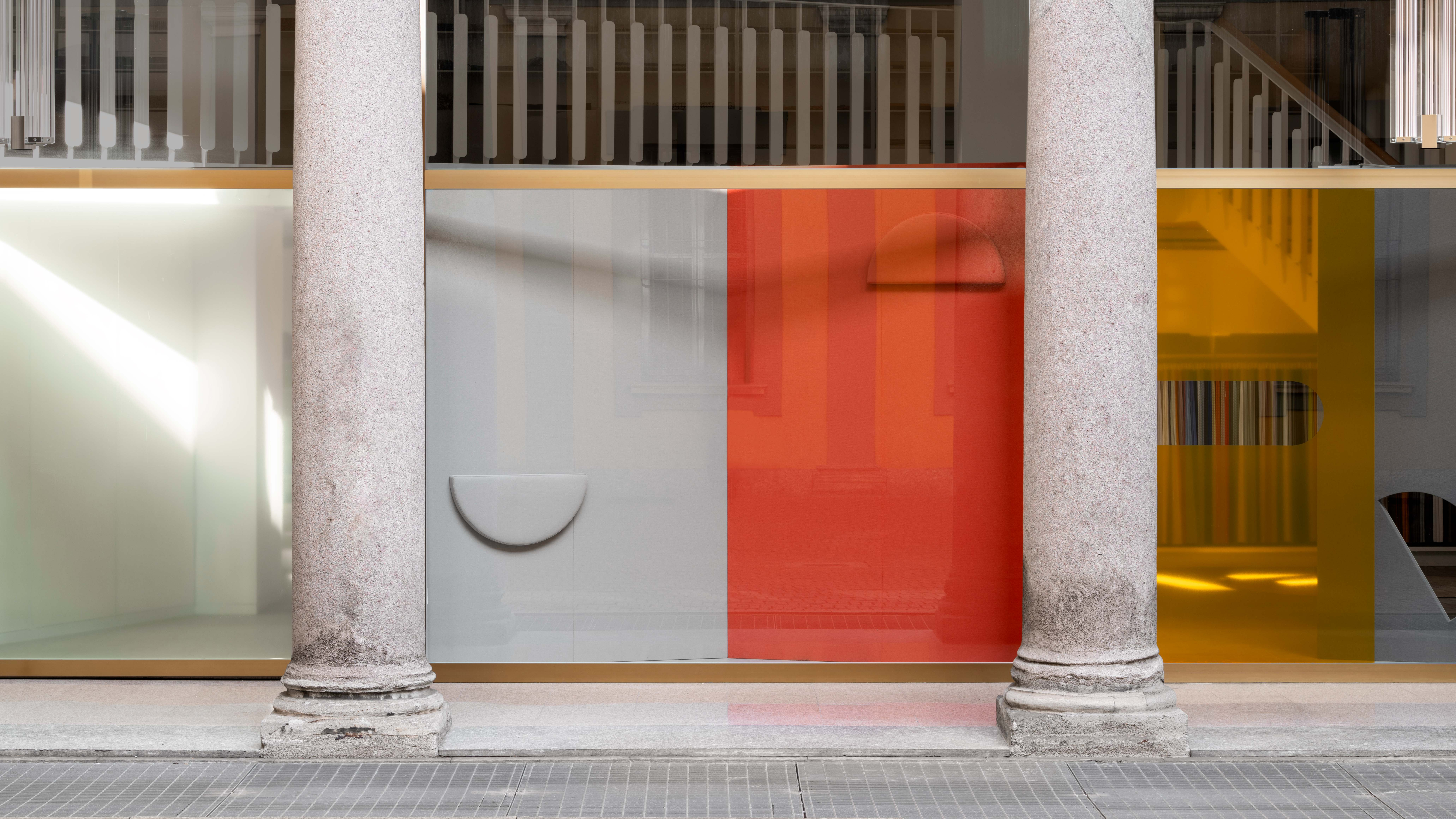 Kapwani Kiwanga transforms Kvadrat’s Milan showroom with a prismatic textile made from ocean waste
The Canada-born artist draws on iridescence in nature to create a dual-toned textile made from ocean-bound plastic
By Ali Morris
-
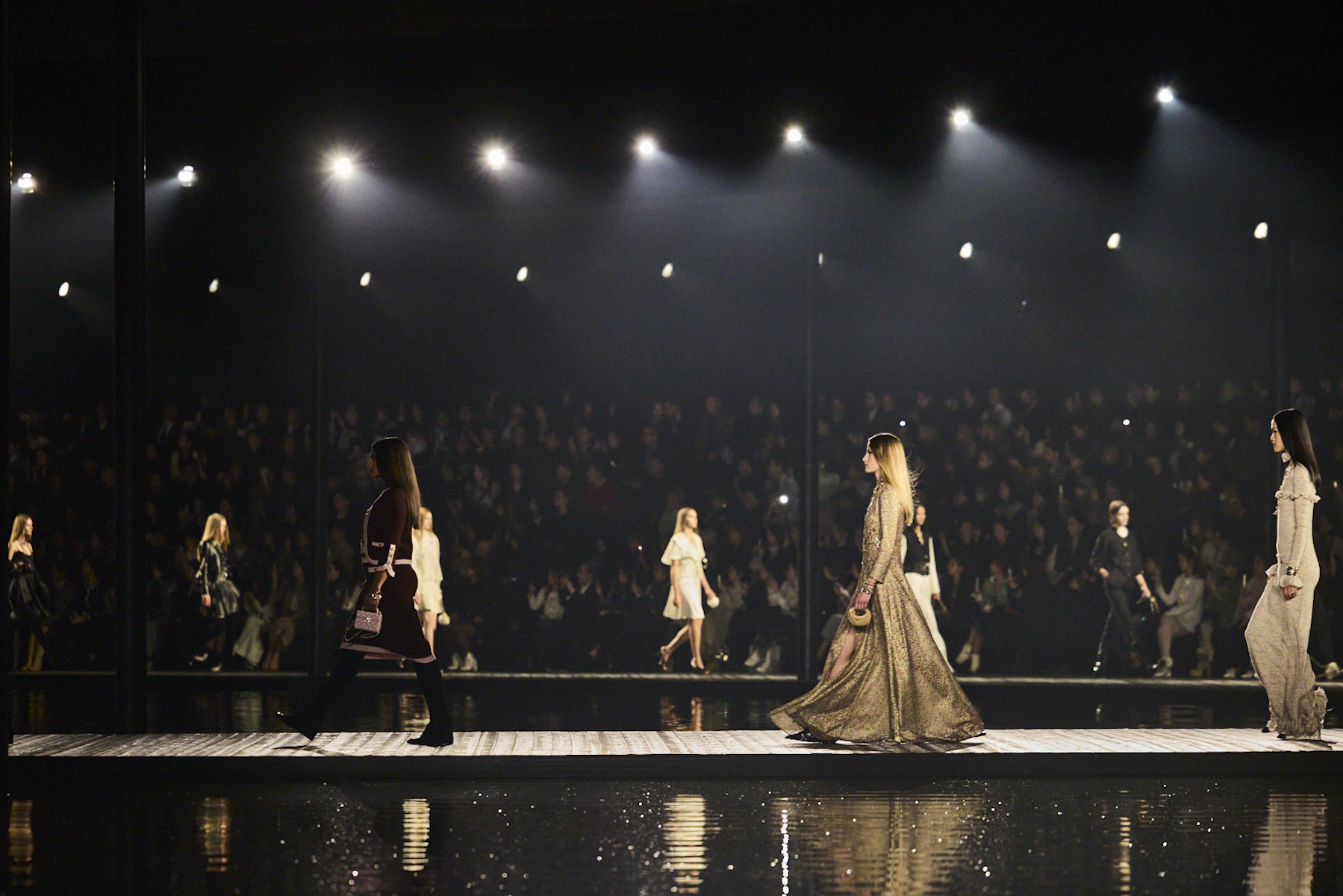 Chanel heads to Hangzhou, China for a poetic Métiers d’Art 2025 show
This evening in China (3 December 2024), Chanel travelled to Hangzhou’s much-mythologised West Lake, a Unesco World Heritage site, for a show that highlighted the extraordinary craft of the house’s artisans
By Jack Moss
-
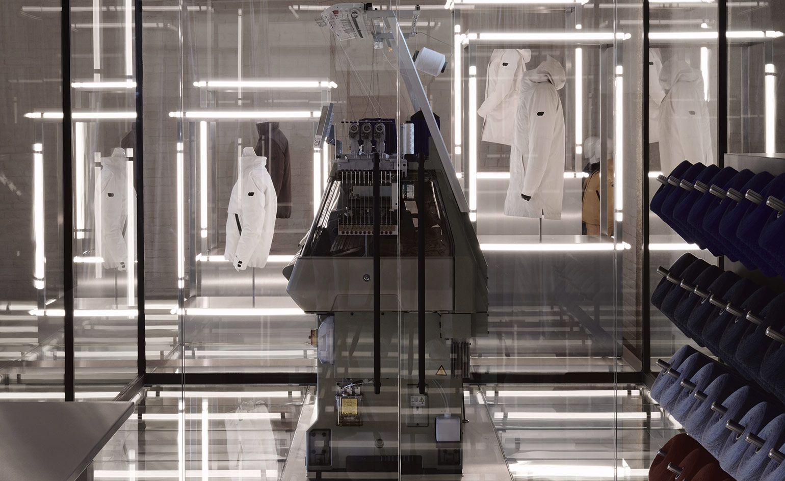 AlphaTauri’s Salzburg HQ is a science fiction fantasy
Browse in-store, buy online: the future-focused mentality of AlphaTauri
By Simon Mills
-
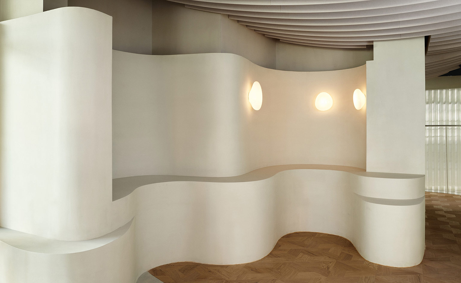 Water inspires Holzweiler’s Snøhetta-designed Oslo flagship
Holzweiler Platz, the new retail destination of fashion brand Holzweiler in Oslo, is designed by architects Snøhetta as a naturalistic space that unites fashion, art and food
By Laura Hawkins
-
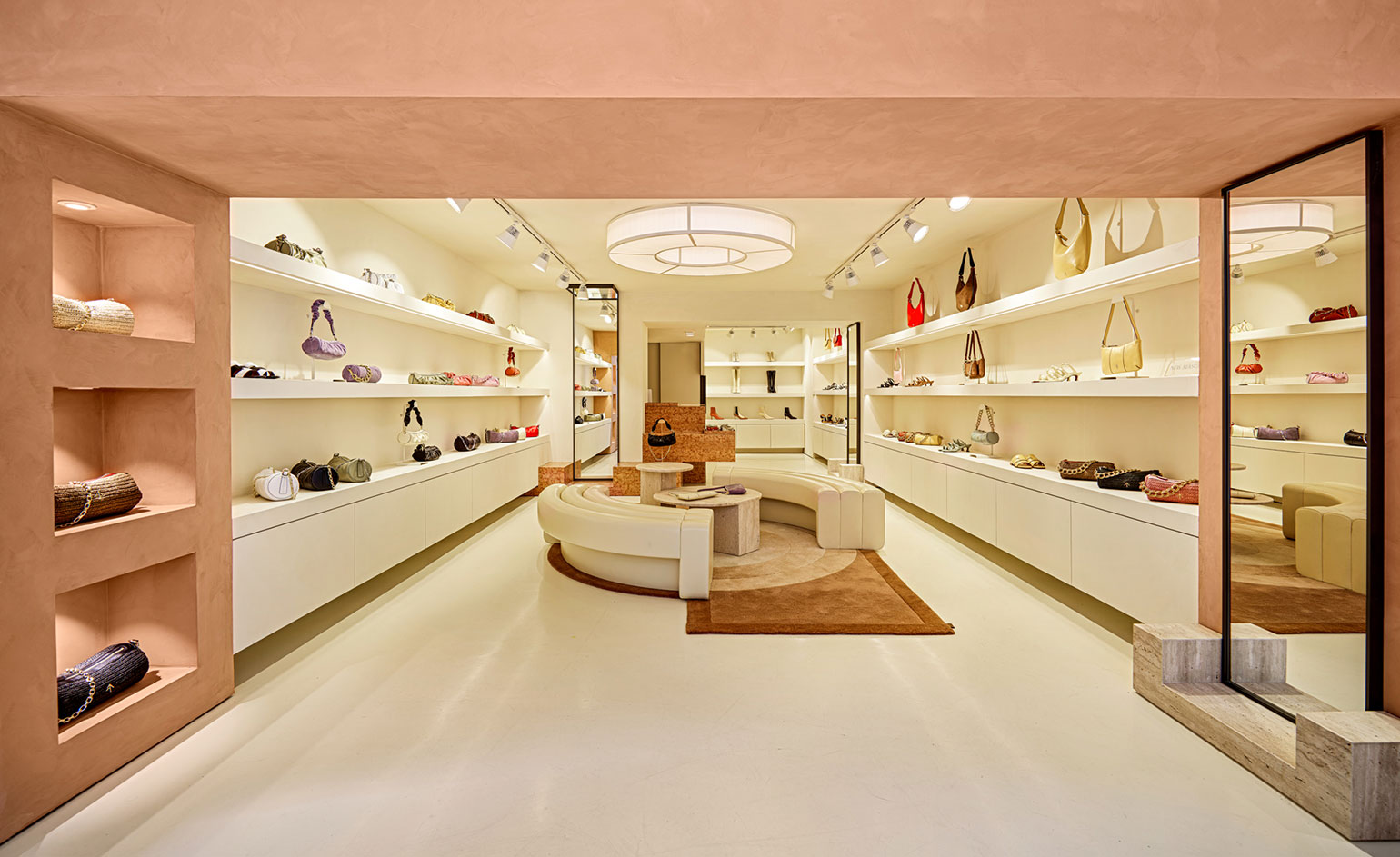 Manu Atelier's first boutique nods to Le Corbusier in Istanbul
The cult Istanbul-based label introduces bold, sculptural expressionism into this first bricks and mortar store
By Laura Hawkins
-
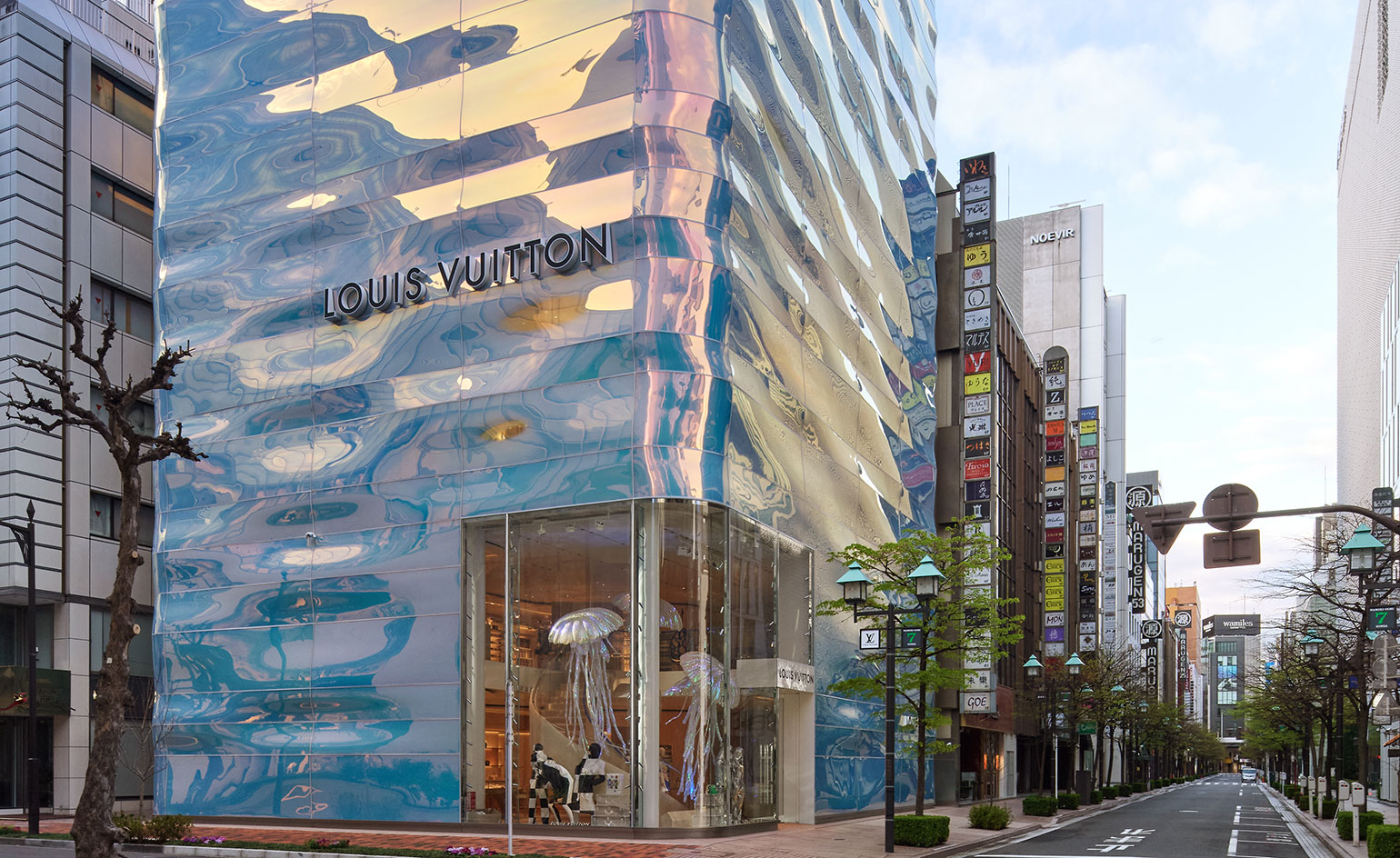 Louis Vuitton's Ginza Namiki flagship evokes a rippling pillar of water
Japanese architect Jun Aoki creates a water-like facade for Louis Vuitton's Ginza Namiki Tokyo flagship
By Danielle Demetriou
-
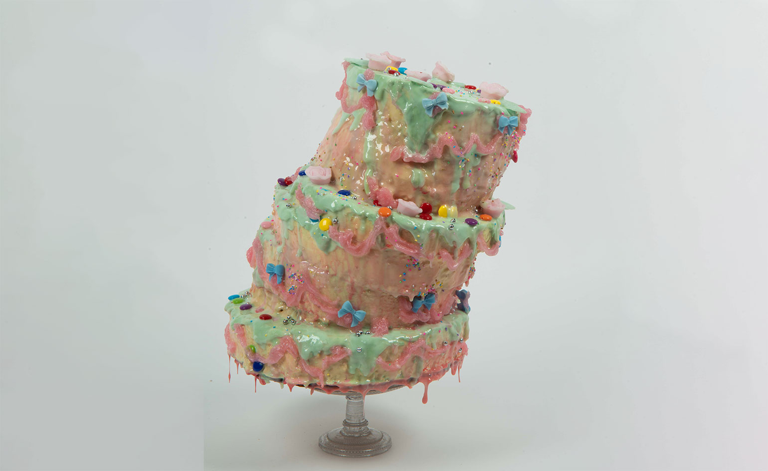 Alternative retail websites for fashionable festive gifting
Look to luxury etailers Rêve En Vert, APOC Store and Doda the Store, Aspect and Zero-Living for feel-good gifting options that support emerging creatives and artists, and have a sustainability-focused mindset
By Laura Hawkins
-
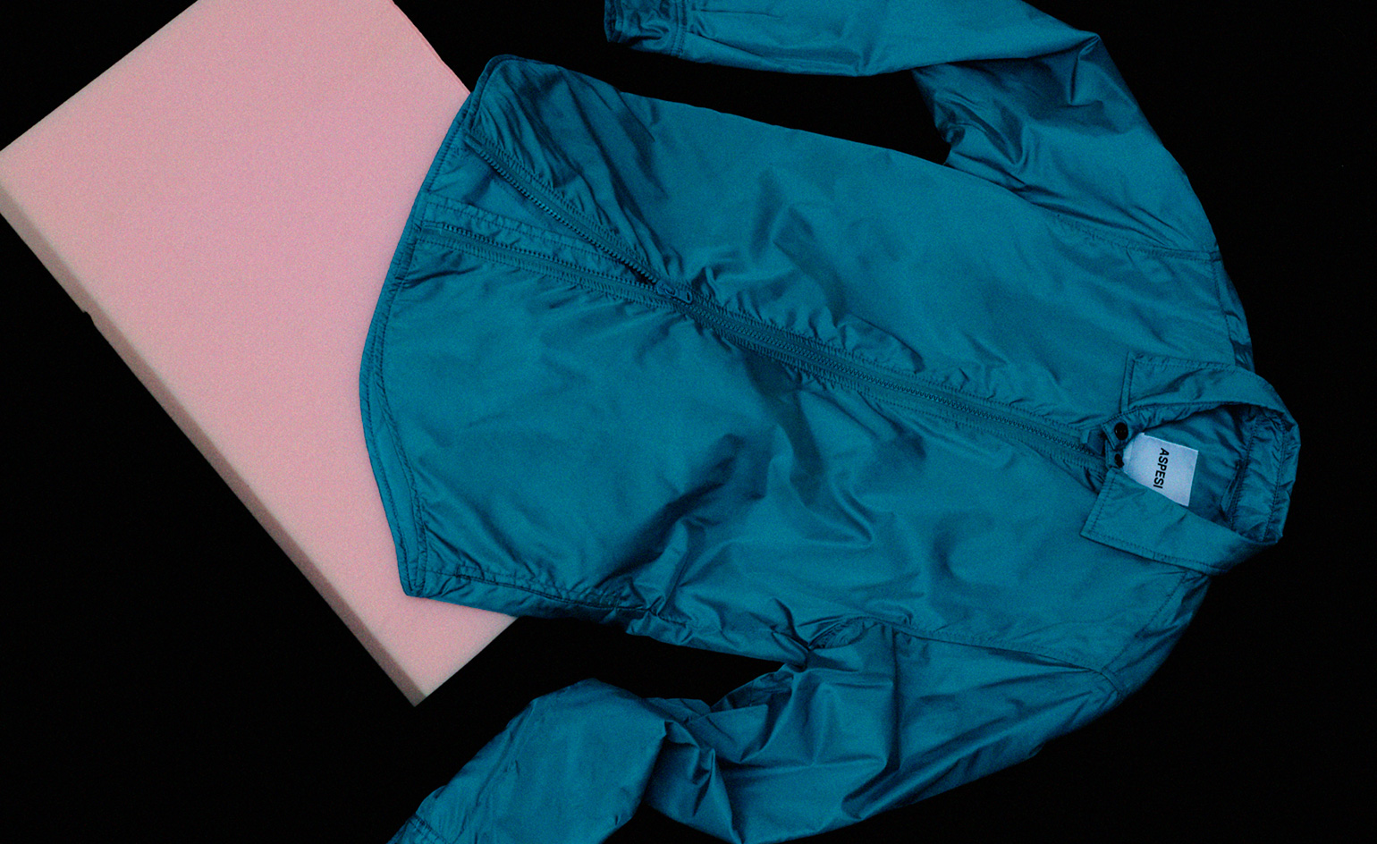 Aspesi’s upcycled shirt is a winter wardrobe staple
The Italian brand's Shirt-Jacket 13 silhouette is well padded with eco-credentials
By Laura Hawkins
-
 David Chipperfield designs Furla's new flagship in Milan's historic Piazza Duomo
Gio Ponti, Vico Magistretti and Achille Castiglione inspire the brand's newest Milan boutique
By Laura Hawkins