‘Jil Sander: Present Tense’ opens in Frankfurt
Today, Uniqlo and Jil Sander announced it is bringing back +J, the lauded collaboration between the Japanese company and German designer, which ran from 2009-2011, to the joy of all wardrobe minimalists. +J is set to relaunch this winter, and in celebration of the news, here we revisit a 2017 Q+A with Sander and Nick Vinson, centred around the opening of her first solo show, ‘Jil Sander: Present Tense’, at the Museum Angewandte Kunst in Frankfurt.
Nick Vinson: Why did you choose to put on this exhibition?
Jil Sander: My archive was not very organised, and an exhibition deadline was a great way to make me speed up the archive revision.
How long have you been working on it?
About 18 months.
What would you say are your design principles?
Innovative quality materials, interesting proportions, perfection in details, energising shapes and a truly three-dimensional execution.
What is Jil Sander’s concept of purism?
The desire to capture the essence of the modern moment as it unfolds season after season. Purism to me means leaving behind unnecessary historical baggage, decorations, conventions, while concentrating on truly contemporary shapes and materials. I always wanted my designs to convey a readiness and openness towards the future.
People may be surprised to learn there has always been room in your life for the baroque. How is your personal taste different from the way you express opulence in your work?
As a fashion designer I tried to do justice to individual proportions by diversifying my collections and breaking them down to multiple possible combinations. The same thing happens when I have to choose the interior design for a building. The house I live in in Hamburg was built in the historicist period at the end of the 19th century by Martin Haller. I tried to give it a modern design, but that didn’t work. So I got Renzo Mongiardino to help me. Under his tutelage I learned that all style periods have a purist version of enlightened craftsmanship and choice materials. We chose a Renaissance interior which did justice to the house and created harmony.
When I think of you I think of the perfect white shirt. What is about your shirts that make them so covetable and why are they such an object of obsession?
I have about a hundred white shirts in my wardrobe. On the one hand, the periodical revision of the outlines of the white shirt is a study in shape, workmanship and quality. On the other hand, these revisions are echoes of a changing zeitgeist. You have to refresh a classic like the white shirt all the time.
Whether it’s a white shirt or a double-faced cashmere coat, fabric development has always been an essential element of your work. Why is research and development into yarn and fabric so important?
The shape and overall look of a piece of clothing is, to a great extent, a function of the fabric. I was interested in materials which lend themselves to a sculptural use. It helps if a fabric has character, a surprising lightness or even a distinct weight. If you want to create new shapes, to start with the material is a great way to get inspired.
Everything I own from you has a special label that reads ‘Tailor Made’. Why is construction so integral to a Jil Sander garment?
If you want to avoid clothes that just cling to the body, you need sartorial construction. This includes the development of patterns, innovative inlay and fine-tuning through repeated fitting. The result will be an autonomous shape that moves in dynamic harmony with the body.
You once said you had a marriage of aesthetics with your architect Michael Gabellini. This exhibition celebrates your creative collaboration with him, as well as with photographers like Peter Lindbergh, Irving Penn, David Sims and Craig McDean, sound artist Frédéric Sanchez and designers like Fabien Baron, Ezra Petronio and Peter Schmidt, who worked with you on your logo and perfume bottles. How do you choose them and what is the collaborative process like?
I like to collaborate with people whose creative work I find interesting. The collaboration itself is a process. You need to find a common language.
The last time I saw you we spoke about your garden in the north of Germany; your exhibition covers aesthetics, material and form of fashion and product design, architecture and garden art. Tell me about working with Penelope Hobhouse on that.
I was inspired by the famous Sissinghurst rose gardens. Our garden project encompassed the design of the surrounding landscape. It is an attempt to bridge the concept of the protected Renaissance theme garden and the English idea of a democratic landscape.

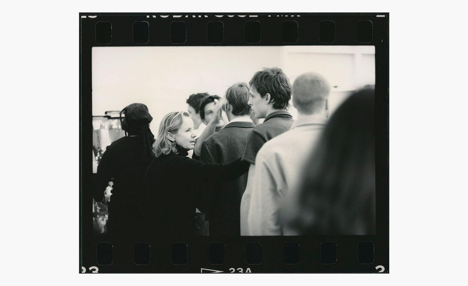
Jil Sander campaign S/S 1996.
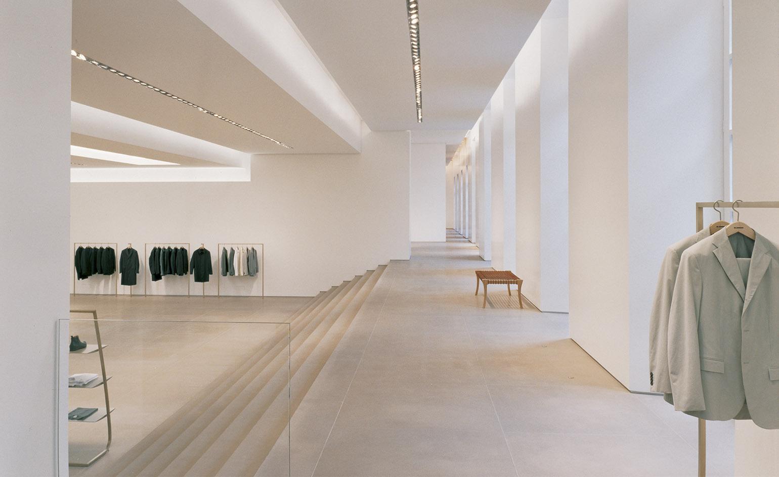
Jil Sander showroom, Milan, 2000.
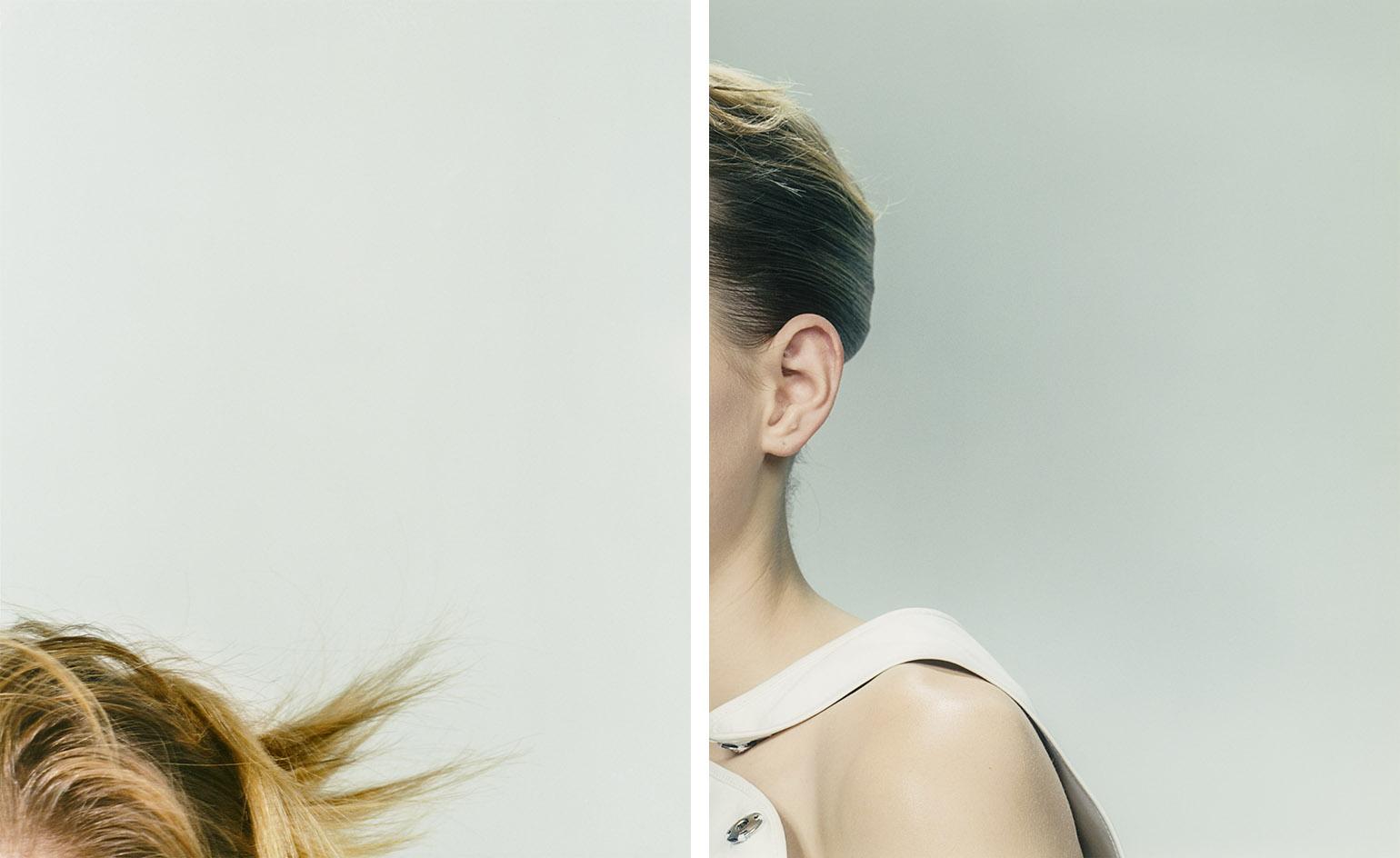
Jil Sander campaign A/W 1996.
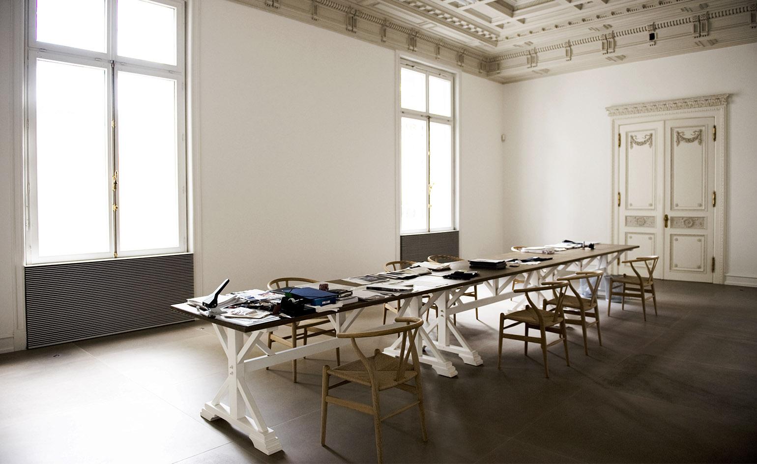
Jil Sander showroom, Milan
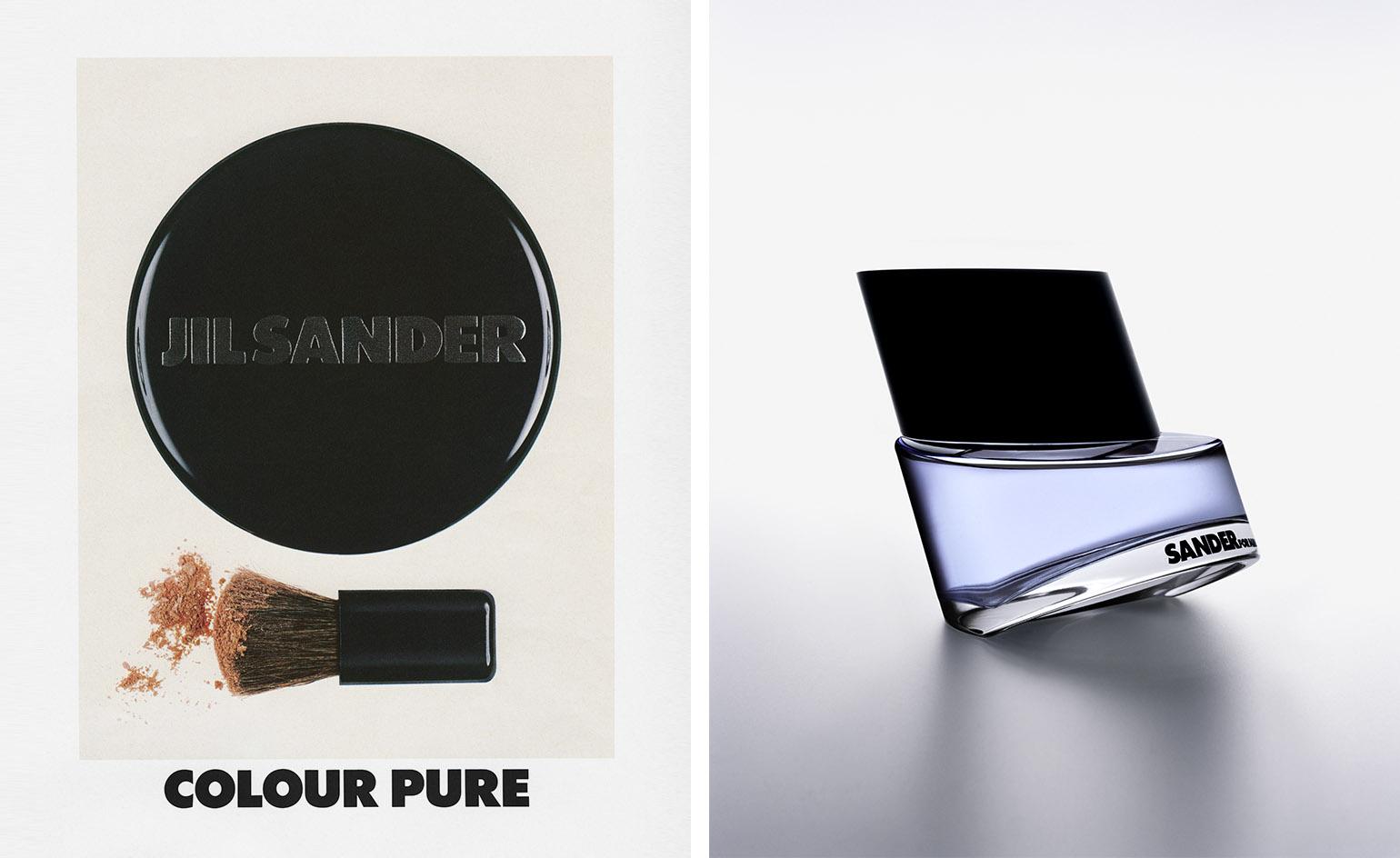
Left, Jil Sander ’Colour Pure’ cosmetic campaign for Women, 1985. Right, Jil Sander cosmetic campaign for Men, 1999.
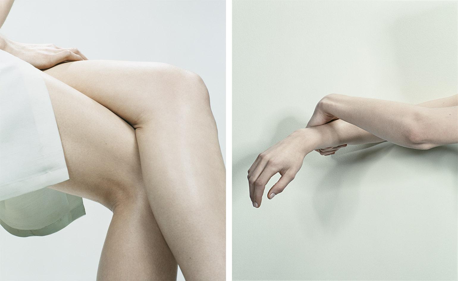
Jil Sander campaign A/W 1996.
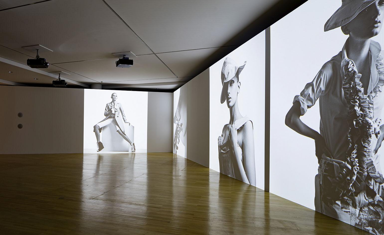
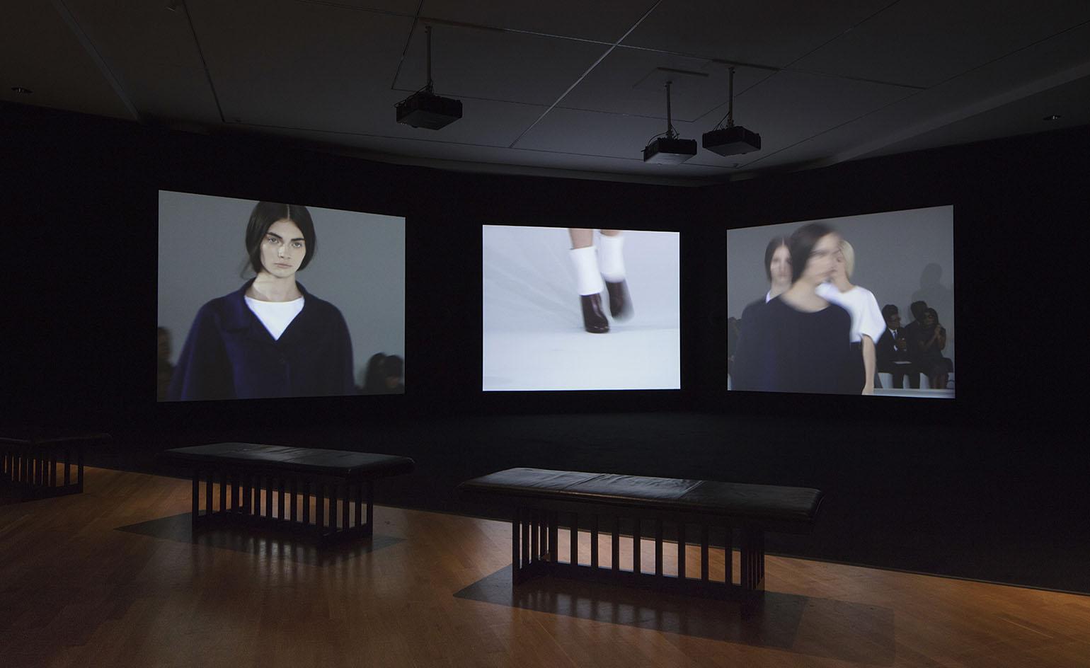
Installation image of 'Jil Sander Present Tense'.
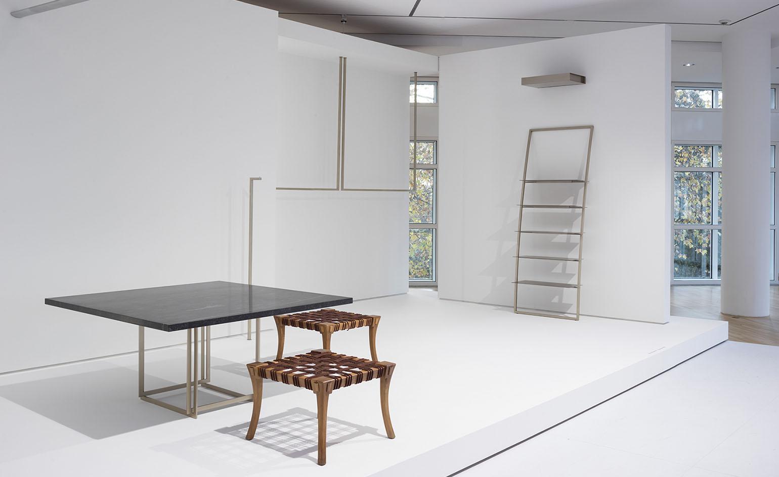
Installation image of 'Jil Sander Present Tense'.
Installation image of 'Jil Sander Present Tense'.
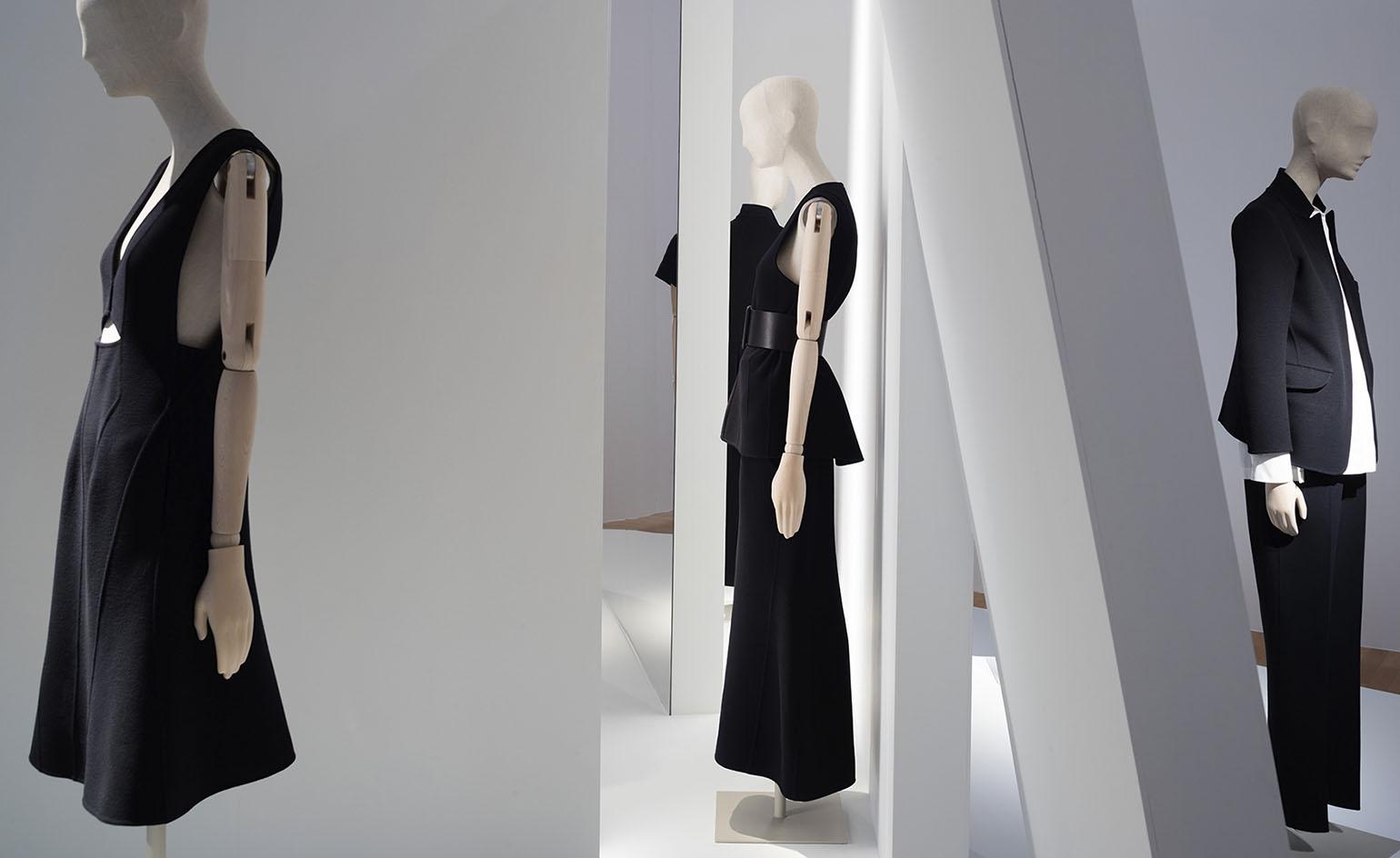
Installation image of 'Jil Sander Present Tense'
INFORMATION
‘Jil Sander: Present Tense’ is on view until 6 May 2018. For more information, visit the Museum Angewandte Kunst website
ADDRESS
Museum Angewandte Kunst
Schaumainkai 17
60594 Frankfurt am Main
Germany
Wallpaper* Newsletter
Receive our daily digest of inspiration, escapism and design stories from around the world direct to your inbox.
Harriet Lloyd-Smith was the Arts Editor of Wallpaper*, responsible for the art pages across digital and print, including profiles, exhibition reviews, and contemporary art collaborations. She started at Wallpaper* in 2017 and has written for leading contemporary art publications, auction houses and arts charities, and lectured on review writing and art journalism. When she’s not writing about art, she’s making her own.
-
 Japan in Milan! See the highlights of Japanese design at Milan Design Week 2025
At Milan Design Week 2025 Japanese craftsmanship was a front runner with an array of projects in the spotlight. Here are some of our highlights
By Danielle Demetriou
-
 Tour the best contemporary tea houses around the world
Celebrate the world’s most unique tea houses, from Melbourne to Stockholm, with a new book by Wallpaper’s Léa Teuscher
By Léa Teuscher
-
 ‘Humour is foundational’: artist Ella Kruglyanskaya on painting as a ‘highly questionable’ pursuit
Ella Kruglyanskaya’s exhibition, ‘Shadows’ at Thomas Dane Gallery, is the first in a series of three this year, with openings in Basel and New York to follow
By Hannah Silver
-
 MK&G’s ‘Glitter’ exhibition: a brilliant world-first tribute to sparkle and spectacle
MK&G’s latest exhibition is a vibrant flurry of sparkles and glitter with a rippling Y2K undercurrent, proving that 'Glitter is so much more than you think it is'
By Hiba Alobaydi
-
 Inside E-WERK Luckenwalde’s ‘Tell Them I Said No’, an art festival at Berlin's former power station
E-WERK Luckenwalde’s two-day art festival was an eclectic mix of performance, workshops, and discussion. Will Jennings reports
By Will Jennings
-
 Alexandra Pirici’s action performance in Berlin is playfully abstract with a desire to address urgent political questions
Artist and choreographer Alexandra Pirici transforms the historic hall of Berlin’s Hamburger Bahnhof into a live action performance and site-specific installation
By Alison Hugill
-
 Cyprien Gaillard on chaos, reorder and excavating a Paris in flux
We interviewed French artist Cyprien Gaillard ahead of his major two-part show, ‘Humpty \ Dumpty’ at Palais de Tokyo and Lafayette Anticipations (until 8 January 2023). Through abandoned clocks, love locks and asbestos, he dissects the human obsession with structural restoration
By Harriet Lloyd-Smith
-
 Year in review: top 10 art interviews of 2022, chosen by Wallpaper* arts editor Harriet Lloyd-Smith
Top 10 art interviews of 2022, as selected by Wallpaper* arts editor Harriet Lloyd-Smith, summing up another dramatic year in the art world
By Harriet Lloyd-Smith
-
 Yayoi Kusama on love, hope and the power of art
There’s still time to see Yayoi Kusama’s major retrospective at M+, Hong Kong (until 14 May). In our interview, the legendary Japanese artist vows to continue to ‘create art to leave the message of “love forever”’
By Megan C Hills
-
 Antony Gormley interview: ‘We’re at more than a tipping point. We’re in a moment of utter crisis’
We visit the London studio of British sculptor Antony Gormley ahead of his major new show ‘Body Field’ at Xavier Hufkens Brussels
By Harriet Lloyd-Smith
-
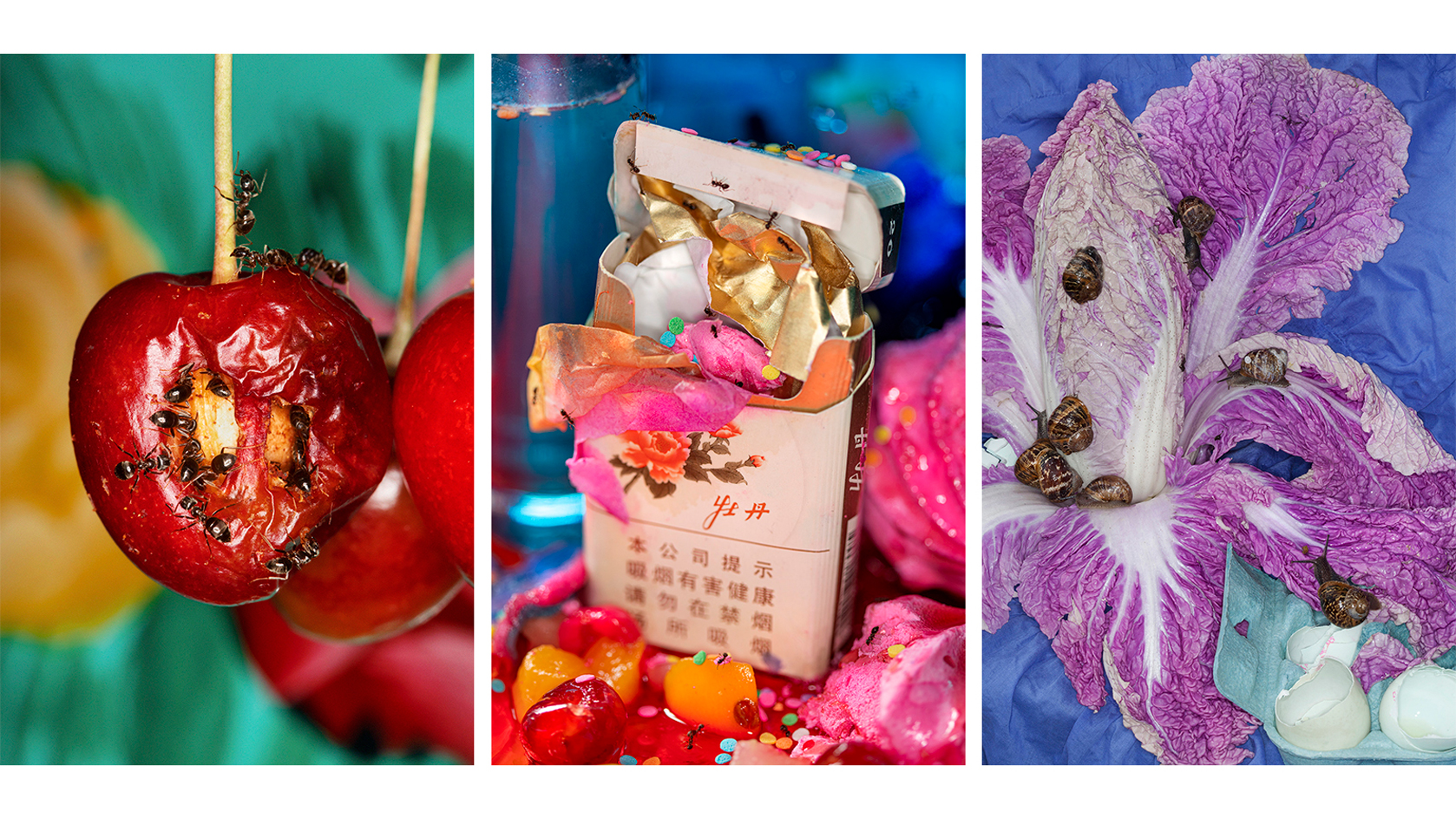 Photographer Maisie Cousins on nostalgia, impulsive making and ‘collecting useless things’
Explore the vision of British artist Maisie Cousins in ‘Through the lens’, our monthly series spotlighting photographers who are Wallpaper* contributors
By Sophie Gladstone