Jonathan Anderson on setting up shop in Soho
JW Anderson has opened its first UK flagship in the west end, cleverly blending glossy new finishes with references to the building’s not-so-polished past
The glowing neon signage that wraps the front of JW Anderson’s newly minted flagship makes it somewhat camouflaged in its gritty Soho surrounds. Perched on the corner of London’s Brewer and Wardour streets, a ‘Las Vegas' amusement arcade sits directly next door while a jumble of tattoo parlours, adult bookshops and numerous Soho walk-ups sit happily next to frozen yoghurt cafes and busy coffee shops in the surrounding streets. It’s only on closer inspection, when you look through the store’s tall glass windows that it becomes apparent that this particular shop is not quite like any of its neighbours.
‘It hasn’t really hit me that we’re finally opening a store after 12 years of doing this,' reflects Jonathan Anderson looking around the space in disbelief. ‘But in a weird way it feels like exactly the right time.'
Anderson, who moved to London in the noughties to attend the London College of Fashion has a longstanding love of the neighbourhood and singled it out as the perfect location for his first bricks and mortar store.
‘When I first moved to London, I would eat in Soho every night,' he recalls. ‘I would go to Maison Bertaux (a famous cake shop on Greek Street) and there was an amazing woman there who would always say, “you can’t sit there” when you tried to sit down, because there was some other customer who always sat there. It actually reminded me of where I grew up in Northern Ireland because you’d be told the same thing in the local pub. So to encounter that in London, which is one of the biggest cities in the world, was kind of comforting.'
The Victorian building that the flagship occupies previously housed two separate stores on its ground floor, one of which was a corner shop, that, according to Anderson, was the ‘go-to place' for late night cigarettes. The stores were divided by a typically narrow Soho entranceway that led to flats above.
The new 1,300 sq ft interior, which is spread across the ground and basement level, is designed by London practice 6a, and like the neighborhood itself, cleverly blends glossy new finishes with references to the building’s not-so-polished past.
The brief, Anderson reveals, was non existent, but having already worked with 6a on his career-defining show, Disobedient Bodies, at The Hepworth in 2017 he was confident that the architects had an innate understanding of what he wanted.
I think as a creative, you naturally become a bit of a control freak, and what I’ve really enjoyed about this is being able to take a step back and enjoy the process
‘What we had done at the Hepworth was kind of a rehearsal,' says architect Tom Emerson, who set up 6a with his wife Stephanie MacDonald after they graduated from the RCA in 2001. ‘We had got to know Jonathan and knew what he liked.'
‘In Mayfair your job is to stand out and to outdo your neighbours, but in Soho you just need to blend in. It’s an area that holds a lot of memories and people are fiercely loyal to it, so you have to do something that joins in and participates in the neighbourhood.'
‘So we started this project by asking, "what happens when you place JW Anderson into the Soho environment and which parts of that environment we interested in keeping?"'.
One of the most notable retained elements is the strip of chequerboard flooring that runs across the store’s ground floor linking with a series of steps that trace the location of the building’s former walk-up hallway. The original tiles and stair were ripped out before they could ask for them to be preserved, Anderson informs, but these are near identical replicas.
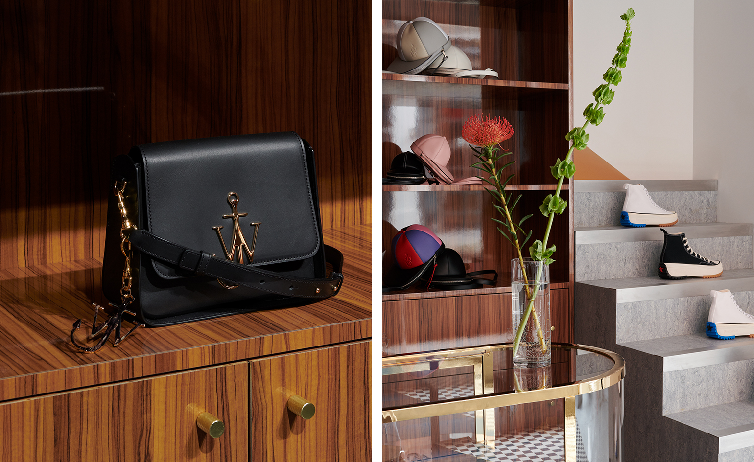
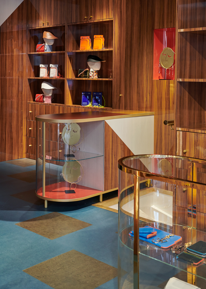
The stairs are now used as display shelves for JW Anderson’s Converse collaboration and the tiles create a dividing line across the interior, clearly indicating where the former shops used to be separated. The Wardour street shop space is bright and lined with glossy aluminium shelving, polished stone floors and immaculate white leather seating. Meanwhile the Brewer Street space where the corner shop used to sit is full of shelving and cabinets made from faux wood formica and brass trim. Blue vinyl tiles line the floor while the original patchy paintwork covers the ceiling.
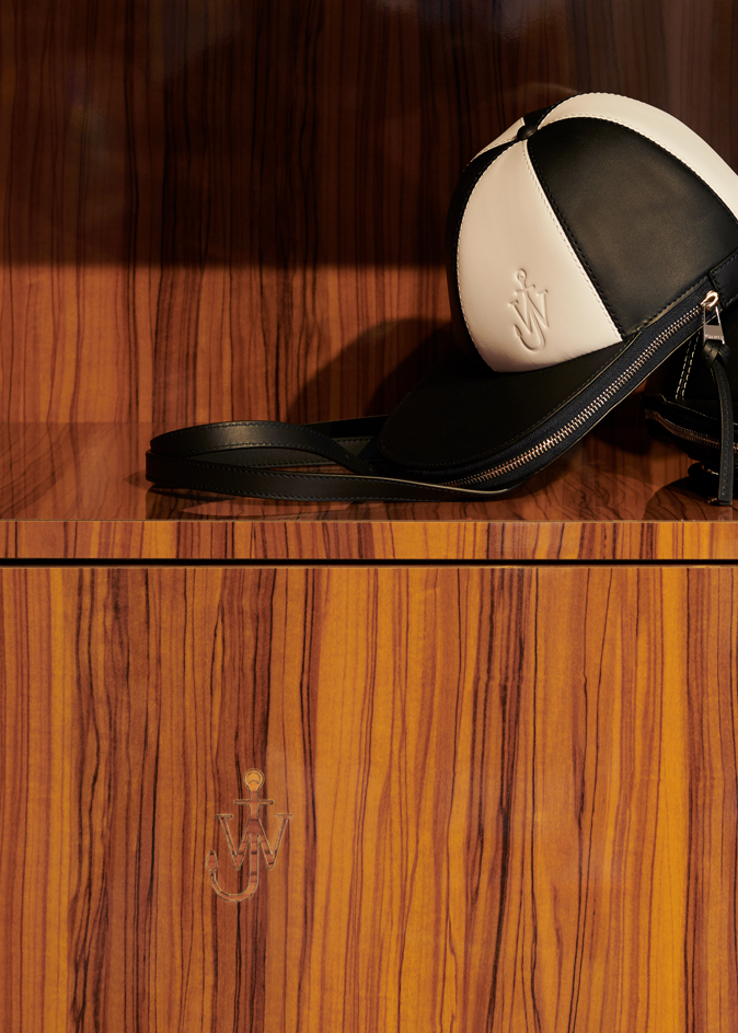
Emerson notes that elements such as the Formica are a nod to the distinctive interiors of local cafes and bars from the 60s, 70s and 80s where faux materials were all the rage. Likewise, the fluted aluminium used on the facade nods to the Italian cafes that once populated the neighbourhood.
‘This abrupt contrast is also present in Jonathan's work, which is also why we wanted to translate that into the interiors,' explains Emerson.
As much as everyone is consumed with the online experience, it's still important to have a physical space
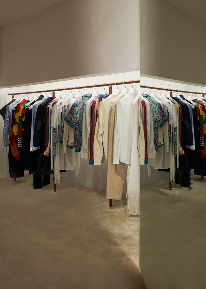
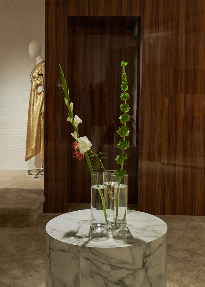
Past the cash desk towards the back of the space, a set of stairs covered in plush cream-colored carpet edged with incongruous strips of bright yellow nosing lead down to a more intimate basement level. Here fabrics hang behind leather-wrapped rails that display JW Anderson’s menswear and womenswear collections. Contrasting with the sumptuous carpet and fine leather detailing, the basement’s original alcove has been refinished with a rough textured plaster that Emerson describes as ‘how you might finish a London basement that you would never expect anyone to see'.
One of Anderson's key references for the project was Kettle's Yard art gallery in Cambridge, which Emerson says is an example of a ‘very British idea of cultured modernism'.
‘You’re discreet but also very knowing,' he explains. ‘There are things you are connected to, but you’re not going to show off about it. Somehow Soho is not unrelated to this idea. So in a sense there wasn’t a brief for this project, but there was a place.'
For Anderson, the collaboration has been a rare chance to take a back seat in the creative journey. ‘I think as a creative, you naturally become a bit of a control freak, and what I’ve really enjoyed about this is being able to take a step back and enjoy the process.'
Going forward the space will be more than just a showroom. JW Anderson will host workshops, readings, exhibitions on ceramics and art, as well as events with the wider Soho neighbourhood. ‘It's going to be a snapshot into the brand,' says Anderson. ‘As much as everyone is consumed with the online experience, it's still important to have a physical space. It's kind of like porn somehow,' he compares with a laugh. ‘Everyone can get porn online but they still come into Soho. Everyone can get fashion online but they will still come into Soho.'
RELATED STORY
INFORMATION
Wallpaper* Newsletter
Receive our daily digest of inspiration, escapism and design stories from around the world direct to your inbox.
ADDRESS
JW Anderson
2 Brewer Street
London, W1F 0SA
Ali Morris is a UK-based editor, writer and creative consultant specialising in design, interiors and architecture. In her 16 years as a design writer, Ali has travelled the world, crafting articles about creative projects, products, places and people for titles such as Dezeen, Wallpaper* and Kinfolk.
-
 Put these emerging artists on your radar
This crop of six new talents is poised to shake up the art world. Get to know them now
By Tianna Williams
-
 Dining at Pyrá feels like a Mediterranean kiss on both cheeks
Designed by House of Dré, this Lonsdale Road addition dishes up an enticing fusion of Greek and Spanish cooking
By Sofia de la Cruz
-
 Creased, crumpled: S/S 2025 menswear is about clothes that have ‘lived a life’
The S/S 2025 menswear collections see designers embrace the creased and the crumpled, conjuring a mood of laidback languor that ran through the season – captured here by photographer Steve Harnacke and stylist Nicola Neri for Wallpaper*
By Jack Moss
-
 The Wallpaper* style team pick their fashion moments of 2024
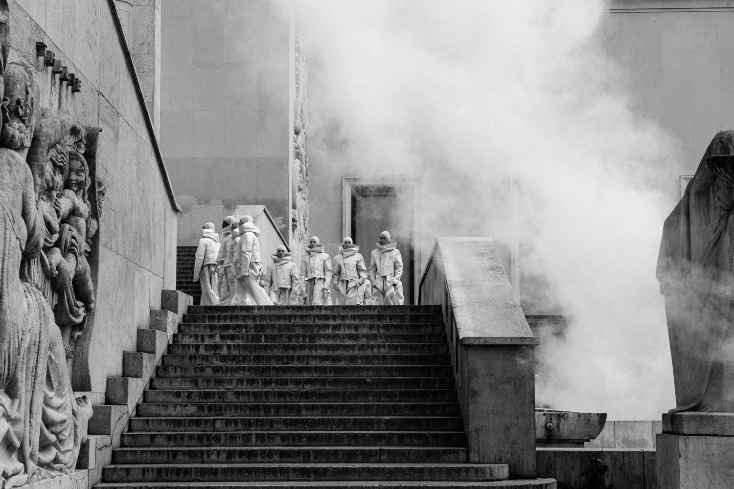
The Wallpaper* style editors reflect on their best fashion moments of 2024, from Rick Owens’ 200-strong Hollywood epic to an Eyes Wide Shut-inspired JW Anderson show, and a slicked-back beauty look at Saint Laurent
By Jack Moss
-
 Giant cats, Madonna wigs, pints of Guinness: seven objects that tell the story of fashion in 2024
These objects tell an unconventional story of style in 2024, a year when the ephemera that populated designers’ universes was as intriguing as the collections themselves
By Jack Moss
-
 Loafer bags to sock shoes, 2024 was all about the mashed-up accessory
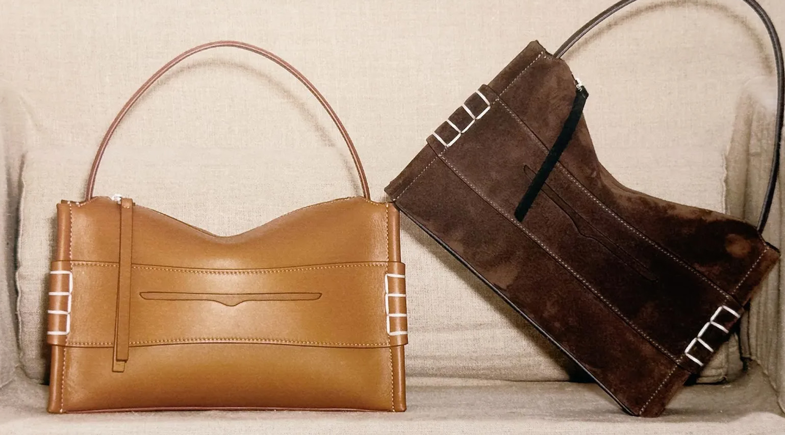
Wallpaper* fashion features editor Jack Moss reflects on the rise of the surreal hybrid accessory in 2024, a trend which reflects the disorientating nature of contemporary living – where nothing is quite what it seems
By Jack Moss
-
 20 years of Dover Street Market’s transporting in-store installations, from giant elephants to soft toys
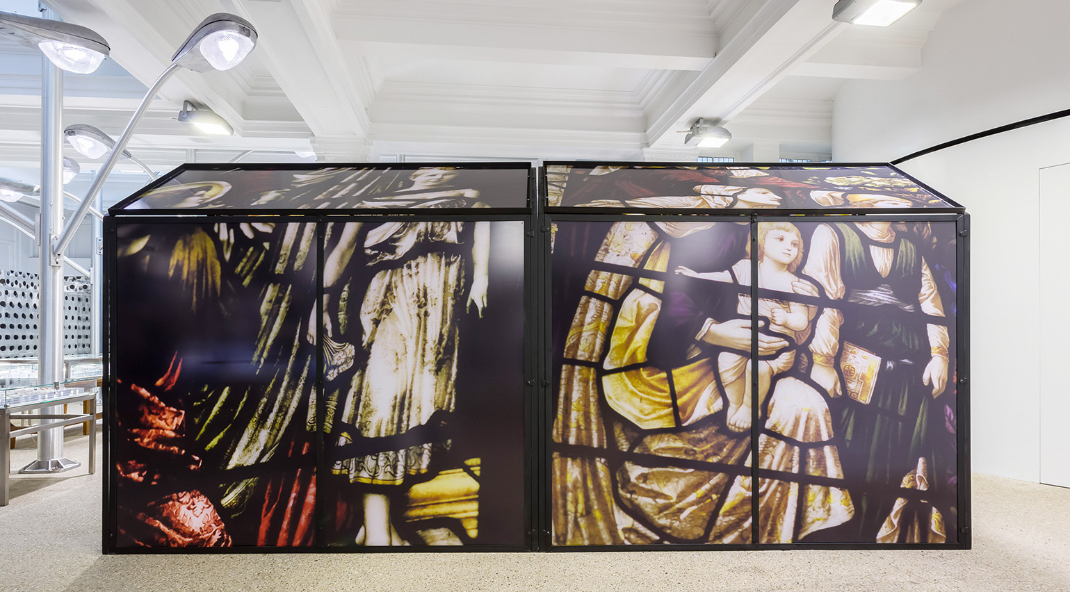
As Dover Street Market, Rei Kawakubo and Adrian Joffe’s radical London concept store, celebrates its 20th anniversary, we look back at ten of its most colourful installations, crafted alongside Simone Rocha, Jonathan Anderson, Martin Parr and more
By Orla Brennan
-
 JW Anderson and Pleasing design a balloon-inspired collection of nail polishes and more
JW Anderson and Pleasing launch an uplifting new capsule collection featuring balloon-inspired metallic nail polishes and a take on the viral rainbow cardigan
By Hannah Tindle
-
 Why the slipper is set to be this season’s definitive men’s shoe
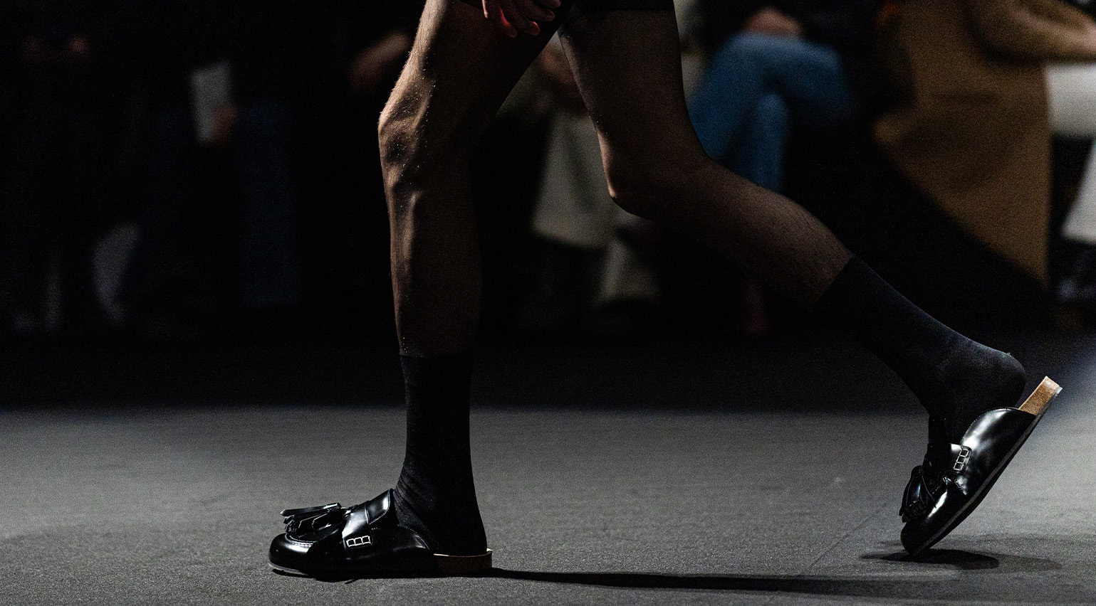
Wallpaper* fashion features editor Jack Moss unpacks the rise of the men’s slipper, which looks set to become this season’s most ubiquitous shoe. Plus, five styles to channel the slipper’s louche elegance in your own wardrobe
By Jack Moss
-
 ‘Her work is a compulsion’: Jonathan Anderson on uniting with artist Christiane Kubrick on a collection inspired by Eyes Wide Shut
A rewatching of Stanley Kubrick’s final movie laid the foundation for JW Anderson’s latest collection, which featured a fantastical collaboration with artist Christiane Kubrick, the director’s wife. Here, Wallpaper* travels to the Kubrick manor in Hertfordshire to capture the collection
By Jack Moss
-
 The Wallpaper* S/S 2025 trend report: ‘A rejection of the derivative and the expected’
Wallpaper* fashion features editor Jack Moss unpacks five trends and takeaways from the S/S 2025 shows, which paid ode to individual style and transformed the everyday
By Jack Moss