London concept store LN-CC peels off its winter coat to reveal its latest Gary Card-conceived skin
There has been much change afoot within the Dalston concept store known as LN-CC - aka Late Night Cameleon Café - that's evolved into a 'conscious chameleon' for its latest style transformation.
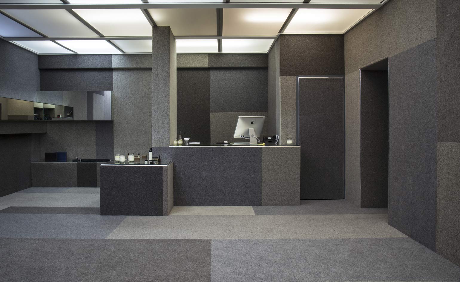
There may still be no actual café to speak of, but five years on, they did decide that it was time to install a till and a 'real change room' as founder/creative director John Skelton deems the new plush carpeted reception space where you can try on and check out your purchases - novel no? 'It was a space that we somehow always lacked,' he smiles, leading the tour.
In February 2014, Milan-based e-commerce specialist The Level Group supplied a much needed cash, infrustracture and logistics injection, pulling the brand-strong, business-weak entity out of administration. Now back on track the purchase has spearheaded this facelift of LN-CC's East London showroom-style store in addition to rebooting the risk-taking retailer's online shoping platform with a new cyber lick of paint.
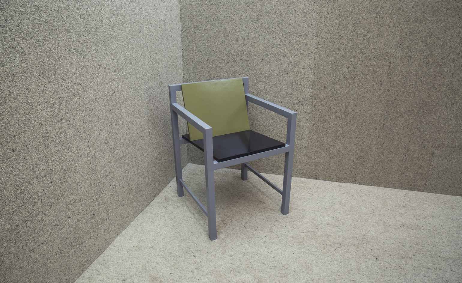
Once inside the former boxing club the trail begins and ends in the aforementioned top-to-toe carpeted transaction room, which designer Gary Card worked on with the Royal family's pile choice Axminster Carpets to lay down a monotone grid that took a week to complete. 'We covered every conceivable part of the room with different tones of carpet,' explains Card, 'like walking inside a colourless, carpeted Mondrian.'
Next door's gallery-esque space remains in tact, albeit under the artistic direction of Alberto Biagetti and his incredible display cases for at least the next six months. Each piece, re-grouped from various galleries, comes with a wooden block sensor that you have to hover over a secret spot to get the wardrobe/cabinet doors to swing open. Biagetti has also taken over the hanging set-up, installing aluminium pipes and fishing wire that suspends the clothes adrift in mid-air. A spongy black 'lounge' that looks like a hard rock, offers a quiet seat for contemplation.
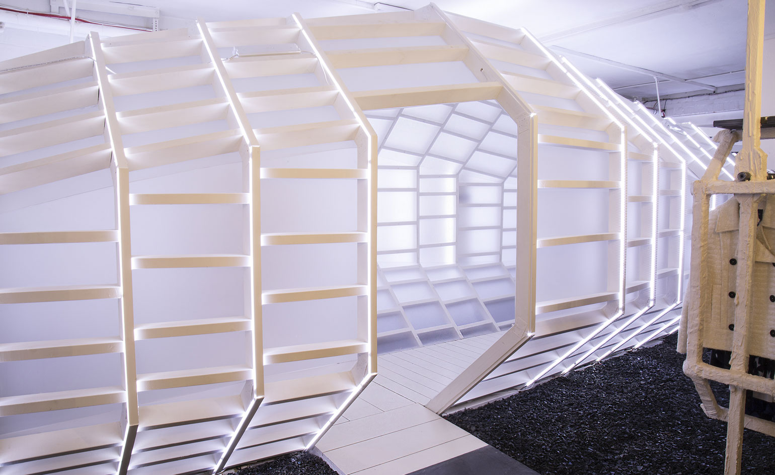
'The [original] design of LN-CC was a career highlight for me,' continues Card, 'so to have the chance to go back and re-interpreted the space was very exciting.' He adds, 'The idea wasn't so much to re-design as it was to re-fabricate. I wanted to retain the look of LN-CC but turn the saturation down on it. We've joked about giving it a baptism of white emulsion, but that was almost the philosophy, a fresh start, a blank canvas, stripping out the warm wood charm of the original and making a starker, more focused space.' Indeed the signature central wooden tunnel has now been white-washed and freshened up with LED lighting. 'It is about updating an iconic space to make it feel more relevant to now,' adds Skelton.
Plans for the new look began back in October and the devil is still painstakingly in the details. It took welders almost three weeks to work out the grid-like rails in the men's room for example. The library now has a steel flooring and cabinets to house their more precious books, which formally tended to 'run away'. In the main womenwear's room, Jesmonite (a quick-drying plastic-based plaster that Card uses in his set installation work) coats rails. On the floor, broken glass bottle chips have been sprayed with black silicon. 'The influences on the space were more material lead this time, experimenting with metals, plastics and plasters,' comments Card. 'The idea of the original space was to change your experience from room to room, this time we wanted to unify it, working with materials that were in harmony with one another,' adding, 'Thomas Houseago was a big inspiration on the plaster room.'
The club space has had a greyscale make-under and a sound surge thanks to a state-of-the-art Koda system, while the bar is stocked with natural versions of party essentials - beer brewed in sea water without sulphates, bio wine and fair trade coffee from Brazil. The toilet has also been given a high-minded revamp. 'People that buy expensive product always want to go to he bathroom so we've had it done properly,' smiles Skelton.
In February 2014, Milan-based e-commerce specialist The Level Group supplied a much needed cash injection, pulling the retail entity out of administration. Now back on track, the purchase has spearheaded this physical facelift in addition to rebooting the risk-taking retailer's online shoping platform.
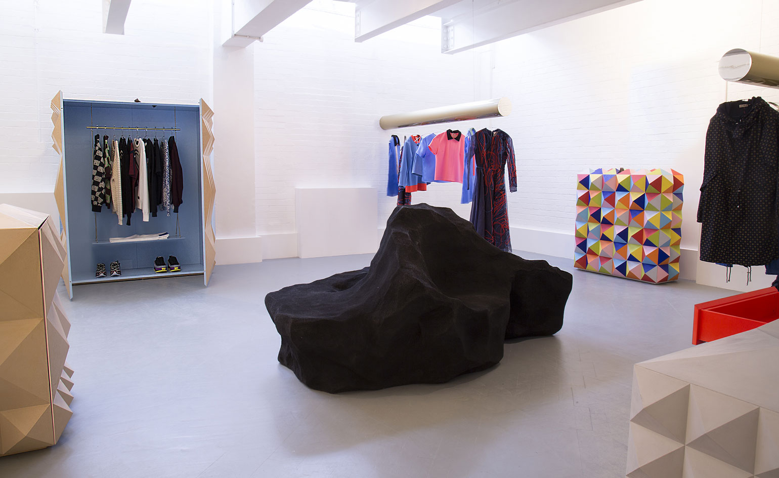
The store's gallery-esque space remains in tact, albeit under the artistic direction of Alberto Biagetti and his incredible display cases. Biagetti has also taken over the hanging set-up, installing aluminium pipes and fishing wire that suspends the clothes adrift in mid-air. A spongy black 'lounge' that looks like a hard rock, offers a quiet seat for contemplation.
'The [original] design of LN-CC was a career highlight for me,' says Card, 'so to have the chance to go back and re-interpreted the space was very exciting'.
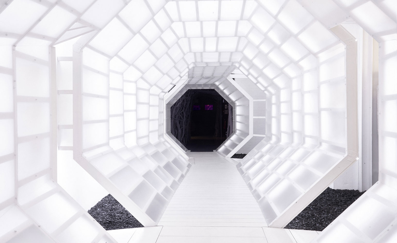
'The idea wasn't so much to re-design as it was to re-fabricate.' he continues. 'I wanted to retain the look of LN-CC but turn the saturation down on it. We've joked about giving it a baptism of white emulsion, but that was almost the philosophy, a fresh start, a blank canvas, stripping out the warm wood charm of the original and making a starker, more focused space'.
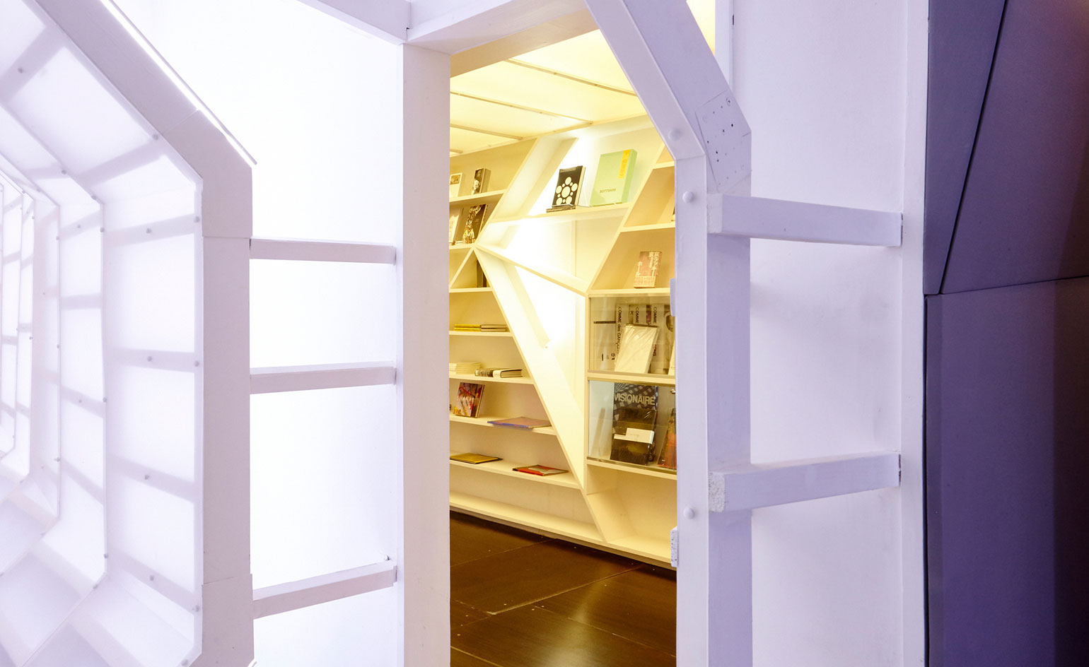
'Indeed the signature central wooden tunnel has now been white-washed and freshened up with LED lighting. 'It is about updating an iconic space to make it feel more relevant to now,' says founder/creative director John Skelton.
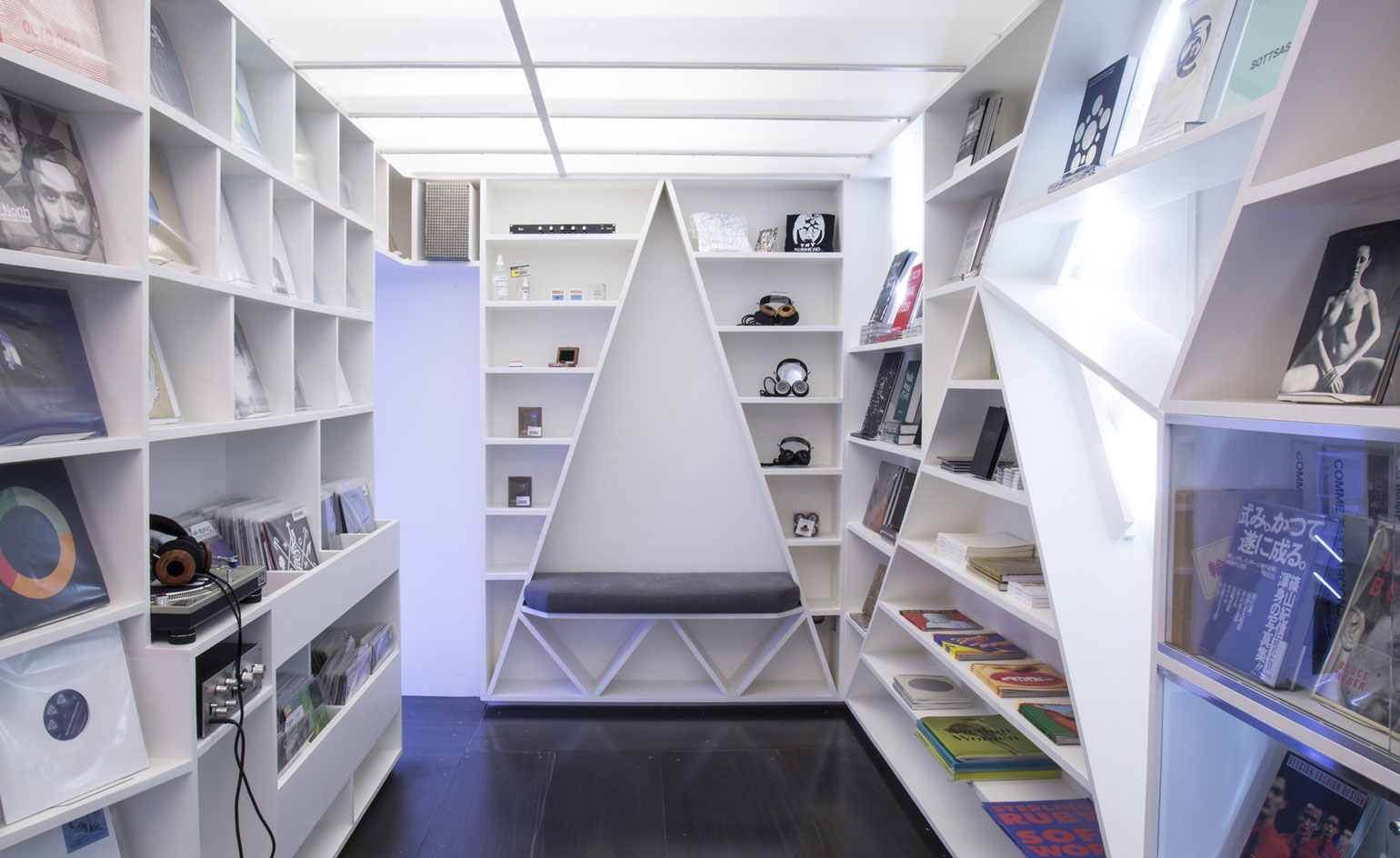
The library also has a new steel flooring and cabinets to house their more precious books, which formally tended to 'run away'.
Wallpaper* Newsletter
Receive our daily digest of inspiration, escapism and design stories from around the world direct to your inbox.
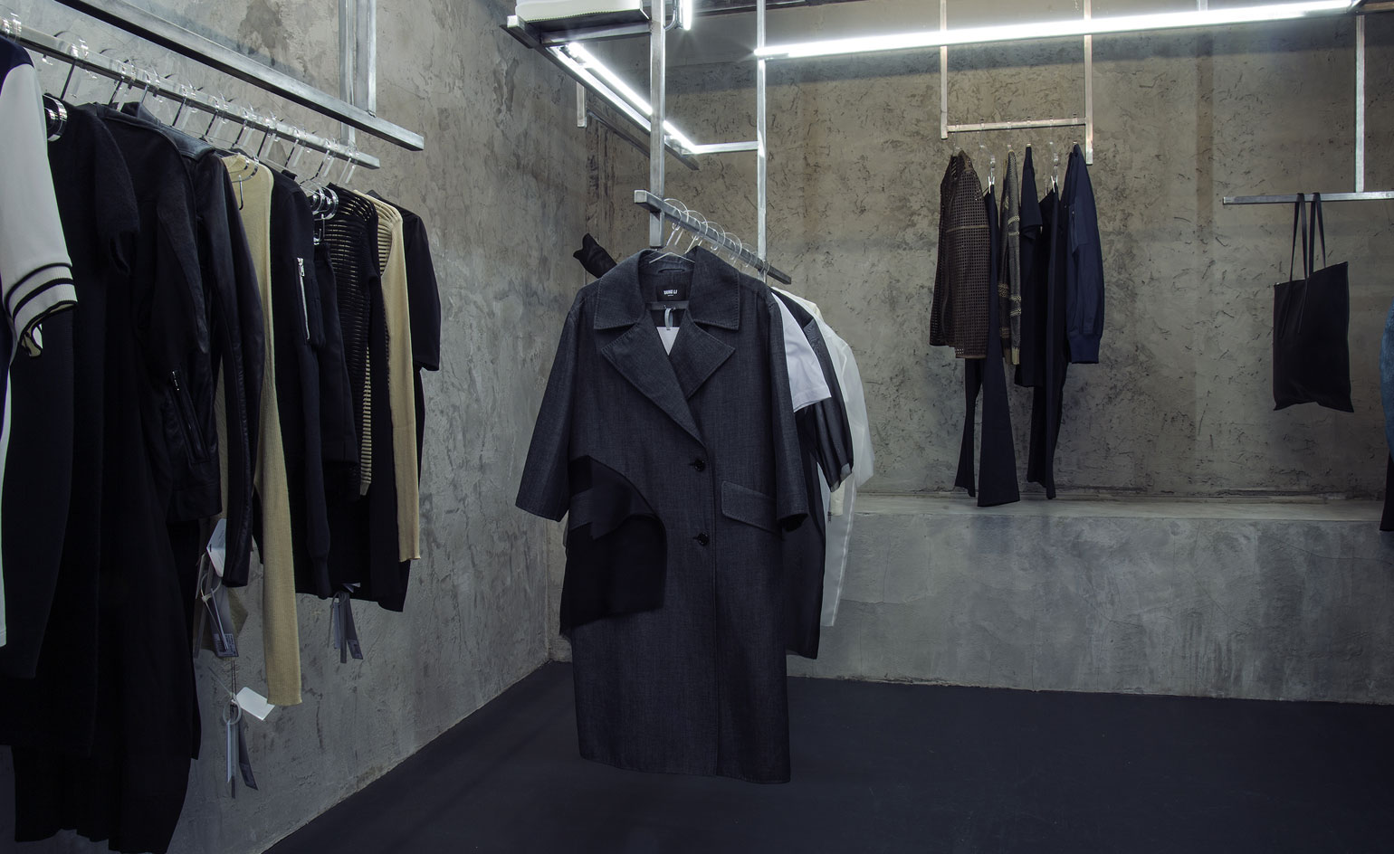
Plans for the new look began back in October and the devil is still painstakingly in the details. It took welders almost three weeks to work out the grid-like rails in the men's room for example.
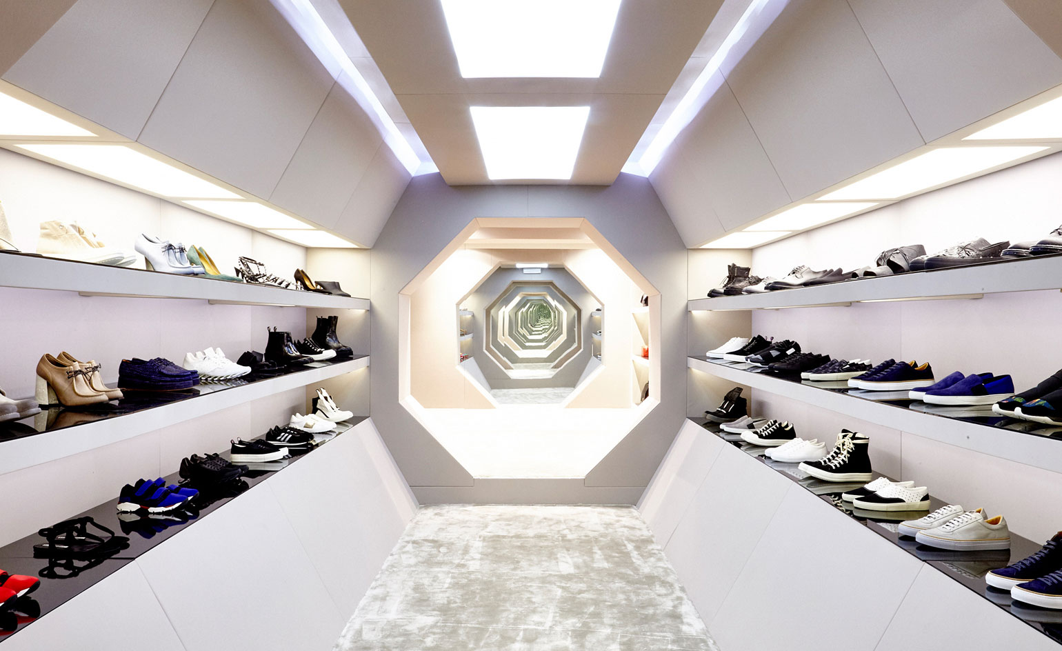
'The influences on the space were more material lead this time, experimenting with metals, plastics and plasters,' comments Card. 'The idea of the original space was to change your experience from room to room, this time we wanted to unify it, working with materials that were in harmony with one another'.
ADDRESS
LN-CC
18 Shacklewell Lane
Dalston, London
-
 Enter the world of Cave Bureau, and its architectural and geological explorations
Nairobi practice Cave Bureau explores architecture’s role in the geological afterlives of colonialism, as part of a team exhibiting at the British pavilion at the Venice Architecture Biennale 2025
By Marwa El Mubark
-
 All-In is the Paris-based label making full-force fashion for main character dressing
Part of our monthly Uprising series, Wallpaper* meets Benjamin Barron and Bror August Vestbø of All-In, the LVMH Prize-nominated label which bases its collections on a riotous cast of characters – real and imagined
By Orla Brennan
-
 Maserati joins forces with Giorgetti for a turbo-charged relationship
Announcing their marriage during Milan Design Week, the brands unveiled a collection, a car and a long term commitment
By Hugo Macdonald
-
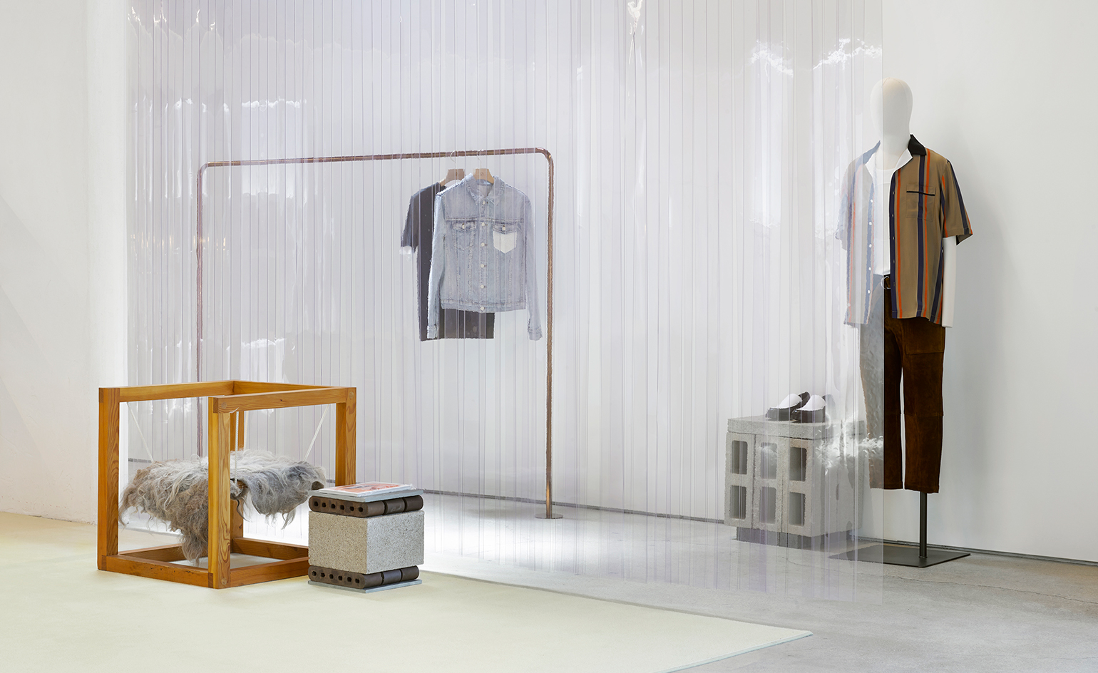 LA confidential: Phillip Lim’s inaugural concept store is a triumphant homecoming
By Ali Morris
-
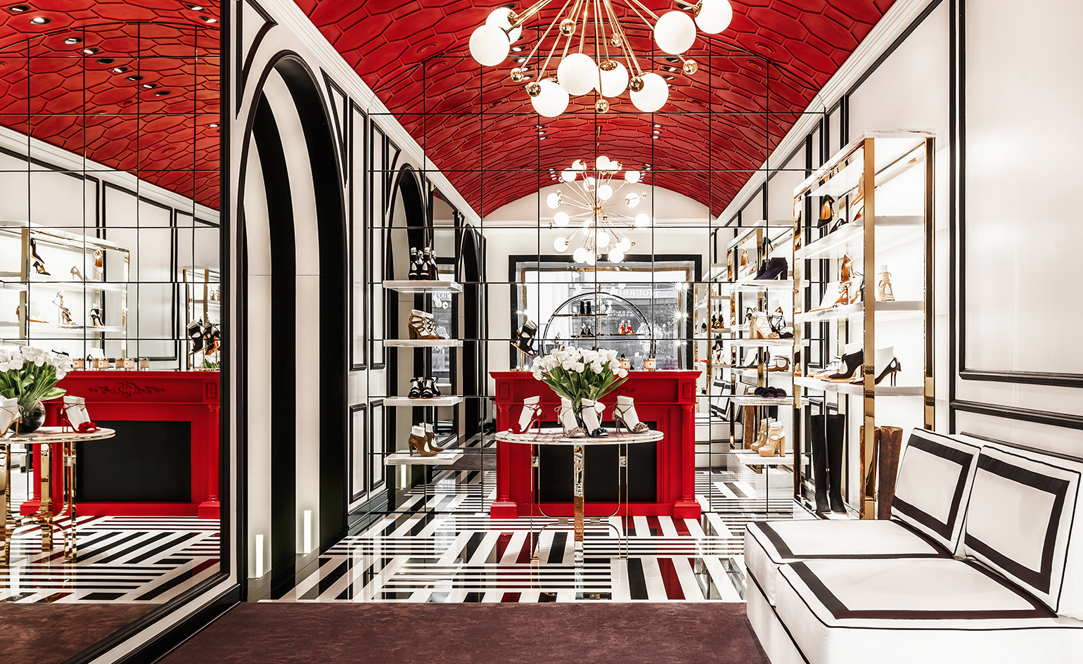 Moscow mule: Aquazzura and Casa Do Passadiço paint the town red
By Ali Morris
-
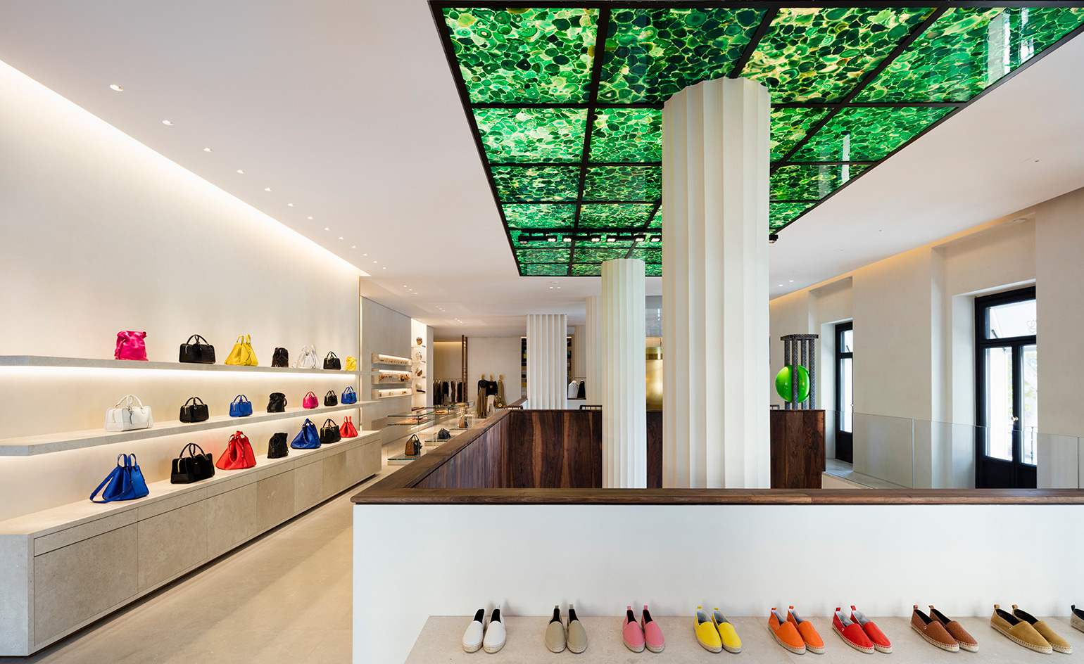 Loewe celebrates its past, present and future with a new flagship in Madrid
By Siska Lyssens
-
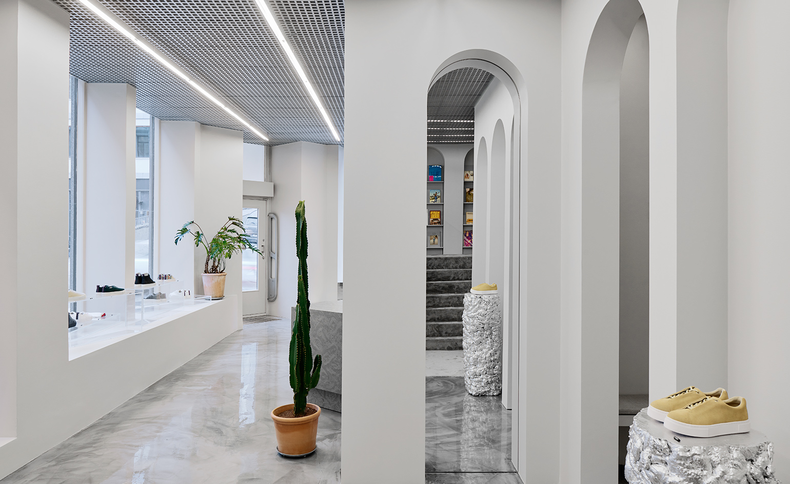 Eytys' striking new Stockholm flagship is an ode to brutalism
By Ali Morris
-
 Leather system: bags of style at Tsatsas’ new Frankfurt showroom
By Yoko Choy
-
 House warming: Want Les Essentiels opens its first global boutique in NY
By Pei-Ru Keh
-
 Hussein Chalayan opens his first flagship in London
By Ali Morris
-
 Carlo Brandelli constructs a new flagship and vision for Kilgour on Savile Row
By Jonathan Bell