Window shopping: looking into the retail vision of luxury e-commerce portal 24 Sèvres
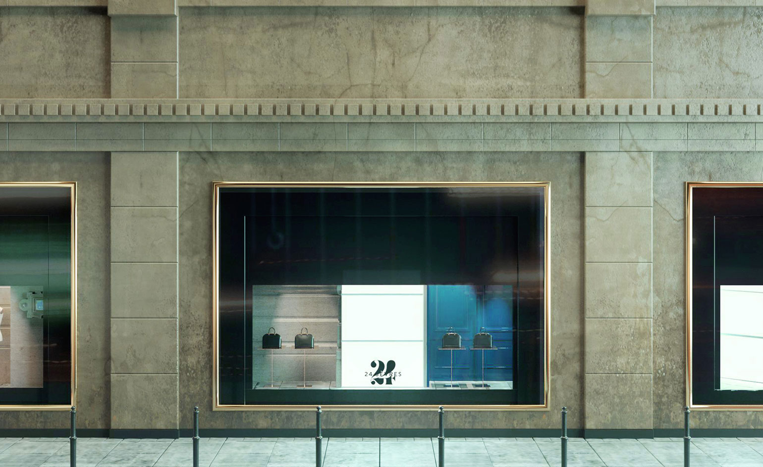
When it comes to the world of e-commerce, ease and speed may tick certain boxes, but rarely does a website translate the experience of physically shopping in a beautifully designed store. Enter the newly launched online portal 24 Sèvres, the LVMH-owned e-commerce venture named after the street location of renowned Parisian store Le Bon Marché.
The website brings the experience of shopping within Le Bon Marché – the first ever multi brand department store, founded in 1838 and revolutionised by the entrepreneur Aristide Boucicaut in 1852 – to a global audience. While e-commerce platforms traditionally aim to render the tropes of print media on the screen, the homepage of 24 Sèvres’ website and smartphone app is imagined as a digital ‘vitrine’.
In Émile Zola’s novel The Ladies Paradise (1883), the ‘series of perspectives’ found at The Ladies’ Paradise department store (itself inspired by Le Bon Marché) are described as beholding ‘endless’ spectacle. Similarly, by adopting a moving image-focused and copy-light approach, 24 Sèvres has bought the eager anticipation and promise associated with window shopping to its own homepage.
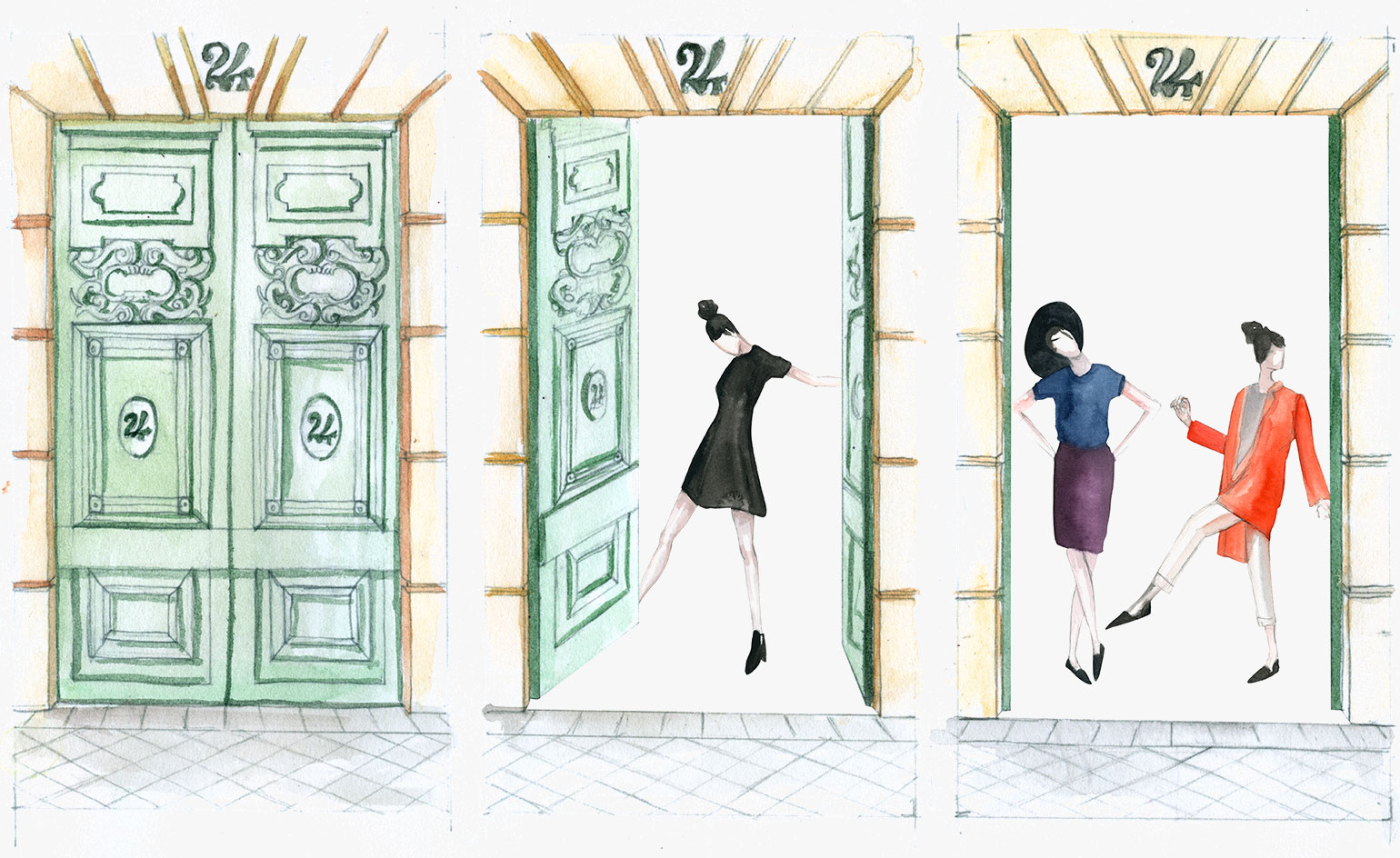
Le Bon Marché was the world's first department store.
Online visitors, like the model who stands in front of a store window on screen – her blouse fluttering in the breeze – can peer inside to admire the pieces in 24 Sèvres’ debut exclusive capsule collection, created in collaboration with Le Bon Marché. The collection features exclusive pieces from 68 international brands, like a Loewe and M/M Paris bag or a pair of velvet mules from Paul Andrew’s debut footwear collection for Salvatore Ferragamo.
Global reach yes, but the website – which has been masterminded by Ian Rogers, chief digital officer of LVMH – retains a truly Parisian outlook (the original Le Bon Marché store is steeped in French design history: its Rue de Sèvres incarnation, which was built in 1869, was expanded in 1872 by Gustave Eiffel). It is the solo online destination to offer Louis Vuitton and Christian Dior, while its visual identity echoes that of a Left Bank apartment.
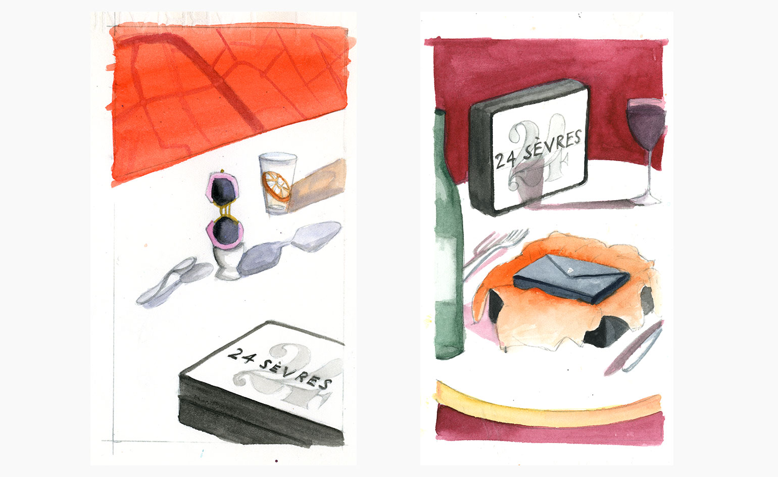
Accessories, so often shot for e-commerce against white or muted backgrounds, have been placed on colourful tiled or weaved timber plinths, while models pose next to coffee tables with flower filled vases, or wooden chairs. The product packaging too has a soupçon of French flair: think a white outer box embossed with the word ‘Paris’ and an arrow pointing to the shopper’s personal initials. Its inner flap features an illustration of Le Bon Marché.
Specific topographical attention to detail is also underscored in sketches of the site’s vitrine mock-ups. These feature instructions emphasising that glossy black Parisian bollards and carved stone street signs should be reimagined in 24 Sèvres' digital window designs, in exact 1:1 ratios of their inspiration. Now that’s what we call window dressing.
24 Sèvres brings the splendour of Parisian department store Le Bon Marché to an online global audience.
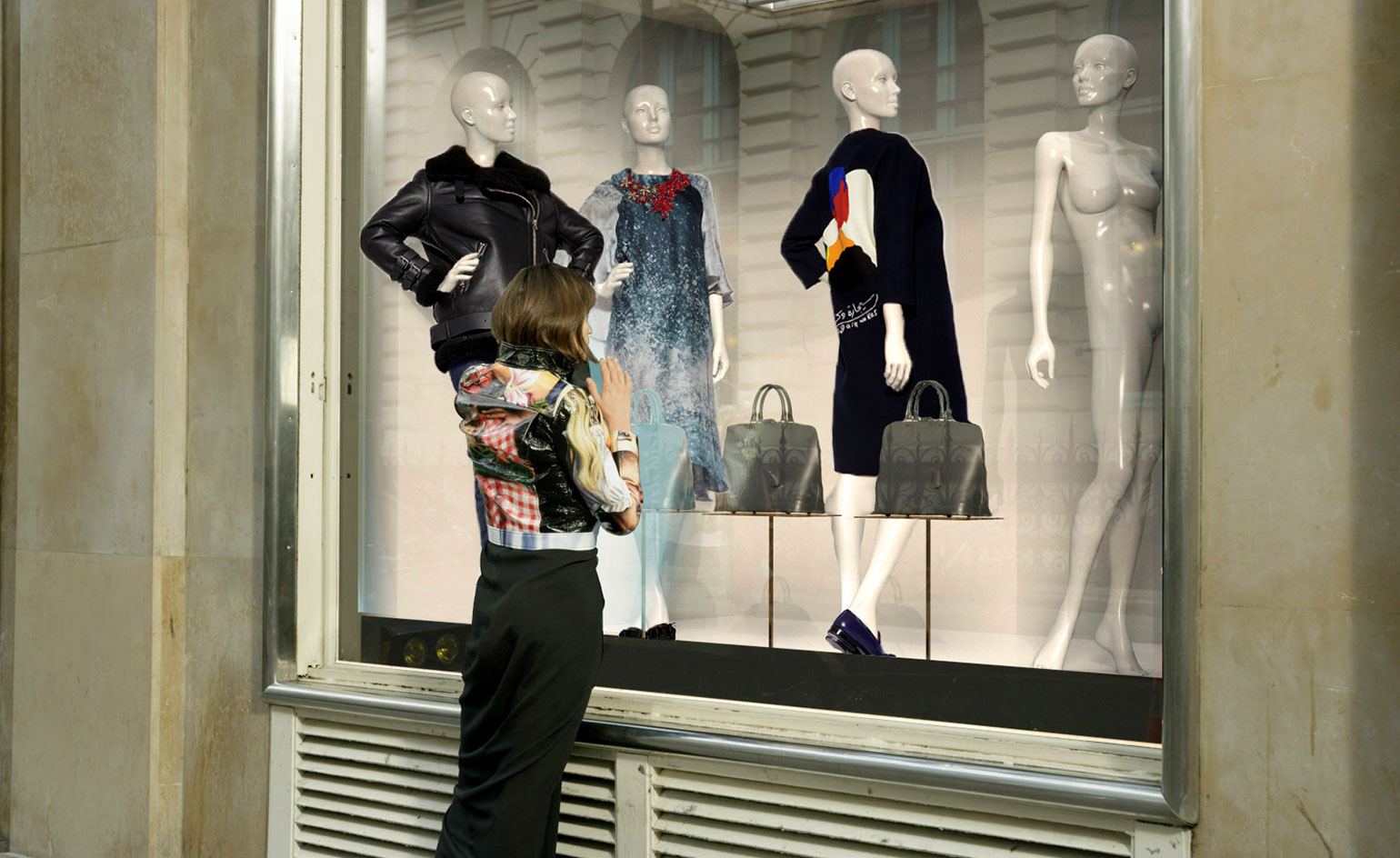
The luxury retailer brings the anticipatory experience of peering through a store window into the online realm
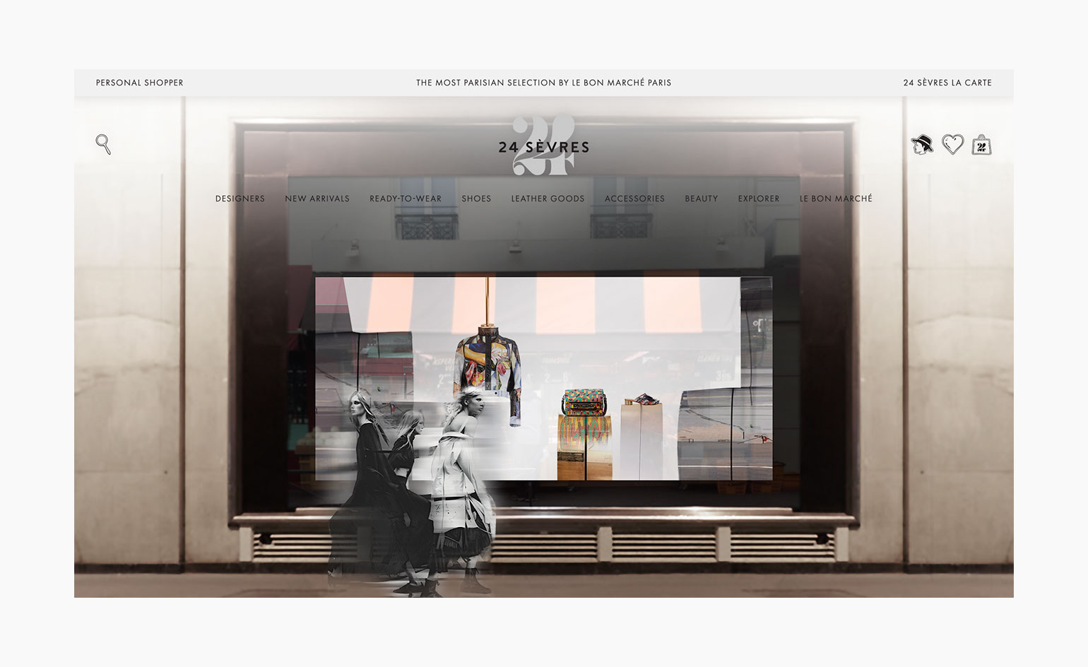
An immersive image-focused shopping experience, 24 Sèvres translates the physical experience of shopping in-store to online, using a series of digital ‘vitrines’
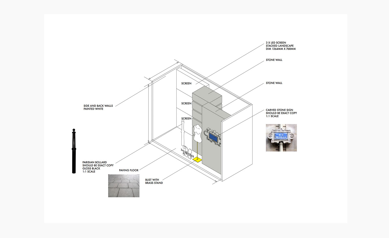
Topographical Left Bank tropes have been translated into the digital presentation of Le Bon Marché
INFORMATION
For more information, visit the 24 Sèvres website
Wallpaper* Newsletter
Receive our daily digest of inspiration, escapism and design stories from around the world direct to your inbox.
-
 The Sialia 45 cruiser is a welcome addition to the new generation of electric boats
Polish shipbuilder Sialia Yachts has launched the Sialia 45, a 14m all-electric cruiser for silent running
By Jonathan Bell
-
 Tokyo design studio We+ transforms microalgae into colours
Could microalgae be the sustainable pigment of the future? A Japanese research project investigates
By Danielle Demetriou
-
 What to see at London Craft Week 2025
With London Craft Week just around the corner, Wallpaper* rounds up the must-see moments from this year’s programme
By Francesca Perry