Mayfair pied-à-terre: Erdem celebrates its 10th anniversary with a debut store on London’s South Audley Street
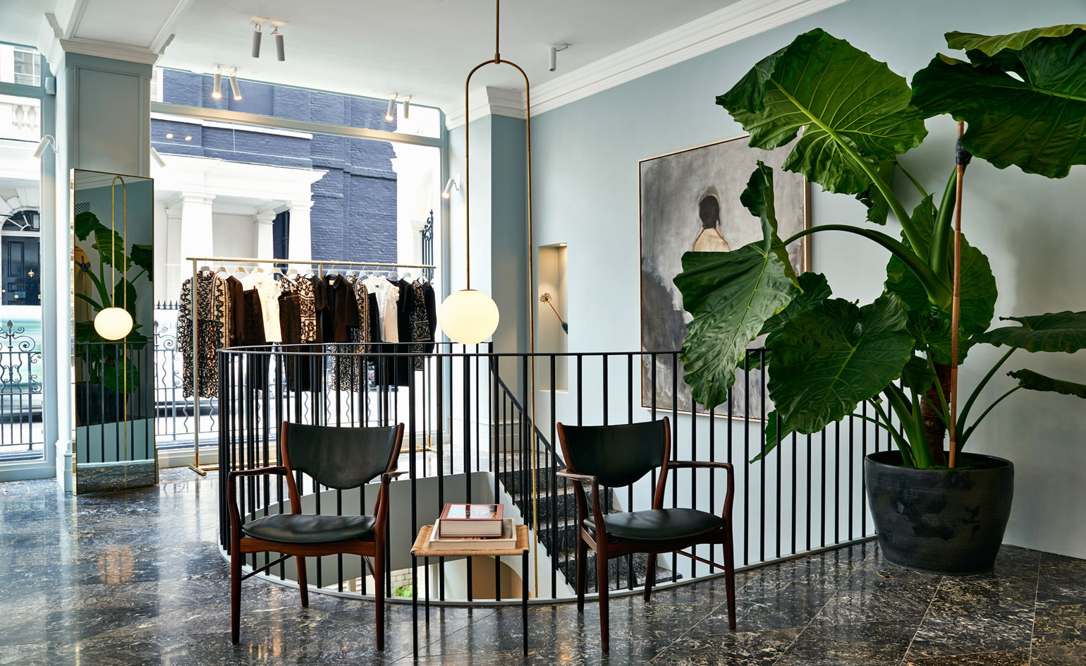
'The main thing is that it’s about her, about this woman,’ begins Erdem Moralioglu standing on the ’E’ insignia tiled threshold of his first London store. ’We both loved the idea that this was almost like her Mayfair pied-à-terre,’ he continues, introducing his long time partner and collaborator, architect Philip Joseph of P. Joseph. ’There had to be a sense of permanence to it, something that looked like it was always here and that’s what really attracted us to this space,’ adds the designer of the site that housed C. John, the Queen’s rug supplier from 1947.
Originally a bank, the 1570 sq ft site is a particularly rare find in Mayfair owing to the fact that it’s located on a corner with expansive windows on two sides, which flood its two floors with light. Connecting the ground and lower-ground floors is a sliced spiral staircase that’s grounded by a black wax steel banister, inspired by a trip to Oslo’s Vigeland Museum and Georgian blacksmithing. ’The original staircase was tiny,’ says Moralioglu of the sweeping curve that’s also referenced in the store’s arched doorways and mirrors. ’It was all about opening up the space; part restorative and part giving it new life.’
Joseph, who has been designing Erdem’s show spaces since they got together in college, worked with a small army of craftspeople on the retail project, from the stairwell’s mobile chandelier, designed by Michael Anastassiades, to an ironmonger from Ghent who took care of custom doorknobs. The alabaster mannequins came courtesy of a maker in Italy, the ceiling lighting from Beirut’s .PSLAB, while the boutique’s handsome harlequin patterned Sainte Anne marble floor was shipped in from Belgium.
’There is this Belgian guy, Karl Storms,’ begins Joseph of its backstory, ’and he’s actually just taken over his father’s company who was obsessive about reclaimed building materials and they have this amazing yard near Antwerp.’ Their Sainte Anne stone came from a quarry that once supplied chimney places for grand 18th and 19th century houses.
’Karl actually has the last of it,’ he continues, ’and because it is so precious we wanted to not be selective about the patterns in it. We said we’d take it as it comes and that’s why we have the rusty brown veins running through it.’
’Often when people use it in manor houses, they try to stick to pure black and white,’ adds Moralioglu of the marble that can also be found in Versailles.
’But we like the warmth of the brown,’ adds Joseph. ’It is that thing where you kind of double take,’ he continues. ’You aren’t quiet sure whether it is traditional or contemporary and it’s the contrast of elements. This could be a traditional floor, but the fact that we haven’t selected the stones, but just laid it as they came, and the fact that there isn’t a border, and then the sliced stairway, makes it contemporary. So it’s that weird kind of play,’ he says of the space.
Wallpaper* Newsletter
Receive our daily digest of inspiration, escapism and design stories from around the world direct to your inbox.
The custom coloured walls reflect the brand’s bone china blue and were mastered with the help of Little Greene. The same hue was used for the store’s bespoke hangers - made by a family in Italy who have been doing them since the 1950s - creating a floating effect. ’We knew we wanted a colour that was soft, but the last thing we wanted was for it to feel like a gallery space, so white just didn’t feel right,’ says Moralioglu, adding, ’even though the previous space was more or less white.’
That said, there are plenty of art and design pieces about. The pair worked with art consultant Hikari Yokoyama to source an Andy Warhol sketch, Daniel Silver watercolours and a 1980s David Hockney photo collage, along with Sigmar on the space’s curated selection of design pieces. However, many were commissioned by Joseph himself - such as the ground floor’s velvet lounge that looks out onto a courtyard version of a Victorian fern garden.
Lush flora touches are also littered throughout from delicate Maidenhairs to an Alocasia tree planted in a giant earthen pot thrown by Kasper Würtz - the artisan behind Noma’s crockery. ’These are the largest planters he’s ever made on a wheel,’ smiles Moralioglu. ’Two men had to throw them at the same time.’ Just anther example of team work that’s paid off in spades here.
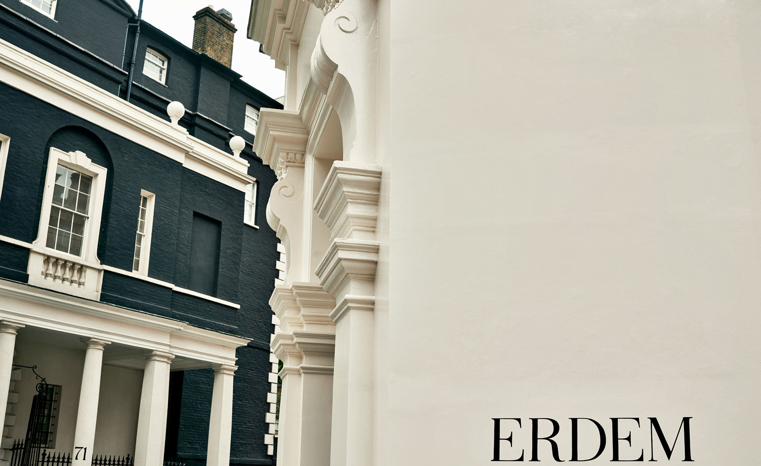
’The main thing is that it’s about her, about this woman,’ begins Erdem Moralioglu. ’We both loved the idea that this was almost like her Mayfair pied-à-terre’
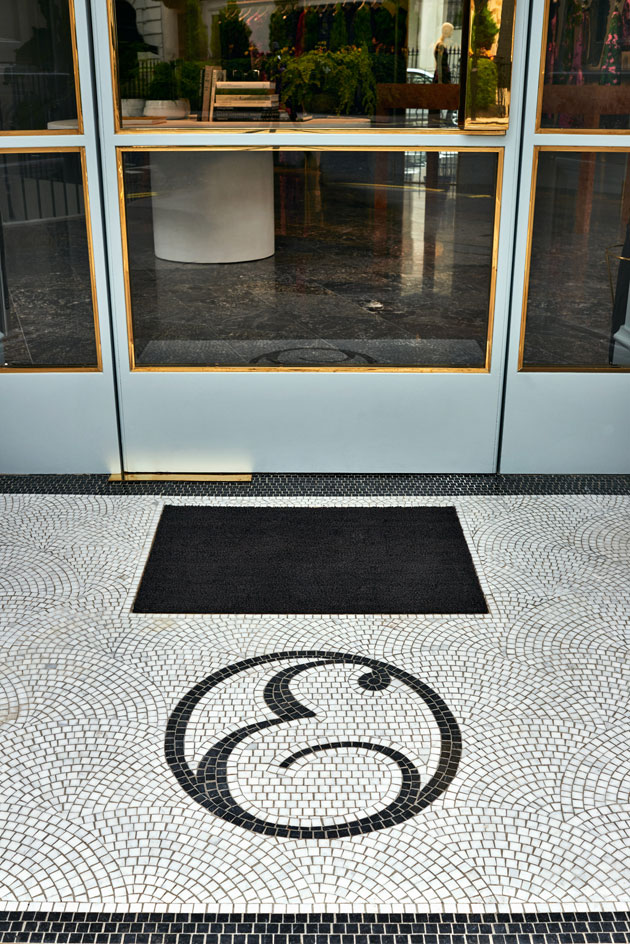
An ’E’ insignia is tiled on the boutique’s threshold. ’There had to be a sense of permanence to it, something that looked like it was always here and that’s what really attracted us to this space,’ adds Moralioglu of the site that formally housed C. John, the Queen’s rug supplier
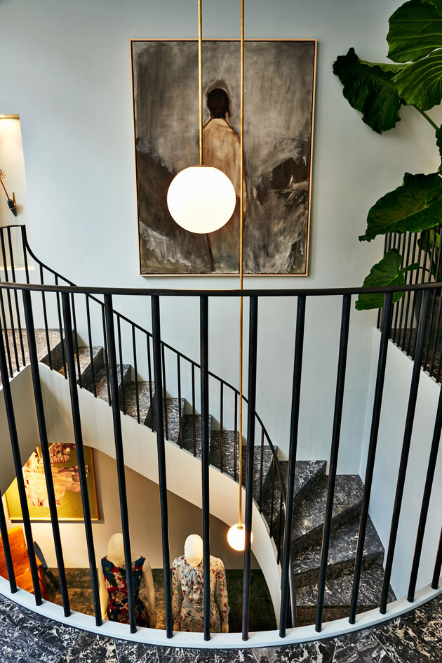
Connecting the ground and lower-ground floors is a sliced spiral staircase that’s grounded by a black wax steel banister, inspired by a trip to Oslo’s Vigeland Museum and Georgian blacksmithing
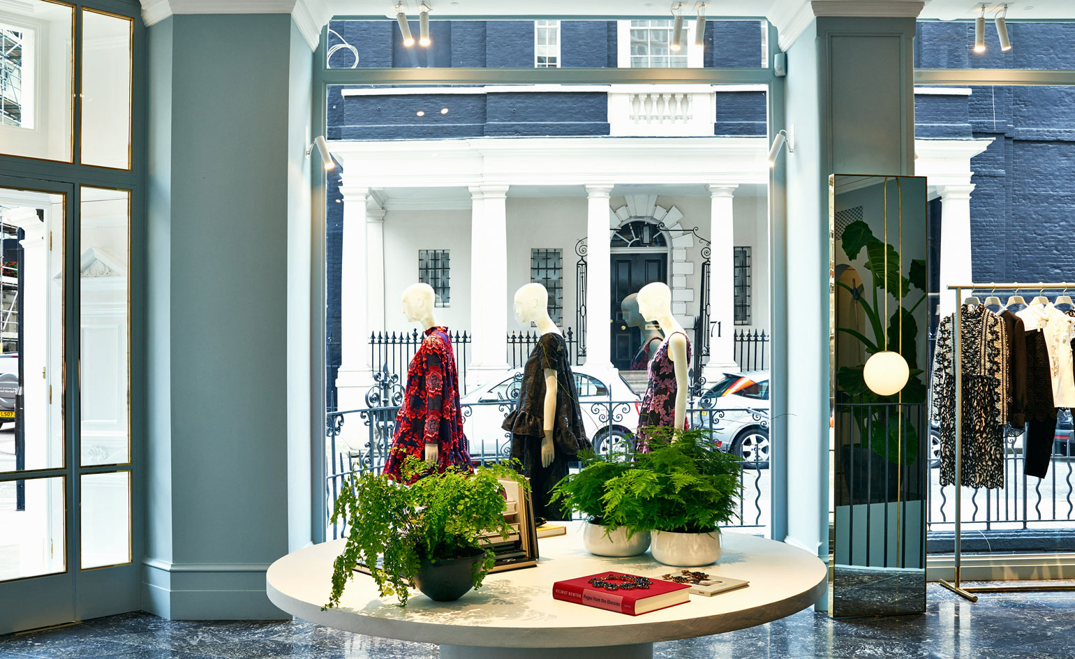
Originally a bank, the 1570 sq ft site is a particularly rare find in Mayfair owing to the fact that it’s located on a corner with expansive windows on two sides, which flood its two floors with light
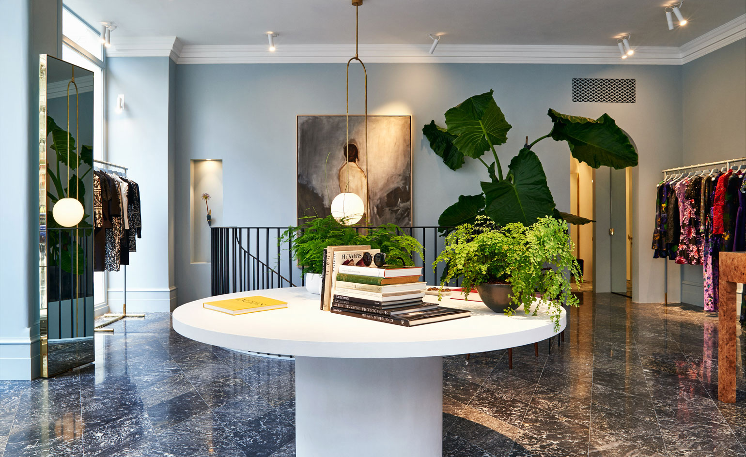
’It was all about opening up the space; part restorative and part giving it new life,’ says Moralioglu
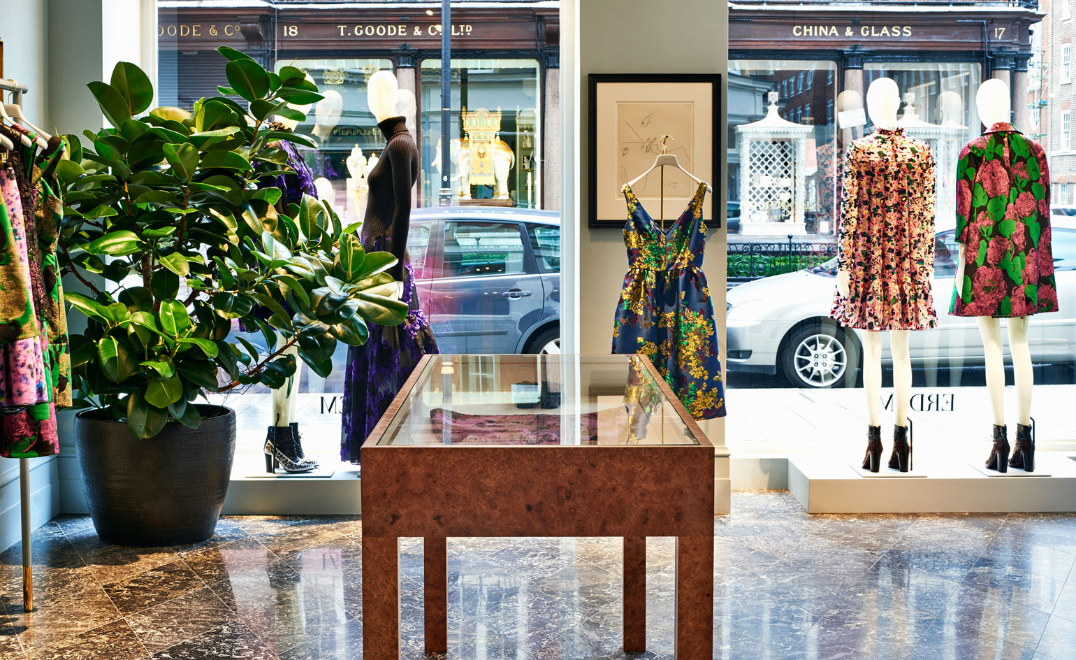
Flora touches are also littered throughout the boutique from delicate Maidenhairs to evergreen trees planted in giant earthen pots thrown by Kasper Würtz - famous for Noma’s crockery
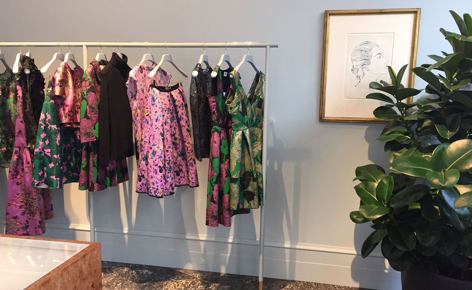
The pair worked with art consultant Hikari Yokoyama to source an Andy Warhol sketch, Daniel Silver watercolours and a 1980s David Hockney photo collage, along with Sigmar on the space’s curated selection of design pieces
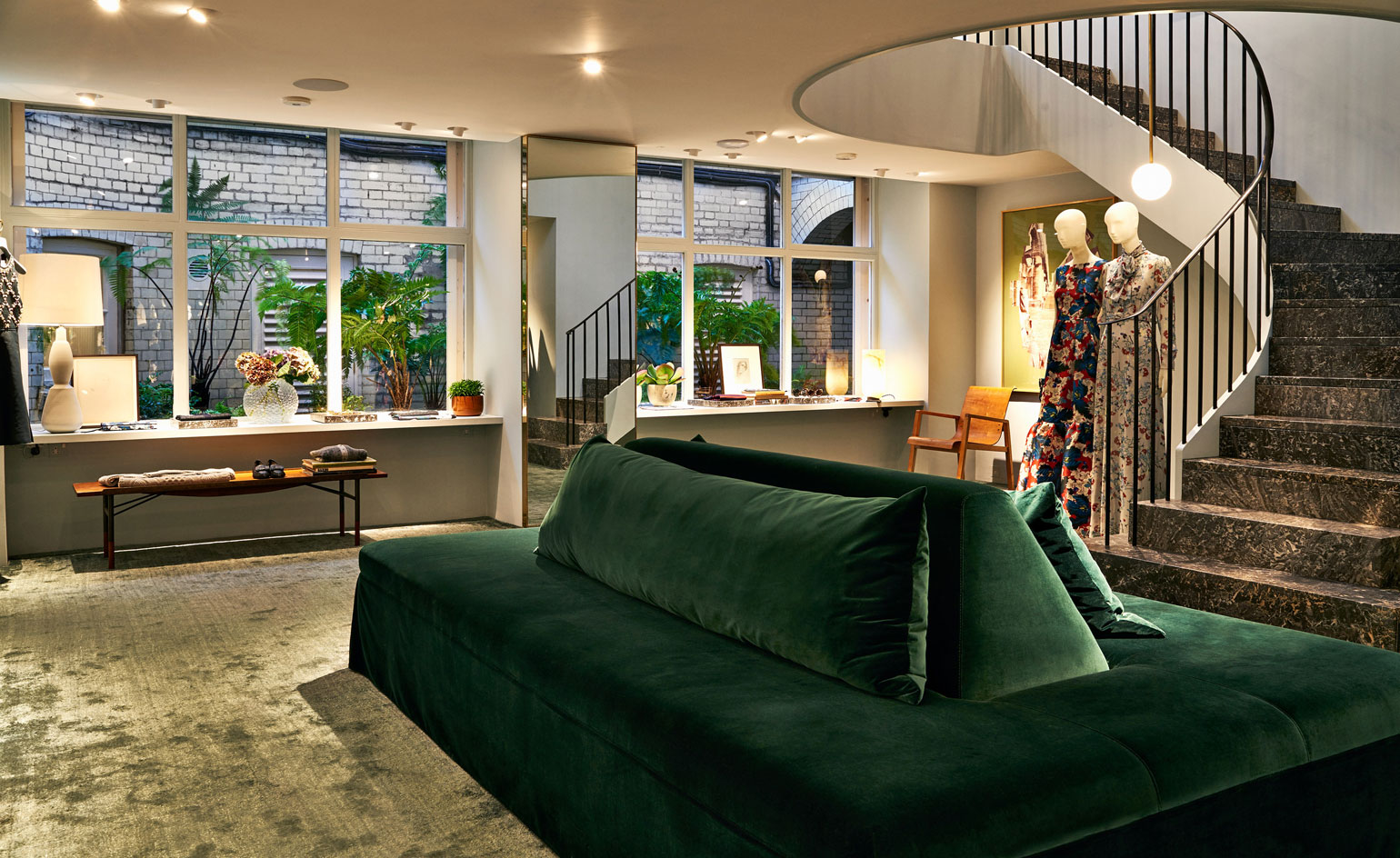
That said, many were commissioned by Joseph himself - such as the ground floor’s velvet lounge
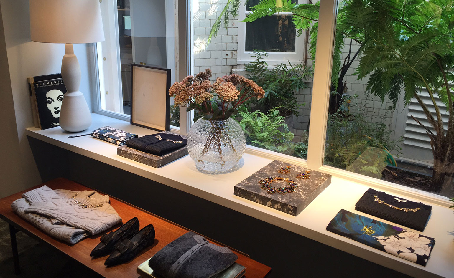
This lower floor looks out onto a courtyard version of a Victorian fern garden. ’You aren’t quiet sure whether it is traditional or contemporary,’ sums up Joseph
-
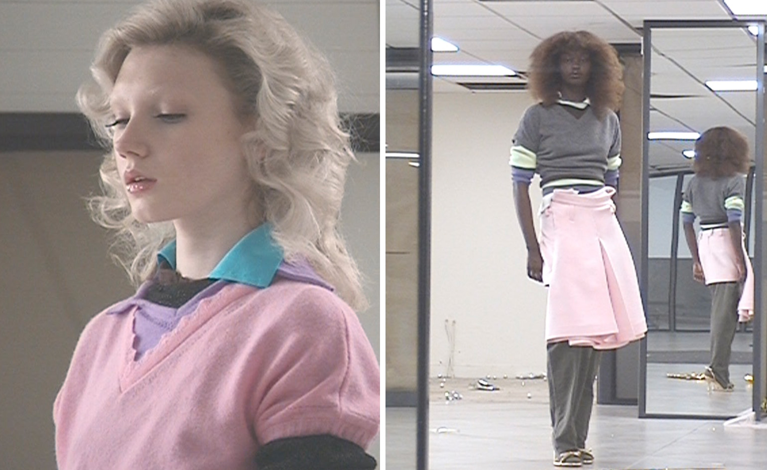 All-In is the Paris-based label making full-force fashion for main character dressing
Part of our monthly Uprising series, Wallpaper* meets Benjamin Barron and Bror August Vestbø of All-In, the LVMH Prize-nominated label which bases its collections on a riotous cast of characters – real and imagined
By Orla Brennan
-
 Maserati joins forces with Giorgetti for a turbo-charged relationship
Announcing their marriage during Milan Design Week, the brands unveiled a collection, a car and a long term commitment
By Hugo Macdonald
-
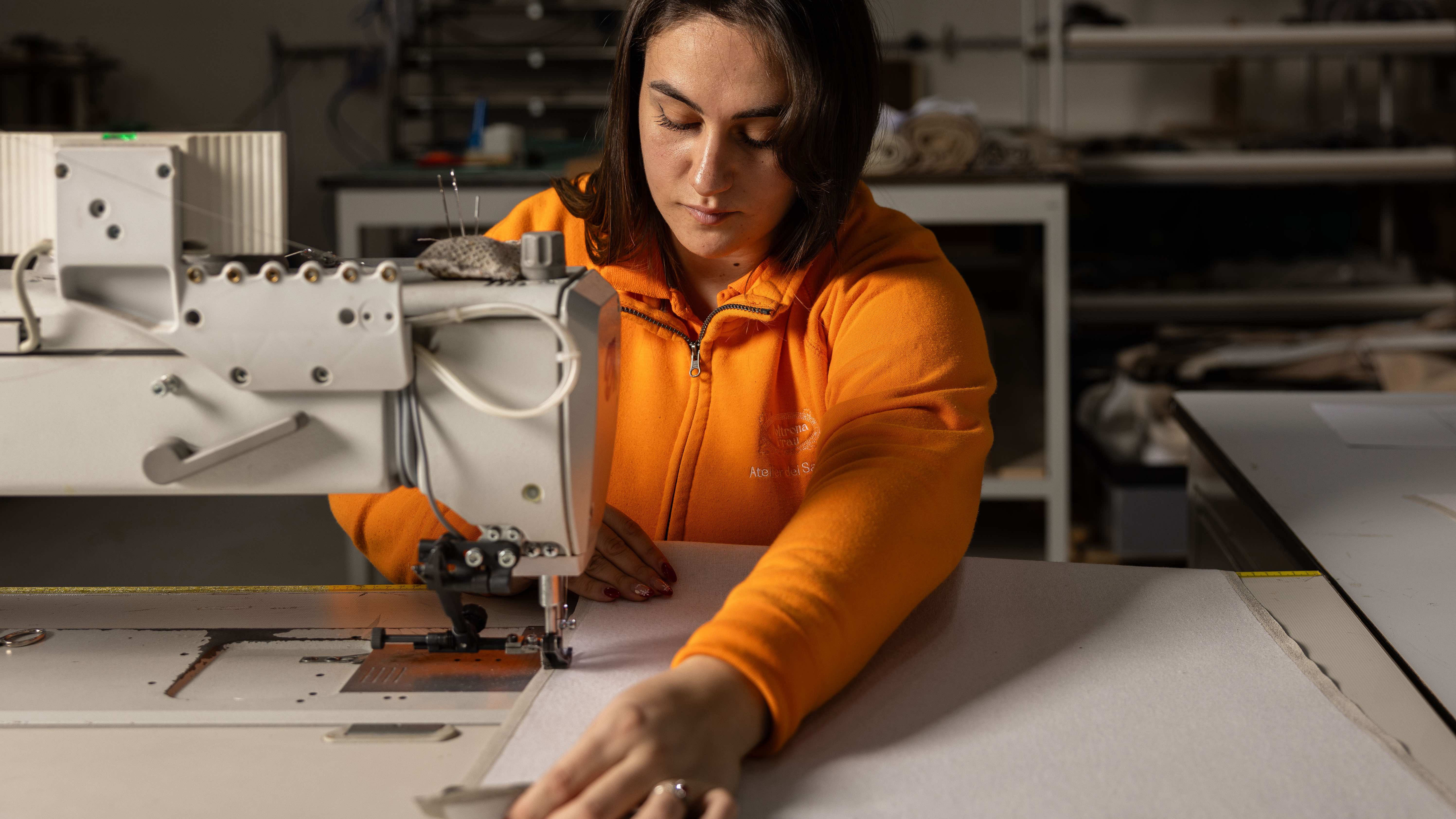 Through an innovative new training program, Poltrona Frau aims to safeguard Italian craft
The heritage furniture manufacturer is training a new generation of leather artisans
By Cristina Kiran Piotti