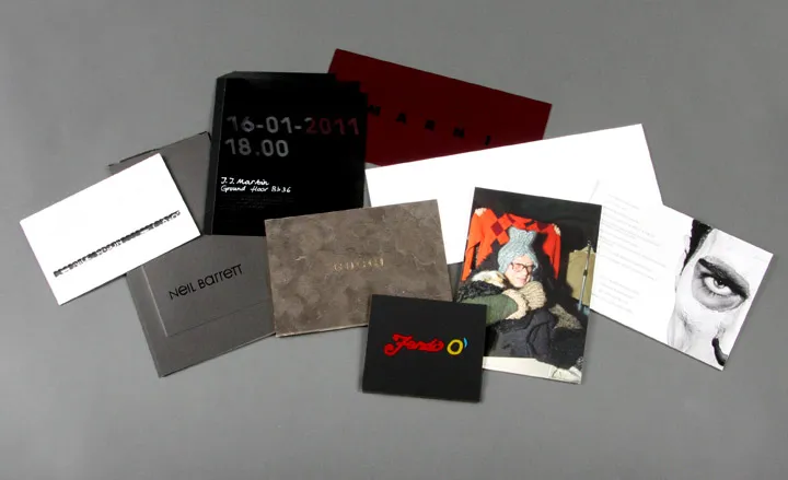

Marni's show invite came in a deep rich burgundy...

... with a simple white background overleaf.

A small and compact offering from Fendi...

... with the Fendi logo treated in varnish, and printed on triplexed layers of coloured card.

Over at Jil Sander, the brand's logo was embossed on heavy board.

Pringle of Scotland dressed up artist Walter Pfeiffer and photographed him for their invite...

... where it was revealed overleaf that there would be a screening of a short film by Pfeiffer preceeding the show.

Umit Benan's invite was printed on heavy board, where it told of the story of 27 year old investment banker Gienchi James and his daily routine...

... the collection presentation address was then revealed under the guise of Gienchi James' whereabouts.

Gucci's suede-effect card had a luxe gold foil detail, which adorned the card's edges and typeface.

Gucci

Three layers of acetate were bound together and printed over with stencil effect for Prada's invitation

Prada

Prada

A perforated strip tore off the DSquared2 envelope to reveal our name and seat number

Front of the DSquared2 envelope.

Neil Barrett produced a heavy card envelope printed with black foil on matte black card...

... a smaller card could be pulled out to reveal the show details.

Some of our favourite invitations from the Paris A/W 2011 Menswear Collections.

Rick Owens opted for a long thin thick board card, with grainy grey and white photocopy-effect detailing on the front surface.

Damir Doma used screen-printing technique on heavy black card.

Damir Doma

The Yohji Yamamoto and Adidas for Y-3 invitation incorporated a bronze foil layer with glossy debossing effect...

... on the other side, the logo was subtly marked with black textured ink, silk screened onto heavy matte card.

Four different colours run through the colourful kaleidescope of the Raf Simons invitation, a feature which nicely continues onto the edging of the black cardboard, where each side appears in either red, green, orange, or purple.

Over at Louis Vuitton, a series of die-cut holes formed the logo, with a super gloss red plastic vinyl effect on the other side.

Junya Watanabe Man used the simple concept of paper collage to great effect - three pieces of gloss, matte and textured card were individually printed, before being stuck together.

While Comme des Garçons employed the use of a slightly distorted typeface for the show's details.

The Dries Van Noten invitation had a large embossing feature of a man riding a horse.

Acne's invitation was roughly textured on one side...

Acne's invitation was roughly textured on one side...

Bernhard Willhelm's invitation came as a folded piece of paper...

... which unfolded into just over A2 size, revealing details in scroll format.

The Ann Demeulemeester poster invitation, printed on lightweight paper stock.

The recurrence of the poster format, used in the Cerruti invitation...

... which unfolded into a black and white print of a model's face.

The largest of the all however, was a colourful super-sized Walter Van Beirendonck A2 sized poster invitation.

Walter Van Beirendonck

Thom Browne's simple bookmark invitation.

Maison Martin Margiela's minimalist invitation was a blank piece of writing paper with the show details, including our seat numbers, printed at the page's bottom in deceptively normal letterhead format.

Dior Homme's textured fabric envelope and white card invitation, which acted as the basis for special project director Nick Vinson's scribbled show notes.

John Galliano sent us these two cardboard models of a Russian émigré with his suitcases in tow...

... which when assembled, became a 3D version of the character.
-
 All-In is the Paris-based label making full-force fashion for main character dressing
Part of our monthly Uprising series, Wallpaper* meets Benjamin Barron and Bror August Vestbø of All-In, the LVMH Prize-nominated label which bases its collections on a riotous cast of characters – real and imagined
-
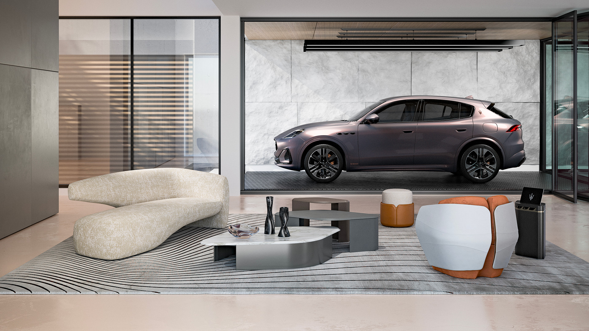 Maserati joins forces with Giorgetti for a turbo-charged relationship
Announcing their marriage during Milan Design Week, the brands unveiled a collection, a car and a long term commitment
-
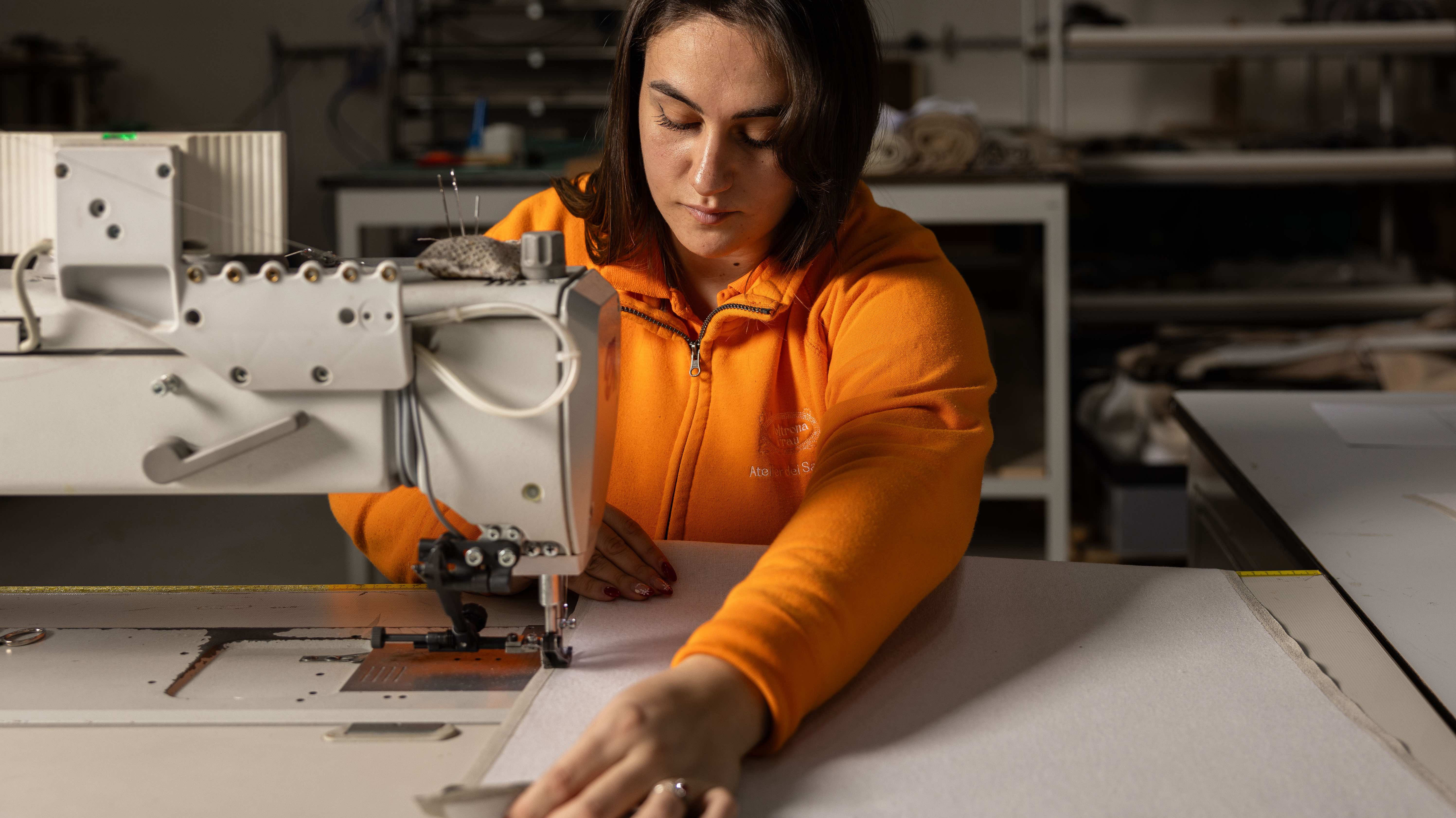 Through an innovative new training program, Poltrona Frau aims to safeguard Italian craft
The heritage furniture manufacturer is training a new generation of leather artisans


