Eye spy: graphic artist Vahram Muratyan lends his famous frames to Smythson
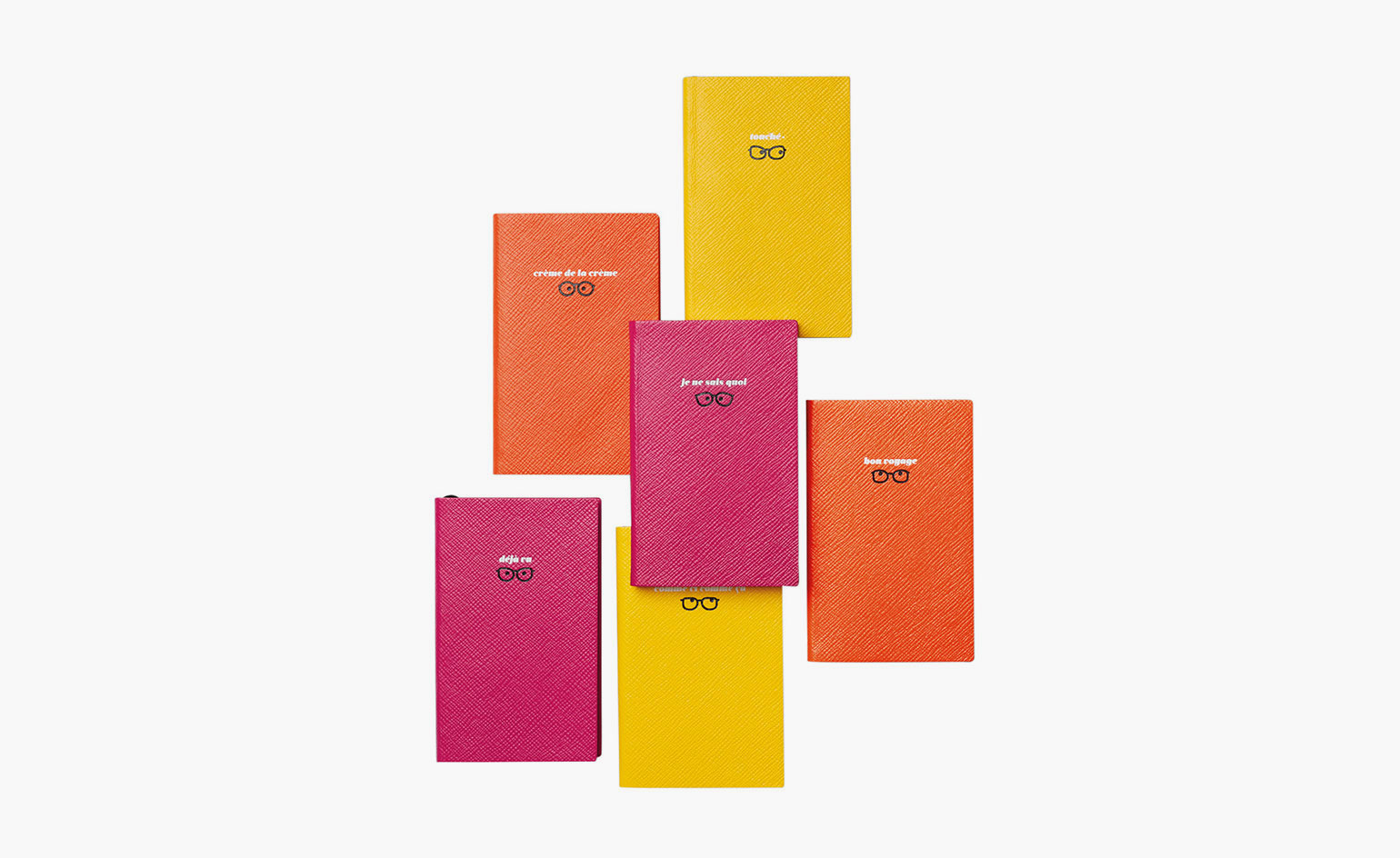
French graphic artist Vahram Muratyan speaks English almost flawlessly. But as his best-selling 2011 book Paris vs New York confirmed, he is also fluent in the visual cues that distinguish both cultures, reading these differences that are so often in plain sight. In a new collaboration with Smythson, he makes his mark for the first time in the realm of notebooks and stationery.
Both formats extend his subtle wit while keeping true to the traditions of Smythson’s seminal designs. Whereas the books boast French figures of speech familiar to Anglophones – think dejà vu, je ne sais quoi and bon voyage – the stationery plays off his other preoccupation: time.
In solid, punchy hues, they combine Smythson’s compact all-caps typography with Muratyan’s extra bold, vaguely retro lettering, so that 'King of Delays' and 'Queen of Postponing' read like tongue-in-cheek self-descriptors. The collection’s total impression lands softly between clever and kitsch. Or, as he describes it, ‘I think it was like tagging a wall on a very respectful building. It’s my tag.’
Seated in a cafe looking out to the Canal St Martin, Muratyan tells Wallpaper* how he was impressed by Smythson’s collaboration with Quentin Jones in 2013 and was delighted when a confluence of connections afforded him a similar opportunity. The back-and-forth played out over five months and included a visit to Smythson’s factory in Swindon where he was impressed to see the old die-stamping machines still in use. ‘They go all the way,’ he says. ‘They have a sense of still doing things because they need to be alive in 2016. It’s almost old-fashioned; and yet, it’s not.’
Unlike his illustrated books, the collection relies almost exclusively on text – except for the black beady-eyed bespectacled icons that beam forth from the notebooks. Ever since Paris vs New York tome, famous filmmaker comparisons – ie 'Woody vs Godard' – have become somewhat of a signature, even more so because the artist can often be found wearing large glasses. For Smythson, they added an expressive flourish, a literal wink. ‘I love things that are imperceptible,’ he explains. ‘It’s very important to let people see things but have their own field of interpretation. You don’t want to assassinate the idea.’
Which is why both parties decided against large graphics and sayings that sounded too cliché or, daresay, insensitive. Nouveau riche, for instance, was proposed but ultimately axed. ‘It’s easy to put people in boxes. Everybody does that. I want to go beyond that. That’s how I always think about projects,’ he says.
As for whether he feels he is contributing to a resurgence in hand-written correspondence, Muratyan believes that some people might collect the notelets with no intention of sharing them. ‘For me, the idea is a work of art that’s always at the limit of being usable,’ he says. 'There is an irony to sending some of these out, or else putting them next to a flower bouquet.' Which is to say, considering a blank card as an objet d’art.
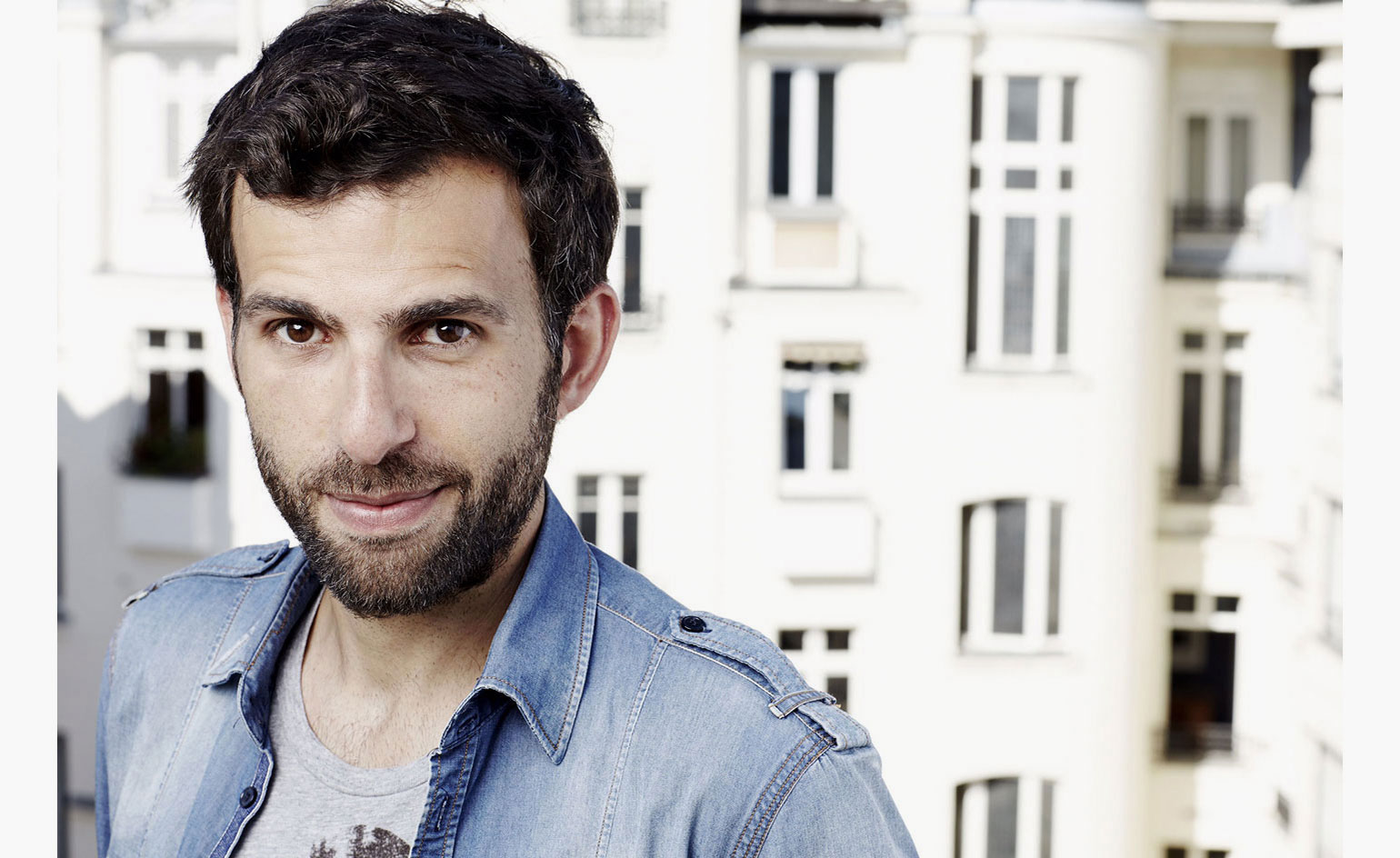
Muratyan (pictured) is also the author of the best-selling book Paris vs New York, published in 2011
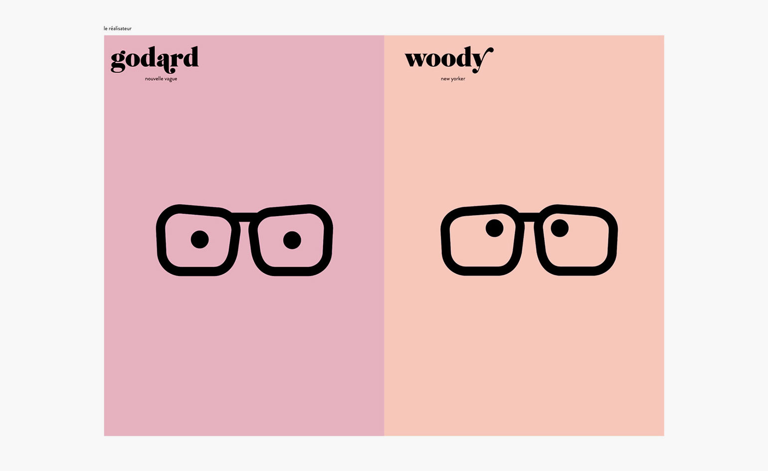
Unlike his illustrated books, the stationery collection relies almost exclusively on text – except for the black beady-eyed 'Woody vs Godard’ icons that beam forth from the notebooks
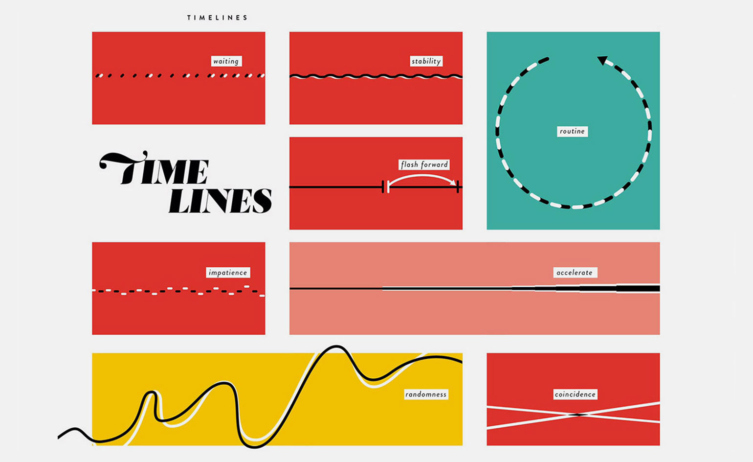
Both parties decided against large, 'clichéd' graphics – favouring a more muted, lower-case look
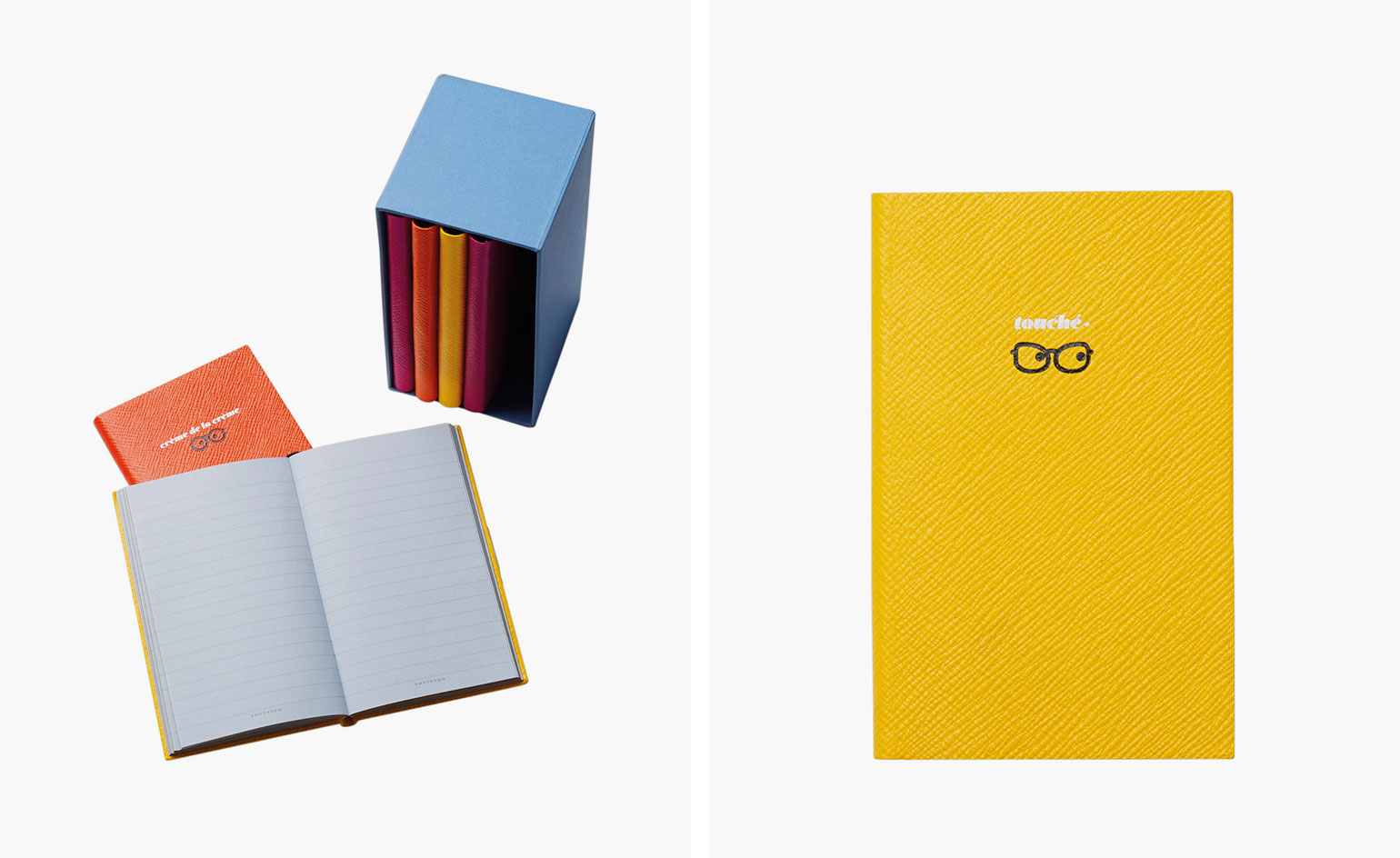
Muratyan believes that some people might collect the notelets with no intention of sharing them: ‘For me, the idea is a work of art that’s always at the limit of being usable,’ he says. ‘There is an irony to sending some of these out, or else putting them next to a flower bouquet'
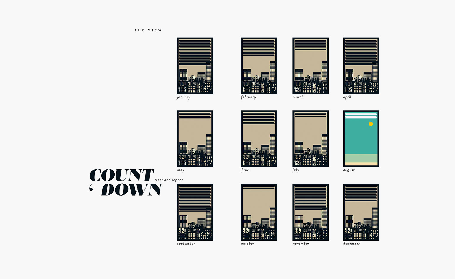
‘I love things that are imperceptible,’ he explains. ‘It’s very important to let people see things but have their own field of interpretation. You don’t want to assassinate the idea’ – a notion seen here in Muratyan's quirky take on a calendar
INFORMATION
For more information, visit Smythson’s website
Wallpaper* Newsletter
Receive our daily digest of inspiration, escapism and design stories from around the world direct to your inbox.
-
 Put these emerging artists on your radar
This crop of six new talents is poised to shake up the art world. Get to know them now
By Tianna Williams
-
 Dining at Pyrá feels like a Mediterranean kiss on both cheeks
Designed by House of Dré, this Lonsdale Road addition dishes up an enticing fusion of Greek and Spanish cooking
By Sofia de la Cruz
-
 Creased, crumpled: S/S 2025 menswear is about clothes that have ‘lived a life’
The S/S 2025 menswear collections see designers embrace the creased and the crumpled, conjuring a mood of laidback languor that ran through the season – captured here by photographer Steve Harnacke and stylist Nicola Neri for Wallpaper*
By Jack Moss
-
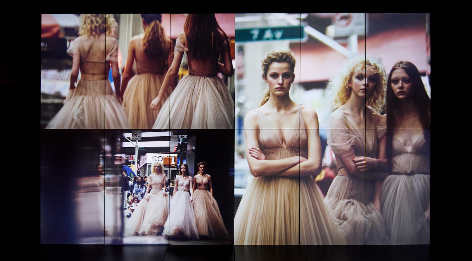 ‘He immortalised the birth of the supermodel’: inside Dior’s career-spanning retrospective of photographer Peter Lindbergh
Olivier Flaviano, head of Paris’ La Galerie Dior, talks us through a new Peter Lindbergh retrospective, which celebrates the seminal German photographer’s longtime relationship with the French house
By Jack Moss
-
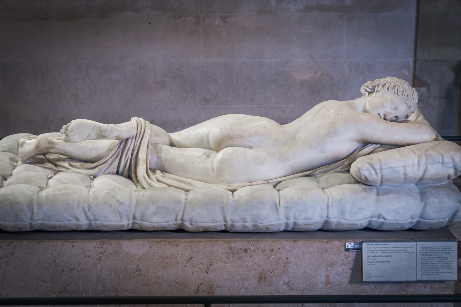 Inside ‘De toutes beautés!’, the Louvre’s new exhibition narrating 10,000 years of beauty ideals through art
‘De toutes beautés!’ marks the beginning of a three-year partnership between the Louvre and L’Oréal Groupe. India Birgitta Jarvis reports on the show for Wallpaper*
By India Birgitta Jarvis
-
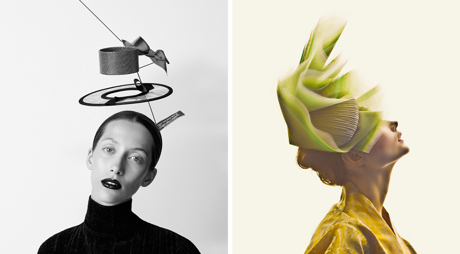 ‘A hat is an alibi, a fabulous lie’: radical milliner Stephen Jones on his career-spanning new Paris exhibition
As ‘Stephen Jones, Chapeaux d’Artiste’ opens at Paris’ Palais Galliera, the British milliner tells Wallpaper* about the transformative power of hats, the one designer he wishes he’d collaborated with, and his lifelong love of Paris
By Jean Grogan
-
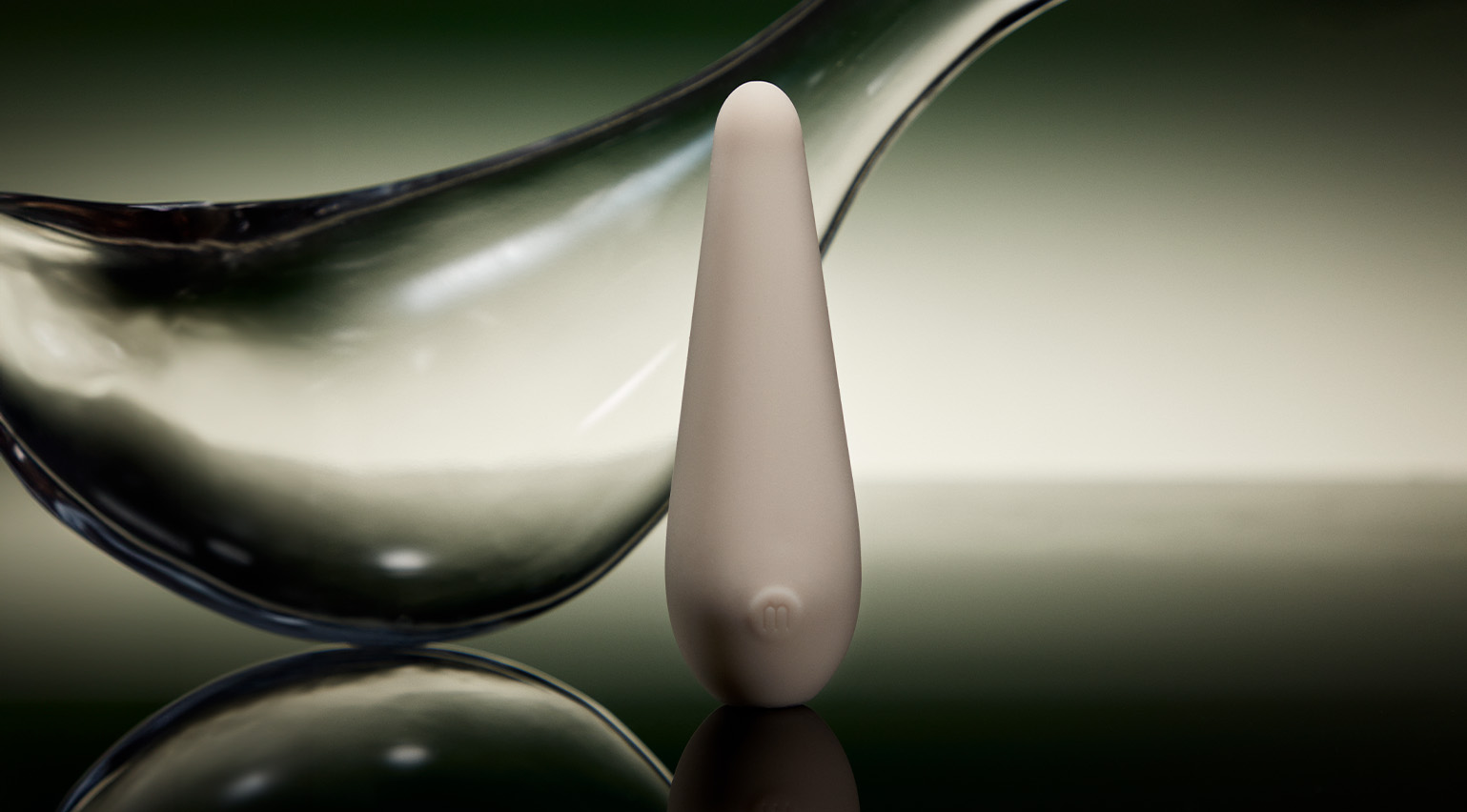 Maude’s Brâncuși-inspired sex toys go on display in a new Paris exhibition
Maude’s design-led vibrators are now on display at Musée des Arts Décoratifs in Paris, as part of ‘Private Lives: From the Bedroom to Social Media’. Brand founder Éva Goicochea talks to Wallpaper* about partnering with the museum and opening up cultural conversations around sex
By India Birgitta Jarvis
-
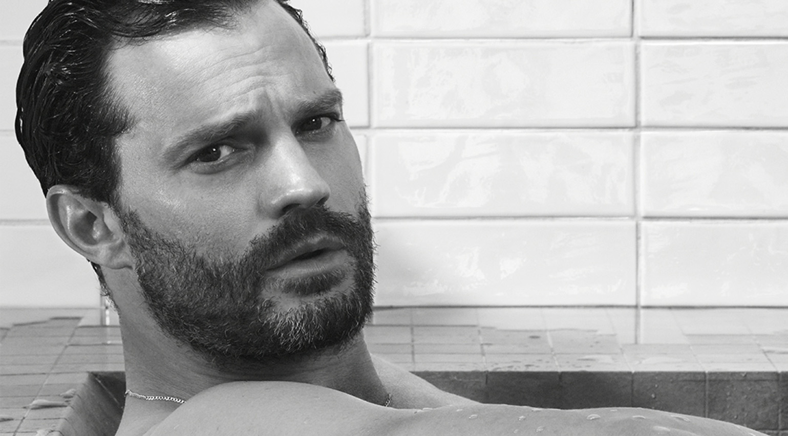 Watch: Jamie Dornan takes a bath in Le Corbusier’s villa for Loewe Perfumes
Jamie Dornan stars alongside Sophie Wilde in the new Loewe Perfumes 2024 campaign, shot by David Sims in Le Corbusier’s Villa Savoye
By Hannah Tindle
-
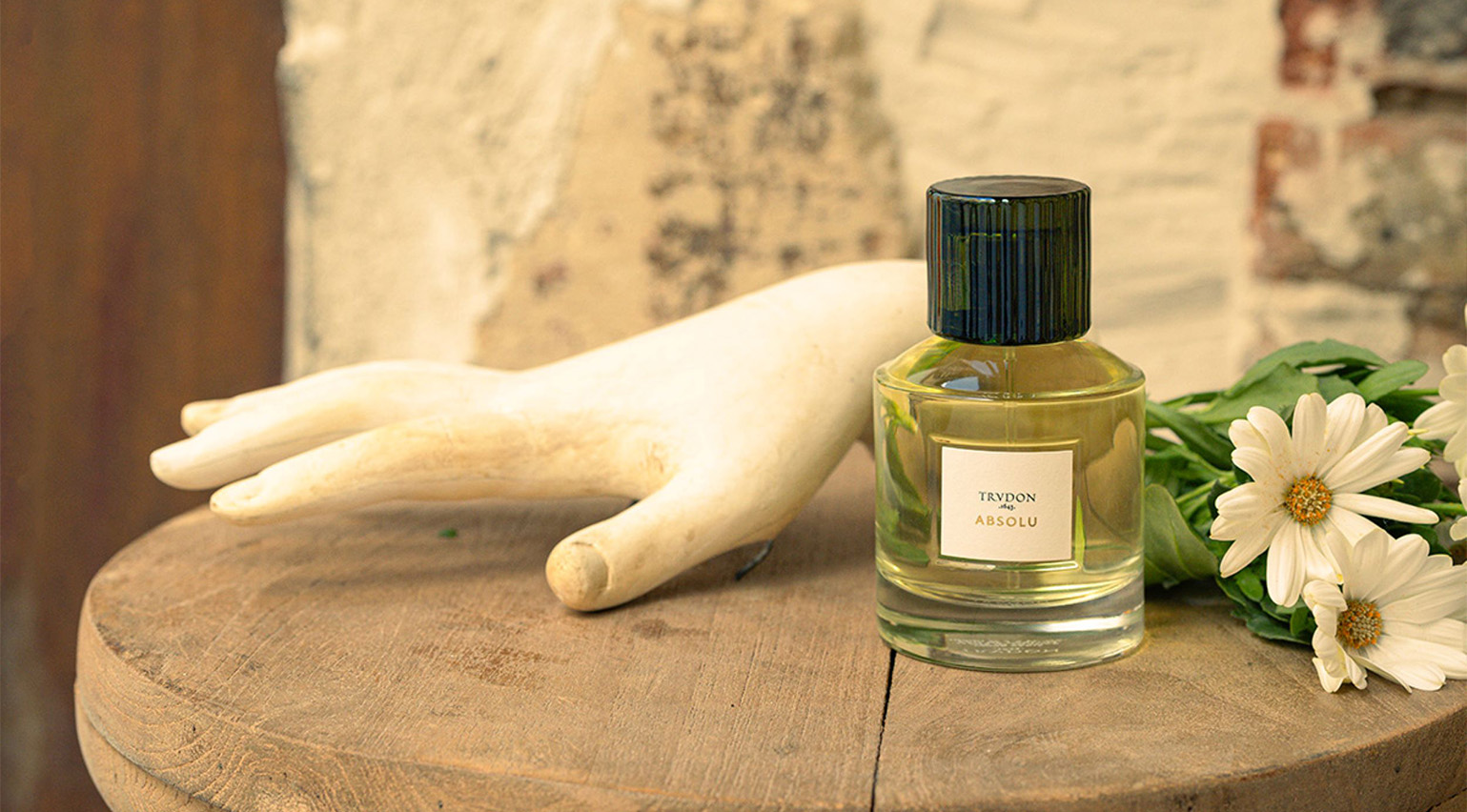 Trudon ‘Absolu’: an intoxicating orange blossom perfume for the start of autumn
Trudon ‘Absolu’, the house’s latest fragrance by Antoine Lie, blends orange blossom absolute with saffron, cardamom, tonka bean and guaiac wood
By Hannah Tindle
-
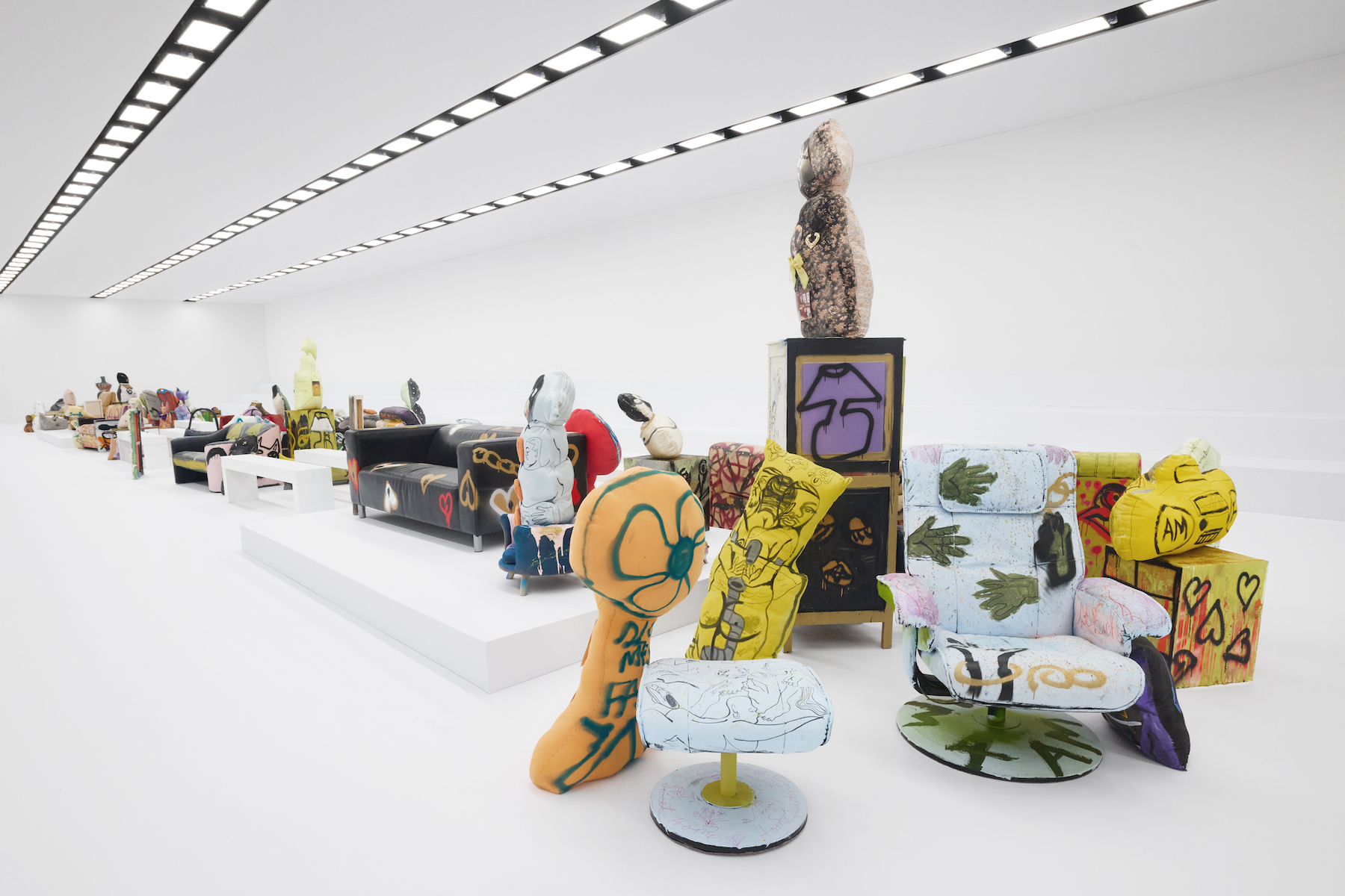 Jonathan Lyndon Chase on creating a ‘complicated and messy’ domestic space for Acne Studios’ latest show
A musing on ‘emotions and the body, and how they affect the space around you’: American artist Jonathan Lyndon Chase tells Mahoro Seward the story behind their Acne Studios runway set, which will backdrop the brand’s S/S 2025 show in Paris later today
By Mahoro Seward
-
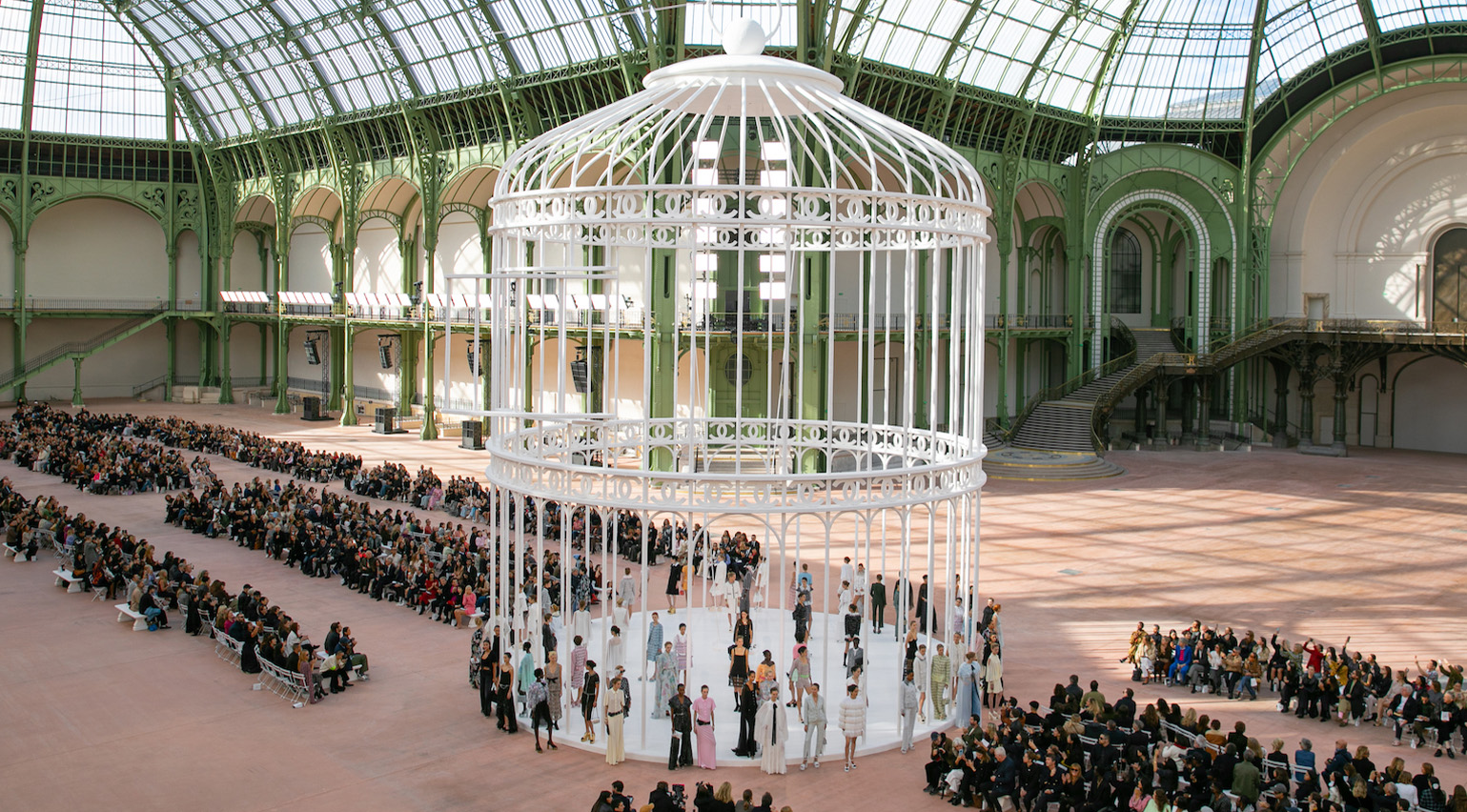 Paris Fashion Week S/S 2025 highlights: Chanel to Louis Vuitton
Wallpaper* fashion features editor Jack Moss selects the best of Paris Fashion Week S/S 2025, from Chanel’s return to the Grand Palais to Nicolas Ghesquière’s ‘soft power’ at Louis Vuitton
By Jack Moss