Building blocks: striking structures around the globe for 2018
Some architects just love making a statement. From monumental monoliths to soaring skyscrapers, here we highlight the bold buildings disrupting skylines and shaking up our perspective of the urban environment
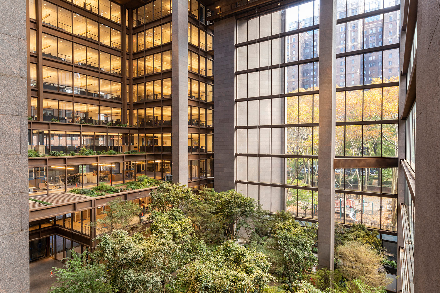
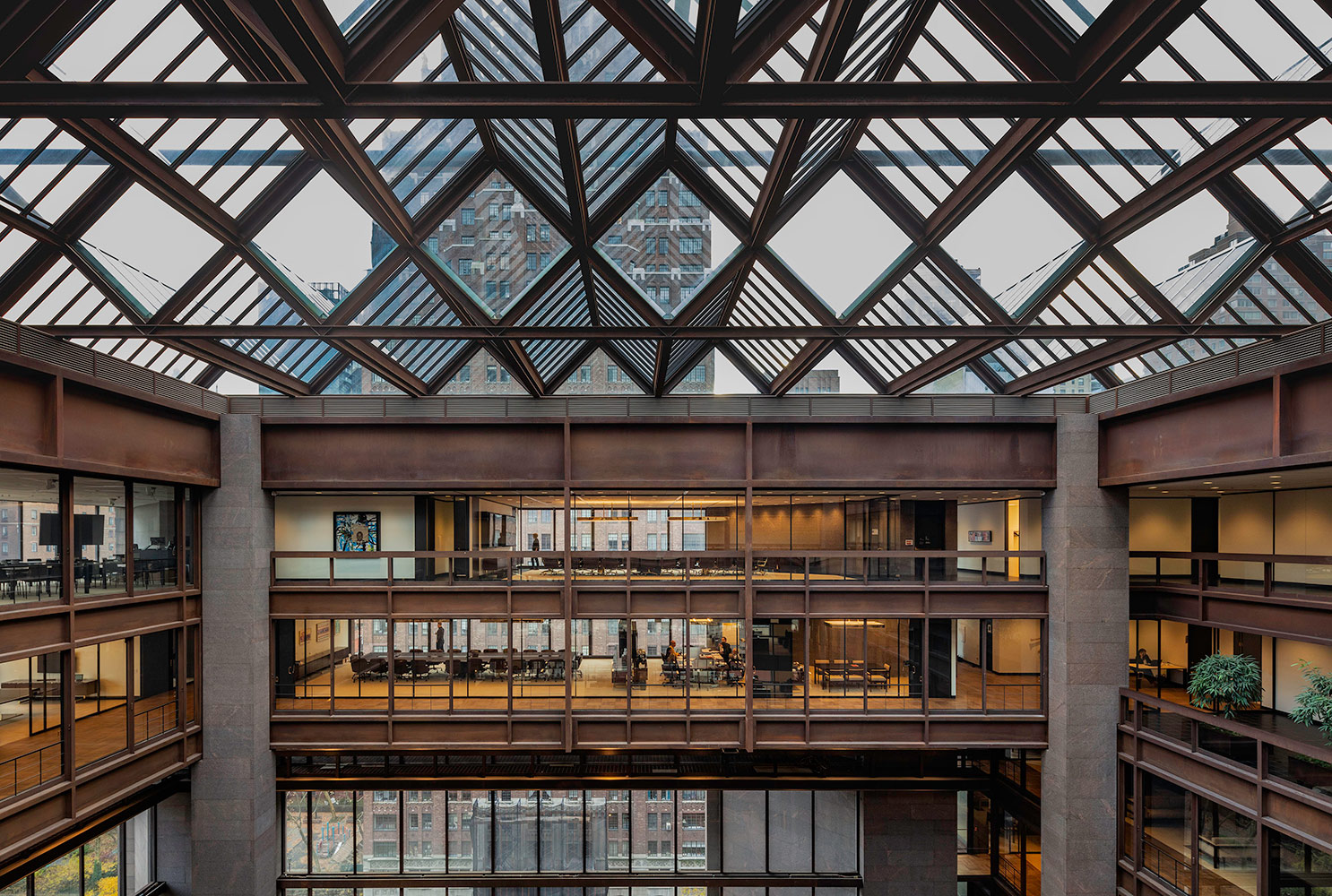
The Ford Foundation Center for Social Justice, Gensler
New York City, US
Gensler has redesigned and renovated the Ford Foundation’s original 1960s headquarters designed by Kevin Roche John Dinkeloo and Associates into a modern, open-plan and sustainable base for the foundation’s 21st century activities. Much of the renovation was focused on bringing the building up to contemporary standards of safety, accessibility and sustainability, yet the new design also brought 50 per cent more open-plan, creative and collaborative space.

The Ford Foundation Center for Social Justice, Gensler
New York City, US
The historic atrium garden – that spans a third of an acre – was restored closely to the original design by landscape architect Dan Kiley, and it has been made accessible to the public and wheelchair users. Keen to express the original atmosphere of the building, Gensler refurbished over 1,500 pieces of furniture, while taking care to restore carpets, lighting, millwork, bronze and leather details. New additions include the double-height gallery – created by removing a portion of the second floor concrete slab – and a new coded signage programme integrated with braille.
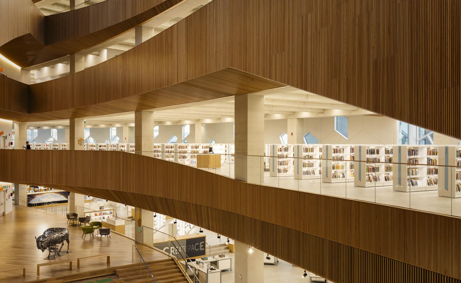
Calgary Central Library, Snøhetta and DIALOG
Calgary, Canada
Snøhetta and DIALOG’s Calgary Central Library was designed to allow one to ‘understand its entire floorplan as soon as you walked in the door,’ says Craig Dykers, founding partner at Snøhetta and lead architect on the project. This was achieved through the creation of the library’s elongated atrium – or pointed ellipse – that is surrounded by a promenade of attractive timber staircases and balustrades that overlap at slightly different angles, leading your eyes up floor-by-floor.
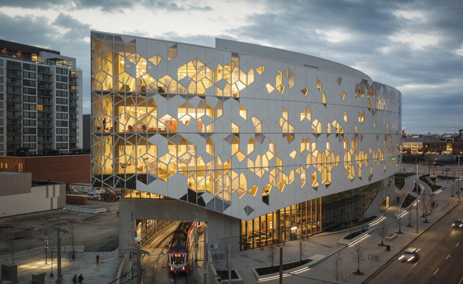
Calgary Central Library, Snøhetta and DIALOG
Calgary, Canada
At CAN$245m, the building’s dynamic and soaring timber-lined interiors, progressive services and programming and the way it successfully weaves together two previously cut-off neighbourhoods are more than compelling justification for its price tag. Combining functionality, beauty and ambition, once inside you cannot help but feel uplifted.
Mactan Cebu International airport, Terminal 2, Integrated Design Associates
Lapu-Lapu City, Metro Cebu, Philippines
At the centre of the Philippine government’s ambitious infrastructure programme, Terminal 2 at Mactan Cebu International airport has been three years under construction. Just opened, the terminal will see 12.5 million travelers annually pass through it. The design was conceived around the idea of a ‘gateway’ by Hong Kong-based Integrated Design Associates, aided by a cast of native collaborators including industrial designer Kenneth Cobonpue, interior designer Budji Layug and architect Royal Pineda.
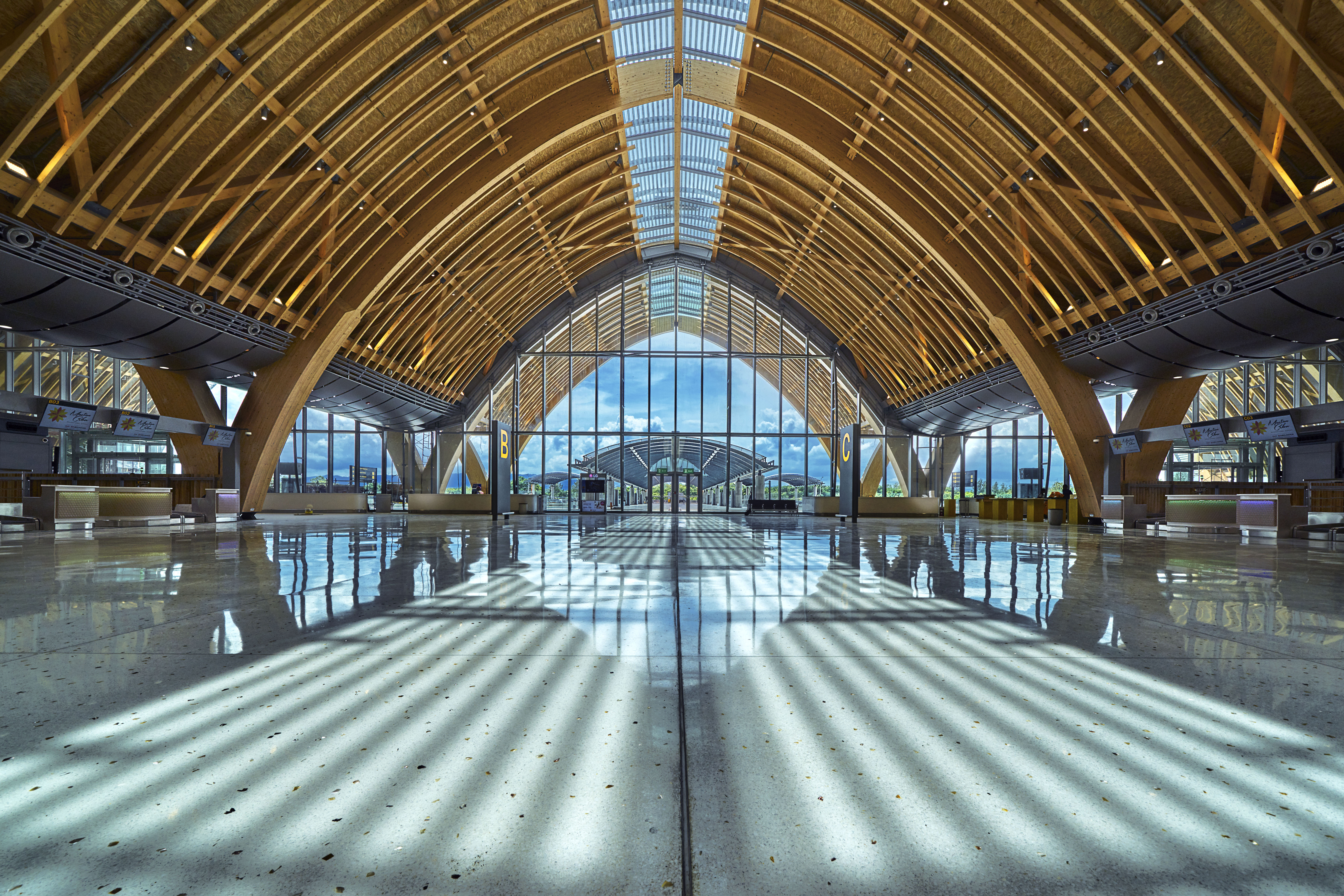
Mactan Cebu International airport, Terminal 2, Integrated Design Associates
Lapu-Lapu City, Metro Cebu, Philippines
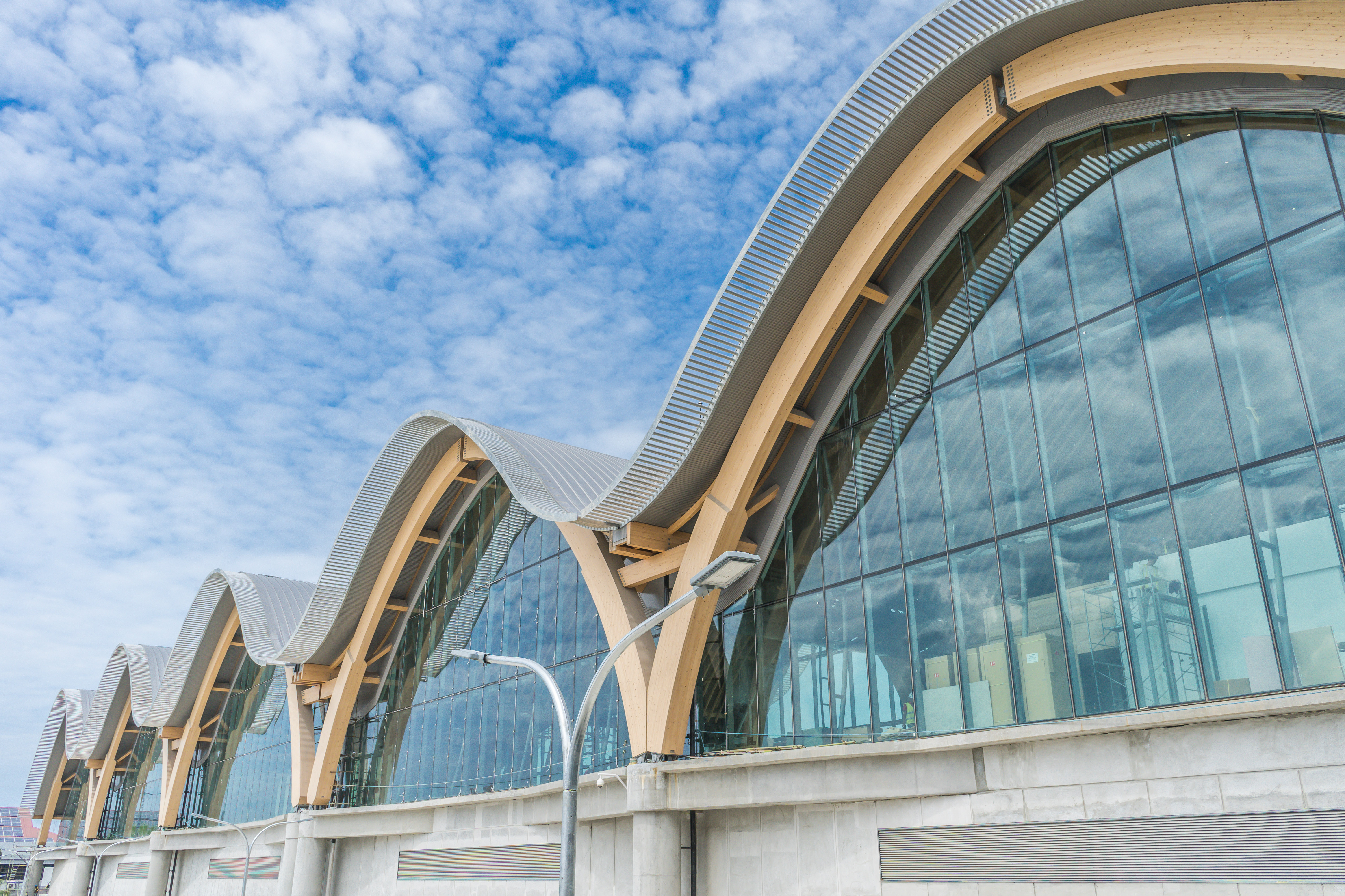
The smooth nature of the undulating layers and the light-filled space within the architecture are qualities inspired by Filipino nature. The structure is constructed by a sequence of glulam arches spanning 100 feet, reducing the amount of structural columns needed to create the vast open space beneath the roof. Interior details include fiber-synthetic mesh on the check-in counters accented by LED lighting, to evoke the ancient Philippine craft of weaving. Terrazzo floors are inlaid with mother of pearl, while moss walls of natural lichen reduce humidity and improve air quality.
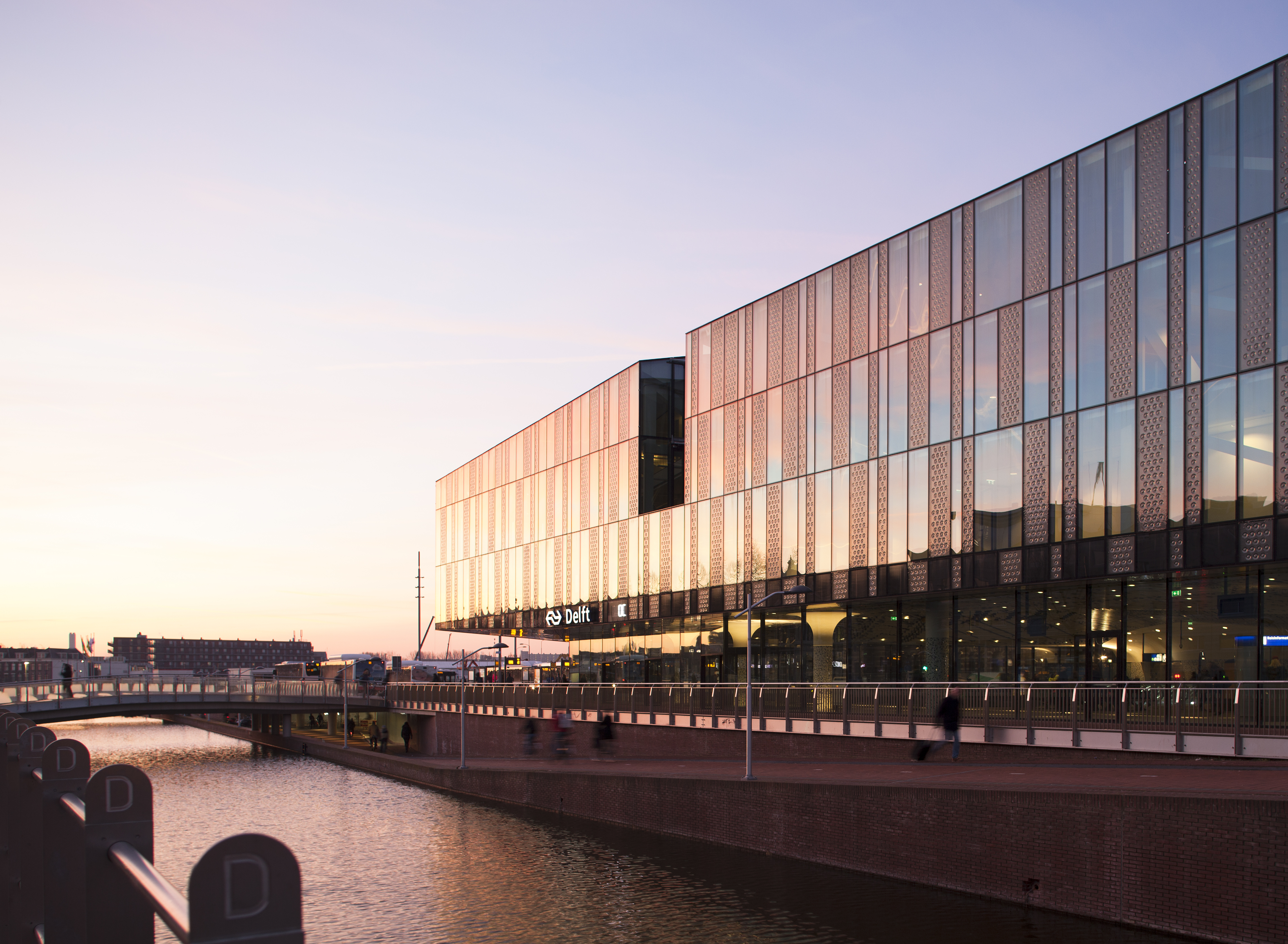
Delft City Hall and Train Station, Mecanoo
Delft, The Netherlands
Mecanoo’s city hall and train station for Delft spans a staggering 28,320 sq m. The project is over a decade in the making and bridges two sides of the city that were previously separated by a concrete viaduct installed during the 1960s. Sustainable in design, the building is wrapped in a glass façade that responds to the varying angles the sun takes across the days and seasons. The glass effectively absorbs sunlight, reducing the interior’s dependency on artificial light. Additionally, it takes in solar heat at a reduced rate, which helps to avoid internal overheating during the warmer seasons. Rooftop solar panels also provide 20 per cent of the building’s energy.
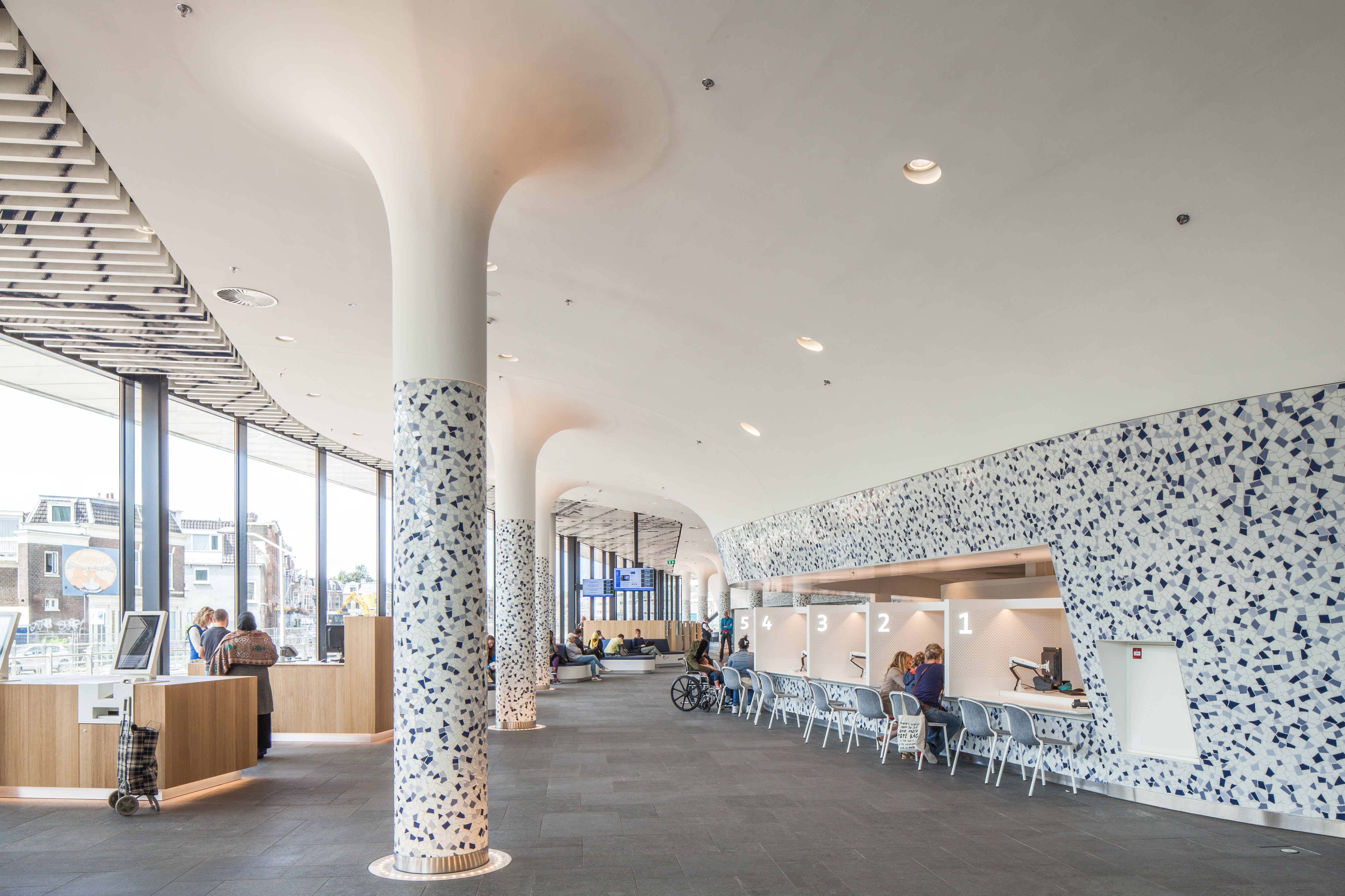
Delft City Hall and Train Station, Mecanoo
Delft, The Netherlands
Upon arrival at the station from the Benthem Crouwel Architects-designed underground platforms, a sprawling overhead historic map greets visitors, rippling throughout inside. Internal structural support columns and walls are embellished with a contemporary take on traditional Delftware blue tiles, a form of pottery that originated in the Dutch city during the 16th century.
National Kaohsiung Center for the Arts, Mecanoo
Kaohsiung, Taiwan
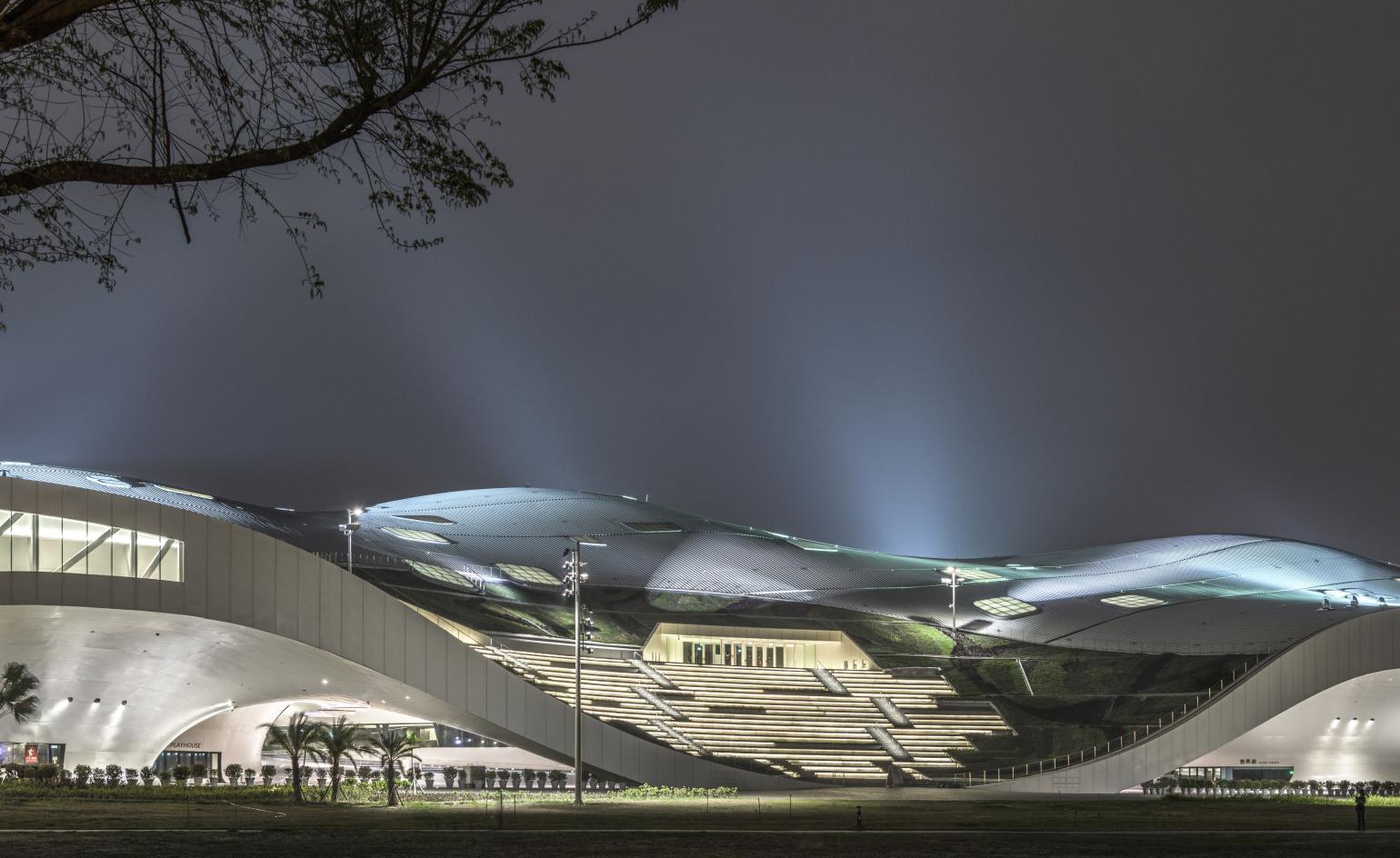
The National Kaohsiung Center for the Arts contains the first dedicated national opera house to be built in Taiwan and is the world’s largest performing arts centre under one roof. Designed by Dutch architecture practice Mecanoo, the long low building measures 225m long and 160m wide and is known locally as Weiwuying, after its location in a metropolitan park that was formerly a military base.
National Kaohsiung Center for the Arts, Mecanoo
Kaohsiung, Taiwan
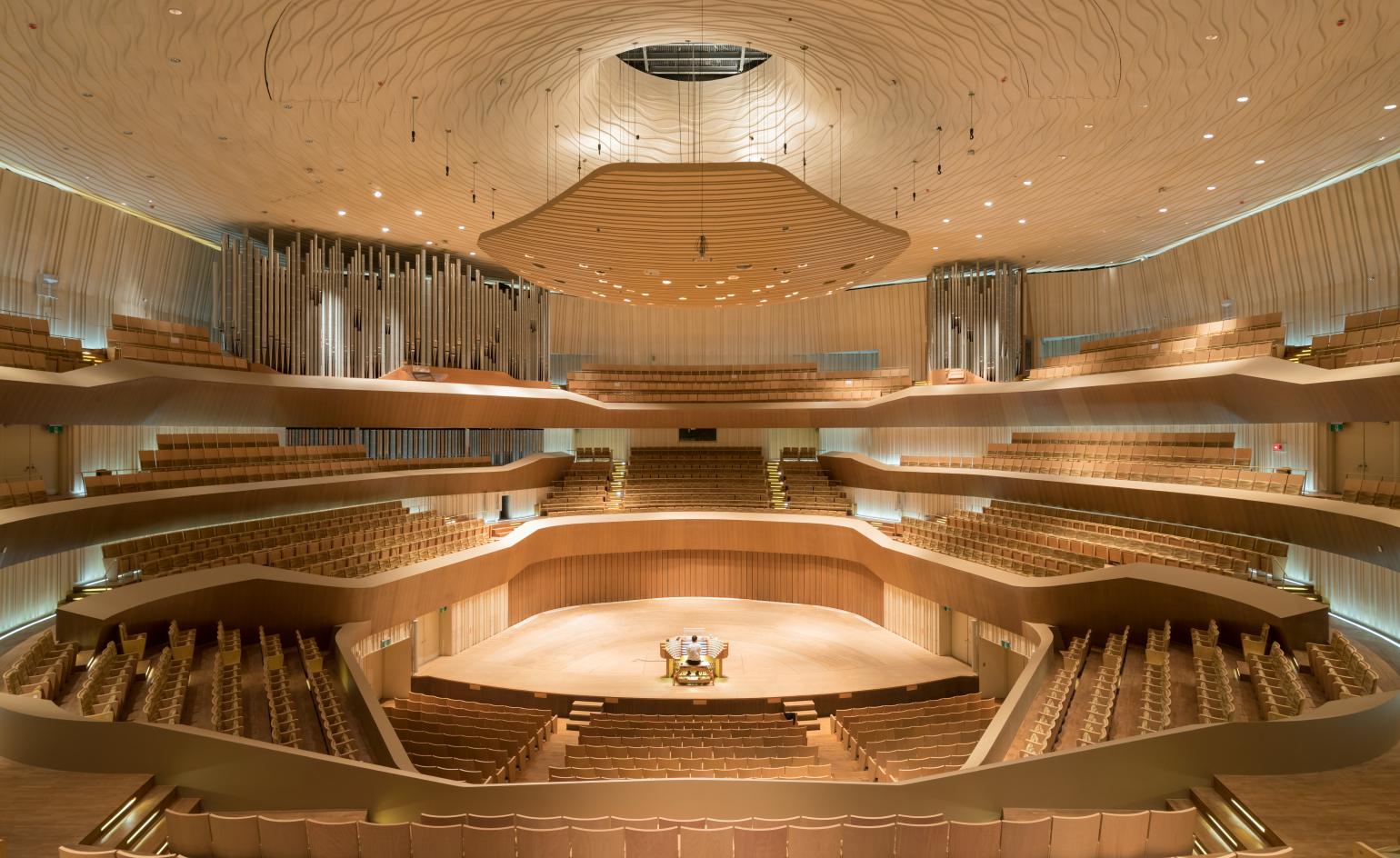
The auditoriums include an opera house, a play house, concert hall and a recital hall, each with its own distinctive identity. With 2,260 seats, and positioned at the centre of the building, the opera house is the biggest of the four spaces, with an appropriately grand colour scheme of red and black with a horseshoe layout. A more intimate ambiance is offered at the playhouse (1,243 seats, for experimental theatre and Chinese opera) and recital hall (470 seats).
Pergola at The Club at Nine Bridges, JOHO Architecture
Jeju Island, South Korea
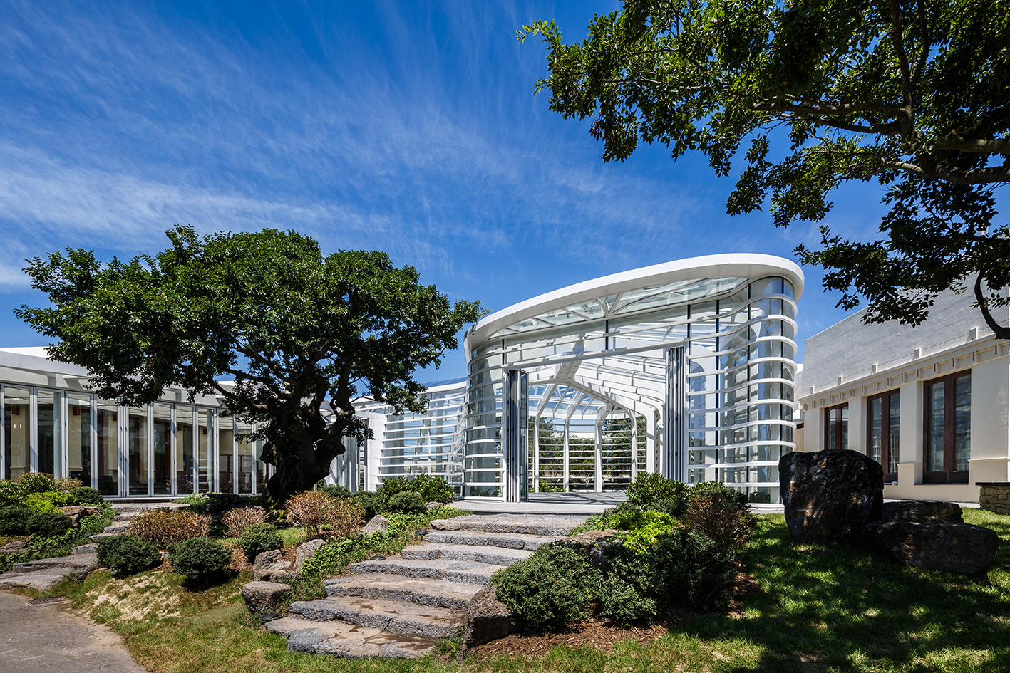
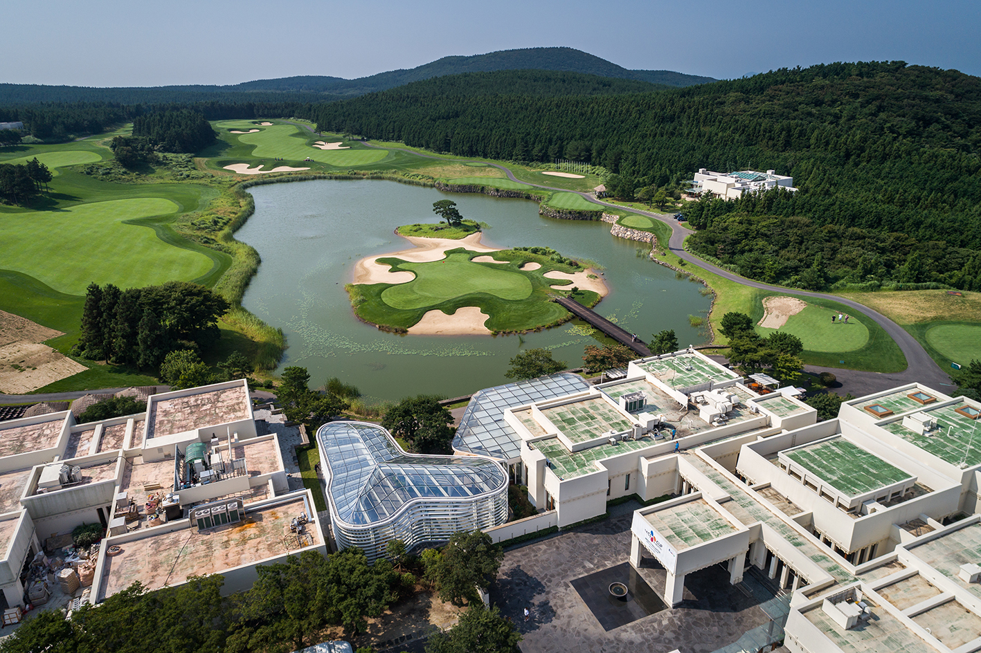
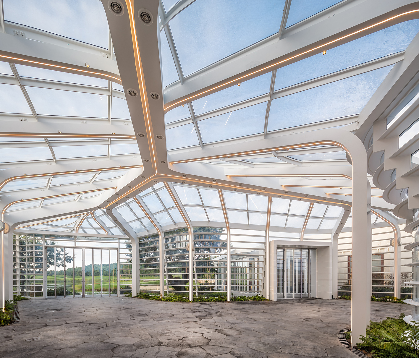
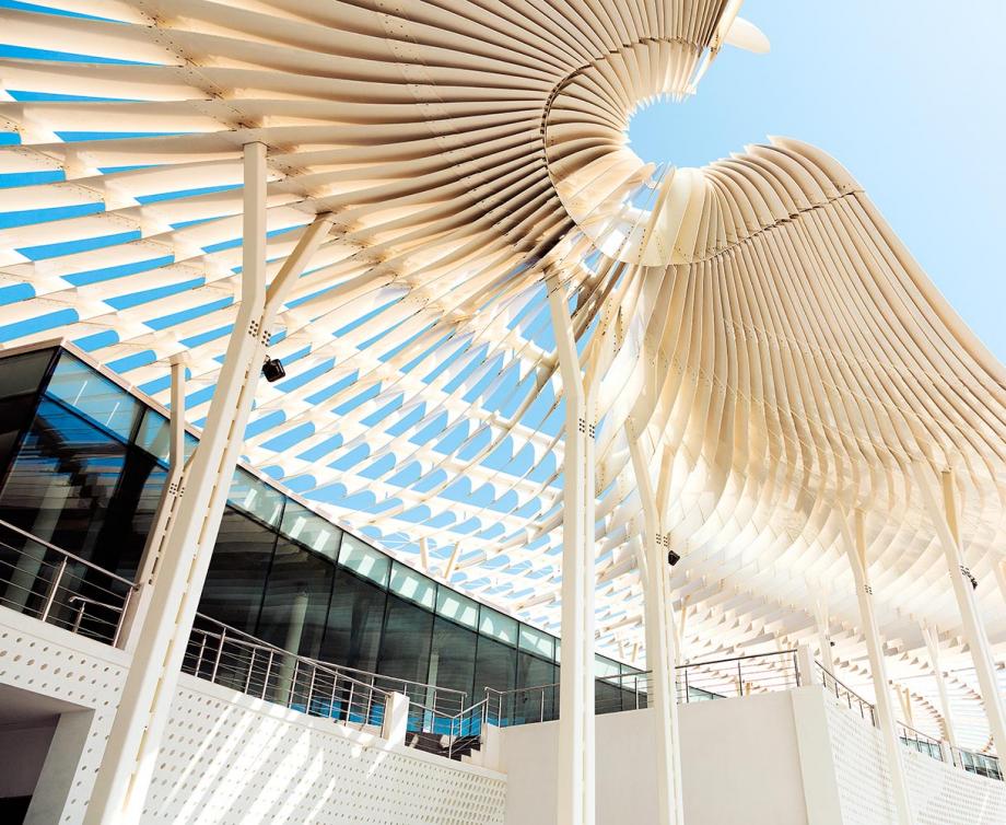
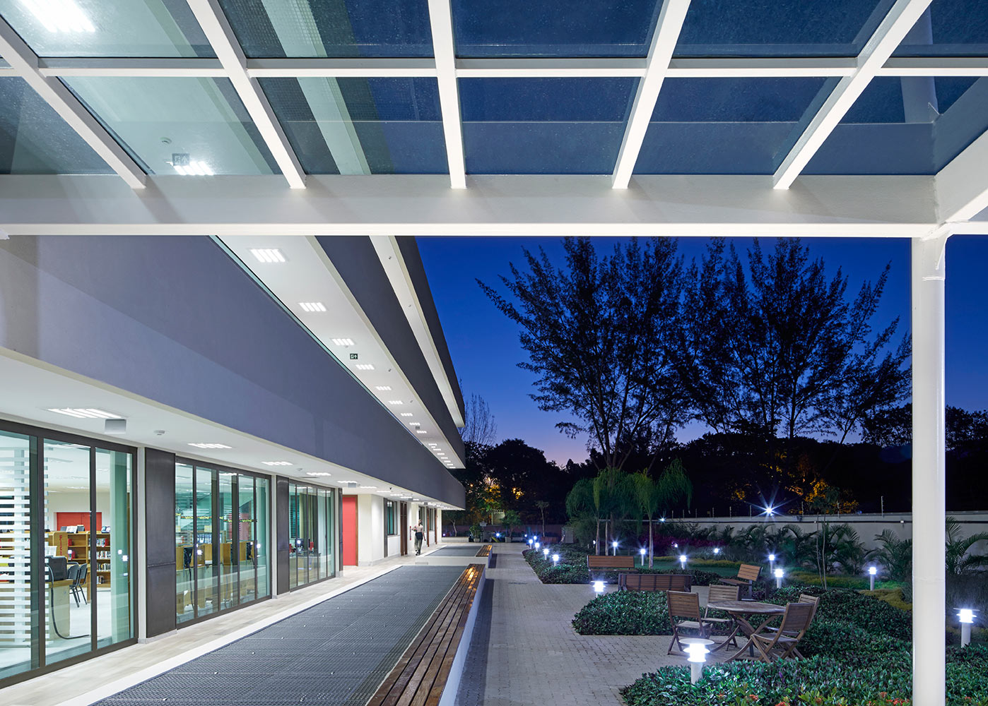
Inspired by nature and the wonderful landscapes of Jeju Island in South Korea, this permanent pavilion sits on the grounds of the Nine Bridges golf club. Designed by Seoul-based practice JOHO Architecture, the glass and steel structure combines organic shapes and advanced architectural technology and construction techniques.
Pergola at The Club at Nine Bridges, JOHO Architecture
Jeju Island, South Korea
The team, who worked closely with real estate and construction experts CJ E&C and technician ILJIN Unisco, chose glass as the main material, so that the pavilion remains discreet and doesn't detract from its natural surroundings. In fact, its shape was composed especially so that it preserves and respects a nearby 600-year-old tree.
Pergola at The Club at Nine Bridges, JOHO Architecture
Jeju Island, South Korea
Spanning some 300 sq m, the Pergola is small architecture at its best, and comes with a dedicated book, entitled ‘Pergola of The Club at Nine Bridges: Architecture and Technology Resembling the Nature'. Published by Korea's Spacebooks, it recounts in detail all the project's challenges and the ingenious solutions that the team of experts came up with to make this small but perfectly formed structure a reality.
Coal Drop Yards, Heatherwick Studios
London, UK
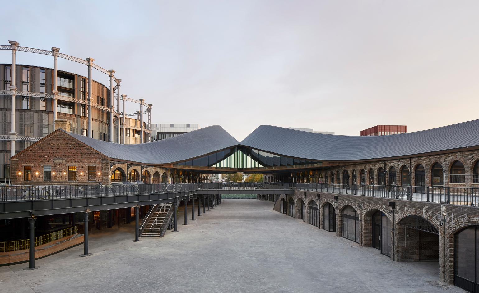
Kings Cross’ new retail hub features a variety in retail units, a result of careful study of different models within the typology, from shopping malls to vernacular retail districts, such as traditional souks, in order to create the best possible design and overall layout.
Coal Drop Yards, Heatherwick Studios
London, UK
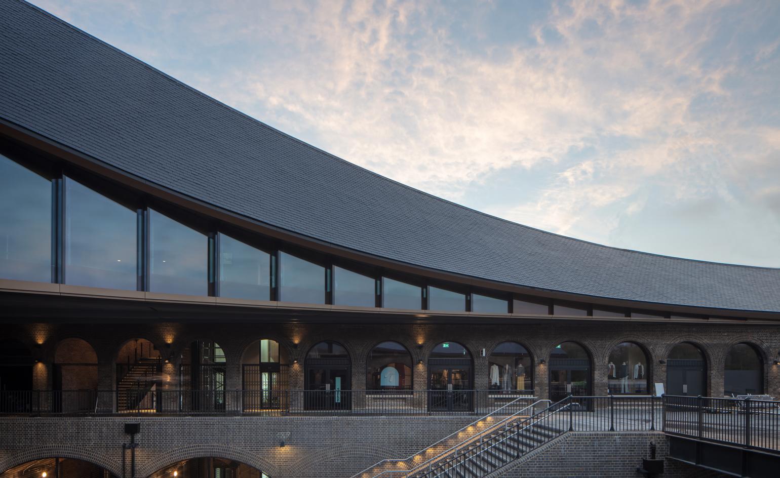
The complex’s striking design features a twin set of sweeping roof structures that sit lightly upon the project’s existing Victorian brick buildings, ‘kissing’ gently at the very top. Clad in Welsh slate and placed lightly upon the original structure, this roof can even be taken down, if needed, without affecting the old building’s bones in the least, explains Heatherwick.
London Bridge Station, Grimshaw
London
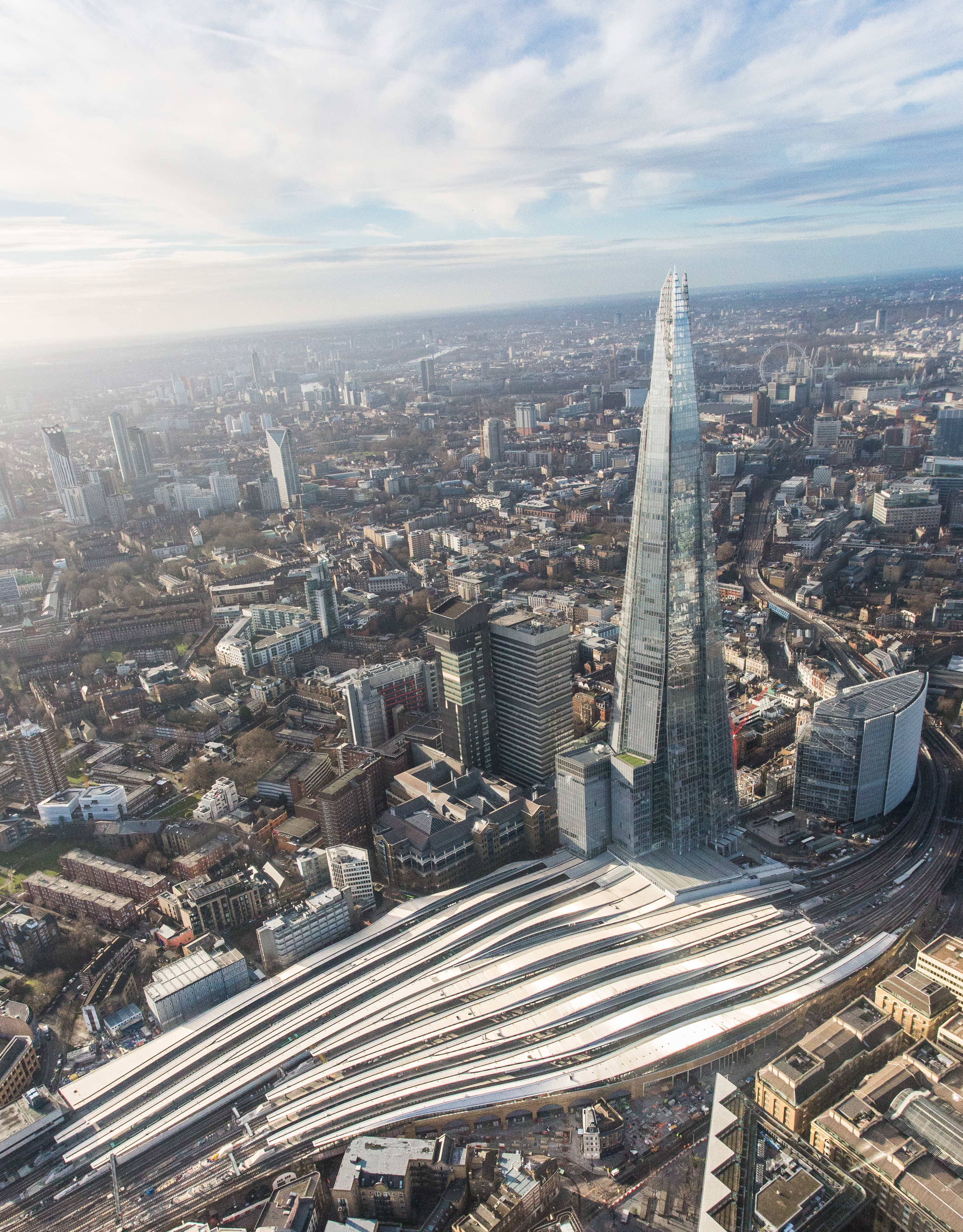
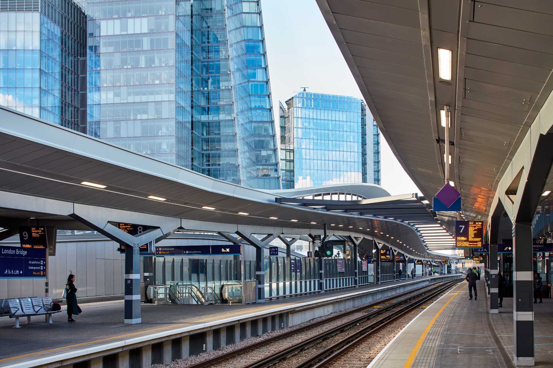
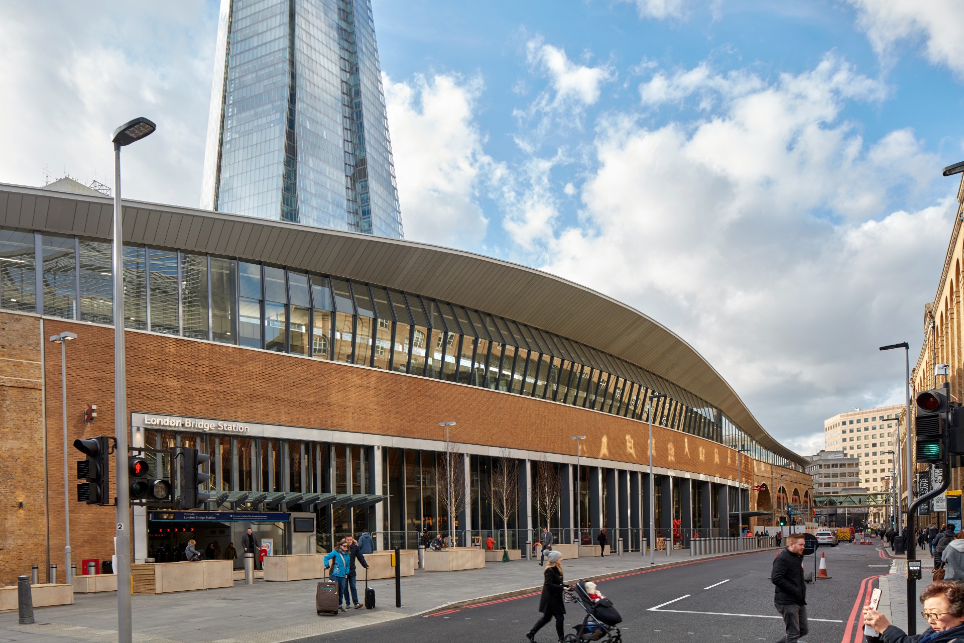
The area around London Bridge has been bustling with construction. Following the office, retail and landscaping around the Shard, now the complex's central London train station is also officially complete, with a design by Grimshaw. The station's complete transformation into a modern transport and infrastructure hub marks the end of the neighbourhood's £1bn redevelopment project.
London Bridge Station, Grimshaw
London
Two key concepts drove the design solution, explain the architects. The first one was the need to create an expansive concourse and civic space that would be large and modern enough to be able to negotiate comfortably the large numbers of passengers and visitors the station gets on a daily basis. The new concourse is now indeed larger in size than Wembley Stadium. The numbers alone are impressive; this station can accommodate 50 million annual journeys.
London Bridge Station, Grimshaw
London
A second, and crucial element in this project was the construction schedule, as all the works needed to be done while the station remained fully operational. Grimshaw's clever design took this into account, featuring modular elements that could be constructed off-site wherever possible. This was no mean feat; the roof alone comprises a series of ribbons made of 1,200 pre-fabricated cassettes.
Burj Alshaya, Gensler
Kuwait
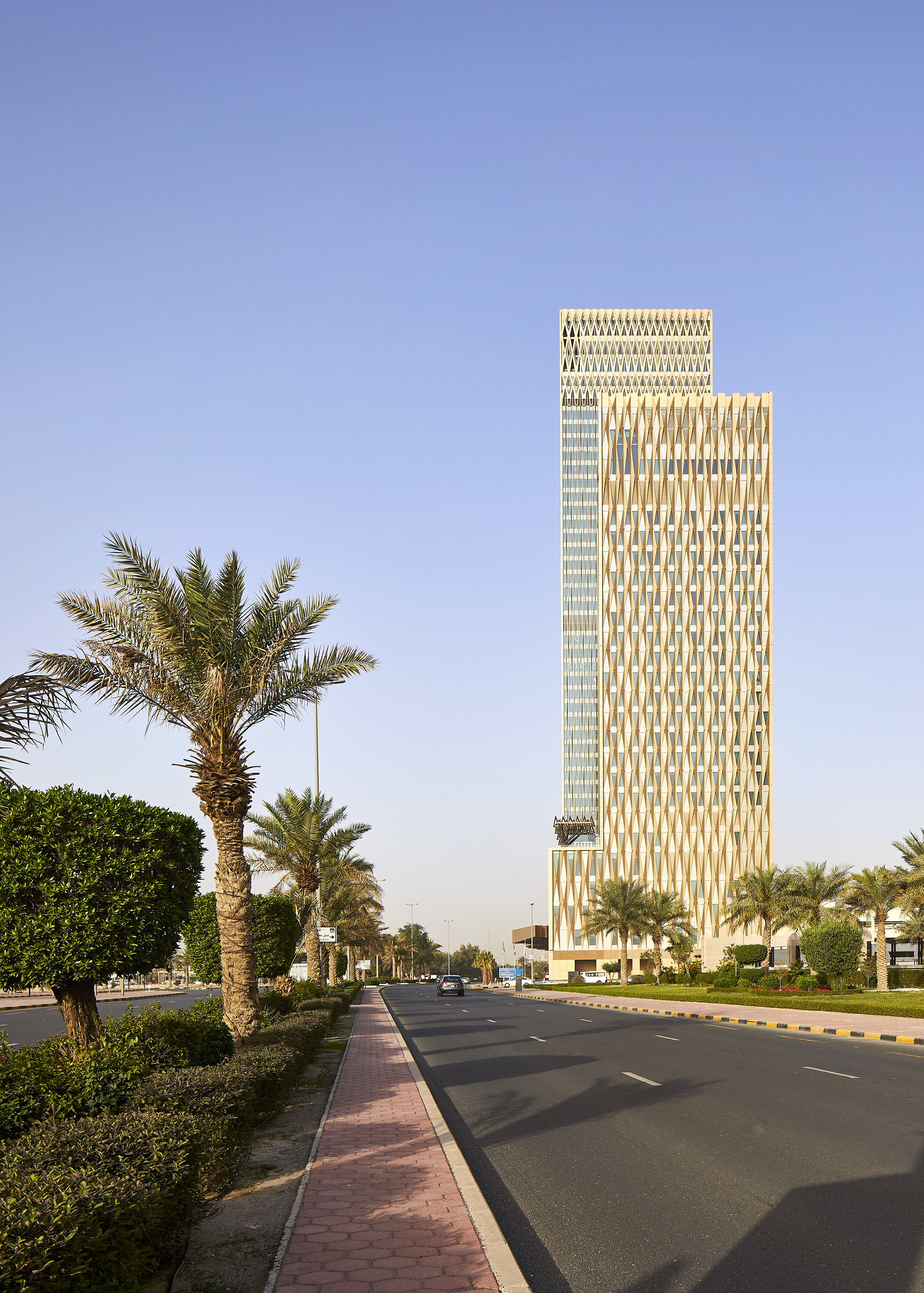
Gensler's new addition to Kuwait City is a striking tower complex comprising the headquarters of the Alshaya Group, as well as a Four Seasons hotel. A podium connecting the two towers sits at the composition's base and contains a variety of retail offerings.
Burj Alshaya, Gensler
Kuwait
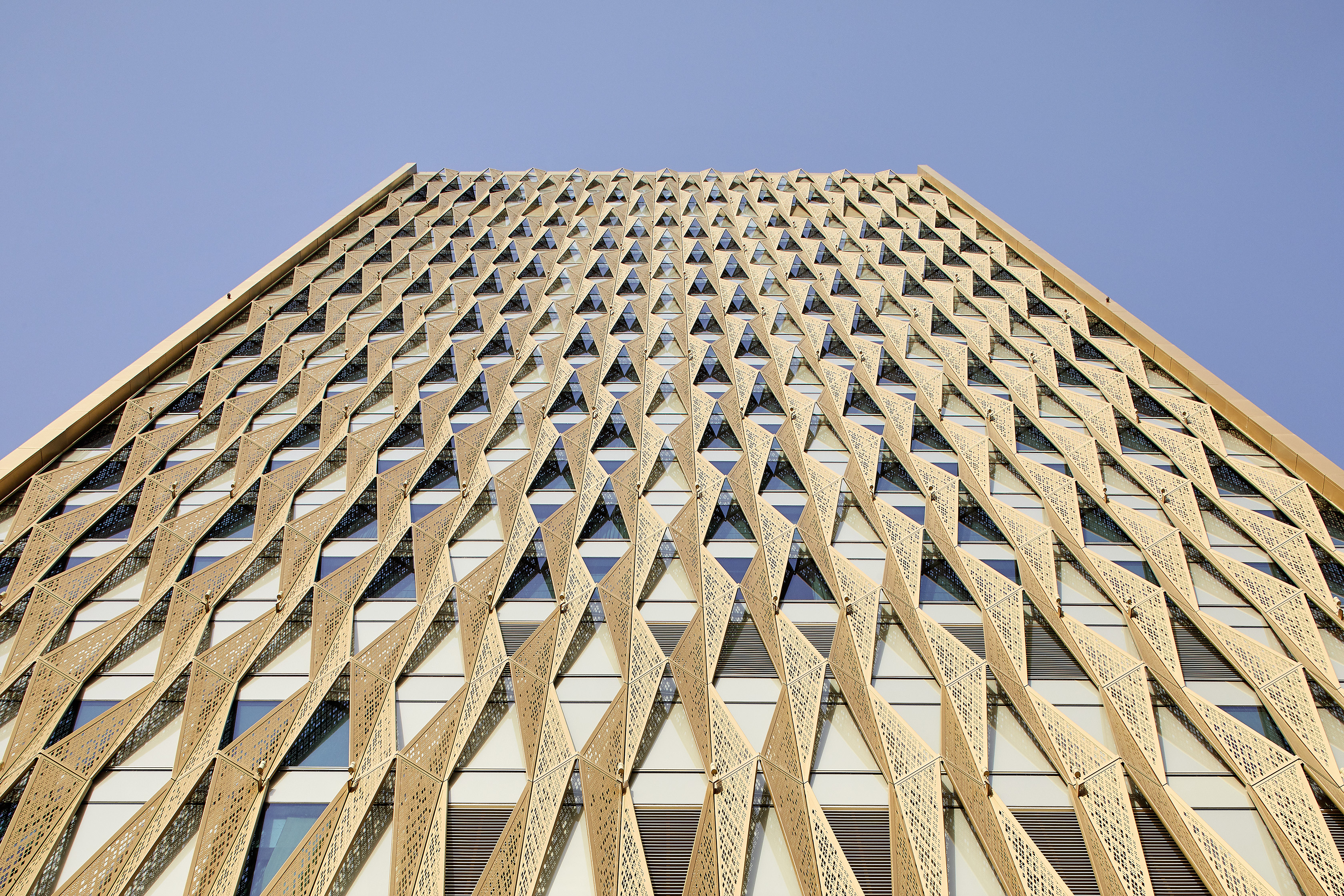
The complex's facade is its most eye-catching feature. For the design, the architects drew inspiration from the region's local culture, and in particular the ‘mashrabiya’, an element of traditional Arabic architecture that sees windows enclosed with latticework. The geometry of the resulting fins not only creates a pleasing visual effect but also helps with shading and cooling.
V&A Dundee, Kengo Kuma & Associates
Dundee, Scotland
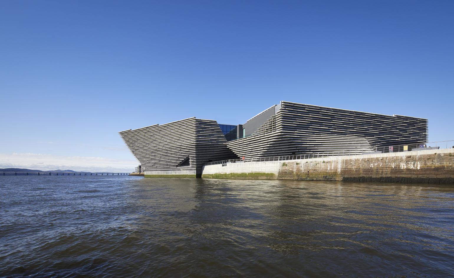
Winner of the 2019 Wallpaper* Design Award for Best Public Building, V&A Dundee’s striking, angular form cites the craggy coastline cliffs of north eastern Scotland. Kuma won the competition back in 2010 with his ambitious design for a museum that takes references from its context and fuses them with the Japanese architect’s signature sensibilities and light touch.
V&A Dundee, Kengo Kuma & Associates
Dundee, Scotland
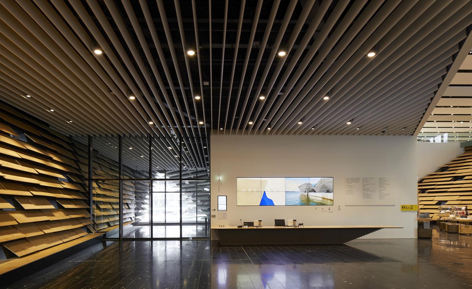
Modern construction technology also played a key role. Its distinctive façade is made of 2,500 cast stone elements hanging off a concrete frame. It was important not to completely conceal the frame, both inside and out, explains project architect Maurizio Mucciola, so materials were carefully selected.
Steinhardt Museum of Natural History, Kimmel Eshkolot Architects
Tel Aviv, Israel
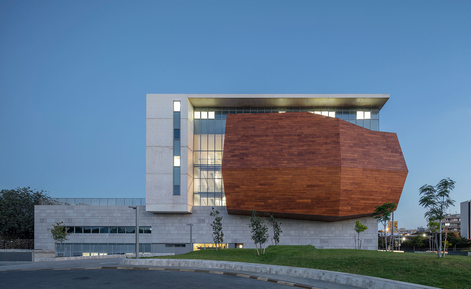
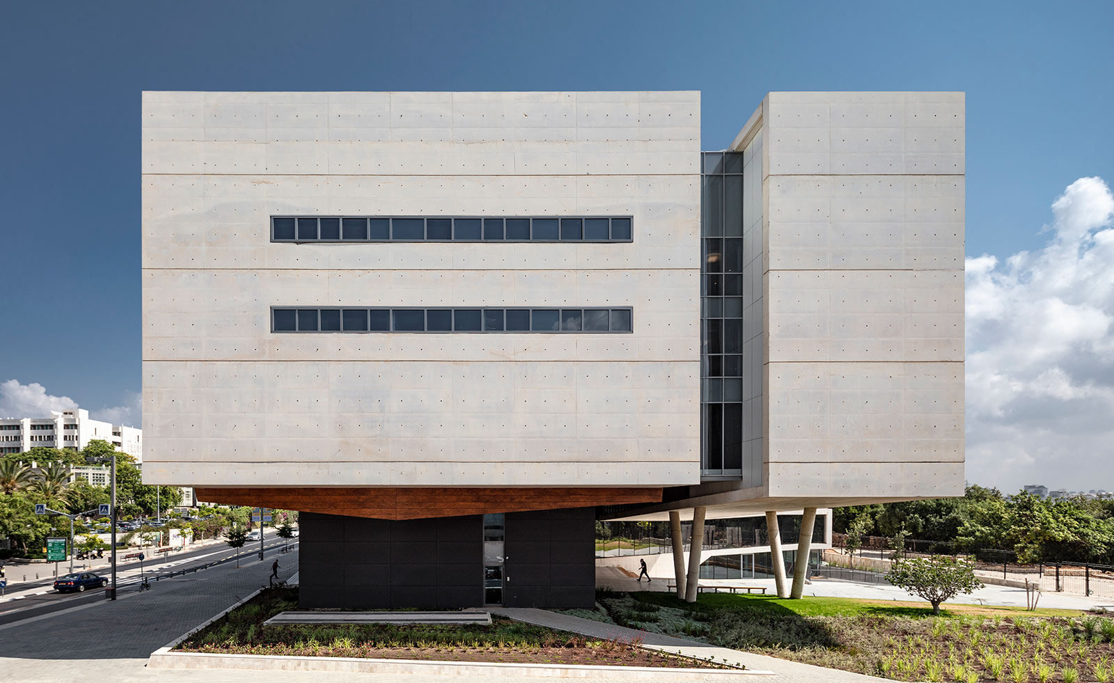
Tel Aviv University’s vast collections of natural history have a new home at the heart of the campus. Set across 10,000sq m, the new building also serves as an academic research centre for staff and new entrance to the campus botanical and zoological gardens. The facade features a wooden-panel shell, nicknamed the ‘treasure box’ that is thermally insulated to allow complete climate control of the interiors.
Steinhardt Museum of Natural History, Kimmel Eshkolot Architects
Tel Aviv, Israel
The museum’s entrance plaza and lawn for public gathering open up a view to the gardens from the street. The architects designed the building to maximise outdoor space and interior exhibition space simultaneously. Interior space is defined by a series of ramps and hallways that lead visitors through an experience of the architectural structure described as ‘choreographed encounters’.
Heli-stage, ATAH
Shaoxing, China
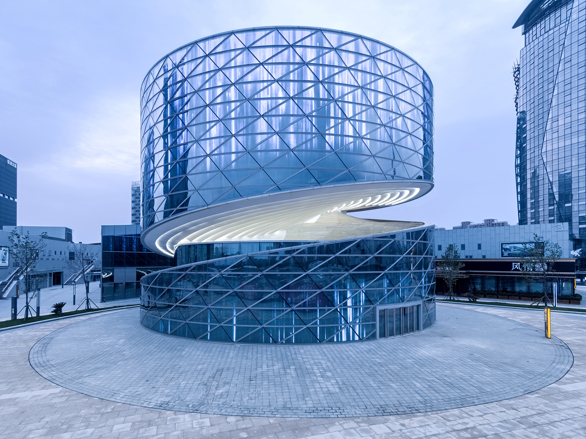
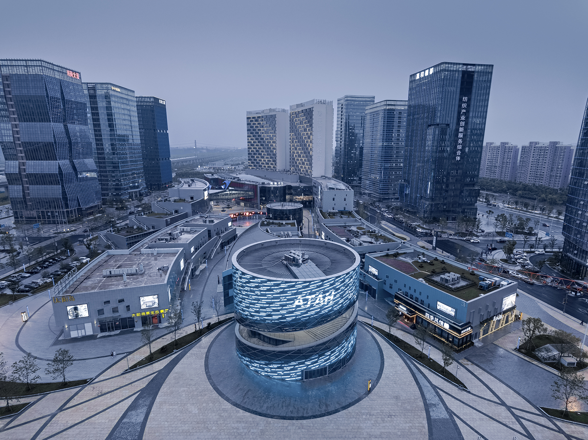
This mixed use cultural centre in China’s Shaoxing, is part of the city's ongoing, large scale China Textile Centre campus, a complex for arts and retail. Situated at the heart of the development, the project is a real centrepiece through its eye catching, round and shimmering design. The steel frame structure has most of its supports on the periphery of the facade, meaning that the interior can remain open and column-free. Writer: Ellie Stathaki.
Heli-stage, ATAH
Shaoxing, China
The building's spiral form blends different levels and connects the interior seamlessly with the outdoors, bringing everything together in a single, large and continuous exhibition space. A staircase connects all floors and leads the visitor in from the entrance level. Meanwhile, a gap at the heart of the structure promotes natural air circulation inside. Shanghai-based ATAH, are behind both the architecture and the interior design of Heli-stage. Writer: Ellie Stathaki.
Frost Museum of Science, Grimshaw
Miami, USA
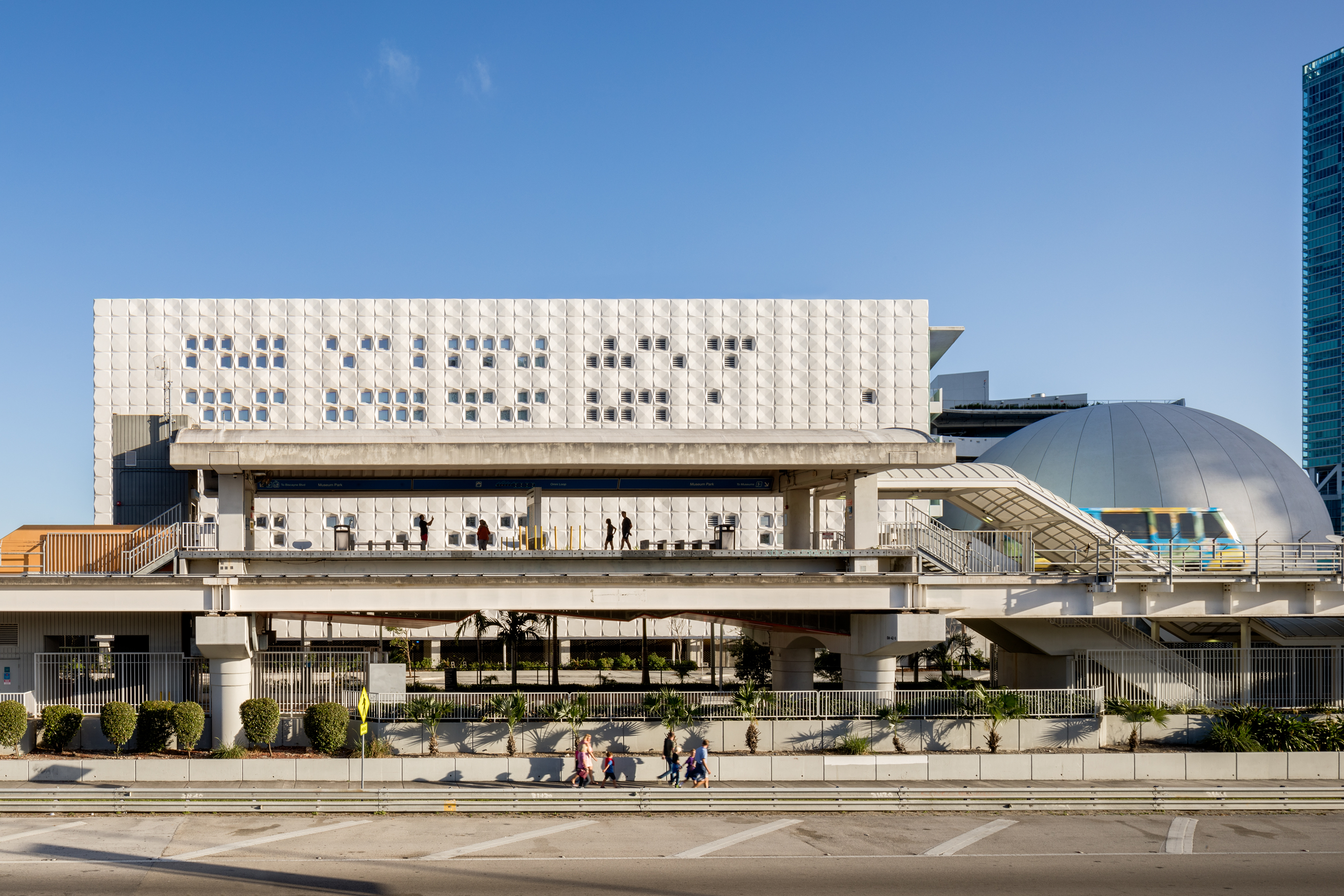
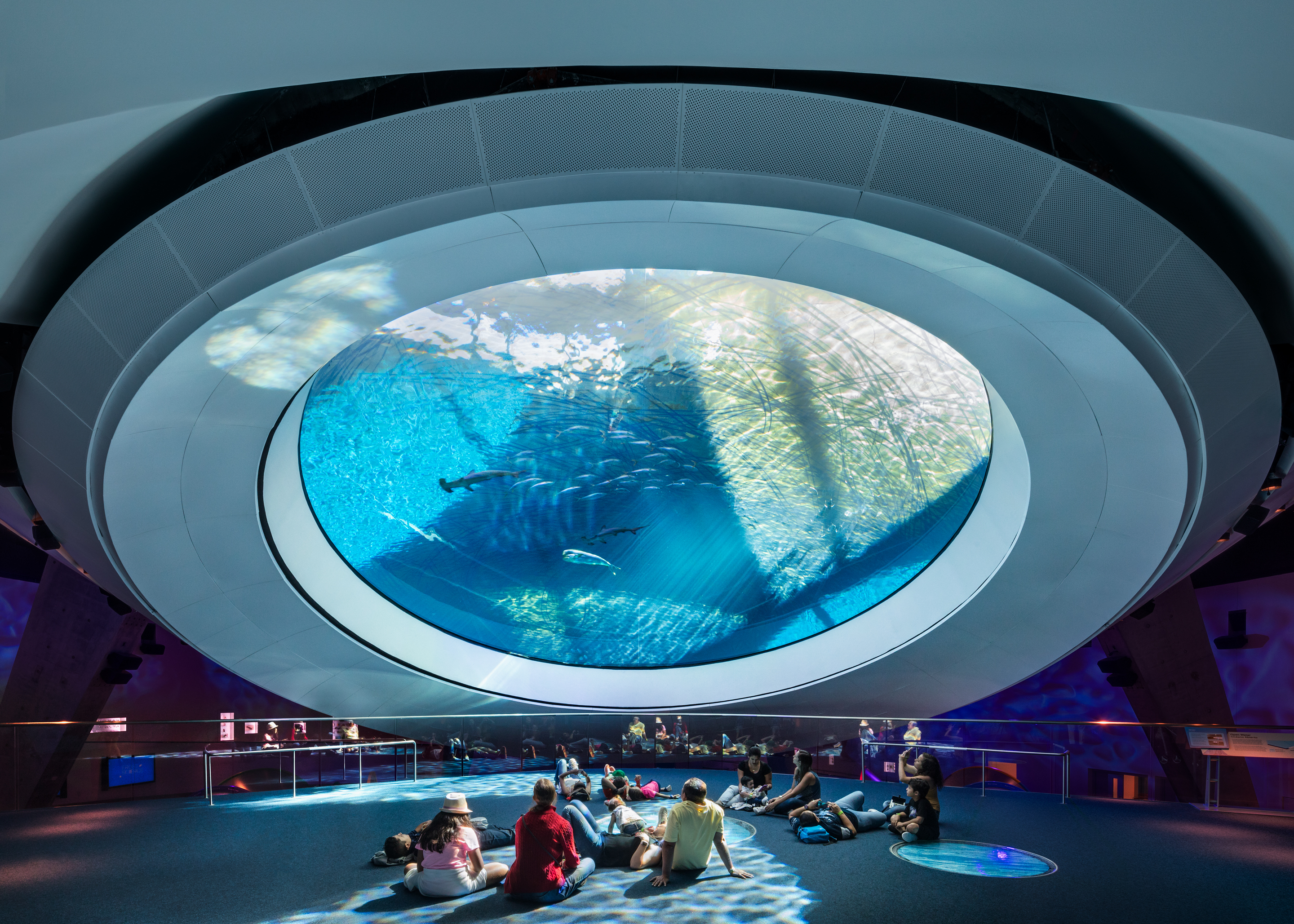
While this striking new museum in Miami opened its doors to the public last May, it only just reached 100 per cent completion. Designed by Grimshaw, the project is a true example of sustainability and technological innovation, having been awarded LEED Gold Certification – no mean feat for a scheme containing an aquarium. Writer: Ellie Stathaki.
Frost Museum of Science, Grimshaw
Miami, USA
The Frost Museum unites several functions, including a planetarium, an aquarium and a science museum, within a single campus in Downtown Miami. The north and west wings are clad in lively, faceted, pixelated textured tiling, while the aquarium features a more organic shape. Open, bright interiors linked with bridges guide the visitor through a journey of discovery. Writer: Ellie Stathaki.
Morpheus hotel, Zaha Hadid Architects
Macau, China
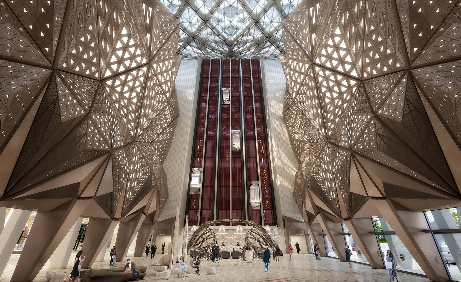
The unconventional monolithic structure of the Morpheus hotel features a freeform exoskeleton that rises from ground level, wrapping around a pair of towers and a cathedral-like central atrium to create a gargantuan block punctuated by three undulating voids that reflect the figure eight.
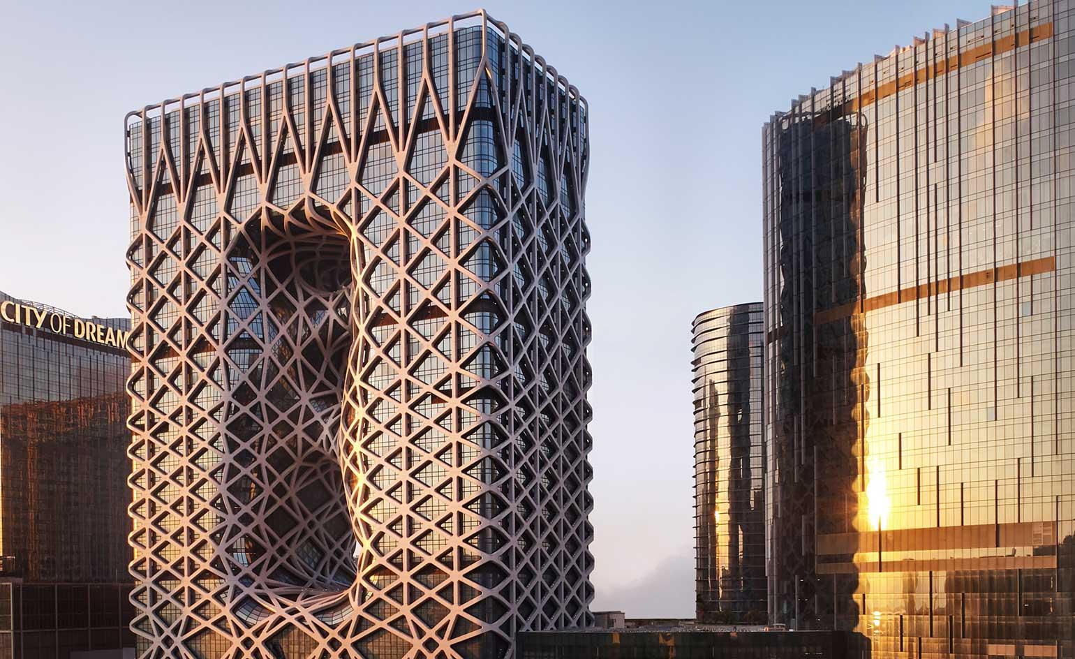
Morpheus hotel, Zaha Hadid Architects
Macau, China
Inside, three futuristic sky bridges connect the main circulation cores while providing vertigo-inducing communal dining and lounge spaces. There are 780 hotel rooms and the upper seven floors house VIP gaming facilities, three pool villas and six duplex villas, as well as a semi-enclosed rooftop swimming pool.
Tencent HQ, NBBJ
Shenzhen, China
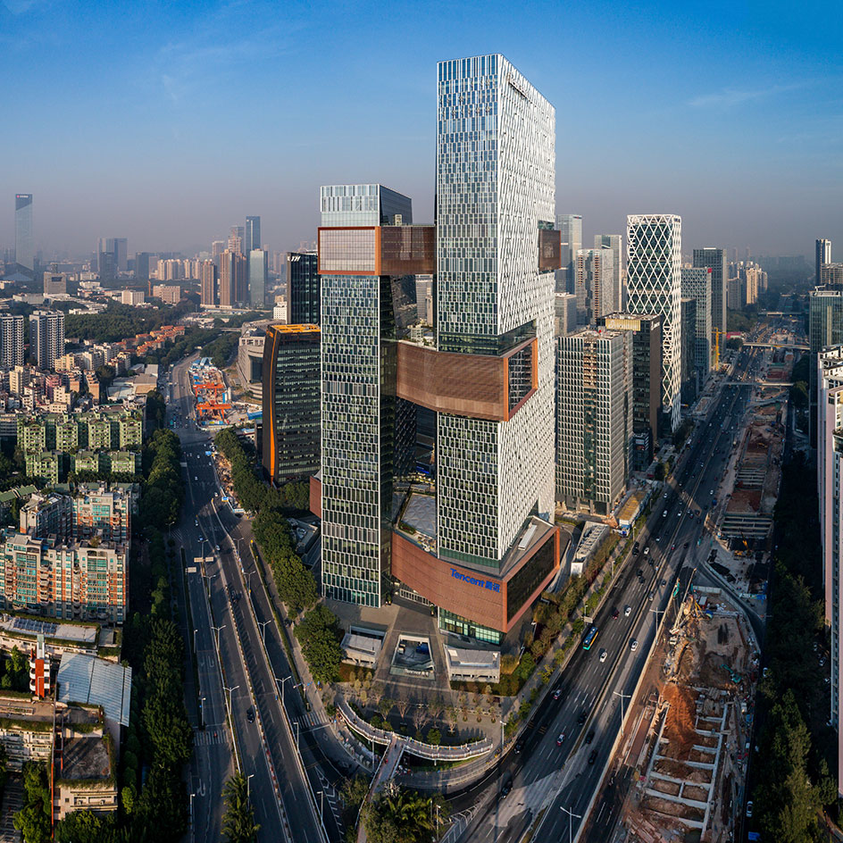
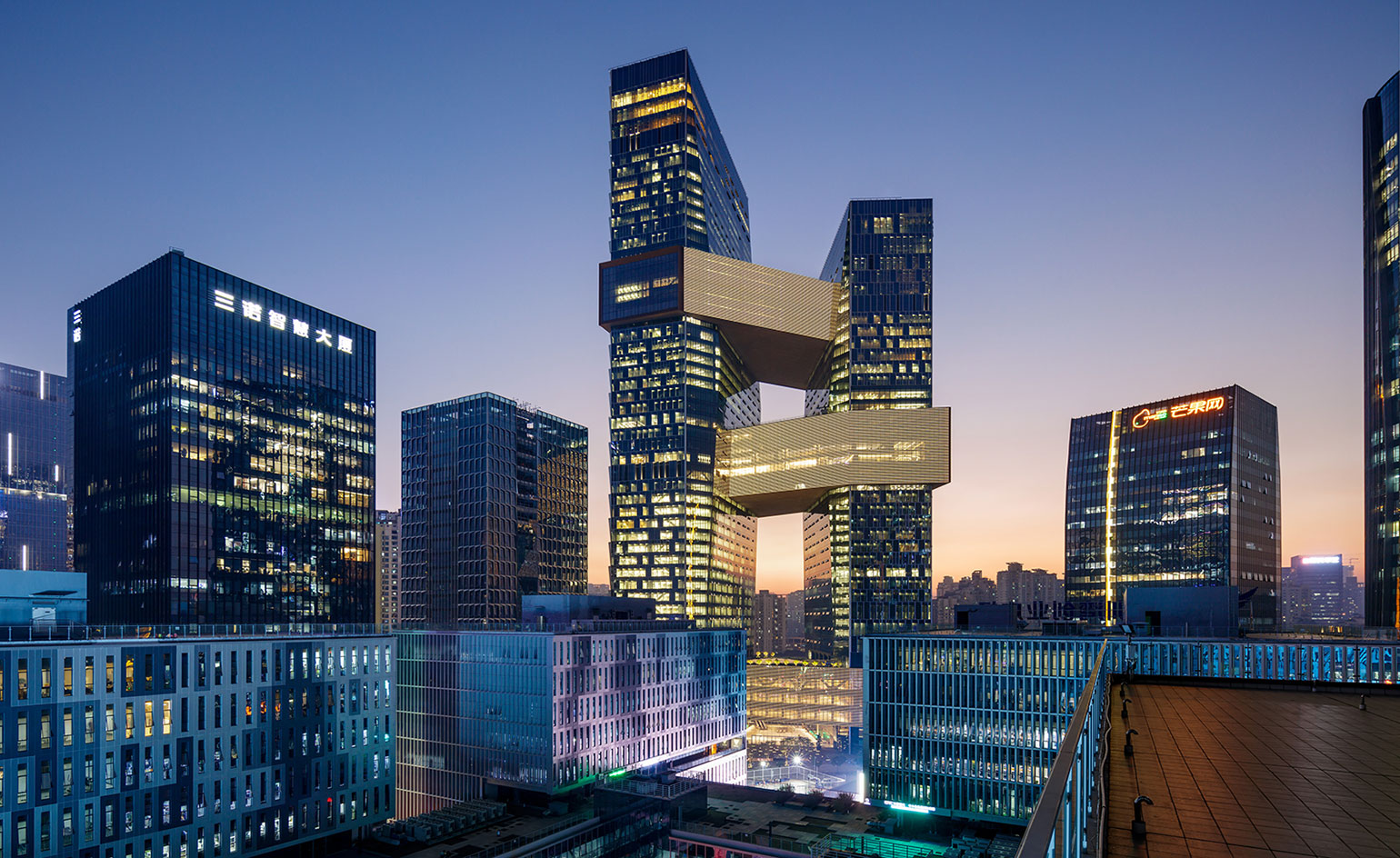
The architects at NBBJ have followed up their Spheres at Amazon’s Seattle campus with an eye-catching structure for another tech business – this time in Shenzhen. The firm has designed skyscrapers linked by three bridges as the next HQ for Tencent, a major Chinese company. Writer: Clare Dowdy
Tencent H Q, NBBJ
Shenzhen, China
The idea is that Tencent’s 12,000 workers get to bond and network in the library, health centre and running track, which are based on the bridges. This is no sprawling campus à la Amazon, but a space-efficient vertical workplace. Writer: Clare Dowdy
Oman Fish Market, Snøhetta
Muttrah, Oman
West of Muscat, on the coast of Gulf of Oman, Snøhetta’s Muttrah Fish Market is a hub for Oman’s fishing industry and a social space for the community. Muttrah city is Oman’s largest harbour, with a long history of commercial trade represented by the original 1960 fish market nearby. Luminosity Productions
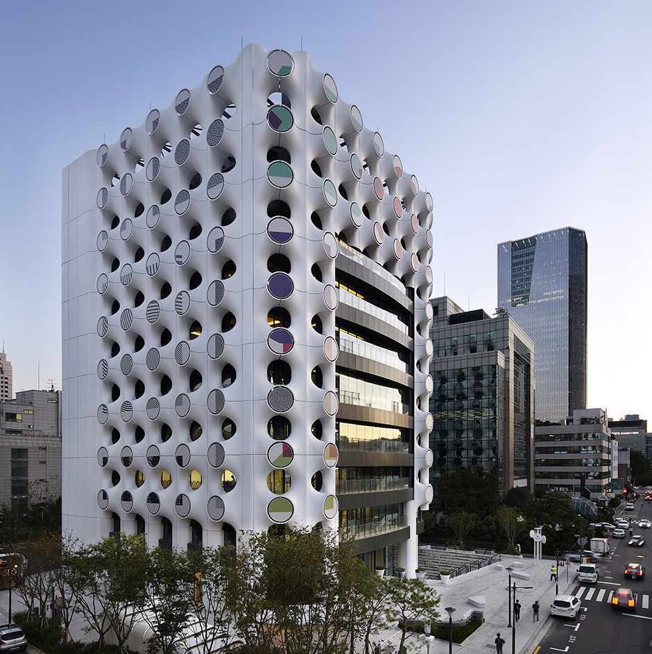
KEB Hana Bank, The System Lab
Seoul, Korea
Art and financial services are not
natural roommates, but a new project
by south Korean bank KEB Hana bucks the trend, bringing culture and finance under one roof. Designed by local architecture firm The System Lab and located in Seoul’s affluent Samsung-dong district, Place 1 is a bank, just not as
you know it. Defined as a ‘cultural bank’ and a ‘slow banking space’, KEB Hana’s new home will host the company’s offices and customer services, as well
as standalone artworks and public exhibitions. The building itself was also conceived as a large-scale artwork for the local community. The external cladding is made of prefabricated state-of-the-art UHPC (ultra-high performance concrete) panels that feature movable circular disks, each holding an art piece by different contemporary Korean artists, including Jin & Park, Oh-Sang Kwon and Sang-Won Lee.
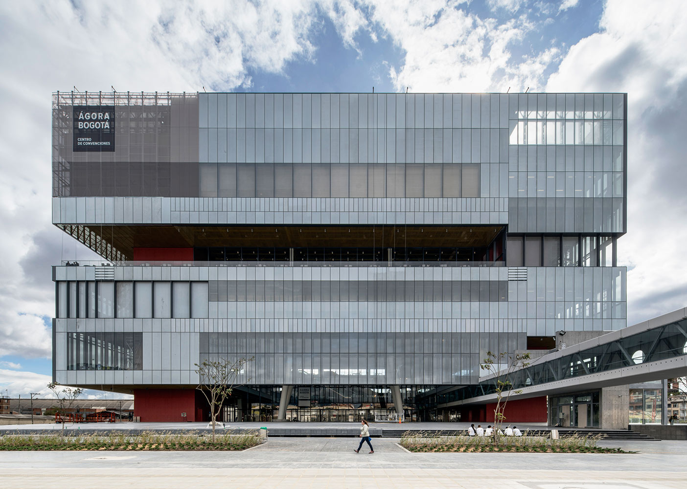
Agora-Bogatá, Estudio Herreros and Bermúdez Arquitectos
Bogatá, Colombia
The Agora-Bogatá is an events centre designed by Bogatá-based architects Estudio Herreros and Bermúdez Arquitectos. The stacked structure contains multiple event spaces inside and outside, bringing a wide range of flexibility. Materials include continuous simulated stone paving, industrial netting, glass wall panels and recycled concrete. The complex brings a public space of 12 000 sq m to the city and can accommodate up to 4,000 people. With innovative ventilation systems, tonnes of natural light and smart acoustic modeling, the Agora-Bogatá is an innovative example of modern architecture and a symbol of ‘New Columbia’.
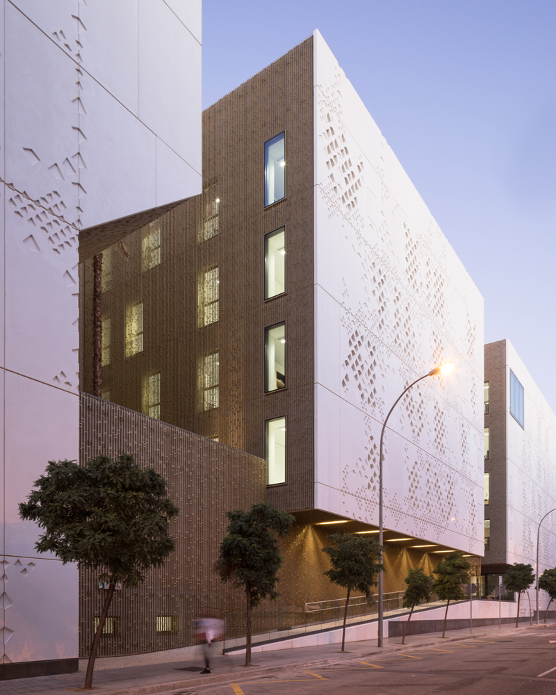
Palace of Justice, Mecanoo
Córdoba, Spain
Moorish influence and Córdoba’s historic architecture are reflected in the design of this new courthouse. The plan of the Palace of Justice is inspired by the urban plan of the old city and the design employs the use of lower and upper courtyards landscaped with palm trees, as seen in traditional architecture in old Córdoba. Housing 26 courtrooms, a forensic institute and public services, the Palace of Justice is located in a largely residential area of ‘anonymous housing blocks’ in an area that was a product of rapid urbanisation. Its facade of perforated glass and reinforced concrete which overlooks a broad public square developed as part of the design (a credit to the compact and efficient design of the building) provides the community with a new civic linchpin.
British School in Rio, John McAslan + Partners
Rio de Janeiro, Brazil
Adjacent to the main Rio Olympic Games Barra site, John McAslan + Partners has completed a senior school for the British School in Rio de Janeiro. The three-storey, low-energy building builds on the Brazilian modernist aesthetic with its strong horizontal form. With a multi-use hall, classrooms, landscaped outdoor class-rooms, science labs, and a sixth form common room, as well as supporting accommodation, the school will provide a place to learn for 2,000 pre-school, primary and secondary education pupils. Natural ventilation and shading underscore’s the school’s environmental credentials and the project forms a monumental gateway to the Barra site and adding the civic identity of the area.
The 100 Street Funicular and Frederick G. Todd Lookout, Dialog Design
Edmonton, Canada
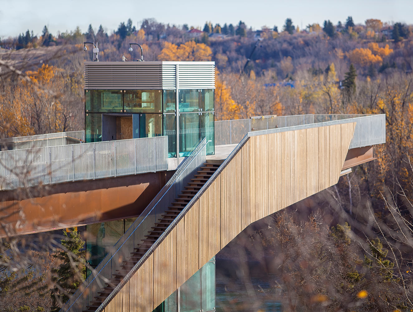
Canada’s first funicular, the ‘100 Street Funicular’ with the Frederick G. Todd Lookout – a viewing platform opening up views across Edmonton’s picturesque valley – provides the community with a new leisure activity located within the city’s largest green space. Designed to improve access to the river and valley, the funicular promotes outdoor activity and appreciation of nature. Dialog Design’s funicular features an accompanying stairway of 170 steps and built-in concrete seating, as well as a pathway for runners alongside one for different types of users. The stairs, cladding and boardwalk are constructed with Kebony wood, selected for its durable nature – its silver grey patina has the same properties of tropical hardwood, developed with an environmentally friendly bio-based liquid.
Red Eléctrica de España Campus, IDOM
Madrid, Spain
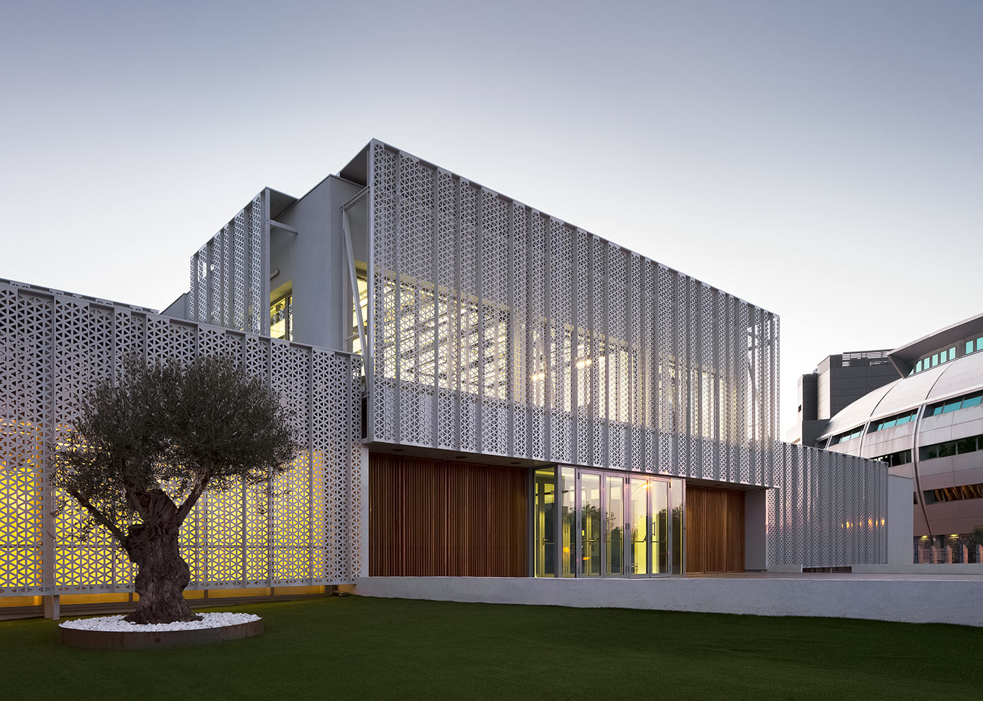
In Madrid’s Tres Cantos Technology Park, IDOM has designed a new campus for Red Eléctrica de España, the operator of the Spanish national electricity grid. Working with two existing buildings, the IDOM team found ways to increase the sustainability of the offices with minimal environmental impact. The result was improved and reorganized workspaces and classrooms, which maximized the available space for communal areas, a laboratory and test area. The new design allowed the campus to rise to its contemporary role and meet the technological needs of the company. Crucially, IDOM developed innovative technologies to thermo activate the structure, improving energy efficiency through insulation and solar protection.
DUO, Büro Ole Scheeren
Singapore
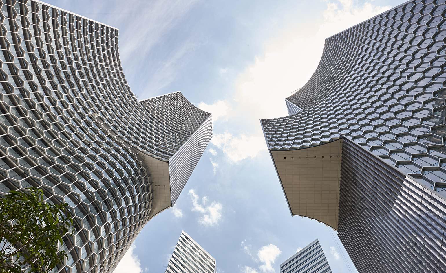
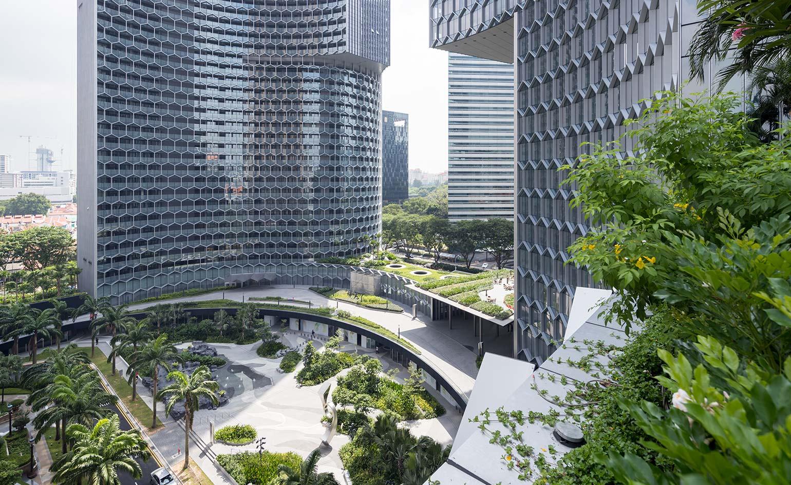
Sheathed with a honeycombed grid of hexagons – a pattern Scheeren used with great effect on his first Singaporean project at the Interlace - the striking silhouette of this twin-towered mixed-used development more than holds its own against its senior neighbours. Though it’s nowhere to be found in the press materials, it’s understood that the raison d’etre of the concave curves was partly to deflect the ‘negative’ feng shui energy generated by the sharp knife-edges of Pei’s Gateway building across the road.
DUO, Büro Ole Scheeren
Singapore
The 39-storey tower holds a mix of offices, the first South East Asian outpost of the Andaz hotel, and an observation deck that offers a dizzying panorama of the island. Across a landscaped piazza that’s peppered with restaurants, shops, and specially commissioned sculptures, the adjoining 49-storey DUO residential tower, meanwhile, features 660 private residences that range from studios to one-to-four bedroom apartments, and penthouses.
Kanda Terrace, Key Operations Architects
Tokyo, Japan
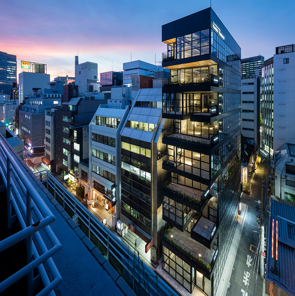
In a central Tokyo neighbourhood, surrounded by mid-rise office buildings, this new block is a rental building for restaurants. The project, which occupies a long, narrow plot of land and fills the entire permissible floor area ratio of space, features a recessed glass façade with three-dimensional stacked terraces, which in size vary by floor. Black joinery and frames bring a sharp and minimal materiality to the building, clearly defining each restaurant. The architecture brings the opportunity for restaurant customers to interact with each other across the different terraces and the streetscape beyond.
Wallpaper* Newsletter
Receive our daily digest of inspiration, escapism and design stories from around the world direct to your inbox.
Ellie Stathaki is the Architecture & Environment Director at Wallpaper*. She trained as an architect at the Aristotle University of Thessaloniki in Greece and studied architectural history at the Bartlett in London. Now an established journalist, she has been a member of the Wallpaper* team since 2006, visiting buildings across the globe and interviewing leading architects such as Tadao Ando and Rem Koolhaas. Ellie has also taken part in judging panels, moderated events, curated shows and contributed in books, such as The Contemporary House (Thames & Hudson, 2018), Glenn Sestig Architecture Diary (2020) and House London (2022).
-
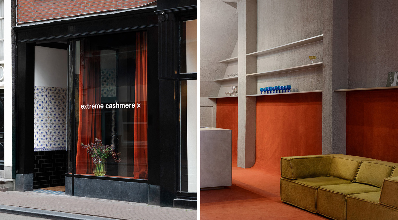 Extreme Cashmere reimagines retail with its new Amsterdam store: ‘You want to take your shoes off and stay’
Wallpaper* takes a tour of Extreme Cashmere’s new Amsterdam store, a space which reflects the label’s famed hospitality and unconventional approach to knitwear
By Jack Moss
-
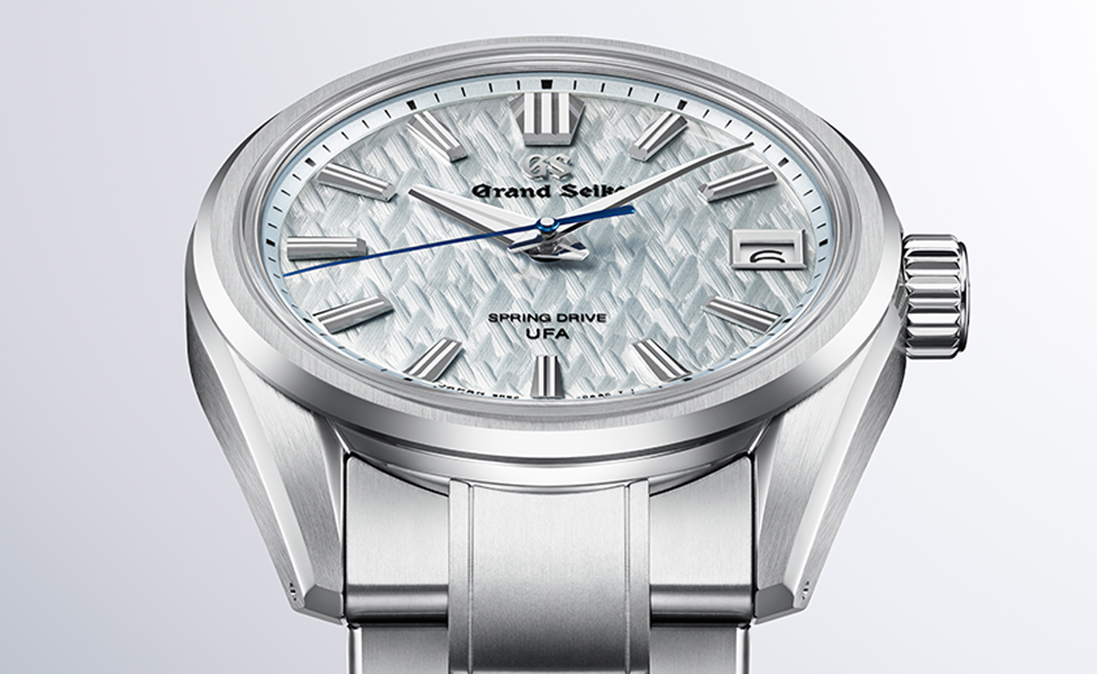 Titanium watches are strong, light and enduring: here are some of the best
Brands including Bremont, Christopher Ward and Grand Seiko are exploring the possibilities of titanium watches
By Chris Hall
-
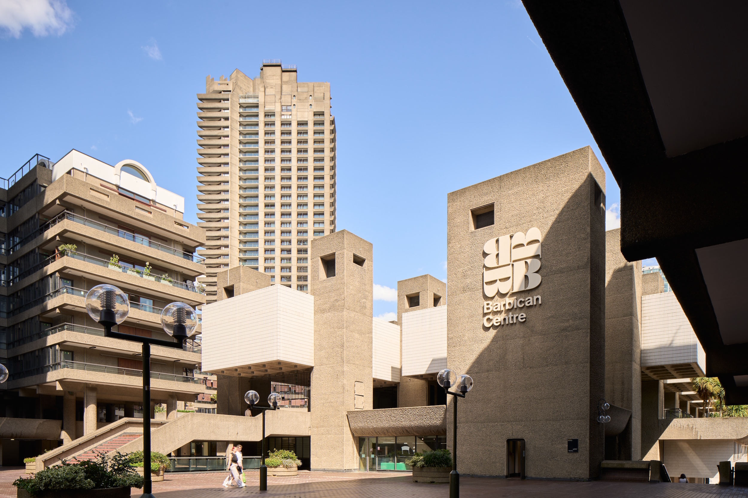 Warp Records announces its first event in over a decade at the Barbican
‘A Warp Happening,' landing 14 June, is guaranteed to be an epic day out
By Tianna Williams