Concrete architecture: our pick of the finest
Tadao Ando to John Pawson and OMA, many architects and practices have been inspired to use concrete – durable, low maintenance, strong and supremely moldable – it’s one the most versatile building materials available and has been used to create churches, homes, cultural buildings and even entire cities. We’ve scoured the globe from Japan to Mexico City, Chile to New York on our quest to present the best concrete architecture around the world.
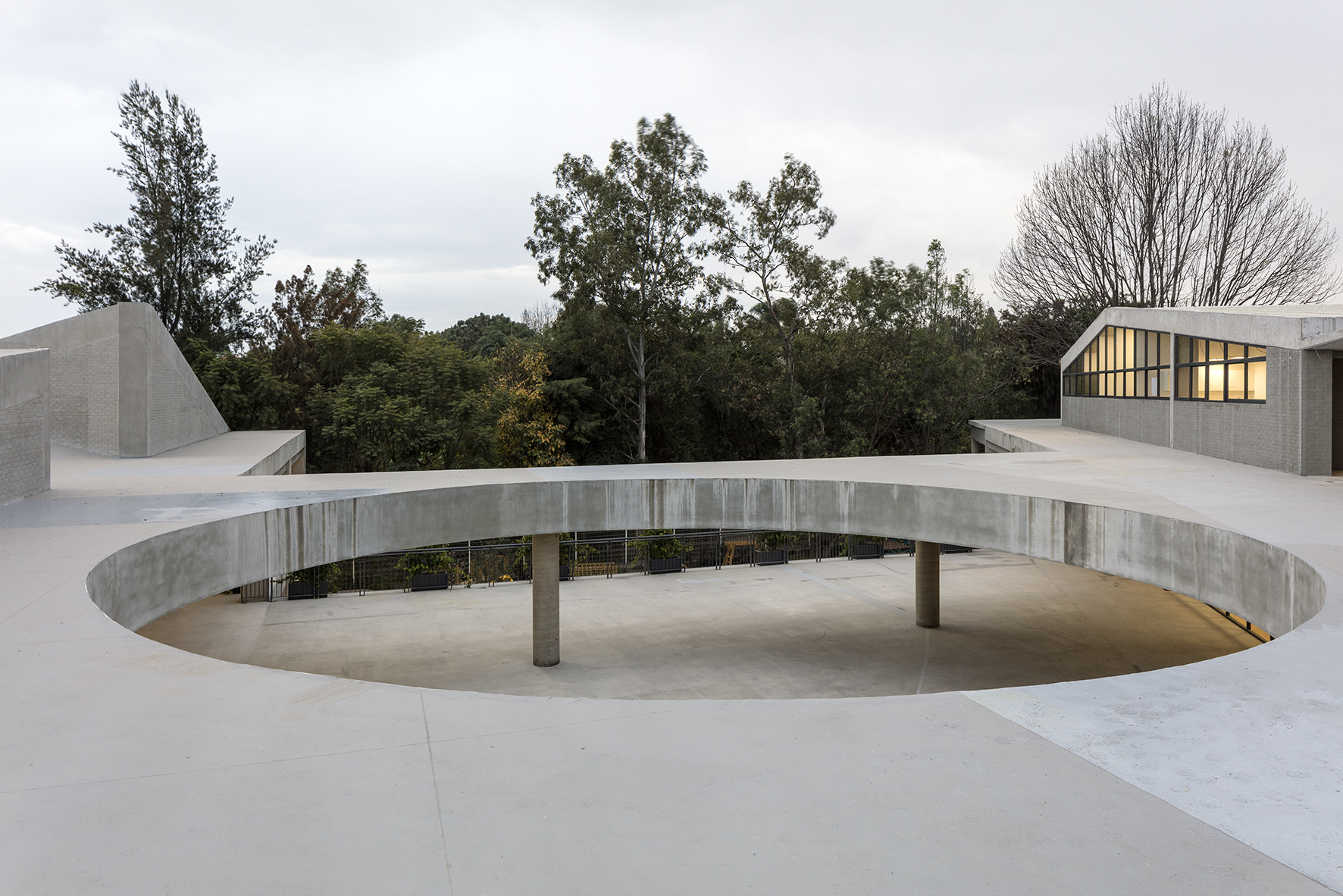
Beelieve school by 3Arquitectura, Guadalajara, Jalisco, Mexico
A school in Mexico has been designed as a concrete circuit to invite people to explore the building. A huge central void in the building opens up a communal courtyard at the heart of the school, while a ramp progresses slowly from the ground floor to the upper levels, allowing people to traverse without a perceptible change in height. As well as concrete, the architects used bricks and wood to create the ‘honest’ aesthetic of the building.
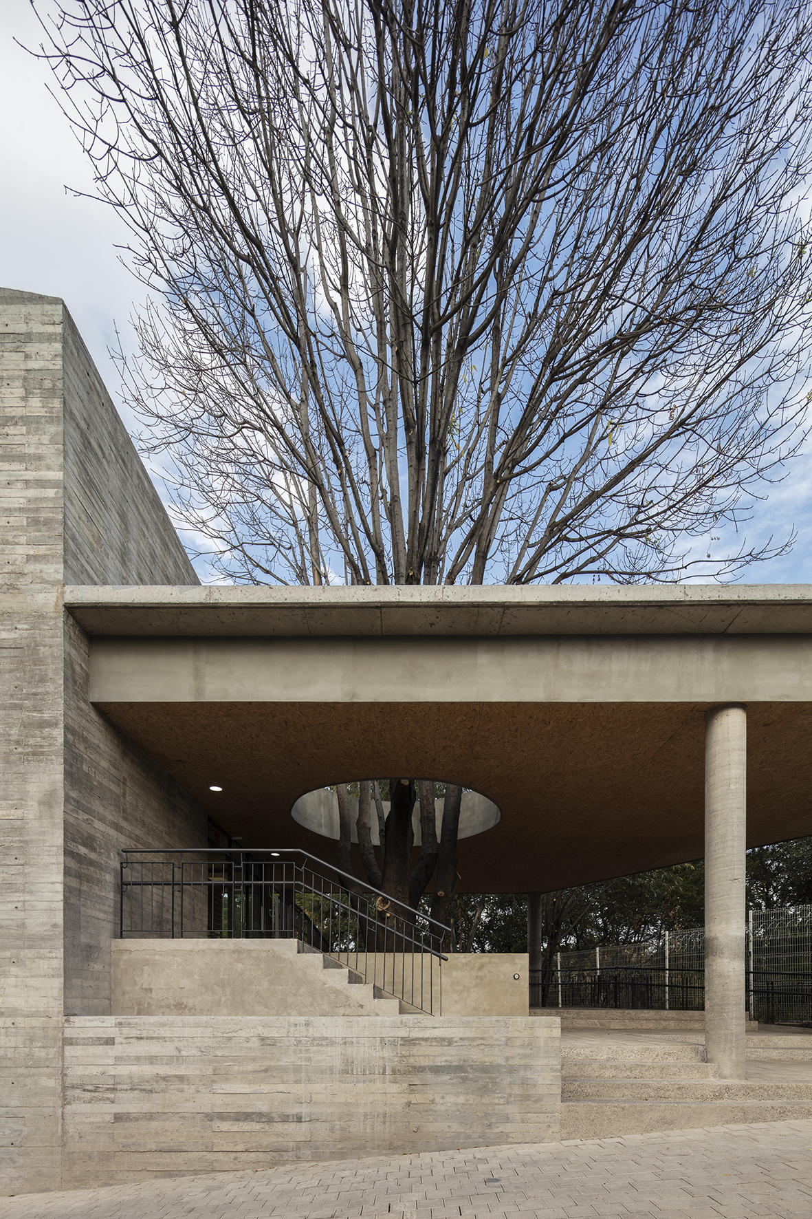
Beelieve school by 3Arquitectura, Guadalajara, Jalisco, Mexico
At the entrance to the school, a void in the roof opens up to allow an existing tree to continue its growth. The whole building was designed to intercept with the topography and nature of the site. A nearby forest encroaches on the site and is welcomed in through a series of gardens that become extensions of the the indoor classrooms.
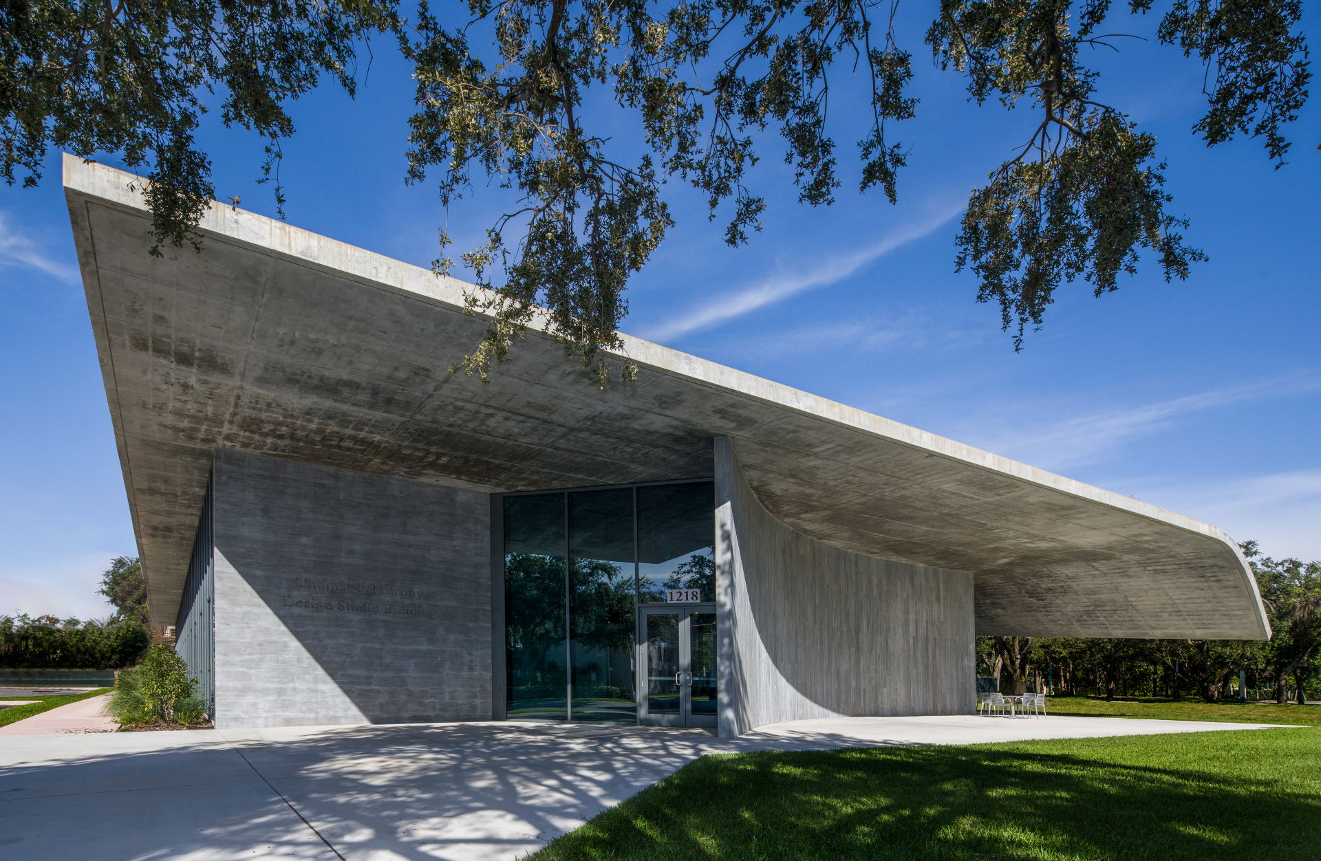
The Thomas P. Murphy Design Studio Building by Arquitectonica, University of Miami School of Architecture
The Miami School of Architecture just got a new building in the form of a brutalist concrete pavilion that will serve as a design laboratory and collaborative space for the students. Arquitectonica principals Bernardo Fort- Brescia and Laurinda Spear, as well as their son Raymond Fort, have been connected to the school through teaching, so it felt fitting for them to contribute to the institution's future through this innovative, new space that includes studio areas, as well as digital fabrication facilities, exhibition areas, and various social and public functions.
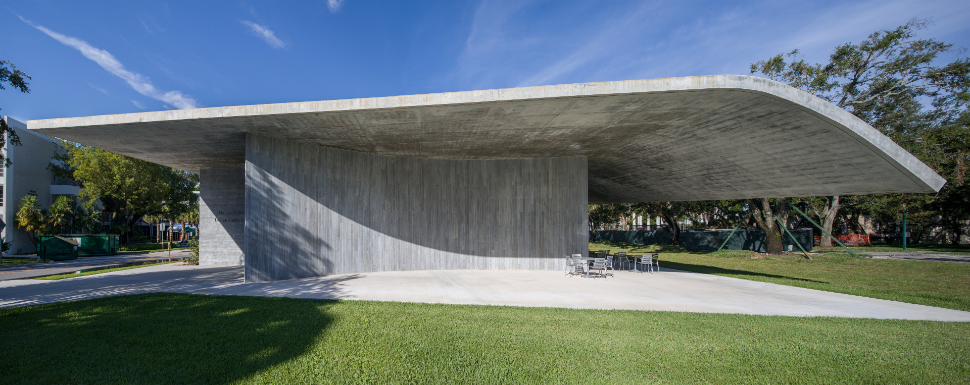
The Thomas P. Murphy Design Studio Building by Arquitectonica, University of Miami School of Architecture
Made out of tactile materials, the structure is a modern design out of glass and concrete. It is, ‘in essence, a single, oversized shed', explain the architects. A vaulted roof is suspended some 18 ft over the floor, featuring narrow steel columns and a few fixed walls. It encourages a sense of openness and collaboration, while also creating a focal point and public plaza outside, for the whole campus. The overall design is environmentally friendly, achieving LEED certification; the architects paid special attention in orientating it around the movements of the sun, so that it is a sustainable and comfortable working environment during the hot Miami summer months.
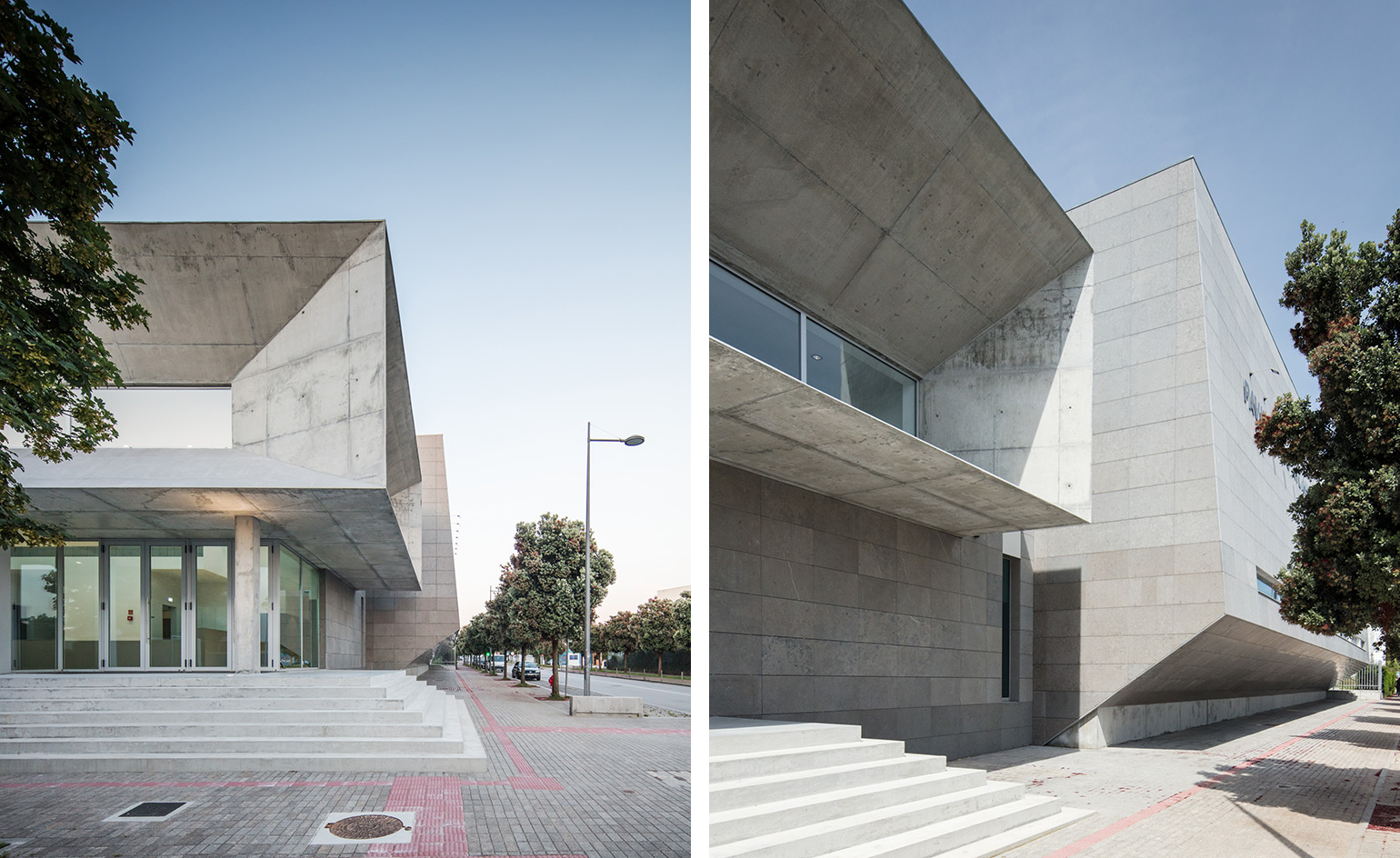
The Atlantic Pavilion by Valdemar Coutinho Arquitectos in Viana do Castelo, Portugal
The design of this community and educational sports pavilion corresponds to the necessity to create a low budget and easily maintained building for the City Council of Viana do Castelo. While Valdemar Coutinho Architects devised a ‘brutalist image’ using concrete and grey-bluish stapled stone tack for the facade, the architects refined the interior architecture to make it approachable and human. In the entrance hall, panels of grey embossed tiles have been designed by artist Mário Rocha.
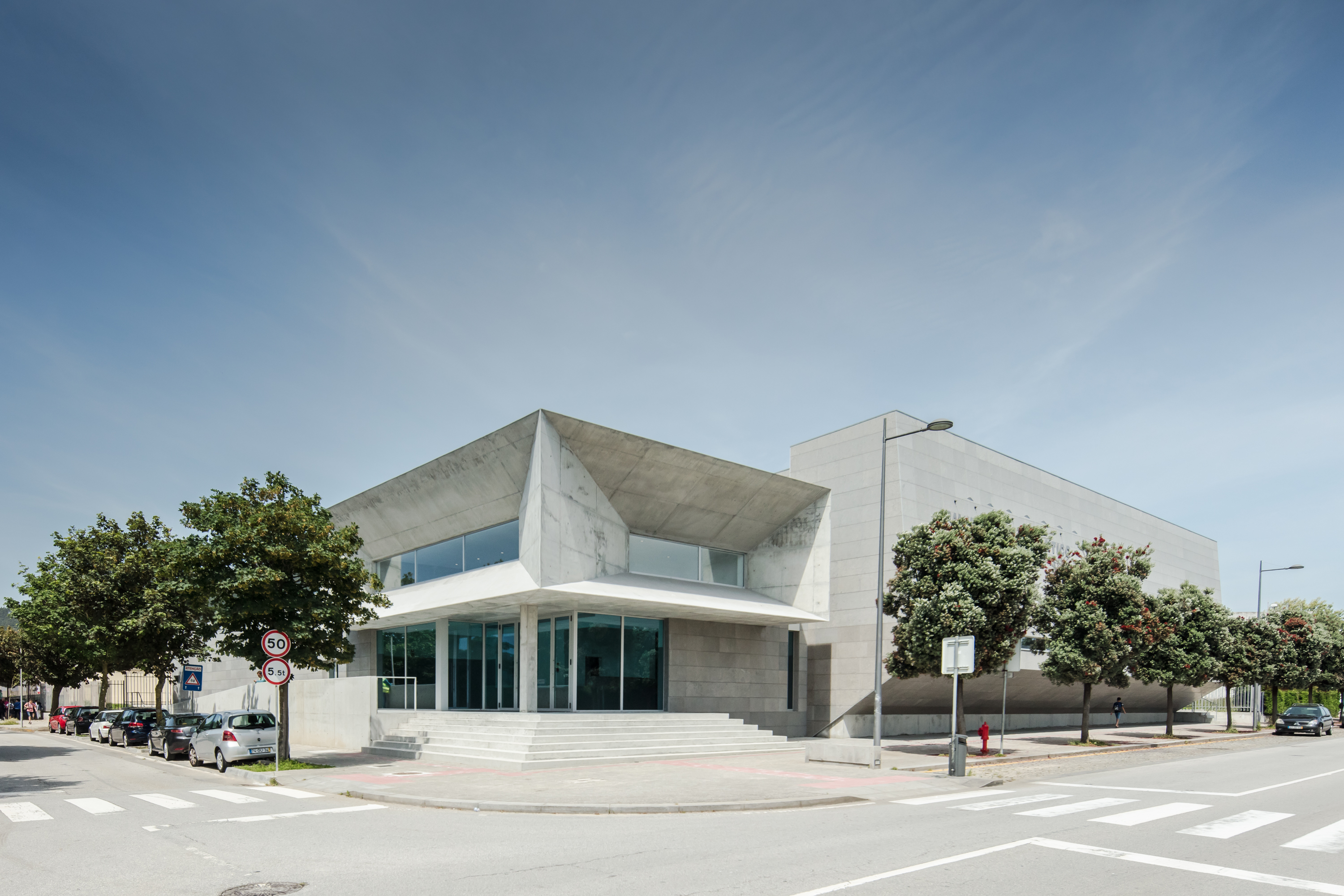
The Atlantic Pavilion by Valdemar Coutinho Arquitectos in Viana do Castelo, Portugal
The pavilion is made up of two parallelepiped volumes that are ‘implanted between themselves, forming a unique volume of dynamic and restrained lines’. The pavilion occupies its site to make the most of the space for sports facilities including volleyball and basketball courts, a playing field and four changing room blocks and social facilities including an entrance hall with seating, a cafeteria as well as space for technical support.
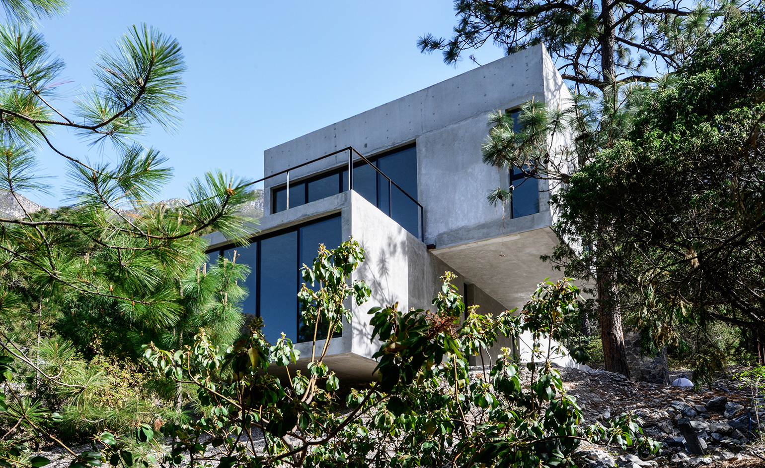
Casa 2I4E in El Junoco, Santa Catarina, Mexico, designed by P+0 Arquitectura
Casa 2I4E is quietly integrated into a hill in Mexico’s verdant El Junico park. The floating concrete volume constitutes a pair of geometric blocks, stacked one above the other. The configuration of the build allows for a scattering of outdoor spaces, which grant the occupants different points to interact with the natural backdrop. Balcony space accompanies the living-dining room on the second floor, and further spaces complement the first-level master bedroom and rooftop. Writer: Luke Halls
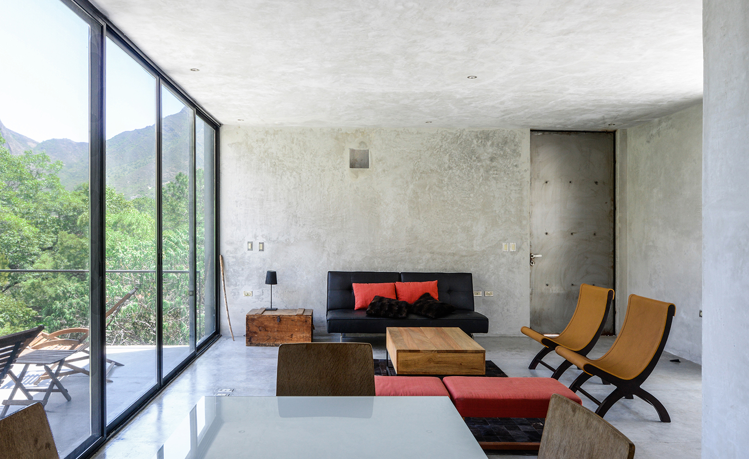
Casa 2I4E in El Junoco, Santa Catarina, Mexico, designed by P+0 Arquitectura
Forging a connection between domestic and rural space was of key importance to the Mexican couple who own the weekend retreat. Resultantly, design considerations – such as the selecting of materials to level accessibility, all played a part in the house’s realisation. Winding exterior staircases, ground-to-ceiling window doors and local stone all bring the outside in, and shadows cast from the surrounding trees bring life to the concrete surfaces. Writer: Luke Halls
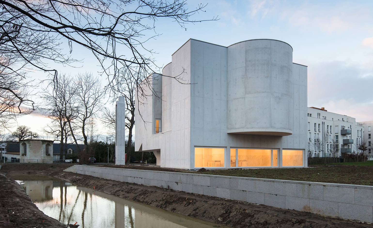
Saint-Jacques-de-la-Lande in Brittany, France by Álvaro Siza Vieira
The first church built in Brittany in the 21st century, Saint-Jacques-de-la-Lande is designed by Portuguese architect Álvaro Siza Vieira. The church has two chapels, a sacristy and a central worshipping space. Located in a local neighbourhood south of Rennes, Saint-Jacques-de-la-Lande is built of white concrete. Its form was designed to integrate into its urban location and echoes the shapes and sizes of surrounding residential blocks. Saint-Jacques-de-la-Lande seats up to 126 people on the second floor of the building – the first floor holds a social and administrative function. A square platform suspended above the cylindrical church volume tempers the access of light, and holds within it lighting and ventilation equipment.
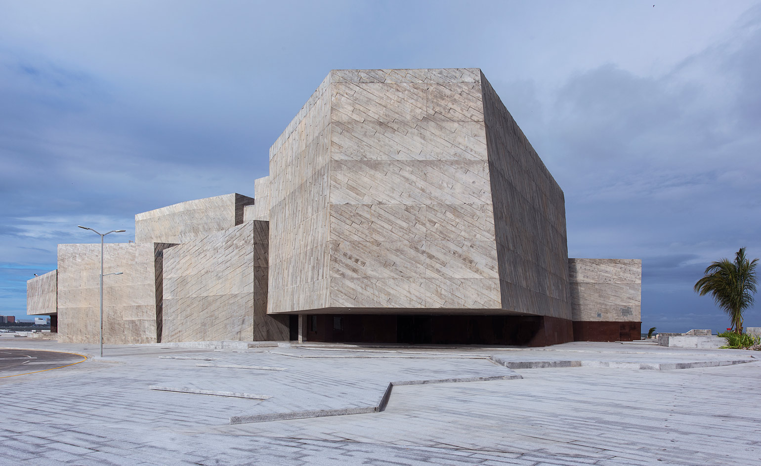
Foro Boca by Rojkind Arquitectos in Boca del Río, Veracruz, Mexico
Foro Boca is a concert hall designed to house the Boca del Río philharmonic orchestra which was formed in 2014. With the hall seating 966 people and a rehearsal space for 150 spectators, the Foro Boca sits within a larger regeneration plan for the urban waterfront area at the estuary of the river. Rojkind Arquitectos formed the concrete shape of the building inspired by the forms of the ripraps in the breakwater.
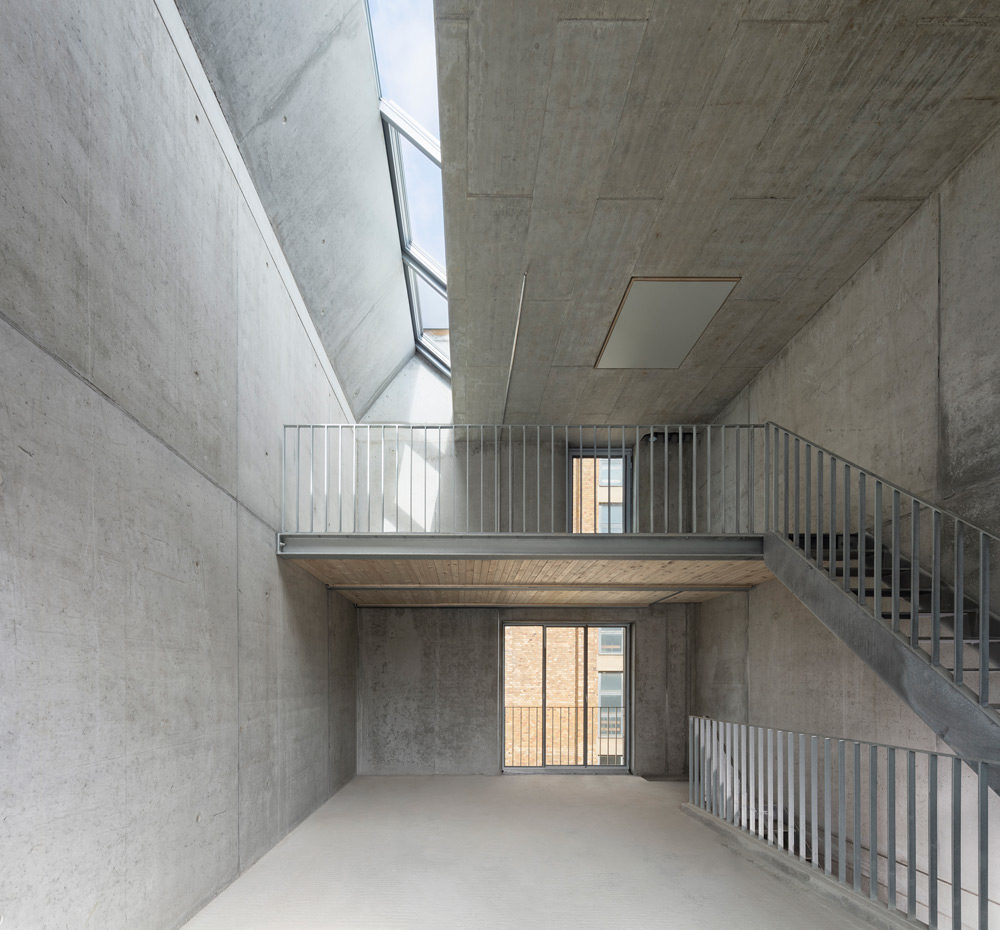
Spreehalle in Berlin by Feilden Clegg Bradley Studios
Spreehalle is designed by London-based firm Feilden Clegg Bradley Studios, in tandem with musician and photographer Bryan Adams, Hoidn Wang Partner, and Sauerzapfe Architekten. Located in the southeastern district of Treptow-Köpenick, the building will house 12 artist’s ateliers in a former factory building that was one part of an extensive complex belonging to the AEG Kabelwerk group (General Electric Company). Feilden Clegg Bradley has retained the industrial bones of the building, which dates from 1910, including two distinctive brick and steel halls.
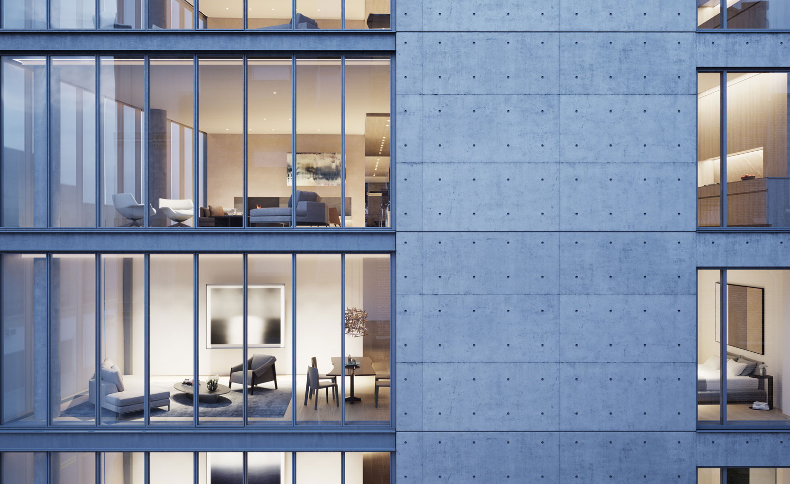
Tadao Ando’s concrete condominium, 152 Elizabeth, in Manhattan
Pritzker prize-winning architect, Tadao Ando’s 152 Elizabeth Street is a beautifully formed, seven-storey, seven-residence building situated in the heart of Nolita. It is Ando’s first residential building in Manhattan. Developed by Sumaida + Khurana, a local firm that is making it a point to work with renowned architects that have yet to build in New York City. For such a debut, the acclaimed architect has put together a building that bears all of his signatures. 152 Elizabeth Street seamlessly blends a poured-in-place concrete structure with a burnished metal framework. Generous glass panels add buoyancy to the building, while a 55-foot high and 99-foot wide living green wall brings a modern air of serenity and calm.
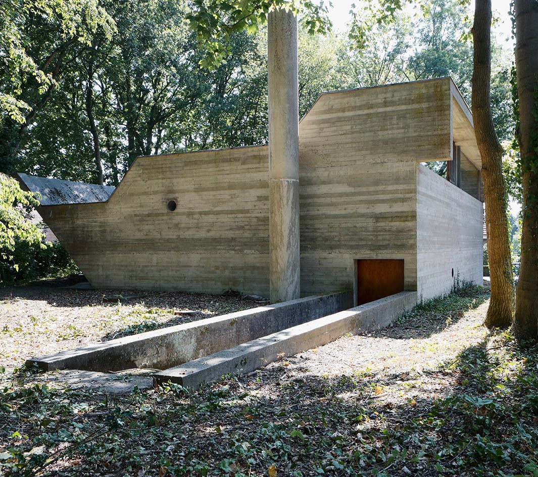
The Van Wassenhove House by Juliaan Lampens
At the tail end of the Brutalist movement, in 1974, the Belgian architect Juliaan Lampens completed a residence in Sint-Martens-Latem near Ghent for the teacher Albert Van Wassenhove. Built for a single man, it was considerably different from other, larger-scale manifestations of Brutalism around the world. Devoid from the usual urban and socialist connotations, this home was envisioned for just one person in a wealthy and quiet neighbourhood. With its closed grey concrete facade and tall rear glass windows that open up to a back garden, the bunker-like house favours privacy – turning away from society and toward indoor tranquility, in harmony with nature.
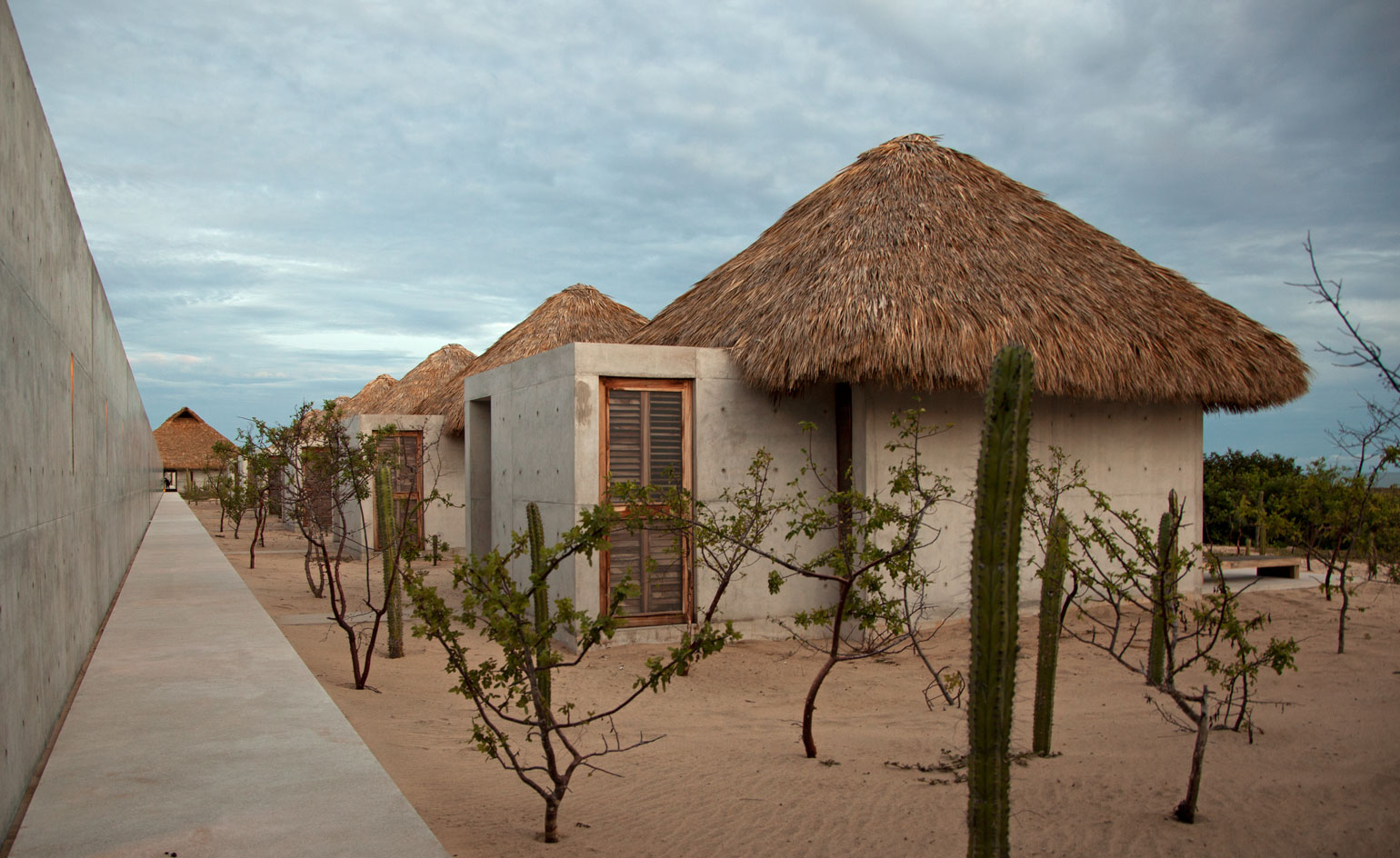
Casa Wabi Foundation by Tadao Ando in Mexico
Set up by artist Bosco Sodi and directed by Patricia Martin (former director and curator of La Colección Jumex), the Casa Wabi art foundation is situated on the outskirts of Puerto Escondido, Oaxaca, about 500 miles southwest of Mexico City. Sodi ‘always admired Ando’s architecture’ and approached the Japanese Pritzker Prize-winning architect for the design of his foundation’s new headquarters. There is one more Japanese connection Casa Wabi is named after the Japanese ideal of wabi-sabi, which revolves around the beauty of life’s imperfections. Ando obliged, creating a central complex around which sit six freestanding residences. The composition also includes two studios, an exhibition space and several multipurpose spaces. A 67-acre botanical garden set to become the foundation’s outdoor contemporary art collection completes the scheme. The architecture combines modern and traditional materials and techniques; the structure is concrete, following Ando’s signature style, but also uses the region's traditional ‘palapa’ construction. This is an open-sided pavilion featuring a thatched roof made of dried palm leaves that is common to that area of Mexico.
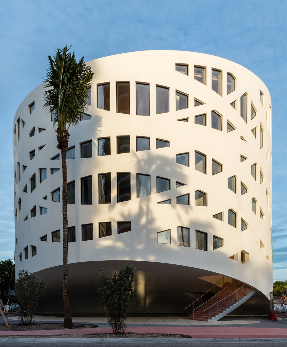
The Faena Forum in Miami designed by OMA
The dynamic core of the Faena District, is the Forum, a hybrid structure for presenting exhibitions, all variety of performances, as well as culinary happenings, lectures and debates, along with conference and corporate events. It features a cast-concrete-and-glass façade that mimics the forms of tropical foliage and comprises two contiguous volumes, a cube and a cylinder. Since the Forum occupies a small, wedge-shaped site, the architects felt that if they were to contain all its activities in a single volume, the building would look cumbersome and out of proportion with its residential-scale neighbours. As a more elegant solution, they instead conceived the 42,565-sq-ft facility as a contiguous cylinder and cube composed of cast concrete and glazing. In addition to the two volumes better respecting the neighbourhood – with the cylinder echoing Miami Beach’s many Streamline buildings – and providing more surrounding public space, where they meet is concealed a central loading dock and an entry to subterranean parking.
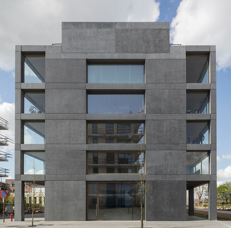
Antwerp housing block by Atelier Kempe Thill
Antwerp’s Zuid neighbourhood's housing development by Dutch architecture firm Atelier Kempe Thill, designed for local developer Triple Living holds 32 apartments which come complete with their own winter garden, and a string of commercial spaces on the ground floor to cater to the flourishing area’s growing needs. The residential element is offered in a variety of shapes and sizes, with spaces ranging from 40 sq m to a whopping 160 sq m. The structure’s clean, minimalist form references the city’s strong roots to 20th-century modernism and rationalism, explain the architects. The grey concrete came in largely prefabricated parts, which were put together on-site. Large glass openings allow views out to the city and the River Scheldt nearby; white wooden details add texture to the façade.
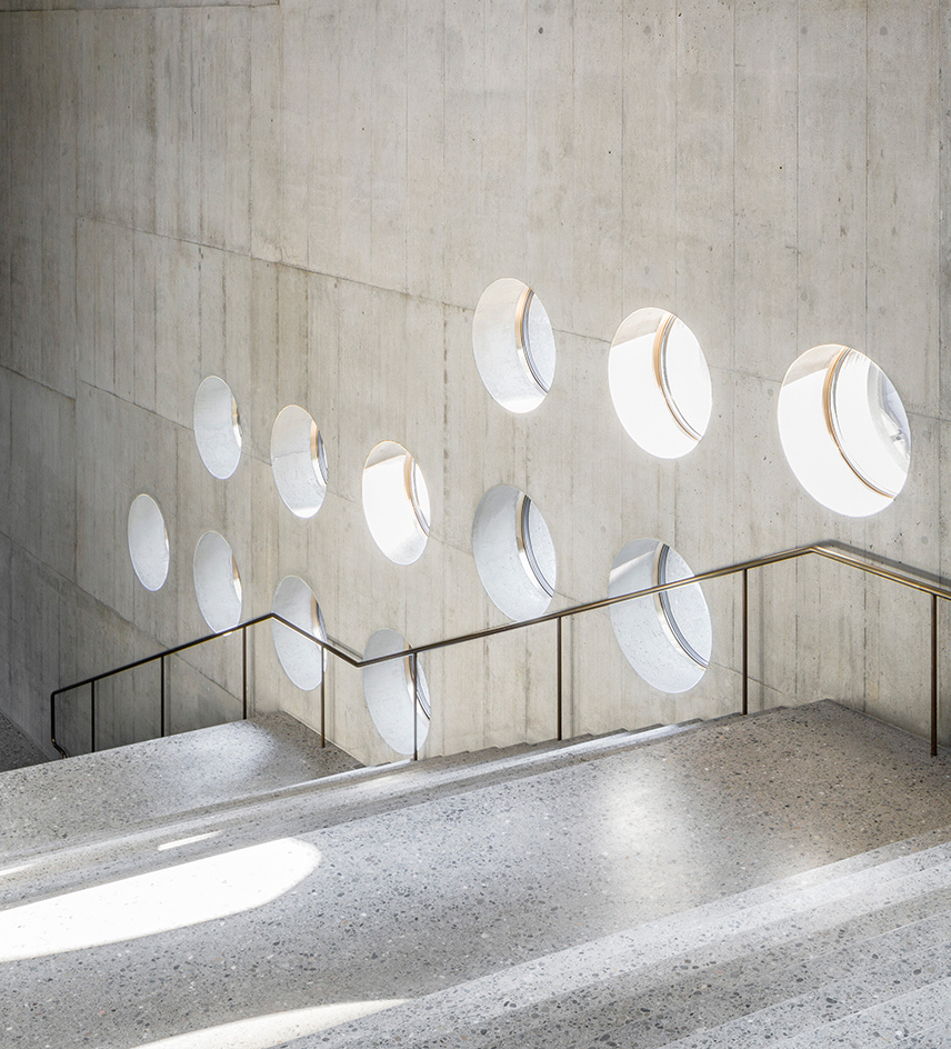
Christ & Gantenbein’s Swiss National Museum additions
The Swiss National Museum in Zurich has been the go-to institution for all things Swiss since its inception at the end of the 19th century. However, when the rich exhibitions hosted in the museum’s original 1898 home – designed by architect Gustav Gull – started outgrowing their historic base, a new strategy was needed. Enter Basel-based architects Christ & Gantenbein, who won the competition for an extension in 2002. The new wing is unmistakably modern, carving an abstract geometric concrete form against the old structure and the nearby Platzspitz Park. Old and new sit side by side harmoniously, designed so that the visitor experience and movement can be smooth and uninterrupted between the two elements.
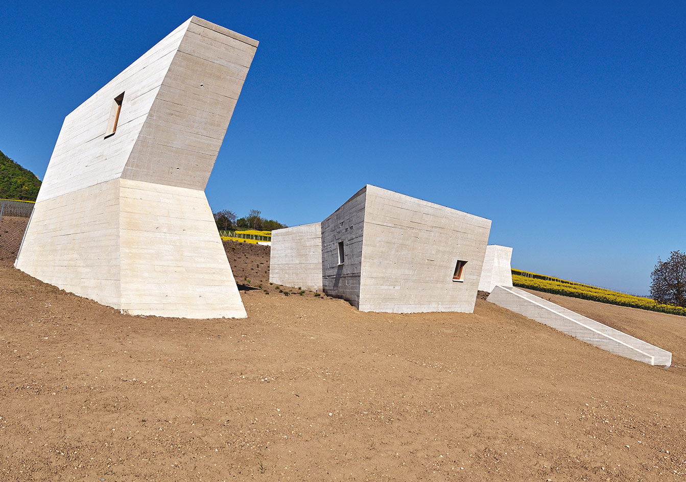
The Archeopark in the Czech Republic designed by Radko Květ and Pavel Pijácek
Archeopark is a concrete campus in the village of Pavlov, in the southern borders of the Czech Republic; created to house the area’s rich archaeological findings. The architecture of the museum, which hosts not only the significant archaeological items, but also a prehistoric burial ground and extensive documentation of the everyday and spiritual life of the Palaeolithic people, is just like their culture: strongly rooted in the earth. Local architects Radko Květ and Pavel Pijácek envisioned the building as a partially underground space. Several concrete volumes, sharp skylights and openings peak above ground, marking the museum’s presence in the landscape, mimicking the prehistoric architecture of dolmens and menhirs.
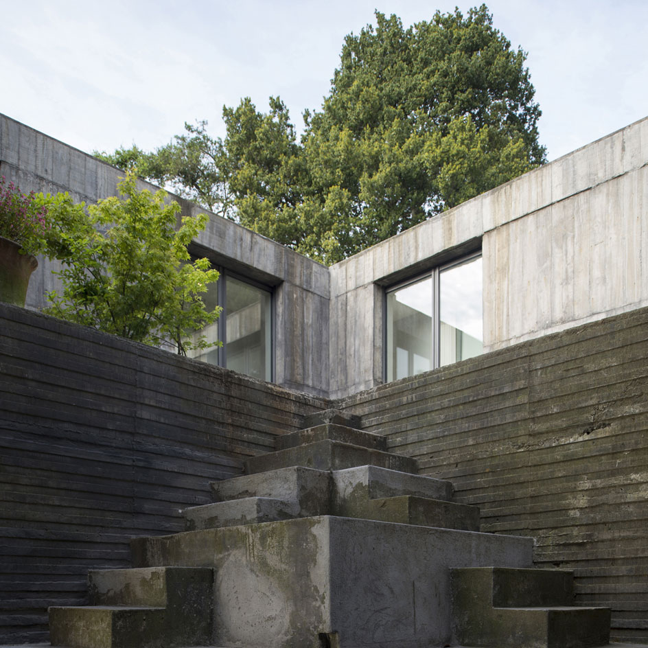
Pezo von Ellrichshausen’s Guna House in Chile
Boldly stating its presence among the site’s mature, dark eucalyptus trees, this new house by acclaimed Concepción-based practice Pezo von Ellrichshausen stands proud on the banks of the Llacolen lagoon in the popular Chilean commune of San Pedro de la Paz. ‘In architecture there is an eternal tension between context and object’ explain the firm’s partners Mauricio Pezo and Sofía von Ellrichshausen. Guna House draws on this balance, and provides a worthy addition to the practice’s growing portfolio. Composed as a single, strongly geometric volume, the house dramatically stakes a claim to its surroundings.
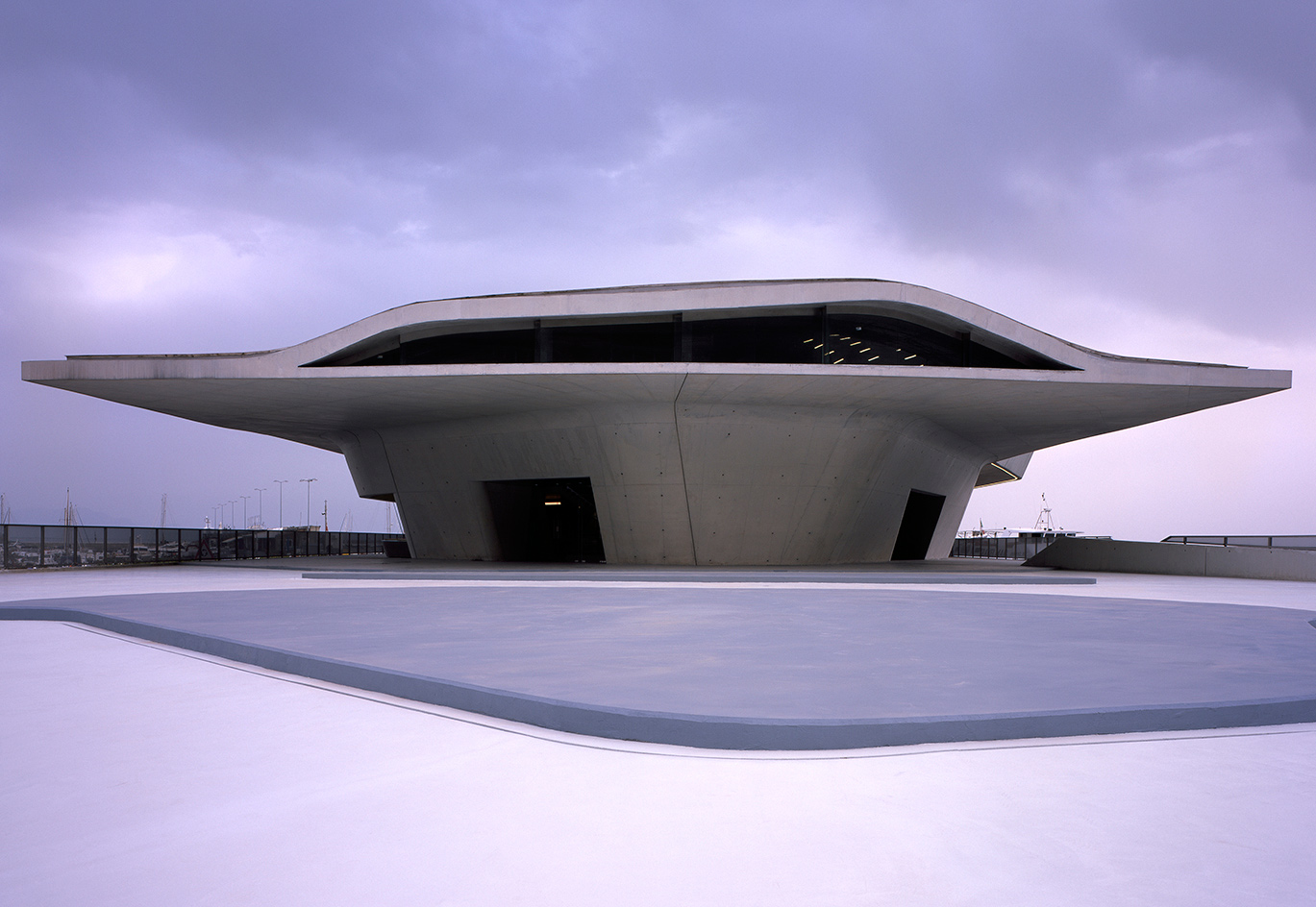
Zaha Hadid’s Salerno Terminal
The Salerno Terminal was the first Zaha Hadid building to be completed by the firm since the architect’s untimely passing. The building’s hard, asymmetric concrete shell was designed to protect users from the region’s hot sun during the popular summer vacation months. Its curvaceous form – a Hadid trademark – even takes its references from the sea, abstractly resembling an oyster. The programme inside is straightforward, containing administration offices for national border controls and shipping lines; a terminal for international ferries and cruise ships; and a separate terminal for local and regional ferries. Internal ramps criss-cross the building, enhancing connections between areas.
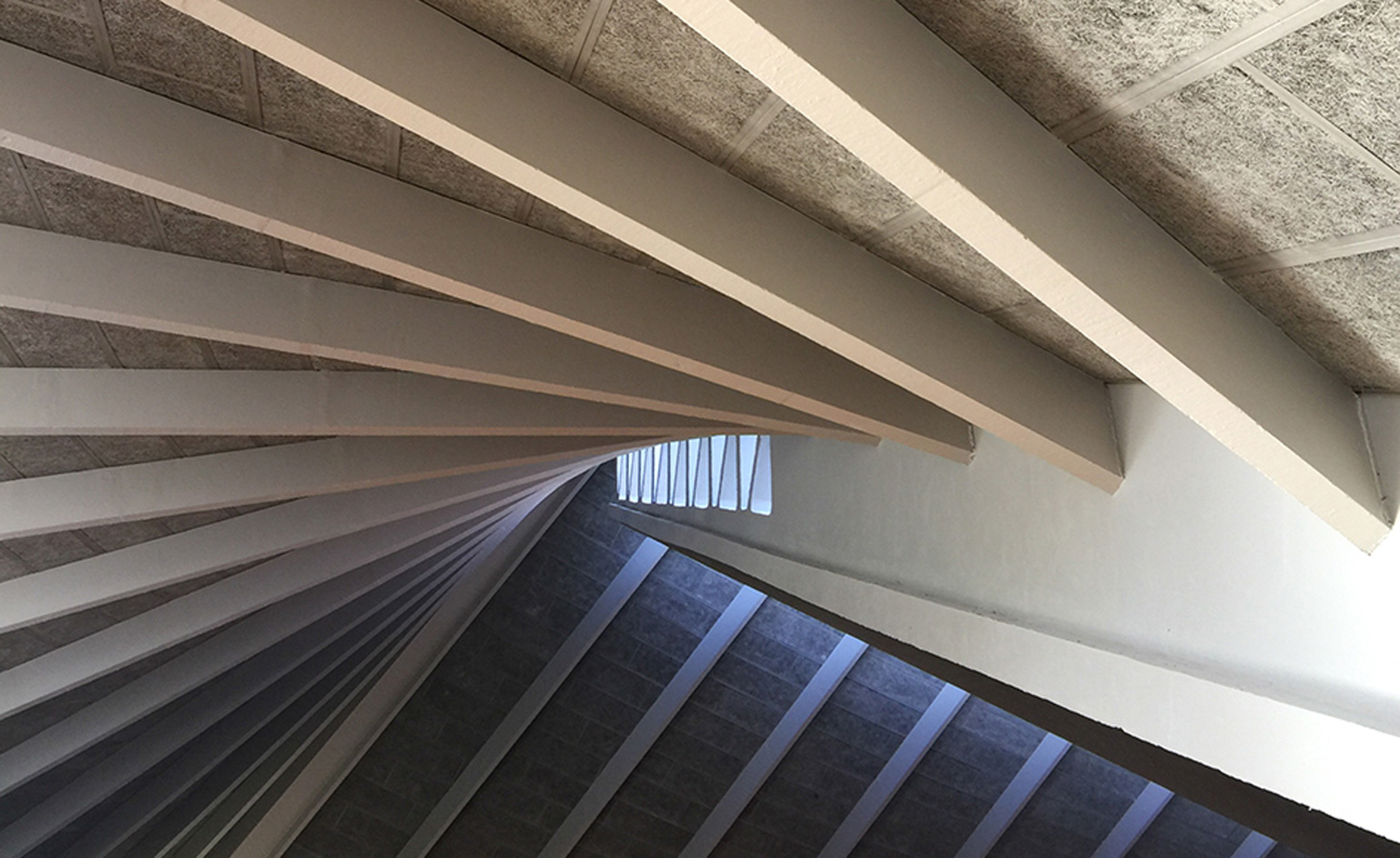
The Design Museum by John Pawson in west London
John Pawson’s first public commission was the transformation of the former Commonwealth Institute on London’s Kensington High Street into the new Design Museum. The process involved negotiating with Terence Conran, representatives from the local council, and the Twentieth Century Society, gutting the rapidly desiccating 1960s interior and taking down the exterior walls until just the Grade II*–listed, gazebo-like roof designed by original architects Robert Matthew Johnson-Marshall & Partners remained, propped up by four concrete buttresses.
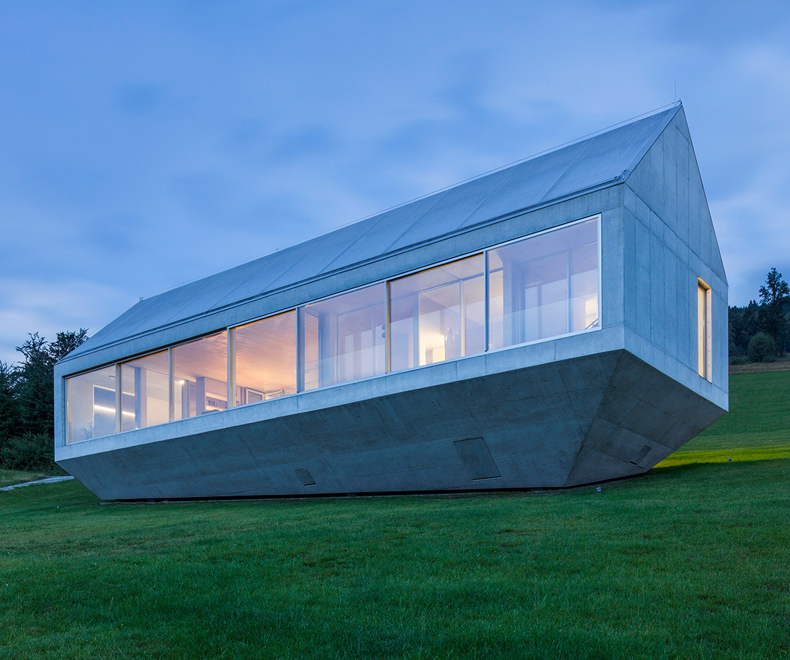
A concrete house in south Poland’s mountainous landscape by KWK Promes
South Poland’s picturesque, green and mountainous landscape was a key inspiration for Katowice based architecture firm KWK Promes’ concrete house, situated in the rolling hills of Brenna. Upon closer inspection, it is not hard to imagine how the visually striking Konieczny’s Ark got its name. Created for the firm’s owner, Robert Konieczny, the home becomes vulnerable to landslides due to its slopeside location, which can be a frequent occurrence in this part of the Polish mountains. To safeguard the building, the architects created a design that ‘floats’ above ground, giving the Ark its abstract boat-like aesthetic, while allowing for water and mud to flow underneath freely, without damaging the property.
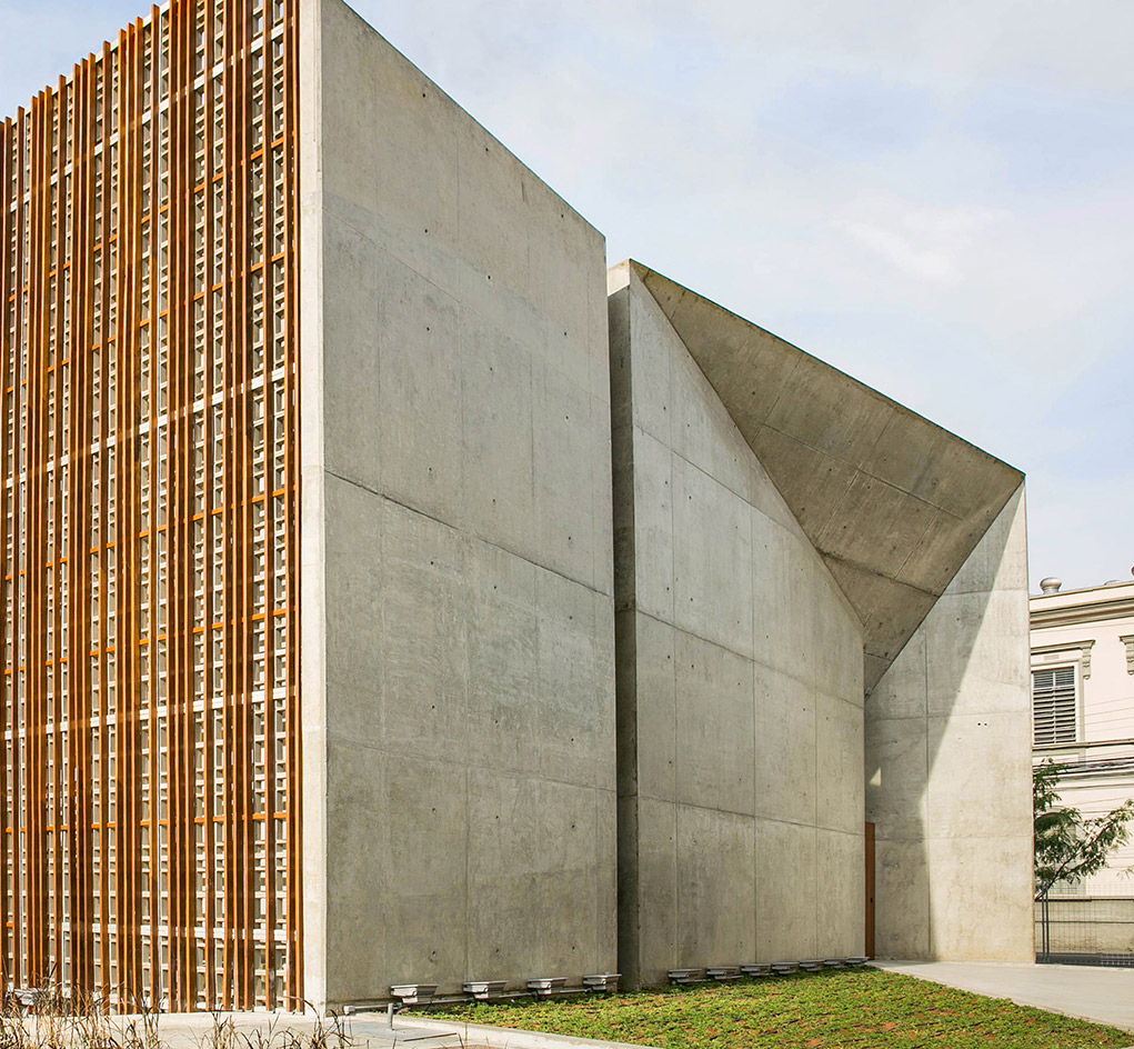
São Paulo’s Espaço Cultural Porto Seguro designed by São Paulo Arquitetura
The Espaço Cultural Porto Seguro, a centre for the arts designed by Brazilian firm São Paulo Arquitetura which is headed by architects Miguel Muralha and Yuri Vital, was envisioned as a key hub to provide the inhabitants of Campos Elíseos with a much-needed centre dedicated to culture and creativity. The project is located in the Paulista area of the Brazilian metropolis. Situated in the city centre, this lively district is home to the headquarters of the Sao Paulo government and the busy train stations of Júlio Prestes and Luz, however it has, in recent years, seen a rise in social problems. The new centre was built to encourage urban rejuvenation, hoping to bring a flood of creative opportunities to the area through a variety of events, from festivals to exhibitions, symposiums and parties.
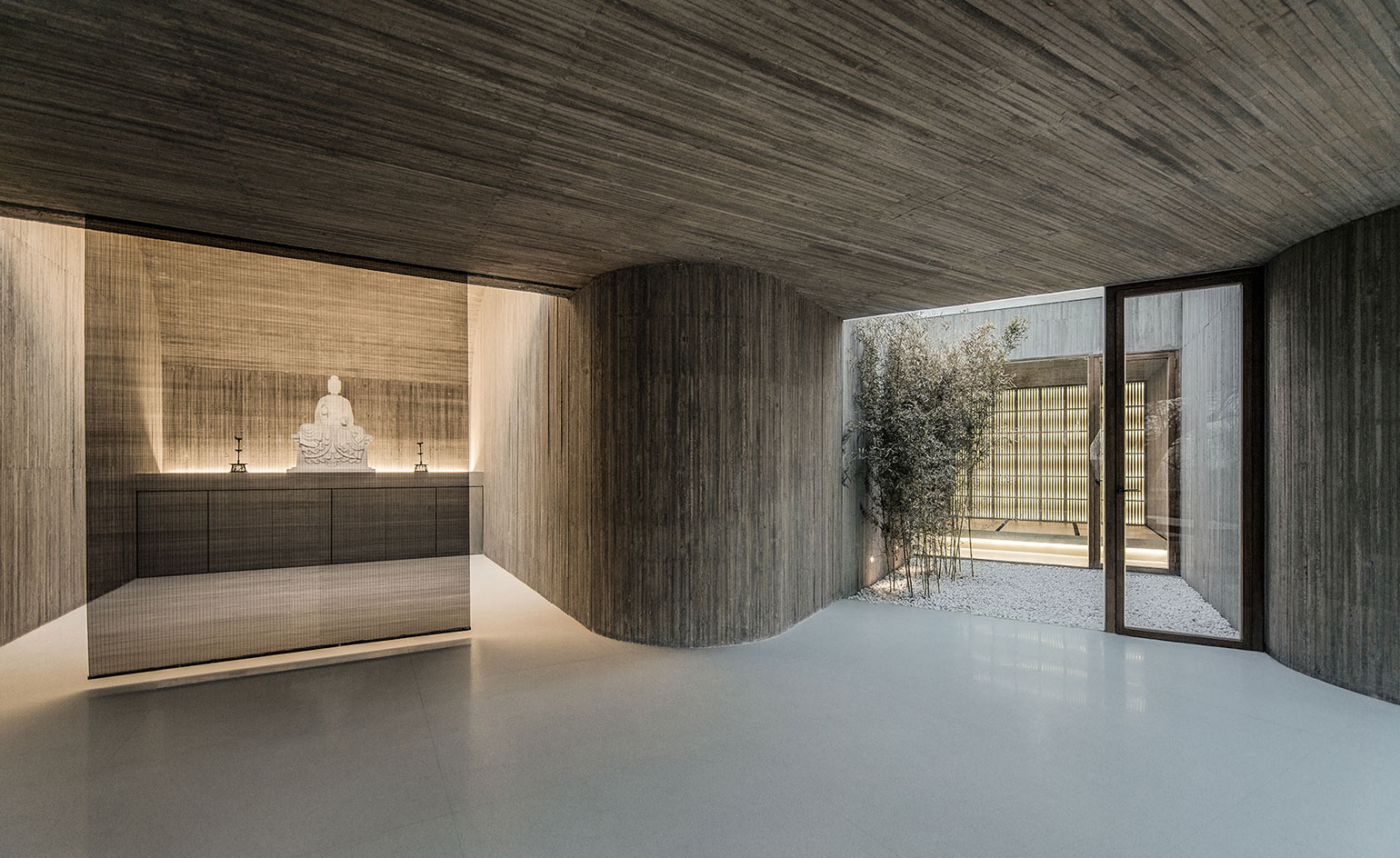
Waterside Buddhist Shrine, Tangshan, Hebei, China, by ARCHSTUDIO
Han Wen-Qiang, architect and founder of ARCHSTUDIO, followed Zen principles and integrated the Waterside Buddhist Shrine closely within its rural location in China. The shrine, a place for meditation and contemplation, is buried within the earth and runs parallel to a small river, designed to avoid any tree trunks and help people to understand and co-exist with nature. Smoothly flowing through the site, the plan is arranged like the branches of a tree. Five spaces with different functions – including an entrance, Buddhist meditation room, tea room, living room and bathroom – curve and connect, allowing the visitor to naturally drift through the space.
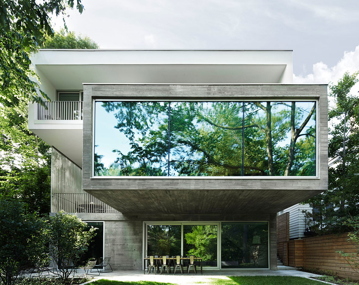
Nature and concrete meet in this Canadian home designed by Angela Tsementzis
Don’t let the verdant surroundings of Angela Tsementzis’ Concrete House fool you; this home, perched on a slope within the quiet and leafy location of Toronto’s Moore Park Ravine, is conveniently located only a 15–minute drive away from the city’s downtown center district. This urban oasis was built for husband and wife John Pylypczak and Diti Katona and their two children. The couple, who run a branding studio, wished for the design of the 380 sq m home to be centred around their passion for nature, and ‘pure, honest and refined aesthetics’.
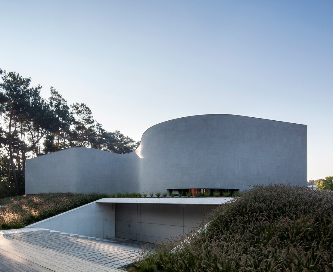
A free-flowing Belgian villa designed by Office O Architects
The restricting practical requirements of daily family life – coupled with planning and often, budgetary, limitations – make undulating, free-flowing forms a rare occurrence in residential design. Belgian based Office O Architects aim to break the status quo with their most recent residential offering; Villa MQ. The spacious villa was completed earlier in the year for a local family and is situated in Belgium's Tremelo. The architects wanted to create ‘something special’ that is at the same time, functional.
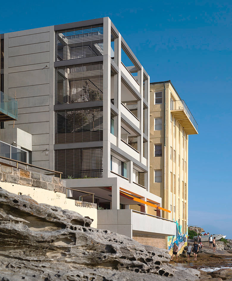
Venetian vibes meets modern take at Deepwater House by Tobias Partners Architects
Inspired by the urban waterside dwellings of the islands of Veneto in Italy, Paddington-based Tobias Partners Architects were tasked with the challenge to encapsulate the Venetian vibe in this concrete-clad modern beach house overlooking Bondi Beach in Australia. After living in a classic Neo-Georgian home for the past 25 years, the clients, a couple in their 60s, were looking for a new and contemporary home; one, which allowed them to have groups of friends and family over, while also playing host to their extensive collection of treasured possessions, acquired during their lifetime of travels.
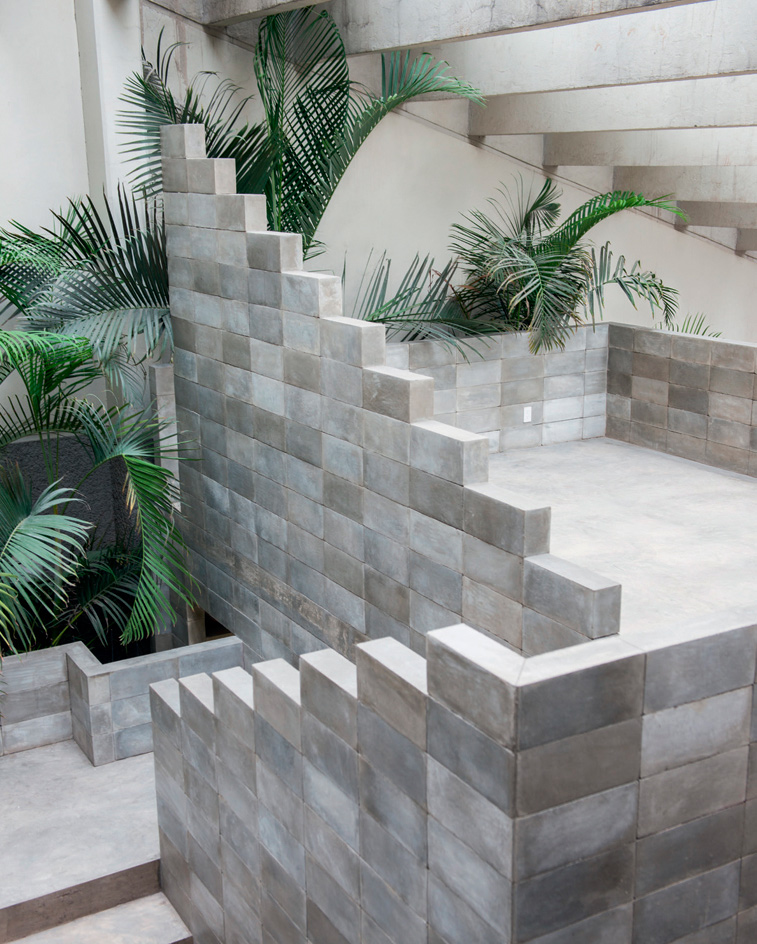
The Mexico City house of artist Pedro Reyes and his wife, fashion designer Carla Fernández
The house of Mexican artist Pedro Reyes that he built with his wife, fashion designer Carla Fernández, in Coyoacán, in the south of Mexico City is a concrete masterpiece. ‘The use of concrete is very canonical, very clichéd, but it has many possibilities,’ says Reyes, pointing out the handmade bricks covered with a wax-like concrete paste, which he developed with his men. ‘There’s a palette of finishes still waiting to be recovered from brutalism.’
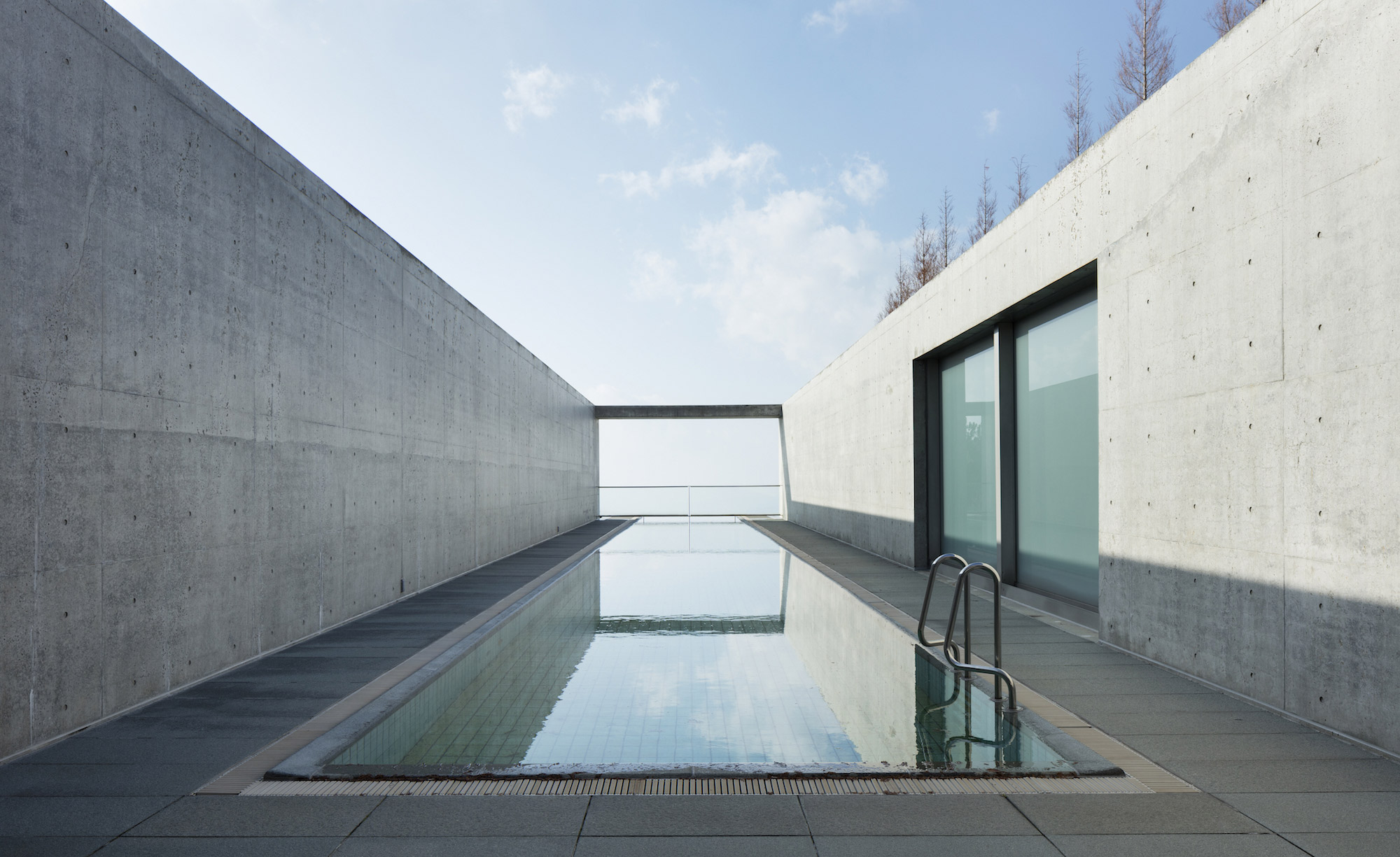
Setouchi Aonagi, Matsuyama, Japan designed by Tadao Ando
Architect Tadao Ando’s intimate seven-room retreat just outside the city of Matsuyama on Japan’s smallest island, Shikoku was completed as a private guesthouse. The building was later turned into a small modern art museum before re-opening as the Setouchi Retreat Aonagi. Overseeing each of the transformations, Ando’s signature minimalistic approach has remained clear, from the large exposed concrete, bright white surfaces and straight lines throughout the space.
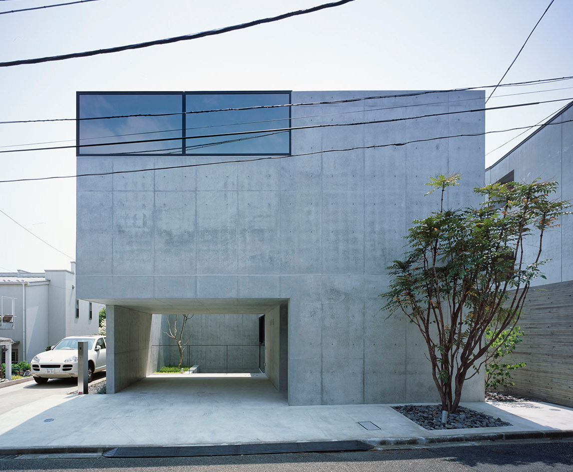
Grigio, a minimalist Tokyo house designed by Apollo
An ode to concrete, this house in Tokyo is designed by Japanese practice Apollo Architects & Associates, headed by Satoshi Kurosaki. Featuring raw concrete inside and out, the house, called Grigio, was created as a simple box. It may appear closed off but the architect has cleverly carved out parts to make it light and open inside. One cut-out volume makes way for the ground floor entrance and garage (which provides shelter for two cars). Carefully placed windows punctuate the facades, while terraces and a central courtyard at the one side of the building allow for plenty of light into the interior.
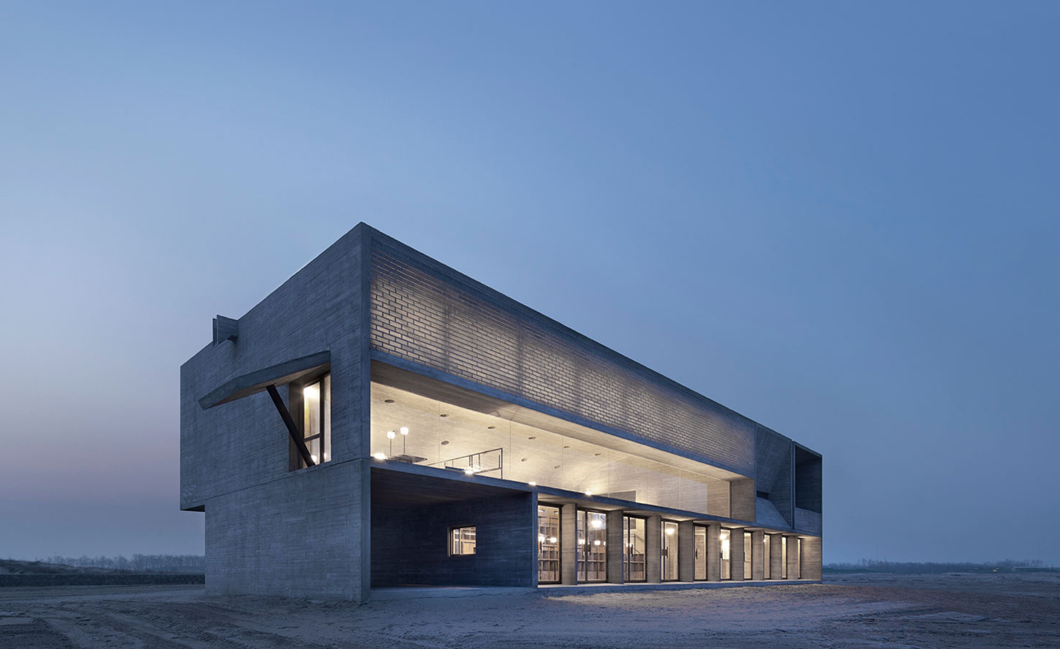
Vector Architects’ beachside library in China
Set against the backdrop of the Bohai Sea, the sound of crashing waves and the rippling effect of water, the serene Seashore Library in China’s north-eastern beach of Nandaihe is the brainchild of Beijing-based Vector Architects. Offering an uninterrupted, front-row view of the seashore’s dramatic sky and ever-changing waters, the building was conceived as an exercise in harmonious coexistence between architecture and landscape. Through his work, Vector’s lead architect, Gong Dong, aims to convey a series of complex relationships, negotiating the idea of boundary, the movement of the human body, the shifting light and the ocean view.
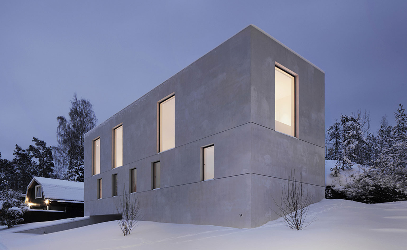
Villa Mörtnäs by Fourfoursixsix is an exercise in Swedish simplicity
In the heart of the Stockholm Archipelago, the stark concrete form of this Modernist-inspired property in the small community of Mörtnäs is a sharp contrast to its quaint cottage-style neighbours. Appearing as a solid light grey box, with a number of uniformly sized openings providing the sole definition to its otherwise seamless elevations, the Villa Mörtnäs, by London-based firm fourfoursixsix (part of the 2011 Wallpaper* Architects Directory), is an exercise in purity and simplicity in design.
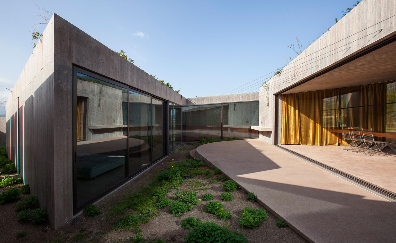
Tense Architecture Network’s concrete residence in Megara, Greece
Situated within the plains of Attica in Greece, this eco-friendly home by Athens-based practice Tense Architecture Network (TAN), is a simple, low volume with a grand view of the nearby Geraneia mountain range and the surrounding Megara region. The structure’s triangular plan is divided into four sections; two enclosed spaces and two open courtyards. The north-facing living quarters comprise an open-plan sitting, dining and kitchen area. A continuous glass façade ensures the living quarters make the most of the picturesque view (the living spaces are orientated towards the mountains) but a curved golden curtain provides subtle privacy when needed, as well as light control.
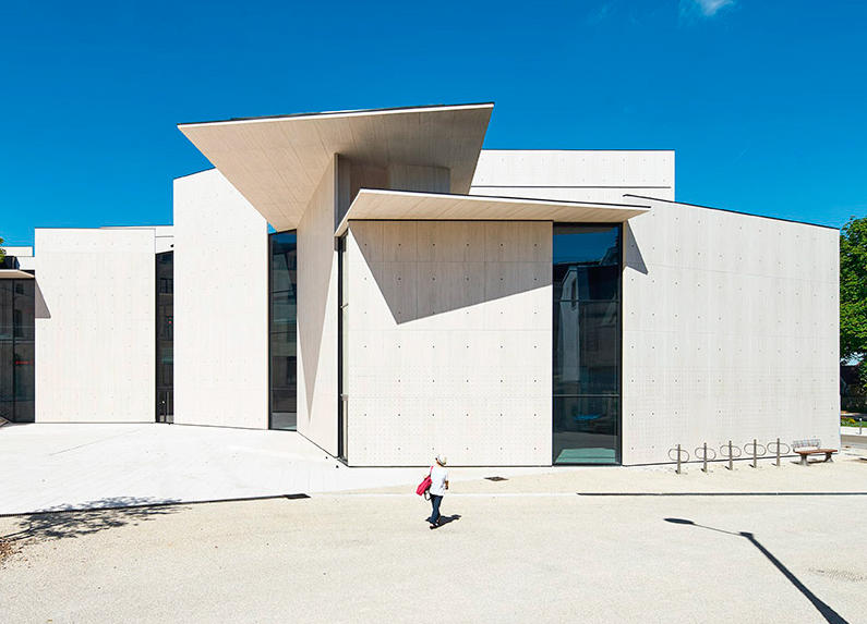
Moatti-Rivière’s graphic design centre in Chaumont
Alain Moatti of Moatti-Rivière architects and Juliette Weisbuch, director of Polymago design studio are the brains behind France’s first graphic design centre in Chaumont, in eastern France. In converting the 19th–century Banque de France for its new purpose, the architects worked around a key priority: that the new centre had to feel inclusive to the 23,000 inhabitants of the town. It’s a fitting home for the centre. Chaumont has a growing tradition in graphic design, having launched the acclaimed International Poster Design competition in 1980 following local botanist Gustave Dutailly’s endowment of his collection of vintage posters to the town in 1906. Moatti’s minimalist construction takes graphic design as its inspiration, with thin stone sheets on an aluminium beehive base representing the designer’s canvas of page, poster or screen. At the same time, the building’s height evokes the scale of Chaumont’s civic architecture. The architects also used the same colour natural limestone as the adjacent bank’s.
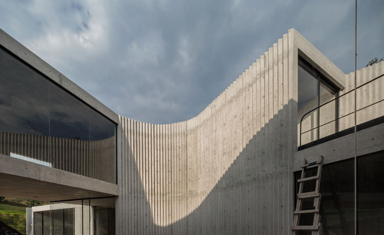
A concrete landmark designed by Cherem Arquitectos in the Mexico City suburb of Bosque Real
Built in collaboration with Rodolfo Diaz for a famous Mexican footballer, this house by Abraham Cherem, is a complex marriage of rectangles and curves; its surface is zigzagged in places and smooth in others. Its walls are 44cm thick (to combat those earth yawns). Cherem was inspired by the way Brazilians Lina Bo Bardi and Oscar Niemeyer used concrete, and he enthusiastically points out every detail; the way the shadows fall at different times of day, how he made the light wells by pouring concrete around traffic cones, how the interior walls, are ‘like concrete curtains, which slide to let the light enter the space’.
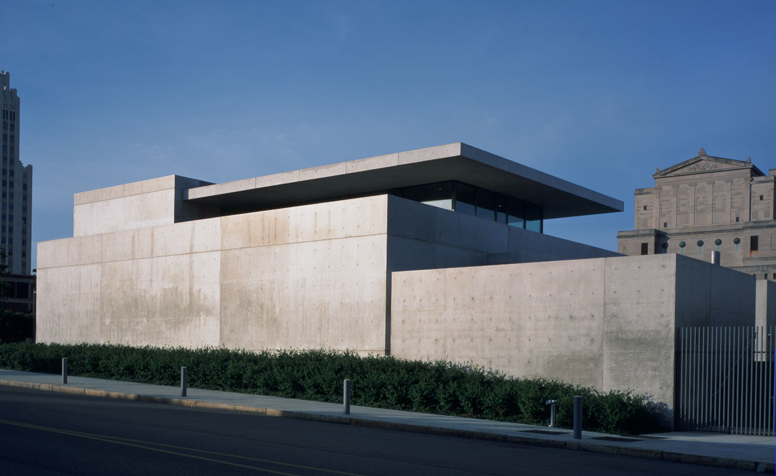
Tadao Ando’s Pulitzer Arts Foundation in St Louis
The Pulitzer Arts Foundation in St Louis is Japanese master Tadao Ando’s very first freestanding public commission in the United States, completed in 2001. In 2014, the original building underwent a makeover, in consultation with Ando, to accommodate the foundation’s growing needs. Responding to an increasing demand for space, the new part includes a significant expansion of the foundation’s gallery area. Arranged within the building’s lower level, two major new display spaces, which previously hosted offices and storage, are now be part of the institution's exhibitions and activities programme, aimed to engage the wider public and local community.
Wallpaper* Newsletter
Receive our daily digest of inspiration, escapism and design stories from around the world direct to your inbox.
Ellie Stathaki is the Architecture & Environment Director at Wallpaper*. She trained as an architect at the Aristotle University of Thessaloniki in Greece and studied architectural history at the Bartlett in London. Now an established journalist, she has been a member of the Wallpaper* team since 2006, visiting buildings across the globe and interviewing leading architects such as Tadao Ando and Rem Koolhaas. Ellie has also taken part in judging panels, moderated events, curated shows and contributed in books, such as The Contemporary House (Thames & Hudson, 2018), Glenn Sestig Architecture Diary (2020) and House London (2022).
-
 A stripped-back elegance defines these timeless watch designs
Watches from Cartier, Van Cleef & Arpels, Rolex and more speak to universal design codes
By Hannah Silver
-
 Postcard from Brussels: a maverick design scene has taken root in the Belgian capital
Brussels has emerged as one of the best places for creatives to live, operate and even sell. Wallpaper* paid a visit during the annual Collectible fair to see how it's coming into its own
By Adrian Madlener
-
 Move over, palazzos. Performances were the biggest trend at Milan Design Week
This year, brands brought on the drama via immersive installations across the city
By Dan Howarth