Building blocks: our edit of 2016’s most striking structures around the globe
Cabinet of curiosity
21 December
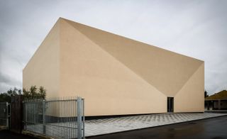
Designed by Portuguese architect Miguel Marcelino, the intriguingly abstract Museum of Mechanical Music has recently opened in Pinhal Novo, Portugal. Housing the client, Luís Cangueiro’s private collection of over 600 mechanical music boxes dating from the late 1800s until 1930s, the building is a playful riff on its contents, appearing as a mysterious box in itself.
The windowless biscuit-coloured concrete block is a fascinating object, which tricks the eye with its convex façade shaped by two diagonal lines which meet the entrance. A central lobby opens up to three galleries of varying sizes where the music boxes are displayed. Traversing through the antechambers, which connect the galleries, diagonal perspectives are opened up allowing the visitor glimpses into different spaces, playing with the intrigue in a similar way to the exterior form.
Writer: Harriet Thorpe
Power play
13 December
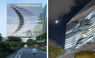
City Centre Tower, Manila, is the latest work from Brooklyn-based architecture and design firm CAZA. Completed this month, the playful yet powerful building will be the new Filipino HQ for leading tech companies including Google. Experimenting with an asymmetrically undulating curve, the architects pulled out an convex shape into space through designing an elliptical pattern of concentric circles across the horizontal axes of each floor. In response, they imprinted a corresponding concave, which slowly unrolls into the façade like a ripple, disrupting the vertical emphasis.
Meanwhile, the strong cuboid outline of the block allows the building to maintain the same physical impact as the surrounding architecture. The exterior architecture thus informs the interior, resulting in balconies overflowing with green plants, alternative views and shifting office shapes for the corporate floors, diversifying the professional environment. Located in downtown metro Manila, the 27 storey mixed use building includes commercial retail, dining and corporate office space.
Writer: Harriet Thorpe
Raise the roof
16 December
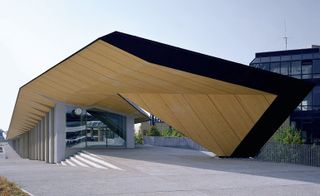
This project – a 2012 competition win by Japanese architect Kengo Kuma and Swiss practice Holzer Kobler Architekturen – was designed to unite several uses within a single structure at the Swiss technology institute, EPFL, in Lausanne. ‘Under One Roof’ – officially known as ArtLab – co-houses three spaces: the Montreux Jazz Café; an experimental exhibition laboratory to showcase (mostly) digital technologies; and space for EPFL’s major research projects. In response to the brief, the architects crafted an elegantly curving, narrow, 250m-long wood, glass and steel structure, covered by a traditionally-built slate tile roof. The café sits at the southern tip, overlooking Lake Geneva.
As originally featured in the January 2017 issue of Wallpaper* (W*214). Writer: Ellie Stathaki
Open-air art
28 November
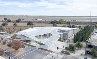
Architects Bohlin Cywinski Jackson and SO-IL have collaborated on the design of the new Jan Shrem and Maria Manetti Shrem Museum Of Art at UC Davis near San Francisco, which opened this November. The striking 50,000 sq ft ‘grand canopy’ made of perforated aluminium triangular beams is the building’s key architectural attraction and a dynamic eave for the experimental institution. Casting patterned shadows across the courtyard below, the canopy will provide a space for open-air exhibitions and interactive events, as well as being a community-orientated area in which the public can gather and relax.
The single-storey gallery is made up of connecting spaces designed for myriad activities, from exhibition displays to interactive workshops. The architects wanted to create ‘smaller volumes and provide an approachable human scale’ within the interior. The new museum and gallery – named after Jan Shrem, founder of Clos Pegase Winery in the Napa Valley and his wife Maria Manetti Shrem, an arts patron – is located near to the Mondavi Center for Performing Arts, and part of UC Davis’ vision for an ‘arts district’ on the south side of the campus.
Writer: Harriet Thorpe
Wallpaper* Newsletter
Receive our daily digest of inspiration, escapism and design stories from around the world direct to your inbox.
Light fantastic
2 November
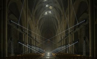
Jason Bruges Studio is behind this site specific, dramatic light installation at the nave of York Minster. Aiming to create an architectural piece sculpted out of beams of light, the renowned lighting designer and artist Bruges and his team drew inspiration from the Minster’s stonemasons.
Entitled ‘Light Masonry’, the choreographed lighting experience explores the architecture of the nave, such as its vaults, but also the audience’s relationship with it. Made possible through the use of a bespoke system of computer controlled moving head luminaires, the dynamic show is both immersive and captivating.
The installation was part of the city’s ‘Illuminating York’ festival, which celebrates lighting and invites visitors to discover York through this fascinating medium.
Writer: Ellie Stathaki
School of thought
1 November
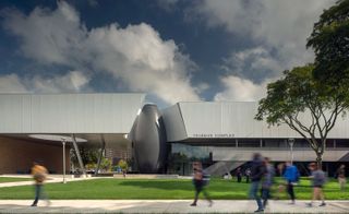
Morphosis’ A Alfred Taubman Engineering, Architecture and Life Sciences Complex at Lawrence Technological University in Michigan has opened for classes. The new complex of academic laboratories has been built to connect the three disciplines under one roof and increase collaboration. Inside the complex, an open flex space runs the length of the building providing communal space for inter-disciplinary engagement.
Marking the entrance, an orb sheathed in a black matte-finished carbon fibre composite sits above a pool of water encasing a three-storey stairwell. Light cascades into the orb from circular skylights which reflect patterns from the water below. The unique form was carefully designed in collaboration with architecture and engineering firm Albert Kahn Associates.
Built with the future of the growing campus in mind, the complex has been designed modularly with the ability to be extended in phases and its smooth bridge-like form echoes its purpose as a link between different parts of the campus.
Writer: Harriet Thorpe.
New heights
18 October
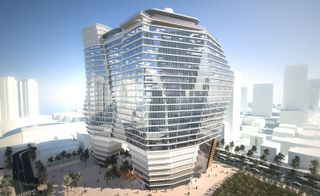
Ron Arad is the brains behind this new tower in Israel, promising to be the tallest structure not only in Tel Aviv, but also the whole of the country, upon its completion in 2022.
Named ToHo, the scheme was conceived as a large scale office development and it includes two towers of workspace and extensive commercial facilities. Careful landscaping over three levels will wrap around the two structures, which will be completed in stages – with the first phase finishing in 2018, before moving on towards final completion.
The project, which is a joint venture between two development companies, spans a striking 1.8-hectare, city centre site – a rare occurrence in the Israeli city. The architects made the most of it, sculpting the structure to take advantage of the area’s abundant natural daylight, while ensuring solar shading and generous office space for each floor.
Construction on the two towers – one eventually reaching 28 storeys high and the other 63 storeys – has already commenced. Arad is collaborating on the project with local firm Yashar Architects.
Writer: Ellie Stathaki
Open book
11 October
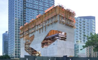
Located on the edge of Queens, facing the UN HQ, across the East River in Manhattan and Louis Kahn’s Four Freedoms Park on Roosevelt Island, the swiftly rising Hunters Point Library has just topped out. Designed by Steven Holl Architects to accommodate a mixed programme that includes a library with dedicated adult, children and teen areas, a cyber-centre, a conference room and a generous outdoor amphitheatre, this relatively low concrete structure stands out on its 22,000 sq ft waterfront site next to Long Island City’s skyscrapers. Encompassing the community library and a surrounding park, the project is designed to be open and public; large, soft-edged glazed cuts in its façade and reading gardens, both outside the main building and on the rooftop, work to emphasise this. Completion is planned for 2017.
Writer: Ellie Stathaki
As originally featured in the October 2016 issue of Wallpaper* (W*211)
OSA’s warm welcome
28 September
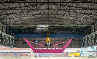
Installed in Dortmund for the ongoing RuhrTriennale, this brightly coloured piece by London- and Berlin-based architecture firm OSA is designed as an accessible sculpture. Entitled ‘well, come’, the project is a ‘hybrid of a physical installation, an animation and a sound installation’, say the architects. The vivid pink structure draws on the process of loading goods, cranes and skips, in the context of the area’s industrial character, in order to take visitors on a journey.
The project is conceived as a symbolic expression of the movement of both goods and people, underlines the firm. ‘It can be located in a place where streams of goods and migrants have been present ever since, immemorial – at the harbour – a “non-place” which as a provisional and future home always refers to what has been left behind,’ it explains.
Engineered by UK-based Atelier One, ‘well, come’ also features a sound installation developed by sound artist and musician Florian Kaplick.
Writer: Ellie Stathaki
Family favourite
25 August
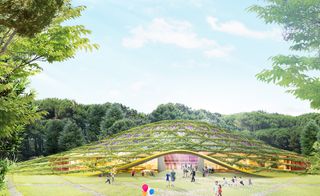
Known for its pioneering object and installation designs, Dror also has one foot firmly in the architecture camp. This never-before-seen concept proves the firm’s multi-disciplinary approach is paying creative dividends. Dreamt up last year, the project proposes a Children’s Museum hidden inside Istanbul’s atmospheric Fatih Forest. Along with the requisite cafe, shop and gallery space the museum would also contain an impressive domed ampitheatre with a vegetated roof, allowing the forest to eventually swallow the museum - merging landscape and architecture completely. Categorised as a ’masterplan’, the ambitious idea aims to create a structure that’s positive for the environment, while providing a space that belongs to the kids - creating the next generation of Dror dreamers.
Writer: Elly Parsons
Science chic
23 August
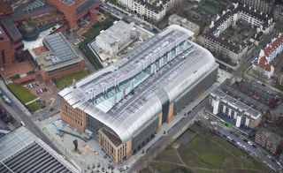
HOK has collaborated with PLP Architecture and Arup for the latest addition to London’s fast-evolving Kings Cross area, where work has just completed on the Francis Crick Institute biomedical research centre.
This is not just any science lab. The Crick is a new, leading institution in its field, created to champion excellence in biomedical research. It is also a significant building, in terms of scale, spanning some 980,000 sq ft and housing over 1,500 staff, making it one of the largest centres of its kind in Europe.
Though arranged as four ‘laboratory neighbourhoods’, which are connected by three internal atria, the building is designed to encourage interaction between its users. Several breakout areas and communal spaces will be shared between all employees – 1,250 of them are scientists – while flexible workspace makes sure the building can adapt to different uses. Arup’s clever engineering ensures that sensitive equipment remains intact by embedding high vibration resistance systems in the laboratories. Its careful and environmentally friendly design has already been scooping up accolades, including a coveted ‘Excellent’ BREEAM rating for energy use.
Tenants are expected to start moving in within the next month.
Writer: Ellie Stathaki
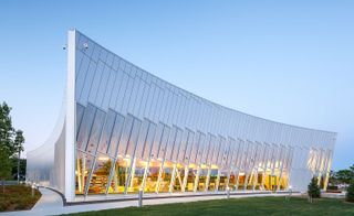
Learning Curve
19 August
The Vaughan Civic Centre Resource Library by ZAS Architects was designed to express the needs and ever-changing identity of the modern library. This new addition to the Canadian city was created as a learning and gathering spot for visitors of all ages.
Adjacent to the City Hall, the new library’s distinct form is flowing and delicate, at the same time adding dynamism to the complex with its sharp geometry. The reflective façade is an interplay of glass and aluminium.
A carefully manicured garden surrounds the new library, leading to the main entrance – this also marks the building’s highest sloping point. A cantilevered overhang protects it, at the same time enhancing the juxtaposition of the structure’s fairly low, horizontal volume, against the City Hall’s lean and vertical clock tower nearby. Inside, this is not your traditional library; instead of only fostering studying and seclusion, the spaces encourage social interaction. In contrast to the fairly monochromatic exterior, the interior is brightly coloured and open.
A café, children’s area and dedicated community and group learning facilities complement the reading areas, while movable and flexible furniture choices mean rooms can adapt to different uses where needed.
Writer: Ellie Stathaki
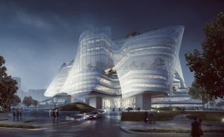
Mad world
17 August
The coastal Chinese city of Xiamen is about to welcome its latest architectural offering, the brand new mixed-use Design Centre, courtesy of Beijing-based architects MAD and the country’s international fashion group Xinhee.
The 61,535 sq m project is built around a central courtyard, which will be open to employees and visitors alike. Six wings extend away from it, forming an organic, distinct star-shaped layout. The flowing structures will house a mix of offices, research spaces and greenery, balancing ‘innovative and creative’ office interiors with vertical gardens and a clever external skin that allows for appropriate lighting and ventilation. The building’s green credentials allow it to adapt easily to the local climate, explain the architects.
’We envision it as a building with skin-and-bones,’ reveals MAD founding principal Ma Yansong, who took inspiration from his client’s business for his design solution. ’The correspondence of clothing and architecture is that they both explore the relationship between the interior and the exterior.’
Landscaping including planting and water features surround the structure, which will be lit and gleam at night like an urban beacon.
Construction for the ambitious Xinhee Design Centre is already underway, with projected completion scheduled for 2017.
Writer: Ellie Stathaki
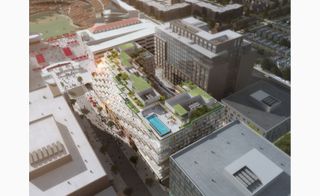
ODA’s new addition to DC’s sporting skyline
16 August
Hot on the heels of the firm’s Toronto Bayside project, ODA New York reveals plans for West Half – a multifaceted development in the Capitol Riverfront district of Washington, DC.
In a conceptual about-turn to most projects of its kind, the 456,000 sq ft residential development – 61,000 of which will be set aside for retail – is designed, director Eran Chen explains, ’from the inside out’, placing the feeling and experience of its residents front and centre.
West Half’s 11 storeys will cant as they rise, aesthetically echoing the Nationals Park stadium sitting adjacent (baseball fans should hot-foot it to viewings of the apartments – 50 per cent of which will factor outdoor terraces with direct views of the sporting action).
The build will be capped by a rooftop pool, as well as cooler courtyard areas placed below the cantilevered balconies situated on the inside of the building’s u-shaped design.
Writer: Tom Howells
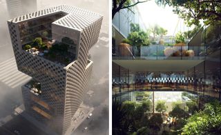
Social sustainability
10 August
International architecture and brand design firm Snøhetta has won the competition to design Banque Libano Francaise (BLF) headquarters in Lebanon. With this latest commission, the practice joins the starry ranks of internationally renowned architects – including Zaha Hadid, Norman Foster and Herzog & de Meuron – currently building in Beirut.
The winning design was chosen for its ability to point towards a new future, both for the city and the community of which it is part of. The new BLF headquarters will include, in a clear articulation of public and private domains, work spaces for the bank’s office as well as multiple types of public spaces both varying in form and function – offering large open surfaces at the bottom for commerce and comfortable terraces at the top for bars. By arranging the work areas around the periphery of the building, an internal circulation is made possible; with it a hub for social interactions. The lower floors, containing the essential public functions and facilities, are essentially a public base connecting the building to the street and the surrounding urban context.
Beyond it’s physical manifestation, the building sets out to three goals: economic, social and environmental sustainability. All together, the aim it to respond to the environment both in terms of it’s energy impact whilst simultaneously respecting the social and urban context it sits in. A completion date for the project has yet to be confirmed.
Writer: Alix Biehler.
Brick work
9 August
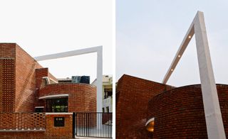
AKDA’s House X sits on a very tight plot within a dense suburban area in Noida, India. The build features three main design elements: a circular drum, which hosts the main living area, a triangular wedge for the circulation and a rectilinear cube that establishes the boundary. Given its setting, the architects had to address fundamental issues of light access, noise and a close proximity to neighbouring buildings.
The three-bedroom house, designed for single-family use, also responds to energy performance issues and raises the bar for ethical construction standards. Indeed, AKDA, established by Amit Khanna in 2004, makes regional specificity and sustainability intrinsic to the design processes and outcomes.
In that respect, building materials were chosen and arranged to stop the hot Indian sun from heating the living area while allowing light to enter the large open spaces. Brick, a widely available material and easy to fabricate, is very resistant to heat and is easy to create customised patterning from, given its standard size. Across the house’s façades, different patterns come together to create both small wind vents and larger angulated openings for light.
Inside, the spaces are demarcated by translucent separations, curved shadowed walls and, in the circulation area, a large light tunnel illuminating the entire house.
Writer: Alix Biehler.
Japanese gardens
5 August
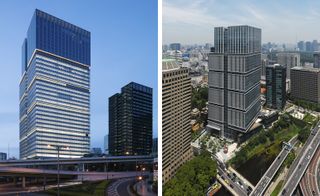
When appointed by Seibu Properties to design Tokyo Garden Terrace, KPF had a challenge on its hands; the mixed-used building not only had to include a wide range of uses – from office, residential, retail and hospitality - in a single complex, but it also included the historical preservation of the 1930 imperial home of Yi Un, the last crown prince of Korea.
The team responded with flair and, located in the neighbourhood of Kioicho, the project has just been completed. The scheme is composed of two towers that draw – in terms of massing – on the area’s wider urban context. The site, which today is also the home of the Benkei Moat and Shimizudani Park, previously housed work by Kenzo Tange, whose oeuvre for the Japanese Metabolism movement served as inspiration for the architectural team.
KPF – who worked with Nikken Sekkei as executive architect – drew on Tange’s vernacular, creating vertical and horizontal striations on the building’s skin, which is made of a chevron curtain wall with rectangular aluminium frames.
The 36-storey Tokyo Garden Terrace now features 231,400 sq m of office space – with Yahoo! Japan as one of the key tenants – five floors of retail at its base and a 250-room hotel on the top seven floors. The adjacent 21-storey Kioi Residence houses the project’s 135 apartment units in a contemporary composition that unites old and new.
Writer: Ellie Stathaki.
’House 1’: a collaborative installation
3 August
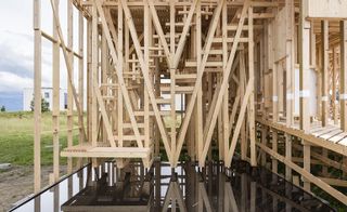
ALICE (Atelier de la Conception de l’Espace), an international group of young architects and researchers from the EPFL (École Polytechnique Fédérale de Lausanne), have come up with a new ideology for living. ALICE’s approach to architecture is to research through design while involving interdisciplinary concepts in their processes and challenging teaching methodologies. ’House 1’, in that respect, attempts to redefine the definition of individual and shared space by blurring physical and cultural boundaries.
The project involved over 200 students, who worked in groups under the close guidance of 12 studio directors and the wood engineer Rémy Meylan. The proposed brief to the students was to design and realise a room intended for inhabitation, or a transitional space to allow connectivity introducing elements such as porches, stairs or doorways. ’House 1’ reveals its final form ’not as something that is done from the top down but something we share’, explains director Dieter Dietz.
After four months of frenetic work and strong engagement, the project has now opened to visitors on the EPFL campus, next to the Rolex Learning Centre. The experience of ’House 1’ is an unfolding evolution of a space that invokes questions, contains possibilities, and is open for interpretation.
Writer: Alix Biehler.
Cultural heritage
1 August
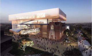
International architectural firms HASSELL and OMA have joined the global contractor Brookfield Multiplex and the Western Australian government in creating a new cultural centre for the city of Perth for 2020. Integrated within its vibrant city centre, the New Museum for Western Australia was conceived as a ‘collection of physical and virtual stories’ aspiring to a multidimensional experience for the visitor.
Mark Loughnan, HASSELL’s principal and board director and OMA managing partner-architect, David Gianotten, state: ‘Our vision for the design was to create spaces that promote engagement and collaboration, responding to the needs of the Museum and the community. We want it to create a civic place for everyone; an interesting mix of heritage and contemporary architecture that helps revitalise the Perth Cultural Centre while celebrating the culture of Western Australia on the world stage.’
The design is based on the intersection of a horizontal and vertical loop, providing various curatorial strategies for both temporary and permanent exhibitions. In addition, a spectacular outdoor space is framed by heritage buildings and intersected by new projects.
Writer: Alix Biehler.
Art house
25 July
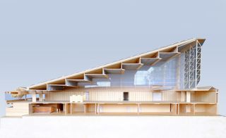
Forget dusty warehouses and impersonal depots, Tzannes architects are set to revolutionise the way in which we store art, thanks to a new 10,000 sq m facility in inner-city Sydney.
Created for a private client’s globally significant collection of contemporary Chinese art, the Dangrove Art Storage Facility’s focal point is the Great Hall, with its impressive sloping roof – a grand space for art to be temporarily displayed, evaluated and curated.
’Our client has a sophisticated understanding of both contemporary art and architecture,’ explains Alec Tzannes. ’The brief was ambitious: we were asked to design a state of the art working building that would securely store the growing collection, but also provide an exceptional experience of viewing and interacting with art for both staff and visitors.’
Tzannes’ aim was to pull off the dust-covers, and ’reinterpret what a functional art storage facility does’.
Writer: Elly Parsons
A walk in the park
18 July
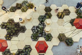
Italian architecture firm OFL has created a new urban garden in the heart of the Sicilian city of Favara – aided by the collaboration of their client, furniture retail brand Milia Arredamenti and local art gallery Farm Cultural Park. The landscaping project, named Zighizaghi for its distinctive geometry, was conceived as a way to bring quality outdoors space to the city’s inhabitants, combining planting and timber.
The Rome-based architects chose to work with the basic shape of the hexagon – mimicking nature, and in particular the world of bees and beehives. ‘The project consists of two levels’, explain the architects. ‘The horizontal (the floor) and the vertical (the lighting systems).’ The floor is made of phenolic plywood and knots of Okoumé timber, while the tall lighting ‘super pods’ also feature a loudspeaker. Zighizaghi is equipped with an automatic irrigation system and its plants were specifically chosen to fit the natural context and the local Mediterranean climate.
Words: Ellie Stathaki
Brooklyn business
15 July
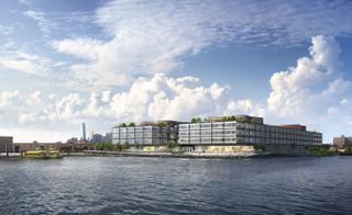
Foster + Partners are the latest big-name designers to put a stamp on a piece of New York waterfront real estate: a mixed-use office development rising up from a former industrial site in Red Hook, Brooklyn. Designed for a range of uses, including 600,000 sq ft for office space and 230,000 sq ft for retail and restaurants, the building will feature flexible, open floorplans that will suit the growing influx of technology and creative businesses in the area.
In addition to stunning views of lower Manhattan, New York Harbour and the Statue of Liberty, 280 Richards Street will also encompass a new public esplanade that connects the four-storey, timber frame building to the Brooklyn Greenway – the bicycle and pedestrian network connecting parks and roads in Brooklyn and Queens. Construction is scheduled to start this summer.
Writer: Pei-Ru Keh
Evolving Melbourne’s skyline
14 July
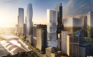
Yesterday, Zaha Hadid Architects got the all clear from Victoria Council to start work on their 700,000 sq m tower in Melbourne. 600 Collins Street takes inspiration from the surrounding Central Business District, where classically-inspired colonnades rub shoulders with high-tech skyscrapers.
ZHA’s Michele Pasca di Magliano explains how the design is defined by Melbourne’s evolving urban landscape, with a focus on the modern city-dweller. The space, shared between work places, homely apartments and generous public terraces, ’will enhance the city’s public realm thanks to the logical division of the structure’s overall volume’.
As well as its urban inspirations, the tower makes use of Melbourne’s distinctive natural environment, and the city’s ’four seasons a day’ weather patterns. There’s high performance glazing to regulate heat, super-efficient central cooling systems and an innovative grey-water reuse program – all of which put energy efficiency at the fore.
Back at ground level, 350 bicycle parking spaces and dedicated electric vehicle bays encourage sustainable travel, and aim to keep Melbourne at the top of ’the most livable city in the world’ list.
Writer: Elly Parsons.
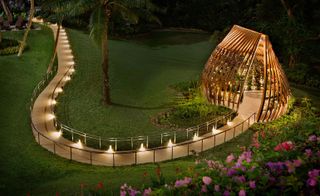
The Orchid, Singapore
6 July
We love a good floral arrangement, though we have to admit The Orchid, an elegantly simple greenhouse by Singapore-based architects Tierra, does take up a little more room than your usual table decoration.
Designed for the 45th anniversary celebrations of the Shangri-La Hotel Singapore and set in a quiet corner of its 15-acre grounds, Tierra’s en plein air creation was inspired by the orchid, though, to the designers’ credit, the form – a swirling bud or a flower in mid-bloom – is not an obvious riff.
To achieve the curvilinear silhouette, timber engineer Venturer began with a skeleton of concentric rings welded from galvanised steel and diagonal steel tension cables. Onto this is strapped 51 7m-long larch wood strips, each one custom-milled as a curved, off-axis rib to create the impression of movement. Larch, long prized for building yachts, ages beautifully – and with time, The Orchid will, the architects say, achieve a lustrous patina.
The cross-hatched off-kilter geometry of the construction creates internal trellises from which hang over 600 orchid plants comprised of 30-odd hybrids. The collection changes seasonally, but for now, the interiors feature a resplendent debut flash of Burana Whites, pink Caesars, red Kalsoms and Jakkit Golds. It’s flower power at its best.
Writer: Daven Wu
Green living
23 June
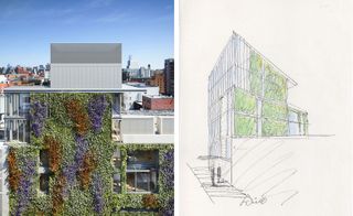
As Tadao Ando’s first residential building in the United States continues to take shape in downtown New York, the Japanese architect has revealed an impression of one of its finer features – an expansive green wall that is touted as the largest residential wall of its kind in the Big Apple.
On a recent visit to the site, Ando created a new sketch (pictured left) of what the wall will look like. Fifty-five feet high and 99 feet wide, the wall will change naturally with the seasons, making it a true sight to behold.
Landscape designers M Paul Friedberg and Partners have selected a variety of vines, including English and Boston ivy, Virginia creepers, jasmine clematis and hydrangea creepers, just for that purpose.
Writer: Pei-Ru Keh.
The Hive arrives at Kew
16 June
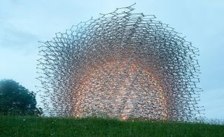
For last year’s UK Pavilion at Milan’s World Expo, artist Wolfgang Buttress created a unique structure that told the story of the honey bee. Receiving much critical acclaim, The Hive has moved to Kew Gardens in South London.
Despite the structure’s delicate appearance, it weighs 40 tonnes and stands at 17m tall. The latticework comprises thousands of aluminium pieces laced with LEDs, creating an atmospheric light work at dawn and dusk. Inside, standing on a honeycomb patterned glass floor, visitors are immersed in a unique, meditative soundscape inspired by the deep hum of a beehive.
As well as being a thing of beauty, The Hive embodies a pressing, environmental message, as Richard Deverell, director of the Royal Botanic Gardens explains. ’The Hive creates a powerful, immersive space for us to explore the urgent issues we face in relation to pollinators, their intimate relationships with plants and their vital role in helping us feed a rapidly growing population.’ The pavilion will provide a scientific and cultural centre point for talks, workshops and events on the issues surrounding native bee colonies.
Wolfgang Buttress adds, ’It’s fantastic to watch The Hive coming back to life at Kew. The Gardens offer the perfect environment to host this multi-sensory experience that integrates art, science and landscape architecture.’
The installation is the first ever UK Pavilion to be reused and brought back home. It opens to the public on 18 June, and will remain a feature in the Gardens until the end of 2017.
Writer: Elly Parsons
Park slope: a Polish museum meticulously merges landscape and architecture
10 June
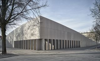
Part building, part public square, the recently completed National Museum in Szczecin, designed by Polish firm KWK Promes, sits at the heart of the city, right next to its award-winning Philharmonic Hall.
The new museum is hidden underground beneath a paved artificial slope, with its roof serving as a public plaza, dotted with trees, sculptures and ramps (for sitters and skateboarders), blurring the boundaries of where landscaping ends and architecture begins.
Along the plaza’s two right-angled raised sides, a row of concrete slats rotate to reveal a glass strip marking the museum’s entrance. A generous lobby leads visitors down to the exhibition hall level, where the museum’s main displays unfold, taking visitors through the post-war history of Szczecin.
Writer: Ellie Stathaki
As originally featured in the July 2016 issue of Wallpaper* (W*208)
Kaohsiung’s new Mecanoo-designed station gets the green light
9 June
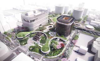
Designed by the Netherlands-based Mecanoo Architecten, Kaohsiung’s new station is a green dream. The station, based in the centre of Taiwan’s second most populous city, will unify different models of transport and introduce a generous amount of public green space to the city, helping make Kaohsiung one of Taiwan’s greatest urban hubs.
The station is part of the Kaohsiung Metropolitan Area Underground Railway Project, which includes seven subterranean stations and a 9.75km railway tunnel. Kaohsiung’s central hall will be the main arrival point for travellers and commuters, welcoming them underneath a bright ceiling of oval-shaped lights. The station will be a true transportation base integrating train, metro, bus services, taxis and cycle paths, as well as relevant facilities such as hotels, restaurants, shops and a commercial building in the canopy.
The project design occupies more than 60,000 sq m and commenced in 2014. It is expected to be completed by 2024.
Writer: Elisa Carassai
Act of congress
6 June
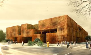
Istanbul-based Tabanlıoğlu Architects has designed a striking new congress centre in Marrakesh. Respecting the city’s history, the centre perpetuates traditional Moroccan values through the use of materials, patterns and space.
Externally, the structure is encased in a natural stone facade, which allows the light in through small perforations. This creates a peaceful, natural environment during any hour of the day. Traditional geometrical patterns such as mandalas decorate the exteriors, and striking porticos referencing traditional Moroccan doors warmly welcome visitors inside. The building also factors a main conference hall, which is set to become a sheltered place for uniting international representatatives.
The balanced relationship between in and out is one of the building’s highlights, achieved through the synthesis of spaces such as inner gardens and patios. This integration of nature provides areas for relaxation and contemplation, repeatedly dissolving boundaries between the internal and the external.
The building has been awarded The Plan magazine’s award for future projects, in the ’Office and Business’ category.
Writer: Elisa Carassai
Fly away: a new installation for bird watching
17 May
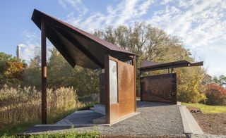
A new bird-viewing platform designed by Toronto’s Plant Architect on the Scarborough Bluffs, reads like a wilderness installation piece offering thoughtfully framed views of flora and fauna.
The East Point Park site, on the Lake Ontario beachfront – wedged between two industrial landscapes – contains 55 hectares of undeveloped open meadows, popular with humans and migratory birds alike. Here, two mirror image pavilions – wing-like weathered steel structures, one facing north to a pond, the other south to the lake – provide contemplative viewing shelters for birders.
Two ’bird walls’ featuring laser-cut images inspired by photographer Richard Barnes’ documentation of migratory birds, channel avian origami and let in light and surrounding greenery.
A bird blind, in the same rusted steel, is laser cut with rectangular and trapezoidal shapes suggesting falling tree branches, while a new ’sound pavilion’ will soon provide auditory framing for bird songs.
Plant’s fine work contrasts the solidity of steel and the transience of flight to celebrate this temporary grounding place for winged beings.
Writer: Hadani Ditmars
Dror for Montreal’s Expo 67
26 April
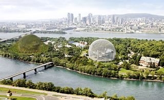
50 years since the unveiling of R. Buckminster Fuller’s Biosphere – a spherical tribute to the historic World Fair Expo 67 – Studio Dror is proposing a contemporary space to haul the island of Saint Helen’s Island into the 21st century.
Concieved to coincide with the 375th anniversary of the city’s founding (which takes place next year), the new landscape would see the architectural vision of Dror Benshetrit sit adjacent to Fuller’s now iconic structure. The dynamic framework of a 150m-wide aluminium dome will be draped with vegetation, creating a visually stunning accompaniment. It’s set to house an array of public events, from fairs and concerts to food markets.
The vast space beneath the planted canopy affirms the dome’s ability to fuse the city’s wealth of rich natural resources with progressive technology. More significantly, the new proposed structure is an opportunity to celebrate the past and nurture the future.
Writer: Ashley Manning
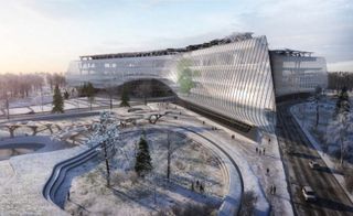
Sberbank Technopark by Zaha Hadid Architects
25 April
The late Zaha Hadid’s architecture practice, ZHA, has won the competition to build the Sberbank Technopark at the Skolkovo Innovation Centre in Moscow. For Hadid, architecture was intrinsically linked to creativity, innovation and engagement; important principles that resonate with the ethos of the Russian bank.
Project director Christos Passas oversaw a design that focused on multi-functioning connectivity to respond to the company’s needs. Sberbank has been at the forefront of many of Moscow’s technological developments and the five-floor design aims to accommodate a wealth of its research and development.
The 131,000 sq m Technopark will be encased in a rib-like structure, the very heart of the company sitting within the dynamic design of glass-fronted levels. Construction is due to begin in around 18 months time, with estimated completion in two years.
Writer: Ashley Manning
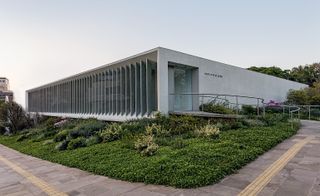
Side effects: a spot of lateral thinking enriches a Brazilian cultural centre
15 April
Isay Weinfeld’s input is unmistakeable in this cultural centre in the Brazilian city of Porto Alegre. Located on a green corner site in Três Figueiras, the low, orthogonal, granite-clad volume of Instituto Ling is striking in its pared-down sophistication. Accessed via a curving ramp that leads visitors up to the reception area through a small, leafy garden, the building’s simple facade provides a stark contrast to its transparent side elevation, which features a series of vertical fins that help control sunlight within. The structure spans three levels – the ground floor houses a series of galleries, a store, café and auditorium, while the lower level includes an event hall, kitchens used for community classes, meeting rooms and toilets. A second basement, not accessible to the public, provides additional services, staff facilities and parking.
Writer: Ellie Stathaki
As originally featured in the May 2016 issue of Wallpaper* (W*206)
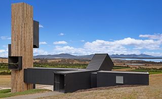
Drink in the view
14 April
The fact that Australia’s Brown Brothers has been producing top-notch wines for over 125 years is testament to its family-orientated ethos and enterprising outlook. Its latest venture is a revamped tasting room, Devil’s Corner Cellar Door, located within the Hazards Vineyard on Tasmania’s east coast. Prioritising the dramatic views over the Freycinet Peninsula, Hobart-based outfit Cumulus Studio has assembled five repurposed shipping containers to create a structure that comprises a trio of lookout points. These, say the architects, interpret the landscape from which the wines originate. Indeed, the curated views, which include a lofty panorama of the sparkling bay, are the perfect platform from which to appreciate the vineyard’s heritage. A further five containers form the ’market’, which features a retail space, a private tasting room, a restaurant and a café – ample opportunity to settle down with a bottle of the fruity Pinot Noir for which Devil’s Corner is best known.
Writer: Rosa Bertoli
As originally featured in the May 2016 issue of Wallpaper* (W*206)
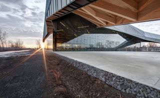
Montreal gains an eco-friendly Stade de soccer
6 April
Last autumn, Montreal launched their eco-friendly soccer stadium, designed by Saucier + Perrotte Architectes (S+P) and Hughes Condon Marler Architects (HCMA).
Situated next to Papineau Avenue’s residential area, the energy efficient construction comprises clean, laminated wood, which gives the stadium elegance and unity. What’s more, the structure is flexible and can be adjusted, transforming the stadium into an open-air facility during the summer, and providing gaps for ventilation in the winter.
On the stadium’s berm there is an elevated pedestrian path that preserves the existing trees. This leads up to the main lobby, which is contained inside a large, translucent crystal box, providing abundant daylight along with views across to the public spaces nearby. The trees and the crystals give the magnificent 5,050 sq m construction a soft and natural feel.
The project changes the ecological symbolism associated with the area which was previously used as a mining centre and then a dumping site.
Writer: Paula Erizanu
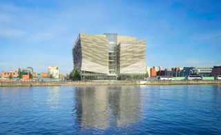
Central Bank of Ireland’s first ’outstandingly’ sustainable office
30 March
Dublin’s new Central Bank of Ireland (CBOI) has been awarded a BREEAM Design Stage ’outstanding’ rating – the first office building in Ireland to do so.
BREEAM is the world’s leading sustainability assessment method for buildings and structures. The ’outstanding’ rating is given to less than one per cent of new non-domestic buildings, and the companies that achieve this accolade are labelled as official ’innovators’ by the awarding body, as opposed to mere ’followers of best practise.’
Henry J. Lyons, Walls Construction and M&E engineers O’Connor Sutton Cronin have taken a fully collaborative approach, working together in order to tick each of BREEAM’s boxes. The bank, still in construction, is set to include a mixed mode ventilation system; facade-mounted louvres allowing fresh air to easily flow through the space; and a building management system that reduces cold air supply, while simultaneously saving energy.
The team have thought about more than just nifty gadgets and air-conditioners, however. They’ve also cleverly located the building in Dublin’s River Liffey docklands area, allowing them to build a footprint large enough that three, environmentally unfriendly city-centre locations can be closed. What’s more, a 300-strong bike rack sits proudly outside to encourage the use of sustainable transport.
Achieving BREEAM’s highest rating has been at the forefront of the team’s objectives from day one, as Deirdre Quigley, senior programme manager at CBOI explains: ’BREEAM provided us with a methodology to independently measure our corporate goals to achieve a fully sustainable building – and to improve the health and well-being of our staff.’
Writer: Elly Parsons
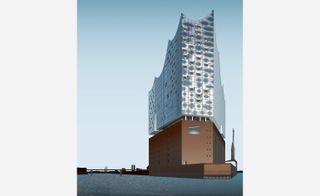
Harbouring desire: Herzog & de Meuron’s ship-like Elbphilharmonie in Hamburg
24 March
The warehouse revamp set to provide a new home for the Elbphilharmonie in Hamburg, designed by Swiss architects Herzog & de Meuron and ongoing since 2003, is the most anticipated scheme in the city’s HafenCity waterfront district; and now there are clear signs that completion is nearing. Apart from its world-class concert hall, with seating capacity for some 2,100 guests, the project will also include a hotel – reached through an elevated internal plaza and an 82m-long curved escalator – as well as retail and residential spaces.
A marketing suite created by interior designer Kate Hume has just been launched for the 45 apartments on sale. The building’s interiors are otherwise by Antonio Citterio Patricia Viel and Partners. Offering views of the River Elbe and the city, and with completion planned for 2017, this striking renovation is set to become a new Hamburg landmark.
Writer: Ellie Stathaki
As originally featured in the April 2016 issue of Wallpaper* (*205)
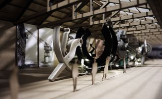
Two arsenals, one vessel
10 March
The 15th Architecture Biennale is just around the corner, and thus the announcements begin; Turkey’s Pavilion the latest to catch our eye.
Curated by Feride Çiçekoğlu, Mehmet Kütükçüoğlu and Ertuğ Uçar, with curatorial collaborators Cemal Emden and Namık Erkal, the theme, ’Darzanà’, will create an allegorical conversation between the seaport cities of Venice and Istanbul, drawing on their shared language and architecture.
This project borrows its name – ’Darzanà’ – from a hybrid of the Turkish word ’tersane’ and the Italian word ’arsenale’, as well as a shared architectural language. A vessel, or baştarda, will be built at an abandoned shipdeck at the Haliç dockyards in Istanbul using the waste materials on site. It will then be taken to Sale d’Armi in the Arsenale and re-installed there.
A cross between a galley and a galleon (propelled by both sails and oars) the baştarda will represent the hybrid nature of the Mediterranean and will ’exhibit that which you cannot demarcate water or put a wire fence between words, all the while looking for the clues to transform fronts and borders into thresholds and spaces of consensus,’ explains the team behind the concept. ’Architectural practice is a field prone to confrontation, conflict, to drawing borders and withdraw, to quitting the profession and taking up other things. The question of whether or not it is possible to transform spaces of conflict into those of consensus by continuing the practice of architecture will be the main theme.’
Selected through a rigorous process including two stages of open calls inviting all designers, artists and architects interested in the prospect, this will mark Turkey’s second appearance at the prestigious international event.
Writer: Sam Rogers
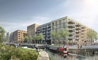
Live-work London
4 March
It’s common knowledge that living in London is a budget-buster, making it even harder than usual for start-ups and creative entrepreneurs to survive in the big smoke. Realising that high living costs are forcing young creatives into the open arms of our second cities and beyond, the powers that be have stepped in.
Today, affordable housing provider Peabody and social enterprise The Trampery announce plans for an innovative all-in-one facility to support London’s creative and technology entrepreneurs.
Fish Island Village in Hackney Wick has been allocated a £7.3 million renovation to deliver 580 new affordable homes on-site to rent and buy. The scheme also includes circa 5,300 sq m of commercial space, 4,500 of which will be operated by The Trampery as workspaces, a fabrication workshop, a theatre and a bar-restaurant. Overall the site will support in excess of 500 jobs in technology and creative businesses.
Stephen Howlett, chief executive of Peabody says, ’We recognise the importance of culture and creativity in successful placemaking and building balanced, thriving communities. We are very excited about the potential for this unique partnership, to engage the local creative community, whilst providing much needed affordable housing.’
Even Boris Johnson is on board, stating that the partnership is a ’shining example of what can be done to support the needs of our creative and tech talent’, which gives credence to the planning guide he published last year, that promised to put ’creativity and innovation at the forefront of planning decisions so that they are able to flourish.’
With work proposed to start as soon as this summer, we haven’t booked our one way tickets to Brighton or Manchester just yet.
Writer: Elly Parsons
Gift of the garden
3 March
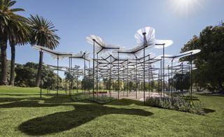
The people of Melbourne have reason to celebrate: Amanda Levete’s MPavilion is to be gifted to the city and relocated to Collins Street park in Docklands.
In its new, permanent home, Levete’s MPavilion will ’continue to inspire and be part of the city’s cultural heritage.’ In addition to this relocation and donation, it has been revealed that the installation has been shortlisted for the famed World Architecture News Awards (WAN) in the Small Spaces category which celebrates small-scale architecture.
Unveiled in late 2015, the nature-inspired canopy was designed by London-based international architect Amanda Levete, director of AL_A, to mimic its intended lush surroundings. ’It’s a contemporary interpretation of a forest, allowing the elements to be felt against one’s face while still enjoying the protection a forest offers,’ she said at the time. A series of 52 resin petals, varying in widths from three to five meters in length, were finely poised on slender carbon fibre columns, bundled closely together to create a modern woodland.
The second MPavilion to be commissioned, Levete’s piece follows in the footsteps of Sean Godsell’s intervention which was also gifted to the city after its tenure. 2016 MPavilion has been awarded to Indian architect Bijoy Jain of Studio Mumbai, although designs have yet to be unveiled. Until then, Melburnians will be able to enjoy Levete and Godsell’s installations.
Writer: Sam Rogers
Noteworthy space
26 February
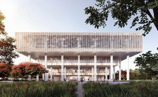
Birmingham bibliophiles reaped the rewards of Dutch architecture practice Mecanoo Architecten’s work in 2013, and soon Taiwan too will benefit from a new public library.
Mecanoo, now an expert in creating outstanding libraries, has won the competition to design the new Tainan Public Library in Taiwan. Working in partnership with Kaohsiun-based MAYU architects+, the new library will fit into 35,000 sq m and feature – as expected – an array of reading rooms, study spaces, children’s areas, a café and a conference hall complete with a 200-seat auditorium. A meeting point of cultures, generations and histories, the building will combine a range of materials – namely stone, wood and glass – to create a sensitive space with a clever use of light.
The entrance hall rises three levels up to show the internal configuration while a curved stairwell guides visitors through its many layers. The top floor is wrapped in a second skin, filtering the light and reducing solar heat gain while affording a canopy of shade to the stepped facade and courtyards below.
Budgeted at €40 million and slated for 2018, the site has also worked in the possibility of a future extension of 13,000 sq m.
Writer: Sam Rogers
SITU #3: Ricardo Alcaide at Galeria Leme, Sao Paulo
19 February
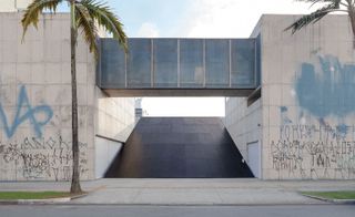
Venezuelan Ricardo Alcaide is the latest artist to exhibit work at Sao Paulo’s celebrated Galeria Leme, launching with a new site-specific piece exploring art, architecture and the city.
His black, geometric, architectural installation is slotted within the gallery’s outside space, set against Pritzker Prize winner Paulo Mendes da Rocha’s building (created for the gallery together with Metro Arquitectos), instigating a dialogue between the two structures.
The large-scale piece is admittedly hard to miss. Spanning the art gallery’s whole courtyard and almost entirely blocking its two entrances, the installation clearly dominates the space with its monumentality, commanding the attention of visitors and passers-by alike.
At the same time, it redirects the flow of visitors to another, temporary entry - on the location of an old entrance, used by the gallery’s previous building on site, which was demolished in 2011. This, not only sets the scene for a new debate about memory and architecture, but also re-examines the visitor’s physical relationship with the building, as well as questions about the relationship between public and private space.
This is the third project under the gallery’s SITU banner. The art program, curated by Bruno de Almeida, aims to look into the ways ’we think about and discuss the production of urban space’, explain the organisers.
The piece will be on show until 15th March 2016. For more information visit the Galeria Leme website
Writer: Ellie Stathaki
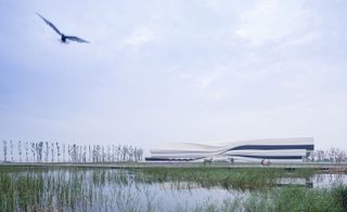
Pictured: Yinchuan MOCA WAA 606, by Di Zhang.
Female architects on the rise
15 February
Nominees have been announced for both the Moira Gemmill Prize for Emerging Architecture, and the Woman Architect of the Year Award.
The former – which takes its name from V&A’s director of design, who passed away last April – celebrates women who are using architecture to affect social change. The eclectic range of projects include a community centre for the victims of 2009’s L’Aquila earthquake, a genuinely handmade school in Bangladesh and a women’s centre in Senegal.
In the Woman’s Award category, focus shifts to the promotion of architects who are climbing the ranks and raising the bar. Particular highlights include the work of Kazuyo Sejima, from SANAA studio, nominated for her sinuous cultural centre ’The River’, nestled in the rolling Grace Farms landscape of Connecticut. That’s not to mention Di Zhang of we architech anonymous ltd for her work on Yinchuan’s Museum of Contemporary Art (pictured) which opened in 2015.
Although the global spread of entries was broader than it has ever been, founder of the woman’s award Christine Murray explains that, ’we did not receive enough entries from Africa, or India – places where maverick women architects appear to be rarer, or less likely to put themselves forward. I hope these awards will help us discover more talented and inspirational role models around the world.’
We can’t wait to see who comes out top at the awards ceremony at Claridges on 4 March.
Writer: Elly Parsons
Lisson Gallery New York
09 February
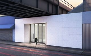
It was only a matter of time before the famed Lisson Gallery from London had an official outpost in New York - and the wait is almost over. Due to open on the 3rd May, the upcoming Lisson Gallery New York is one of the Big Apple’s most highly anticipated art openings of this spring, designed by studioMDA and Studio Christian Wassmann.
Strategically located in a new building nestled underneath the famous High Line site, the new space will span 8,500 square feet, consisting of 4,500 square feet of gallery and 4,000 square feet of offices, viewing spaces and storage. The structure was designed to work with the High Line’s existing infrastructure elements and around the surrounding park.
Smooth grey concrete floors, clean interiors and plenty of natural light through two large skylights on either side of the main exhibition space, make up for the Lisson’s familiar DNA of contemporary art space. The striking minimalist façade will be made out of exposed white concrete.
The new gallery will be joining the art company’s two existing homes in the British capital and a further one in Milan, making this the fourth official Lisson exhibition space.
The gallery’s inaugural exhibition will feature paintings of the celebrated Cuban-born painter Carmen Herrera.
Writer: Ellie Stathaki
Bamboo Stadium
1 February
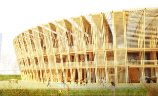
Facing the urgency of sustainable development, recent graduate Chen Shen has presented designs at ArchiPrix, Netherlands for an innovative new stadium, constructed entirely from bamboo.
One of the world’s fastest growing plants, and as strong as mild steel, bamboo is used as scaffolding across Asia. It’s not uncommon for entire homes to be made from the material. But, in terms of scale, this project is arguably the most ambitious bamboo-based development the west has seen.
If it could work anywhere, it would be De Bretten – a forward-thinking green zone in Geuzenveld, Amsterdam – where Shen believes the stadium would ’enhance the recreational and ecological value of the local context’.
The use of bamboo would also mean the new stadium can be easily dismantled, amended or rebuilt elsewhere, providing an attractive, flexible solution for potential sponsors.
In Shen’s opinion, bamboo is God’s gift to building. As well as the ecological benefits, the stadium presents an inviting, airy landmark, that would stimulate bamboo’s use as a viable building option in the west.
Writer: Elly Parsons
Jeddah Tower gains a firmer base
28 January
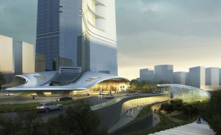
The 1000+ metre Jeddah Tower in Kingdom City, Saudi Arabia is scheduled to be completed in 2019. To balance out a building of that height, an equally expansive base area is required. Landscape architects SWA have risen to the challenge, with new plans for concentric hardscaped layers to loop around the tower’s reception area.
With a waterway, various planting areas, a paterre garden, and a maze of elevated paving sections, SWA aims to enhance the approach, as well as providing an interesting view from the tower’s lower levels.
With so many elements combining to form the final design, bold, continuous paving will provide a strong visual identity. The radial pattern will begin inside the lobby, continue through the gardens and walkways, finally diffusing by the lake.
Writer: Elly Parsons
Ceramic Studio
25 January
Suburban Osaka has gained another multifunctional marvel to add to its collection of pocket-sized apartments.
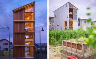
OFEA (Office of Environment Architecture) have created a home-cum-workshop for a family of local pottery artists. On the concrete-based ground floor there is a practical workspace; on the three stories above, a warm and functional family home.
The four narrow levels are connected by a steel stairway, and floor to ceiling windows that can be completely opened, overlooking a dramatic mountain view.
A patchwork of pottery lines the walls, on timber shelving that scales one side of the building. Due to a limited budget, all walls and ceilings have been left with their oak skeleton still on show, and furnishings are left to a tasteful minimum – if anything, this adds to the warmth and character of the structure.
Writer: Elly Parson
Makkah Museum
19 January
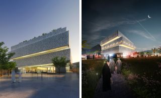
Parisian Architecture practice Studio Adeline Rispal along with London based firm Mossessian Architecture have won an invited competition to design a museum of Islamic faith situated in the holy city of Mecca, or Makkah as it is also known.
The Makkah Museum, which will be located 7km from the Grand Holy Mosque, features a public reception space, 5,600 sw m of permanent and temporary exhibition galleries, an auditorium, educational space, book store and roof garden with controlled temperature to counteract the region’s harsh climate.
Visitors will travel through the museum, using a central void, which hosts a continuous spiral ramp system. Visible from a dedicated space at the base of the spiral are the 99 names of Allah, inscribed upon the underside of the cupola. Local Hijaz rock from the mountains of Mecca will be used throughout the interior, hollowed out to create plinths and alcoves, which visitors encounter along the exhibition path.
Studio Adeline and Mossessian Architecture secured this prestigious commission with their successful vision of a building, which features a delicate and well-considered balance of faith, heritage and modern technology.
Writer: Sara Sturges
Members only at the V&A
8 January
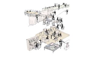
The V&A is one of London’s finest museums and, as its growing member figures attest, its popularity shows no sign of waning. The expanding membership base has pushed the current Members’ Room to its limits and the institution has therefore decided to relocate and expand it.
Architecture firm Carmody Groarke has triumphed over stiff international competition to claim the £156,000 commission, which is due to be completed in 2017. The award-winning studio will create a relaxed environment to meet the wide-ranging needs of the V&A’s eclectic membership. The plans depict a multidisciplinary space in which members will be able to relax in armchairs, indulge in food and drink, study on computers, or educate themselves via book collections and specially curated exhibits.
The room on the fourth floor will overlook the new courtyard, currently being constructed as part of the Exhibition Road project, and will also be used as a space for the museum’s ongoing cultural events programme.
David Bickle, the Museum’s new director of design, commented that the quality of submissions had been exceedingly high but Carmoady Groarke’s proposal had impressed the panel of judges with its particular sensitivity to the Museum’s legacy. He praised the firm for responding to the brief in a ’loose, relaxed, conversational way’.
Writer: Rhiannon McGregor
Greenwich’s Optic Cloak
7 January
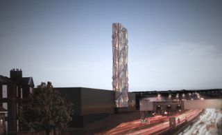
The renowned British artist Conrad Shawcross is adding a little interest to the edge of London’s South Orbital – he has been commissioned to create an imposing new structure for the Greenwich Peninsula. Named ’Optic Cloak’, the architectural landmark is a fittingly nautical addition to London’s ’seaside-village’, drawing on maritime camouflaging techniques.
The ’cloak’ element is achieved through the ’moiré effect’: an optical phenomenon created by overlaying perforations of aluminium panels at different angles to each other, resulting in a beguiling, uneven surface which appears to change continually.
The landmark will be completed in April 2016 as part of the Peninsula’s new low carbon Energy Centre, and has been designed in collaboration with the architectural practice CF Møller. With artwork like Antony Gormley’s Quantum Cloud and Richard Wilson’s A Slice of Reality already featured on the peninsula, the new addition of Shawcross’ 160 ft sculpture sets to lift the area’s regeneration project to new heights.
Writer: Elly Parsons
Southampton’s new Maggie’s Centre
6 January
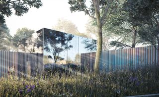
Cancer charity Maggie’s has been granted planning permission to build a new support centre in Southampton, designed by the internationally renowned practice AL_A. Scheduled to open in 2017, the space will provide free support to anyone living with cancer, and their families.
Colour, light and communal areas were central elements to the design. After approaching the centre through peaceful, interconnected walkways, patients will reach the kitchen – the heart of any Maggie’s centre. The large, open space is naturally lit by an impressive skylight. Glass and other reflective materials are used throughout, in the place of a more traditional interior design scheme, to draw in changing seasonal colours. As Amanda Levete of AL_A comments, the centre will be ’an oasis in the grounds of Southampton General Hospital; a woodland glade seemingly transported from the nearby New Forest’.
To complement the secluded building, Sarah Price (co-designer of the 2012 Gardens at the Olympic Park in Stratford, London) has been commissioned to create the surrounding landscape. Early flowering orchids, wild garlic and bluebells will light up woodland pathways, and provide a relaxing, natural vista to look out on.
Breaking free of the topographical uniformity of the concrete car park and austere hospital buildings, the sheltered centre works in tandem with the gardens to create a space where the outside and inside blend into one.
Writer: Elly Parsons
Ellie Stathaki is the Architecture & Environment Director at Wallpaper*. She trained as an architect at the Aristotle University of Thessaloniki in Greece and studied architectural history at the Bartlett in London. Now an established journalist, she has been a member of the Wallpaper* team since 2006, visiting buildings across the globe and interviewing leading architects such as Tadao Ando and Rem Koolhaas. Ellie has also taken part in judging panels, moderated events, curated shows and contributed in books, such as The Contemporary House (Thames & Hudson, 2018), Glenn Sestig Architecture Diary (2020) and House London (2022).
-
 ‘Fashion & Interiors: A Gendered Affair’ at MoMu unpacks the hierarchy of the home
The Antwerp exhibition interrogates the relationship between fashion, interiors and gender through the concept of ‘gesamtkunstwerk’, a complete work of art. Curator Romy Cockx gives Wallpaper* a tour
By Dal Chodha Published
-
 Milan Design Week: Dropcity challenges detention space design with 'Prison Times'
Dropcity's inaugural exhibition 'Prison Times – Spatial Dynamics of Penal Environments', opens a few days before the launch of Milan Design Week and discusses penal environments and their spatial design
By Ellie Stathaki Published
-
 ICON 4x4 goes EV, giving their classic Bronco-based restomod an electric twist
The EV Bronco is ICON 4x4’s first foray into electrifying its range of bespoke vintage off-roaders and SUVs
By Jonathan Bell Published