Learning curve: first-class new university buildings from Uppsala to Toronto
Giving us a lesson in architecture we won't forget, these university buildings deliver a range of functions and interior finishes, and each brings an informed vision for the future of education to the table. As originally featured in the November 2017 issue of Wallpaper* (W*224)

Receive our daily digest of inspiration, escapism and design stories from around the world direct to your inbox.
You are now subscribed
Your newsletter sign-up was successful
Want to add more newsletters?
Project type: Social hub and management HQ
Name: Segerstedthuset
Location: Uppsala University, Sweden
Architects: 3XN
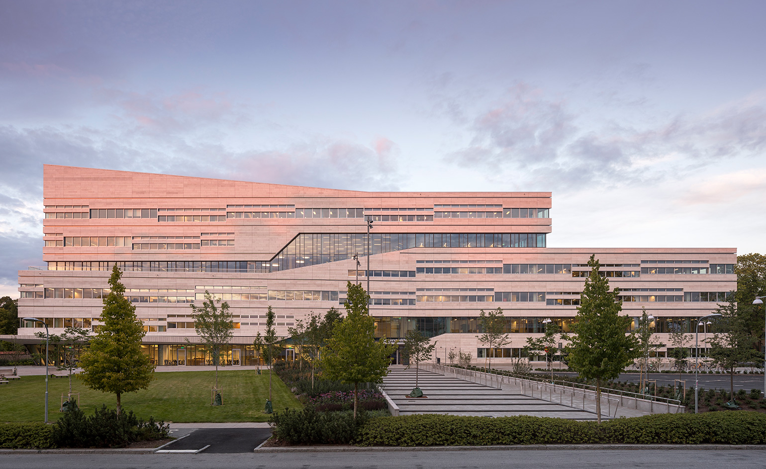
As the early rays of the sun dance off its limestone façade, the new Segerstedthuset in Uppsala, Sweden takes on a rosy hue – a fitting complement to the nearby castle, a pastel pink structure dating back to 1549. Completed this summer, Segerstedthuset has a distinctively modern form characteristic of its Copenhagen-based architects, 3XN. It consists of two U-shaped, overlapping volumes that abound with sharp angles and floor-to-ceiling glass, tempered with an abundance of horizontal lines and gently sloping roof elements that blend the building into the natural landscape. It’s a sensitive addition to a historic area (also comprising a bastion, a park and a botanical garden) that has seen few changes in recent decades.
Segerstedhuset was commissioned by the Uppsala University – the oldest university in the Nordic region – to provide workspace for its researchers, management and administrative staff, who were previously spread across nine different buildings. More importantly, the new building was conceived as a campus landmark, and a social hub for the university community. The 25,000 sq m campus landmark serves 45,000 students.
Project type: Social hub and management HQ
Name: Segerstedthuset
Location: Uppsala University, Sweden
Architects: 3XN
Wide walkways, cut through landscaped areas with outdoor seating and lead into entrances on opposite sides of the building. 3XN worked with Statens Konstråd, Sweden’s public art agency, to commission Color Wheel, a set of revolving doors (one at each entrance) with multicolour glass panels by American artist Spencer Finch. As the doors turn, the glass overlaps to create virtually infinite colour combinations. It’s an allusion to the endless quest for knowledge, but also a brilliant lure for the campus community and external visitors alike.
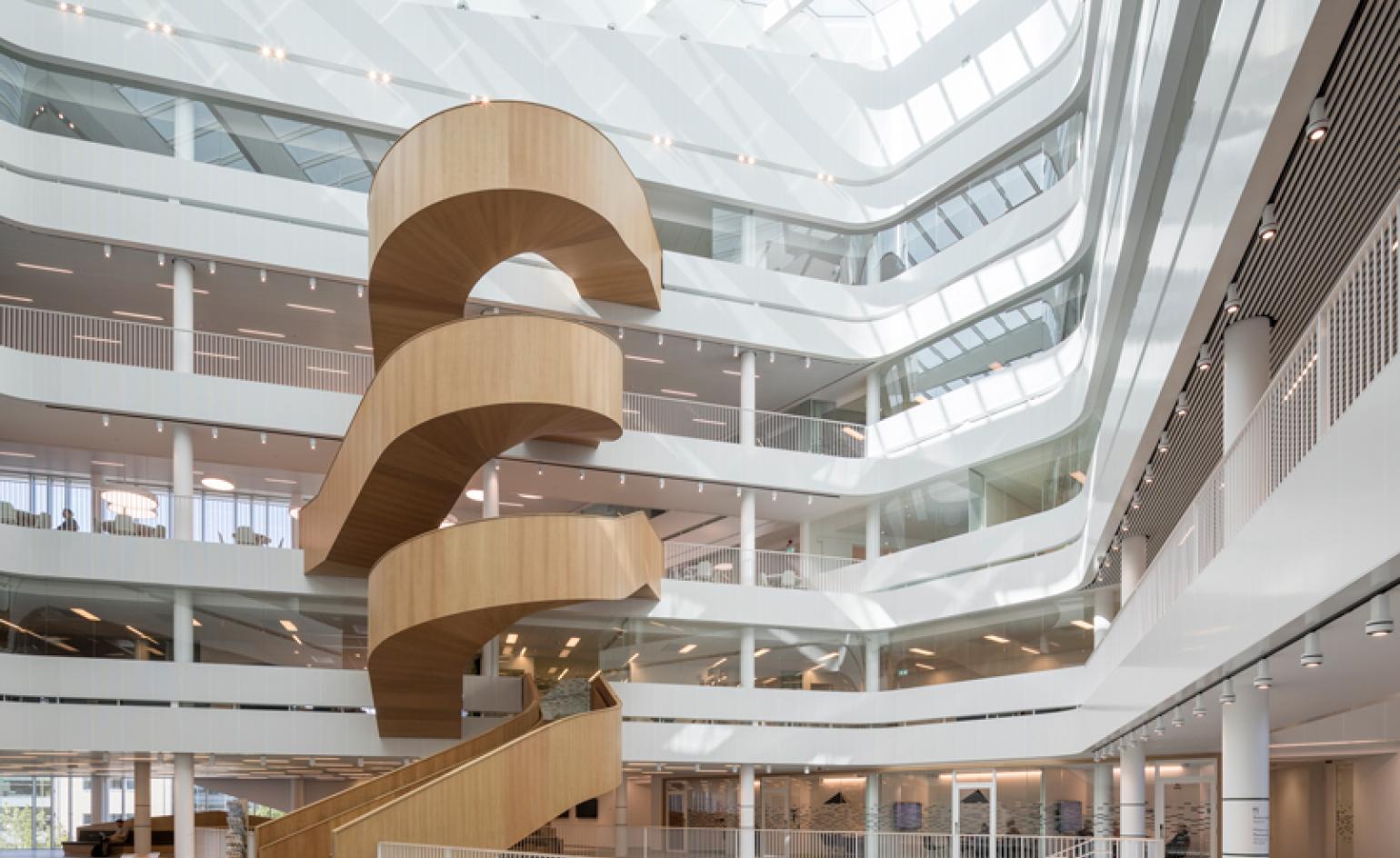
Once in the building, one encounters a full-height atrium, bedecked with large windows through which natural light pours in, and with a sculptural four-part beechwood staircase spiraling through the space. According to Jan Ammundsen, senior partner and head of design at 3XN, ‘the atrium acts as the heart of the building, with the staircase functioning as the main artery. It brings not only warmth to the atrium but animates the entire space’. A separate staircase connects the two lower levels where the entrances are located, allowing easy passage through the building for passers-by. This is lined with a vertical garden, created by Stockholm specialist Green Fortune, further blurring the boundaries of outer and inner space.
Project type: Social hub and management HQ
Name: Segerstedthuset
Location: Uppsala University, Sweden
Architects: 3XN
The ground floor houses a relaxed restaurant and event space, whereas the upper levels have a combination of traditional offices, meeting rooms and informal gathering spaces (with ‘Attach’ tables by Lammhults and slender ‘Hee’ bar stools by Hay), complete with the fika stations that are so essential to Swedish working culture.
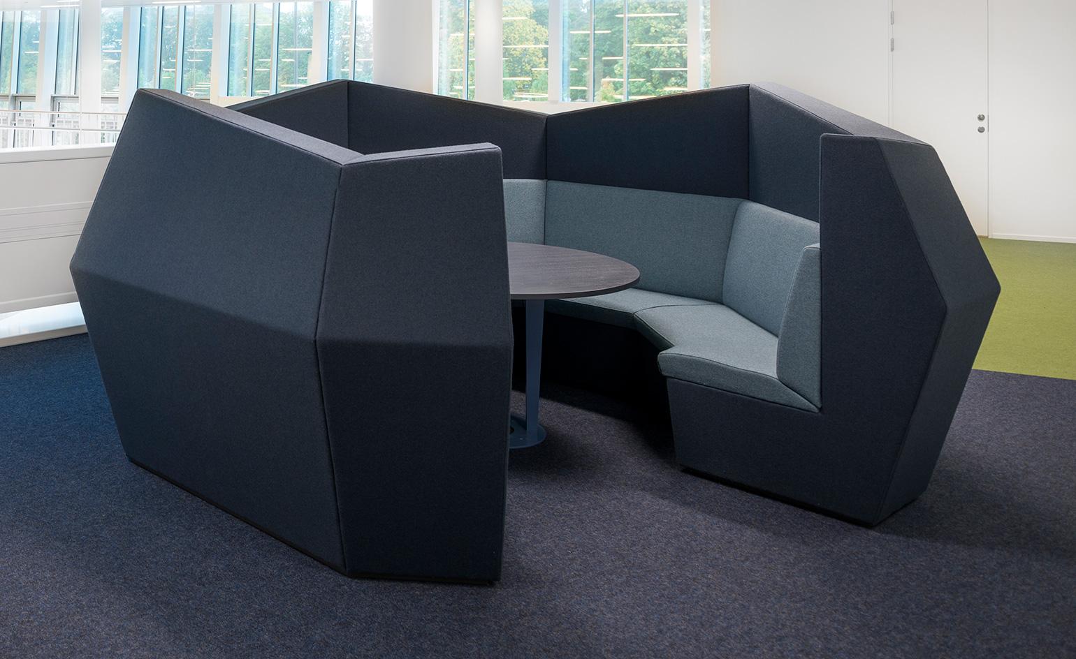
3xn worked with interior architects Indicum to shape the Segerstedthuset's offices, working with the university to rethink the way workspaces, circulation and social hubs were used and arranged. Indicum also designed much of the bespoke furniture. Pieces include custom-designed octagonal sofas-cum-meeting spaces, produced by Facctory, along with bespoke benches, desks and tables. Indicum's geometric prints also appear on the acoustic panelling by Abstracta.
Project type: Administration block
Name: Think Corner
Location: University of Helsinki, Finland
Architects: JKMM
Local practice JKMM has transformed the old administration block of the University of Helsinki into the sleek Think Corner. Located in the heart of the Finnish capital, it faces the 1950s Aarne Ervi-designed Porthania building, whose front square has become an important element of the campus and cityscape. Although the revamped building stands in stark contrast with the surrounding area’s Empire-style architecture, it also forms a natural connection with the nearby university buildings, extending the square into Think Corner and linking the Porthania building and the nearby university museum.
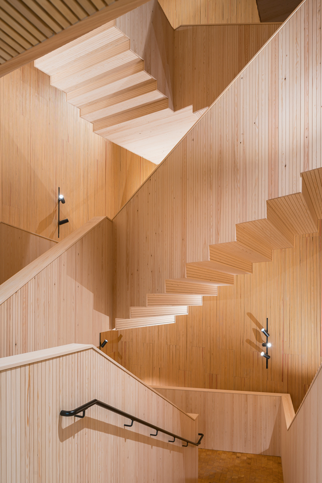
The building’s main new features are its wide entrance and large street-facing windows. ’Think Corner is a screen and window to Helsinki city centre,’ says JKMM co-founder Asmo Jaaksi, who has worked on the project since winning a public competition in 2015. ‘We tried to keep the material palette simple, just concrete and pine wood,’ he adds. Inside, the two materials are kept raw and blended throughout the space, the building’s asymmetrical complexity is in contrast to its material simplicity.
Project type: Administration block
Name: Think Corner
Location: University of Helsinki, Finland
Architects: JKMM
There is a theatricality to the space, with irregular volumes and wide directional windows. ‘The crucial thing is the openness of the concept, so we tried to show it in the architecture as much as possible,’ Jaaksi says. The university will occupy the first three floors, while a further three levels will serve as office space for a local company.
The ground floor is the heart of the building, serving as a continuation of the public square and featuring a bookshop and café. There’s also a central covered courtyard which will host events and, when not in use, serve as a working space, with meeting rooms and nooks set around it. ‘You can be in a private area and still feel involved in the main space,’ explains Jaaksi. The building’s furniture will feature Finnish brands such as Nikari, pieces designed by JKMM and more by international brands such as Hay. Clad in Finnish granite, the exterior completes the architects’ strong material focus, further connecting the new structure with the nearby buildings.
Project type: Administration block
Name: Think Corner
Location: University of Helsinki, Finland
Architects: JKMM
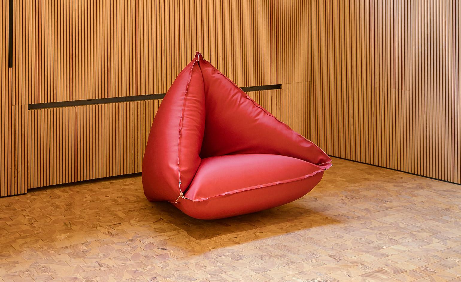
Think Corner's meeting rooms and books contain lounge seating from Vivero and 'Mags' sofas from Hay. The lighting supplier was iGuzzini. Office spaces are furnished with pieces by Martela and Nikari, as well as shelving from Finnish design house Selki-Asema. The informal seating areas are given a scattering of Vivero's 'Doremi' geometric beanbag chairs, designed by Kaisa Hirvaskoski-Leinonen, Mikko Nissilä and Elina Nissinen.
Project type: Faculty building
Name: Faculty of Fine Art, Music & Design
Location: University of Begren, Norway
Architects: Snøhetta
As the academic year commences, so does a new era for the University of Bergen, which has scored a new Faculty of Fine Art, Music and Design building, designed by Norwegian practice Snøhetta. Located in the Møllendal district, facing north towards the city and overlooking the Store Lungegårdsvannet bay, the building marks the incorporation of the Bergen Academy of Art and Design, the Grieg Academy and the Bergen University Department of Music, uniting previously scattered departments under one roof.
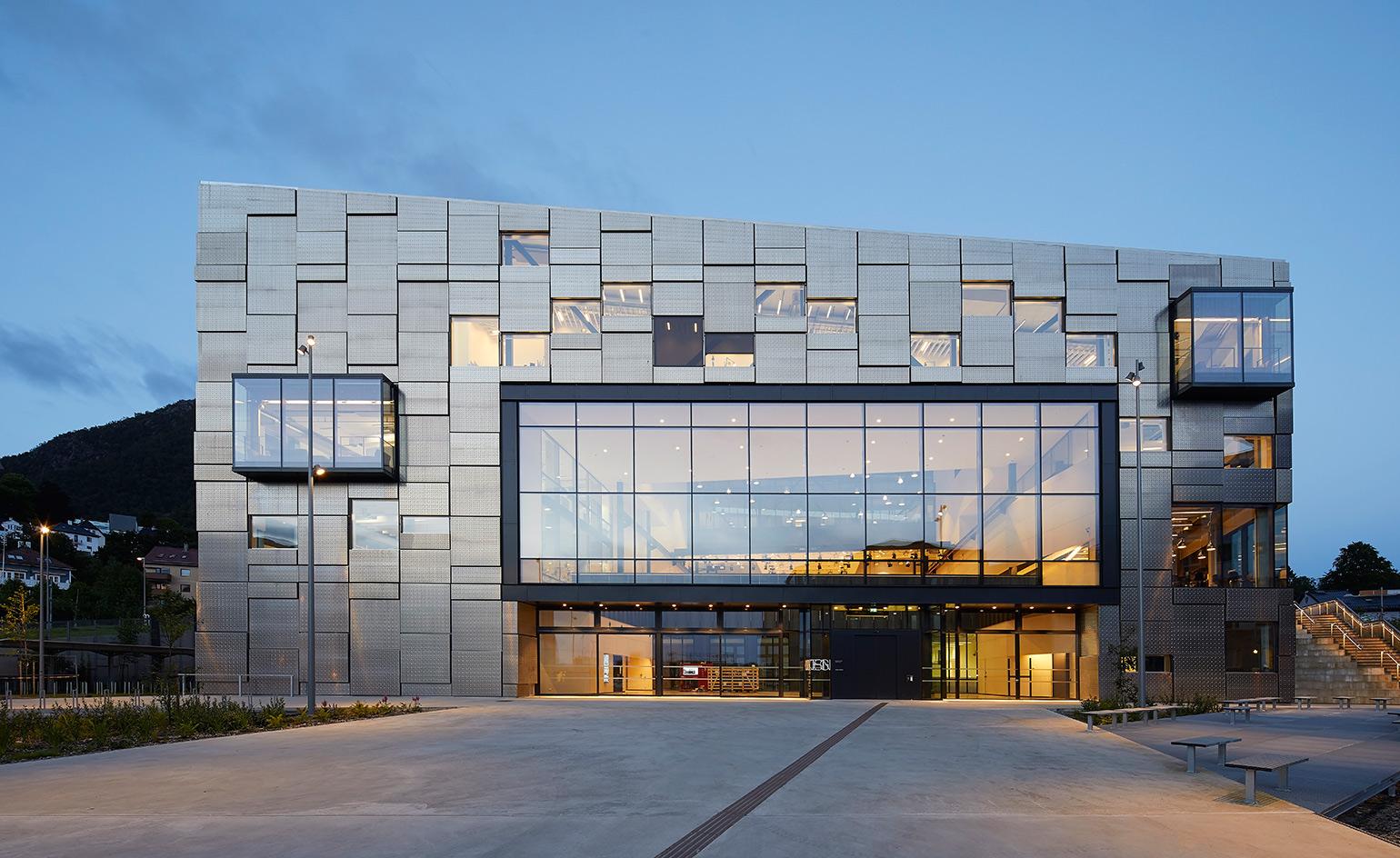
Programmed around a series of project halls, workshops, offices, communal and social spaces, the faculty serves 600 students across four floors and 14,800 sq m. It boasts a statement façade with irregularly placed window boxes, designed with the interior in mind: ‘We worked with the school to optimize light and create as much working wall space as possible – that’s the mechanical reason why it looks like it does,’ says Astrid Renata Van Veen, senior architect at Snøhetta.
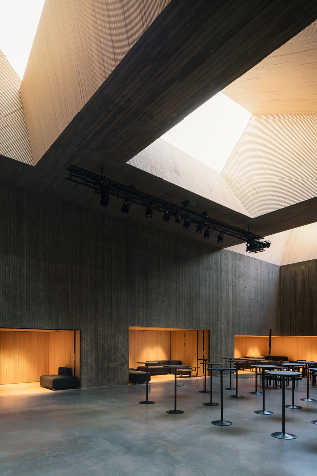
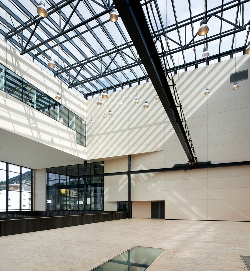
The building is a three-dimensional canvas in the largest sense. The students’ work – the metalworking, plastering, firing, 3D-modelling, performing and painting – needed to be at the forefront, so interior materials, including grey vinyl floors, sanded and oiled raw steel panels and exposed concrete, prioritise durability. The atrium of the large Project Hall (52 x 24m) features a gantry crane to lever artworks to the upper levels.
Receive our daily digest of inspiration, escapism and design stories from around the world direct to your inbox.
Project type: Faculty building
Name: Faculty of Fine Art, Music & Design
Location: University of Begren, Norway
Architects: Snøhetta
A vast glazed entrance to the building opens up to the largest project hall. Here Snøhetta chose pine block flooring and perforated white birch wall panels: ‘We decided to make the Project Hall the living room of the school – the white birch brings warmth to it without disturbing the nature of the building – it is almost white, but you can see the texture.’
Interior way-finding systems throughout the vast building include light strips on the ceiling and plastic shapes embedded into the vinyl floor. Workspaces are open plan where possible and feature a variety of timber desk benches designed by Scenario. Students have already begun to personalise the work stations, while faculty members have studios of their own too, a rare amenity for art professors.
The culture of display and experimentation is built into the building: bespoke steel frames for exhibiting students’ art are hung on the walls, while embedded into the foundation stone is artist and faculty member Charles Michalsen’s solar-driven artwork, delivering the Morse code pulses for ‘art, design’ continuously on repeat. The building’s statement façade features protruding aluminium cassettes of various heights.
Project type: Architecture school
Name: Daniels Building
Location: University of Toronto, Canada
Architects: NADAAA
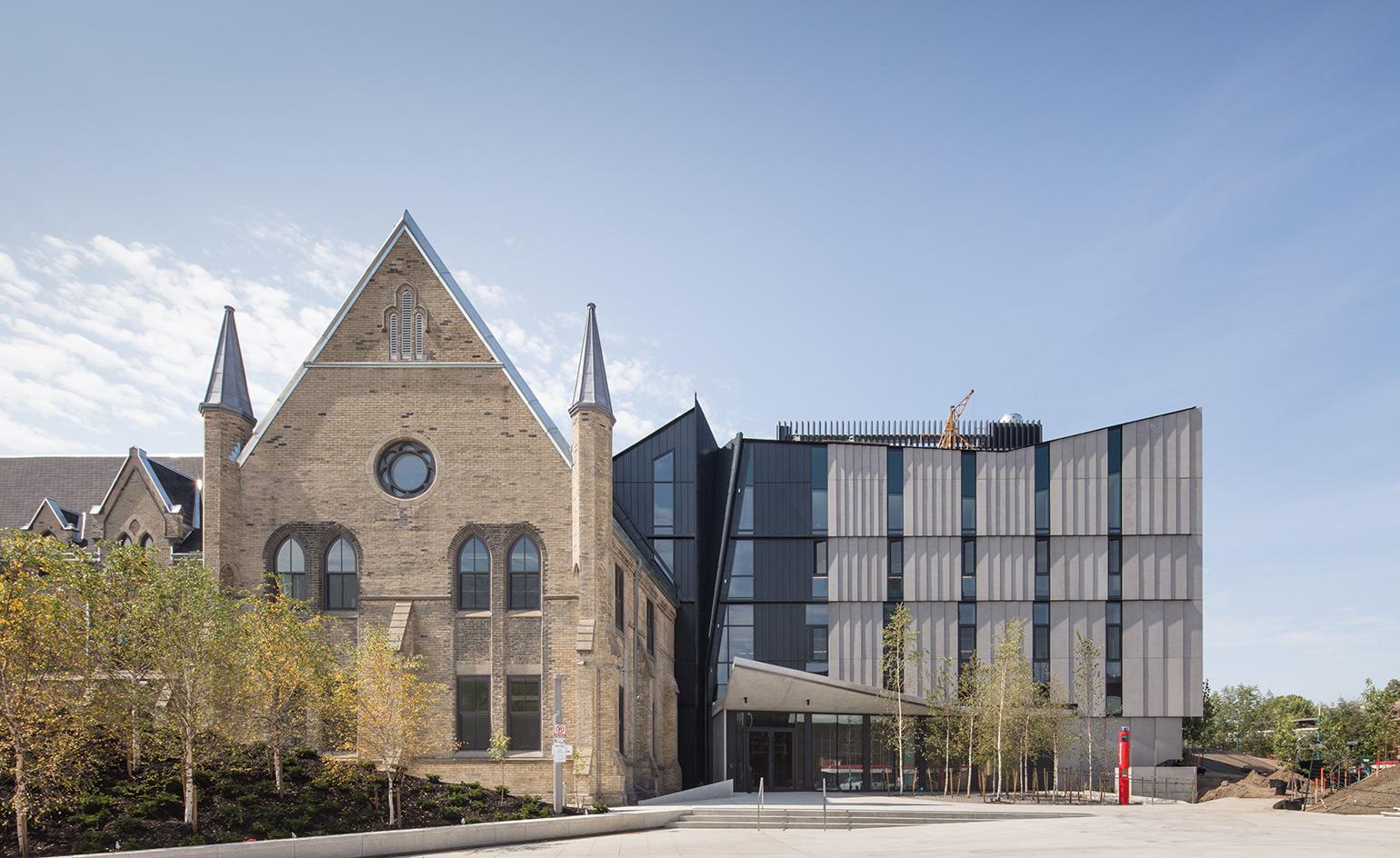
The University of Toronto’s new architecture, landscape and design facility is a double-height fabrication lab faced in glass, behind which 3D-printers whir into action. At dusk, multiple levels of glazing supported by a sloping concrete frame glow from within. But what’s that Gothic spire just beyond?
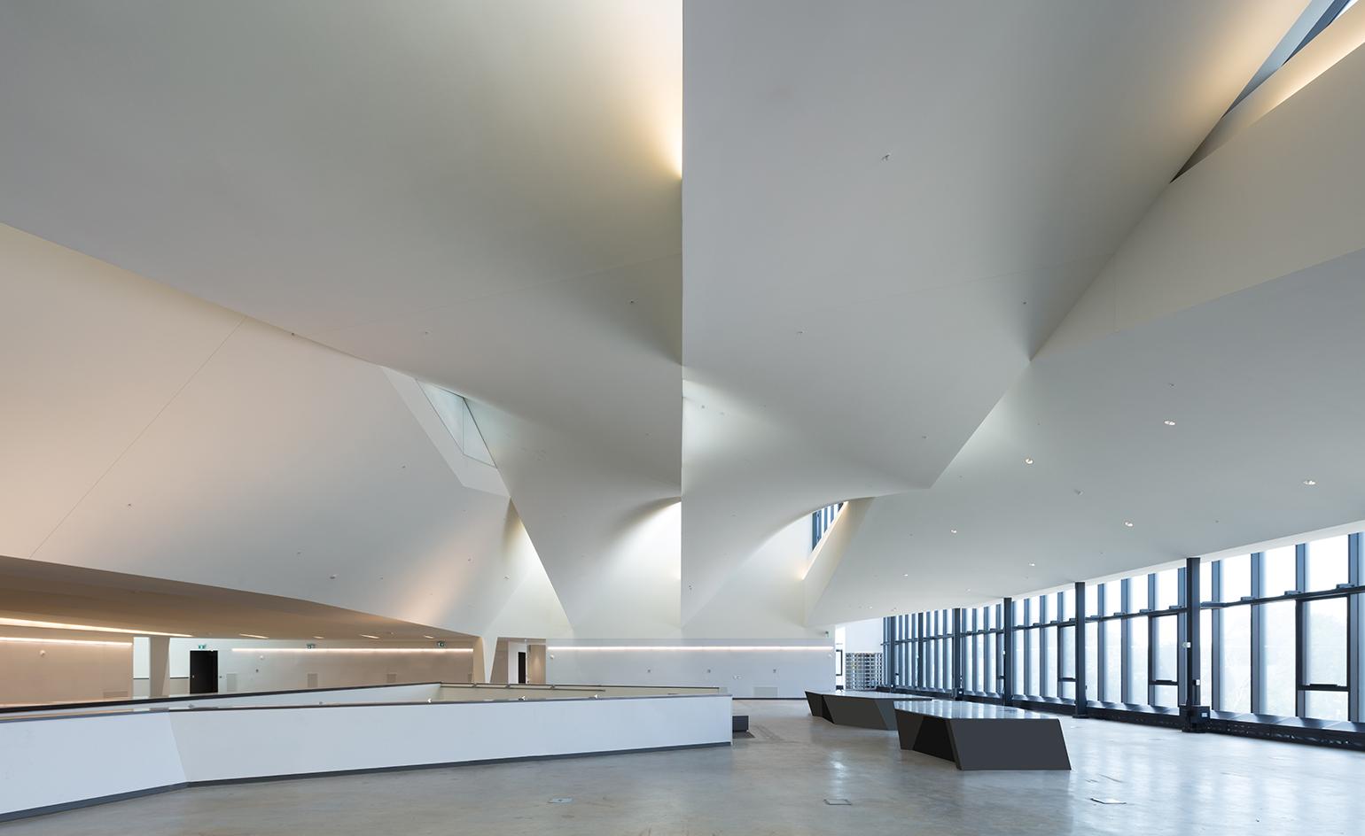
The building reveals itself as a visual chronicle of the city’s development and a merger of two eras: 21st century to the north, 19th to the south. The spire belongs to the 1875 structure, built by Smith & Gemmell as a Presbyterian seminary before becoming a hospital, insulin factory and faculty building. Together with the new wing, designed by Nader Tehrani and Katherine Faulkner of NADAAA, the Daniels Building for the John H Daniels Faculty of Architecture, Landscape and Design. In the top-floor graduate studio the ceiling’s asymmetrical twists meets the glass walls in Gothic points.
Bespoke furniture includes desks and lockers designed by the students themselves. The new faculty building echoes the U-shape of the old, integrating into its surroundings by Public Work's landscaping.
Project type: Architecture school
Name: Daniels Building
Location: University of Toronto, Canada
Architects: NADAAA
Infiltrating the former cloistered courtyard is a flexible lecture hall edged with concrete bleachers and acoustic fins and, beneath it, Toronto’s first architecture gallery. While the heritage structure functions as an office and study wing, the addition is bright and versatile. The brightness falls down from the roof, its trusses peaking at intervals like the fingers of two hands clasped together. Light feeds down towards the lecture hall, and through voids over the second-floor studios.
Conduits between the wings pass striking lookouts: over the ‘fab lab’ and the soaring foyer, and out to the surrounding area through NADAAA’s trademark mesh valance. Once upon a time, Torontonians looked right through this landmark. Today they still can, but in a different way entirely. NADAAA’s addition stands in striking contrast to the 19th-century original.
Ellie Stathaki is the Architecture & Environment Director at Wallpaper*. She trained as an architect at the Aristotle University of Thessaloniki in Greece and studied architectural history at the Bartlett in London. Now an established journalist, she has been a member of the Wallpaper* team since 2006, visiting buildings across the globe and interviewing leading architects such as Tadao Ando and Rem Koolhaas. Ellie has also taken part in judging panels, moderated events, curated shows and contributed in books, such as The Contemporary House (Thames & Hudson, 2018), Glenn Sestig Architecture Diary (2020) and House London (2022).
