Frieze tents: the evolving architecture of the global art fair
Frieze Art Fair is the Cirque du Soleil of the art world. Far from makeshift, a Frieze tent is meticulously masterplanned and engineered for optimum light conditions and impact – when the world’s most affluent collectors are likely to be striding the aisles any old marquee just won't do. Over the years Frieze has selected some of the world’s leading architects, including SO-IL, Carmody Groarke and Universal Design Studios, to design various aspects of the Fair, from VIP social spaces and entrance lobbies to integrated plots for performance art and site-specific installations. Here we take a look at the evolution of design and architecture of the Frieze tent...
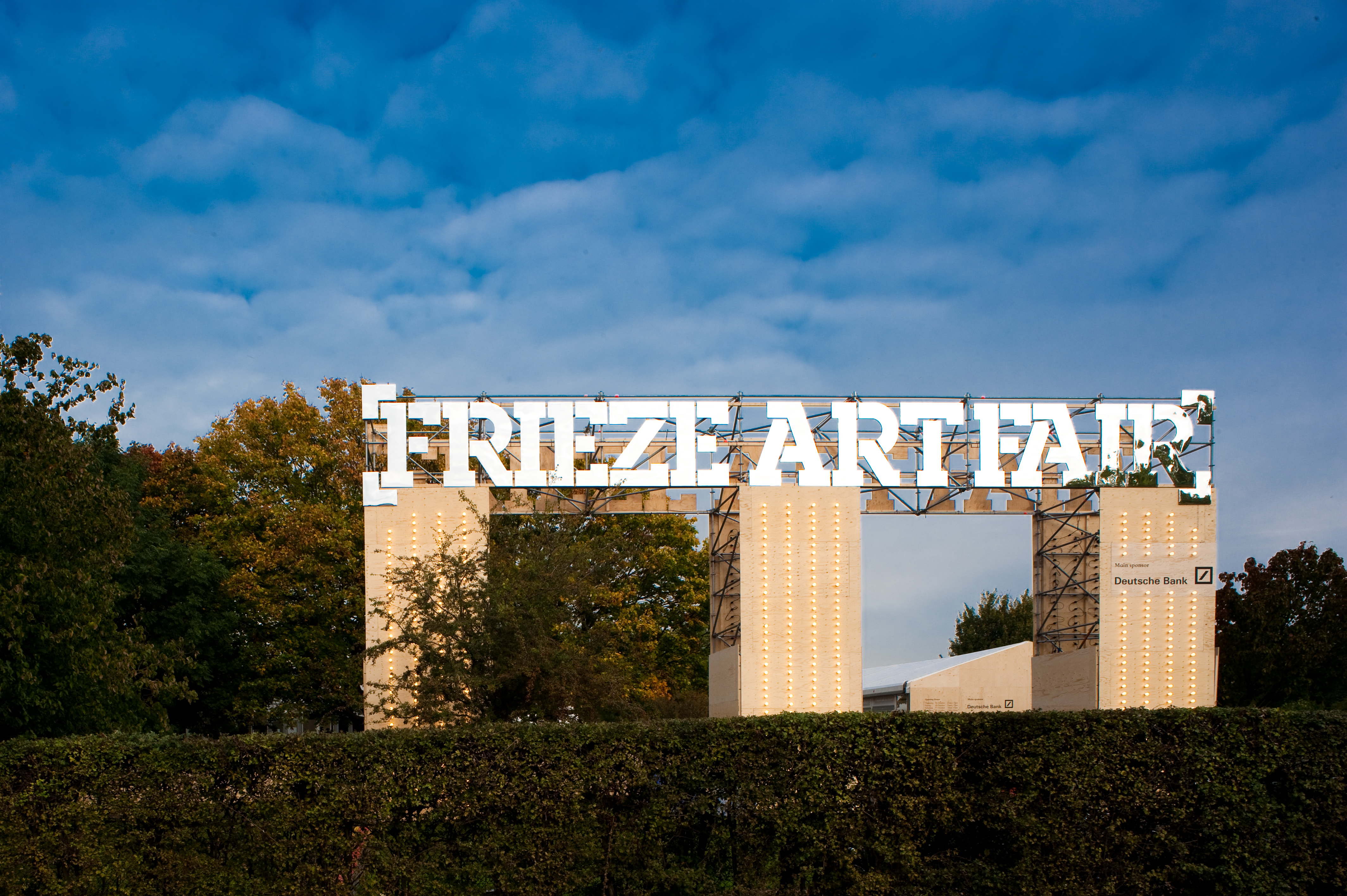
Frieze London, 2009
Architecture and branding have developed a close relationship across the Frieze art fair design since it launched in 2004. Here, at the 2009 rendition in London, the trademark Frieze stamp appears like a billboard atop three chunky architectural columns marking the entrance. While the branding has become more muted as the fair has matured, this bastion is reminiscent of the early Frieze days. As a streak of continuation, sections of the fair continue to be highlighted by a series of neon shades. Photography: Graham Carlow
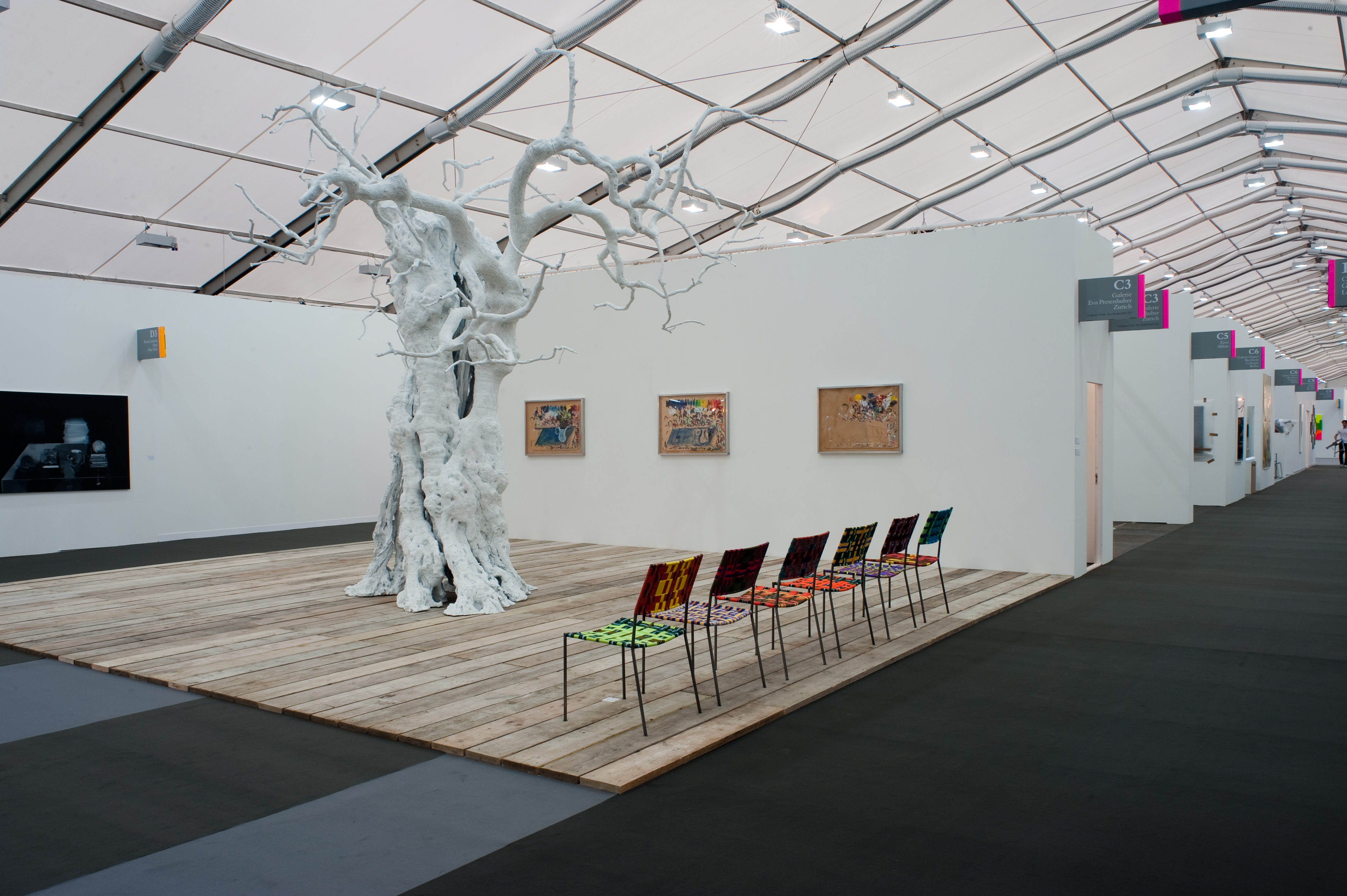
Frieze London, 2009
In the early days, visitors walked across a scrappy patchwork of timber, board and carpet plots, synonymous with the start-up nature of the fair driven by young entrepreneurs Matthew Slotover and Amanda Sharp. Today however, as Frieze has matured into the world’s leading contemporary art fair, the flooring is much more seamless. At Frieze Masters, launched in London in 2012, gallerists may select their shade of grey carpet from a restrained palette, resulting in beautifully muted acoustics. ictured, Frieze 2009, London. Photography: Graham Carlow
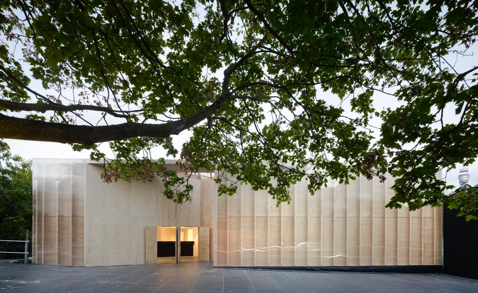
Carmody Groarke, Frieze London, 2011-2013
London-based architecture practice Carmody Groarke designed structures for the 2011, 2012 and 2013 editions of Frieze in London. The architects designed a series of interlinked, translucent pavilions surrounding the perimeter of the exhibition tents, a concept designed to strike a balance between viewing art, the social experience of the fair and the park context. These timber-lined ‘rooms’ were carefully positioned around the trees and the palette of materials was rudimentary in character, with proprietary timber flitch beams and raw plywood sheathing for walls and roofs, covered externally with polycarbonate – reflecting the temporary nature of the tent itself and its material. Pictured, Frieze 2011, London.Photography: Christian Richter
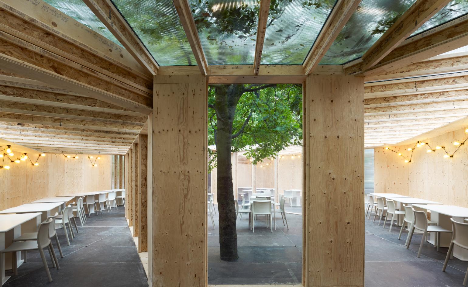
Carmody Groarke, Frieze London, 2011
Frieze tents pride themselves in their temporary and site-specific nature – as seen in wHY’s latest rendition for the inaugural Frieze Los Angeles. Here we see a tree, built purposefully around by Carmody Groarke, to preserve the outdoor nature and use the assets of the surrounding natural context as part of the design. Photography: Christian Richter
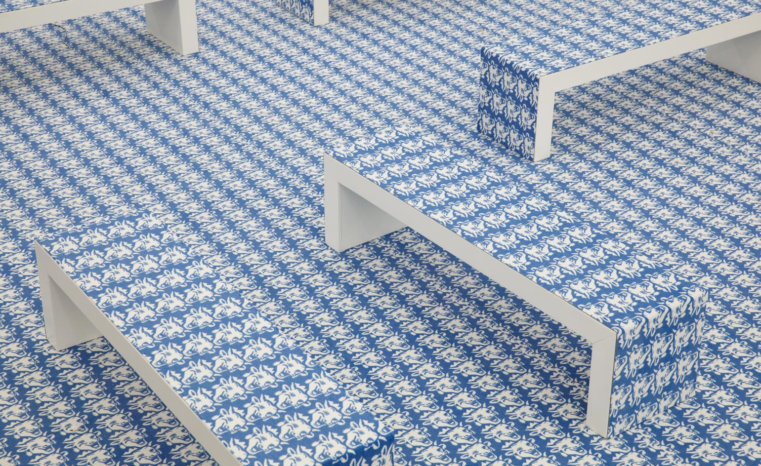
Thomas Bayrle, Frieze Projects, 2012
On many occasions at Frieze, art has become a part of the architecture. For Frieze Projects in 2012, a repeating pattern by German pop artist Thomas Bayrle was woven into amenity and intermediary spaces of the fair. Two patterned designs – this one pictured, the Laughing Cow cheese motif – from 1967 were replicated and stretched into a ‘world suspended between positive collectivism and deadening uniformity’. Photography: Polly Braden
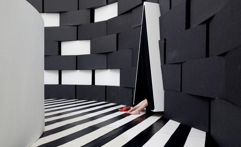
Angelo Plessas, Frieze Projects London, 2013
Many architectural interventions take place outside the main tent structure. In 2013, London’s Frieze Projects included a small tent to function as a space for visiting families. Greek artist Angelo Plessas designed ‘The Temple of Play’, a free playground providing activities throughout the duration of the fair. Like building blocks, cubes were assembled in a curve to delineate the space and a slim angular triangle entry area created a fun intervention for children. See the Wallpaper* 2013 Frieze edit.
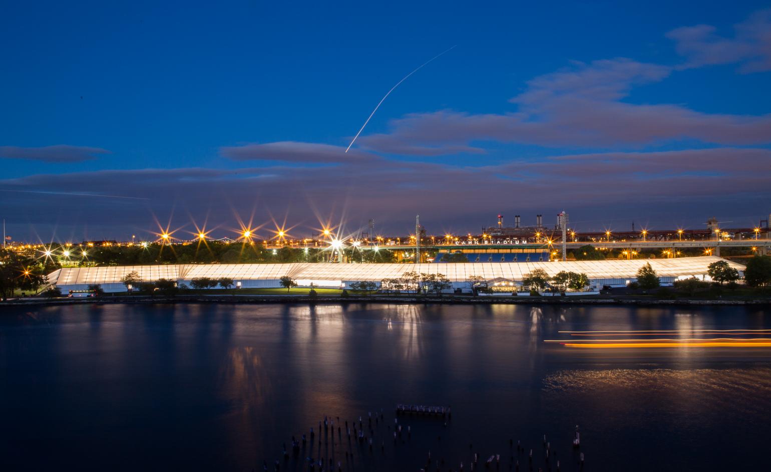
SO-IL, Frieze New York, 2015
In 2012, Frieze set its sights on the bright lights of New York City. There, on Randall’s Island SO-IL designed a snaking pavilion that followed the course of the land, and brought a welcome change to the standard rectangular marquee-style organisation of previous fairs. The flexible design proved successful and was replicated for the following NYC fairs. Spanning an area of 225,000 sq m, the tent was still built of a prefabricated rental structure – one of the key constraints of the design – yet a series of angled voids introduced into the otherwise straight-edged tent form brought flexibility for wedge-shaped amenities. Photography: Marco Scozzaro
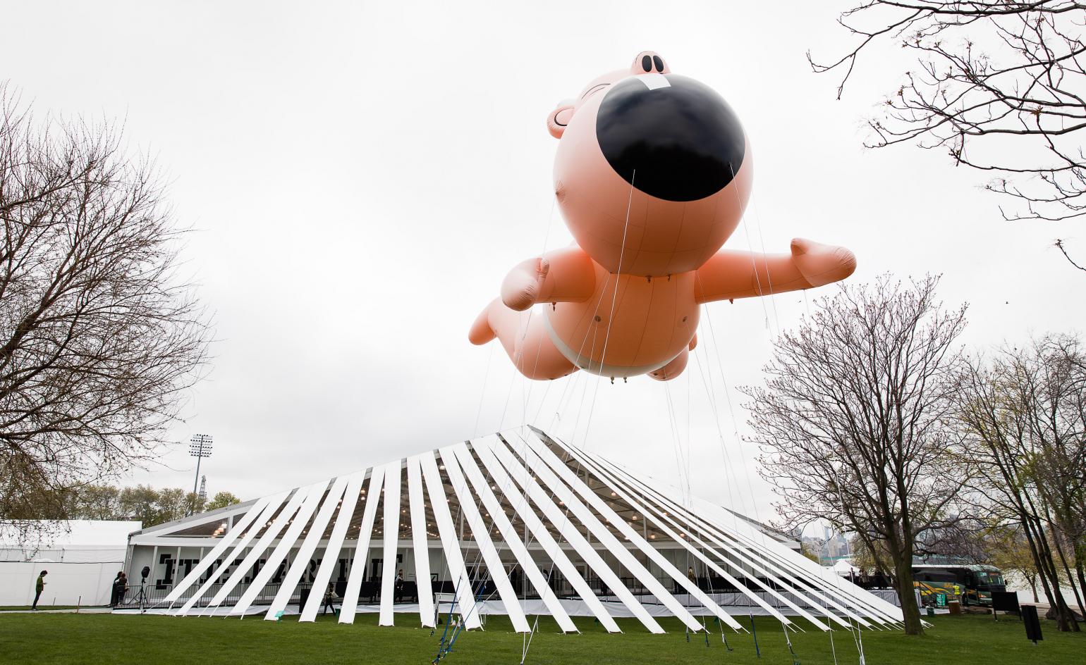
SO-IL, Frieze New York, 2016
This ribbon structure designed by SO-IL created shaded entrances to the fair. In a continuation of the light-weight and flexible tent design, strips of the tent fabric were simply extended out to overhang the main tent which, then connected to the ground to create a fanning sheltered parade.
Wallpaper* Newsletter
Receive our daily digest of inspiration, escapism and design stories from around the world direct to your inbox.
Universal Design Studio, Frieze London, 2017
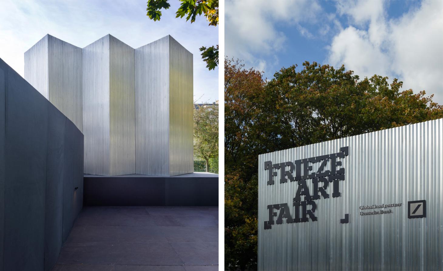
Everyone loves to make an entrance at Frieze. Universal Design Studio returned as the architects of Frieze London in 2017, for the fourth consecutive year, creating a revamped entryway (pictured) and a series of new restaurant interior concepts. With a distinctly material-led aesthetic, the London-based studio, founded in 2001 by Edward Barber and Jay Osgerby, has created environments across retail, hospitality and exhibition design, as well as architectural work
wHY Architecture, Frieze 2019
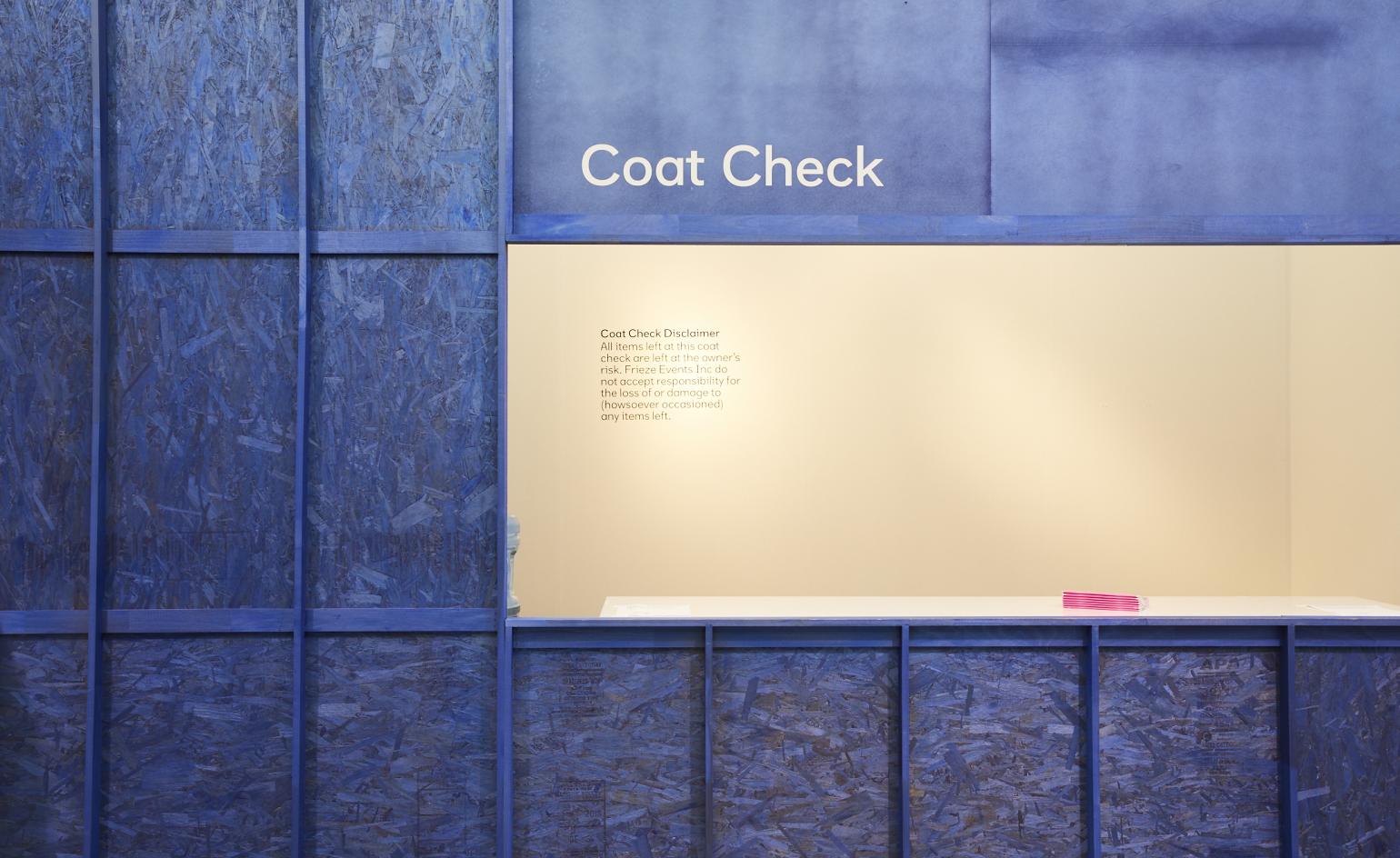
For the inaugural edition of Frieze LA Kulapat Yantrasast, founder and creative director at wHY, and a Los Angeles resident since 2003, wanted to create the effect of being backstage at the Paramount Studios location. A pink banner afloat two archways wrapped in faux-foliage welcomes you to the fair. Inside the entry pavilion, blue-stained plywood is constructed using set-building techniques of the studio’s master production designers. Yantrasast used plants throughout, real and artificial, to anchor the fair into its new climate.
Ellie Stathaki is the Architecture & Environment Director at Wallpaper*. She trained as an architect at the Aristotle University of Thessaloniki in Greece and studied architectural history at the Bartlett in London. Now an established journalist, she has been a member of the Wallpaper* team since 2006, visiting buildings across the globe and interviewing leading architects such as Tadao Ando and Rem Koolhaas. Ellie has also taken part in judging panels, moderated events, curated shows and contributed in books, such as The Contemporary House (Thames & Hudson, 2018), Glenn Sestig Architecture Diary (2020) and House London (2022).
-
 Put these emerging artists on your radar
This crop of six new talents is poised to shake up the art world. Get to know them now
By Tianna Williams
-
 Dining at Pyrá feels like a Mediterranean kiss on both cheeks
Designed by House of Dré, this Lonsdale Road addition dishes up an enticing fusion of Greek and Spanish cooking
By Sofia de la Cruz
-
 Creased, crumpled: S/S 2025 menswear is about clothes that have ‘lived a life’
The S/S 2025 menswear collections see designers embrace the creased and the crumpled, conjuring a mood of laidback languor that ran through the season – captured here by photographer Steve Harnacke and stylist Nicola Neri for Wallpaper*
By Jack Moss