Higher education: campuses with elevated aesthetics
From soaring student centres to sculptural labs for creative thinking, here’s our round-up of campus buildings that take education and architecture seriously.
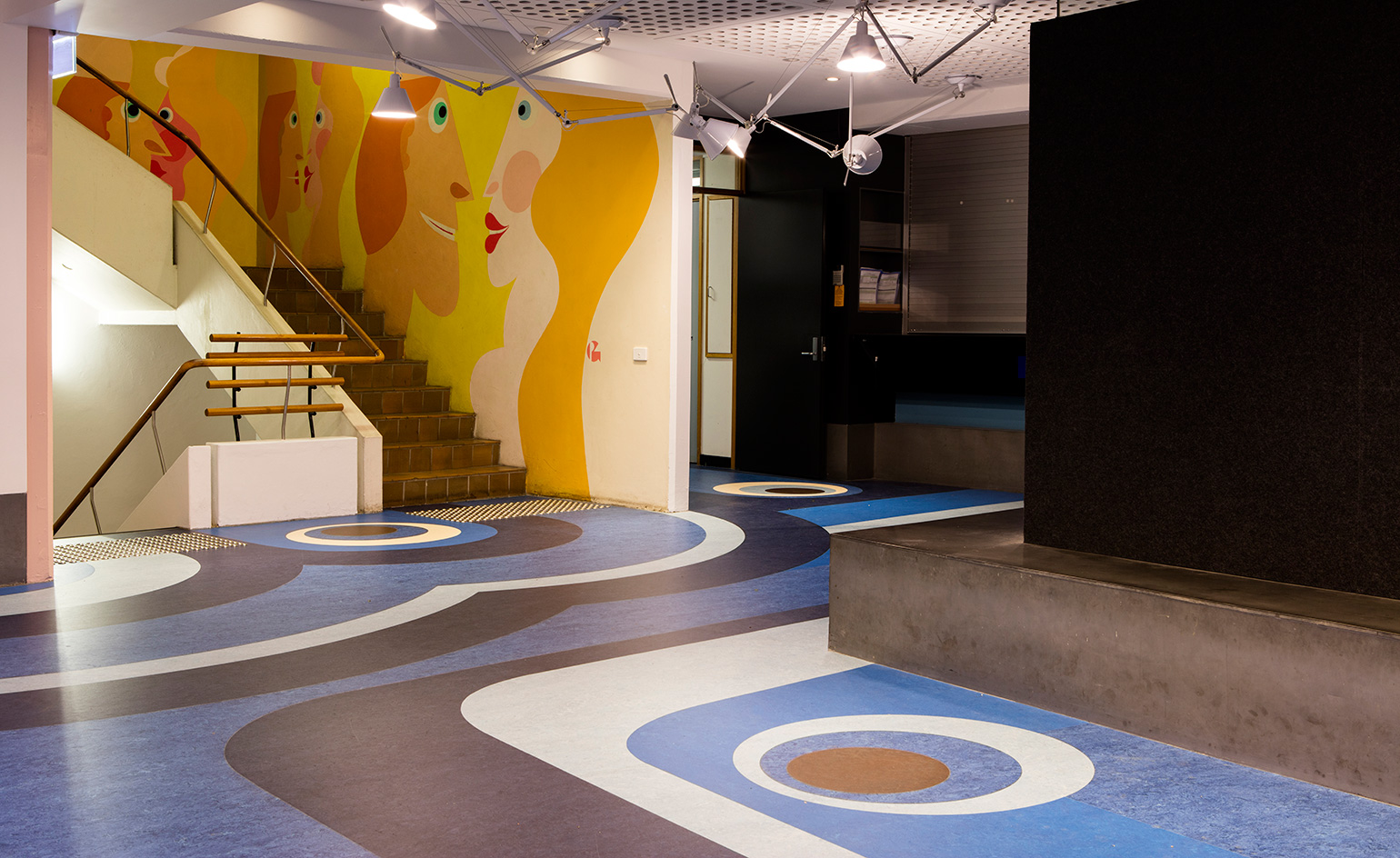
University of Queensland Architecture School
Set in a neighborhood of Brisbane, the University of Queensland Architecture School has been the training ground for many well-known and prominent Australian architects. Its new interior, although modern and provocative, using modern art references in a concrete shell, recalls native traditional Australian aboriginal art both in its aesthetic and in its concept. Inspired by an existing mural by Pancho Guedes, which tells a story of chance meetings, shared ideas and joy, architecture studio m3architecture embraced the use of bright colours reminiscent of 1970s supergraphics to balance out the existing brutalist building, designed in 1974 by Nutter Stevenson and Partners, giving the Architecture School a fresh new contemporary look. Writer: Alix Biehler
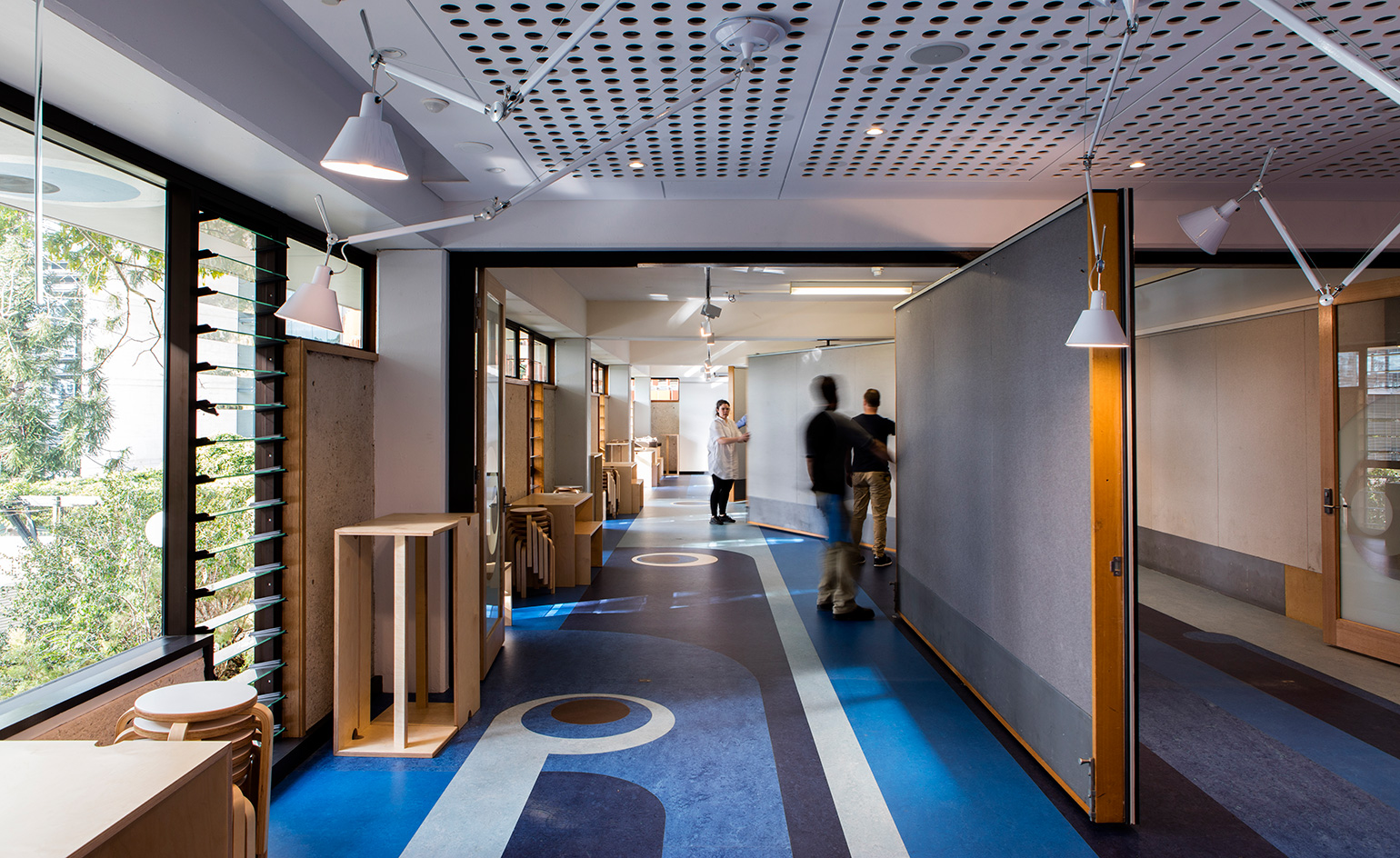
The works include a renovation of the second level, designed to be used as a flexible studio, lecture and seminar space, as well as a making and fabrication zone. ‘We transformed single purpose rooms with no views, into flexible and porous spaces that support the social and collaborative nature of architectural education,’ explains m3architecture, which is based just around the corner from the university. Each of the two new spaces have no ‘edge’ – spilling out to adjoining spaces, and with views to the exterior.
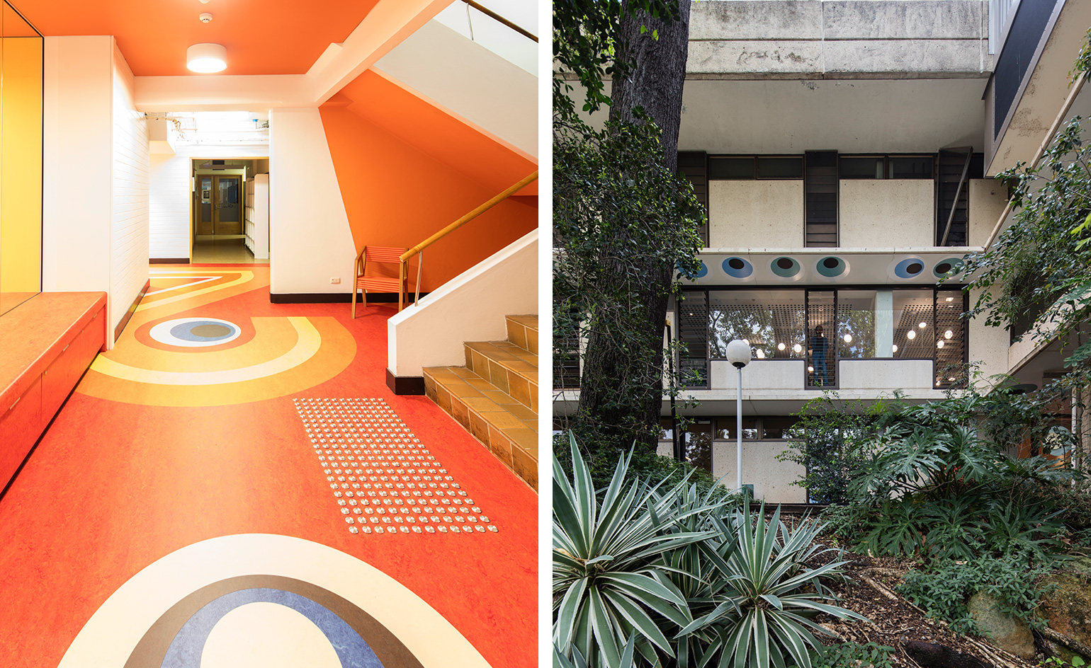
As the design’s concept set out to bring new life into the School for the benefit of students, staff and visitors alike, the result provides a new identity for the institution, drawing light in and connecting the interior to its leafy surroundings. It provides the capacity for staff, students and visitors to share a communal kitchen as part of a new flexible and collaborative tutorial and exhibition space. Since the renovation, the studio has been commissioned to design a second stage of renovations, including learning spaces on the building’s top floor
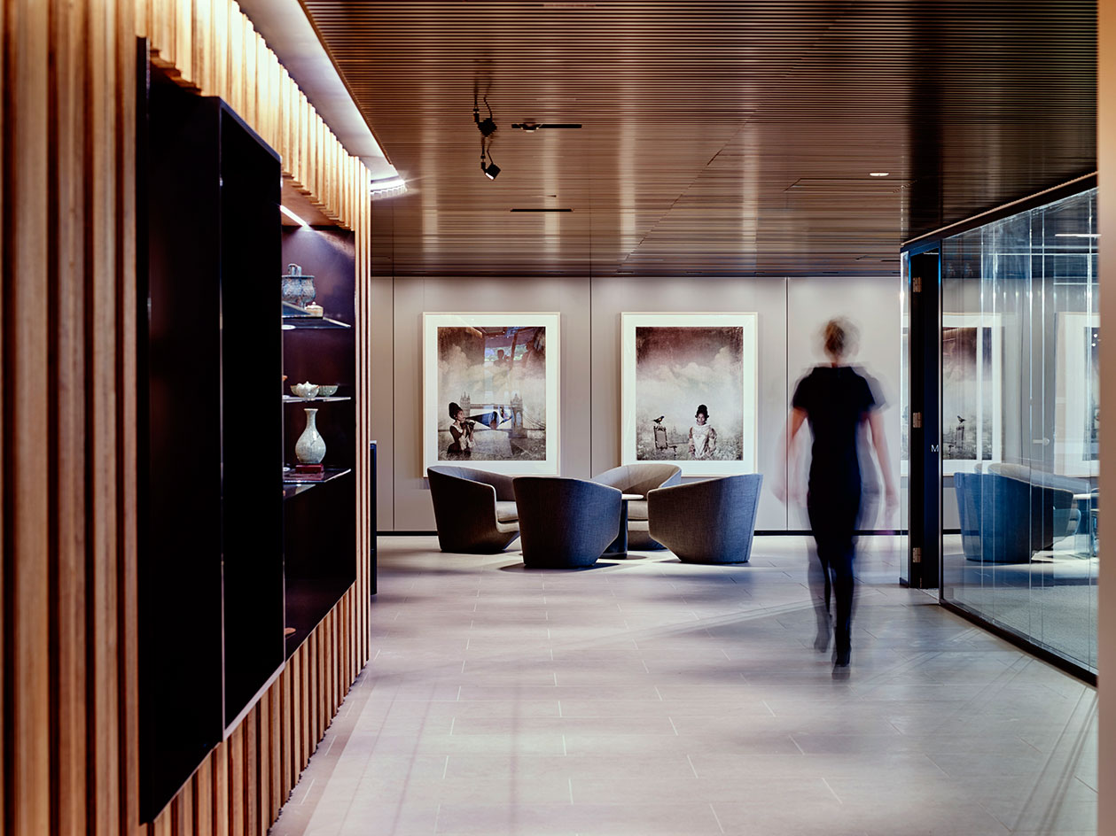
Western Sydney University (WSU)
The Sydney based Allen Jack + Cottier architecture firm was called upon the redesign of an existing space within the Western Sydney University’s (WSU) Parramatta campus – which would become one of the institution’s key centres with a new officse, gallery and meeting space in the shape of the Chancellery. The program spanning on a whole floor within the building, the design’s clean modern lines made of locally sourced warm timber are matched by artworks and furniture, specially selected for this space. Writer: Ellie Stathaki
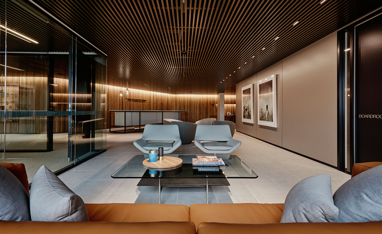
’Our starting point with good workplace design is that it has to work at a practical level, whilst reflecting the vision and aspiration of our client,’ says Allen Jack + Cottier’s Scott Norton. ‘In this case, we were very fortunate that the Vice Chancellor clearly understood the value of good design.’
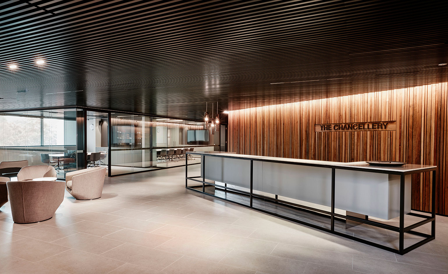
The program was also relatively unusual. It blends public areas – such as the gallery, where Western Sydney University’s collection of artworks and gifts from other universities and institutions are displayed – with more private sections, such as the school’s administrative offices. An undulating timber wall successfully divides the two areas. Differences in materials and colour palette create a further distinction.
Calgary's Taylor Institute
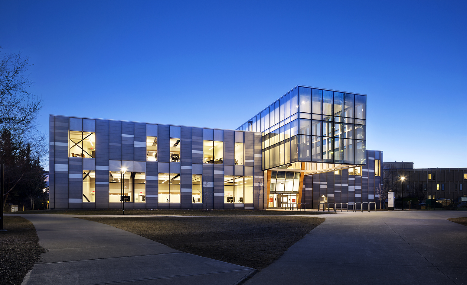
On the bones of an old art museum at the University of Calgary, Diamond Schmitt Architects (DSAI) have designed a new hub of learning. At the nexus of a new campus gateway, the Taylor Institute of Teaching and Learning is also at the center of a movement seeking new approaches to pedagogy. Using the footprint of the old Nickel Arts Museum, but opening up its dark, cavernous interiors, DSAI have created a light filled space imbued with a sense of open learning. Writer: Hadani Ditmars
Wallpaper* Newsletter
Receive our daily digest of inspiration, escapism and design stories from around the world direct to your inbox.
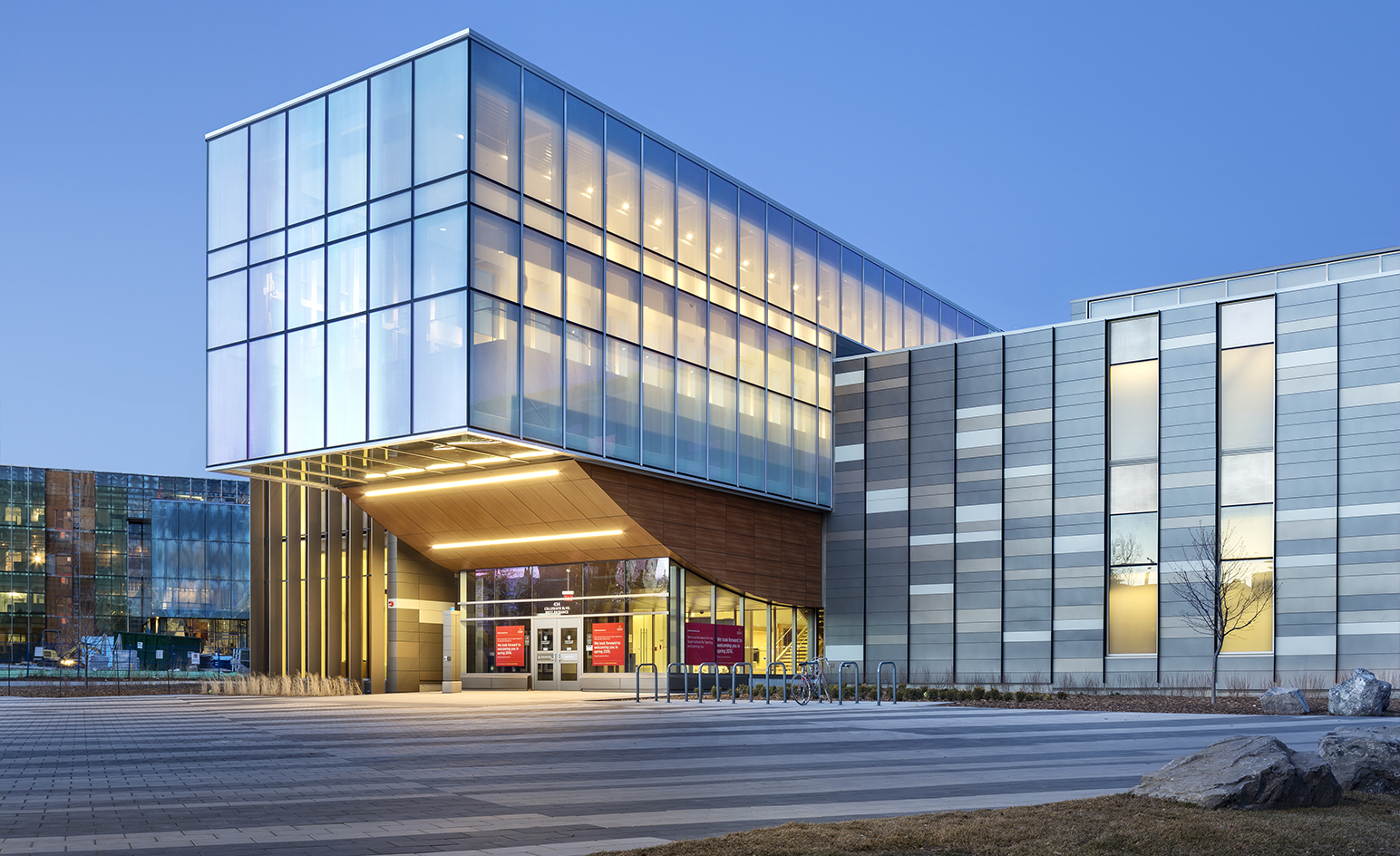
The building is composed of two perpendicular rectangular boxes – both unified and differentiated by a giant steel truss – that suspends an East-West spanning glass atrium. Here a central spine acts as an axis for a wide variety of learning spaces and two cantilevered projections that extend over the front entry plaza and into the campus green, blurring indoor and outdoor.
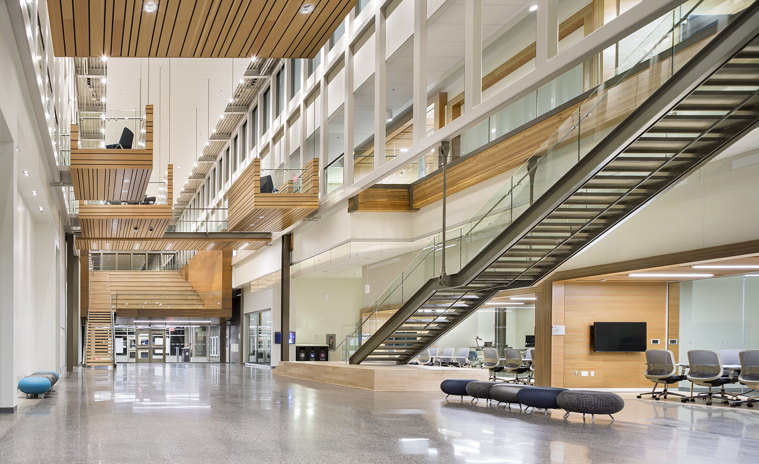
The essential idea expressed architecturally, notes DSAI principle and project architect Matthew Lella, is that ‘learning takes place all the time, everywhere and in a whole range of ways.’ From lectures to informal meetings and study groups, ‘educational exchanges happen inside and outside of more structured approaches.’
Columbia University Medical Center
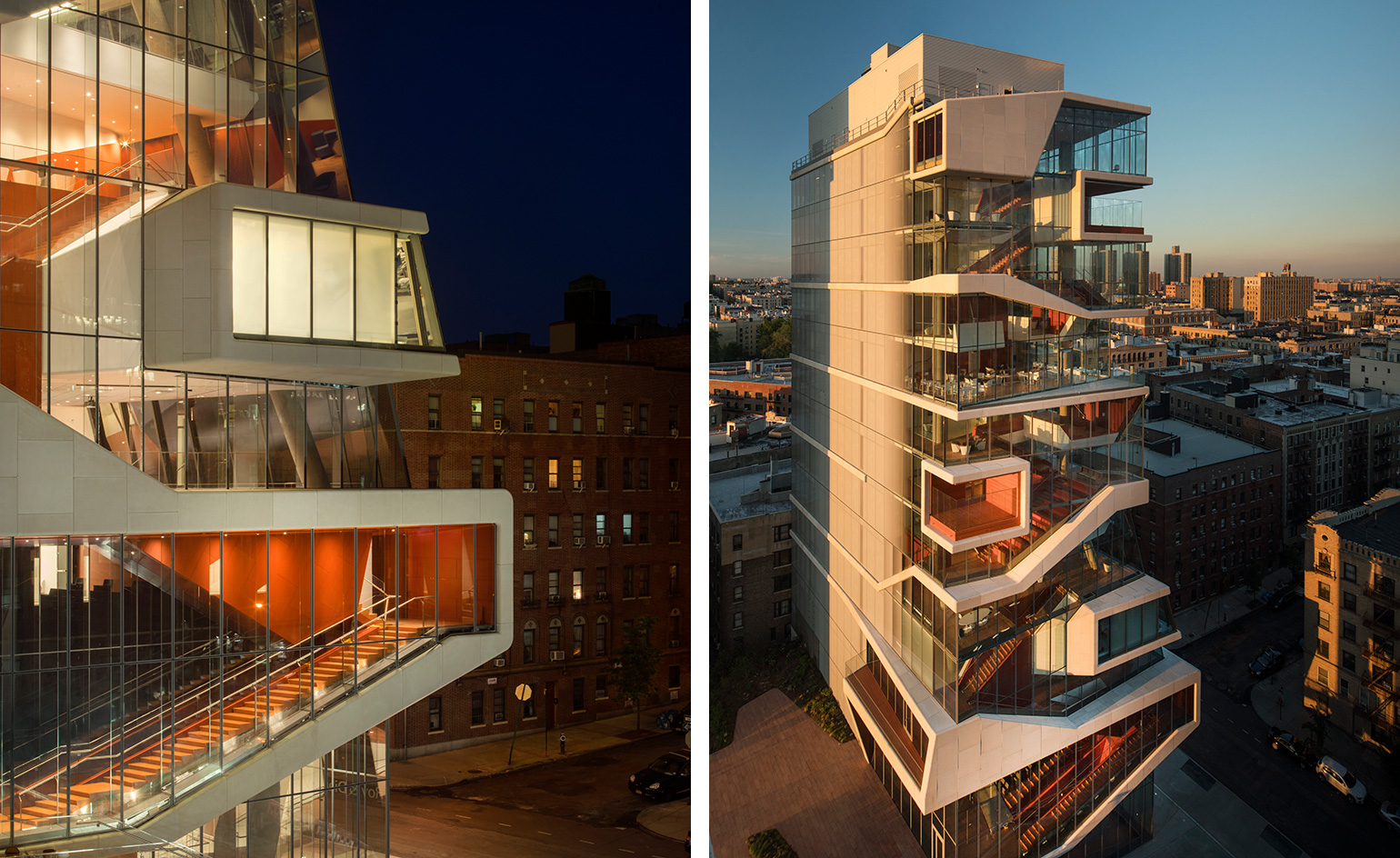
Diller Scofidio + Renfro seems to be the architects du jour for Columbia University as the 14-storey, glass cascading Medical Center tower is unveiled just in time for the start of the fall semester. The tower is both an education and graduate centre and after heavily weighed considerations taken on the part of the architects in collaboration with the firm Gensler, the pristinely modern building is anchored to become the hub of medical student life at the university. Writer: Julie Baumgardner
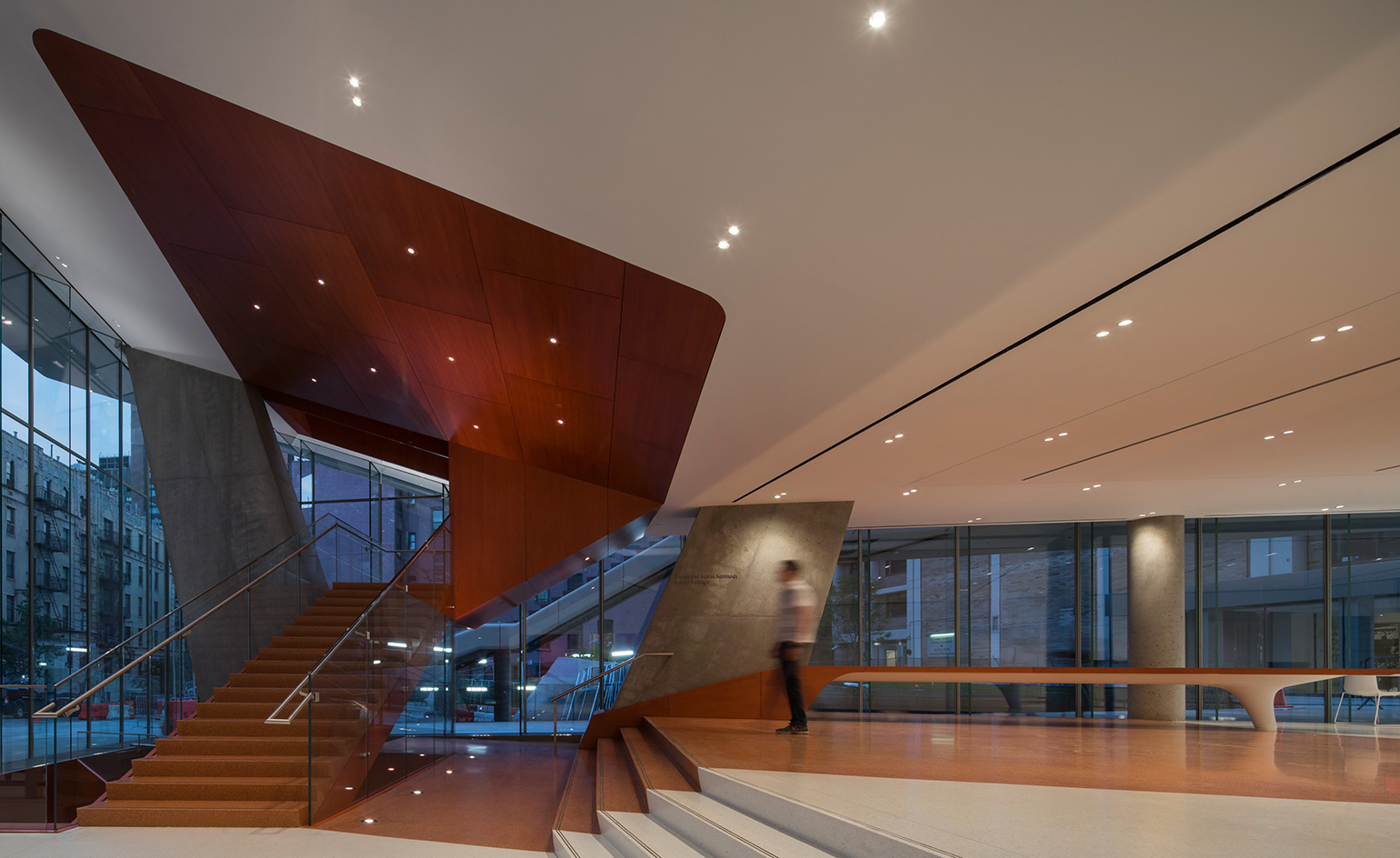
The Center is flooded with light, exploiting ’views to the south, north and east, and a celebration of the site’ and factoring state-of-the-art everything, including study sky lounges, like those of an arena or taller tower. Add in smart-glass ensconced common areas, and chances are the students won’t ever want to leave.
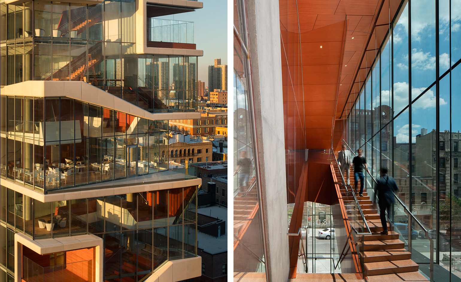
’For the students, there is a correlation between space and learning.’ And while the classrooms and learning spaces within the building offer the latest -with the best technological setups available, including flexible teaching spaces and a clinical simulation center - the ’heart of the building’, in Diller’s eyes, is really the 10th floor student common area. When researching for the project, Diller came across an anatomy map of a snake, whose heart is in the middle of the body, becoming the guiding principle behind the building’s concept.
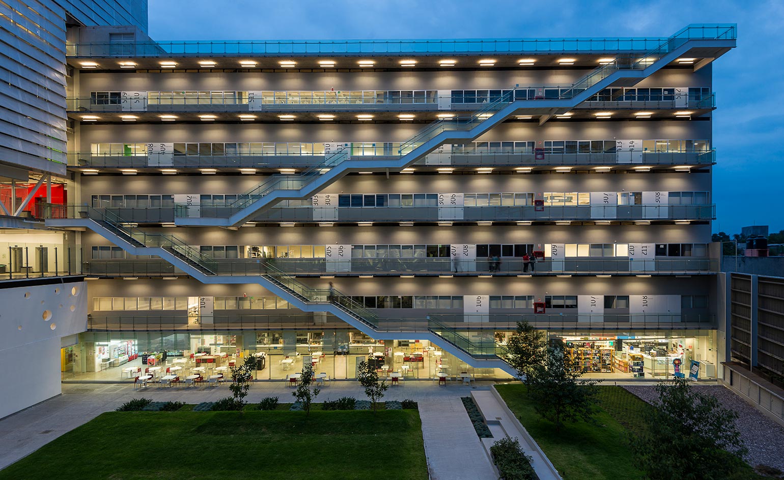
Centro, Mexico City
Mexico City’s creative career college finally has a campus to match, with a recent architectural overhaul by Enrique Norten and his firm TEN Arquitectos.
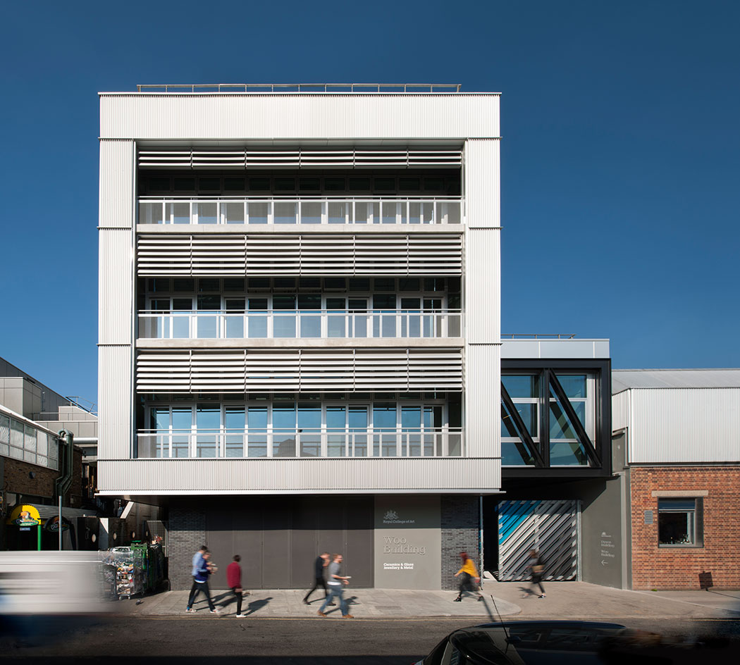
Royal College of Art, London
The new, warehouse-like Battersea home of Royal College of Art’s ceramics, glass-making, jewellery and metalwork classes was built by firm Haworth Tompkins with the philosophy ‘the building should act as a background to art’.
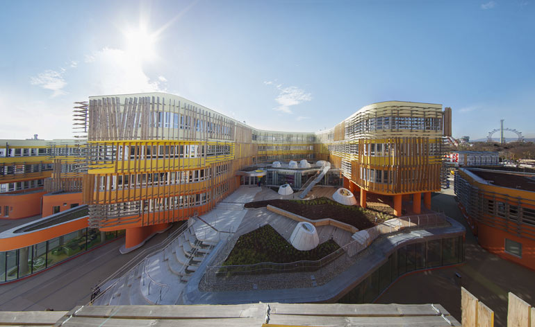
Vienna University of Economics and Business
CRAB Studio’s new buildings for the Vienna University of Economics and Business are colourful additions to campus life, muted by a timber facade that fits with the local landscape.
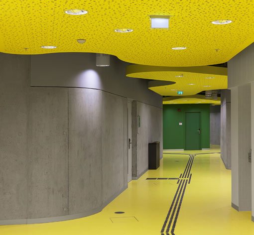
The undulating buildings comprise bright classroom and extracurricular spaces.
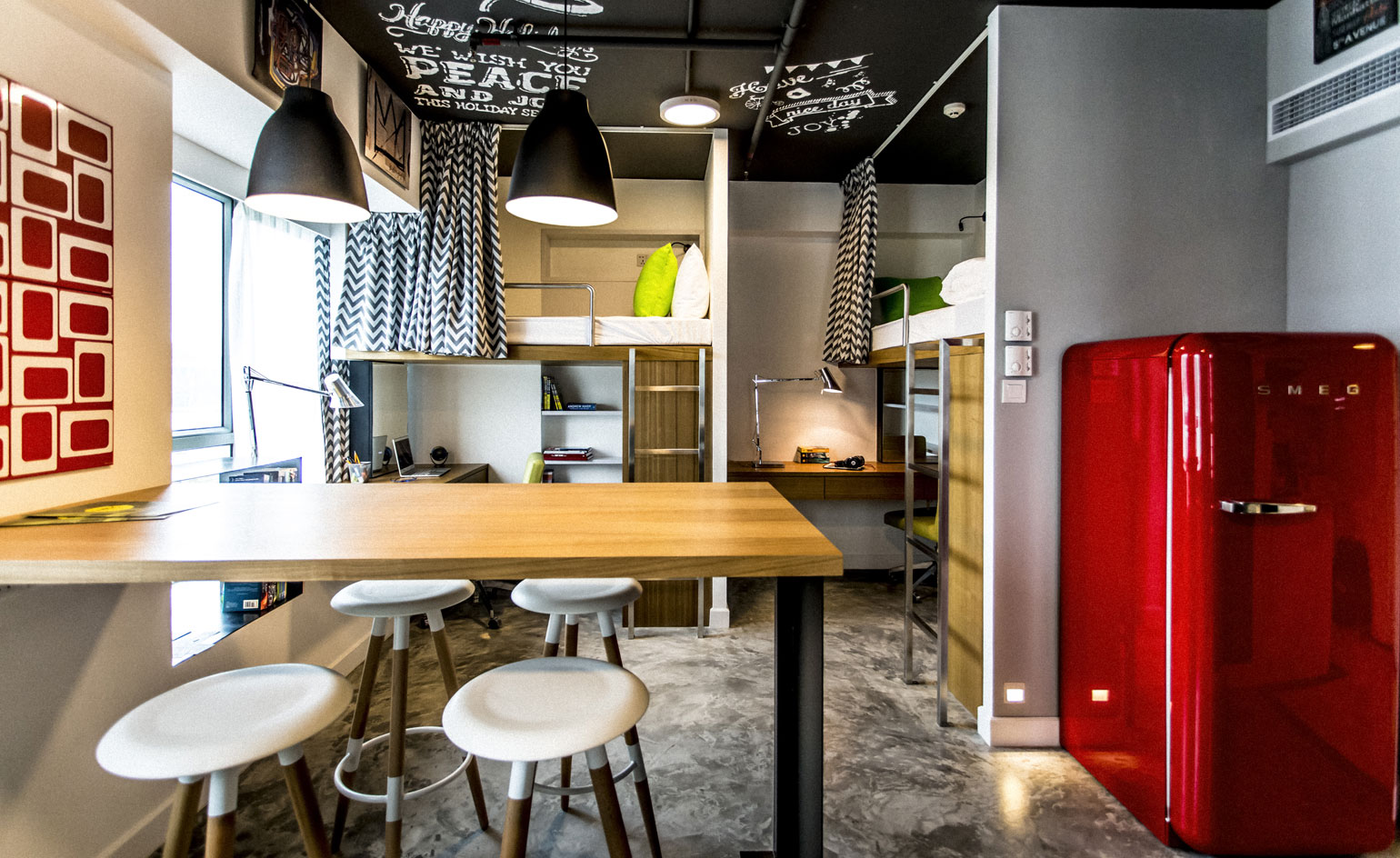
Campus HK, Hong Kong
The concept of the ’designer dorm’ has been realised by LYCS Architecture in Hong Kong’s Tsuen Wan district
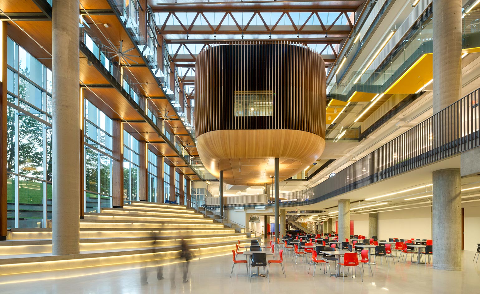
Vancouver’s University of British Columbia
DIALOG and B+H’s engaging design for the Vancouver UBC student union is centred by a floating ‘nest’ containing a black box theatre.
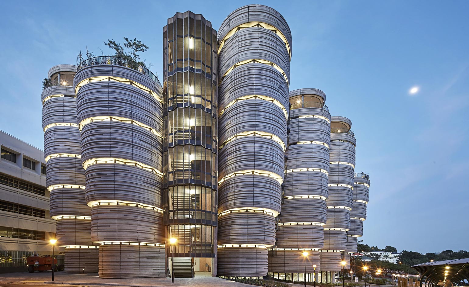
Nanyang Technological University, Singapore
Thomas Heatherwick’s Learning Hub has earned the nickname ’Dim Sum’ for its resemblance to a stack of baskets. Twelve towers contain unconventional, circular classrooms.
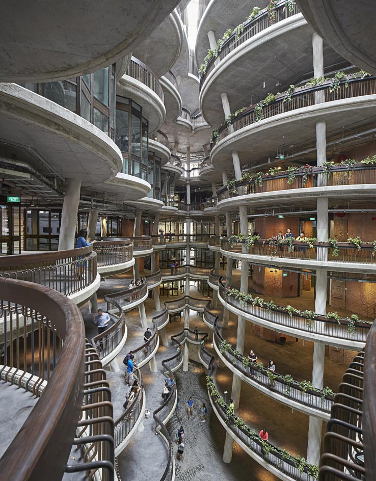
Heatherwick asserts that ’the most important commodity on a campus is social space’, adding that the only way for students to learn from each other is to eschew the sterile academic designs that have come before.
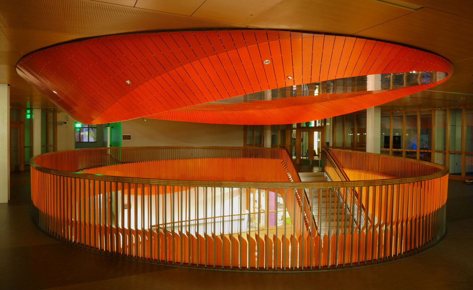
Oregon State University
The installation is a collaboration between Los Angeles design firm Amorphis and architecture alumnus Matthew Au.
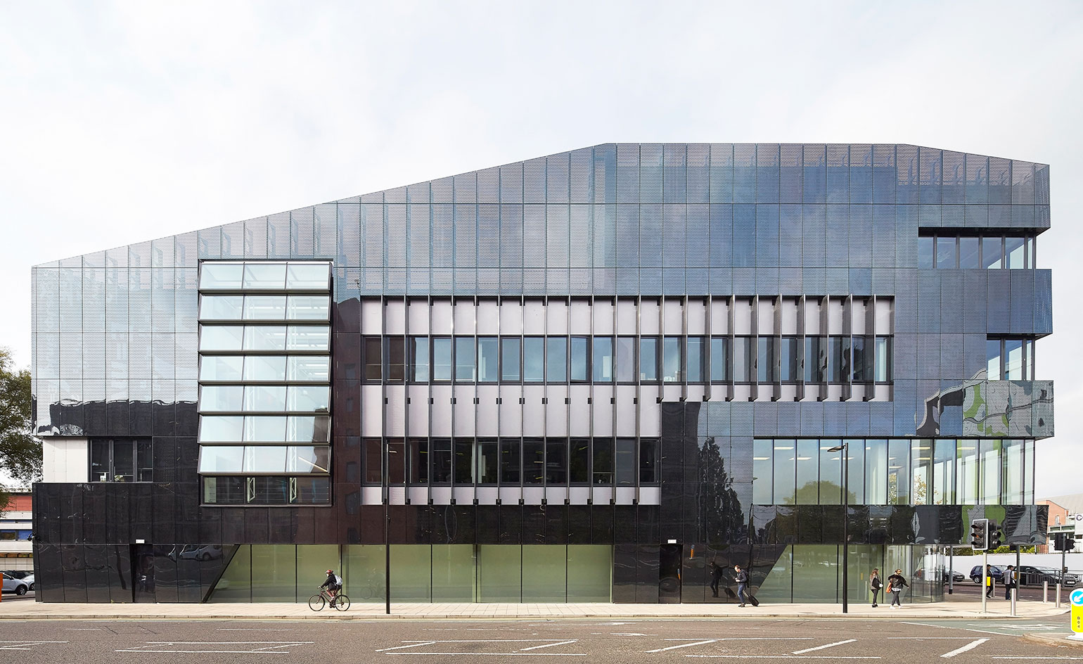
National Graphene Institute, Manchester
The centre responsible for first isolating the world’s thinnest material has been subtly adorned with its scientific equation – a brilliant mixture of architecture and chemistry by Jestico + Whiles.
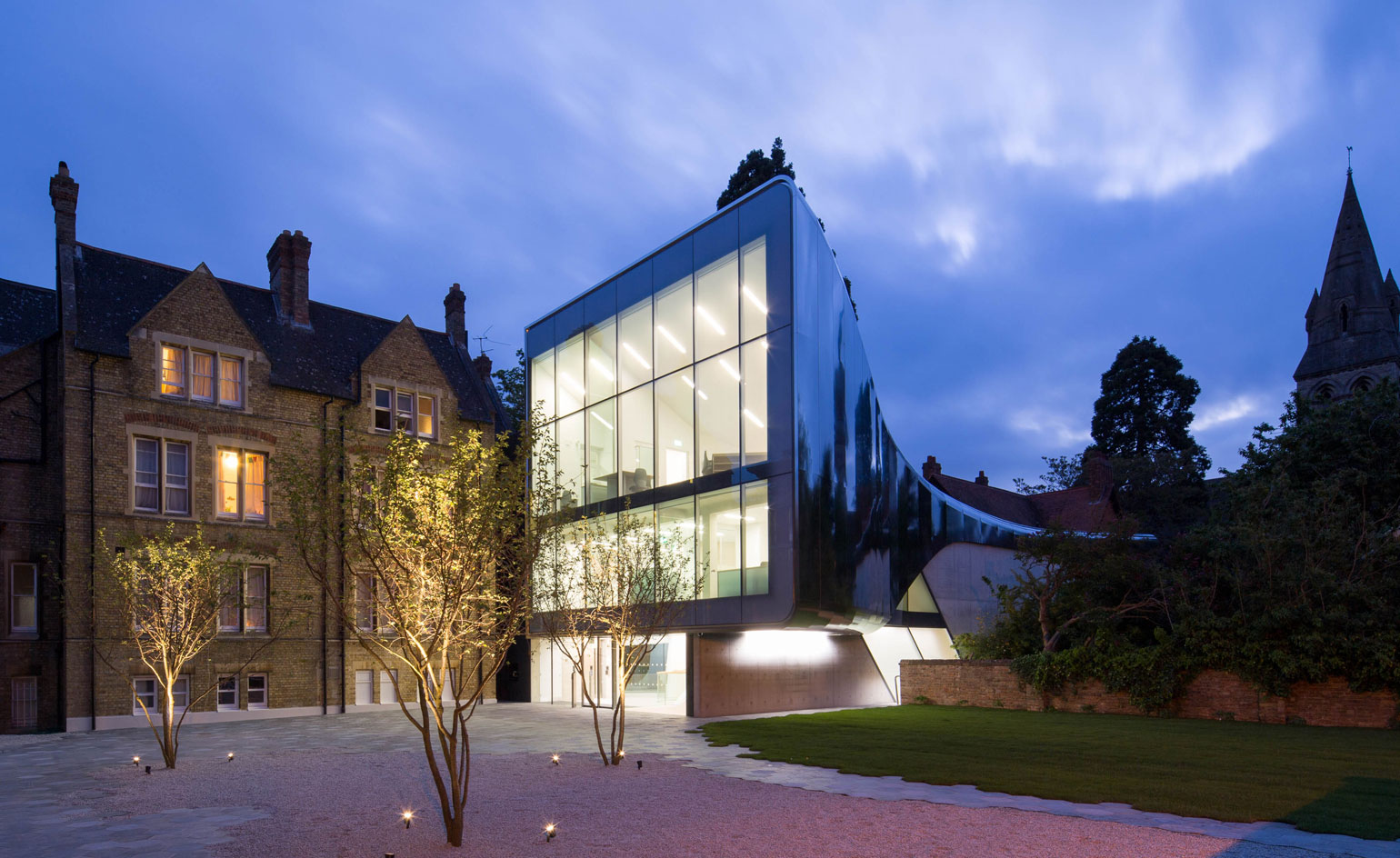
St Antony's College, Oxford University
The building's library and event spaces are a resource to the public – and it even features a cafe.
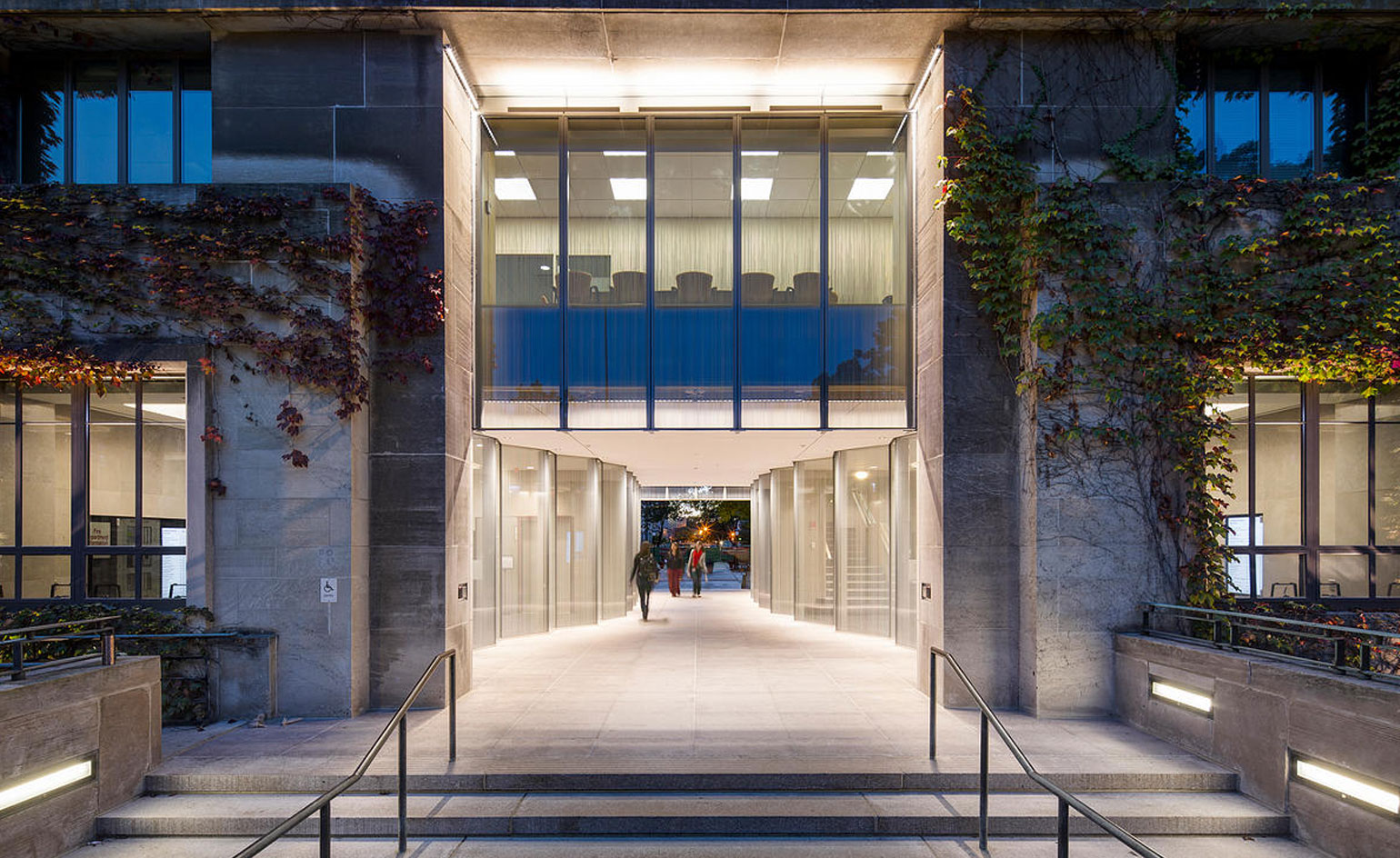
University of Chicago
Even some of the country’s brightest students will inevitably be late for class – and when they are, they’ll now benefit from this beautiful glass portal by Krueck and Sexton.
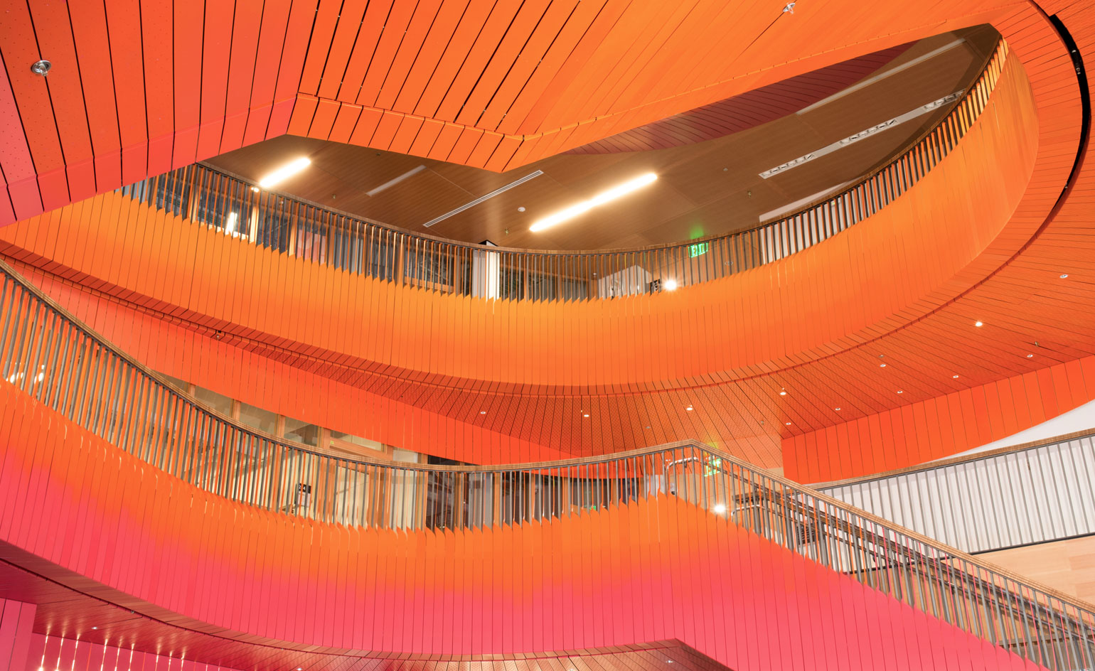
Oregon State University
In this permanent installation at OSU, an aluminum sunset blazes above the bustle of the student center. ’Afterglow’ spirals up the building before culminating in a tesselated mirror.
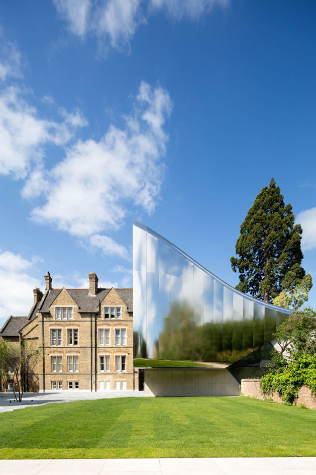
St Antony's College, Oxford University
Zaha Hadid’s Middle East Centre may not immediately call to mind the labirynth of the traditional medina or the soaring minarets of the fertile crescent – nor does it aim to. Rather, in a bold departure from brick and ivy, Hadid calls to mind the skyline of Dubai, the sleekness of modern Beirut and the future of a historied region.
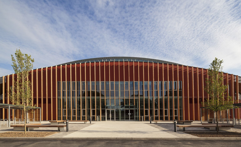
University of Cambridge
The University of Cambridge Sports Centre is set apart by a facade of timber fins and a progressive reliance on green energy. The multi-sport complex was designed by Arup Associates.
Ellie Stathaki is the Architecture & Environment Director at Wallpaper*. She trained as an architect at the Aristotle University of Thessaloniki in Greece and studied architectural history at the Bartlett in London. Now an established journalist, she has been a member of the Wallpaper* team since 2006, visiting buildings across the globe and interviewing leading architects such as Tadao Ando and Rem Koolhaas. Ellie has also taken part in judging panels, moderated events, curated shows and contributed in books, such as The Contemporary House (Thames & Hudson, 2018), Glenn Sestig Architecture Diary (2020) and House London (2022).
-
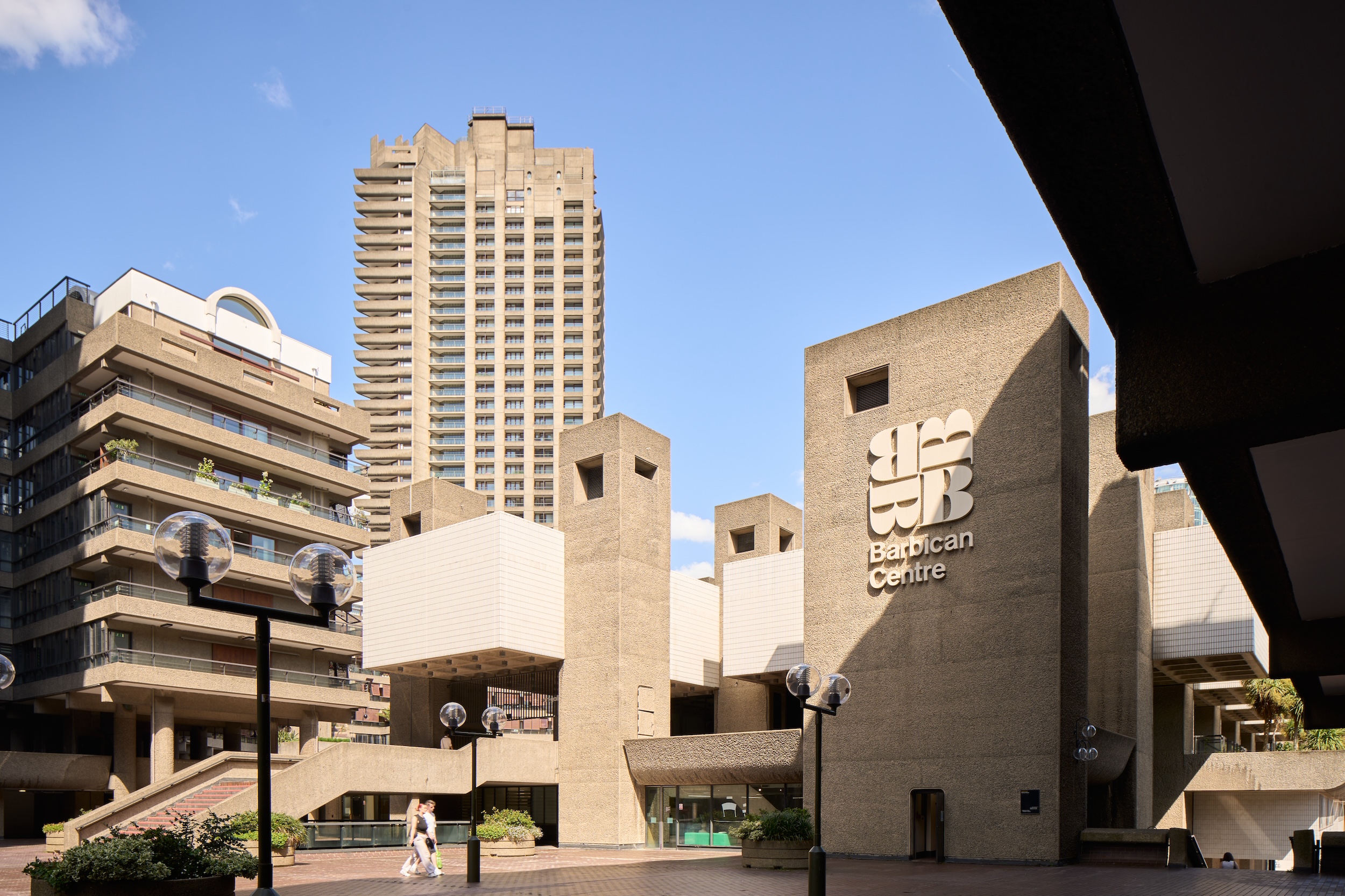 Warp Records announces its first event in over a decade at the Barbican
‘A Warp Happening,' landing 14 June, is guaranteed to be an epic day out
By Tianna Williams
-
 Cure your ‘beauty burnout’ with Kindred Black’s artisanal glassware
Does a cure for ‘beauty burnout’ lie in bespoke design? The founders of Kindred Black think so. Here, they talk Wallpaper* through the brand’s latest made-to-order venture
By India Birgitta Jarvis
-
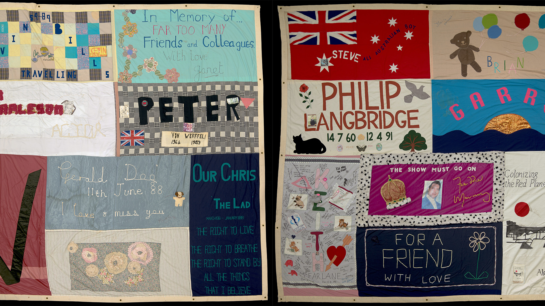 The UK AIDS Memorial Quilt will be shown at Tate Modern
The 42-panel quilt, which commemorates those affected by HIV and AIDS, will be displayed in Tate Modern’s Turbine Hall in June 2025
By Anna Solomon