Mirrored architecture: reflect on these special spaces
When glass-sheathed corporate skyscrapers first started bouncing kaleidoscopic visions of architectural angles off their sleek façades in the 1960s, architects began to think about the possibilities of mirrored glass as a material. Half invisible, illuminated by light, a trick yet also a device, the mirror has alleviated architecture somewhat from its heaviness. It helps loosen up and have some fun too – expanding our relationships with urban and rural contexts, providing invisibility, camouflage and immersion. Go on, steal a glance into these architectural looking-glasses…
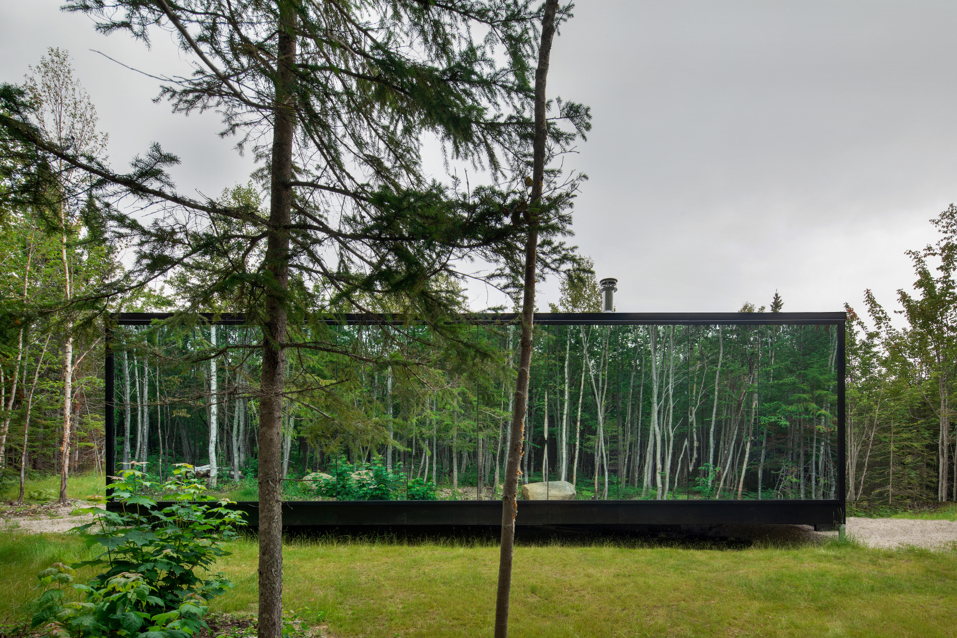
Reflection
Bourgeois Lechasseur / architects
Set in the green, leafy expanses of Québec’s spectacular countryside, this project by local studio Bourgeois Lechasseur / architects draws on the surrounding forest's beauty. The project - part of one of the area's glamping sites - is composed of two reflective cabins, which aims ‘to engage guests in an intimate relationship with nature, rather than dazzle them with the overwhelming views nearby.' The units are clean, simple and prefabricated. ‘A nostalgic yearning for nature resides deep in the minds of many Canadians, often conceived as rustic log cabins tucked away in the woods,' say the architects. ‘Today’s travelers, however, seek comfort and poetry, something Reflection will also provide as guests immerse themselves in the surrounding forest.'
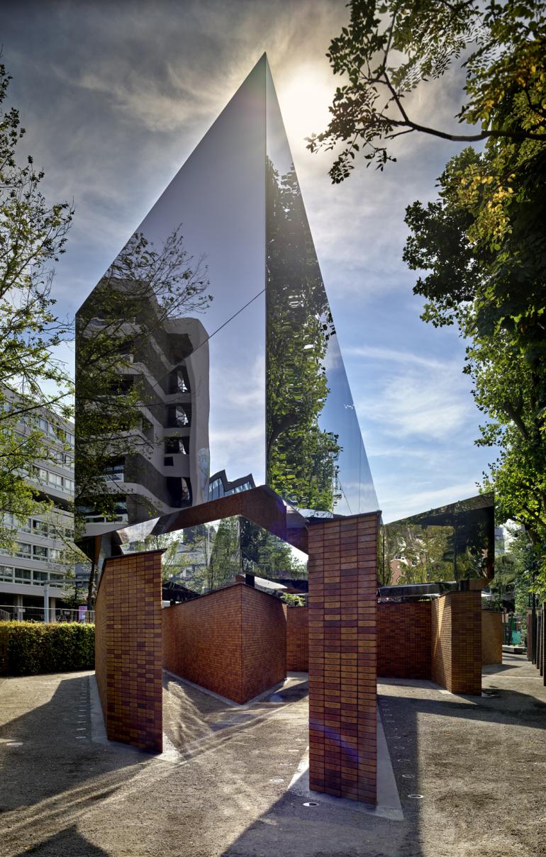
National Holocaust Memorial of Names, Amsterdam, Netherland
Studio Libeskind
Daniel Libeskind and Studio Libeskind have just unveiled the National Holocaust Memorial of Names in Amsterdam, a powerful design shaped by reflective volumes and dramatic geometries. The piece, commissioned by Dutch Auschwitz Committee (Nederlands Auschwitz Comité), aims to commemorate the Dutch Jews, Sinti and Roma who were murdered during the Holocaust, and the names of more than 102,000 victims are engraved on the brick plinths’ walls. The project is defined by a labyrinth of passages. This is created by a series of relatively low brick volumes arranged at different angles. They support four mirrored architecture pieces clad in stainless steel sheets, each forming a letter of the Hebrew alphabet and together forming a word that translates as ‘In memory of’. While the word can be only fully read from above, the striking composition creates a powerful dialogue with its surroundings, reflecting buildings, light and passers-by and drawing them into the composition.
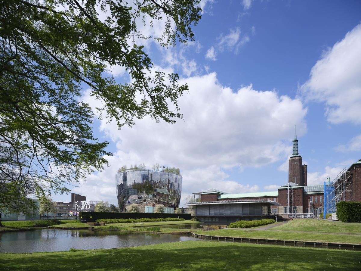
Depot Boijmans Van Beuningen, Rotterdam, Netherland
MVRDV
On average, most international museums only show six to seven per cent of their collections to the public at any one time. The rest is often off-site and hidden from view, tucked away in closed depots. The new Depot Boijmans Van Beuningen in Rotterdam, designed by architecture firm MVRDV, is bucking this trend, making 99 per cent of its building accessible to the public and the entire collection of the neighbouring Museum Boijmans Van Beuningen – some 151,000 artefacts – available for viewing, even as they are stored. Technological innovation was key to this bold move, says MVRDV founding partner Winy Maas. ‘We put technology on the same level as sociology, ecology and economics,’ he says. ‘Innovations and achievements in all these aspects are equally important.’ Indeed, the Depot’s ovoid, monolithic appearance belies the most sophisticated engineering. The 39.5m-high, bowl-shaped structure is 40m in diameter at the bottom and 60m at the top, and its overhanging part has no direct supports. Additionally, the openings, including the visitors’ entrance, and the entrance and exit for the exhibitions, create weak points on the ground floor. The task, therefore, was to come up with a design in which the lowest (and narrowest) part of the building could withstand the high load from above.
Wallpaper* Newsletter
Receive our daily digest of inspiration, escapism and design stories from around the world direct to your inbox.
Additional writing: Yoko Choy
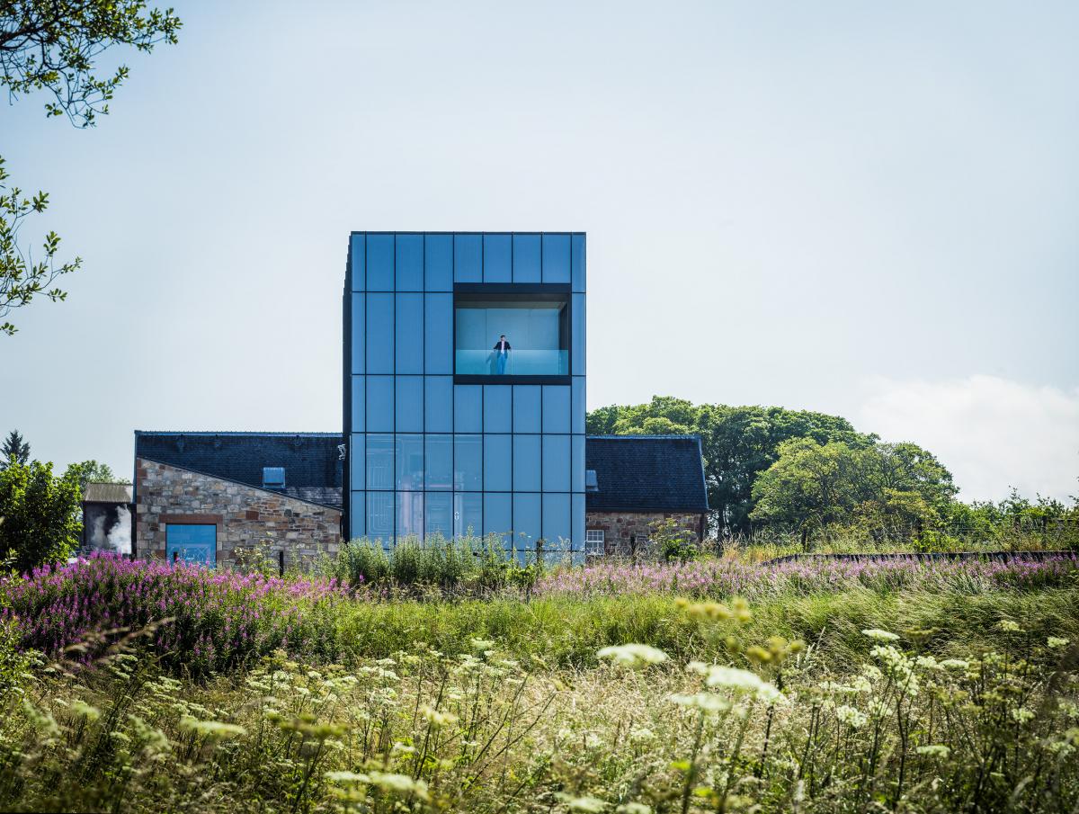
Glenmorangie Distillery, Tain, UK
Barthélémy Griño
‘Everything starts here,’ says Glenmorangie CEO Thomas Moradpour, talking about the whisky brand’s headquarters in Scotland, with a smile – and he has good reason to be pleased. The Glenmorangie Company has just completed major works to its Highland home, including a thorough revamp of its facilities and the creation of a research laboratory to promote innovation and future thinking. Created by Paris architecture studio Barthélémy Griño, the refreshed Glenmorangie Distillery is set to be a pivotal step towards crafting the brand’s future, Moradpour explains. Glenmorangie single malt whisky is only ever produced in its main distillery in Tain, a 45min drive north of Inverness. As whisky needs to be aged (to a range of durations, depending on the product – from three to ten years or more), forward planning is central to the brand’s development and future success. ‘We need to be creative and have the flexibility to innovate and experiment,’ explains Moradpour. At the same time, estalbished in the 19th century, Glenmorangie is steeped in tradition and has carefully planned methods to produce its delicious product, also boasting the tallest stills in Scotland, which help give the drink its unique flavour. So blending this rich heritage with a view towards the future is a balance to be carefully preserved.
Eidolon House, London, UK
Dominic McKenzie Architects
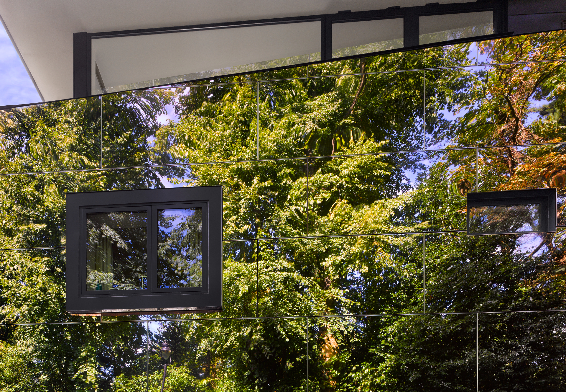
Believed to be the first mirror-clad home in London, Eidolon House sits on one of Highgate’s sloped streets, a stone’s throw from Highgate Cemetary. The design continues in the tradition for avant-garde architecture started by existing structures in the area, such as John Winter’s 1969 Corten steel clad house. Clad in mirror polished stainless steel the structure reflects the trees opposite it and amplifies the changing seasons, maintaining a fairly mysterious exterior with few (yet generous) openings, placed high up on its facade. Inside, woods, bright, open spaces and crisp white walls define the interior.
Middle East Centre, Oxford, UK
Zaha Hadid Architects
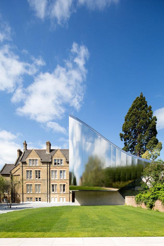
Oxford University has a tradition of commissioning exceptional modern architecture, from Niall McLaughlin’s award winning 2011 Somerville College student accommodation, to design classics like Arne Jacobsen’s St Catherine’s College. The new Investcorp Building for the school’s Middle East Centre at St Antony’s College is the campus’ latest addition. The stainless steel-clad, shiny, flowing piece is a confident departure from traditional Oxford’s material palette of brick and stone - but one would expect nothing less from its acclaimed architect, Zaha Hadid. This is the Middle East Centre, its twisting form compact, yet clever, featuring an immaculately detailed interior makes it feel sharp, bright and generous.
MOCA Cleveland, USA
Farshid Moussavi Achitecture
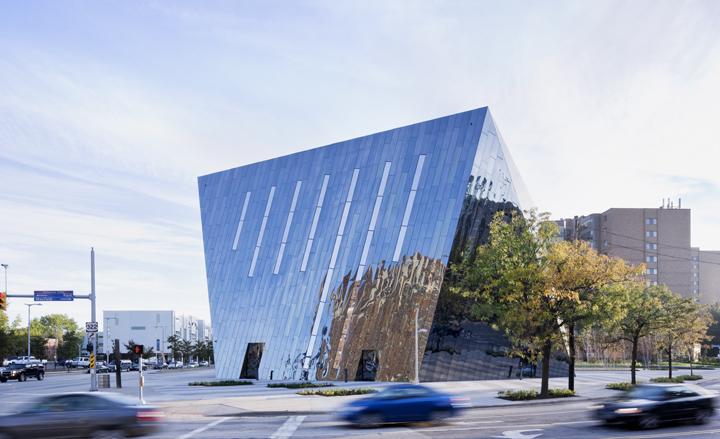
Sleek, surprising, and incredibly versatile, the $27.2 million new home of MOCA Cleveland - Farshid Moussavi’s first museum commission and her first building in the United States - is a slow-motion spectacular, unfolding gradually over four stories and approximately 34,000 sq ft. The building envelope, a craggy carapace that is independent of the load-bearing floors, has six faceted sides, one of them a tall triangle of transparent glass that echoes the three-cornered building site. The others are clad in panels of black stainless steel for a unique finish that is part funhouse mirror, part mood ring. ‘This material was an exciting find,’ says Moussavi, who stumbled upon the dusky Rimex paneling after the museum’s board nixed her first choice of gold anodized aluminum. ’We discovered that this black steel acquired different dynamics when applied to our shape, with its surfaces that are tilted to different orientations and that catch the light differently. It started playing with time,’ she adds. ‘We eventually understood the significance of this for a contemporary art museum, which should play with the idea of the now.’
Additional writing: Stephanie Murg
Fabric Warehouse 2.0, Auckland, New Zealand
Fearon Hay
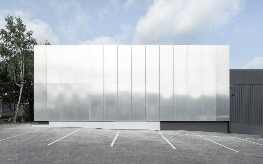
Located in downtown Auckland, Fabric Warehouse 2.0 creates two clear spaces – office and warehouse – with bold, installation-like connections, like the metal-wrapped internal stair and balustrade. The architects describe the sleek, mirror-surface exterior as deliberately mysterious – it’s more Donald Judd than big box store. That artistic focus extends to the client’s collection of art and objects, which are scattered throughout the space, alongside internal courtyards for work and meetings.
Garden Studio, Amsterdam, The Netherlands
CC Studio
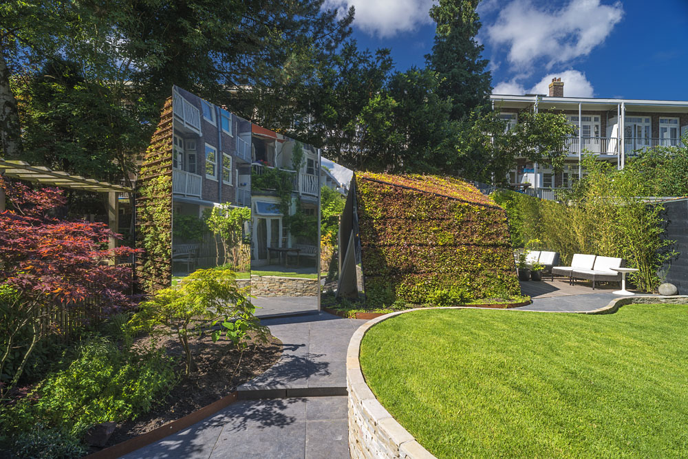
A reflective camouflaged garden studio has been inserted into a Dutch family garden in Amsterdam. Designed by local architecture practice CC Studio, the structure is essentially two parts combined - with one holding storage space and the other containing a home studio for one of the owners, who is the director of the augmented reality start-up company Layar. Geometric, angular volumes mix with mirrored and planted surfaces in a composition that not only creates a visual centrepiece for the garden, but also enhances the space by creating optical illusions.
Minor Rose hair salon, New York, USA
Also Office
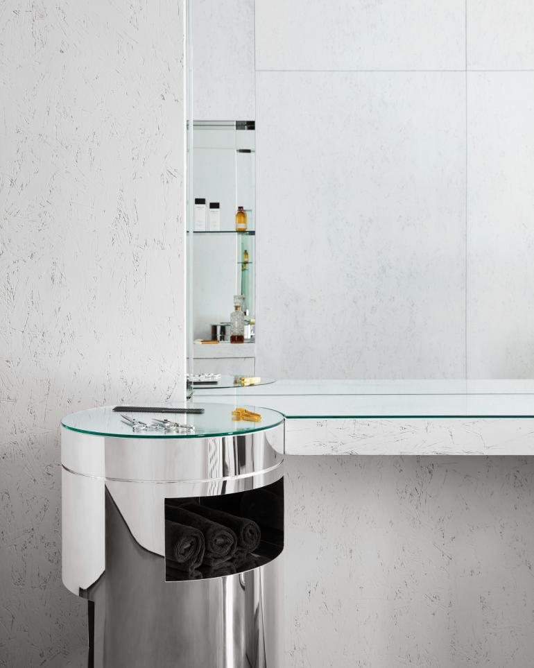
Often, great things come in small packages, and this new hair salon interior in New York’s chic Gramercy Park neighbourhood is a case in point. Named Minor Rose, the space was designed by Evan Erlebacher of Brooklyn-based architecture studio Also Office. The project, for hairstylist Bradley Scott Rosen, was conceived as a boutique, perfectly detailed interior that is at once fit for purpose and aesthetically sharp. ‘To enlarge the appearance of the interior, we punctuated the walls with mirrored, architectural niches to reflect and multiply the space beyond its modest footprint,’ says the architect. ‘Using mirrors was a natural choice for the salon, which is all about the experience of looking from different perspectives – both for Bradley and his clients. We wanted the design of the salon to be elemental so that it created a simple frame for that relationship.’
Mirror Houses, South Tyrol, Italy
Peter Pichler Architecture
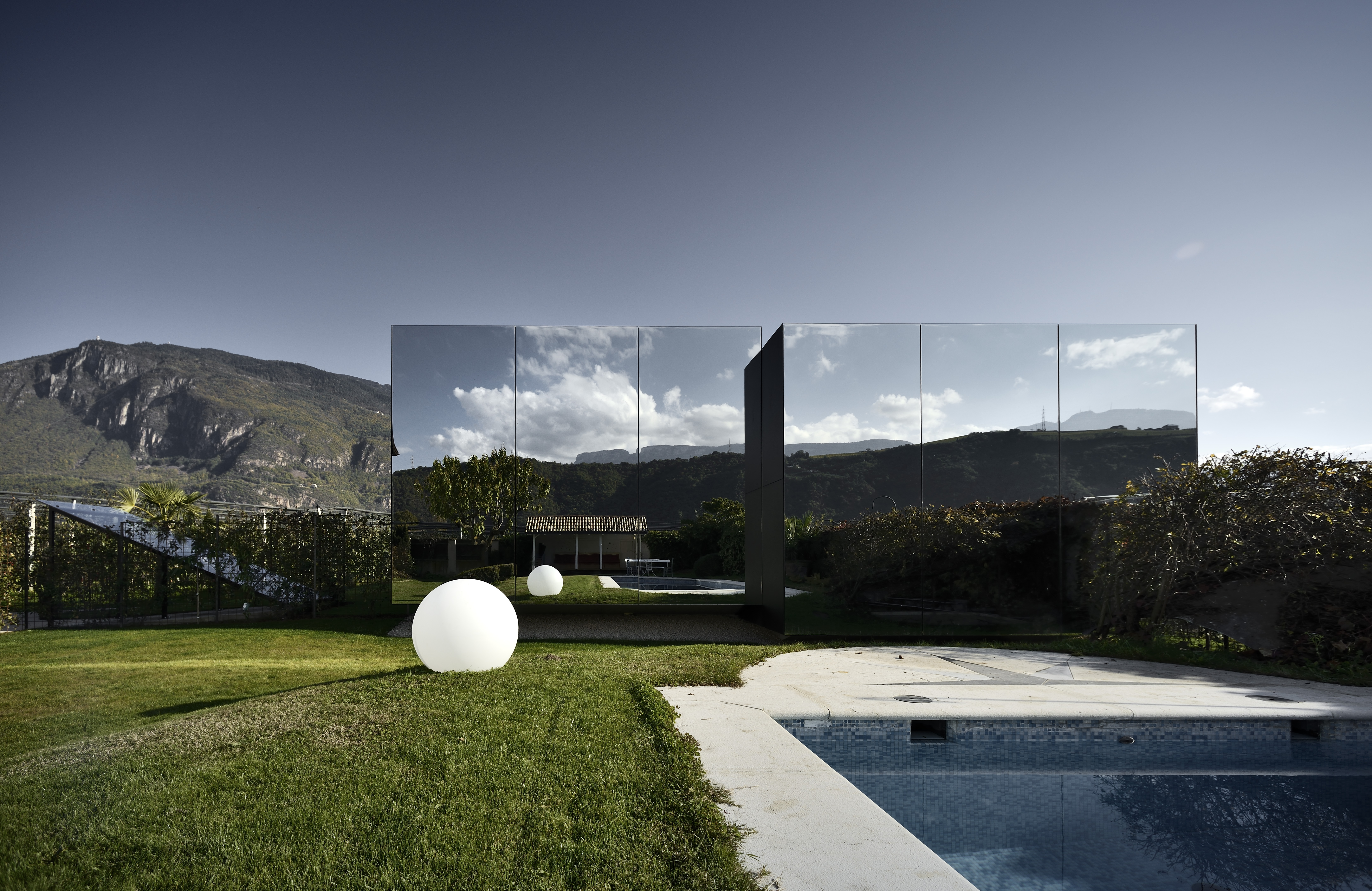
In the South Tyrolean Dolomites, architect Peter Pichler designed this pair of homes for his client to rent out as luxury holiday units on her apple farm. Each of the units contains a kitchen/living room, as well as a bath and bedroom with overhead skylights providing natural light and ventilation. A basement level also offers temporary storage for guests.
The Mirrored Sight, Guizhou, China
Li Hao
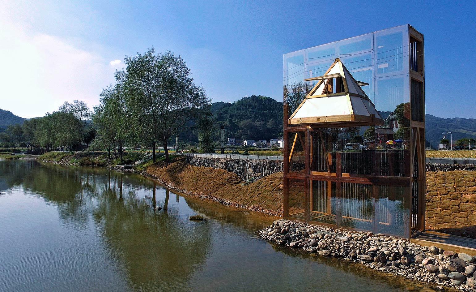
Located on the north bank of the Longxi River – outside Longli in southeast Guizhou, China – architect Li Hao constructed a permanent mirrored shelter made of bamboo. The pavilion, a place for leisure and contemplation, is covered with a skin of Pilkington Mirropane (a single-transparency glass) on the southern facade. The surface reflects the old town established as an early Ming military settlement 600 years ago.
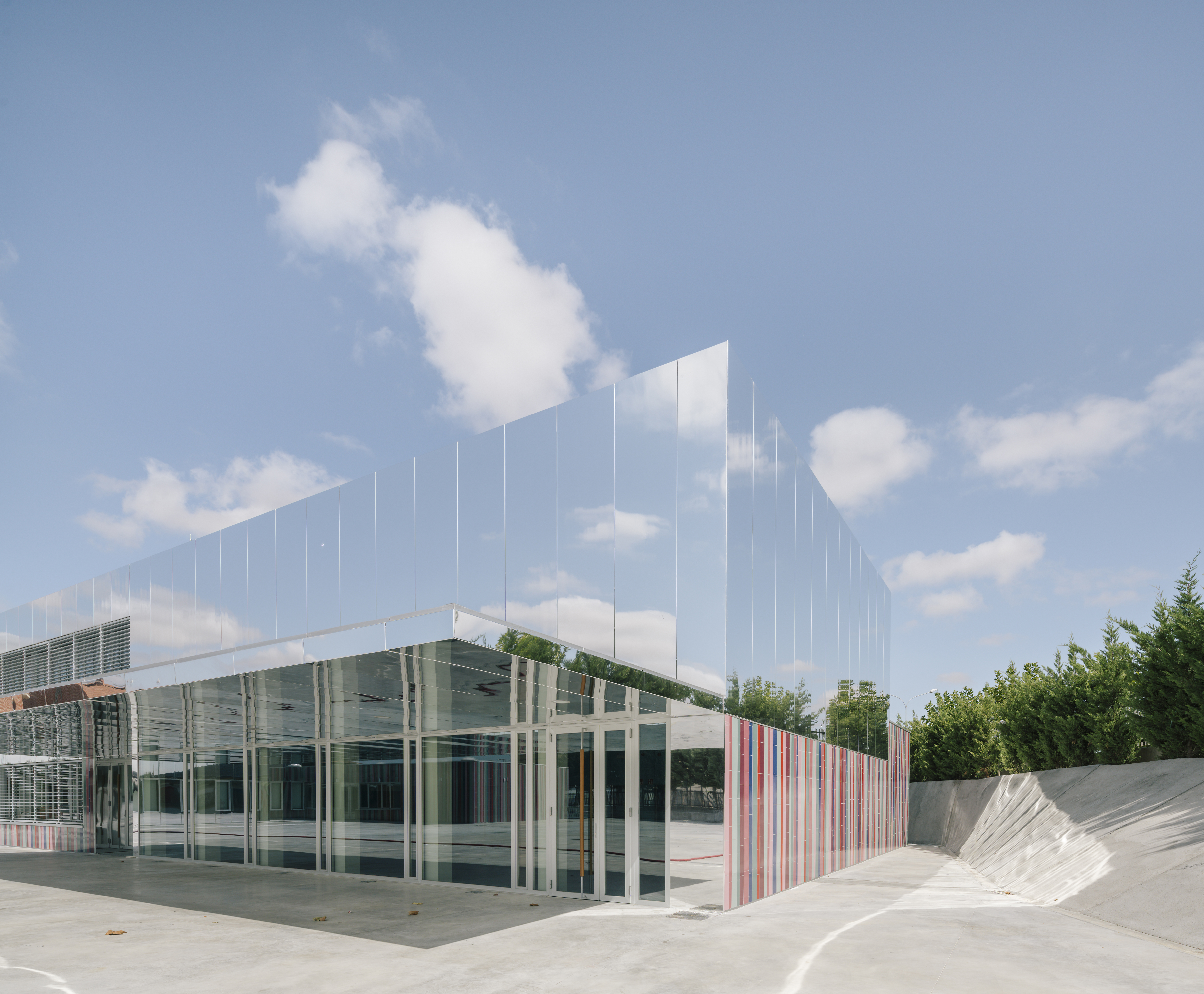
The Invisible School, Salamenca, Spain
ABLM Arquitectos
Villares de la Reina has developed into one of Salamenca’s key manufacturing hubs over the last decade. Offsetting the industrial aesthetic of the municipality, ABLM Arquitectos designed the Invisible School for the area’s youth. The exterior façade features StacbondR composite aluminium panels, which interplay with ceramic plinths in varying shades of blue, pink, red and purple. The mix of colours promotes equality between boys and girls, a representation of the school’s ethos.
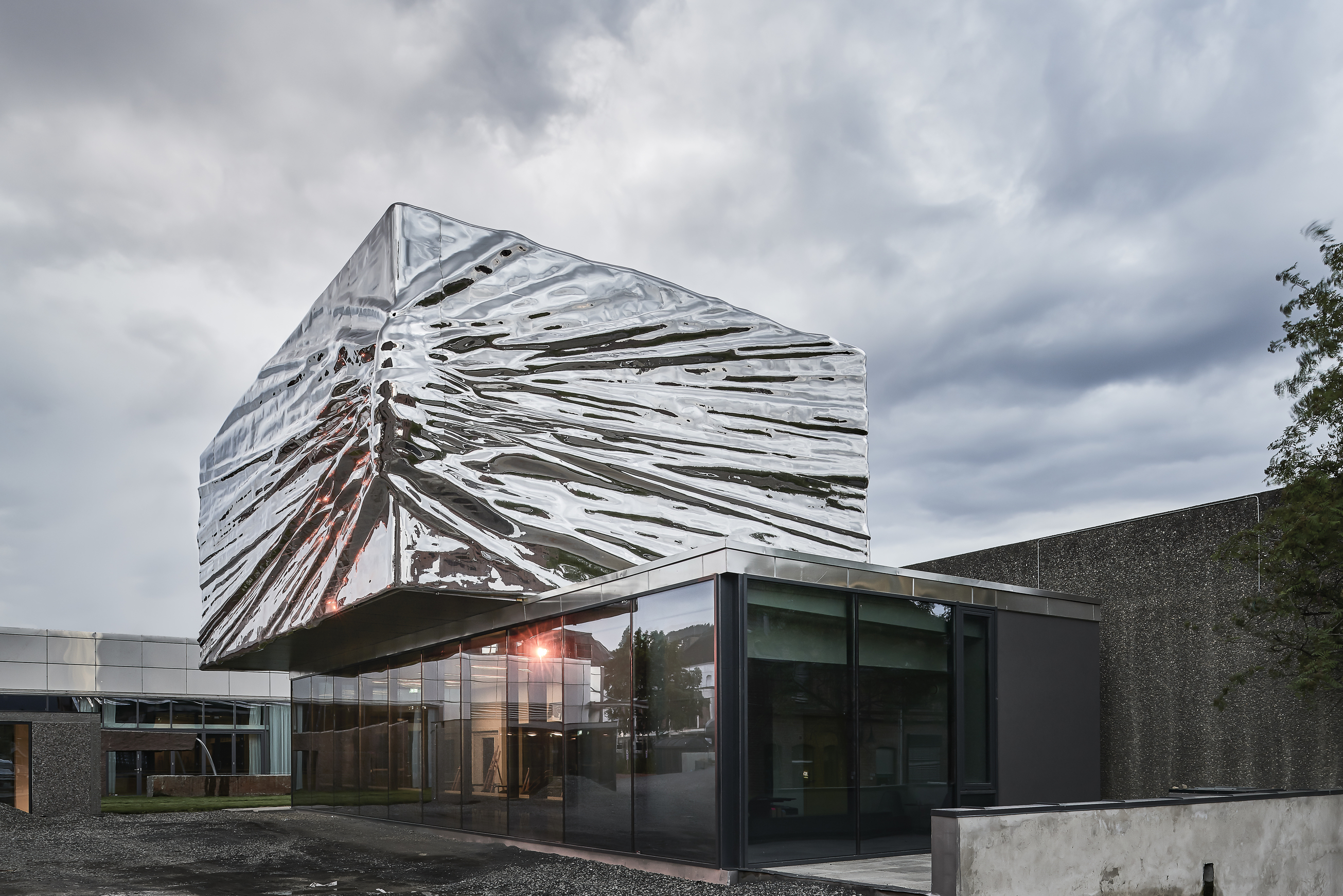
Lillehammer Art Museum, Norway
Snøhetta
In 1994, Snøhetta renovated the Lillehammer Art Museum, bridging the main 1964 building to a new independent volume. Twenty-two years later, the Norwegian firm continued its work with the museum by designing a second expansion. Existing buildings were interconnected to the museum by the new Weidemannsalen exhibition hall. Further additions include two new theatres and an interior renovation of the Lillehammer Cinema.
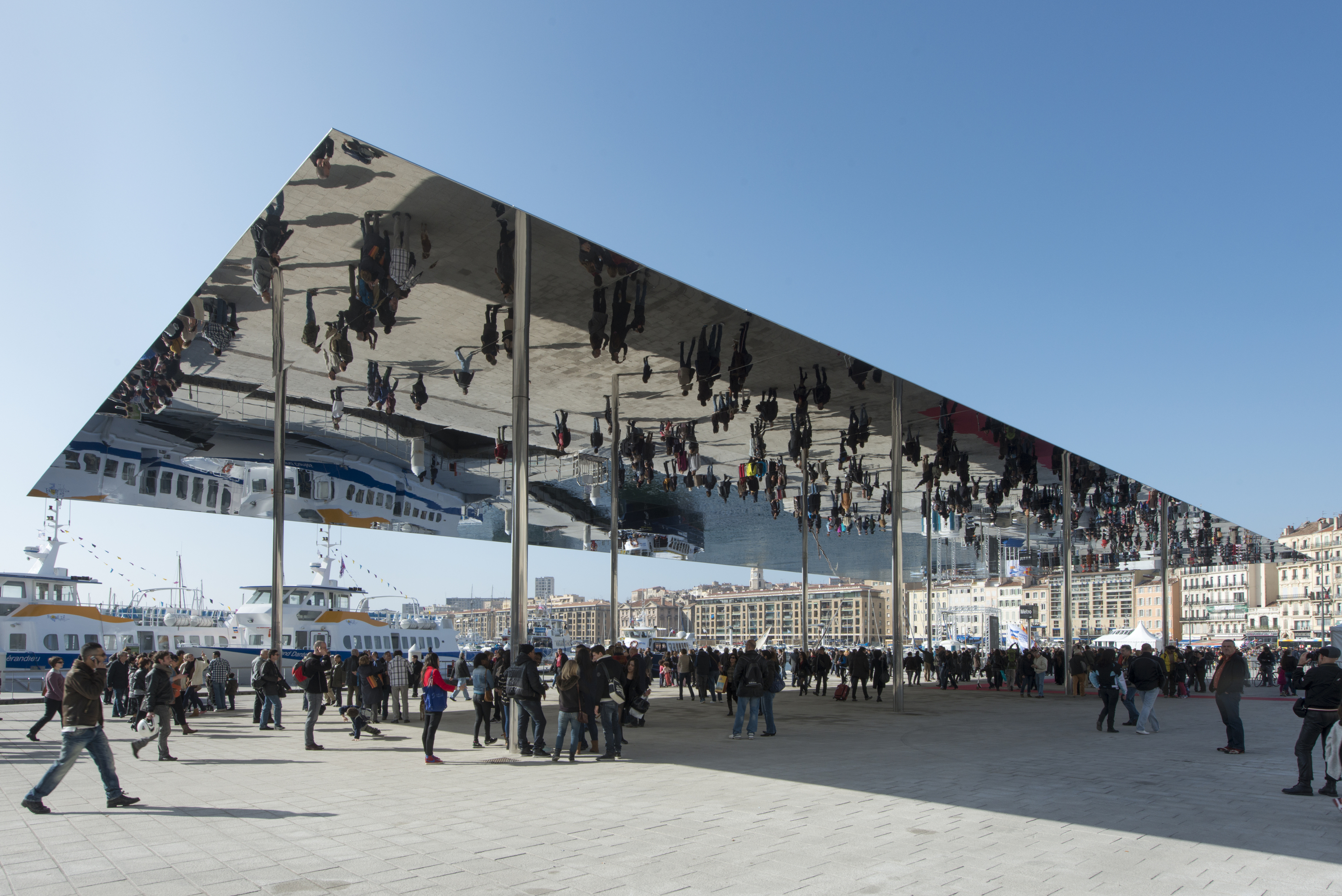
Marseille Vieux Port, France
Foster + Partners
In 2013, Marseille was selected as the European Capital of Culture. Following the announcement, the city’s Vieux Port received funding for regeneration. Resultantly, the port’s eastern Quai des Belges welcomed a new discreet mirrored pavilion by Foster + Partners. The reflective construct provides a sheltered canopy for visitors exploring the area, as well as for temporary events and markets to occur below.
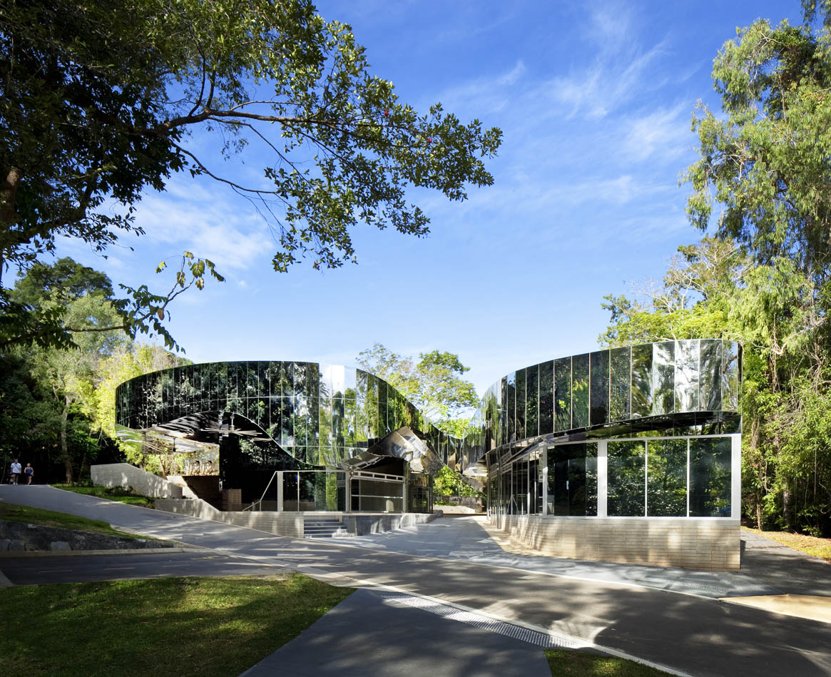
Cairns Botanic Gardens Visitors Centre, Queensland, Australia
Charles Wright Architects
In 2009, Charles Wright Architects was invited to enter an exclusive competition to design a new visitors’ centre for the Cairns Botanic Gardens. Filling the quota for a ‘fresh and challenging idea’, the firm successfully integrated its design into the Australian rainforest region. The design takes cues from tropical architecture, and adds a contemporary spin on stylistic conventions with its mirror-clad exterior.
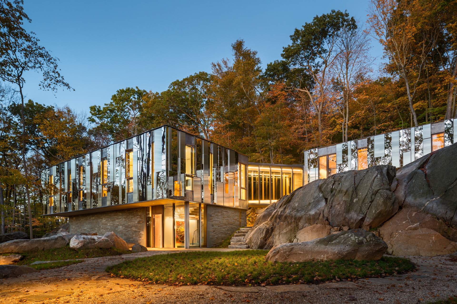
Pound Ridge House, New York, USA
KieranTimberlake
The design brief for Pound Ridge House was plain and simple – a ‘house in the woods, of the woods’. Bringing the woodland presence to the home’s occupants, KieranTimberlake immersed the three-volume family home in the natural backdrop of Pound Ridge. The home gently responds to the site’s topography, snugly fitting amongst the ridge’s slopes and plateaus.
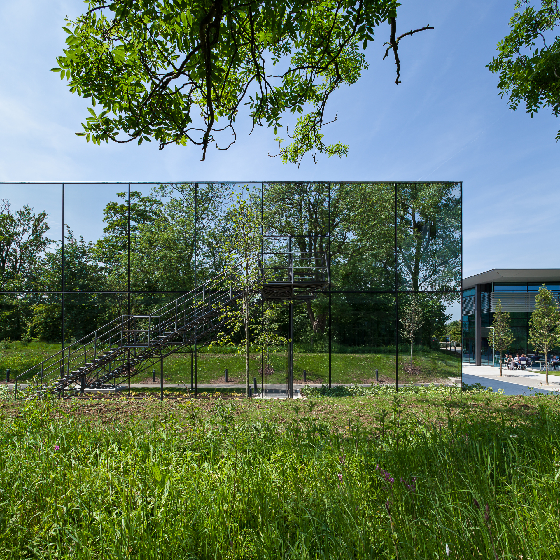
Dyson Campus, Malmesbury, UK
WilkinsonEyre
WilkinsonEyre expanded Dyson’s Malmesbury campus with several new blocks. The largest of the new spaces, D9, is a dedicated research and development facility, featuring 129 new laboratories spread across 12,000 sq m. The reflective exterior provides privacy and security, yet also outward views and generous daylight to the researchers inside.
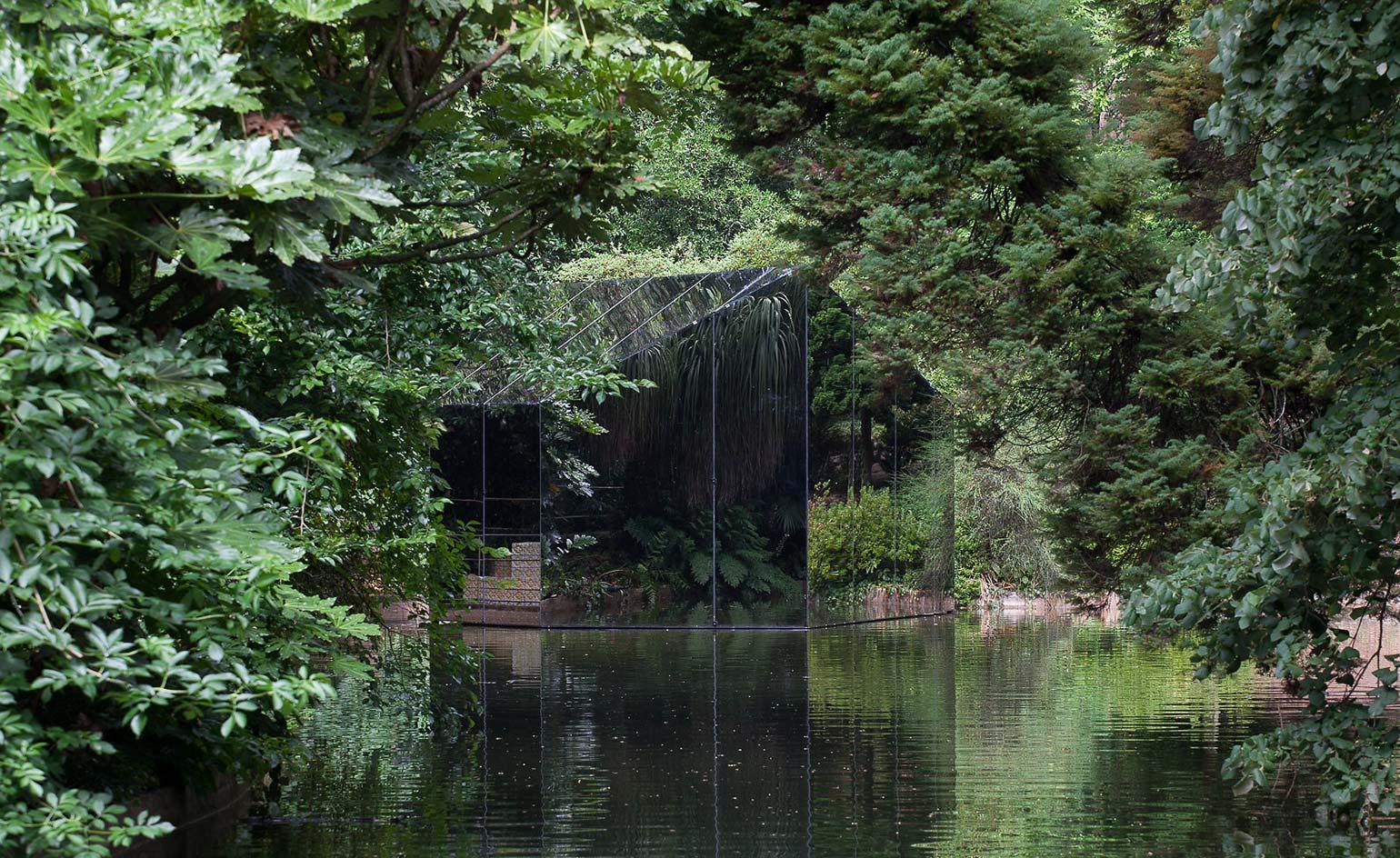
Liquid Pavilion, Porto, Portugal
depA Architects
Commissioned by the Serralves Foundation in Porto, this pavilion designed by the Porto-based studio depA Architects is built of dark glass that reflects its leafy surroundings. The mysterious geometric form appears to float on a lake in the middle of Serralves Park, in proximity to the foundation’s contemporary art museum designed by Álvaro Siza and the art deco Serralves Villa.
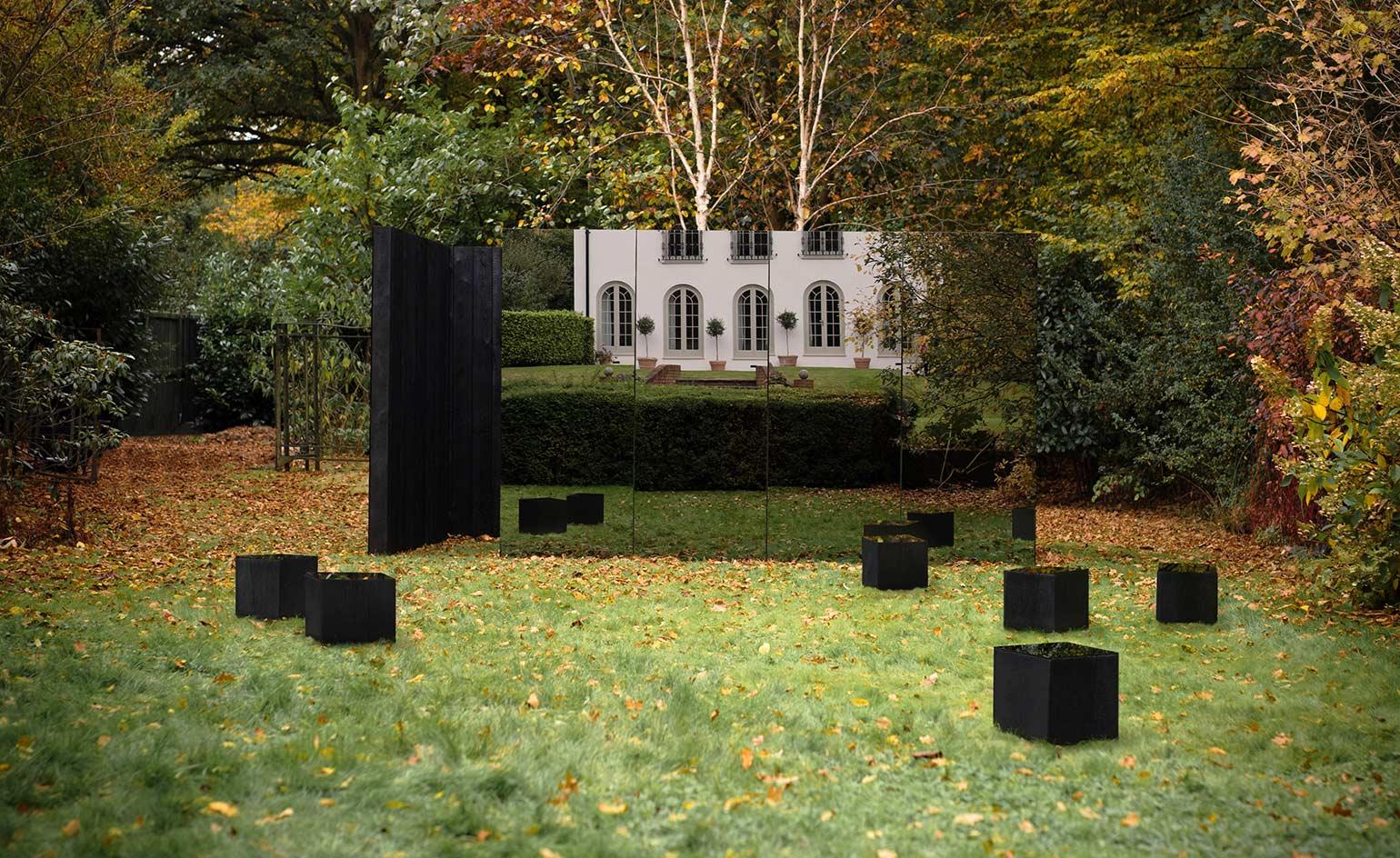
Treehouse Pavilion, London, UK
Studio Kyson
Created as an exploration of classic architecture principles, such as form, light and texture, this ethereal pavilion was designed and built by emerging London-based architecture practice Studio Kyson. Headed by Scott Kyson, the architects worked on the pavilion playing with juxtapositions between solid and void, dark and light, and rough and smooth.
Ellie Stathaki is the Architecture & Environment Director at Wallpaper*. She trained as an architect at the Aristotle University of Thessaloniki in Greece and studied architectural history at the Bartlett in London. Now an established journalist, she has been a member of the Wallpaper* team since 2006, visiting buildings across the globe and interviewing leading architects such as Tadao Ando and Rem Koolhaas. Ellie has also taken part in judging panels, moderated events, curated shows and contributed in books, such as The Contemporary House (Thames & Hudson, 2018), Glenn Sestig Architecture Diary (2020) and House London (2022).
-
 Put these emerging artists on your radar
This crop of six new talents is poised to shake up the art world. Get to know them now
By Tianna Williams
-
 Dining at Pyrá feels like a Mediterranean kiss on both cheeks
Designed by House of Dré, this Lonsdale Road addition dishes up an enticing fusion of Greek and Spanish cooking
By Sofia de la Cruz
-
 Creased, crumpled: S/S 2025 menswear is about clothes that have ‘lived a life’
The S/S 2025 menswear collections see designers embrace the creased and the crumpled, conjuring a mood of laidback languor that ran through the season – captured here by photographer Steve Harnacke and stylist Nicola Neri for Wallpaper*
By Jack Moss