Postmodern architecture: from Las Vegas to Japan
Postmodern architecture emerged in the late 1960s as a backlash against the monotony of modernism. It was a cry for architects to unstick themselves from entrenched ideals and endlessly accumulating glass blocks. In protest, postmodernism added expressive characteristics onto the muted palette of modernity such as colour, reappropriating historical styles and humour. Denise Scott Brown and Robert Venturi stepped out onto the sidewalks of Las Vegas to see what they could learn from the low-brow. Philip Johnson, Michael Graves and Charles Moore piled up neoclassical references in new ways. Terry Farrell combined Aztec design with green glazing in London, James Stirling threw pink-painted metal pipes against travertine in Stuttgart and Arata Isozaki deconstructed mathematical forms, combining the high-tech with the traditional. It's a movement that kept on moving, embarking down new routes well into the 1990s and early 00s; nothing was ever too much.

Receive our daily digest of inspiration, escapism and design stories from around the world direct to your inbox.
You are now subscribed
Your newsletter sign-up was successful
Want to add more newsletters?
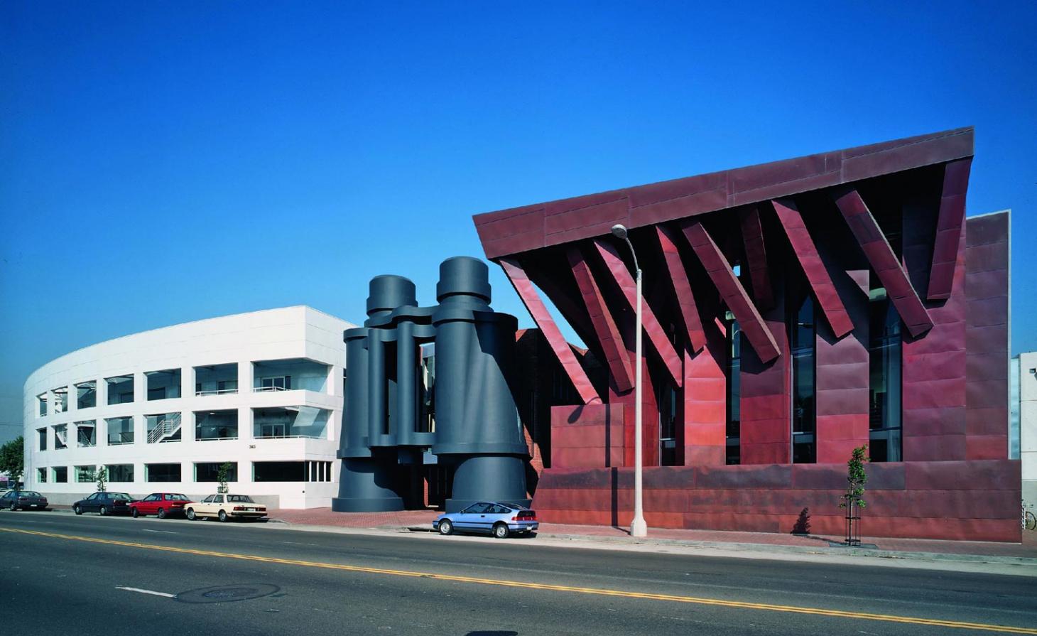
Binoculars Building by Frank Gehry
Venice, Los Angeles, US
1991
This West Coast HQ for advertising agency Chiat/Day was designed by Frank Gehry. When the ad agency departed, the building became rentable office space and adopted its self-explanatory nickname, the Binoculars Building. The building is a combination of three distinct portions – the central one being a pair of over-sized binoculars, an artwork by Coosje van Bruggen and Claes Oldenburg that opens up a pedestrian and vehicle entrance. Only the Los Angeles-based Gehry could have dreamed up this theatrical and humourous design, that looks like it should belong in a theme park. Google is one of the more recent office tenants, moving there in 2011.
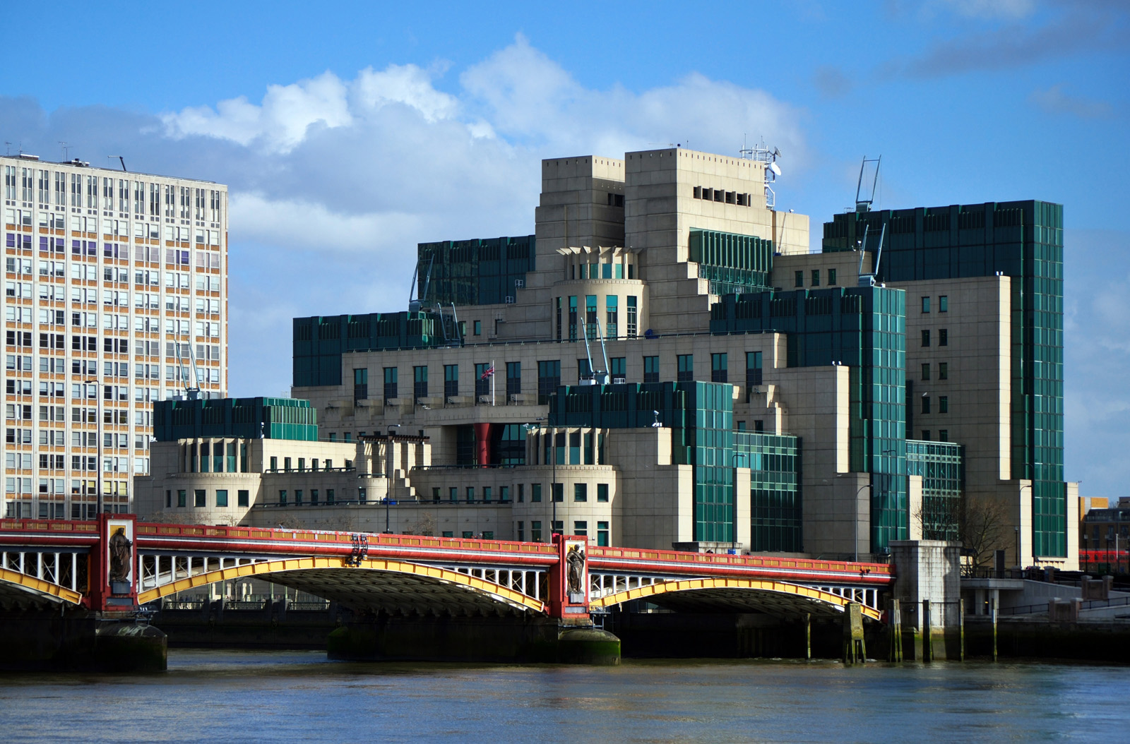
The SIS Building by Terry Farrell
London, UK
1994
A leader of postmodern architectural theory, architect Terry Farrell reached a pinnacle of British postmodernism with his SIS Building that is now held up as a key example of the movement. Known to Londoners as the MI6 Building, the cream-coloured stone and green-windowed block rises from the south bank of the Thames in Vauxhall attracting a fair amount of attention for a supposedly secret service building. Its accumulating blocks stack up in reference to Mayan and Aztec temple design resulting in a layered fortress that incorporates 60 open-air terraces into its design – as well as triple-glazed windows and butressed protection against bombs.
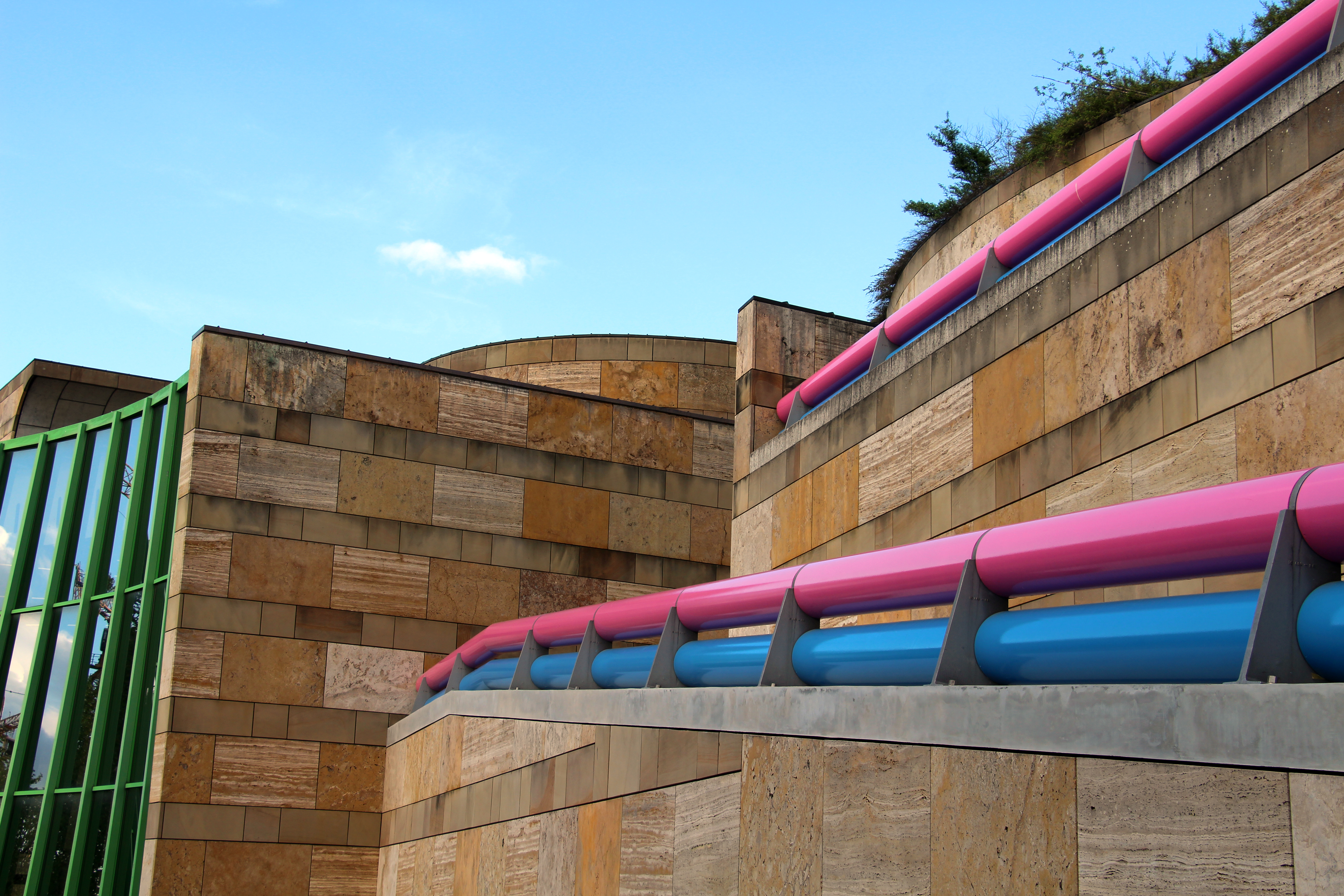
The Neue Staatsgalerie, Stuttgart, by James Stirling (Michael Wilford & Associates)
Stuttgart, Germany
1984
Selected by competition, British architect James Stirling's design for this museum of modern and contemporary art in Stuttgart combines traditional elements of 19th-century museum design with modernism. This can be seen most clearly in the materials – a luminous green steel frame collides with pink and blue handrails against the classical architectural palette of classical travertine and sandstone. The job of the building, situated on its sloping site, was to unite Stuttgart's modern art offering with the original Staatsgalerie built in 1843. Stirling's aim was to capture a sense of timelessness and demonstrate the evolving relationship between art and architecture.
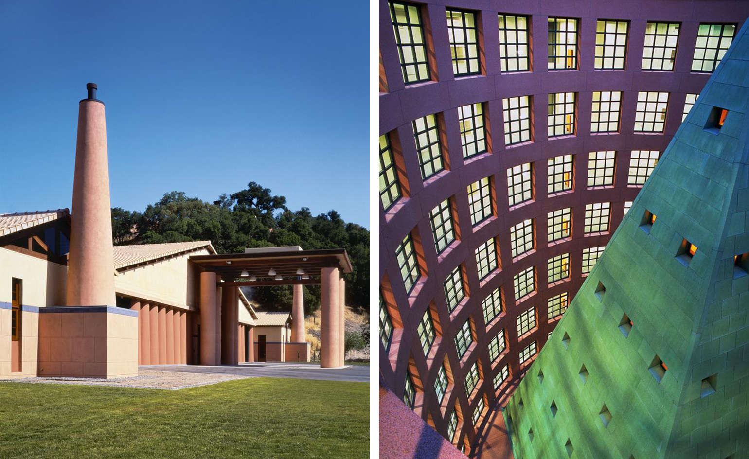
Clos Pegase Winery (left) and Hyatt Regency Fukuoka (right) by Micheal Graves
Napa Valley, California, US, and Fukuoka, Japan
1987 and 1993
Modernism meets ancient Mediterranean architecture at this Napa Valley winery designed by Michael Graves. Wine-lovers are welcomed through an impressive terracotta-coloured entrance portico supported by huge pillars. Designed for wine production and tasting, the winery is accompanied by a residence commissioned by its founders Mr and Mrs Jan Shrem and it also includes a ‘Cave Theatre' excavated out of the 1858 sq m of caves.
Another of Graves' grand creations, The Hyatt Regency Fukuoka holds a vast pyramid structure in its midst naturally lit from above and encircled by a rotunda of hotel rooms. The facade of the building is sheathed with a glass curtain wall that is a glazed layer above the pre-cast masonry grid. Inside, a grand stairway beneath a gold-leafed pavilion connects the levels of the building. As well as the hotel, the building contains a 11,000sq m office space, conference rooms, lounges, restaurants, retail, and a wedding chapel.
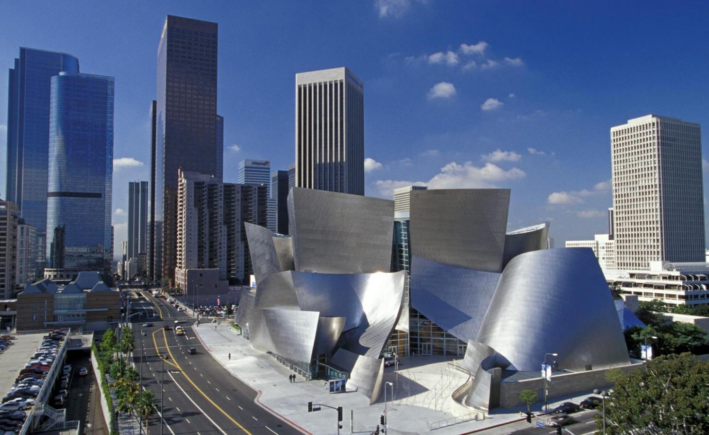
The Walt Disney Concert Hall by Frank Gehry
Los Angeles, US
2003
The whipped stainless steel peaks of the Walt Disney Concert Hall in Los Angeles express the height of Frank Gehry's sculptural magic. Bringing some drama to the downtown skyline, the totally deconstructed form of the concert hall is closer to art than architecture, yet somehow it manages to function as one of the most atmospheric venues in the world. Set on a glass façade at the ground level, the building opens up to a unique timber panelled interior with acoustics designed by Minoru Nagata.
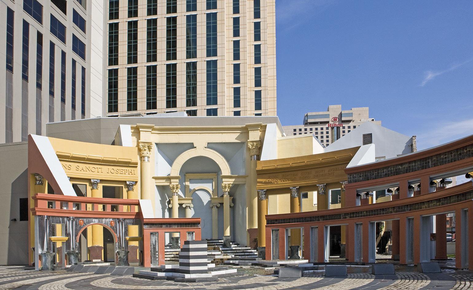
Piazza d'Italia by Charles Moore and Perez Architects
New Orleans, US
1978
Architect Charles Moore was commissioned by the city of New Orleans to design a piece of public architecture for the Italian-Americans of the city, who had arrived in waves of immigration from the late 19th century and represent a significant portion of the community. Working with the local Perez Architects, Moore assembled a series of classical public objects including a water fountain in the shape of Italy, colonnades, a clock tower and a Roman temple, arranging them like a still life. Moore abstracted these objects with modern materials, until the plaza looked like a two-dimensional painted stage set.
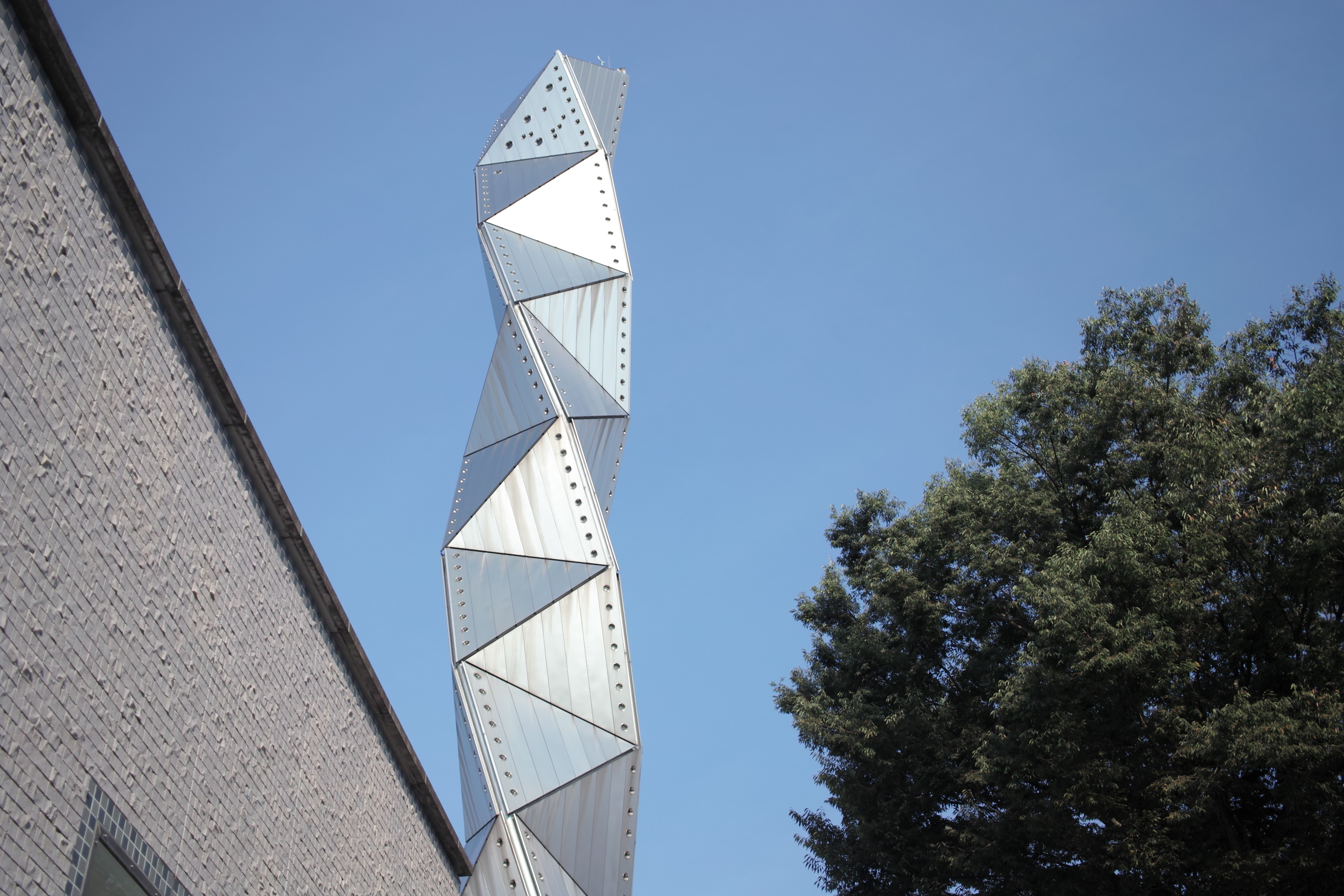
Art Tower in Mito by Isozaki Arata
Ibaraki, Japan
1990
Rising like an electrical charge nearly 100m into the sky, this tower designed by Arata Isozaki is part of an arts complex in Mito, Japan that includes a concert hall, theatre and a contemporary art gallery. The landmark geometric tower is based on the tetra-helix shape. The piece was commissioned by Mito City, located 120km from Tokyo, to celebrate its 100th anniversary.
Receive our daily digest of inspiration, escapism and design stories from around the world direct to your inbox.
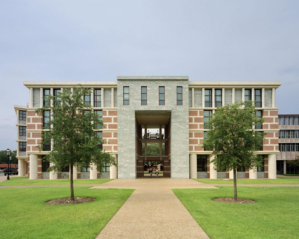
Martel College, Rice University by Michael Graves
Houston, Texas, US
2003
After completing the masterplan for Rice University, Michael Graves was commissioned to design a new complex that combined a dormitory, classrooms, a library, dining commons, apartments for faculty, as well as a separate house for the college master and a kitchen and servery for all three Rice University colleges. Graves took on the challenge resulting in this neat Martel college building as part of the design that spans 10,000sq m and calmly incorporates all functions required within its classically tiered architectural layers. Buildings are arranged around courtyards following the university's request for the building to encourage a community focused lifestyle.
Courtesy of Michael Graves & Associates
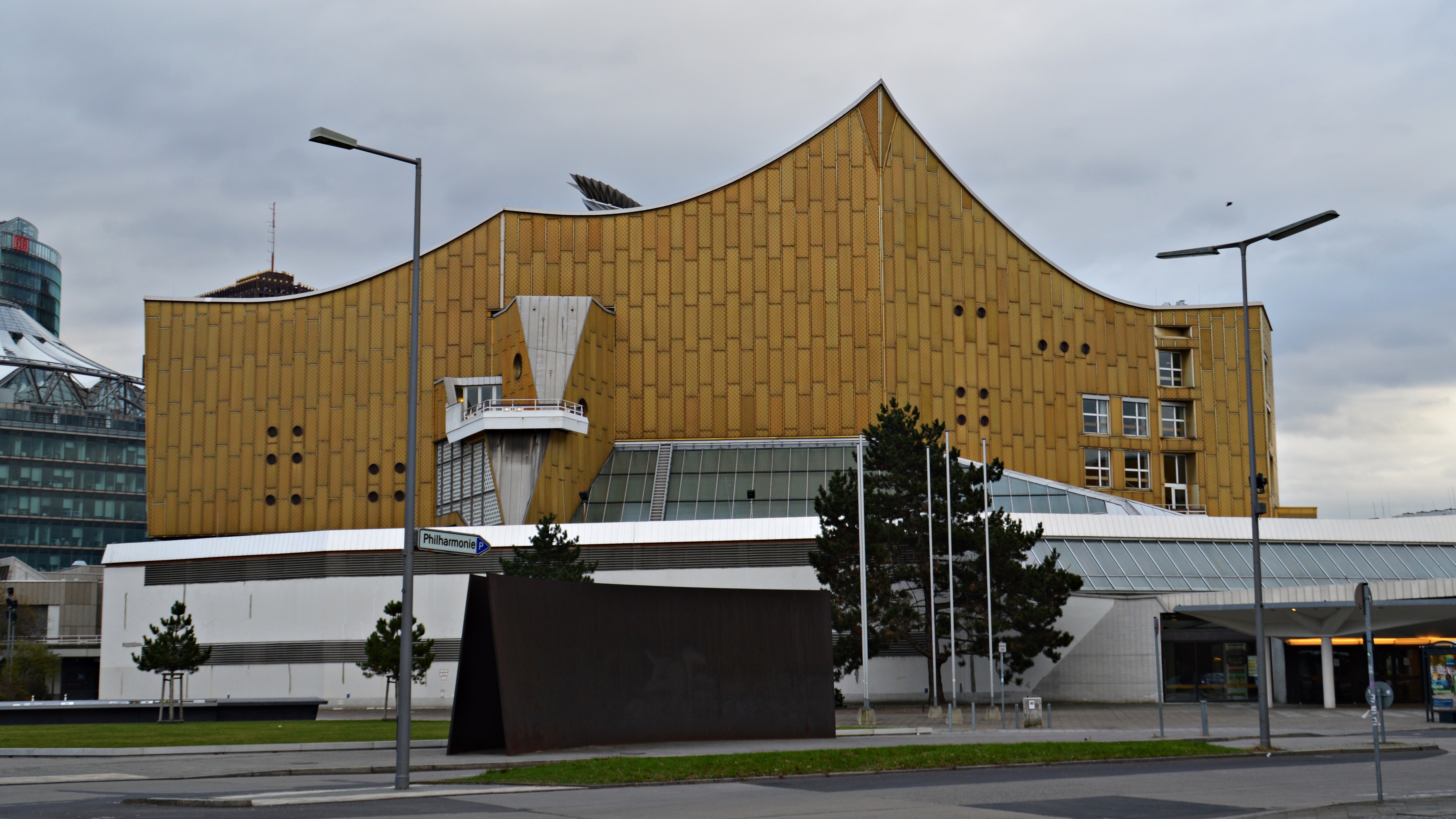
Berlin Philharmonic by Hans Scharoun
Berlin, Germany
1963
On the edge of Berlin's Tiergarten German architect Hans Scharoun designed this organic metallic building to replace a previous concert hall destroyed in the Second World War. While the yellow colour is unexpected, it complements the natural surroundings. Soon, bold architectural neighbours followed, including the Neue Nationalgalerie designed by Mies van der Rohe (1968) and the brutalist Staatsbibliothek (1978) also designed by Hans Scharoun, with Edgar Wisniewski. Beneath the dramatic ceiling of the main auditorium that reflects the shapes of the facade, the centrally placed stage was designed to project sound in all directions to the surrounding audience.
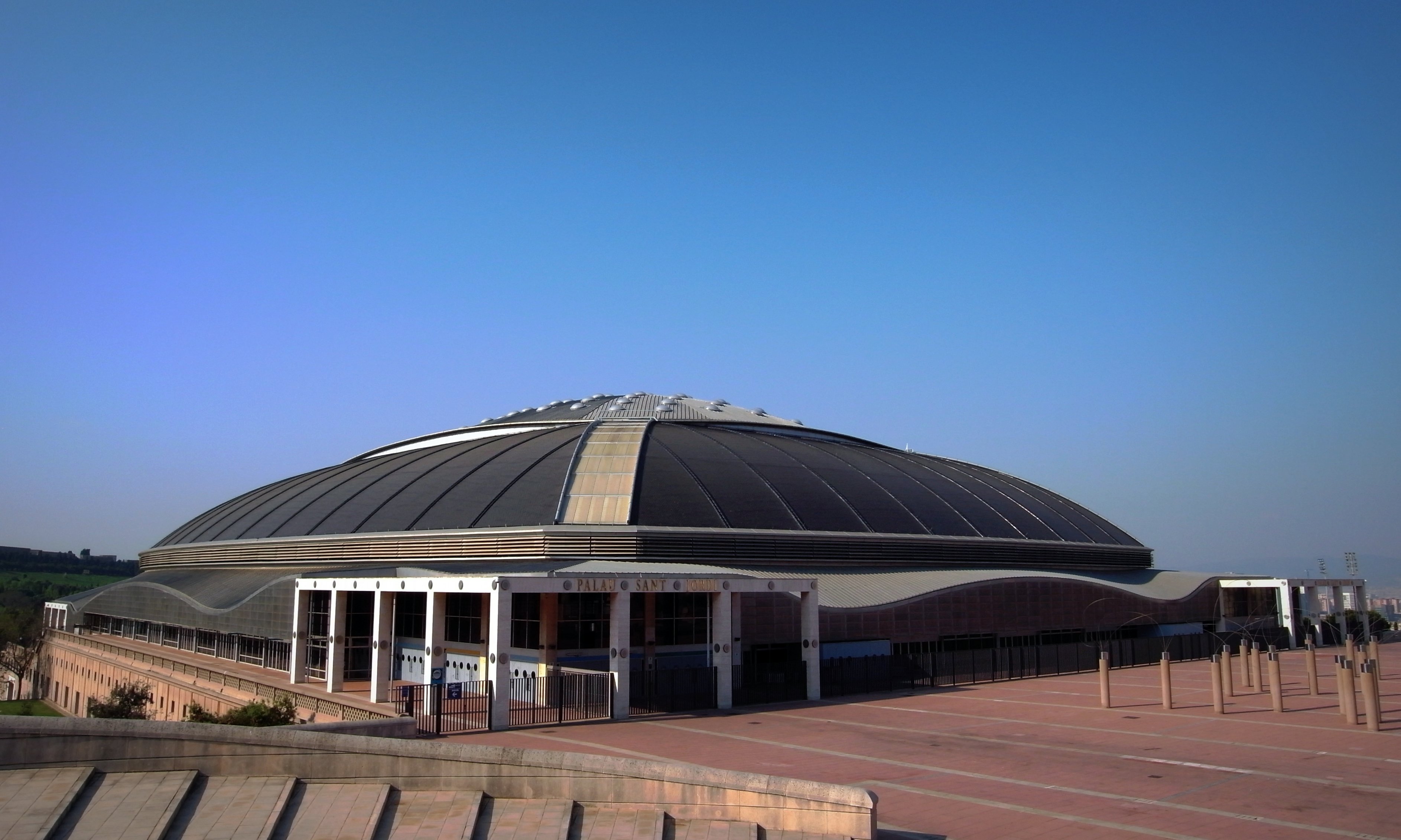
Palau Sant Jordi by Arata Isozaki
Montjuic, Barcelona, Spain
1990
Designed for the Barcelona Olympic Games in 1992, this sporting arena was inaugurated in 1990 and has become a social, sporting and musical hub for the city – holding 24,000 in its concert hall. Sitting atop the Montjuic mountain, it is a friendly, curving form that sought to fuse influence of the east and west to create a new sense of international modernity. It also made sure to reach the highest technical achievement through modern engineering, including the use of mechanised materials for a flexible venue that is still central to the life of the city today.
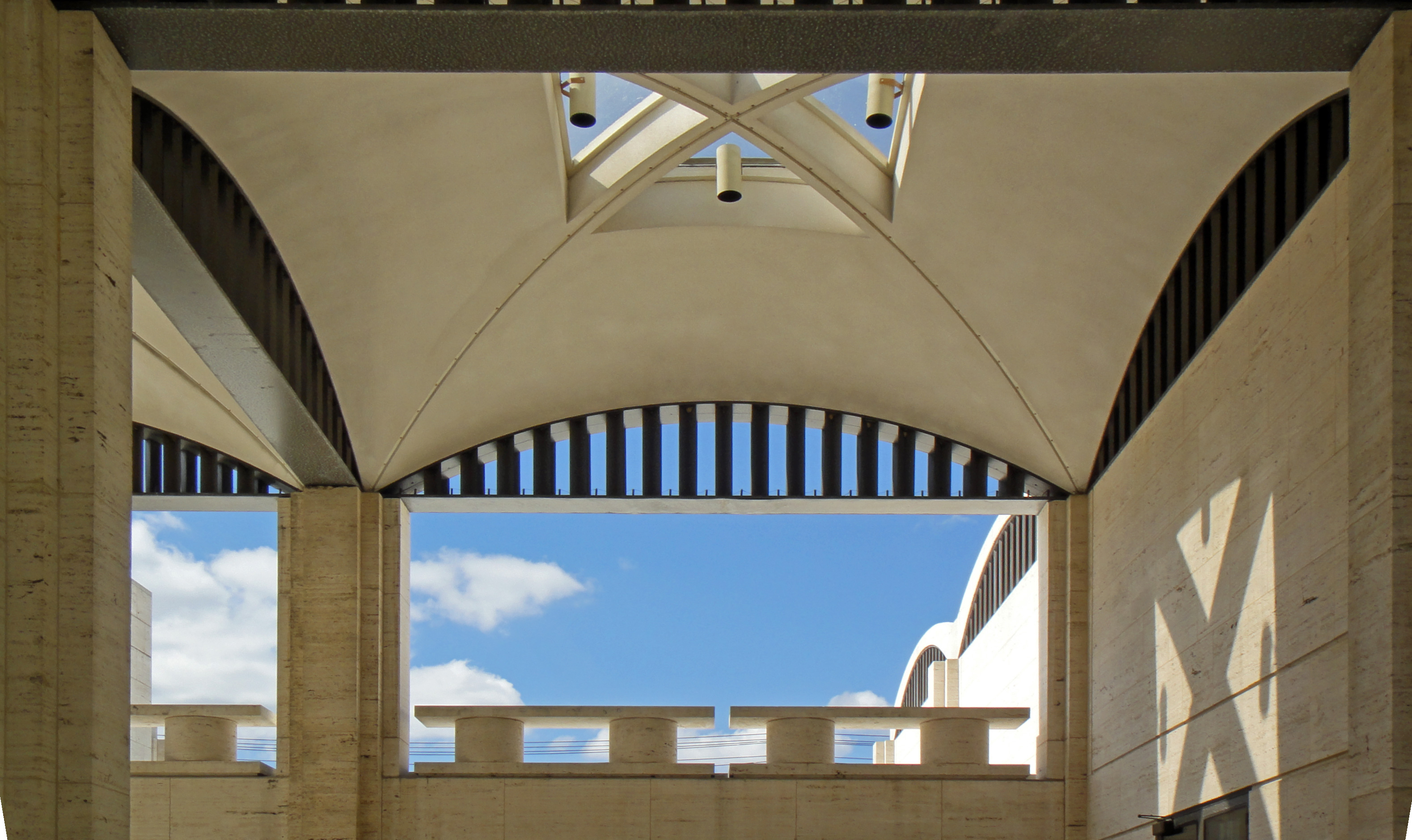
Kreeger Museum by Philip Johnson with Richard Foster
Washington DC, US
1963
This art musuem was previously the residence of culture-lovers David Lloyd Kreeger and Carmen Kreeger who were members of the Washington DC arts community. Located in a wooded park of over five acres, its pale stone, layered arches were inspired by Roman aqueduct design. Defying its own typology as a house, it seems to have been built to fulfil a public role which it rose to, eventually opening as a public museum. Entry through the vaulted front porch leads into the Great Hall which is lined with fabric walls and chevron wood floors.
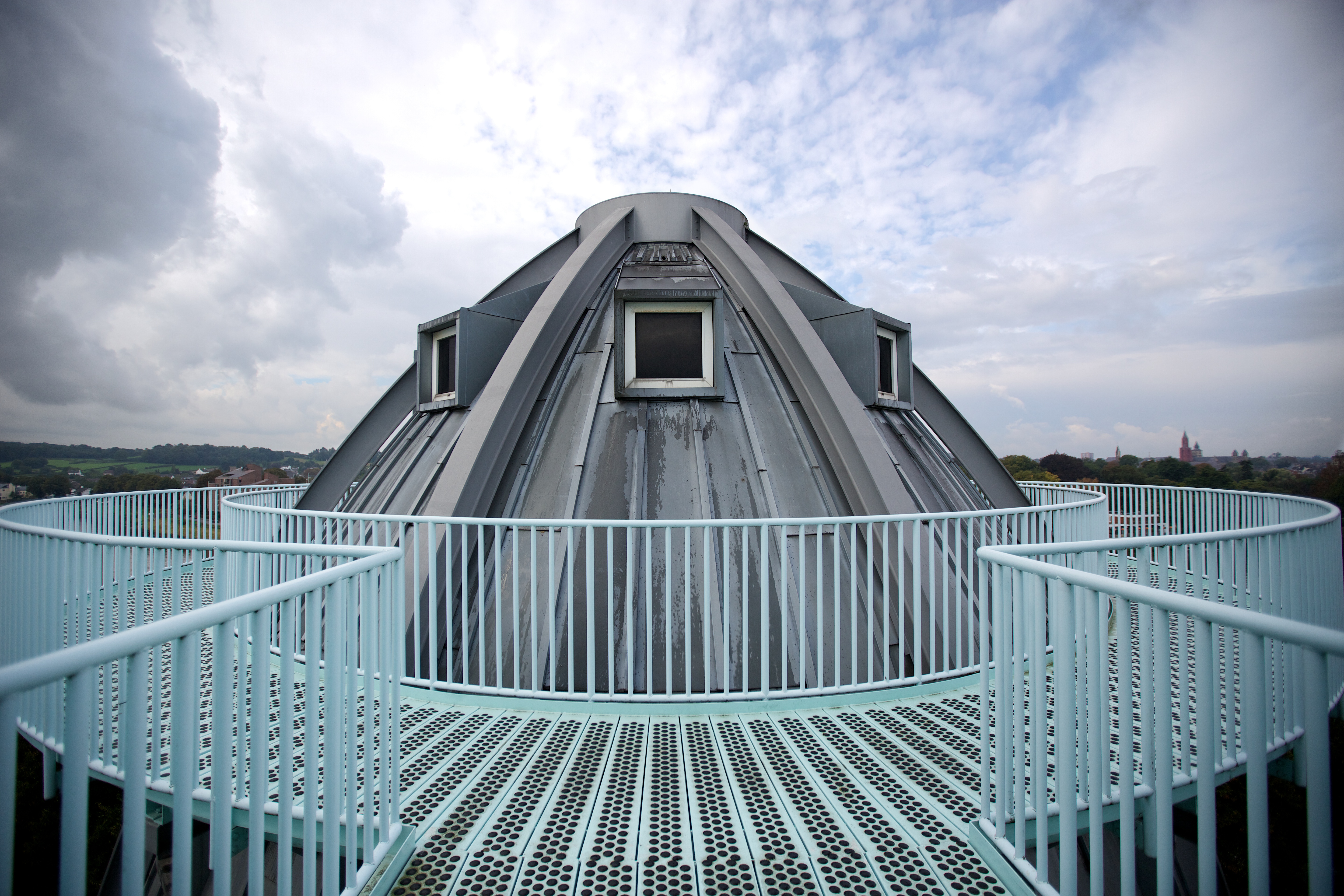
The Bonnefanten Museum by Aldo Rossi
Maastricht, Netherlands
1995
Aldo Rossi's fine art museum in Maastricht lifts influence from the industrial past of its site. The domed cupola structure rises like a beacon of postmodernism along the River Meuse, alongside the traditional 17th-century Dutch architecture of the city. While the exterior architecture is unexpected, the interior follows a traditional gallery layout. Rossi designed the exhibition spaces to be lit from above, organised around an 'E' shaped plan and a central staircase.
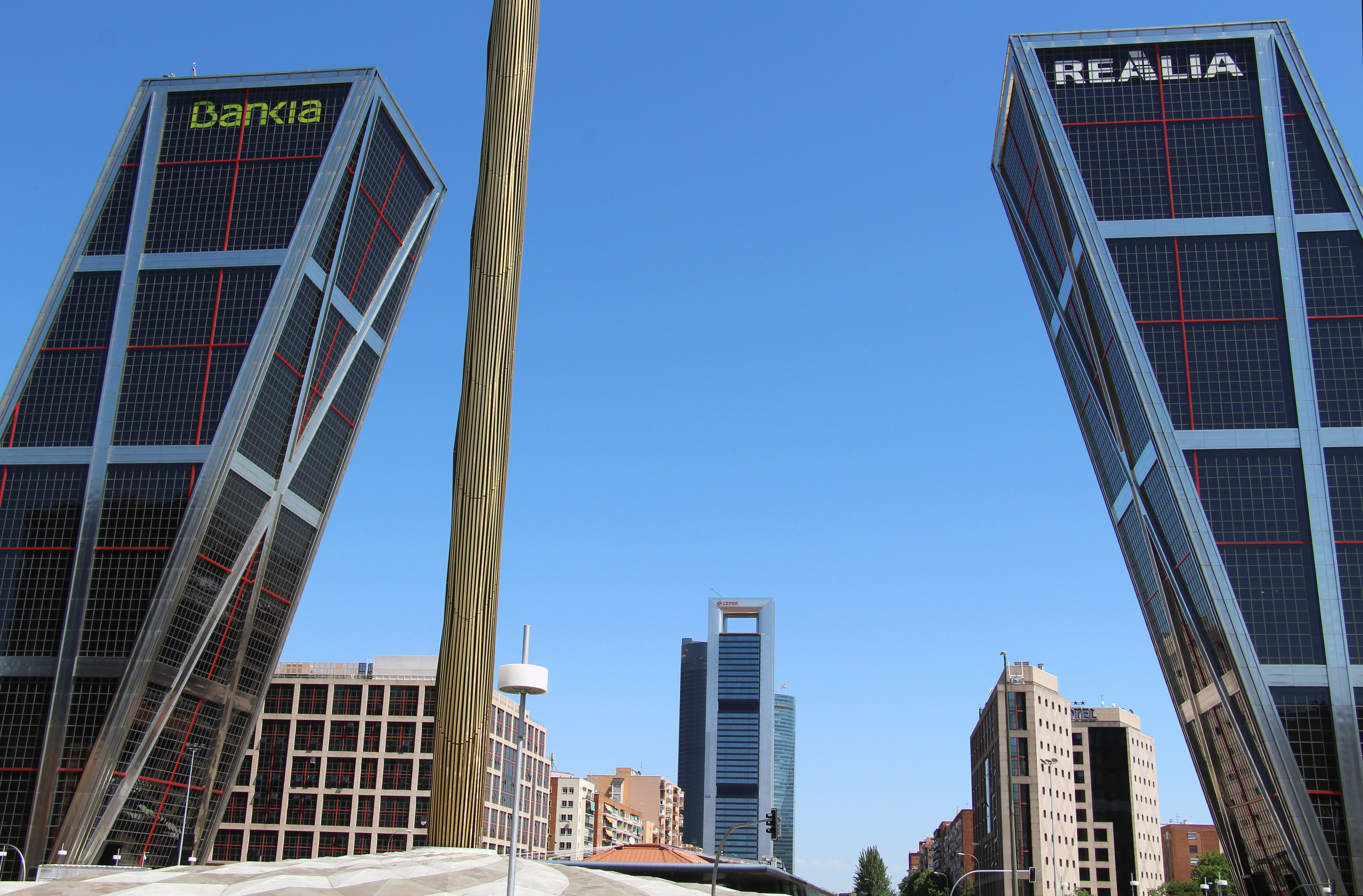
Torres KIO by Philip Johnson and John Burgee
Madrid, Spain
1996
This pair of office towers subverts the sleek, vertical American modernist skyscraper form with a new angle. Philip Johnson and John Burgee challenged engineers Leslie E. Robertson Associates and the construction team at Fomento de Construcciones y Contratas to build the first ever diagonal skyscrapers. The extreme diagonal slant allows the structures to lean into and above Madrid's central avenue Paseo de la Castellana. The forms are criss-crossed with red metal cladding above a darkened glass curtain wall, patterned with grey mullions. The west tower has a blue helipad at the top, while the east tower has a red helipad.
Ellie Stathaki is the Architecture & Environment Director at Wallpaper*. She trained as an architect at the Aristotle University of Thessaloniki in Greece and studied architectural history at the Bartlett in London. Now an established journalist, she has been a member of the Wallpaper* team since 2006, visiting buildings across the globe and interviewing leading architects such as Tadao Ando and Rem Koolhaas. Ellie has also taken part in judging panels, moderated events, curated shows and contributed in books, such as The Contemporary House (Thames & Hudson, 2018), Glenn Sestig Architecture Diary (2020) and House London (2022).
