School architecture: design scoring kudos in the classroom
School’s in. As September term time commences, take inspiration from these examples of architecture and design for children’s education. From high schools to kindergartens, much can be learnt from those crafty kids – the importance of colour, play, safety and climbing frames. And much can be unlearnt – Adam Khan's take on the indoor play centre was inspired by the discomfort of leisure centre chairs and bad smells. Release your inner child today and run a sticky finger across these tactile surfaces...
take on the indoor play centre
Cranleigh Preparatory School by Tate Harmer
Surrey, UK
2018
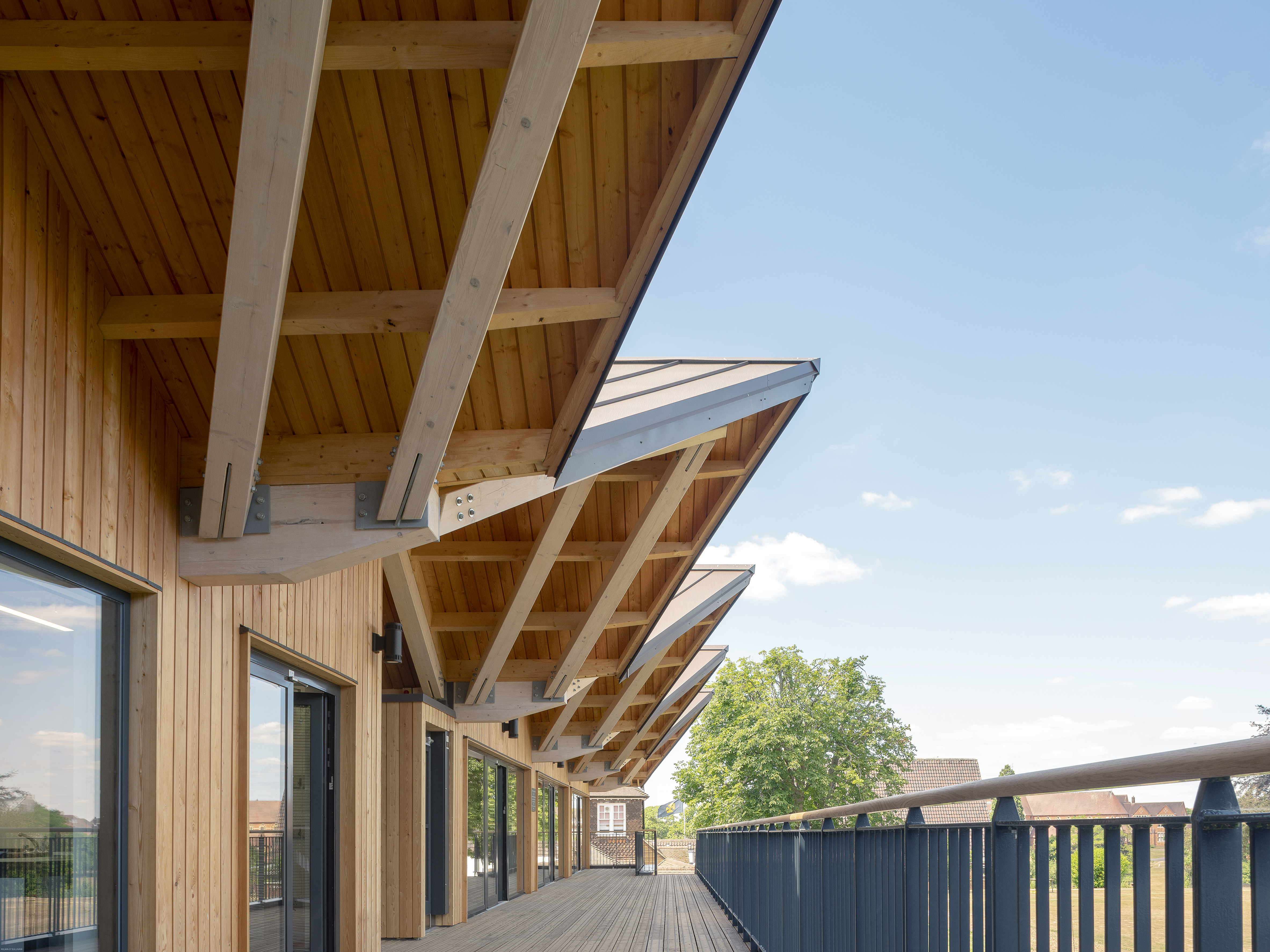
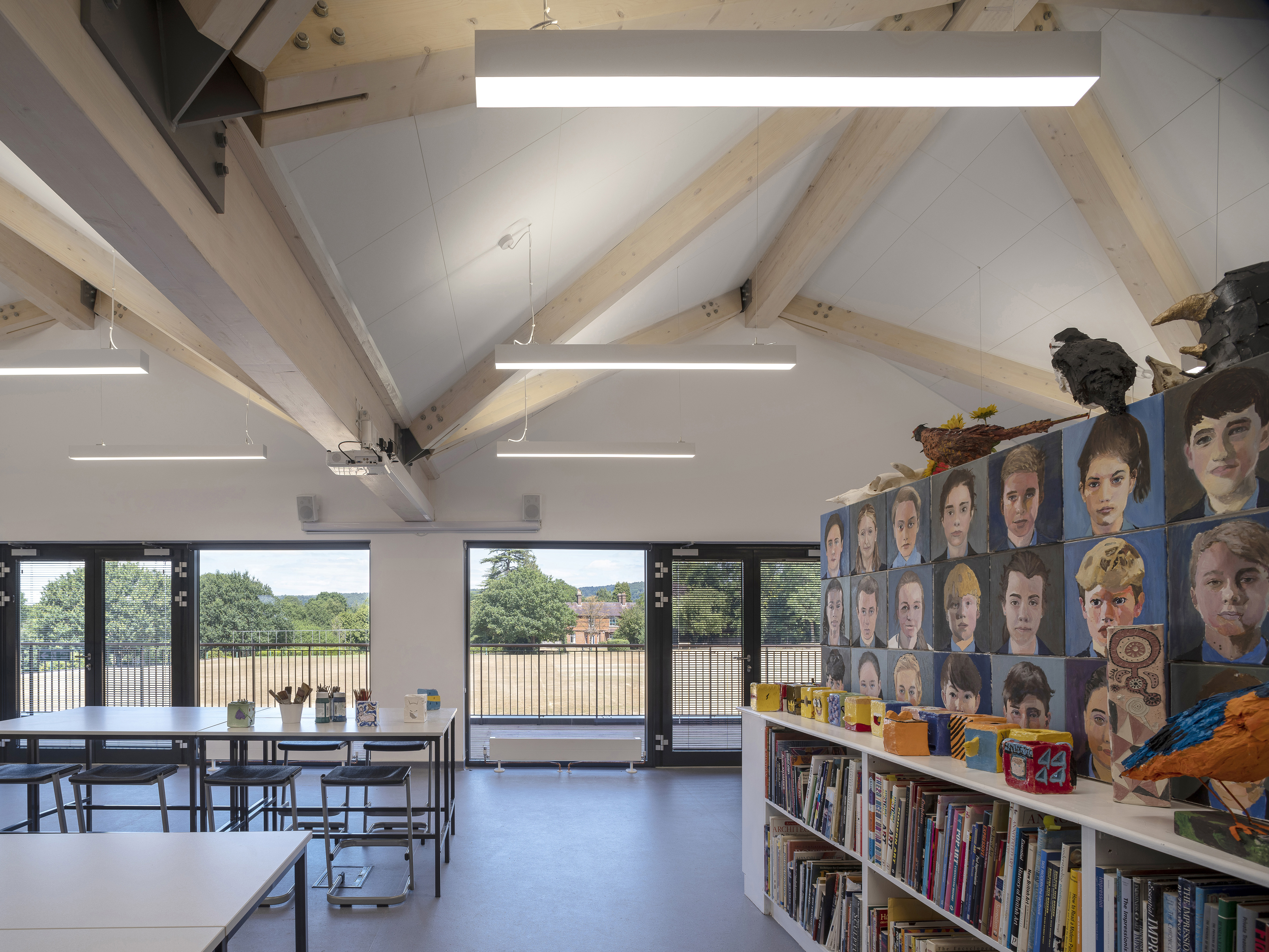
London-based architecture studio Tate Harmer has designed a timber teaching and sports building for a school in Surrey. Surrounded by rolling fields, a cricket green and trees, the architecture echoes its natural surroundings through its timber façade and sustainable low energy design. ‘Working on buildings such as the Eden Project has given us an extensive knowledge of carefully inserting structures into some of the most sensitive national settings,’ says Rory Harmer, partner at Tate Harmer.
Cranleigh Preparatory School by Tate Harmer
Surrey, UK
2018
Working with the contractor Blue Forest, a tree house design and construction company, the architects created a new building to replace two existing buildings, bringing three science labs, art classrooms and a home economics room to the campus. The building is wrapped with external circulation to bring people outside into the fresh air, while inside, the rooms are naturally ventilated with plenty of opportunities for daylight and fresh air to enter. High ceilings and open plan space are facilitated by the ‘floating’ vault glulam roof.
Kindergarten by VMDPE
Shenzhen, China
2018
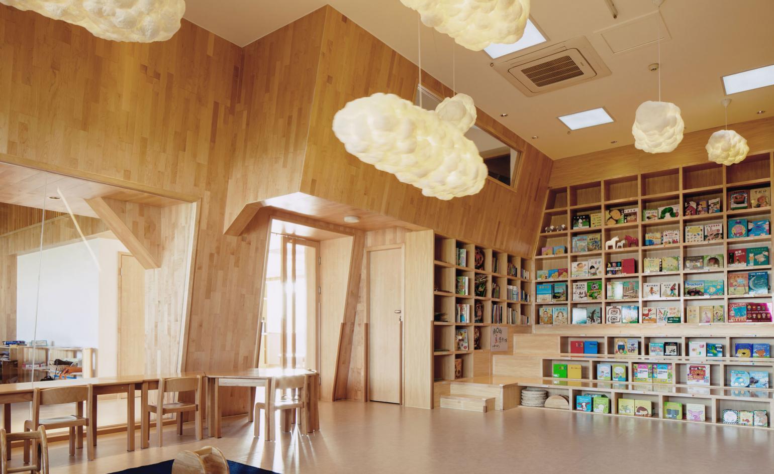
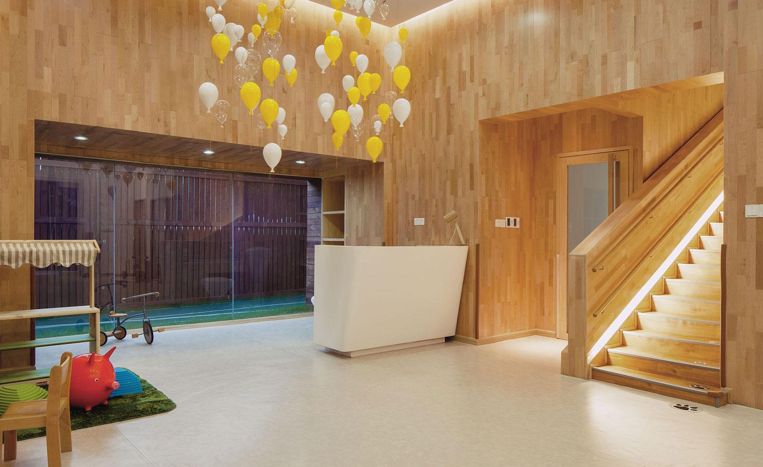
VMDPE Design is taking playtime seriously at the IBOBI International Education Centre and Kindergarten in Shenzhen. Located in the Jingshan Villa, a high-end property development in the Shekou Area of the city, the new facility is designed top-to-toe with little people in mind; complete with pint-sized furniture, low-level windows for easy viewing, and even mini-staircases, so that children can explore the space as freely as possible.
Kindergarten by VMDPE
Shenzhen, China
2018
The local firm – which specialises in designing spaces for children – was tasked with creating a space in line with the Montessori educational approach, a child-centred method based on scientific observations of children from birth to adulthood, where grown-ups often take a back seat, allowing the child to discover the world around them, establishing their own set of interests naturally.
The Storey’s Field Community Centre and Nursery by MUMA
Cambridge, UK
2018
The Storey’s Field Community Centre and Nursery designed by MUMA is a new hub in the heart of the ‘North-West Cambridge’ development, a new community comissioned by Cambridge University to house its staff in reliable and affordable housing. The centre followed clear sustainability and biscuit-coloured brick guidelines, neatly slotting into the masterplan with a warm and uplifting design for the new community.
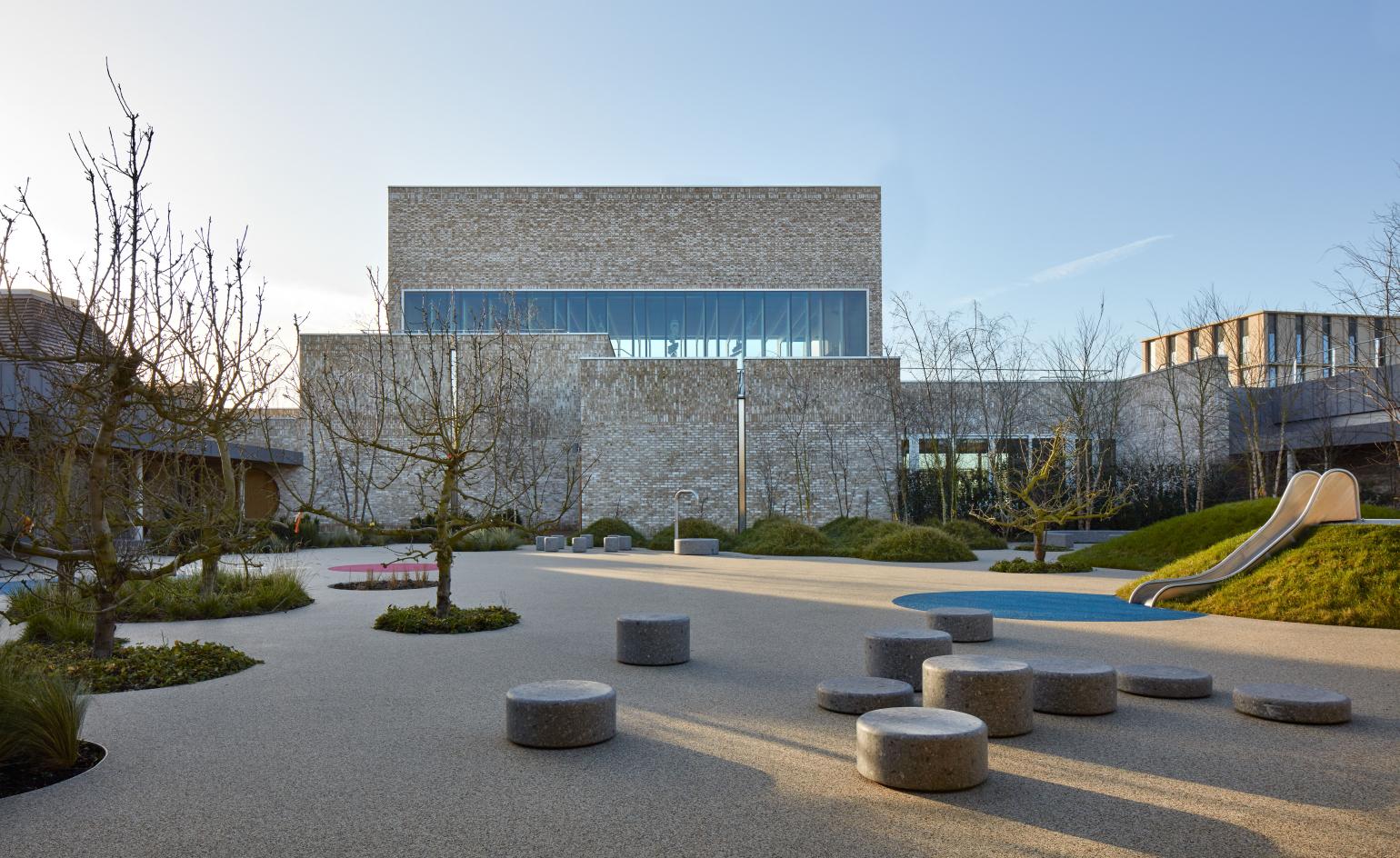
The Storey’s Field Community Centre and Nursery by MUMA
Cambridge, UK
2018
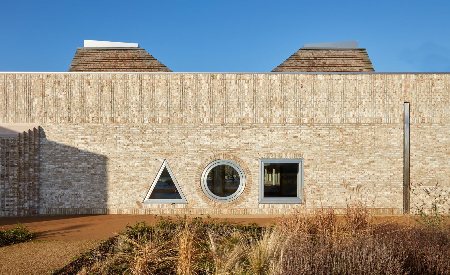
The centre followed clear sustainability and biscuit-coloured brick guidelines, neatly slotting into the masterplan with a warm and uplifting design for the new community.
Wallpaper* Newsletter
Receive our daily digest of inspiration, escapism and design stories from around the world direct to your inbox.
Ánimo South Los Angeles Charter High School
Brooks + Scarpa
2018
Brooks + Scarpa has designed new facilities for Ánimo South Los Angeles Charter High School, following the unfortunate burning down of half of the campus as the result of a faulty air conditioning unit. The most visually striking addition to the new structure is the 20 ft yellow metal wall, which wraps around the building’s exterior and forms a central courtyard at the heart of the facilities.
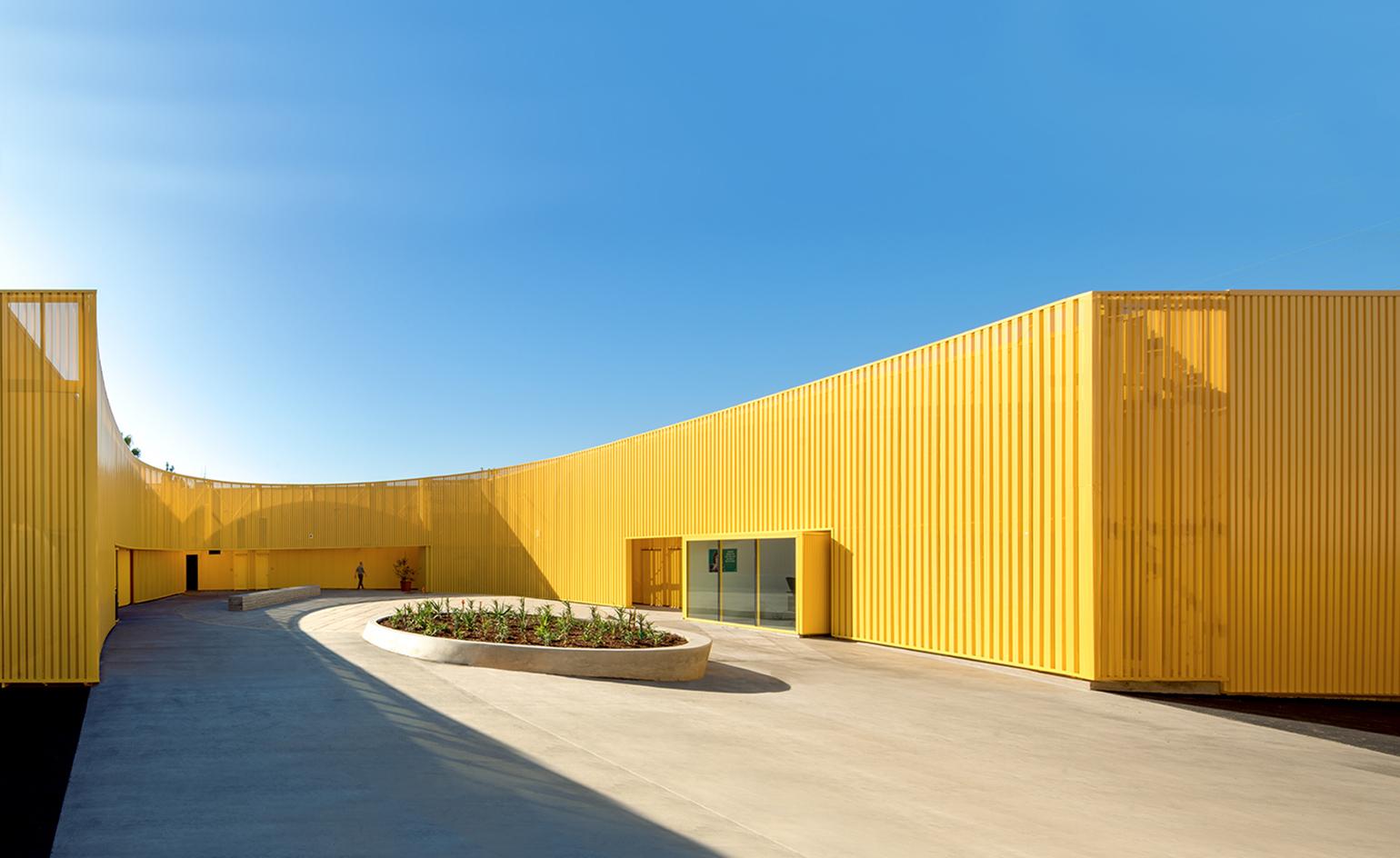
Ánimo South Los Angeles Charter High School
Brooks + Scarpa
2018
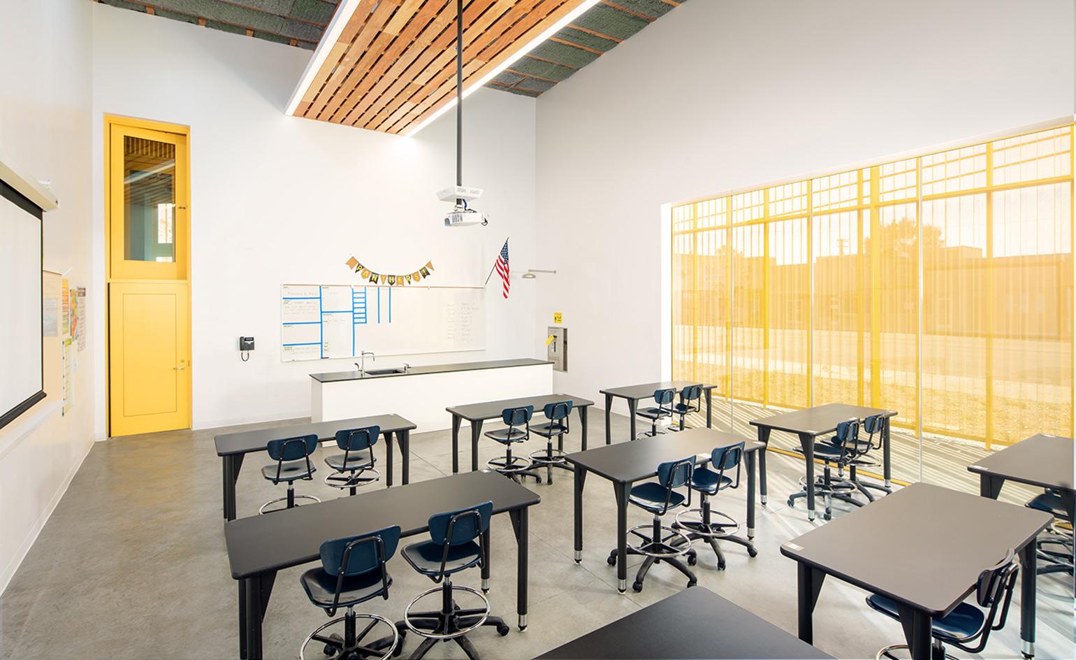
18,000 sq ft in size, the space was designed to reflect the school’s ethos of being a safe environment for study and socialising. Cost-effective in production, the perforated anodized aluminium façade maximises security, enhances privacy and filters natural light and ventilation throughout the new rooms. The new facilities include 11 new classrooms, two new science labs, administrative and counselling offices and more.
Sissi’s Wonderland library by Muxin Studio
Shanghai, China
2017
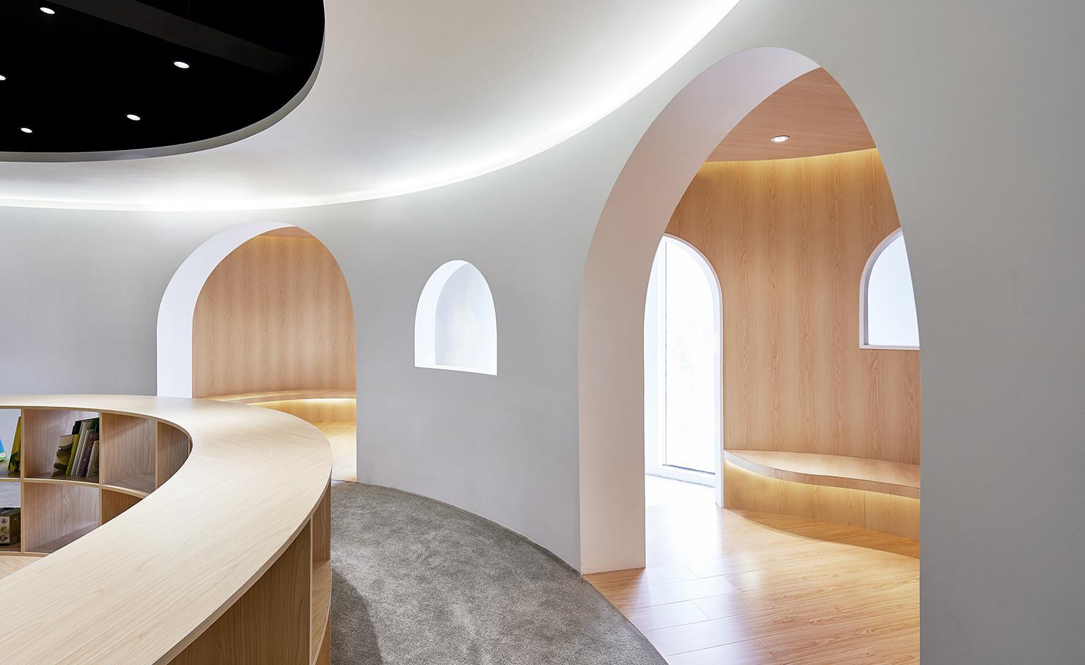
Designed as a smooth environment for children to play and learn, this children’s library in the Pudong area of Shanghai is a cosy hub for education and activity. Tactile materials such as polished timber and thick carpet were chosen for the curved, flowing space that was designed as a giant toy. Alcoves, shelves and benches are easily accesible to children and arched doorways and windows create private spaces for spending quiet time.
City Of London Freemen’s School, Swimming Pool by Hawkins\Brown
Surrey, UK
2017
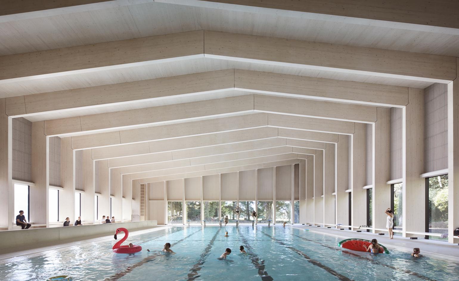
The scheme provides a 25m, six lane competition pool with associated changing facilities and a flexible teaching / event space. The most important internal space is the pool hall. The roof and walls of this space are constructed almost entirely from exposed, white stained timber. The interior strategy works with this natural material and chooses a complimentary palette of colours and textures. Internal views from the reception and event space in to the pool hall are framed by deep window seats. In addition these three key spaces all have panoramic views towards the surrounding woodland.
Wonderlab by Muf Architecture/Art
Science Museum, London, UK
2016
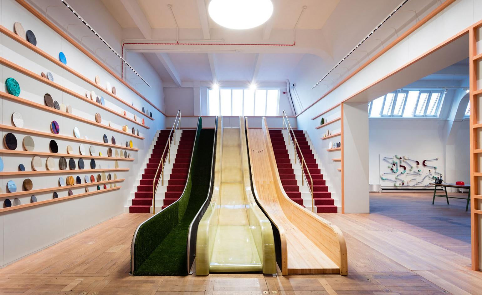
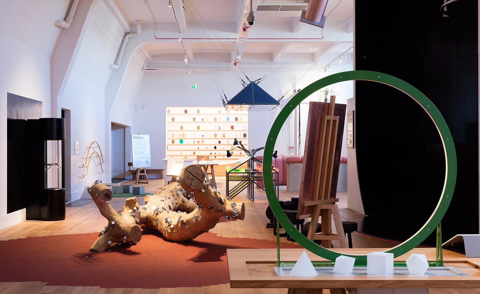
Combining science with craft, design and art, the Wonderlab at London's Science Museum has been designed for school groups, yet bespoke details, contemporary art and comfortable seating make the experience adult-friendly too. A contemporary reinvention of the Children’s Gallery which opened in 1931, the gallery was a part of the museum designated for children to play, experiment and learn in.
Courtesy of Science Museum
Wonderlab by Muf Architecture/Art
Science Museum, London, UK
2016
Divided into seven scientific zones, there are over 50 different exhibits uniquely designed by a whole range of collaborators for children to explore. A sense of history and narrative has been embedded through the choice of materials. Deep red quilted undercroft is paired with brass in the theatre, while in the more industrial gallery, air con vents are painted sparkly white and crystals are set into smooth wooden benches.
Courtesy of Science Museum
Clover House Kindergarten by MAD
Okazaki, Japan
2016
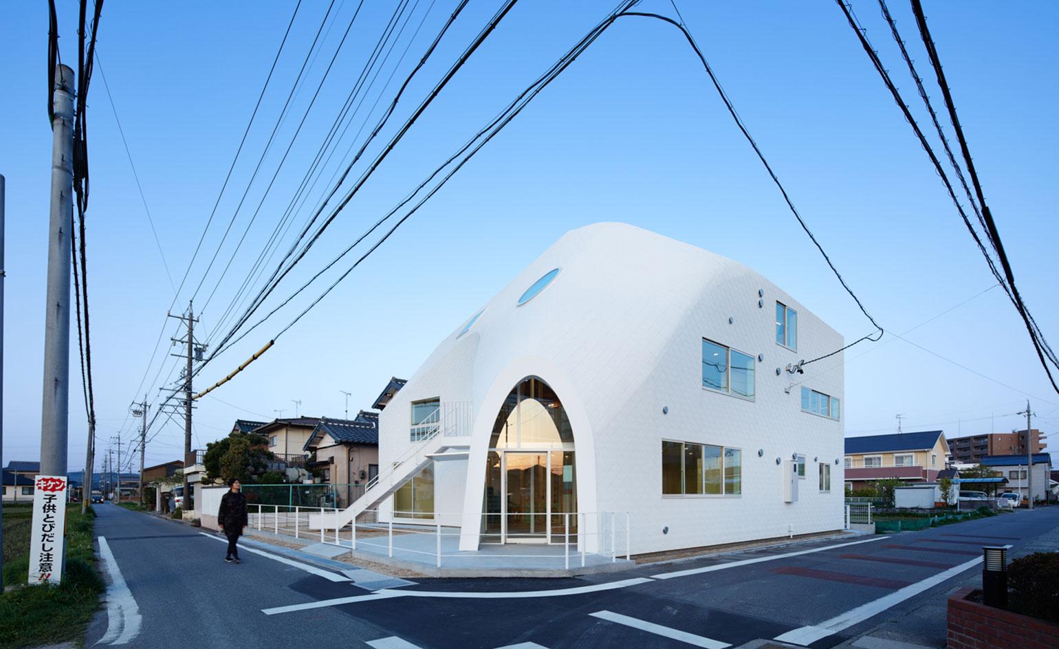
Childcare architecture often aims to emulate warm, homely environments for its precious little guests. In the case of a new kindergarten in Japan, things have gotten even more literal. The Clover House nursery used to be a two-storey house, nestled in a quiet residential street in the small town of Okazaki; now, it has been dynamically transformed into its current use by Chinese architecture firm MAD. Aiming to create a nurturing and inspiring environment for young‘uns, the house’s owners commissioned the architects to lead their dream project, redesigning their own home into a kindergarten.
Clover House Kindergarten by MAD
Okazaki, Japan
2016
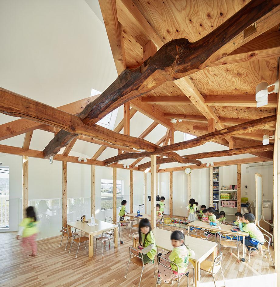
The interior is playful and fresh, with light flooding in from several windows of different shapes and sizes, punctured into the façade. The house’s traditional pitched roof was also maintained, but everything was wrapped in a new skin, blurring the boundaries between what’s new and what pre-existed. Adding an extra dollop of playfulness, the space comes complete with a slide leading from the second floor down to the outdoor play area and the building’s front courtyard.
Hootz House indoor play centre by Adam Khan
Pensthorpe Natural Park, Norfolk, UK
2016
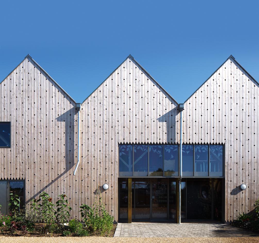
Adam Khan, a London-based architect and father of three, remembers all too well those hours spent ‘sitting on a leisure centre chair, inhaling the smell of wee and burgers’, as his kids played merrily. ‘I’d wonder why these places are so depressing when often a great deal of effort goes into creating them in the first place.’ Khan decided to reinvent the indoor play centre with Hootz House. Pictured here, the wooden exterior features a grid of 50mm holes in which insects and birds are invited to take up residence.
Hootz House indoor play centre by Adam Khan
Pensthorpe Natural Park, Norfolk, UK
2016
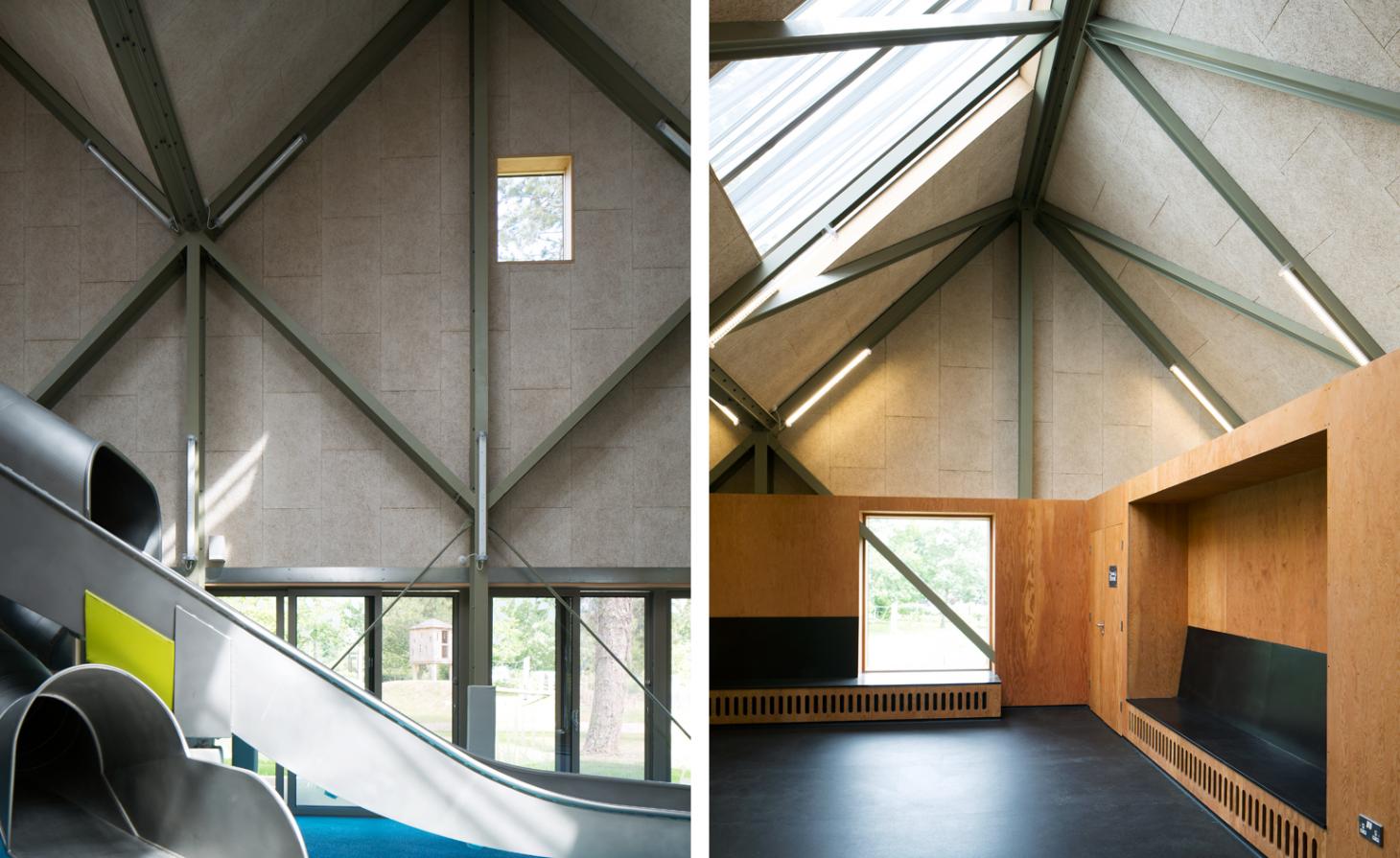
Taking cues from Tumbling Bay, the Olympic Park’s adventure playground, Khan also designed WildRootz, a 7,000 sq m playground filled with rope walkways and wooden huts, tunnels and burrows, zip wires and slides. Khan applied the same philosophy to the 530 sq m Hootz House. An assault course of ropes, slides, bridges and huts, it’s a challenge for any teeny Tough Mudder keen to flex their muscles in real time. There’s also a party room, a decent café and a mezzanine where adults can sit and survey the scene below in style.
Kindergarten by Feld72
South Tyrol, Italy
2010
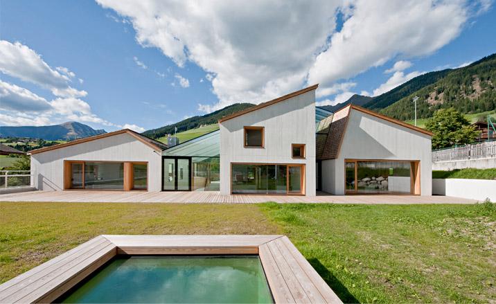
Located in South Tyrol, Italy, this elegant new kindergarten was designed by Vienna- and Bolzano-based architects Feld72. The brief was to create a daycare centre that would be able to ‘speak’ equally to both children and adults, as well as connect with the local culture (a heady mix of German, Italian and local Ladin) and the area’s Alpine nature. One of the team’s main aims was for the building to relate to the nearby structures, using traditional elements and translating them into contemporary forms.
Kindergarten by Feld72
South Tyrol, Italy
2010
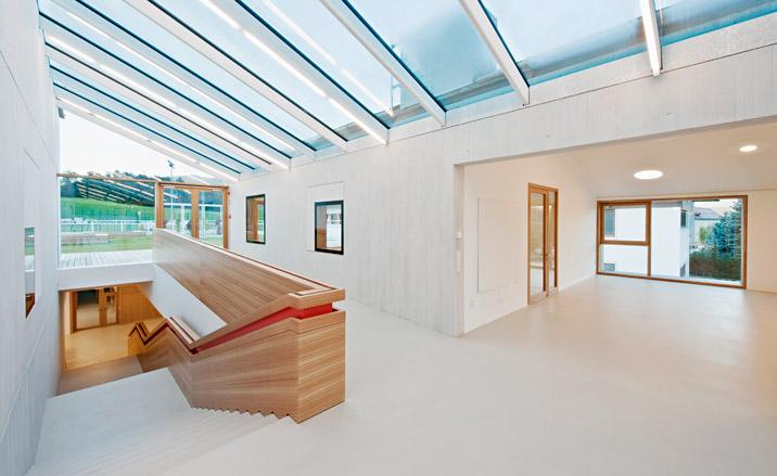
In an attempt to help the pupils recognise their classroom and feel familiar with their own space within the large complex, the architects designed the building as three adjoined ‘houses’. Using these abstract house shapes, the interiors are differentiated and the structure is divided into obvious ‘wings’. Functional and effective, the design secures the students’ as well as the nature’s wellbeing. All the classrooms are south facing, with skylights and large windows providing the interior with plenty of natural light.
Els Colors Kindergarten by RCR
Manlleu, Barcelona, Spain
2004
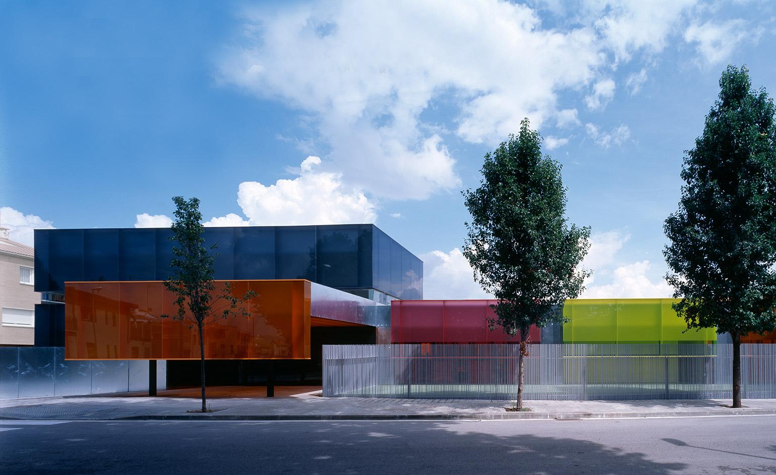
The structure of the school for 0 to 3 year olds is made of steel, concrete, laminated glazing and opaque aluminium. The north and south facades feature galzanised sheeting which functions for shade and insulation.
Els Colors Kindergarten by RCR
Manlleu, Barcelona, Spain
2004
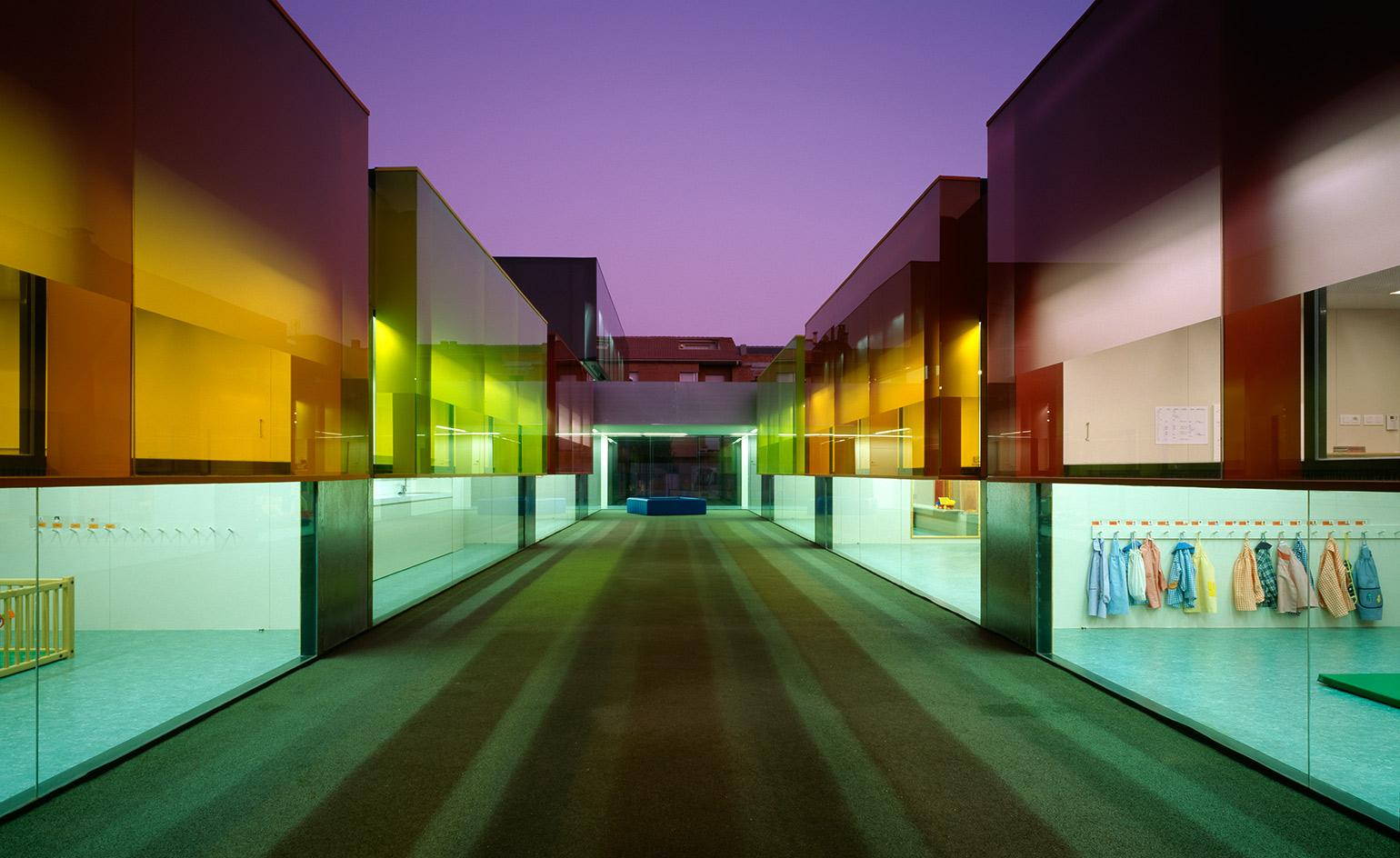
El Colors pre-school in Manlleu (central Catalonia) is projected as a series of simple, geometric glass volumes of varying colours, each one denoting a different function. Their dimensions and placement have been designed from the perception of young children, with the aim of developing spatial awareness.
Ellie Stathaki is the Architecture & Environment Director at Wallpaper*. She trained as an architect at the Aristotle University of Thessaloniki in Greece and studied architectural history at the Bartlett in London. Now an established journalist, she has been a member of the Wallpaper* team since 2006, visiting buildings across the globe and interviewing leading architects such as Tadao Ando and Rem Koolhaas. Ellie has also taken part in judging panels, moderated events, curated shows and contributed in books, such as The Contemporary House (Thames & Hudson, 2018), Glenn Sestig Architecture Diary (2020) and House London (2022).
-
 In Wales, Michelin-starred Gorse celebrates the country’s abundant larder
Gorse is the first Michelin-starred restaurant in Cardiff, putting Welsh cuisine on the map. We speak with chef and founder Tom Waters about the importance of keeping culinary traditions alive
By Tianna Williams
-
 Ludmilla Balkis’ organic, earthy ceramics embody the Basque countryside
The sculptor-ceramicist presents a series inspired by and created from found natural objects in a New York exhibition
By Anna Solomon
-
 At this secret NYC hangout, the drinks are strong and the vibes are stronger
For People's bar, Workstead serves up a good time
By Anna Fixsen