Shanghai sprawling: the Chinese mega-city’s best architecture and design
Modern Shanghai is the epitome of China’s intense economic development. The continual construction here, fuelled by big government investment, is astonishing, and large international architecture firms (OMA, Tadao Ando, Heatherwick Studio) are vying for their piece of the pie. A burgeoning art scene, a flighty dining and nightlife scene where bars and restaurants open, close or morph into a totally different entity from one month to the next and clued-up hipsters hop from supper to gallery to party to late-night karaoke session. Here we explore Shanghai through its architecture and design. It’s a ride you really shouldn’t miss.

Receive our daily digest of inspiration, escapism and design stories from around the world direct to your inbox.
You are now subscribed
Your newsletter sign-up was successful
Want to add more newsletters?
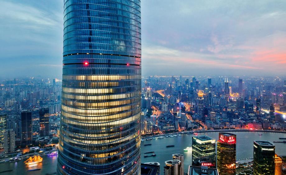
Shanghai’s tallest tower reaching 632 m designed by Gensler
The Shanghai Tower – Shanghai’s most anticipated architectural marvel – launched in 2017 after breaking ground in 2008 – tops out at 632 metres, making it the city’s tallest tower and second in the world, at least for now. It’s also been garlanded for its green initiatives. Its asymmetrical, spiralling profile helps it withstand typhoon winds. The tower uses wind turbines, collects rainwater and has a double-glass skin for cooling and ventilation – allowing it to cut thousands of tonnes from its carbon footprint. And, like a vertical city, it accommodates sky lobbies at multiple levels that act as natural refuges for workers in the upper floors. For this, it was allowed to boast the first LEED Platinum rating among super-tall towers.
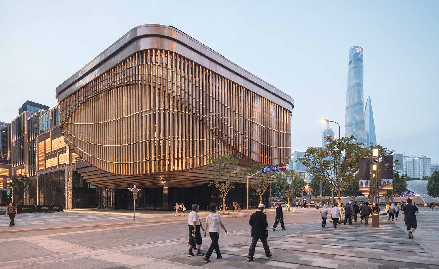
Thomas Heatherwick and Foster + Partners’ Fosun Foundation
Located on Shanghai’s waterfront, this sweeping arts and culture centre by Foster + Partners and Heatherwick Studio is a new destination for the financial district. The facade is constructed of a series of bronze bamboo shoot tubes that vary in height creating the effect of a sweeping architectural curtain that rotates to the sound of music. The layered form of the building is inspired by traditional Chinese theatres and the building has four floors above ground and three below.
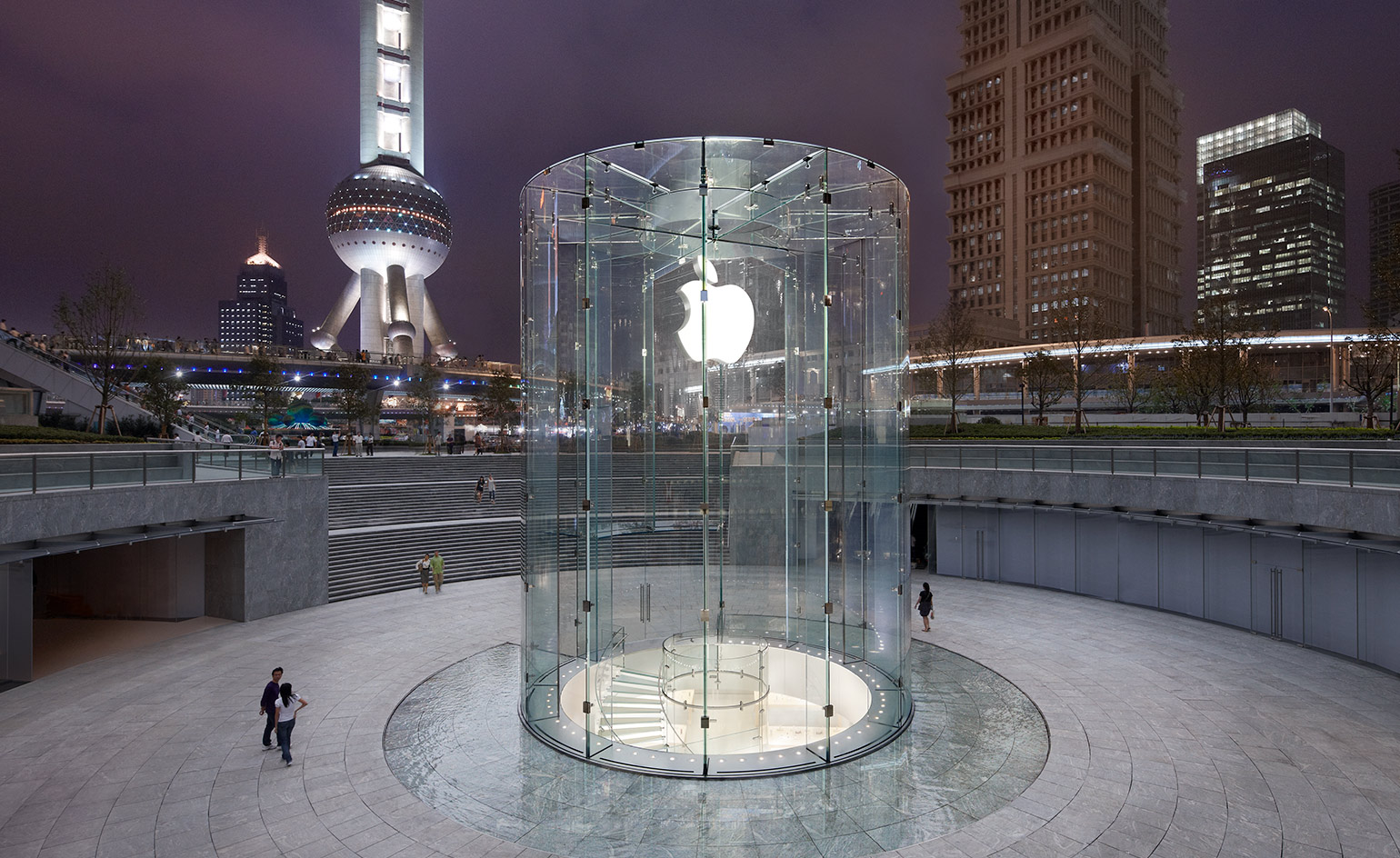
Shanghai’s Apple Store in Pudong designed by Bohlin Cywinski Jackson
China’s first Apple Store designed by Bohlin Cywinski Jackson opened in 2010 and is set in a circular landscaped garden. Visitors enter above ground into a 41 ft glass cylinder and sink down into the lower ground floor level via a spiralling staircase made of glass into the circular-shaped plan of the store, which is inspired by the technology of the Apple products.
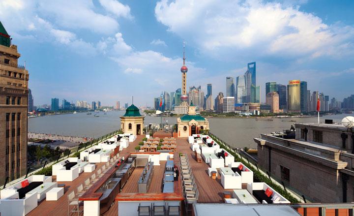
Take in the view from the artsy Swatch Art Peace Hotel in Shanghai
The rooftop terrace of the Swatch Art Peace Hotel in Shanghai – the hotel formerly known as the Palace Hotel (opened in 1909), the building has been re-set as an ‘art residence’ for jet-set artists and travellers by new leaseholders, the Swatch Group. The former Palace Hotel fronting Shanghai’s Bund waterfront is one of the city’s oldest hotels. In its opening year, 1909, the First International Opium Commission was held here, and Chiang Kai-shek and Soong Mei-ling celebrated their engagement in 1927.
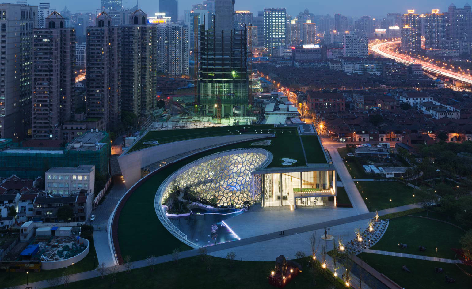
Perkins+Will’s Natural History Museum in the Jing’an Sculpture Park is surrounded by the soaring tower blocks of downtown Shanghai
With a captivating collection of over 10,000 artefacts – including everything from dinosaurs to deep-sea monsters and mummies from the Ming Dynasty – the new home for the Shanghai Natural History Museum, designed by internationally acclaimed practice Perkins+Will, captures the essence of nature through biomimicry. Previously housed in the former 1920s Shanghai Cotton Exchange, the old museum suffered from space constraints and was able to display just one percent of its entire collection at any given time. In contrast, the generous new structure accommodates six levels of exhibition space and offices, a 30m high entrance lobby and an IMAX cinema, covering a total area of 45,086 sq m.
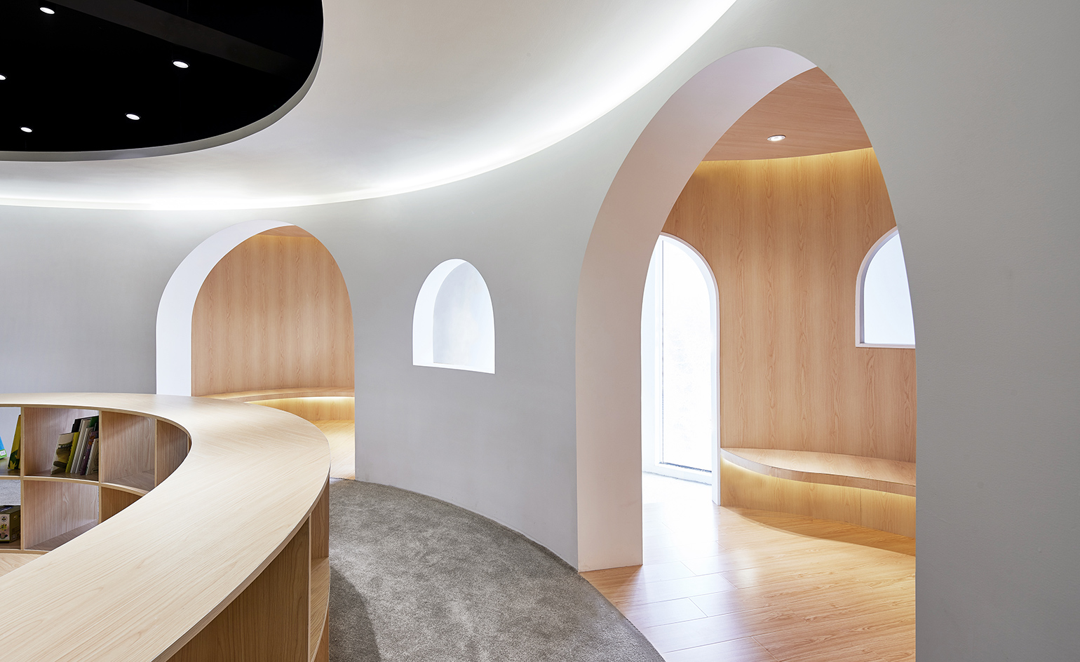
Sissi’s Wonderland library for children designed by Shanghai-based Muxin Studio
Designed as a smooth environment for children to play and learn, this children’s library in the Pudong area of Shanghai is a cosy hub for education and activity. Tactile materials such as polished timber and thick carpet were chosen for the curved, flowing space that was designed as a giant toy. Alcoves, shelves and benches are easily accesible to children and arched doorways and windows create private spaces for spending quiet time.
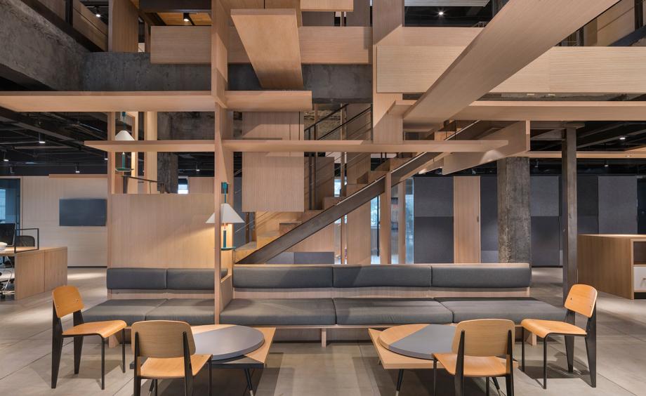
Behind the scenes at Dariel Studio’s redesign of Wieden+Kennedy’s Shanghai office
For the redesign of Wieden+Kennedy’s Shanghai office, Dariel Studio stripped back the existing office space revealing the raw structural materials, then added new functionality and a sculptural framework to unify and inspire the space. At the core of the office, the symbol of the tree was used as a stylistic and conceptual design reference, reflecting the creativity and growth of the advertising agency – founded in 1982, Wieden+Kennedy now has eight international offices and a client base that includes major brands such as Nike, Heineken and Tiffany & Co.
Receive our daily digest of inspiration, escapism and design stories from around the world direct to your inbox.
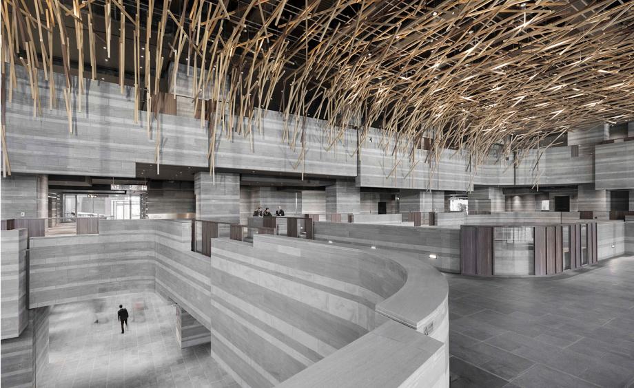
The HUB Performance Exhibition Center, Shanghai designed by Ben Wood with interiors by Neri & Hu
This performance centre by architect Ben Wood is the banner project at the centre of Hongqiao – a Shanghai suburb of 25,000 expats and exponentially more locals – and its new cultural and commercial district that complements its massive airport and rail hub. Elegant interiors by marquee designers Neri & Hu soften the industrial edges – obsessed with history and tradition, the firm has layered cool grey local sandstone in striations around a five-storey atrium, and built out interior balconies like jagged rock face. Behind, bridges and pathways lead to private meeting spaces dressed in slick wood panelling, brassy chainmail and Ming-blue tiles hand-painted with a pictorial history of the neighbourhood. But most noticeable is the soaring canopy of wood thatch across the vaulted ceiling.
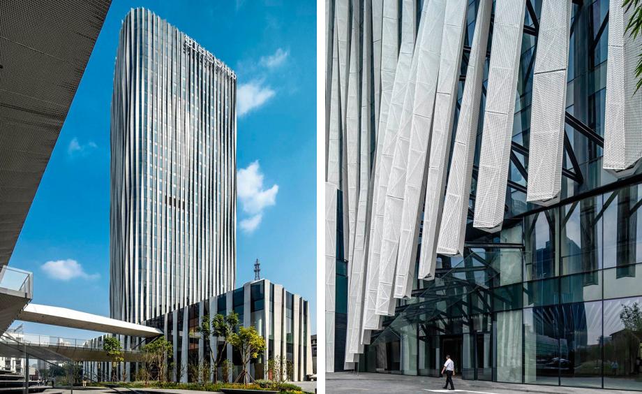
The ‘pleated’ facade of Hongkou Soho designed by Kengo Kuma
Kengo Kuma wanted his Shanghai office tower to contrast with the ‘hard’ buildings we’re used to. For this property, north of the Bund riverfront, he designed an overlay of 18mm aluminium mesh, pleated like a Gucci skirt and flaring out at the bottom to expose a glazed façade. Inside, there is barely a solid expanse of wall, as the pleated aluminium continues, alternating with waves of stone that cascade over the workspaces – many of which are open for public hot-desking. Bathed in light and parcelled only by interior glass, the undulating spaces have a moody atmosphere that changes depending on the time of day.
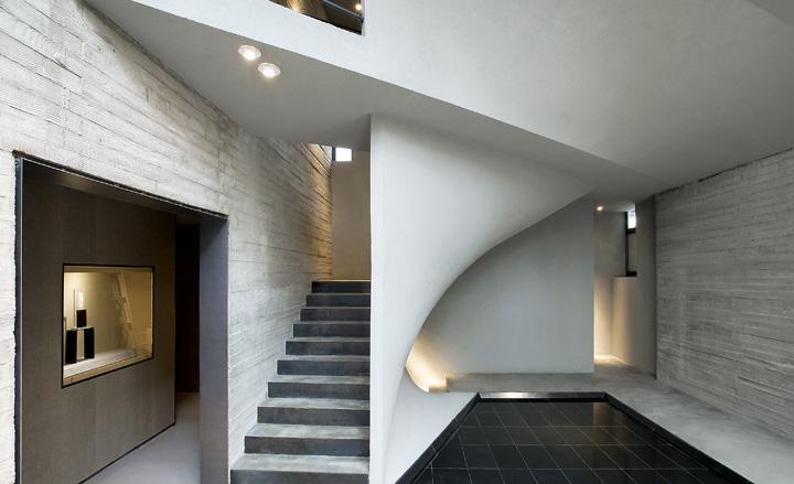
Tradition meets modernity at the Shanghai Jade museum designed by Archi-Union
Shanghai practice Archi-Union went inside a standard century-old building in central Shanghai and completely redefined its logic. With split-levels, lofts, mezzanines, caverns and peek-a-boo openings in the undulating walls, the decade-old practice created not an interior but an experience. The fluctuating staircase is a vehicle in the true sense of the word, transporting visitors across various platforms, into light or dark, smooth or textured, public or private spaces. The architects emphasise a connection between the old green stone and the futuristic grey concrete of the striated rendering. They both unfold gradually in a non-linear way, telling their own stories and entering into their own dialogue despite their contrasting properties. It offers a visually peaceful retreat from the harsh reality of the modern city.
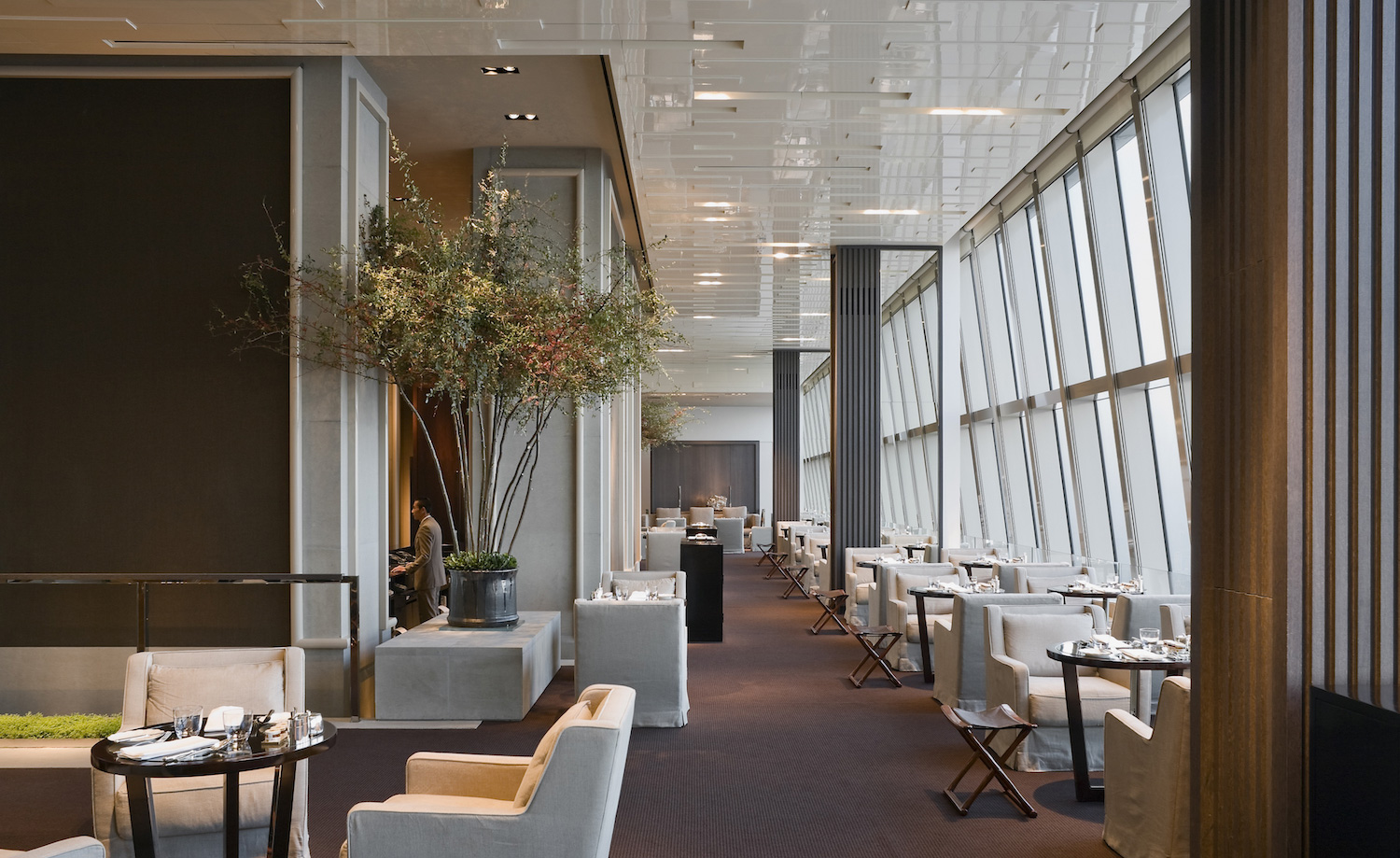
The highest hotel in the world at the Park Hyatt, Shanghai designed by Tony Chi & Associates
Occupying the 79th to 93rd floors of the city’s new World Financial Center (SWFC) the hotel is currently the highest in the world. The building itself – at 1,614 ft – stands tall among the the multitude of skyscrapers that now define the city’s impressive skyline, east of the Huangpu River in an area known as Pudong. In contrast to the frenzied chaos outside, where more than 18 million people elbow their way through city life, the mood inside is significantly serene, thanks in part to New York-based firm Tony Chi & Associates who have upheld the Park Hyatt brand’s understated philosophy with a sleek interior scheme using plush leathers and elegant streamlined timber, in a low-key colour palette highlighted with thoughtful, discreet lighting. All this does little to detract from the main event - the awe-inspiring views of the city - that are framed by the building’s floor-to-ceilings glass windows. If just being in the hotel wasn’t calming enough, there is a soothing spa with a 20 metre infinity pool followed by a Tai Chi Courtyard where daily sessions are held.
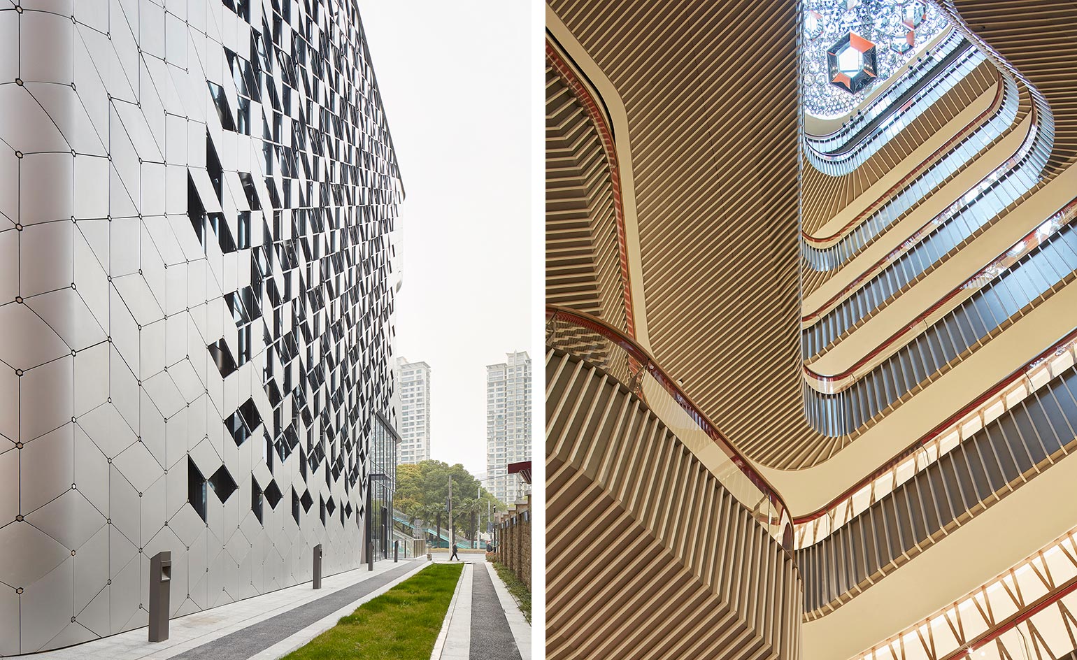
UN Studio’s ‘vertical city centre’ at Lane 189 in Putuo
Found in the Putuo neighbourhood of central Shanghai is a mixed use project that combines retail, resaurants and office spaces described by UN Studio as ‘vertical city centre’. The statement facade is based on a hexangonal grid and glazed double-height openings reveal the heart of the building to the street. A central void in the centre of the building is defined by a series of pocketed spaces, plateaus and intimate plazas.
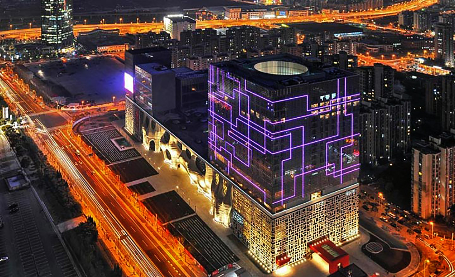
The Himalayas Centre in the Pudong area of Shanghai, designed by Arata Isozaki
Shanghai’s Pudong is possibly the best example of a place that's risen from virtually nothing. Two decades ago it was nigh on unpopulated; today it is a showcase of some of Asia’s boldest architecture, a prime example of ‘if you build it, they will come’. Japan’s Arata Isozaki rolls out the welcome wagon with his Himalayas Center, completed in March, inspired by feng shui, Chinese characters and artist Mondrian's Neoplasticism movement. The result – anchored by an ‘urban forest’ at centre – is as complicated as it is magnificent.
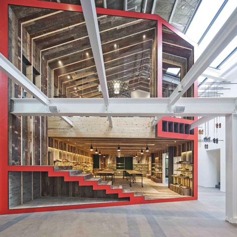
Neri & Hu’s flagship showroom for Camper
Architectural duo Lyndon Neri and Rossana Hu’s innovative designs have put them at the forefront of contemporary design in China, making them Camper’s first port of call when it came to creating the Spanish shoe brand’s new flagship showroom and office in Shanghai. Erected within an industrial warehouse in the French Concession, the store’s ‘building-within-a-building’ concept draws inspiration from the city's ‘nong-tangs’, or traditional urban alleys.
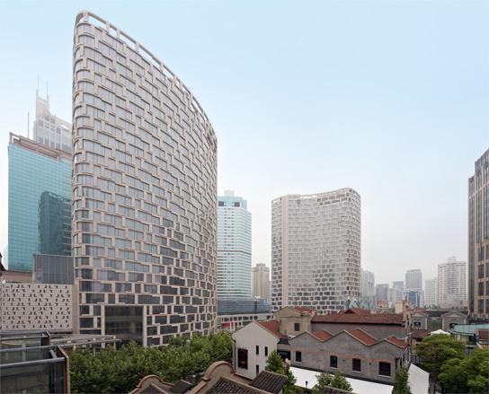
The Andaz Shanghai designed by Kohn Pedersen Fox in the Xintiandi district
After a decade of sometimes ill-thought-out development across Shanghai, these low-rises in the smart Xintiandi district are doing right by the city. The shapely stone-clad structures, designed by multi-national practice Kohn Pedersen Fox (with offices in Shanghai and Hong Kong), provide a fantastical backdrop to the historic village that lies beyond, offering a new experience from every angle. The first to open, in early 2011, houses the luxury Langham hotel. Asia's first Andaz launched in the second building at the end of the year.
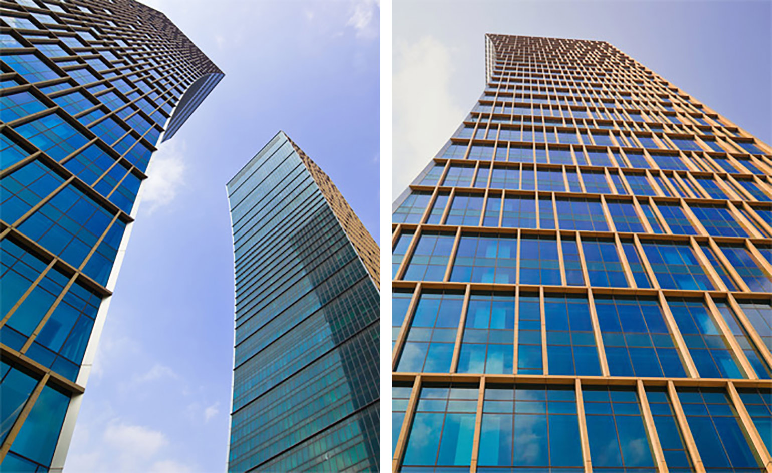
Monuments to finance: the CITIC Towers by Miami-based Arquitectonica
Twin concave stone-and-glass towers by Miami-based practice Arquitectonica are simple yet striking monuments to China’s banking might (they’re occupied by the Agricultural Bank of China and China Construction Bank). And yet the riverfront site, the former Shanghai Shipyard, informed the design, including the nautical symmetry and the negative space between the towers, which resemble a gateway.
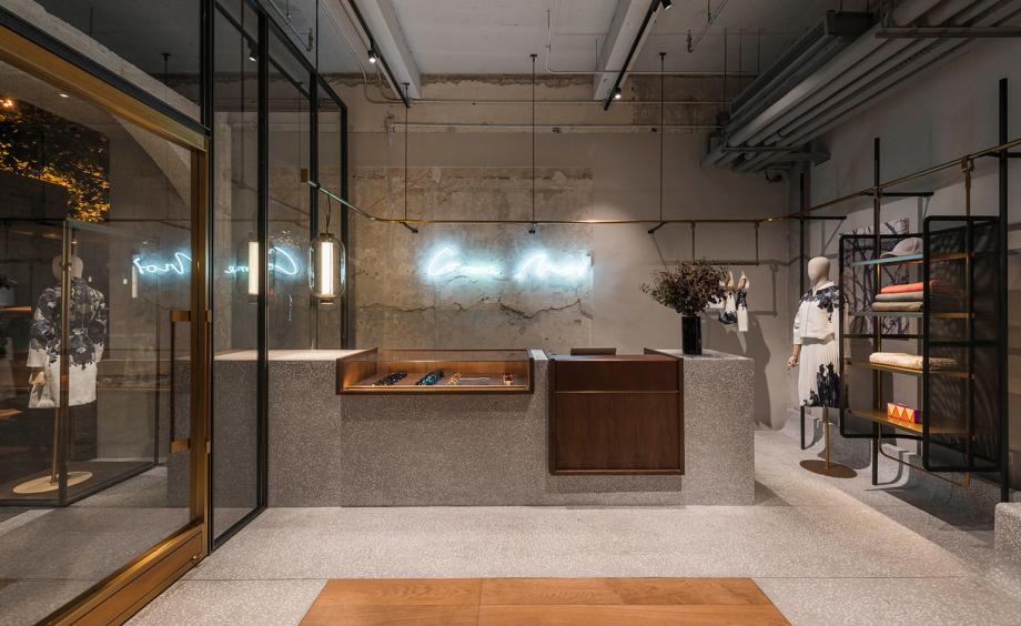
Neri & Hu’s Comme Moi flagship in Shanghai
Chinese supermodel Lu Yan stayed close to home when it came to commissioning Shanghai-based designers Neri & Hu to create a new flagship store for her fledgling fashion brand Comme Moi. The new boutique, occupying a prime spot within Shanghai’s Art Deco Donghu Hotel, initially presented Yan with something of a challenge. Built in the 1920s, it had undergone numerous renovations, its myriad of previous tenants leaving traces behind. Upon entering, visitors are met with a sequence of four intimate chambers linked with a retro futuristic brass rail that flows continuously throughout the store. It not only acts as a unifying visual theme but also doubles as a distinctive frame for the designers’ metal mesh, cage-like cabinets. Other design highlights include a series of full-length mirrors dotted around the store that add a feeling of spaciousness.
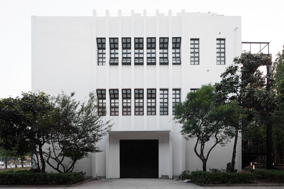
The modern design wing of the Shanghai Museum of Glass
The design wing at the Shanghai Museum of Glass is part of the G+PARK campus of new and refurbished buildings on the grounds of a disused glass factory. The 2,100 sq m, two-storey and unmistakably modern structure, completely renovated by Shanghai-based museum specialists Coordination Asia, is now also connected to the museum’s Main Hall by a new bridge of tinted glass that creates a special holographic effect of yellow, red and green.
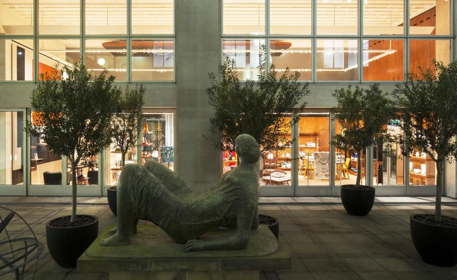
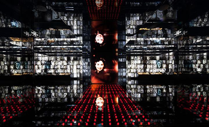
The experiential Shanghai Film Museum designed by Coordination Asia
Built in the 19th century, this film studio languished for decades before its rehabilitation this spring as a four-storey, 15,000 sq m experiential tribute to Chinese film. Tilman Thürmer of Shanghai practice Coordination Asia designed the cavernous space, dedicating each section to an interactive exhibit, from screening and streaming rooms to real sound stages, vitrines of memorabilia, ‘4D photo albums’, even a mock-up of the city's iconic Nanjing Road, visible in so many films over the years.
Thürmer ‘art directed’ the interior in a palette of white and black, with grey and metallic accents referring to the silver screen. In each room a play of light and shadow creates a mood that refers back to the medium. Yet it’s the thousands of artefacts, employed to theatrical effect, that steal the show.
Ellie Stathaki is the Architecture & Environment Director at Wallpaper*. She trained as an architect at the Aristotle University of Thessaloniki in Greece and studied architectural history at the Bartlett in London. Now an established journalist, she has been a member of the Wallpaper* team since 2006, visiting buildings across the globe and interviewing leading architects such as Tadao Ando and Rem Koolhaas. Ellie has also taken part in judging panels, moderated events, curated shows and contributed in books, such as The Contemporary House (Thames & Hudson, 2018), Glenn Sestig Architecture Diary (2020) and House London (2022).
