Building blocks: our edit of 2017's most striking structures around the globe
Some architects just love making a statement. From monumental monoliths to soaring skyscrapers, here we highlight the bold buildings disrupting skylines and shaking up our perspective of the urban environment
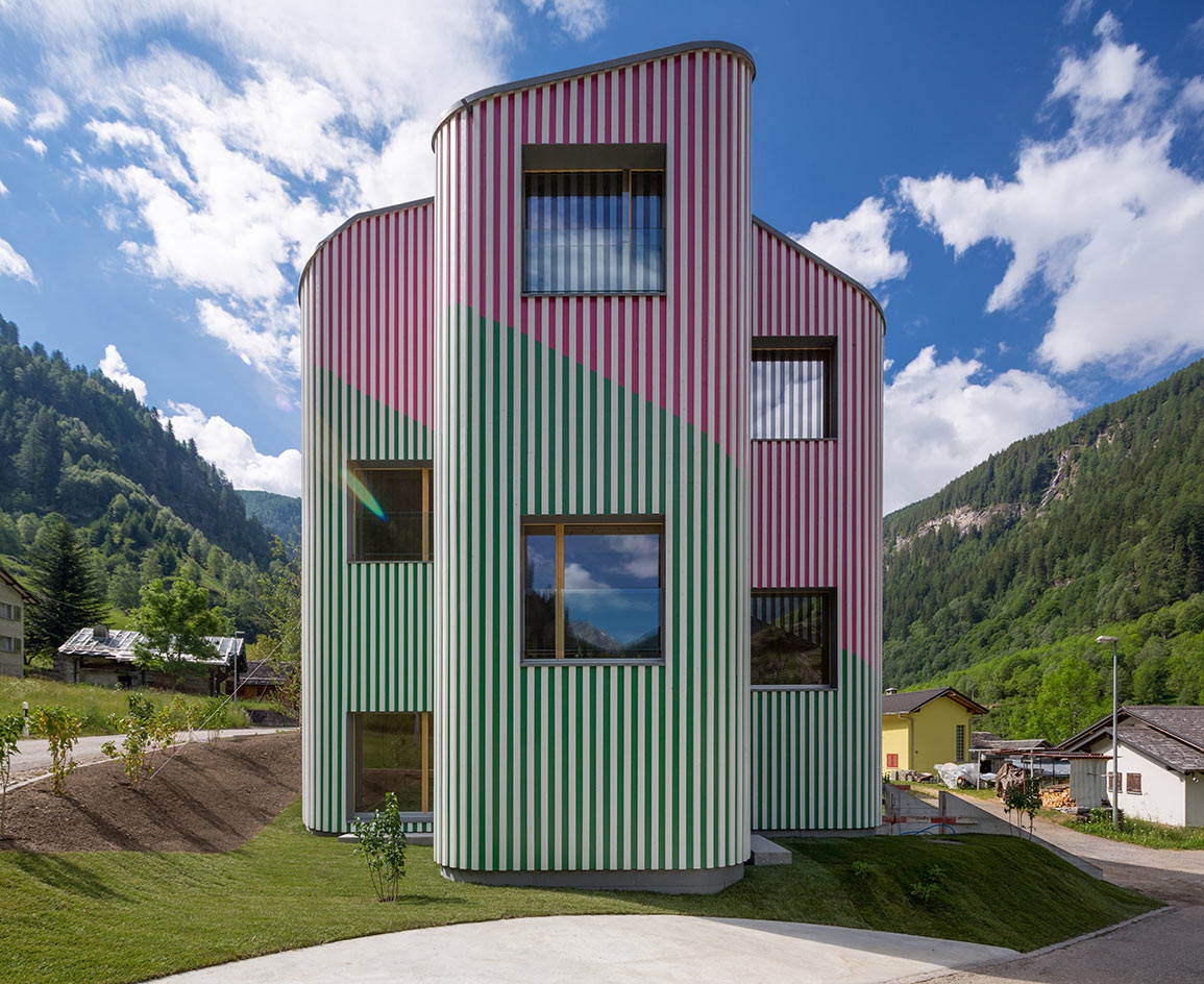
Swisshouse Rossa, Davide Macullo Architects
Rossa, Switzerland
Visitors to the village of Rossa in the Swiss Alps are coming face-to-face with a shocking pink-and-green-striped structure, an architecture/sculpture hybrid by Swiss practice Davide Macullo Architects and French artist Daniel Buren. While alien to its context in the scenic calanca valley, the building, named Swisshouse rossa, is a simple reinvention of the house archetype. constructed using traditional alpine building materials, the two-level structure is made entirely of wood with a reinforced concrete basement, while Buren’s bold stripes are designed to give a feeling of comfort to those who reside within. As originally featured in the November 2017 issue of Wallpaper* (W*224)
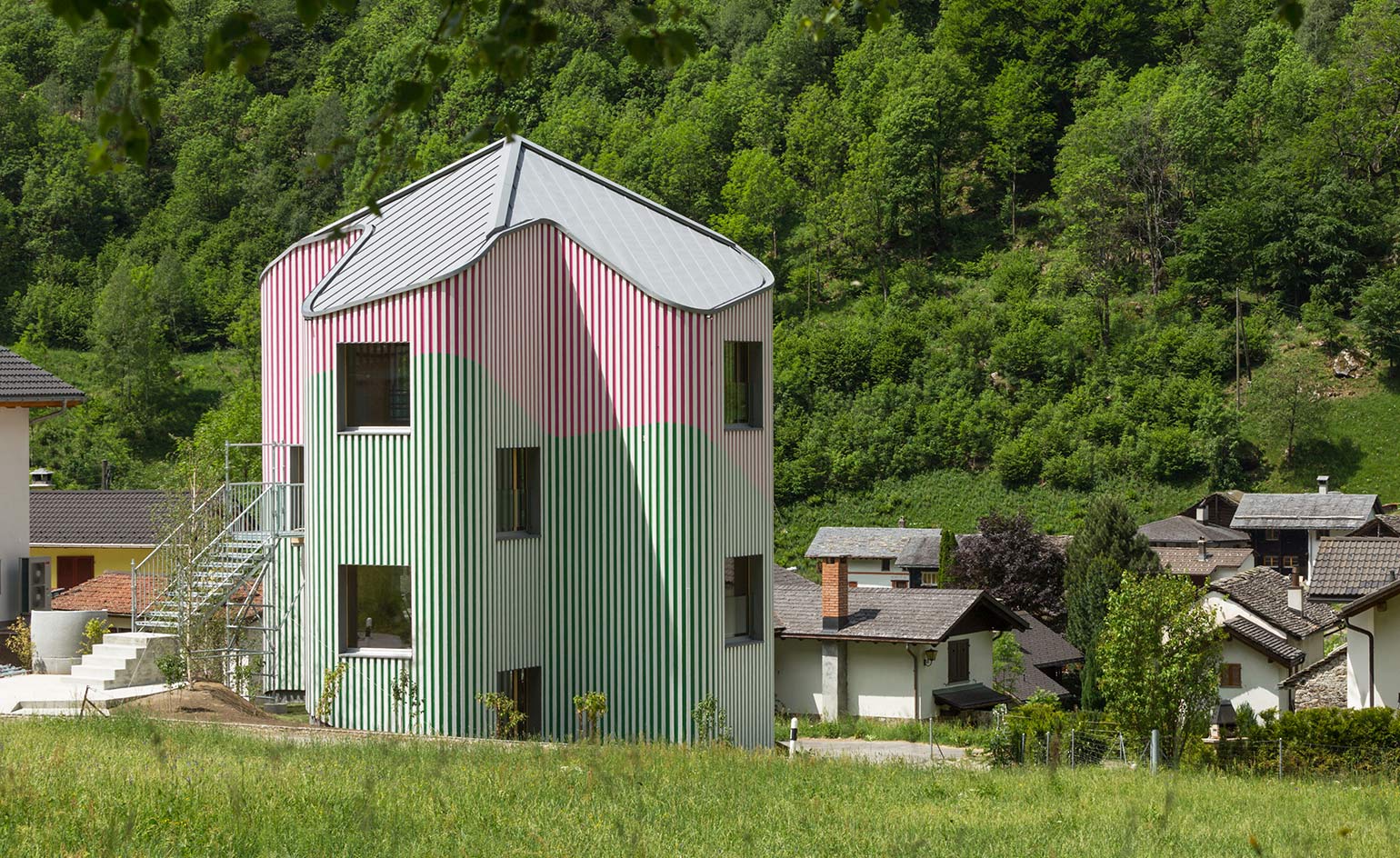
Swisshouse Rossa, Davide Macullo Architects
Rossa, Switzerland
The conceptual artist Daniel Buren is known for changing perspectives of the built environment, previously injecting his colourful vision into Le Corbusier’s Cité Radieuse in Marseille and Frank Gehry’s Fondation Louis Vuitton in Paris. now, Buren and Macullo have created their own work of public art and a modern fairytale in the mountains. As originally featured in the November 2017 issue of Wallpaper* (W*224)
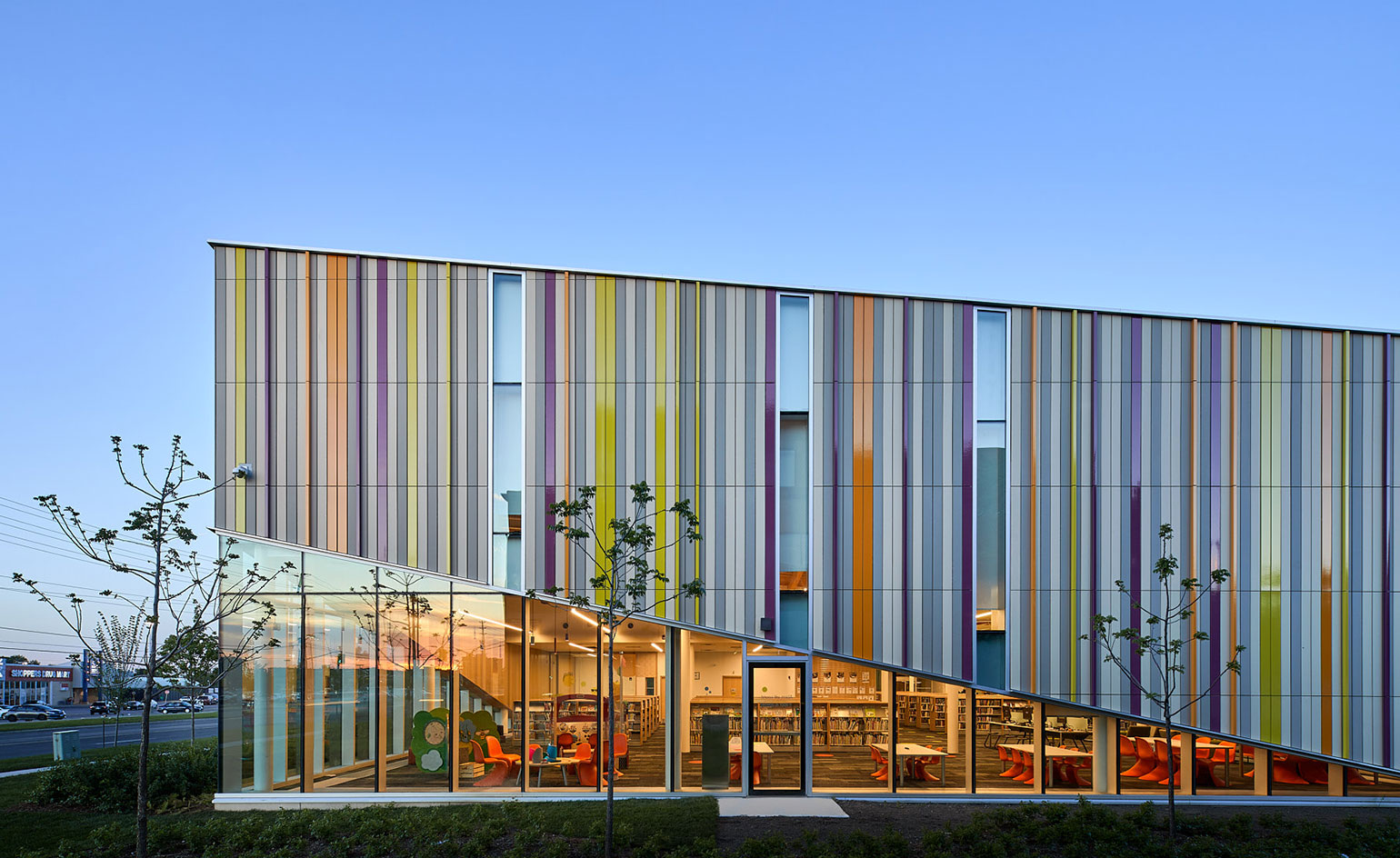
Albion Library, Perkins + Will
Toronto, Canada
A public library in Toronto’s Rexdale neighbourhood has been upgraded into an increasingly social space with a colourful terra cotta façade. Located between a residential area and a busy four-lane road, the geometrically playful block was a welcome addition to the largely concrete streetscape. Providing visibility and protection at once, the terra cotta layer covers an inner façade of glazing which allows plenty of light into the heart of the plan where internal courtyards and interior pavilions structure the design. Photography: Doublespace
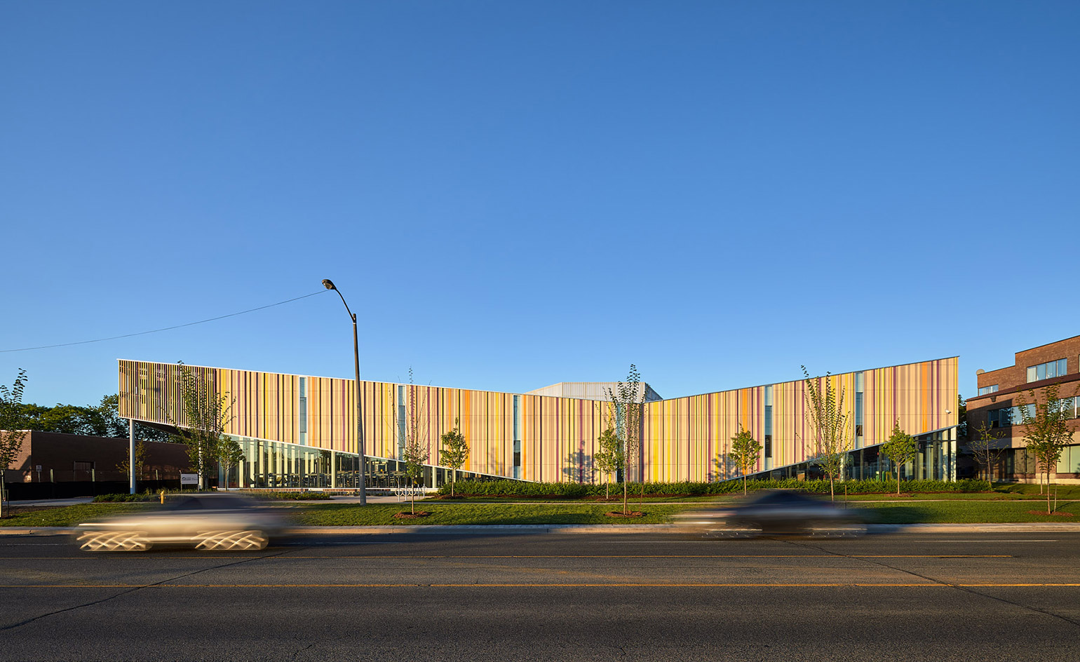
Albion Library, Perkins + Will
Toronto, Canada
The original brief was to close and renovate the existing library, yet architects Perkins + Will decided to build the new library on the underutilized parking lot, so the old library could stay functioning in its vital community role as one of Toronto’s busiest libraries. Now the upgraded library has opened, the former building will be redesigned into a public plaza, parking lot and market square space, as well new trees, seating and public pathways around the site. Photography: Doublespace
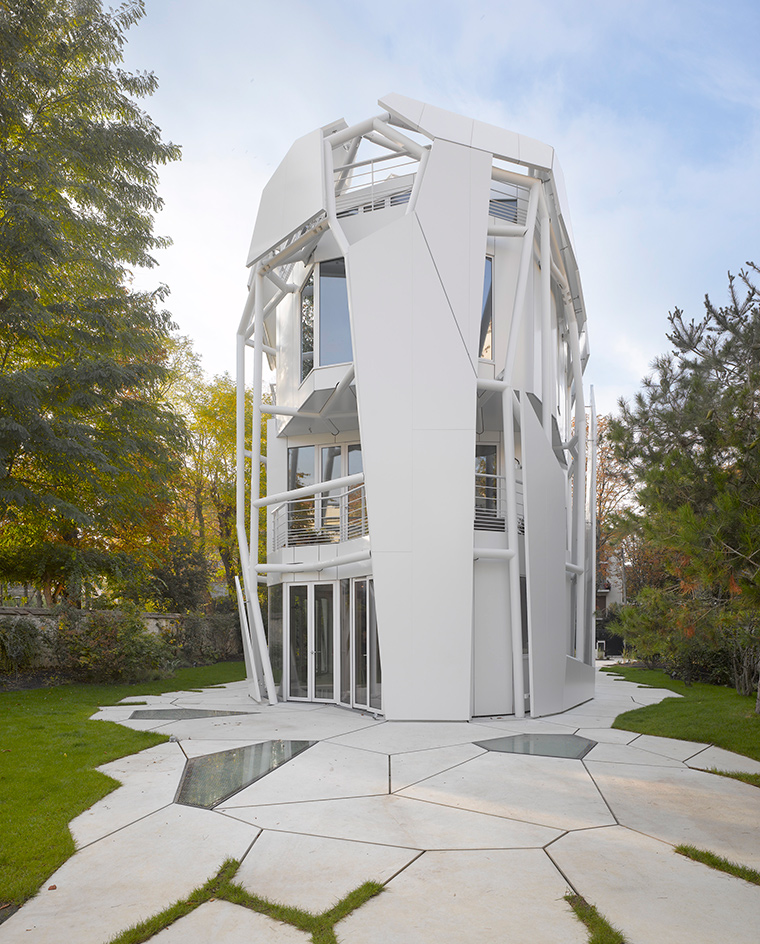
House S, Jakob + MacFarlane
Paris, France
This house by Jakob + MacFarlane sprouts from a site in the Parisian suburb of Boulogne-Billancourt. ‘It’s in a neighbourhood with several avant- garde houses built in the 1920s and 1930s by the likes of Le Corbusier and Mallet-Stevens,’ says Brendan MacFarlane, who started Jakob + MacFarlane with Dominique Jakob in 1997. The house reflects the shimmering white walls of its iconic precursors but takes a different structural direction. Rising like a fractured ovoid, its edges are defined by a branching tubular steel frame set over an internal steel-panelled skin. Five terraces are scattered throughout, while inside there are not one but two aquariums incorporated into the stair tower. Writer: Jonathan Bell
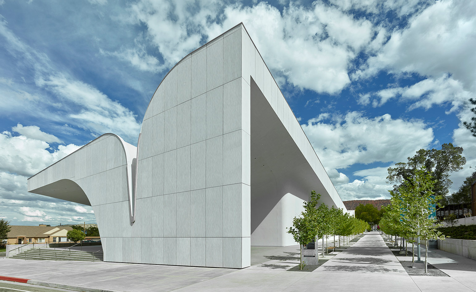
Southern Utah Museum of Art, Brooks + Scarpa
Utah, US
The sweeping roof of the new Southern Utah Museum of Art follows the shapely sandstone formations found at the nearby Bryce Canyon and Zion National Park. Designed by LA-based architecture practice Brooks + Scarpa, the SUMA is a response to the dramatic Utah landscape, and it is also responsive to the environment: the roof passively collects snow melt and storm water runoff that collects into concealed wells where it is than recharged back into an aquifer. Writer: Harriet Thorpe
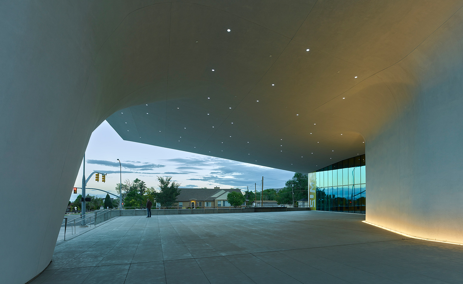
Southern Utah Museum of Art, Brooks + Scarpa
Utah, US
Beneath the undulating roof, sculptural space is designed for social gatherings. The roof also cantilevers out to the west to provide more sheltered outdoor space, and protects the glass façade of the building from solar glare. Surrounded by landscaped parks with native planting, the SUMA has been designed to accommodate outdoor events and performances. Writer: Harriet Thorpe
Wallpaper* Newsletter
Receive our daily digest of inspiration, escapism and design stories from around the world direct to your inbox.
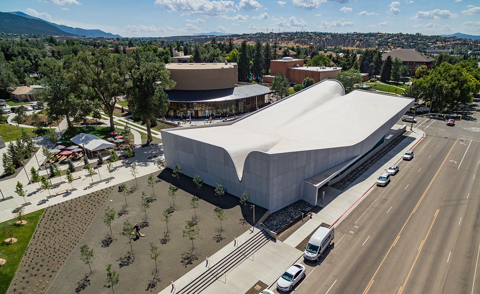
Southern Utah Museum of Art, Brooks + Scarpa
Utah, US
Located on the Beverley Taylor Sorenson Center for the Arts campus of the Southern Utah University, the new cultural landmark connects downtown Cedar City to the university and will provide a new social space for students and the public alike. The museum focuses on artists and culture of southern Utah and the surrounding Colorado Plateau, providing a home for the collection of work by local artist Jim Jones, as well as a place for regional artists and students to exhibit. Writer: Harriet Thorpe
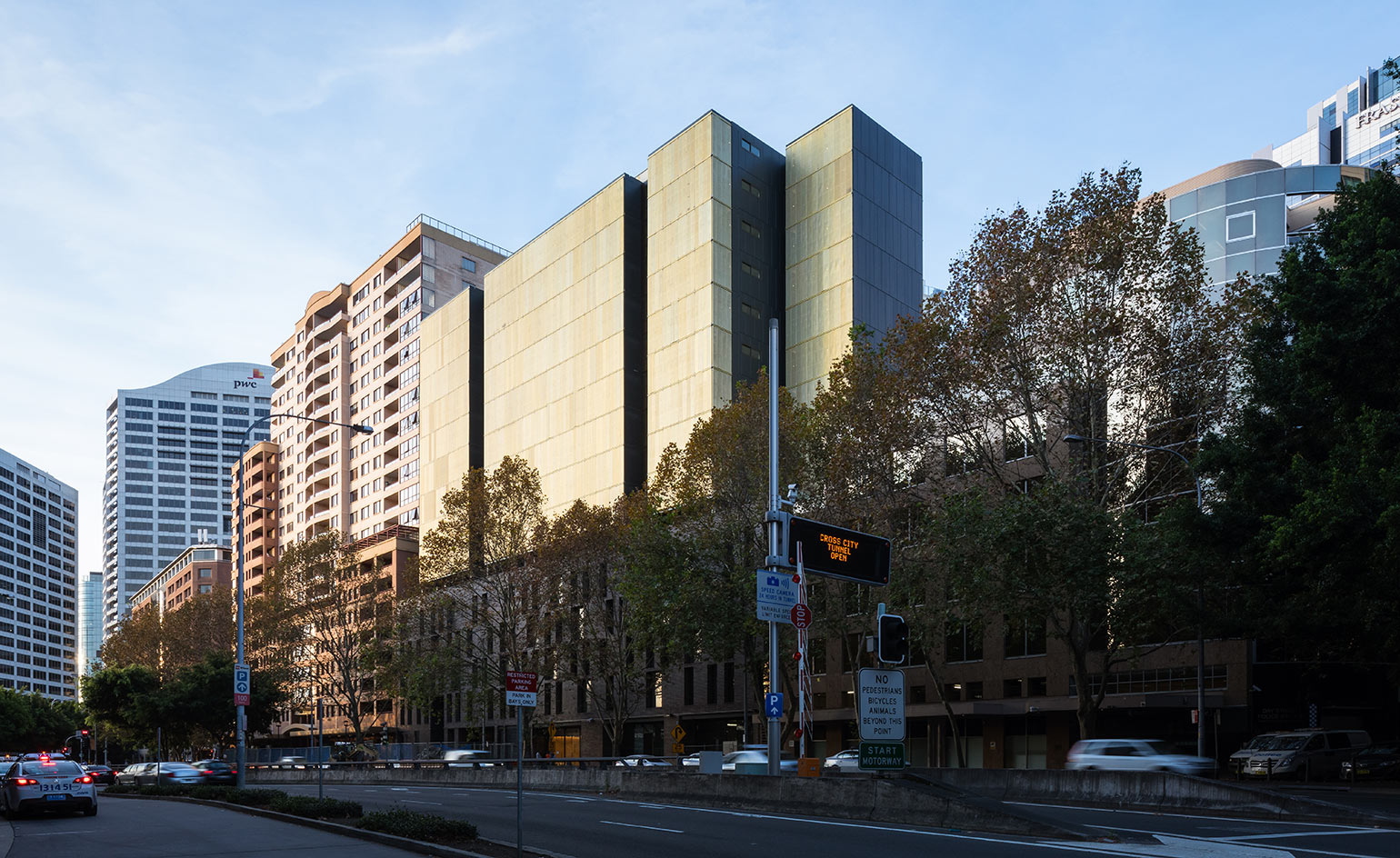
Day Street Apartments, Tzannes
Sydney, Australia
The golden facade of this new residential and commercial building located on the southwestern edge of Sydney’s CBD has multiple functions. Constructed from over 1,000 aluminium mesh shutters, the skin acts as a filter that can be responsive to light, temperature and weather conditions. Writer: Harriet Thorpe
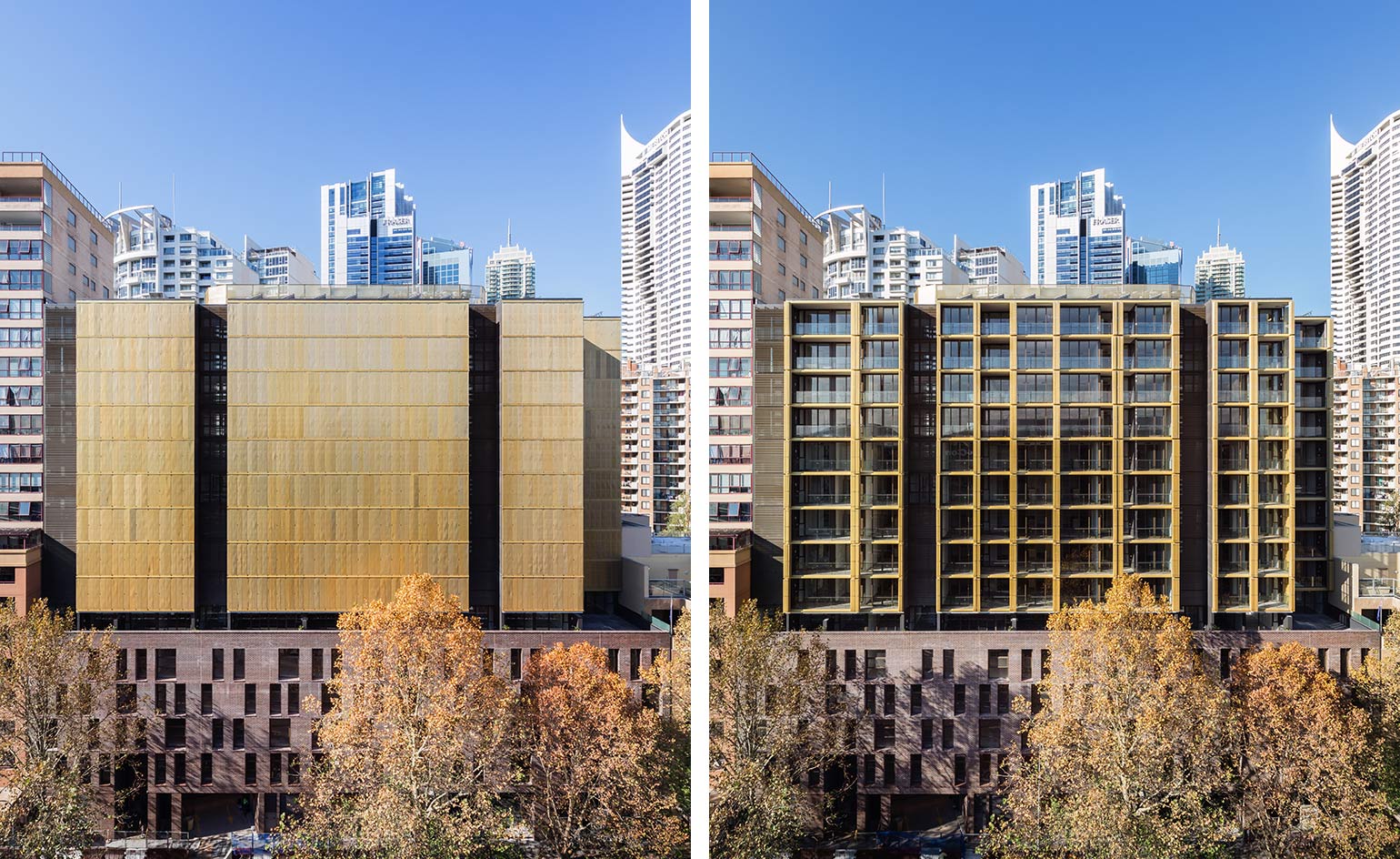
Day Street Apartments, Tzannes
Sydney, Australia
Including 119 apartments over 14 storeys, the 10,000 sq m building has a brick base which responds to the original context of the site, which previously hosted four non-heritage brick warehouses that had fallen into disuse. Commercial and retail space occupies the ground floor level, and beneath that, three levels of storage and car and bike parking. Writer: Harriet Thorpe
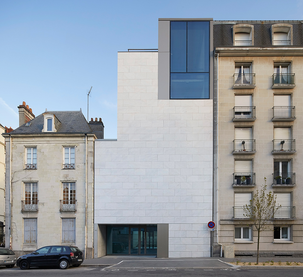
Nantes Museum of Fine Arts, Stanton Williams
Nantes, France
The transformation of the Nantes Museum of Fine Arts into one of France’s top cultural draws is nearing completion. This once-stuffy regional French gallery building, dating from 1900, has been turned inside out by London architecture practice Stanton Williams, which has brought its minimal aesthetic to bear with a palette of stone, oak, concrete and bronze. Pictured here, the new archive building. As originally featured in the July 2017 issue of Wallpaper* (W*220). Writer: Robert Bevan
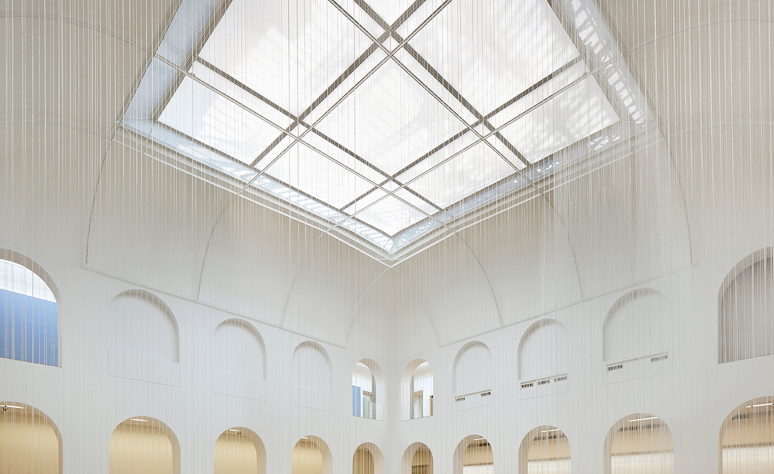
Nantes Museum of Fine Arts, Stanton Williams
Nantes, France
When it opens this month, visitors will find an entire museum quarter has been created in the six years that the building has been closed. The €48.8m complex is now made up of the original 19th-century building, a baroque church that hosts a commissioned Bill Viola triptych, an archive building and a new extension, with an external sculpture court at its heart. The extension, known as The Cube, is a white marble-clad volume containing four levels of art galleries, with the entire south elevation glazed with translucent laminated marble. Meanwhile, the internal courtyard of the original museum building has been hollowed out to form a ghostly top-lit de Chirico-like space for installations and temporary exhibitions (pictured here). As originally featured in the July 2017 issue of Wallpaper* (W*220). Writer: Robert Bevan
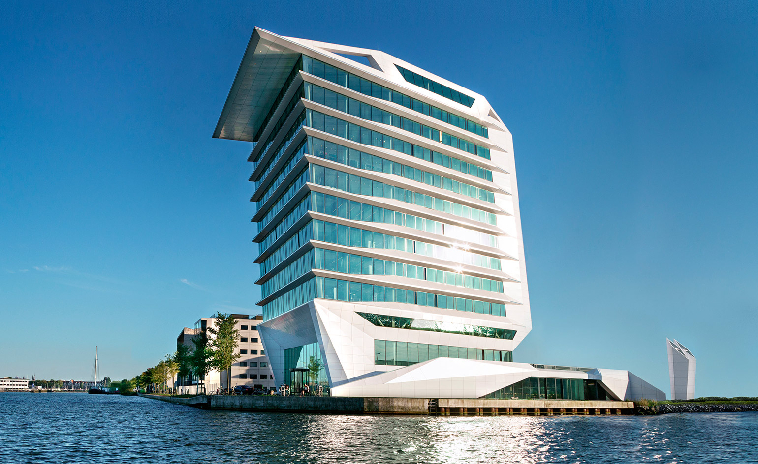
Calvin Klein and Tommy Hilfiger European HQ, MVSA Architects
Amsterdam, The Netherlands
This dynamic building by MVSA Architects, with PVH Europe and Heren 2, is home to the new Calvin Klein and Tommy Hilfiger headquarters, located on the waterfront of the Danzigerkade, in the evolving industrial district of Houthavens in Amsterdam. The architects wanted to create a striking design powerful enough to compete with the neighbouring landmarks of the EYE film museum and Muziek- gebouw aan t ‘IJ. Writer: Harriet Thorpe
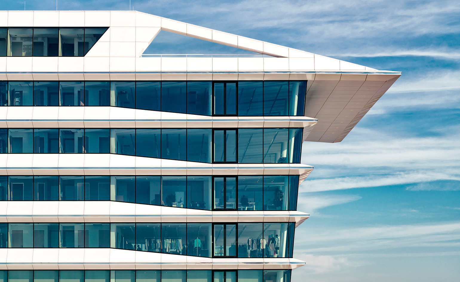
Calvin Klein and Tommy Hilfiger European HQ, MVSA Architects
Amsterdam, The Netherlands
The 12-storey office building is clad in sleek white aluminium that reflects light from the water. Its gradual cantilever gives it a sense of movement with the aesthetic of super yacht, apt to its dockside context. Inside, layouts are open plan and there is a large roof terrace for employees and clients to enjoy views across Amsterdam. Writer: Harriet Thorpe
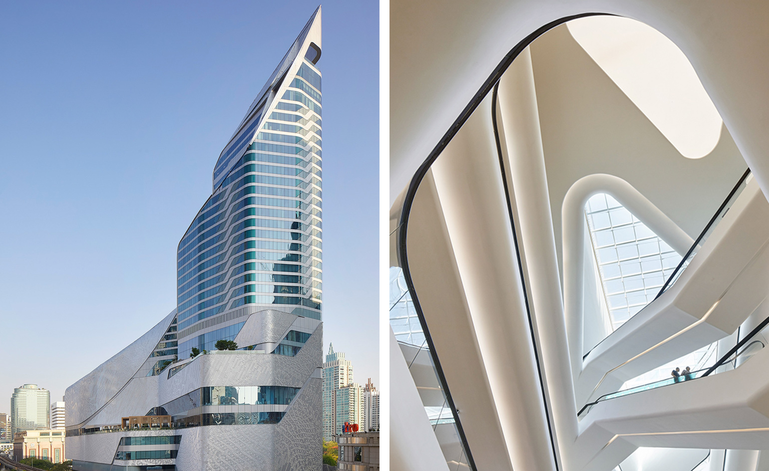
Central Embassy, AL_A
Bangkok, Thailand
The first tower in Thailand to be completed by a British architect, Central Embassy is a magnificent 37 storey mixed use building, located on Bangkok’s busy Ploenchit Road, on the site of the former British Embassy gardens. The project was commissioned by Central Group, one of Thailand’s leading retailer and department store operators to house a shopping centre and with 27 storeys reserved for the Park Hyatt hotel.
Writer: Harriet Thorpe
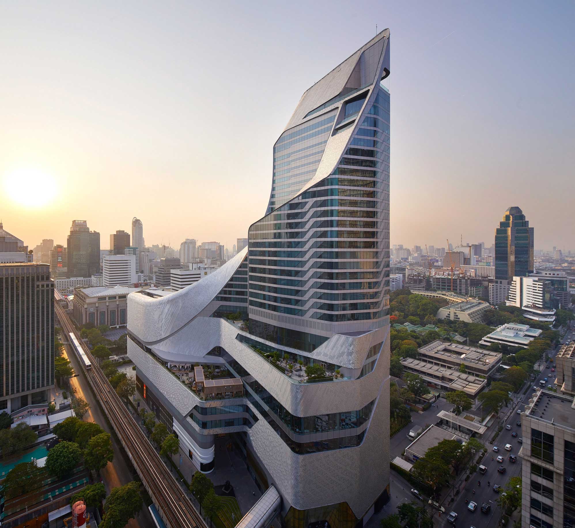
Central Embassy, AL_A
Bangkok, Thailand
Clad with a patterned skin of 300,000 aluminium tiles, the Central Embassy is asymmetrical in every aspect imaginable and the design is defined by a series of stepped terraces that divide the functions of hotel and shopping centre. The guest rooms of the hotel overlook Nai Lert Park while the hotel bar and sky terrace look across views of the centre of Bangkok. Writer: Harriet Thorpe
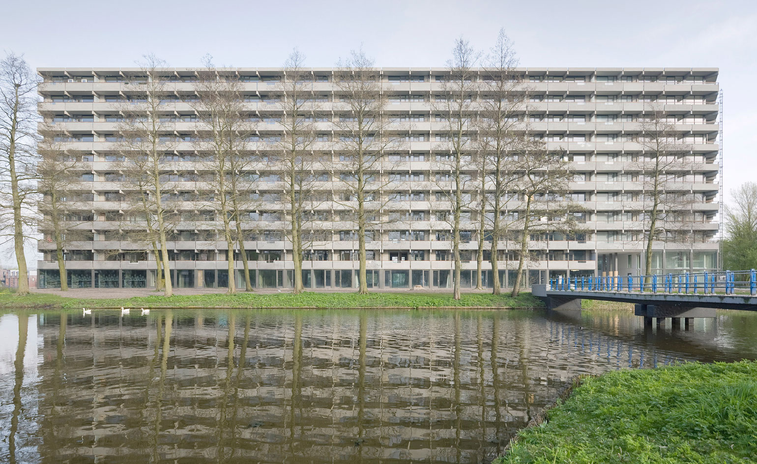
De Flat Kleiburg, NL Architects and XVW Architectuur
Amsterdam, The Netherlands
The winner of the 2017 European Union Prize for Contemporary Architecture – Mies van der Rohe Award, De Flat Kleiburg is a renovation project in the residential area of Bijlmermeer, Amsterdam. Why is this block so special, you may be wondering. Well, it was saved from demolition by being converted into a Klusfat, a system where inhabitants would be in charge of renovating their own apartment individually from installing utilities to rolling on that last layer of ecru. Creating a new model for developers and buyers, NL Architects thus initiated a renovation that was partly conceptual. The architects took charge of reactivating the building structurally and restoring communal areas, while leaving the apartments as empty blank canvases. Built in the 1960s Kleiburg stretches to 400m long and rises 10 storeys high and is the only remaining building that represents the original Bijlmermeer residential experiment which was inspired by Le Corbusier.
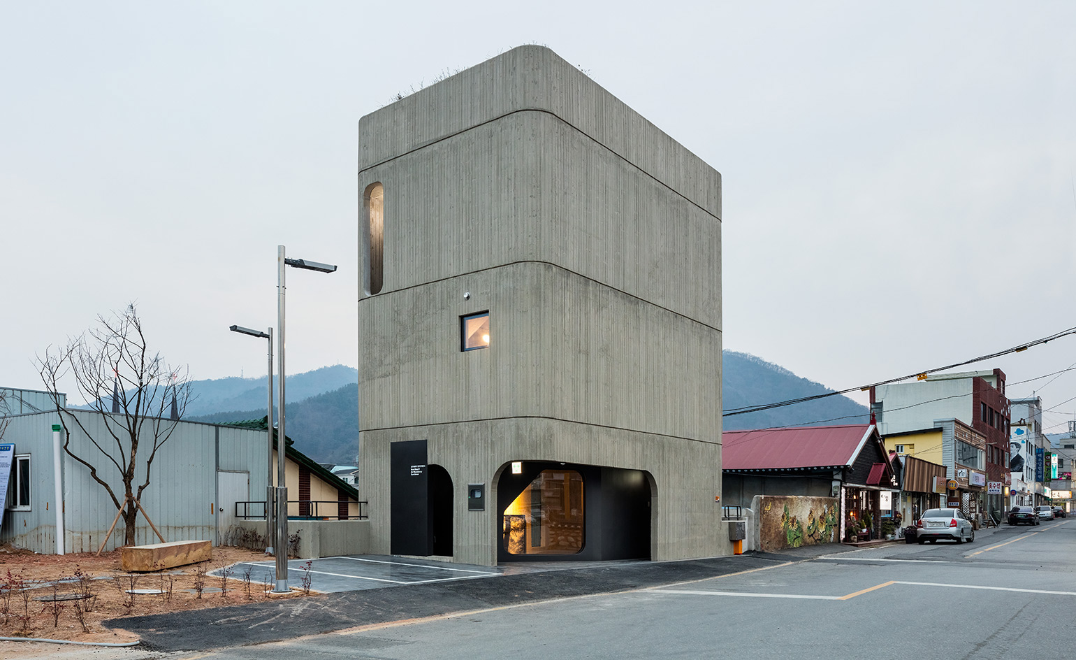
Bae Bien-u Photography Studio, The System Lab
Sooncheon, South Korea
Chanjoong Kim, of architecture studio The System Lab, has spent his career eking out space from unlikely sites, and this four-storey concrete tower, a new studio, house and gallery for photographer Bae Bien-u, stands in stark contrast to its low-rise neighbours. located in southern Korea, the building is effectively a double-skinned concrete tube. the sober materials palette references Bae’s monochromatic depictions of landscape and forests, creating a stacked brutalist landscape. the staircase is sandwiched between the walls, allowing the circulation space to loop upwards from the basement exhibition space to the private rooms and rooftop garden.
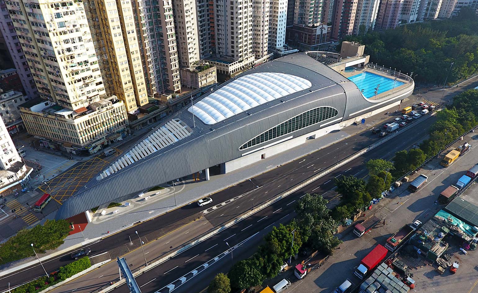
Kennedy Town Swimming Pool, Farrells
Hong Kong, China
Like a jelly poured into its mould, the futuristic Kennedy Town Swimming Pool flows neatly to the edges of its triangular site between the road and the historic tram-line creating an aero-dynamic form worthy of the sky. Conscious of the urban context, architects at Farrells closely researched the location to create a building that would be respectful of its residential neighbours, yet also an iconic addition to the prominent site with views across the harbour. Writer: Harriet Thorpe
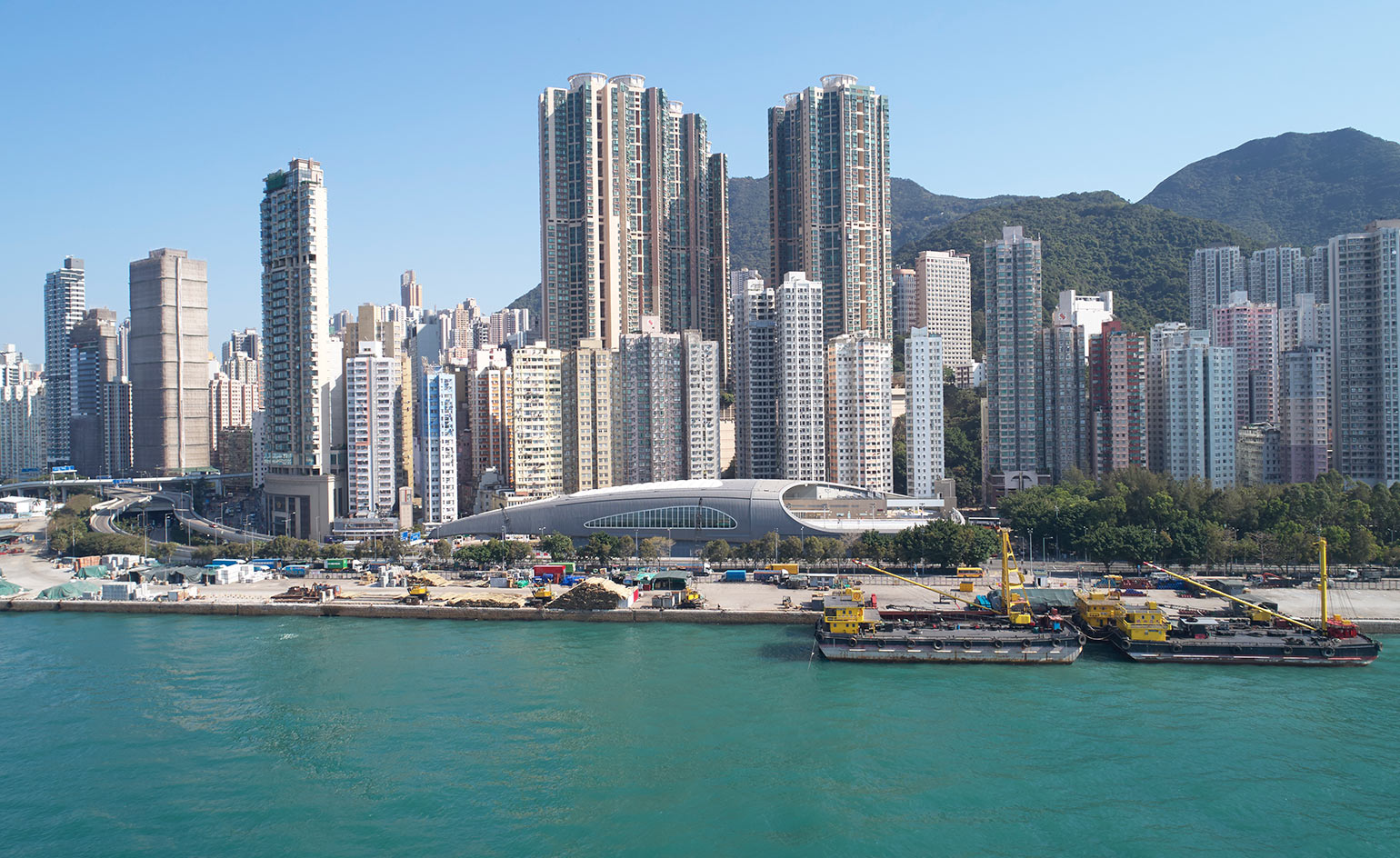
Kennedy Town Swimming Pool by Farrells, Hong Kong, China
7 March
Surrounded by residential high rises, the site was previously a car park, derelict since the 1990s, and the low-lying swimming pool was an ideal solution for utilising the space effectively. Enclosed within the shell-like form are two 50m pools (indoor and outdoor), one 25m indoor pool, outdoor leisure pool and jacuzzi.
Writer: Harriet Thorpe
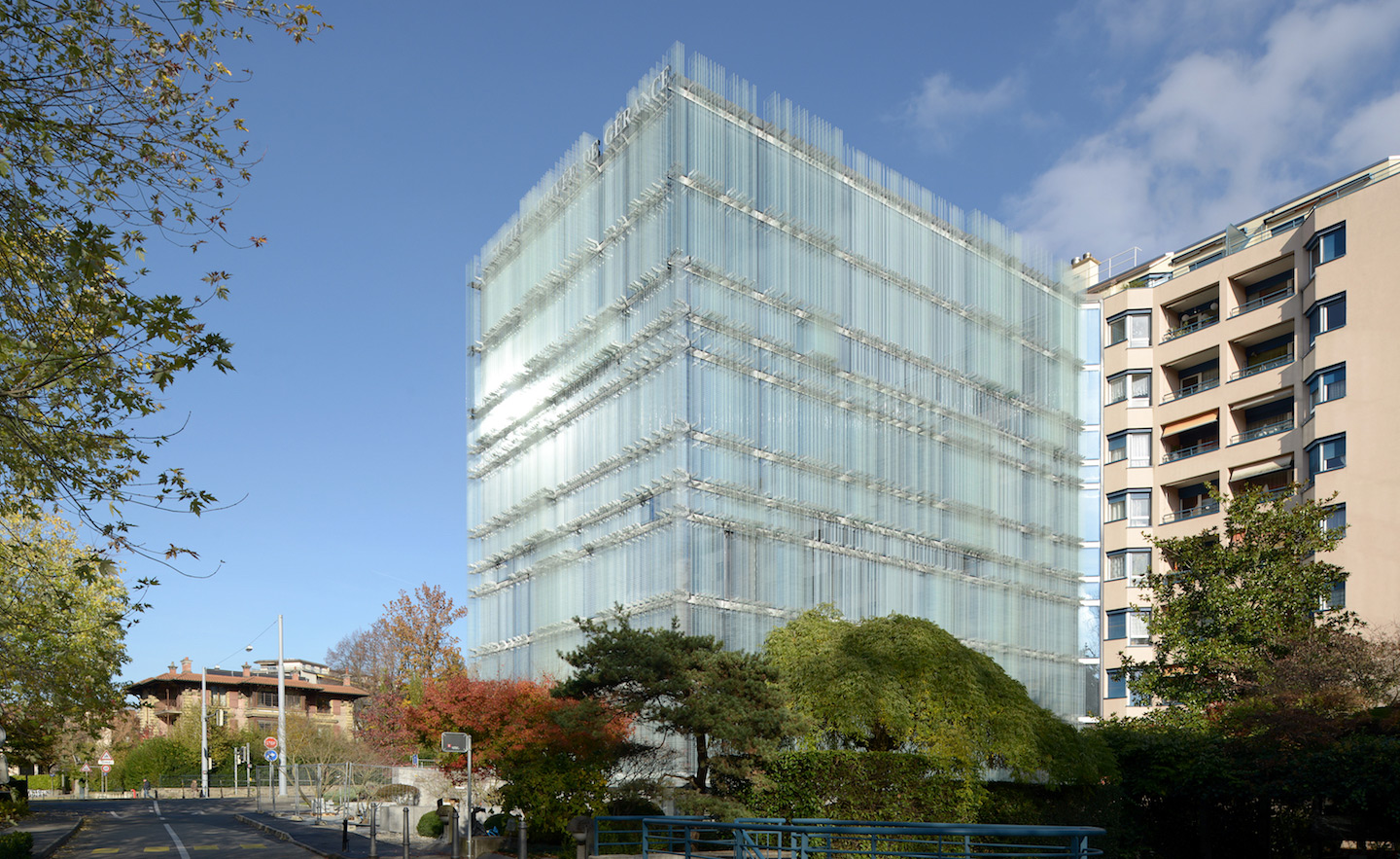
Société Privée de Gérance HQ, Giovanni Vaccarini Architetti
Geneva, Switzerland
Designed by Italian firm Giovanni Vaccarini Architetti, the new Swiss headquarters of Société Privée de Gérance involved the adaptive reuse and extension of the existing building, and began with redefining the architectural envelope. Creating a blurred effect, the envelope lays screen-printed patterns of squares in a gradient from fully transparent to densely opaque over glass fins composed to make the building highly energy-efficient and optimise the quality of the work space inside. One manifestation of an ongoing research project conducted by the office for 20 years, the textural face of the steel and glass building also generates maximum views out, solar shading, and acoustic and thermal insulation. Writer: Shonquis Moreno
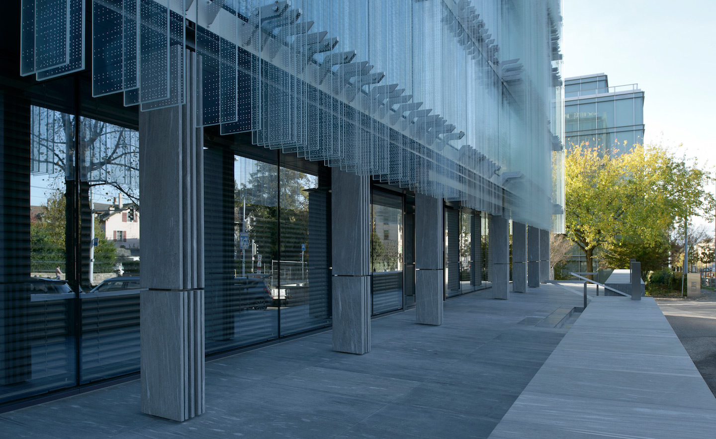
Société Privée de Gérance HQ, Giovanni Vaccarini Architetti
Geneva, Switzerland
The compositions of the patterns were based on a grid of multiples and submultiples of 60 cm ranged, floor after floor, to suit each interior’s type of layout – open plan, individual office, public area. The team then introduced variations to this rhythm by making it respond to external factors like privileged points of view, and visual or sun exposure. ‘The envelope thus became the locus where internal and external elements influenced each other,’ Vaccarini says. ‘The purpose of the screen-printing was to define a ‘nebula’ where light may settle and give substance to the ethereal surface of the glass blades.’
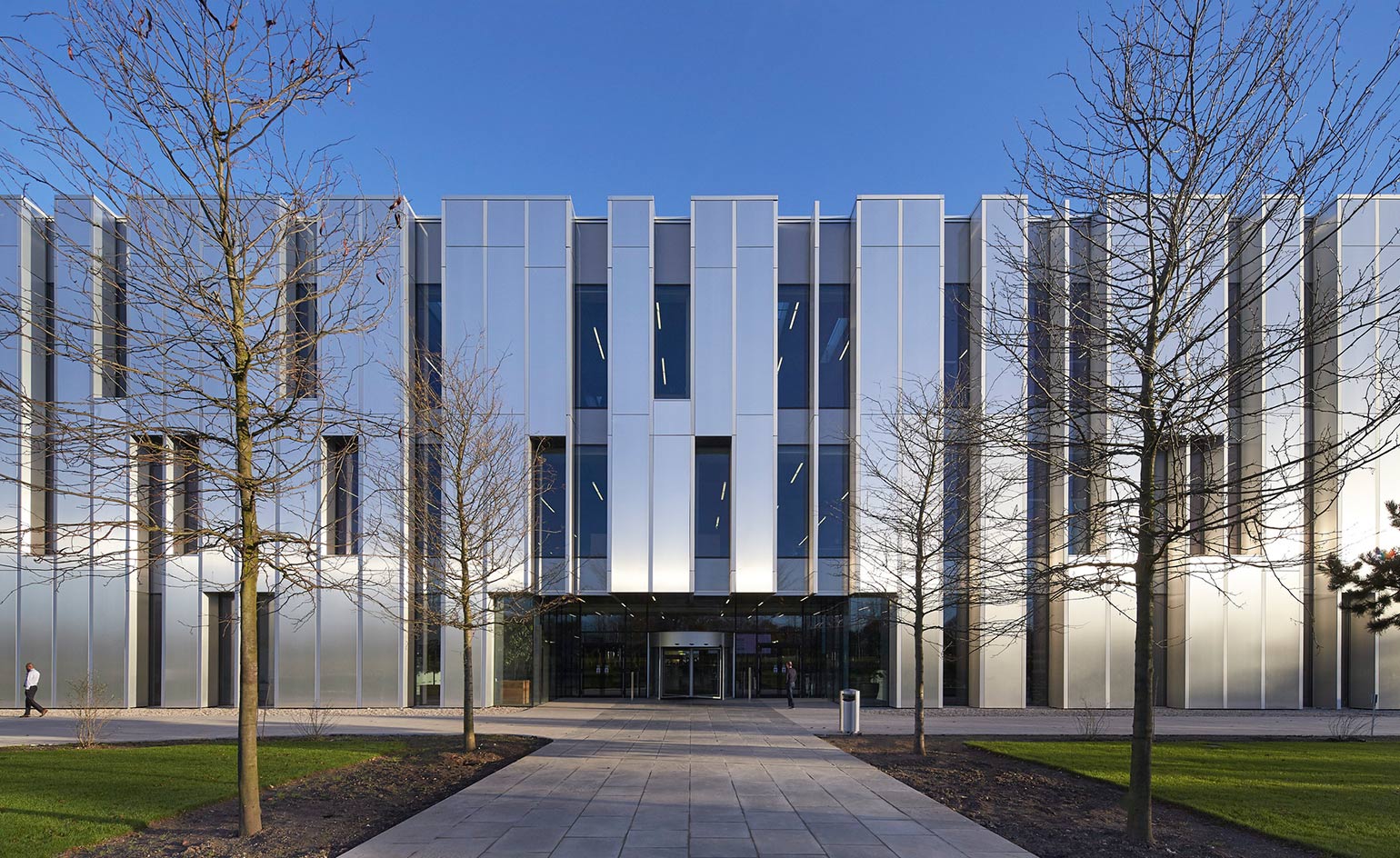
Sky Central HQ, AL_A and PLP Architecture
London, UK
Sky Central was designed by PLP Architecture, AL_A and HASSELL. The broadcasting company’s HQ in Osterley, West London is equipped for the future with smart features woven into its very fabric from high-tech electric vehicle charging stations and renewable energy sources to sustainable structural solutions. Large windows and skylights encourage natural light into the interiors reducing the need for electric lighting and the timber roof – one of the largest in Europe – made of 6km of glulam beams saved on CO2 emissions. Writer: Harriet Thorpe
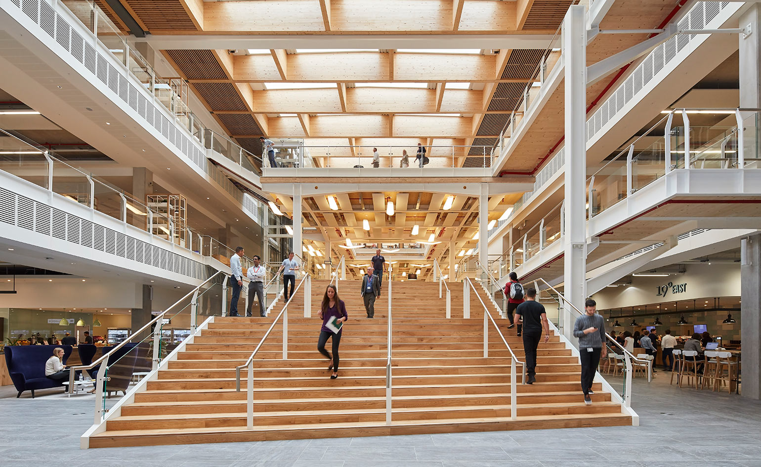
Sky Central HQ, AL_A and PLP Architecture
London, UK
Technical achievement was not however second to the design. The sleek façade with connecting oblong shapes fuses the three storeys into one cohesive form, which reflects light and the surrounding natural environment. The ethos of openness continues inside where the office is designed like a campus with integrated spaces to work and relax, offering the 3,500 employees based at the site time to dine, exercise and recharge at the 45,000 sq m HQ. Writer: Harriet Thorpe
Ellie Stathaki is the Architecture & Environment Director at Wallpaper*. She trained as an architect at the Aristotle University of Thessaloniki in Greece and studied architectural history at the Bartlett in London. Now an established journalist, she has been a member of the Wallpaper* team since 2006, visiting buildings across the globe and interviewing leading architects such as Tadao Ando and Rem Koolhaas. Ellie has also taken part in judging panels, moderated events, curated shows and contributed in books, such as The Contemporary House (Thames & Hudson, 2018), Glenn Sestig Architecture Diary (2020) and House London (2022).
-
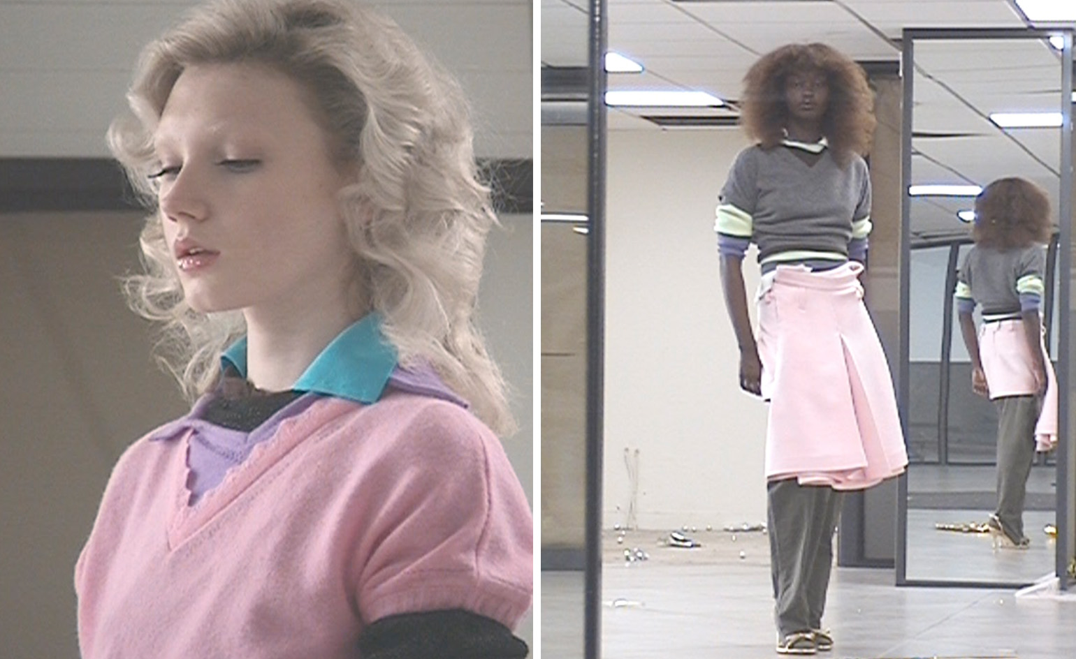 All-In is the Paris-based label making full-force fashion for main character dressing
Part of our monthly Uprising series, Wallpaper* meets Benjamin Barron and Bror August Vestbø of All-In, the LVMH Prize-nominated label which bases its collections on a riotous cast of characters – real and imagined
By Orla Brennan
-
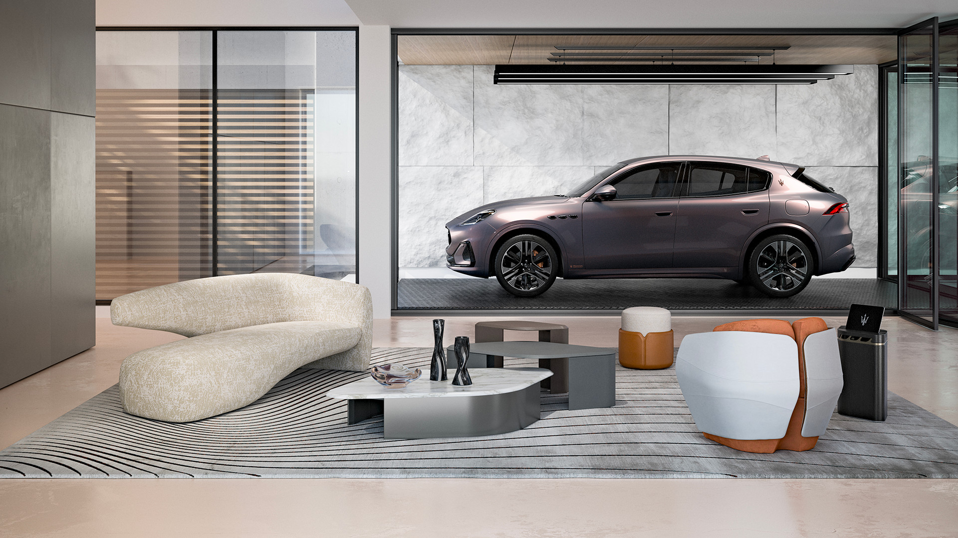 Maserati joins forces with Giorgetti for a turbo-charged relationship
Announcing their marriage during Milan Design Week, the brands unveiled a collection, a car and a long term commitment
By Hugo Macdonald
-
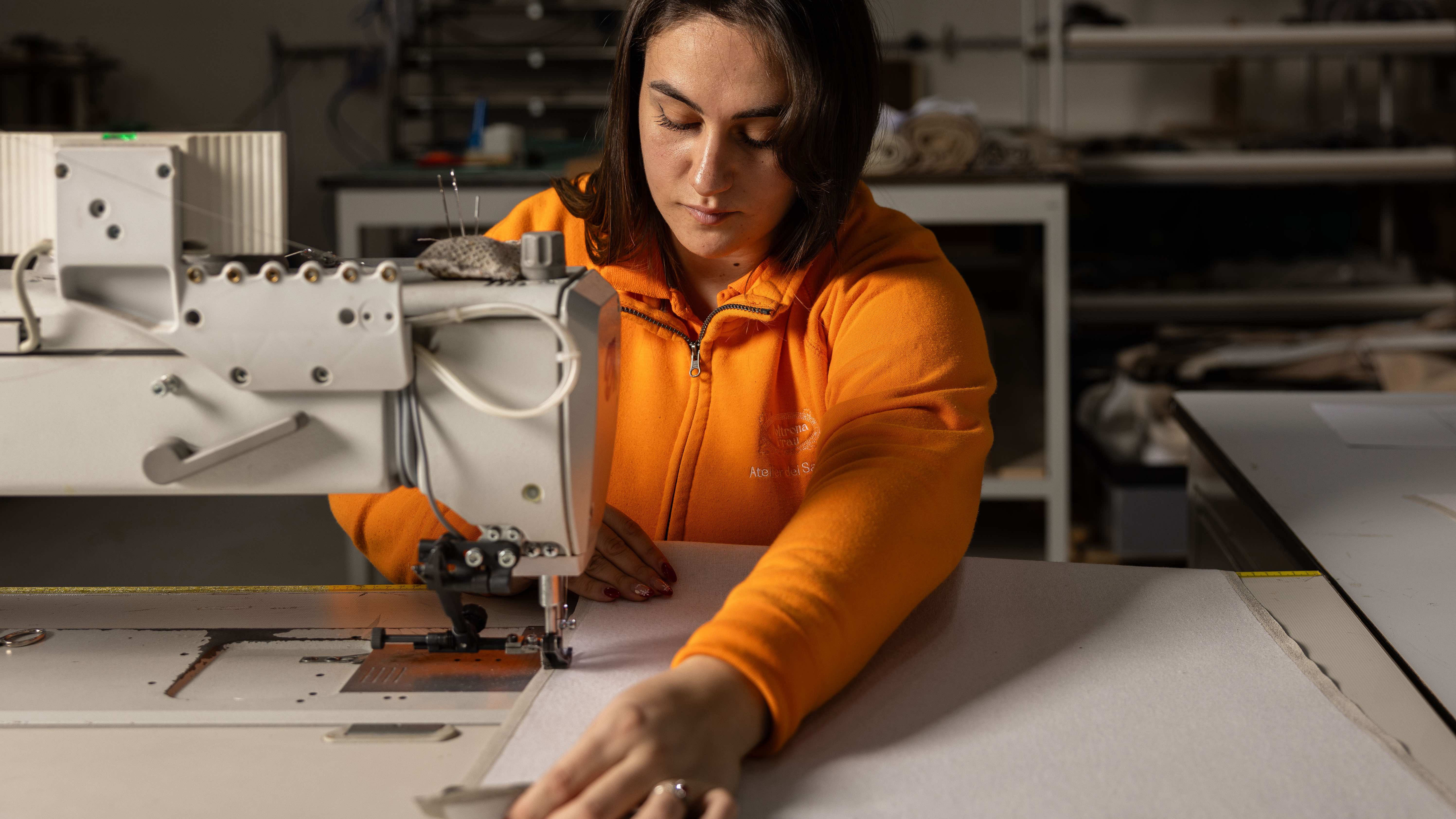 Through an innovative new training program, Poltrona Frau aims to safeguard Italian craft
The heritage furniture manufacturer is training a new generation of leather artisans
By Cristina Kiran Piotti