Bibliothèque looks back on ten years in design
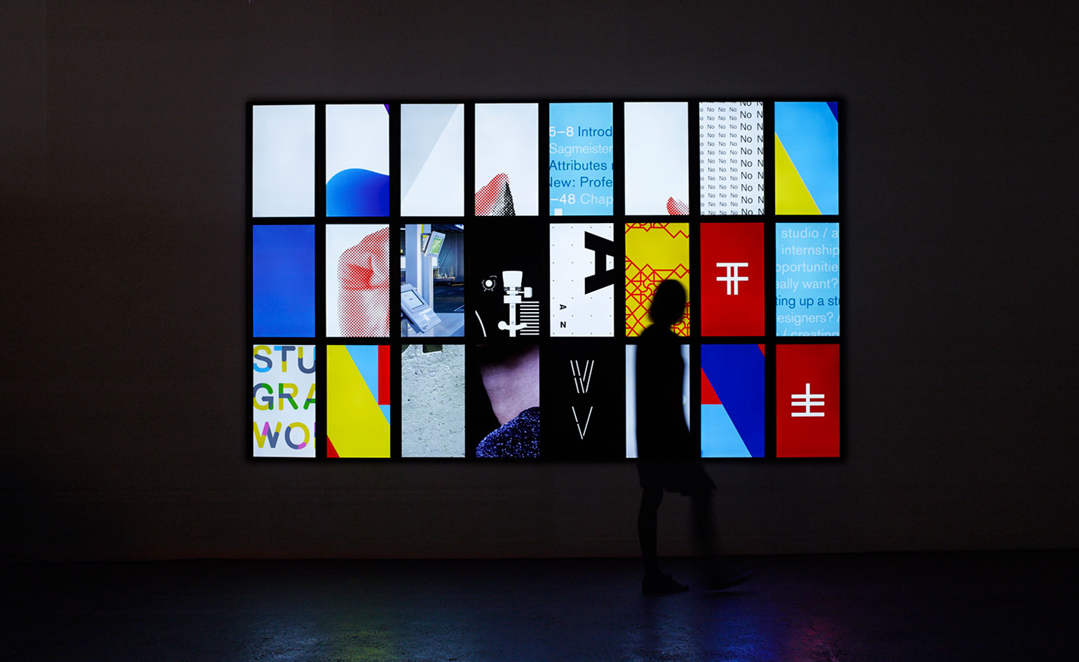
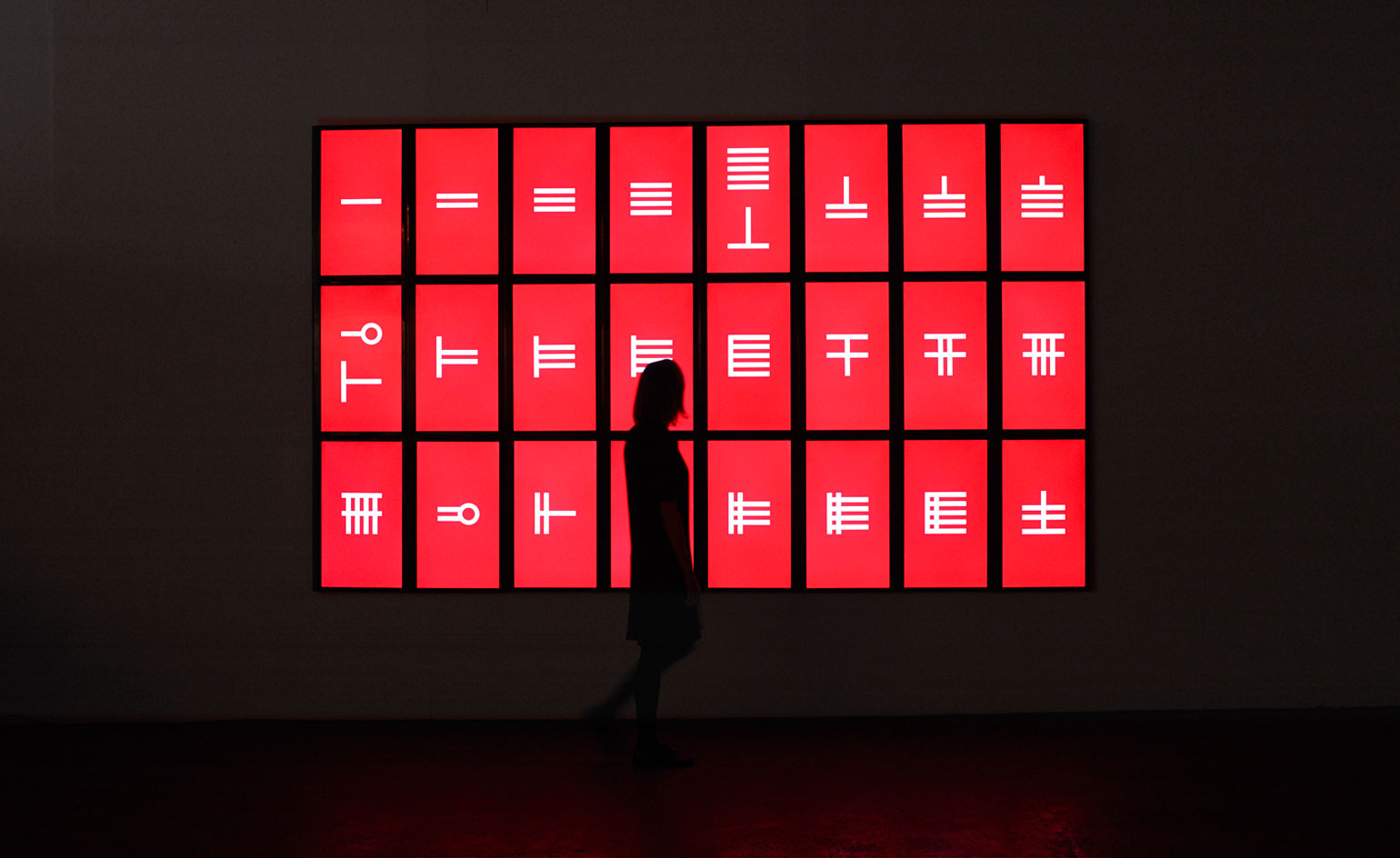
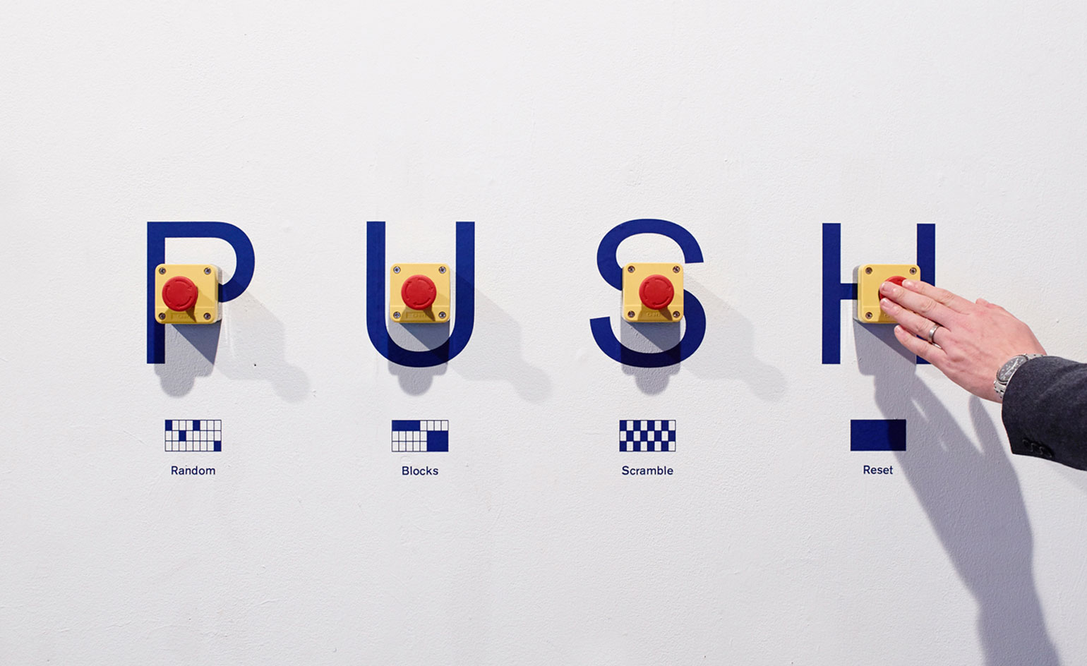
London-based design consultancy Bibliothèque is celebrating 10 years of sterling creative works this weekend with a site-specific installation and pop-up bookshop and cafe at the Hoxton Arches. The exhibition, opening today and on show until 19 October, is a collaboration with digital clever clogs The Workers
Writer: Nick Compton
Meanwhile, the bookshop - a tie-in with Artwords of Shoreditch and Broadway Market - will feature hard-to-find rarities from the studio's own archive, limited edition books produced specifically for the event as well as a specially curated reading list. Coffee and other treats come courtesy of Climpson & Sons.
To mark the occasion, we asked Bibliothéque co-founder Jonathon Jeffrey to give us the inside line on 10 of the company's favourite projects...
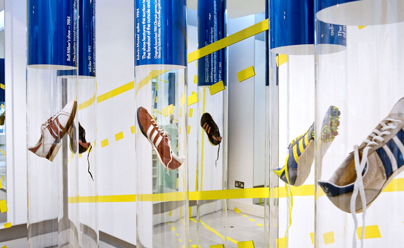
Olympic Archive for Adidas: No other brand has been so closely associated with so many athletes in so many sports over so many years as Adidas. During the 2004 Olympic Games in Athens, Bibliothèque produced spatial designs and print items for the launch of two new Adidas stores in London: a gallery/concept store on Newburgh Street and the Originals store on Earlham Street. The brief stipulated a display of shoes worn by a selection of medal-winning athletes. The content - sourced from the Adidas archive of original sport shoes - included shoes worn by sporting legends such as Jesse Owens, Dick Fosbury and Muhammad Ali. The solution was a 'forest' of suspended, transparent Perspex tubes. Each encapsulated a shoe and a caption, allowing visitors a 360º view of the object. The athletic theme was reinforced by track and field graphics applied to the store interior.
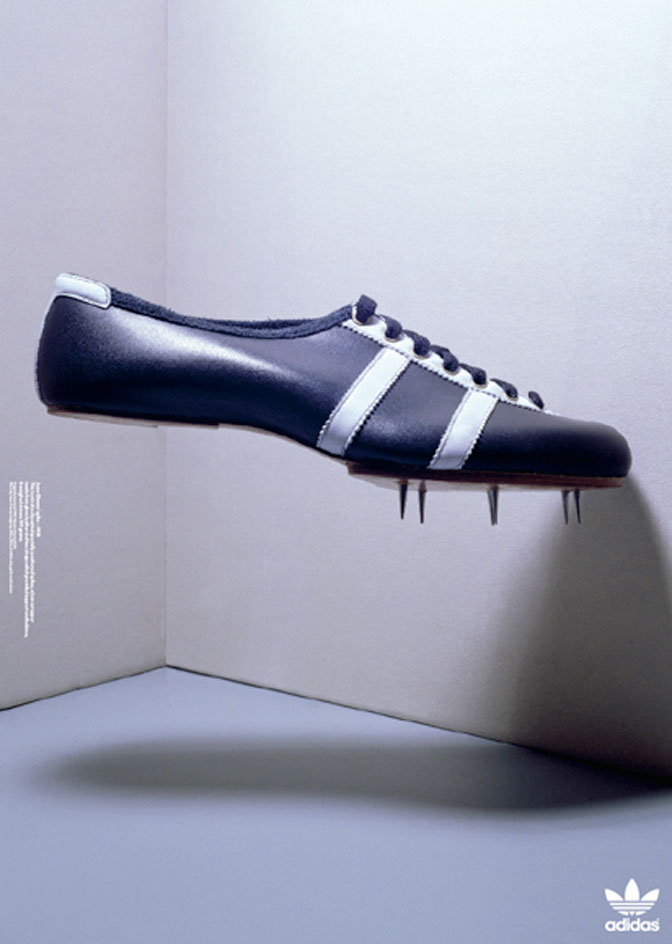
Olympic Archive for Adidas: For promotional posters and brochures, the shoes were photographed in a variety of gravity-defying positions with 3D typography expressing the concept's dynamism.
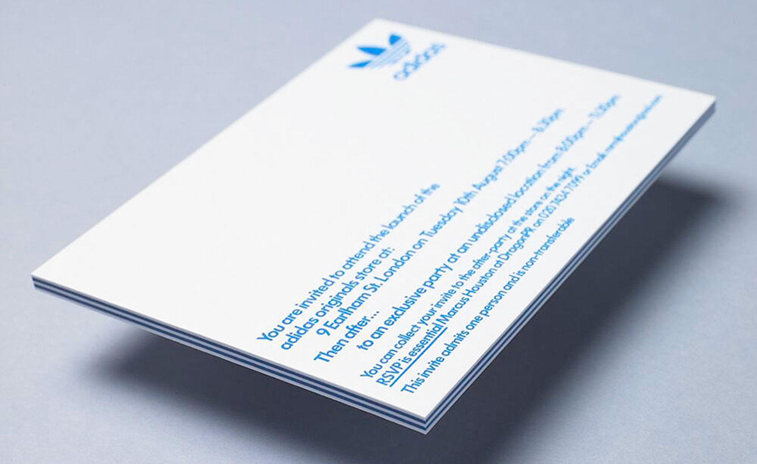
Olympic Archive for Adidas: The launch party invitation provided an opportunity to encapsulate the brand's signature stripes into the object's core. By alternately bonding layers of white and blue board, we created a 6mm capacity invite with striped edging and screen printed text.
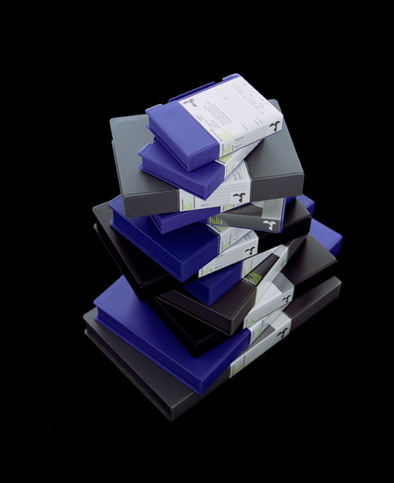
Moving Brands: This was a slightly idiosyncratic project for us, as Moving Brands (a fellow branding agency) were more than capable of producing their own identity - but in the words of Moving Brands founder James Bull: 'If we expect our clients to willingly go through a branding process with an outsider then we should be prepared to do it ourselves.' The project was our reaction to Web 2.0 and what we liked to call 'logosludge'. Paul Rands' UPS logo had been shelved and the new identities seemed to be sugar-coated with a new digital sheen.
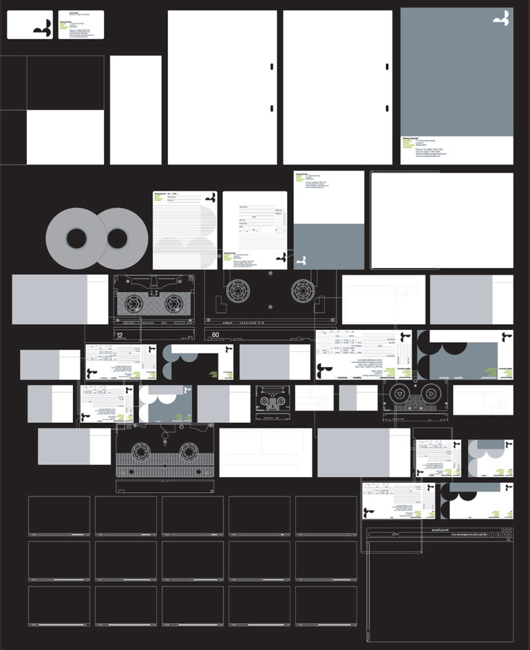
Moving Brands: Our logo solution was inspired by the time-based nature of MB's output - a circular (think spools, countdowns, clocks), geometric abstraction of the company initials, M and B. The flexible application of the marque alongside a palette of greys and an accent green provided a sophisticated visual language.
Wallpaper* Newsletter
Receive our daily digest of inspiration, escapism and design stories from around the world direct to your inbox.
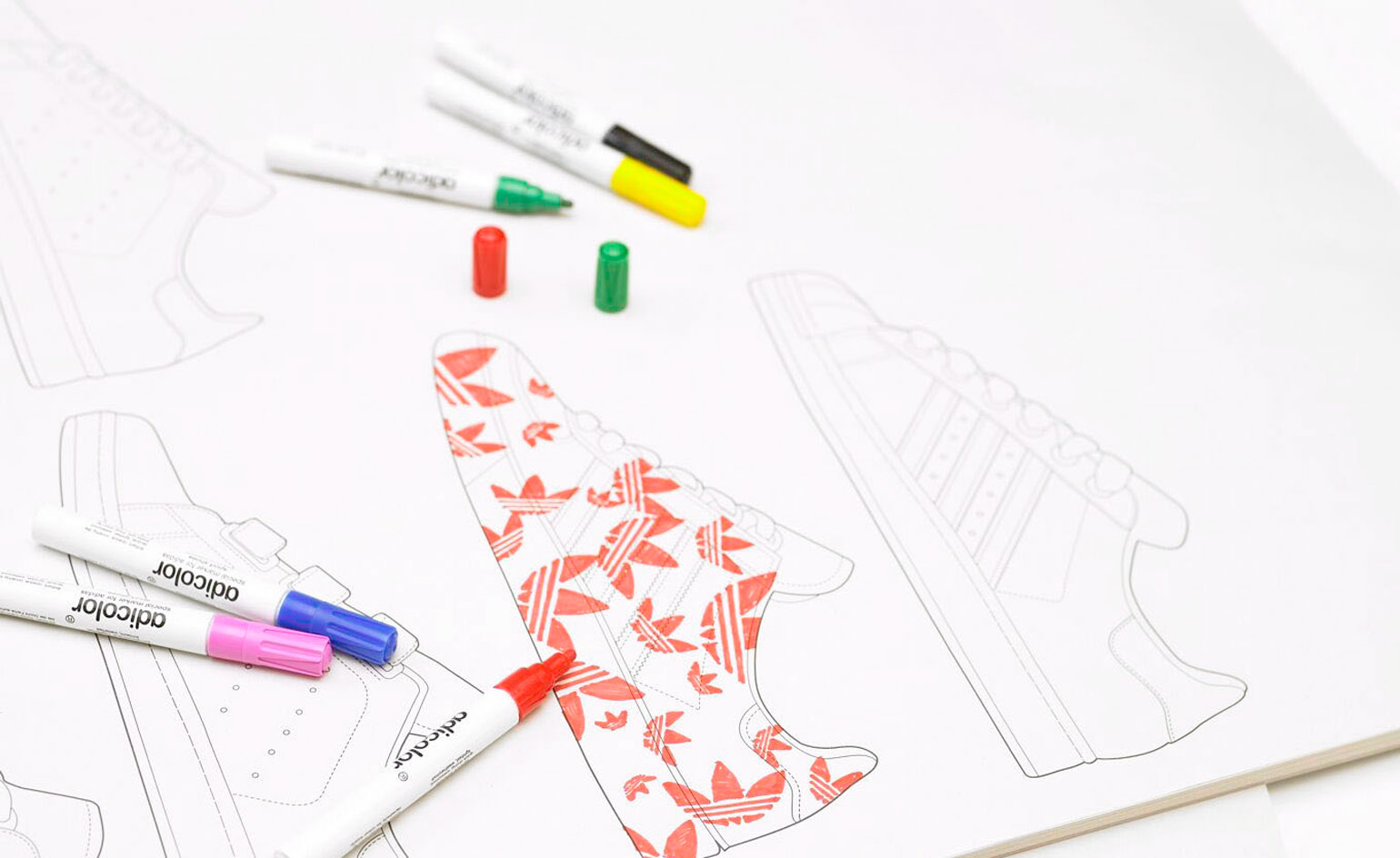
Adicolor for Adidas: This was great fun - more sneakers with added colour. Adidas relaunched the 'Adicolor' sneaker range (sneakers you can customise with paint markers) with 20 amazing collaborators, including Peter Saville, Claude Closky and Kermit the Frog.
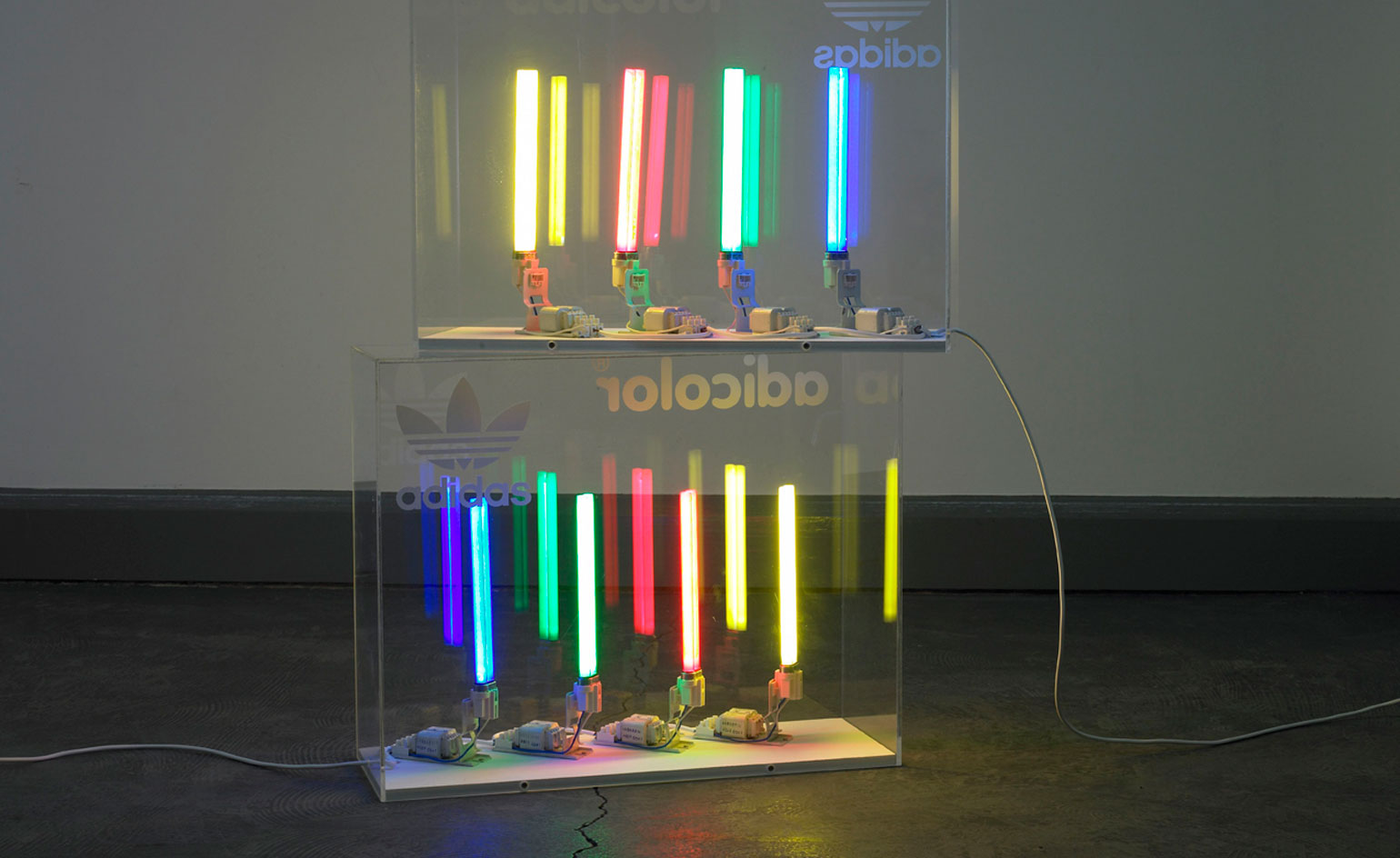
Adicolor for Adidas: They needed two installations - one at Comme des Garcons' Dover Street Market Store and one at cult sneaker store Foot Patrol.
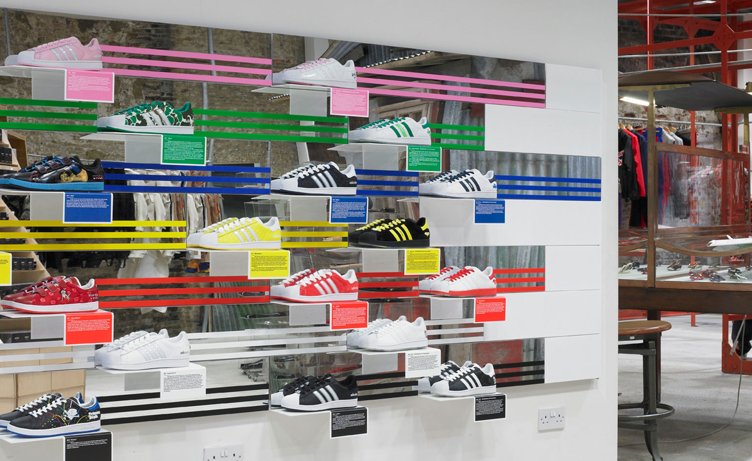
Adicolor for Adidas: One problem though - two locations and only one pair of sneakers. The solution? A shelving system with integrated mirrors was used to create the illusion of a pair of trainers when, in reality, only one shoe was on display. Integrated captions provided a profile of each designer, with a series of wall mounted colouring pads to get people involved
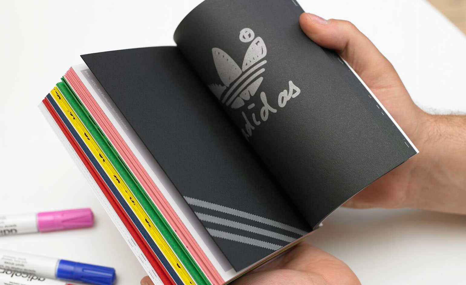
Adicolor for Adidas: We also made a giveaway book in the 'Adicolor' palette featuring profiles of all the collaborators and their 'Adicolor' designs.
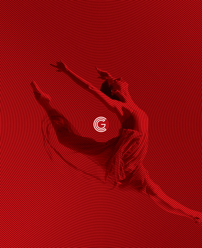
Covent Garden: One of our longest-running projects, Covent Garden has a rich heritage stretching back to the 16th century. As part of an ambitious, long-term project aimed at transforming the area into a premiere retail and lifestyle destination, Bibliothèque were commissioned to create the Covent Garden identity. The geometric nature of the logo provides a visual language based on concentric circles. Implementation varies across both business and public sectors and encompasses a range of applications including packaging, marketing, advertising, reports, mapping, way-finding and environmental graphics.
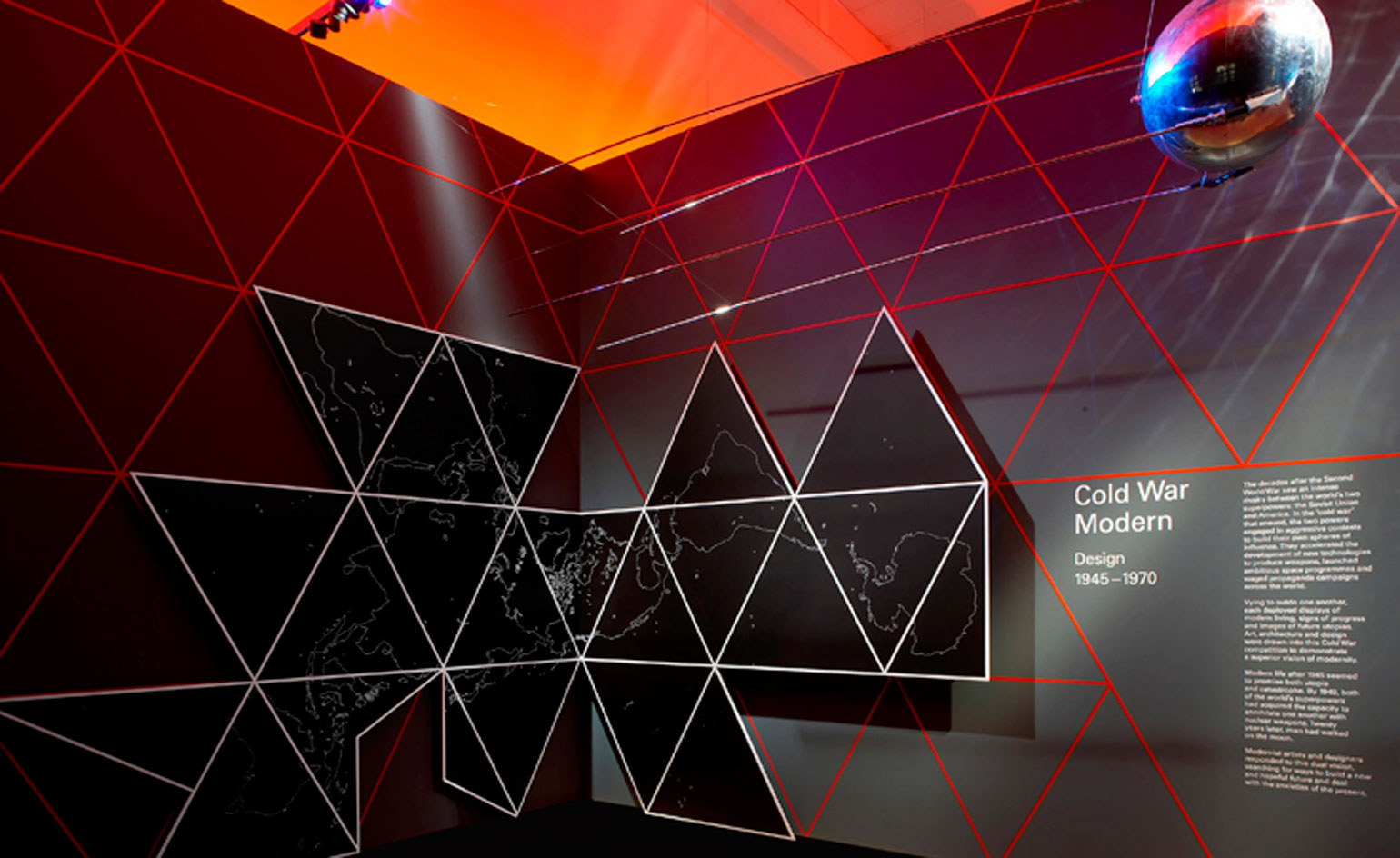
Cold War Modern: Our favourite midcentury subject matter: design, film, fashion and architecture. 'Cold War Modern' was our first spatial project with long-time collaborators Universal Design Studio.
Cold War Modern: It was the first exhibition to examine contemporary design, architecture, film and popular culture on both sides of the Iron Curtain during the cold war era.
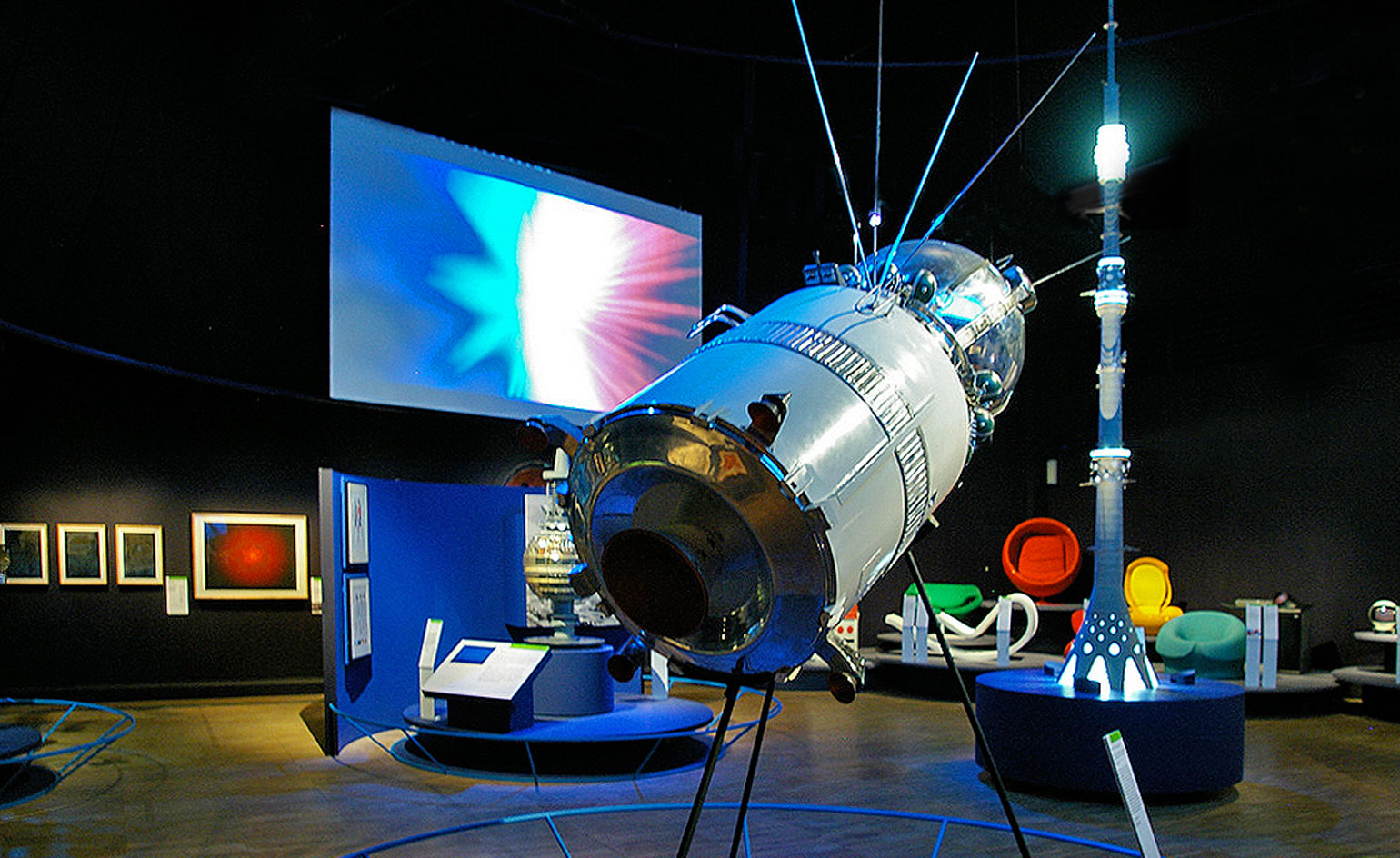
Cold War Modern: The exhibition brought together over 300 exhibits - from a Sputnik and an Apollo mission space suit to films by Stanley Kubrick, paintings by Robert Rauschenberg and Gerhard Richter, and fashion by Paco Rabanne.
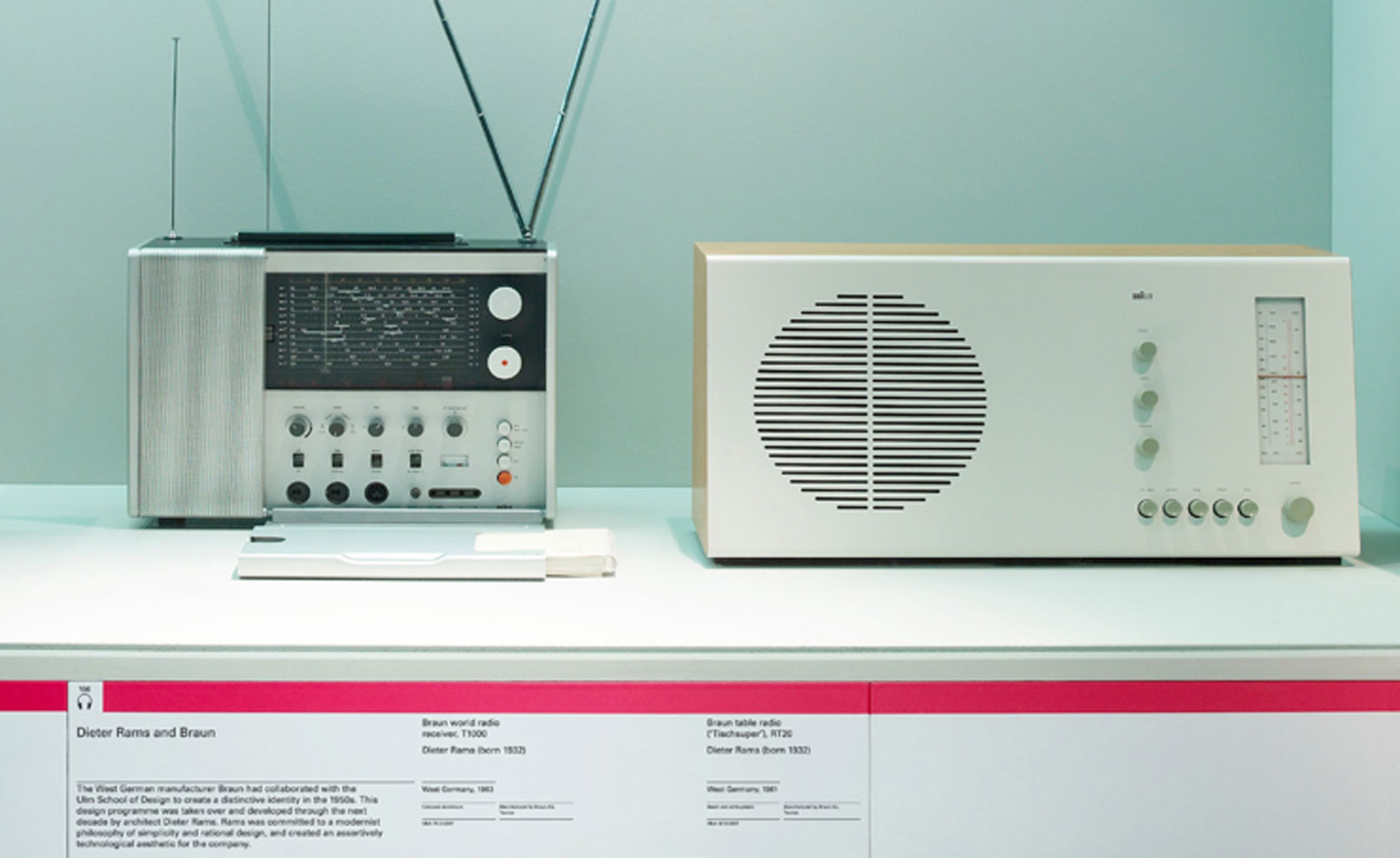
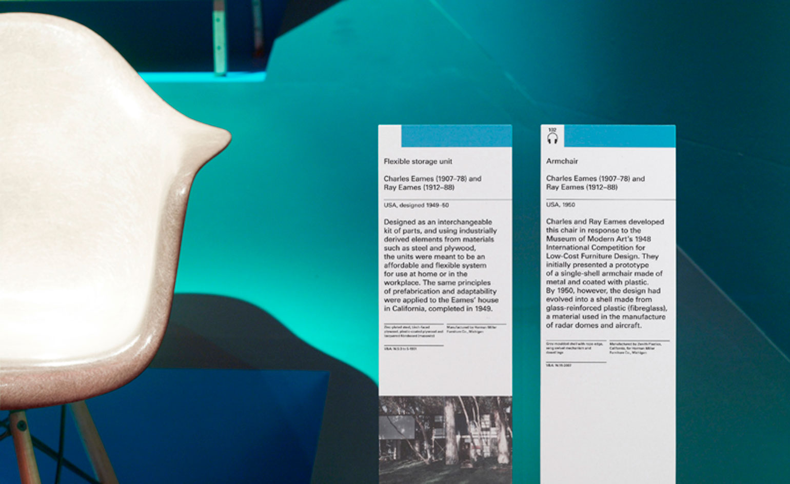
Cold War Modern: Also on show were designs by Charles and Ray Eames and Dieter Rams, architecture by Le Corbusier, Richard Buckminster Fuller and Archigram, and vehicles including a Messerschmidt micro-car.
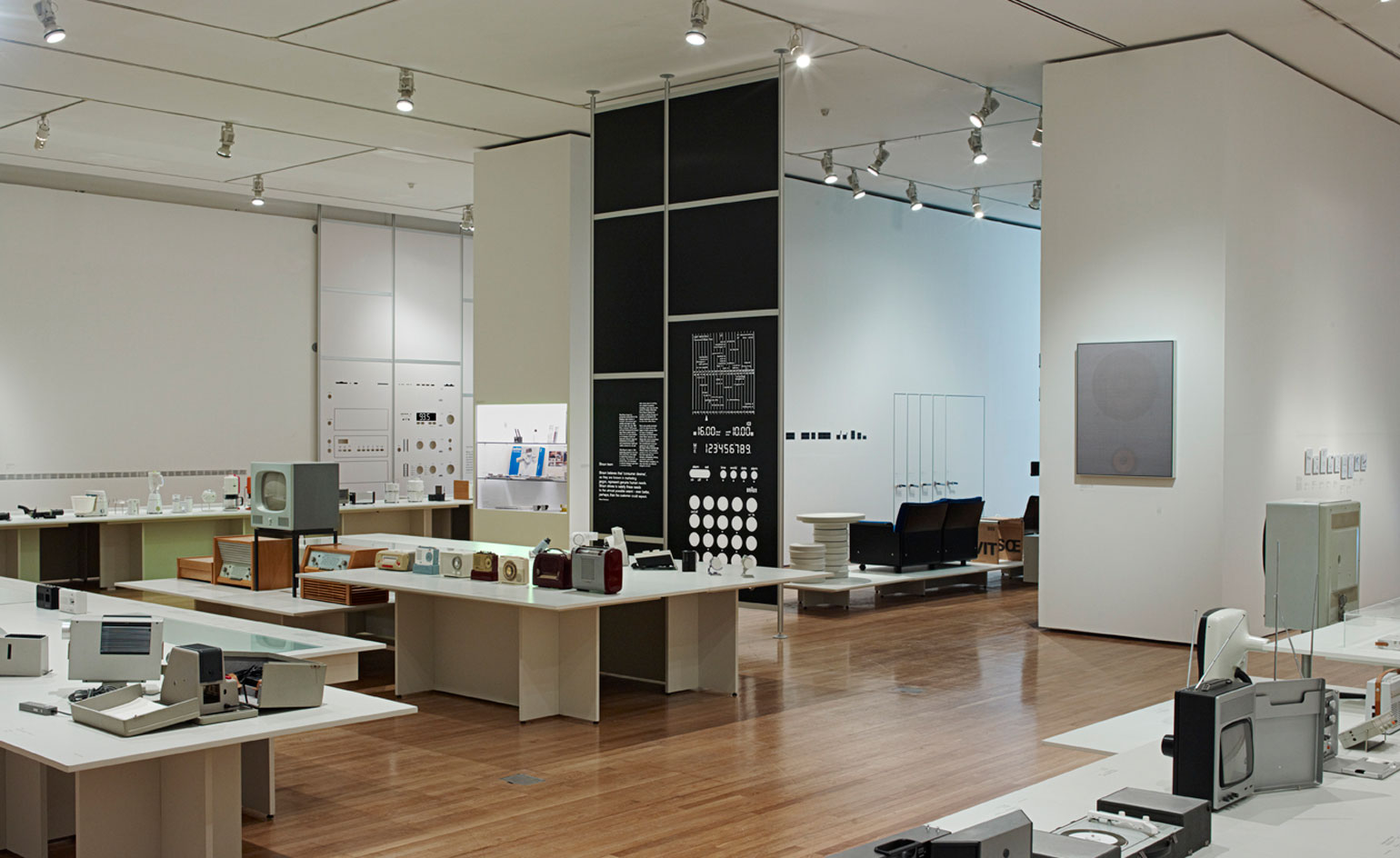
Less and More: Dieter Rams: This was the dream project. We cornered London Design Museum director Deyan Sudjic at a private view and told him we were the people for the job. This was a retrospective exhibition dedicated to Dieter Rams.
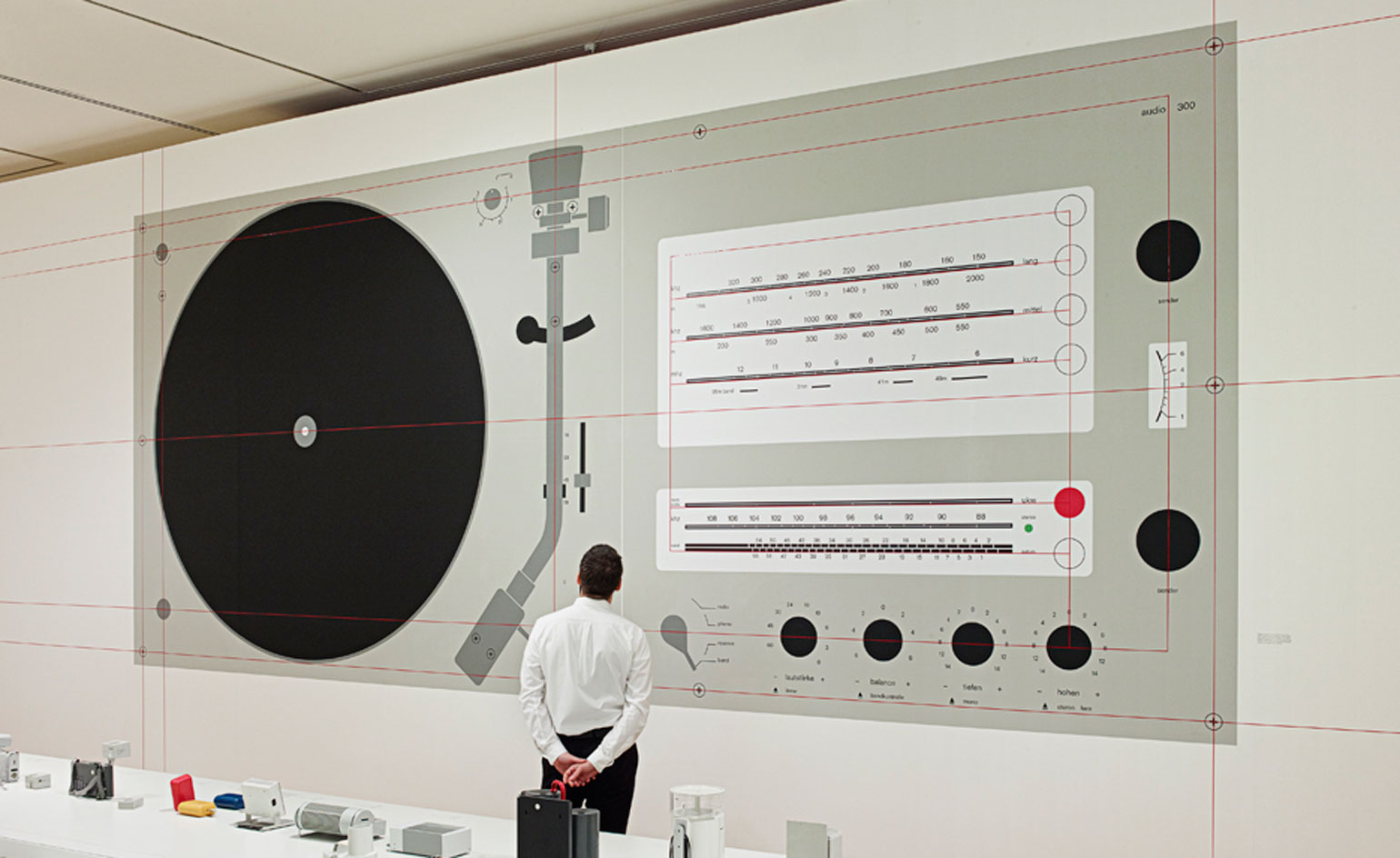
Less and More: Dieter Rams: The exhibition featured 244 objects, spanning six decades of Rams' life and work. Planned across five sections - Dieter Rams' solo projects, Braun team projects under Dieter's leadership, Vitsœ, Typology and Legacy - the design of the exhibition utilised an array of graphic expressions - each appropriate to specific areas of curatorial content.
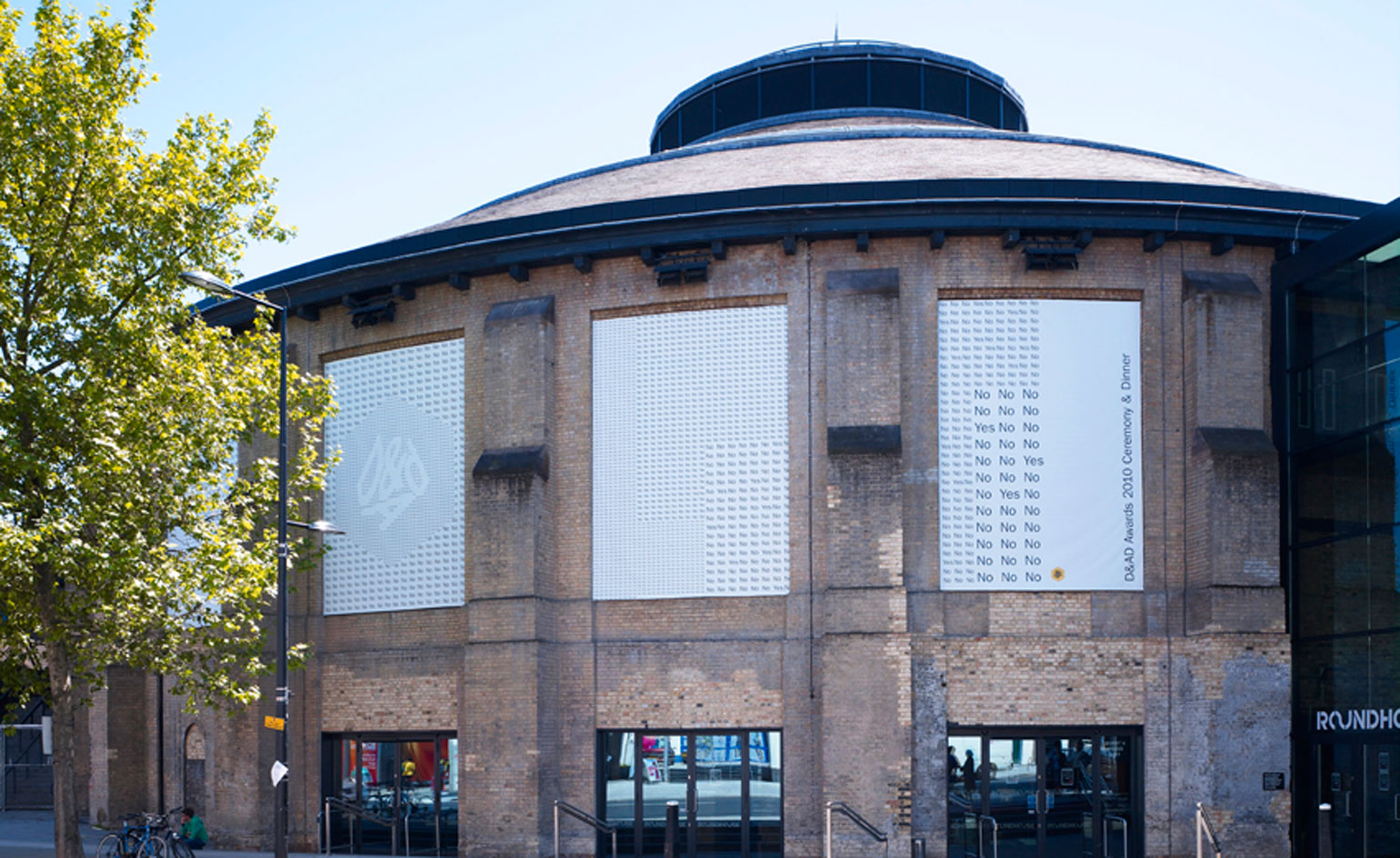
Awards Cermony & Dinner, D&AD: Bibliothèque were commissioned to design and art direct the 2010 D&AD Awards Ceremony and Dinner.
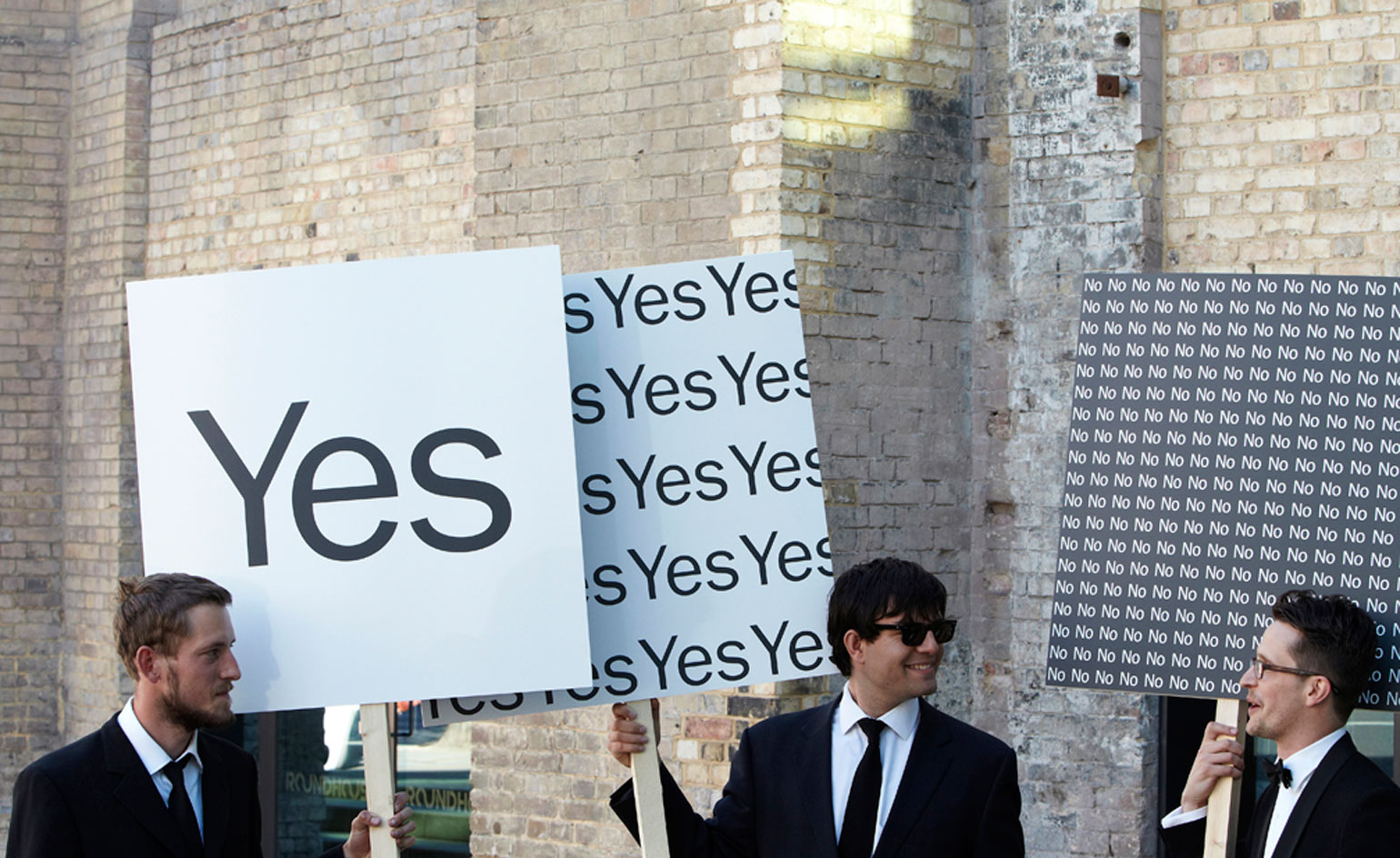
Awards Cermony & Dinner, D&AD: This project was conceptually based on the decisive nature of the judging criteria: there is no grey area, is the entry in or is it out? Is it a 'Yes' or a 'No'? Graphic, spatial and ambient executions communicated the concept as a typographic expression of the number of rejections proportional to the acceptances.
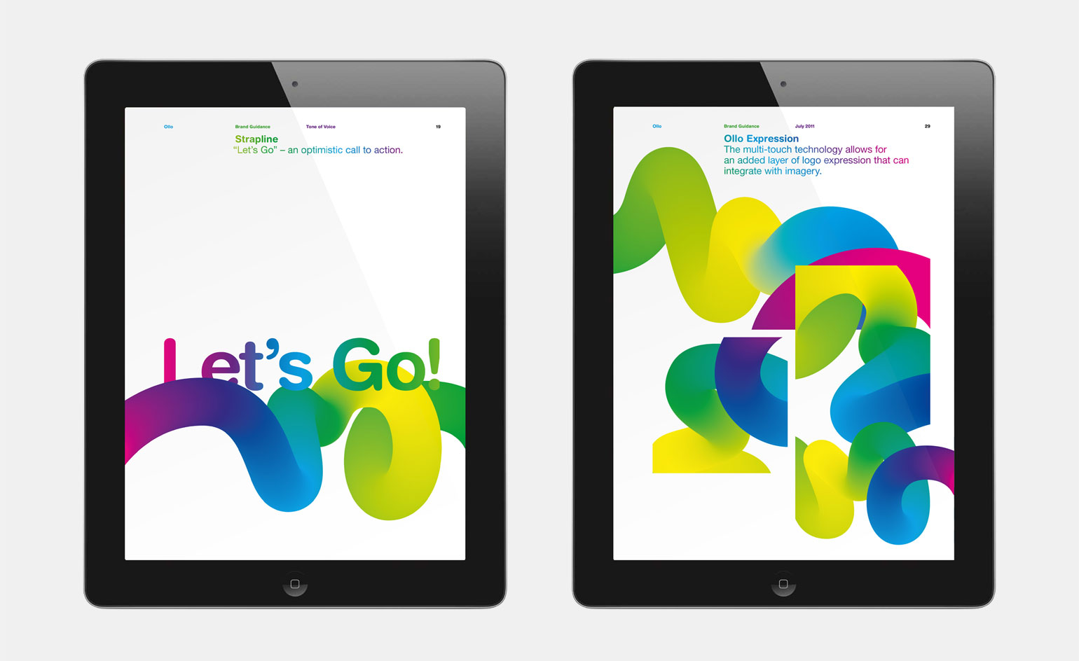
Ollo: This project was a brand creation - including strategy, naming and visual identity - for a new telecoms company providing high-speed internet access to emerging markets. The Ollo concept is simple - one line of communication connecting communities where online demand sits alongside limited infrastructure. Our brief was to develop a brand experience that would differentiate the new product within the saturated telecoms market. Following thorough research and analysis of the competitive landscape, we formulated the strategic position of 'new possibilities for a new audience.' This informed the brand name, tone of voice, logotype and subsequent visual language. The logo is the first to exploit the new multi-touch hardware of smart phones and tablets. Custom software allows for interactive manipulation of the logo, turning it into a creative tool in building the visual language. Playing with the interactive logo allows the designer to create an infinite number of brand-orientated digital assets that can be integrated into the brand.

The Olympic Torch: Sometimes the smaller projects are just as rewarding as the bigger ones and this project is a case in point. This poster was a contribution to 'Fit' - an exhibition of London 2012-inspired posters initiated and curated by UK designers Jonathan Barnbrook and Vaughan Oliver.
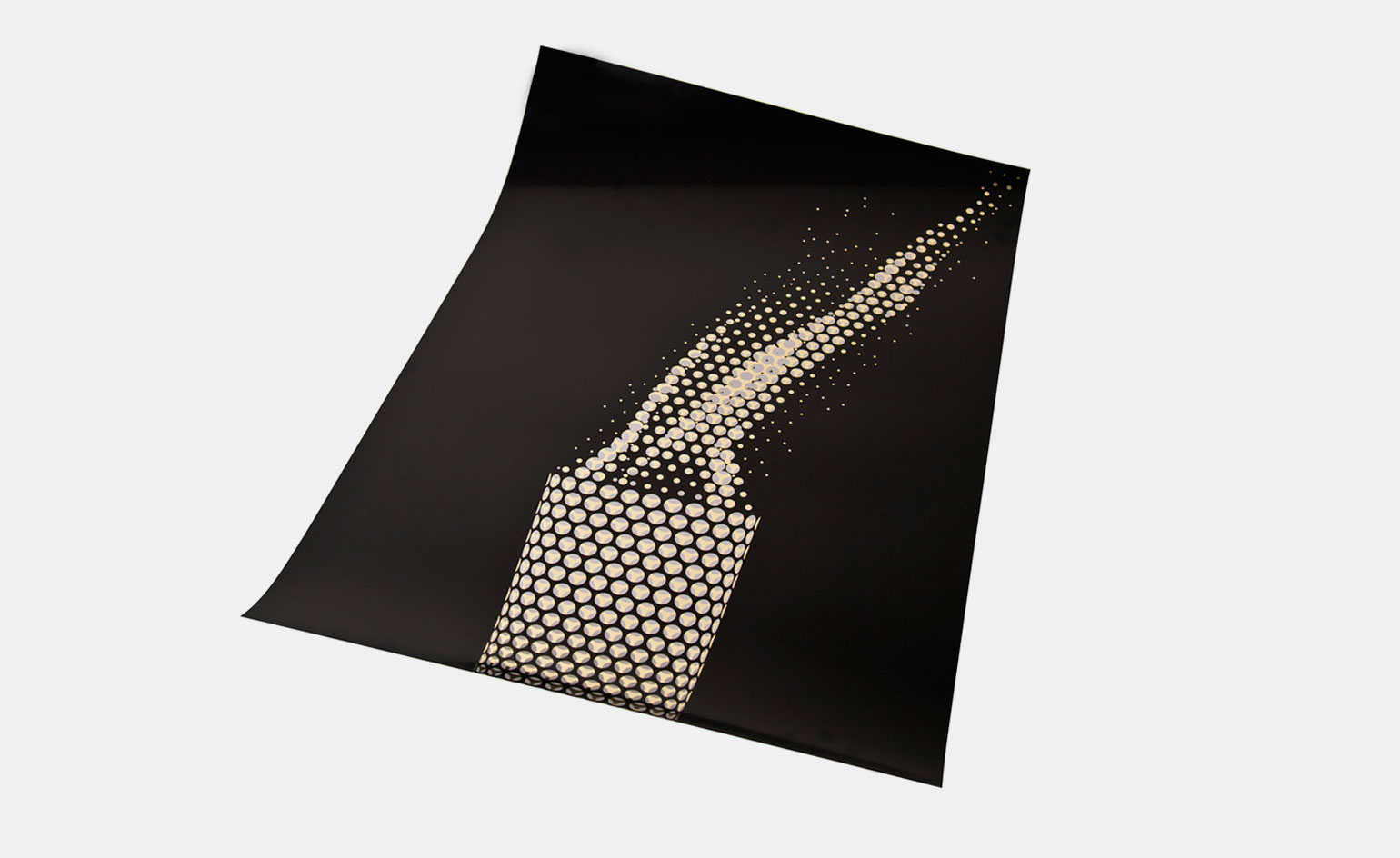
The Olympic Torch: The brief stipulated that we could not use official IOC graphic assets because of copyright infringement. Nonetheless our approach was to produce a poster that could potentially be used in the context of London 2012. Our solution was to reproduce the Olympic flame using the same geometric pattern as the torch, while replicating the materiality of the object by screen printing onto a gold substrate.
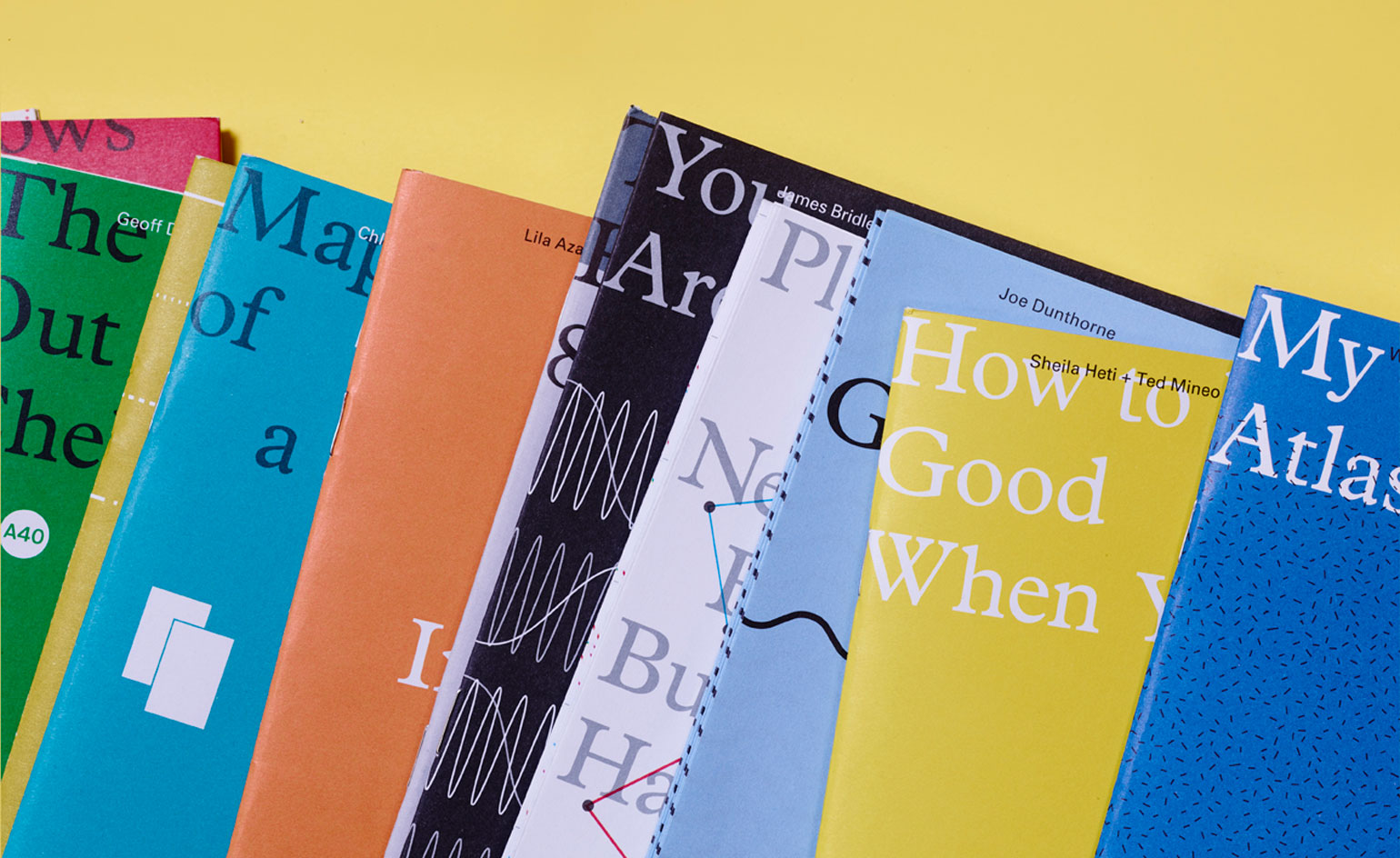
Where You Are, Visual Editions: London-based book publisher Visual Editions bridge the gap between art and publishing. 'Where You Are' consists of 16 personal maps from an array of artists, writers and thinkers - each one exploring the idea of what a map can be.
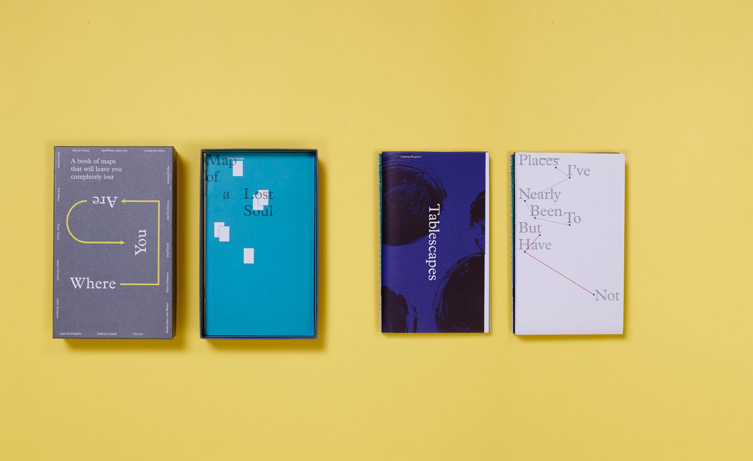
Where You Are, Visual Editions: It's a collection of writing (non-fiction and fiction) and visuals (drawings, photographs, paintings) that explodes what a map is.
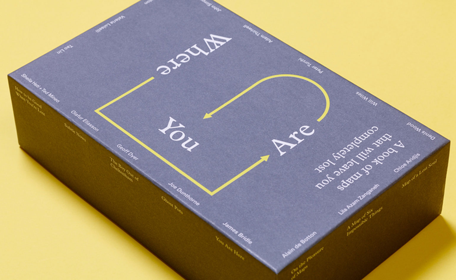
Where You Are, Visual Editions: A wide range of writers, thinkers and artists responded to the brief, bringing together human stories about modern, everyday personal lives and mapping.
Rosa Bertoli was born in Udine, Italy, and now lives in London. Since 2014, she has been the Design Editor of Wallpaper*, where she oversees design content for the print and online editions, as well as special editorial projects. Through her role at Wallpaper*, she has written extensively about all areas of design. Rosa has been speaker and moderator for various design talks and conferences including London Craft Week, Maison & Objet, The Italian Cultural Institute (London), Clippings, Zaha Hadid Design, Kartell and Frieze Art Fair. Rosa has been on judging panels for the Chart Architecture Award, the Dutch Design Awards and the DesignGuild Marks. She has written for numerous English and Italian language publications, and worked as a content and communication consultant for fashion and design brands.
-
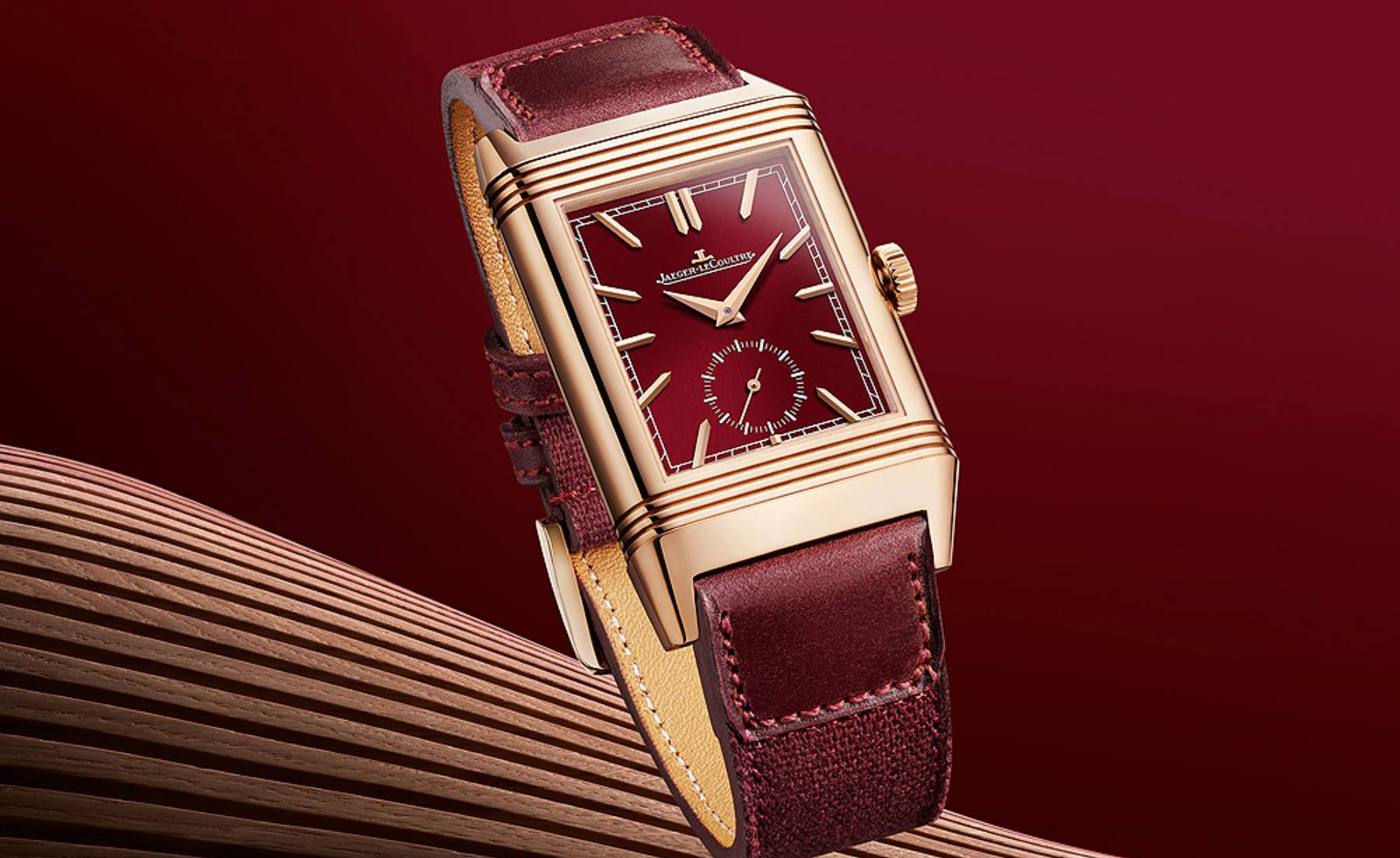 From dress to tool watches, discover chic red dials
Watch brands from Cartier to Audemars Piguet are embracing a vibrant red dial. Here are the ones that have caught our eye.
-
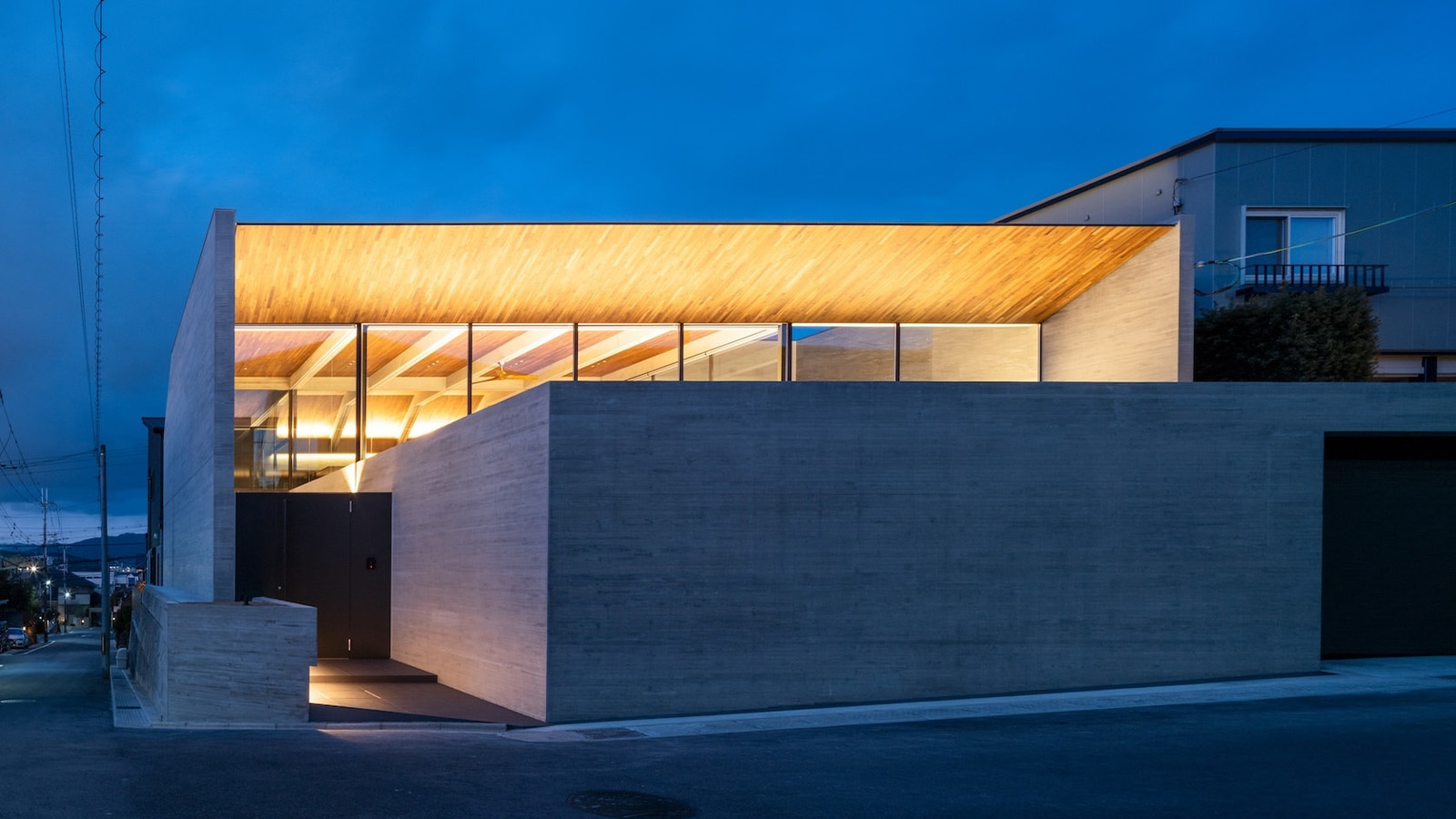 Behind a contemporary veil, this Kyoto house has tradition at its core
Designed by Apollo Architects & Associates, a Kyoto house in Uji City is split into a series of courtyards, adding a sense of wellbeing to its residential environment
-
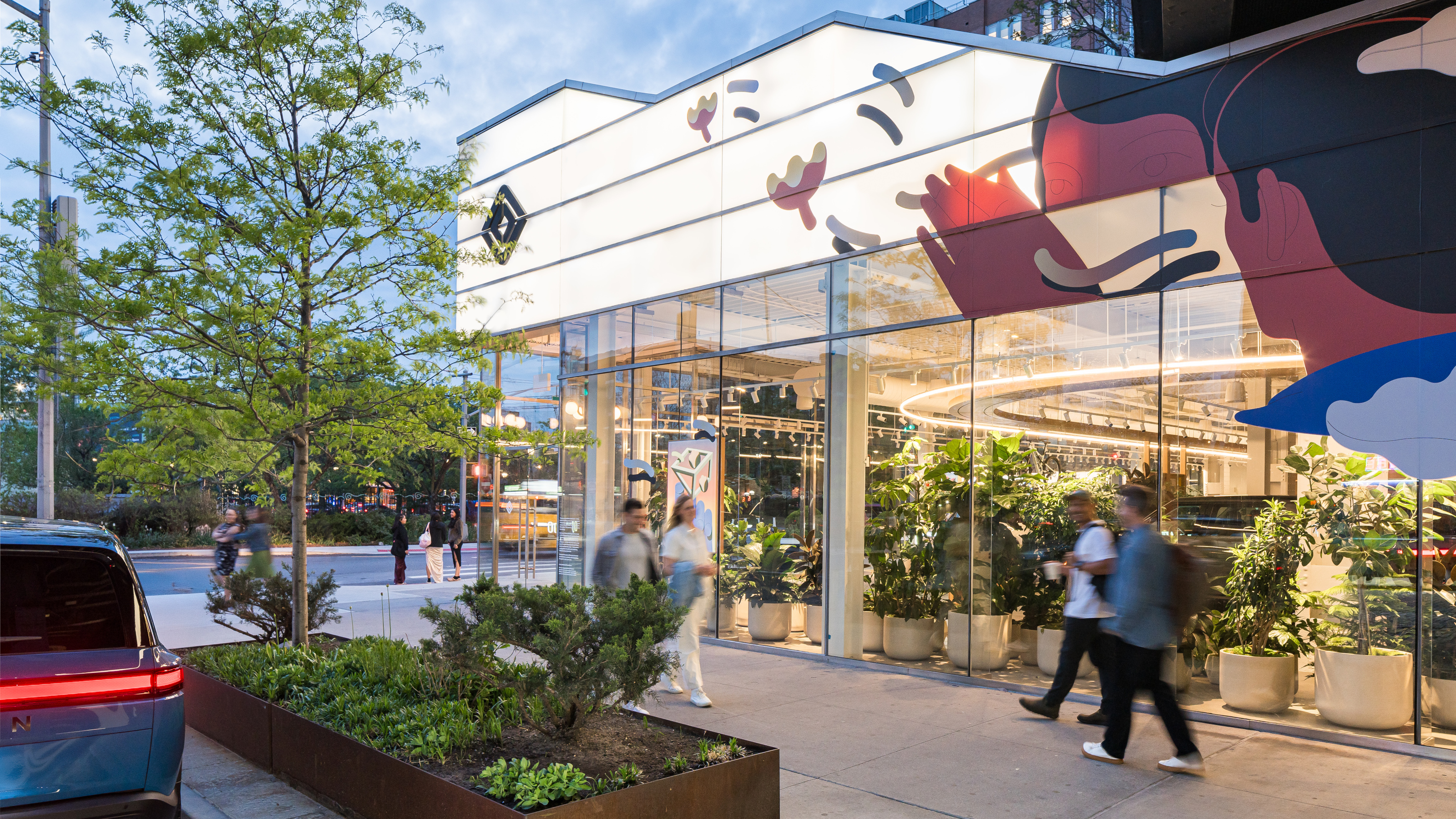 EV maker Rivian creates its first Concept Experience in New York’s Meatpacking District
Under the High Line, in the heart of one of New York’s most famous neighbourhoods is the Rivian Concept Experience, a showroom designed to surprise and delight both long-term aficionados and total newcomers to the brand