Design Awards 2013: best of the rest
Best trend
There's nothing puzzling about this new direction
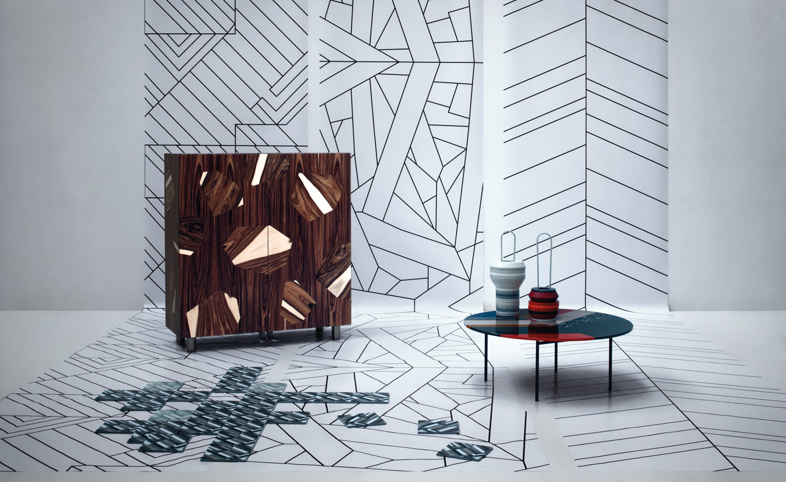
Random patterns, asymmetric forms and a kind of modern marquetry were all part of one definite trend this year - designs put together like a puzzle. The traditional techniques of inlaying and overlaying have been updated, with unexpected assemblages of stone, wood, leather, acrylic and ceramic creating a new type of freestyle, decorative geometry.
'Azulej' tiles, by Patricia Urquiola, for Mutina
Based on ancient handcrafted majolica, but made of hydraulic cement with cold, digital-print glazing, Patricia Urquiola's tile patterns combine different, mixed-up aesthetics, including geometrical schemes and floral designs, which allow a puzzle pattern to be created in both a longitudinal and a diagonal direction.
€99 per sq m; www.mutina.it
'Bois de Rose' cabinet, by Massimo Morozzi, for Edra
Massimo Morozzi's return to hands-on design saw him rediscover old woodwork traditions, but with completely new results. Much of the random, rosewood veneers break the rules of cabinetmaking. Not to mention that they are opened
by piano pedals rather than handles.
€8,640; www.edra.com
'Fishbone' coffee table, by Patricia Urquiola, for Moroso
Patricia Urquiola's modern take on inlaying sees her using Alycrite to mimic natural materials such as horn, marble, mother-of-pearl and tortoiseshell in a random, herringbone-style pattern. With its super-glossy finish and rich, shiny shades, we can't keep our hands off it.
€1,570; www.moroso.it
'Slab' vases, by Form Us With Love, for Cosentino/Silestone
Swedish design group Form Us With Love showed that quartz compound Silestone can be used for more than just kitchen and bathroom surfaces. Like a heavyweight pre-school puzzle, rings in all shapes, sizes and colours make for a different vase each time they're put on the bracket.
Prices on request; www.cosentinogroup.net
Interiors: Elisa Ossino; Writer: Paul McCann
Best Reissues
Our favourite second comings
Ferdinand Kramer table
The 1951 'Calvert' coffee table, by lesser-known Bauhaus architect Ferdinand Kramer, is part of the inspired Knock-Down collection, an early effort to create flat-pack furniture for ease of export. Today's versions by E15 come in oak or walnut veneer, or coloured lacquer.
'Calvert FK04' coffee table, from €390, by Ferdinand Kramer, from E15
Giò Ponti tableware
Using Giò Ponti's original sketches, Sambonet has produced stainless- steel pieces that were designed by the Italian rationalist in 1951, but never manufactured: asymmetric 'Conca' flatware, a tray made from one piece of metal, and a striking centrepiece made of two bowls.
'Conca' cutlery, from €13 each; 'Moka' spoon, €7; centrepiece/ bowls, €339, all by Giò Ponti, from Sambonet
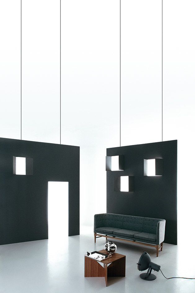
Arne Jacobsen sofa
Conceived in 1939 for Søllerød City Hall, the 'Mayor' sofa is a fine example of early modernism from the granddaddy of Danish design, Arne Jacobsen. This three-seater version, produced by Copenhagen's &Tradition, features a frame of solid oak with Kvadrat upholstery.
'Major AJ5' sofa, €4,449, by Arne Jacobsen, from &Tradition
Le Corbusier light
Inspired by large-scale industrial lamps, the 'Projecteur 365' was originally designed by Le Corbusier in 1954. Now Nemo Cassina has produced wall, floor and ceiling models, with modern elements developed in collaboration with the Le Corbusier Foundation.
'Projecteur 365' light, €800, by Le Corbusier, from Nemo
Interiors: Elisa Ossino; Writer: Emma Moore
Best reinvention
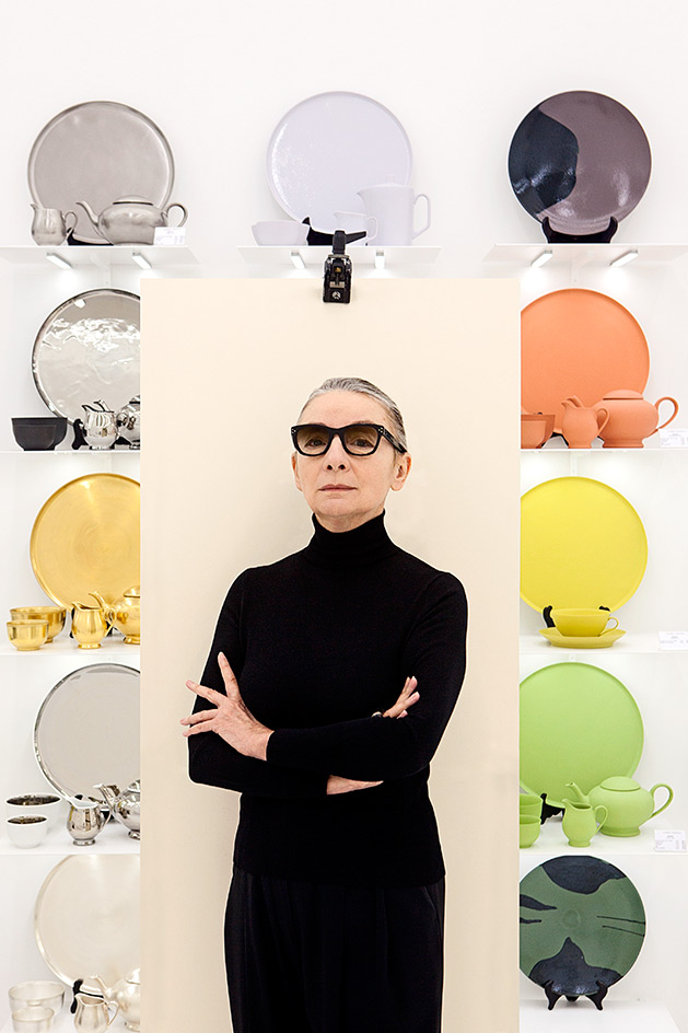
Muriel Grateau, designer and gallerist, Paris
It's not that Muriel Grateau wasn't on our radar. Her name has been above the door of her seventh arrondissement gallery since 1997. Her colour-drenched ceramics have leapt out from the pages of interiors publications over the years and Grateau's striking, black-swathed figure has brought a discreet elegance to the Parisian interior's scene for as long as we can remember. But walking into her newly whitewashed gallery earlier this year, a whole new light shone on the work of the distinguished designer and homeware queen, who started off as a fashion designer in Milan. Grateau's ceramics, glassware and linen, all in fearless hues, are displayed on the ground floor, while her jewellery and new range of silverware and watches are on show upstairs. And with the likes of Peter Marino and India Mahdavi on her list of collaborators, the seasoned designer is definitely one to keep watching.
Writer: Emma Moore
Wallpaper* Newsletter
Receive our daily digest of inspiration, escapism and design stories from around the world direct to your inbox.
Best use of material
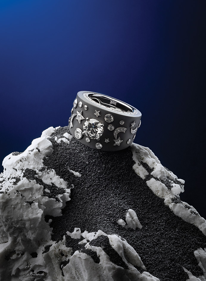
'Clair-obscur' ring, by Chanel Fine Jewellery
The juxtaposition of diamonds and titanium, a somewhat industrial material, is at odds with the romantic image of high jewellery, but that's exactly what we like about Chanel's 'Clair-obscur' ring. 'The most diverse methods are legitimate, provided they are only used in the true spirit of fashion,' said Gabrielle Coco Chanel in 1932, when she created her only high-jewellery pieces. So, when Benjamin Comar, Chanel's director of fine jewellery, re-interpreted the range, rather than just replicate her collection of diamond pieces inspired by stars and comets, he played something of a celestial joke: he set old-school, round-cut diamonds against a futuristic 'sky' of blackened titanium. The Apollo 17 space mission discovered the presence of titanium in meteorites in 1972; the alloy is now widely used in aerospace technology.
Writer: Caragh McKay; Stylist: Ursula Geisselmann
Best plant shop
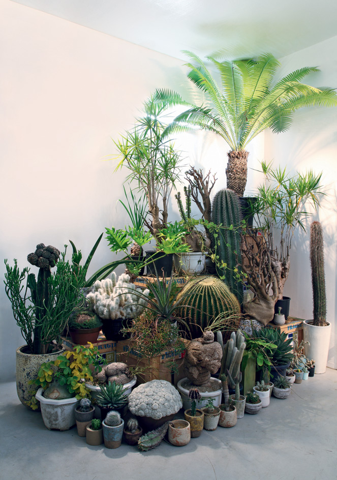
Qusamura, Hiroshima
The 2012 opening of Qusamura was a cause for celebration among plant enthusiasts and pottery lovers alike. The brainchild of florist Kohei Oda, the Hiroshima boutique specialises in pairing unusual cacti with characterful crockery. Beautifully presented to accentuate their strange, spiny shapes, his potted creations, much like spiky bonsais, are botanical sculptures for the home. Oda sources each one from horticulturalists across the country, often choosing cacti that are too weird or weathered for conventional markets. But through Oda's eyes, they have the exquisite potential of fine antiques.
2-26-21 Nishihara, Asaminami-ku, Hiroshima, www.qusamura.com
Writer: Naomi Pollock
Best collection
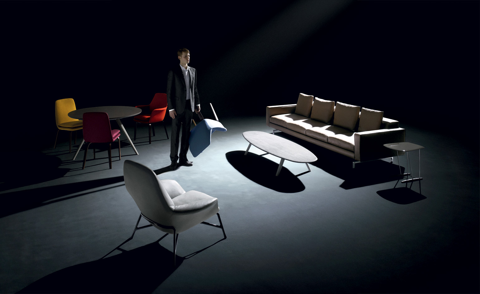
2012, by Minotti
Minotti's powerful 2012 furniture collection evinced the grown-up combination of innovation and continuity that is the family brand's determining ethos. No affectation, no exaggeration, just fabulous detailing, traditional workmanship, sumptuous materials and, to misquote Raymond Chandler, lines to make a bishop kick a hole in a stained-glass window. With hints of midcentury flair (see the oak skids on the side table), a sprinkling of Scandinavian style (in the 'Prince' and 'Gilliam' armchairs) and unabashed Italian luxury (in everything) all in a contemporary package, consider us besotted. Under the coordinating eye of artistic director Rodolfo Dordoni, the 2012 collection injected more colour than in recent Minotti palettes and increased innovation on the quiet: we love the angle of the tapered leg on the 'Evans' table, for example, and 'Brice', the sofa-hugging coffee table, is a delight. The collection also has pieces adapted to more compact living spaces, such as the 'York Lounge' armchair and the 'Sherman 93' sofa. Minotti 2012: the past in conversation with the present and producing stunning furniture.
www.minottilondon.com
Interiors: Amy Heffernan; Writer: Paul McCann
Best future vision
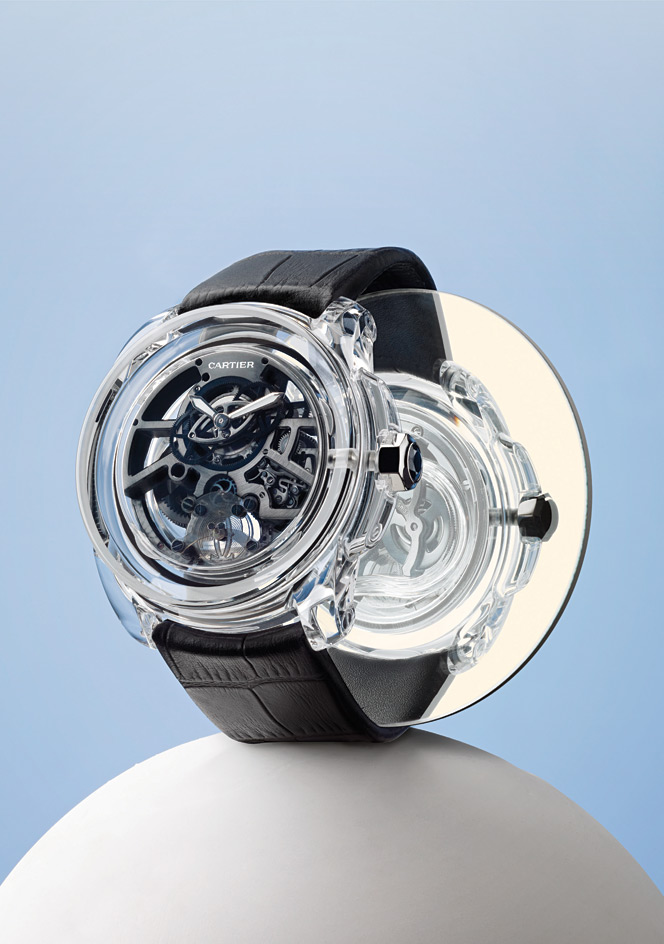
'ID Two' concept watch, by Cartier
It has the form of a classic watch, and yet Cartier's 'ID Two' looks like nothing we've ever seen before. The transparent case appears to be made of glass, but is actually a single block of new-generation clear ceramic, vacuum-sealed with 500 times less air inside than outside, significantly increasing reliability. A not-for-sale one-off, the 'ID Two' is an aesthetic and technological risk. 'We had to adapt to certain pitfalls,' says Edouard Mignon, product and services director at Cartier's watchmaking innovation division. The aim of concept watches, however, is to find answers to everyday problems. 'The creative gambles and technological solutions of this watch will find their way into Cartier's piece in ten or 20 years' time,' says Stanislas de Quercize, president and CEO of Cartier International. Clearly, we can't wait.
www.cartier.com
Writer: Caragh Mckay; Stylist: Ursula Geisselmann
Best finishing touch
Beauty essentials to help you create the ultimate look
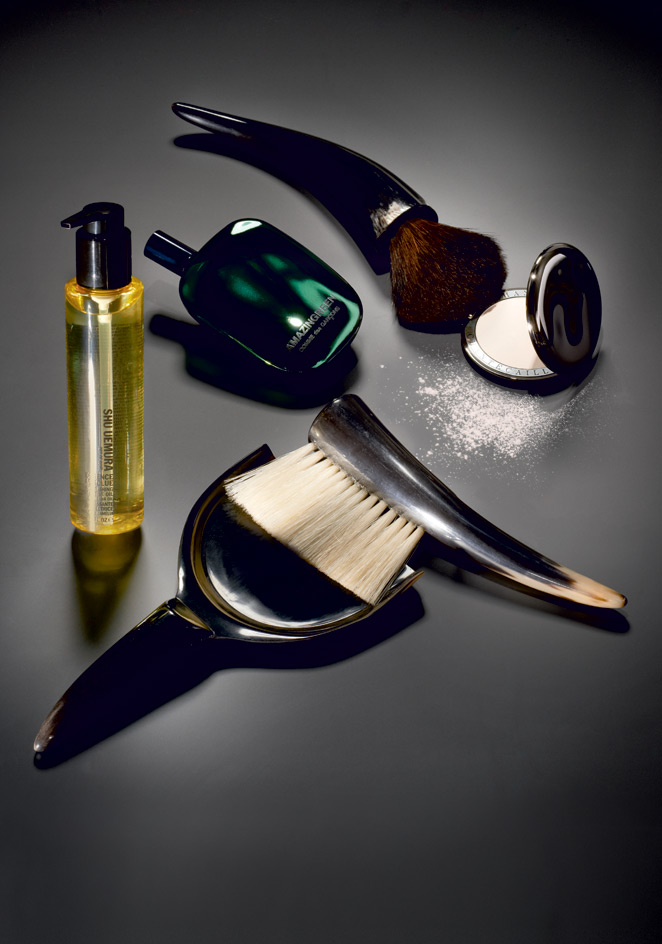
Eau de parfum
This new scent expands the growing green olfactory category with its verdant hit coming from crushed ivy leaves, vetiver and spicy pepper, which sits alongside Comme des Garçons' signature mineral notes to create a modern classic with a masculine edge.
Amazingreen Eau de Parfum, £57 for 50ml, by Comme des Garçons
Perfecting powder
The Holy Grail of make-up is to create the illusion of a digitally perfected, blemish-free complexion, a result achieved with this fine, colourless powder that works on all skin tones to blur imperfections - like Photoshop in compact form.
High Definition Perfecting Powder, £62, by Chantecaille, www.chantecaille.com
Brushes
Polish-born designer Matylda Krzykowski has worked with Viennese brush maker Norbert Meier and horn maker Thomas Petz to create a contemporary collection of brushes and pans for Vienna Design Week 2012.
'Borste & Horne' make-up brush; small pan and brush, prototypes, by Matylda Krzykowski, www.matyldakrzykowski.com
Protective hair oil
Available as an oil or 'oil-in-cream' formula, Essence Absolue is laced with quick-to-absorb camellia oil, which feeds hair shafts, calms frizz and provides lasting lustre. It also imparts a delicate scent, adding fragrance to fluidity.
Essence Absolue Nourishing Protective Oil, £32, by Shu Uemura Art of Hair, www.shuuemuraartofhair.com
Writer: Emma Moore

Best lab
Faculty of Pharmaceutical Sciences, University of British Columbia, by Saucier + Perrotte Architects and Hughes Condon Marler Architects
The University of British Columbia (UBC) in Vancouver has stood, architecturally at least, in the shadows of the city's other leading academic institution, the Simon Fraser University - a perfectly pitched ode to academia designed by the late, great Arthur Erickson. Enter its striking new Faculty of Pharmaceutical Sciences building designed by Montreal's Saucier + Perrotte Architects and Vancouver's Hughes Condon Marler Architects and the university now has a crowd-pleasing piece of controlled drama.
Marking the new gateway to the rapidly developing southeastern edge of the campus, this building is instantly engaging. The entrance features an open plaza that slopes down from an adjacent knoll, literally drawing one inside. Designed as a kind of cubist tree, the façade reveals the building's intent: to transform organic form into Cartesian geometry and to pay homage to the debt science owes to nature.
The façade's variegated glass boxes - an alternating pattern of smoked, enamelled and clear glazing - jut out in different widths and depths, reflecting nearby foliage. They are the 'branches' to the 'trunk' of concrete at the building's base.
Fittingly for a university campus carved out of forest, the tree inspiration continues throughout the building. As you enter the lobby, taking in a permanent exhibition that skilfully fetishises pharmacy (with just a hint of Damien Hirst) and opens up to ground- level glass windows, there is a sense of being at the base of a tree trunk.
Two atrium light wells open up the building to the sky, creating a sense of forest canopy as you ascend the six floors filled with labs and classrooms. Black steel-clad stairwells at seemingly arbitrary angles (one of Saucier's signature elements) bridge the different levels and then disappear into the atrium. Alternating smoked and clear glazing breaks up long corridors and filters patterned, leaf-like light into the interior.
www.saucierperrotte.com, hcma.ca, www.pharmacy.ubc.ca
Writer: Hadani Ditmars
Best comfort food
Pretty pickles in New York, plus two scoops of out-of-this-world indulgence
Jacob's Pickles
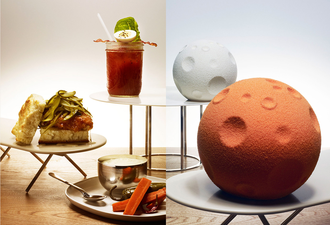
Jacob Hadjigeorgis of New York bar and restaurant Jacob's Pickles has dreamed up a distillation of American comfort foods that has both the local Upper Westsiders and downtown gastrophiles flocking. Opened just over a year ago, it combines Southern soul food with East Coast pickle culture, alongside cocktails and 25 rustic microbrews on tap. Dishes include buttermilk fried chicken, honey and pickle biscuit sandwich, with a side of cheesy grits, and a knockout BLT Bloody Mary, with a bacon strip and half a pickled egg. Everything on the menu will remedy a rotten day.
www.jacobspickles.com
Ice Moons
For its 2012 limited-edition festive offering, Häagen-Dazs teamed up with London designers Doshi Levien. Inspired by Georges Méliès' silent film Le Voyage dans la Lune, they created moon-shaped, layered ice cream bombes: the orange 'Harvest Ice Moon' mixed salted caramel, vanilla ice cream, crispy chocolate cereal and caramelised pecans, while the white 'Full Ice Moon' featured macadamia nut brittle ice cream, raspberry sorbet, meringue and a pistachio biscuit base. 'It was the first time in a design meeting that we ate the prototype,' say the design duo.
www.doshilevien.com
Food: Emily Jonzen; Writer: Emma Moore
Best cover-up
Super-power outerwear that cuts a dash
Herno
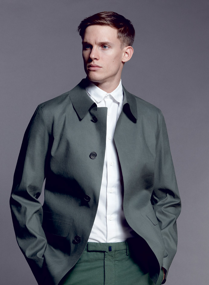
Established in Italy a decade after Sealup (and like Sealup, a trusted manufacturer for a number of international luxury goods brands), Herno matches technical innovation with the sharpest silhouettes and cutting. One of the first Italian brands to open a store in Japan, Herno now has a huge fan base there, which is (almost) always a strong recommendation.
www.herno.it
Fashion: Mathew Stevenson-Wright; Writer: Nick Compton; Model: Chris Doe at Select Model Management; Hair: Yoshitaka Miyazaki using Bumble and Bumble

Best cover-up
Super-power outerwear that cuts a dash
Sealup
Sealup has dedicated itself to keeping Italians and foreign fans chic and dry since 1935. The latest collection continues in the long tradition of understated technicality, but introduces a range of ultra-light fabrics treated with a new resin, which along with glued seams, ensure total weather-proofing.
www.sealup.net
Fashion: Mathew Stevenson-Wright; Writer: Nick Compton; Model: Chris Doe at Select Model Management; Hair: Yoshitaka Miyazaki using Bumble and Bumble

Best cover-up
Super-power outerwear that cuts a dash
CP Company
No, not another bad day for Jack Bauer- though if there was ever a man in need of high-spec, super-functional outerwear, the take-no-prisoners hero of CTU is him - 24 is actually a new capsule collection from the cult Italian label CP Company. As the name suggests this is a total wardrobe solution for the 24/7 urban man of action and stretches from dressier, tailored pieces to all-weatherproof jackets. CP's trademark technical fabrics, capacious pockets and detachable hoods are enlisted across the line. Heavy-duty gear for on and off duty.
www.cpcompany.co.uk
Fashion: Mathew Stevenson-Wright; Writer: Nick Compton; Model: Chris Doe at Select Model Management; Hair: Yoshitaka Miyazaki using Bumble and Bumble
Best cover-up
Super-power outerwear that cuts a dash
Hancock
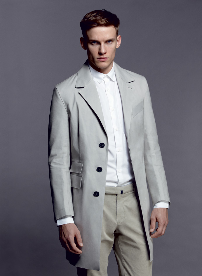
New British label Hancock takes its name from one of the founders of the rubber industry, Thomas Hancock, who worked with Charles Macintosh on the development of vulcanised rubber clothing. The label's founders, Daniel Dunko and Gary Bott, ex-Mackintosh managing director and brand manager respectively, set up a factory in Scotland last year using new and vintage machinery and employing local craftsmen. But if that makes it sound like one more faux-heritage peddler, think again. The rubberised clothes are not just cotton, but also wool flannels, cashmeres and silks, all designed by Scottish art and design students, with a few pieces by old-hand tailor Timothy Everest thrown in for good measure.
www.hancockva.com
Fashion: Mathew Stevenson-Wright; Writer: Nick Compton; Model: Chris Doe at Select Model Management; Hair: Yoshitaka Miyazaki using Bumble and Bumble
Best bottom drawer
'Cartesia', by Nosigner, for MSY
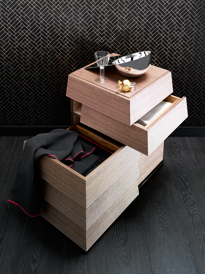
Named for René Descartes' Cartesian coordinate system, Eisuke Tachikawa's improbably lovely chest of drawers is intended to sit in one corner of a room, but open in two directions. We were bowled over by the effortless nature of the drawers' mechanics, but it's not just about a clever engineering system: the solid, graphic drawers - which have a trapezoid shape in order to avoid the need for handles - are also hugely attractive. Made to order using Tamo
or walnut wood by craftsmen in Japan's Tokushima region, 'Cartesia' comes with two, four or seven drawers.
From €3,000, by Nosigner, for MSY
Interiors: Sarah McNabb; Writer: Paul McCann
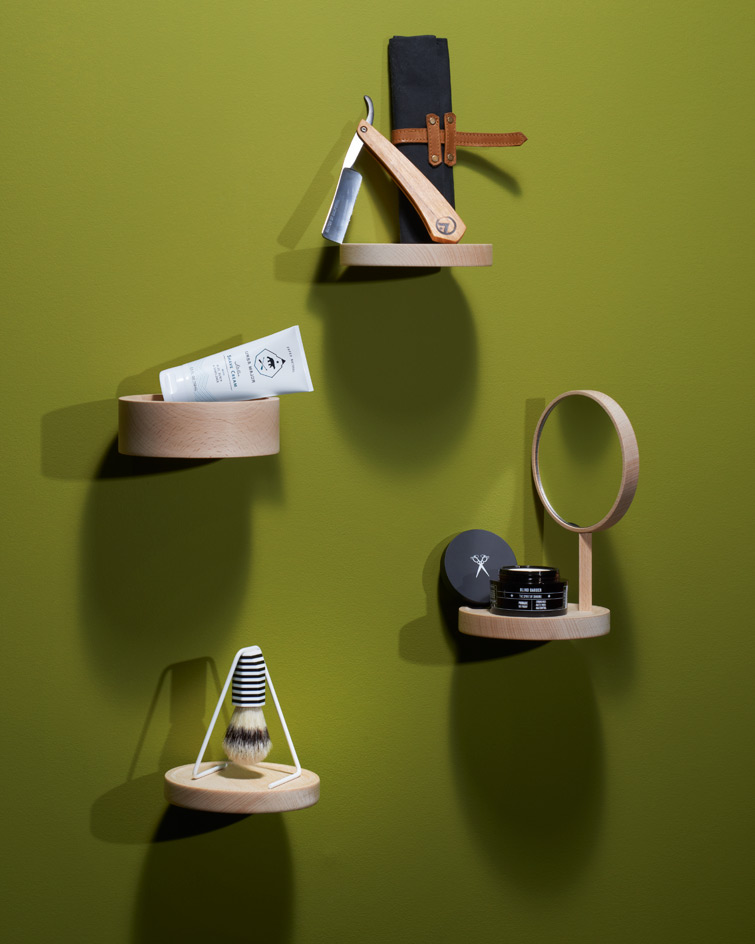
Best groom
These preening products really tidy up
From top to bottom:
Cut-throat razor
Grooming experts Baxter of California have teamed up with Canadian Base Camp X (famed for its beautifully crafted axes) to make a limited run of cut-throat razors. Cut from Tennessee hickory, the handle holds a Hart steel razor and comes with a neat waxed canvas and leather pouch.
Straight Razor, $280, by Base Camp X and Baxter of California
Shaving cream
Ursa Major has been winning fans since its launch last year, and its nourishing aloe, willow bark and birch sap shaving cream is its hero product. Owner Oliver Sweatman was a founder of New York barbers Sharps, but sold up and moved to Stowe in Vermont to be closer to the great outdoors that now inspire his grooming products.
Stellar Shave Cream, $24, by Ursa Major
Hair pomade
The roaring 1920s-style approach of the Blind Barber (a cocktail is served with every cut) has made it a Stateside favourite since it opened in 2010. Its new range of products follows a similarly boozy path, with juniper berry (a key ingredient in gin) in its shaving unctions and hops, a natural thickening agent, in its pomade.
90 Proof Pomade, $22, by Blind Barber
Shaving brush
The style currency of this shaving brush, with its layered acrylic handle, is self-evident. Team it with this innovative magnetised stand and the design is a real winner. Created by London-based studio Yang Ripol, magnetised inserts let the brush hang and dry upside down, which is key to keeping boar bristles shipshape.
Brush and stand, prototype, by Yang Ripol
Writers: Emma Moore, Pei-Ru Keh
Best test of time
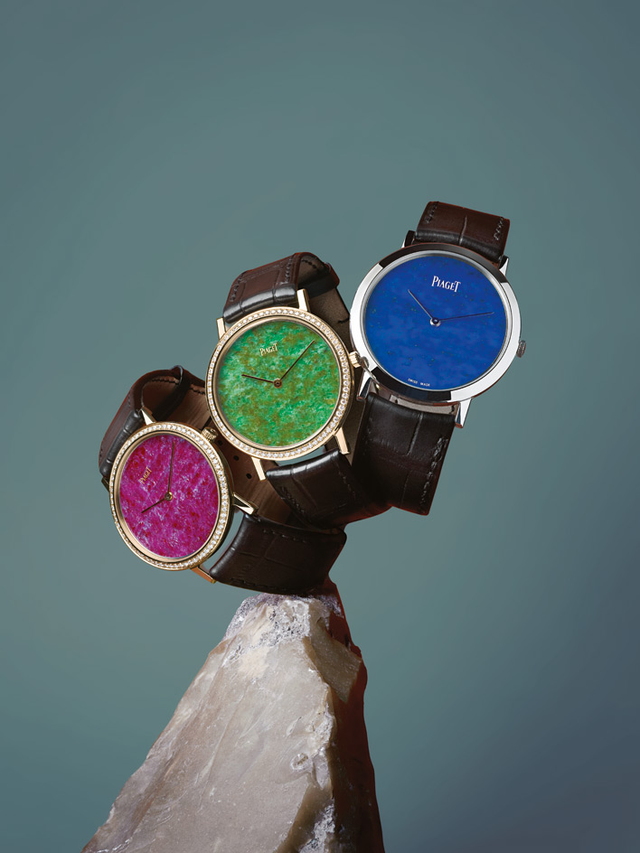
'Altiplano' hard-stone dial watches, by Piaget
As fans of Piaget's psychedelic-luxe watch designs of the 1960s and 1970s, the revival of its hard-stone dial designs delivered one of our horological high-points this year. Only the truly chic had the chutzpah to sport gem-hued dials back in the day, and nearly 50 years later, the avant-garde 'Altiplanos' sit elegantly apart from the sport-watch aesthetic that has dominated watch design over the past couple of decades. With an element of fine jewellery, these timepieces remind us how innovative the fusion of engineering and design can be, and that the best can derive from something as simple as introducing colour and texture where it's least expected.
'Altiplano' watch with heart ruby dial, £19,800; with malachite dial, £16,000; with lapis lazuli dial, £17,600, all by Piaget
Writer: Caragh McKay; Stylist: Ursula Geisselmann

Best day out
Franklin D Roosevelt Four Freedoms Park, New York City, by Louis Kahn
When President Roosevelt outlined the famous four freedoms in his celebrated 1941 State of the Union speech, he rallied a nation behind an idea of 'future days' worth fighting for. Fast-forward over 70 years and the long-awaited Franklin D Roosevelt Four Freedoms Park has finally opened on the southern tip of Roosevelt Island, on New York City's East River.
The park was originally designed by American architect Louis Kahn in 1973. But Kahn's death the following year and a shortfall in finances and political will derailed the project. Construction work finally began in 2010, thanks to William vanden Heuvel, former US ambassador to the UN and founder of the Franklin and Eleanor Roosevelt Institute.
Strikingly geometric, the focal point of the triangular park is a 476kg bronze bust of President Roosevelt, created in 1933 by artist Jo Davidson. Behind it sits a dramatic open-air plaza that Kahn called the 'room', looking over the water towards the city. With spectacular views of the Manhattan skyline, this truly unique park - Khan's last work - is set to become a key city highlight for New Yorkers and tourists alike.
www.fdrfourfreedomspark.org
Writer: Ellie Stathaki
Best mission
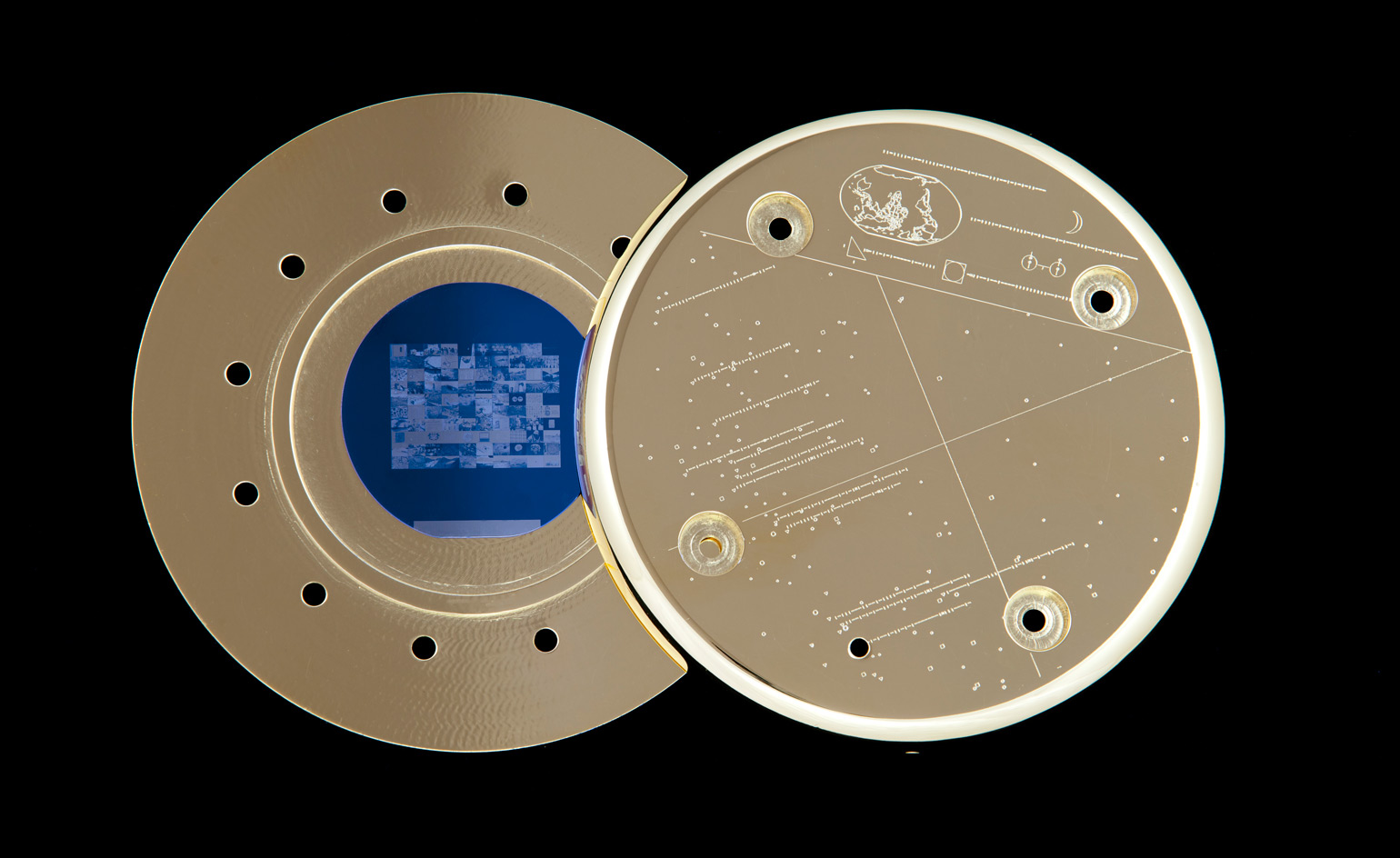
The Last Pictures, by Trevor Paglen
The book that chronicles Trevor Paglen's The Last Pictures project is described as available 'for audiences on earth', carrying the clear implication that the primary audience is an extraterrestrial one. For once this is not just a publicist-driven fancy.
Paglen is an American artist and photographer. He grew up on US and German military bases and specialises in photographing military installations and artefacts of America's hidden national security state, including NSA listening stations in West Virginia, and CIA prisons near Kabul. His images, often shot through very long lenses, are blurry and diffuse. 'Useless as evidence,' he says, but still aesthetic and allegorical. His striations of long-lens light have been blown up to large sizes and shown at London's Tate Modern and New York's Metropolitan Museum of Art.
His most recent project is intended for a more rarefied crowd. With funding from the public art collective Creative Time and the help of materials scientists at MIT, he attached a gold canister containing 100 photographs etched onto a silicon wafer to the outside of a communications satellite. The images - including a cloud, a chicken farm and Trotsky's brain - tell a unique tale of recent human history. A 2012 map of pulsars is etched onto the outside of the canister - the rate of the pulsating stars can be used like a calendar, telling any aliens who find it when it was launched.
The Echostar satellite, which was launched from Kazakhstan in November, circles the earth so high (36,000km) that it is not disturbed by atmospheric turbulence and could continue orbiting long after we're all gone. Paglen gives it five billion years, or until the Sun becomes a Red Giant and engulfs the Earth. The selected photographs are intended to underline the fragility of humanity, without being all-encompassing. 'They are a document of this historical moment. But not meant as a representation of humanity. Just one impression of the world at this moment,' he says. For audiences on Earth, there is the book and an exhibition, in collaboration with the University of California Press and New York's Metro Pictures Gallery.
www.creativetime.org/thelastpictures
Writer: Paul McCann
Best bookshop
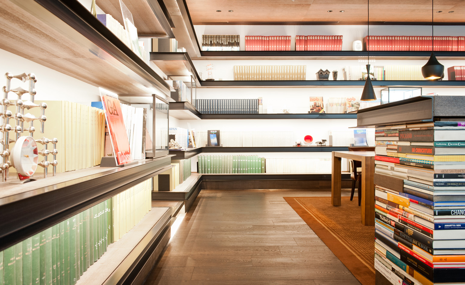
Daikanyama T-Site, Tokyo, by Klein Dytham and Kenya Hara, for Tsutaya
There is no small irony in the fact that the giant Japanese books, CDs and video rental chain Tsutaya - having perhaps abandoned all hope of pulling in young people to peruse and purchase physical printed matter - commissioned this huge bookshop to appeal to the over-45s market, a demographic not quite ready to give up on words on paper. But when we visited, the place was packed and no one looked much over 25.
Tokyo-based British firm Klein Dytham came up with T-Site idea, a series of three neo-modernist pavilions arranged around a series of wooded courtyards (the complex, in the capital's low-rise and leafy Daikanyama district, is also home to restaurants and other shops, including a dedicated Leica outlet). The striking white façade of each pavilion is made up of overlapping concrete Ts, but branding is kept to a minimum and the signage is delicately handled by Kenya Hara. Inside, shelves creak with over 140,000 books and magazines from around the world, as well as CDs and DVDs (for sale and to rent). A hammered-steel central staircase created by Japanese craftsmen leads to an upstairs lounge bar, where you can read leather-bound vintage magazines, and the menus, a rare digital intervention, are iPads.
tsite.jp/daikanyama, www.tsutaya.co.jp, www.klein-dytham.com, www.ndc.co.jp
Writer: Nick Compton

Best storage
'B3' drawer fitting system, by Bulthaup
The humble kitchen drawer is not usually something to be proud of, but Bulthaup's 'B3' interior fitting system has changed all that. The German kitchen specialist has devised a clever set of wave-like inserts which fit into any of its drawers to help keep things organised. Available in a range of heavy-hitting materials, including oak, steel and rubber (pictured), the structural addition is complemented by an equally astute series of prismatic dividers that playfully slide along its ridges to accommodate utensils of every shape and size. And the customisation doesn't stop there: the 'B3' system also boasts additional wooden knife blocks, glass spice jars and stainless-steel containers to keep any loose ends, from garlic cloves to cookie cutters and toothpicks, neat and tidy. The configuration is versatile and an be swapped as needed to suit, making this one good-looking pull-out worth ordering.
'B3' drawer insert (including three dividers and wooden knife block), from £400, part of the 'B3' kitchen, by Bulthaup
Writer: Pei-Ru Keh
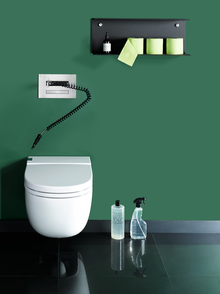
Best loo
'In-Tank Meridian', by Roca, and 'Hydroplate', by CEA
In an attempt to keep toilet matters as pristine as possible, we have sought out the freshest loo and accessories. Roca's latest WC has a built-in cistern, discreetly hidden behind the bowl, offering a two, three or 4.5 litre, noise-free flush and optimised water flow. This leaves space for the industry's newest must-have, the water jet loo cleaner. CEA's 'Hydroplate' system has screw-less fixings and a retractable hose designed to put the least popular member of the household, the toilet brush, out of a job. We've teamed these two winners with Aesop's sweet-smelling 'Post-Poo Drops' and Planet Luxe's all-natural 'Toilet Cleaner'.
'In-Tank Meridian' toilet, from £950, by Roca. 'PLA06 Hydroplate', from €932, by CEA
Writer: Emma Moore
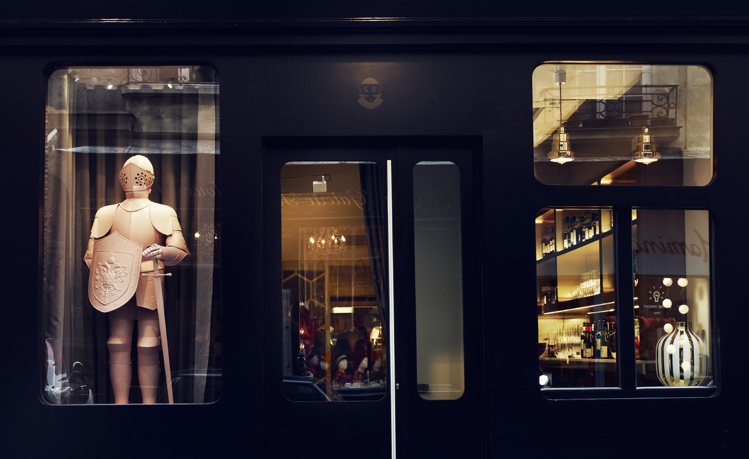
Best fixer-upper
Le Sergent Recruteur, Paris, by Jaime Hayón, for Behind The Scene
When the owners of Le Sergent Recruteur, one of Paris' oldest restaurants, needed to update what they freely admitted was a tourist trap with dated interiors, they wisely turned to Jaime Hayón. Seven months later and the cavernous space in the city's moneyed Île Saint-Louis has been freshly spruced up with the Spanish designer's trademark handsome pastels and softly rounded rectangular forms. The bones of the building - the rough stone walls and ancient timber rafters - are intact, but Hayón has added modern layers such as a stainless steel-edged, marble-topped bar and tapestries specially woven by Amsterdam's Textile Museum. Timber-trimmed steps lead down to a bijou, mirror-lined private dining room. In the kitchen, chef Antonin Bonnet (ex-La Baumanière, and London's Greenhouse) presides over a modern European rural menu. Recent highlights have included line-caught mackerel marinated with lime juice, charcoal roasted onions, and pear tart served with clover ice cream.
41 rue Saint-Louis-en-l'Île, 4e, tel: 33.1 43 54 75 42, www.lesergentrecruteur.fr
Writer: Daven Wu
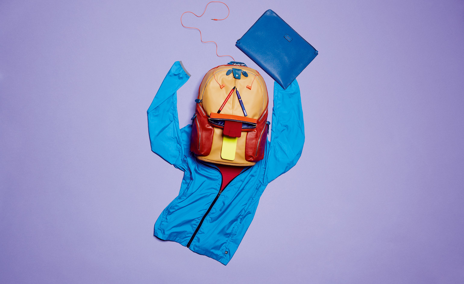
Best bag
'Coleos' backpack, by Piquadro
It is an irony of the contemporary urban condition that we at once want to be lighter, faster and more mobile, and to carry all the communication tools known to man while we do it. Of course, these tools get lighter and smarter all the time, so this is possible. It just means we compartmentalise more than ever. And our best bag of the year, by the Italian label Piquadro, compartmentalises beautifully. This multicoloured leather marvel has not just padded compartments for your 13-inch laptop and your iPad, but also pockets for your smartphone, credit cards, umbrella (with drainage holes) and more, as well as a folding rainproof cape. It is also expandable in case you want to fill it with quaint old analogue items such as books and magazines.
€330, by Piquadro
Writer: Nick Compton
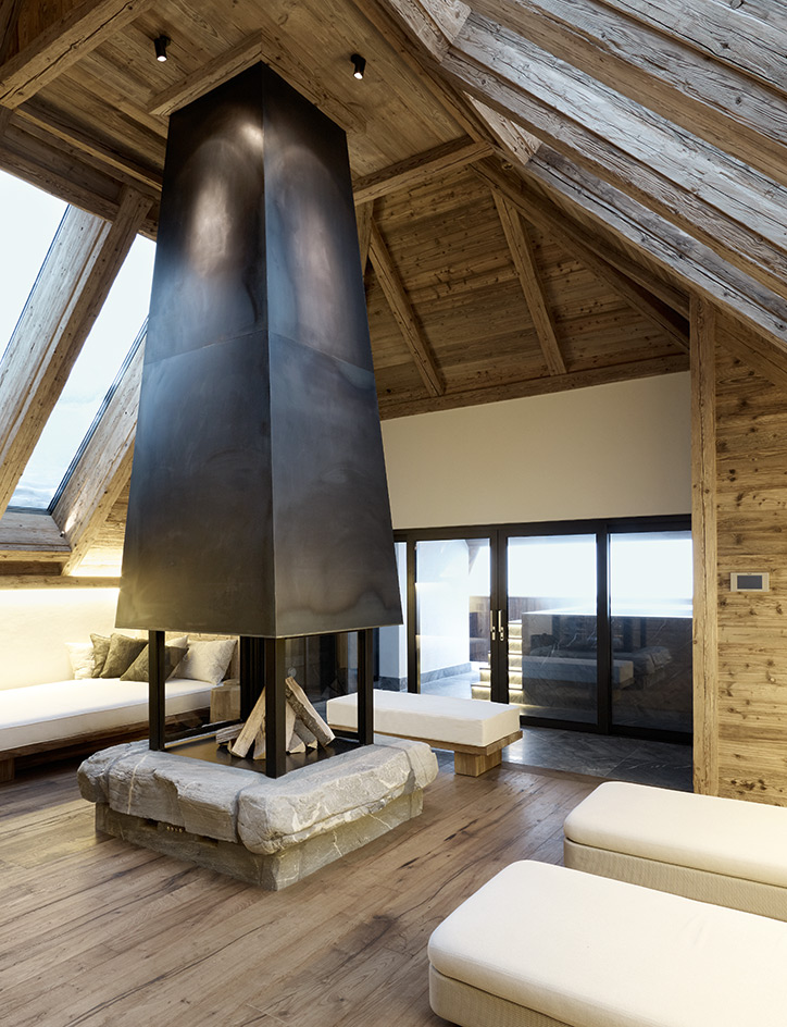
Best winter retreat
The Alpina Gstaad, Switzerland
They say all good things come to those who wait and in the case of Gstaad, it has been more than a century since a five-star hotel opened there. Set on a hilltop in nearly seven acres of prime Oberbort real estate, the hotel, with its 25 rooms and 31 suites, overlooks the Bernese Alps and is part of an ambitious $337m development that will eventually include private apartments and chalets. The interiors have been rigged out by design consultants HBA/Hirsch Bedner Associates with a rugged blend of reclaimed timber, unbleached wool rugs, and fir and leather columns. However, for our money, the real draw is the tranquil Six Senses Spa, which Thai interiors outfit P49 Deesign has fitted with darkly stained Swiss conifer, rock walls, timber plinths, and basins carved out of rock. The subtle Asian theme is also picked up in Megu, the hotel's sumptuous Japanese restaurant. Here, designer Noé Duchaufour-Lawrance was inspired by traditional Japanese homes to create a three-levelled space partitioned by slatted conifer screens covered with antique kimono fabric.
Alpinastrasse 23, Gstaad, tel: 41.33 888 9888, www.thealpinagstaad.ch. Room rates: from £561
Writer: Daven Wu

Best building sites
A rising financial star in China and a low-slung arts space in Brazil
Shenzhen Stock Exchange, China, by OMA
Up until now, OMA's extravagant adventure in modernist architecture may seem to have been mostly concerned with cultural creation, re-shaping galleries, TV stations, and other media outlets of modern life. But in fact, Rem Koolhaas' studio has never shied away from addressing the rather more prosaic infrastructure of finance, be it the 2003 competition entry for the European Central Bank, or the Rothschild Bank in London, completed last year. The upcoming Shenzhen Stock Exchange is an explicit metaphor for a young market, a symbol of economic power that happens to have no strings attached thanks to its huge 'floating' podium. Just as millions of daily trades float about in a virtual marketplace, the podium base is elevated, raised 36m above a public square. Seven years in the making, the 246m-high structure blends engineering audacity with hi-tech cladding, all set in a stylised garden plaza.
oma.nl
Writer: Jonathan Bell

Best building sites
A rising financial star in China and a low-slung arts space in Brazil
Cais Das Artes, Brazil, by Paulo Mendes da Rocha and Metro Arquitetos
The Cais das Artes (Quay of Arts) complex sits on the waterfront in Vitória, capital of Brazil's Espírito Santo. Designed by Paulo Mendes da Rocha in collaboration with Metro Arquitetos, it comprises a museum and theatre, two monolithic concrete structures elevated above a plaza and set at right angles to each other. Decidedly industrial in character - this is a working port, after all - the Cais das Artes features a dramatic undercroft, letting the public space flow beneath the building with tantalising glimpses up, across and through, towards distant peaks and the city's signature Deputy Darcy Castelo de Mendonça bridge. A cultural generator that doesn't revert to look-at-me iconism, the Cais is old-school concrete with a very contemporary urban aspiration.
www.metroo.com.br
Writer: Jonathan Bell
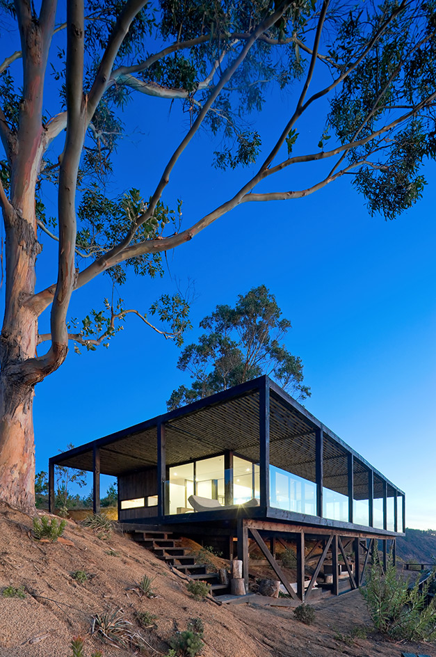
Best getaway
Casa Till, Chile, by WMR Arquitectos
As the perfect getaway retreat should, by definition, be remote, smart but Spartan and with breathtaking sea views, Casa Till ticks all the boxes. Designed by WMR Arquitectos, the house is located on the Chilean coastline on a 200m-high and 10km-long stretch of cliffs, about 5km from the village of Matanzas. There is only one other house - also by WMR - for miles around.
In 2009, the Santiago- and Matanzas-based firm, headed by directors Felipe Wedeles, Jorge Manieu and Macarena Rabat, was invited by the clients to create their dream weekend bolt-hole. Inspired by the architects' previous work, in particular their use of wood, the brief asked for something stylish but simple.
Prefabrication was essential in the construction process and only local labour and materials were used. Pine was the wood of choice, as it ages well and is relatively inexpensive. The 85 sq m house was designed within a simple 3.2 sq m wooden grid that structurally supports the whole building and was treated for strength and durability, which turned the timber black. Outside, the ceiling supports a sun terrace with a Jacuzzi, connected to the main house via a ramp.
www.wmrarq.cl
Writer: Ellie Stathaki
Rosa Bertoli was born in Udine, Italy, and now lives in London. Since 2014, she has been the Design Editor of Wallpaper*, where she oversees design content for the print and online editions, as well as special editorial projects. Through her role at Wallpaper*, she has written extensively about all areas of design. Rosa has been speaker and moderator for various design talks and conferences including London Craft Week, Maison & Objet, The Italian Cultural Institute (London), Clippings, Zaha Hadid Design, Kartell and Frieze Art Fair. Rosa has been on judging panels for the Chart Architecture Award, the Dutch Design Awards and the DesignGuild Marks. She has written for numerous English and Italian language publications, and worked as a content and communication consultant for fashion and design brands.
-
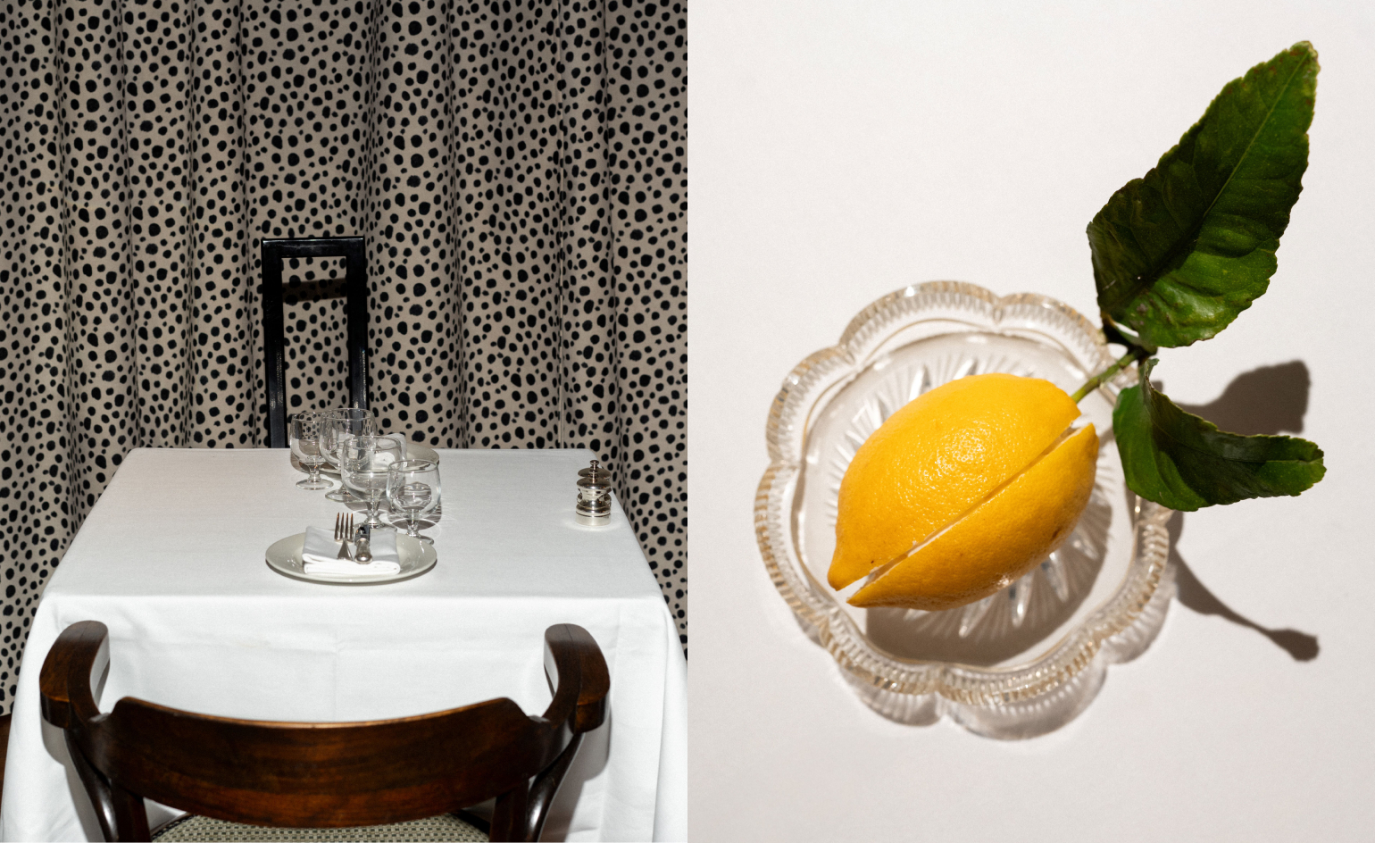 Marylebone restaurant Nina turns up the volume on Italian dining
At Nina, don’t expect a view of the Amalfi Coast. Do expect pasta, leopard print and industrial chic
By Sofia de la Cruz
-
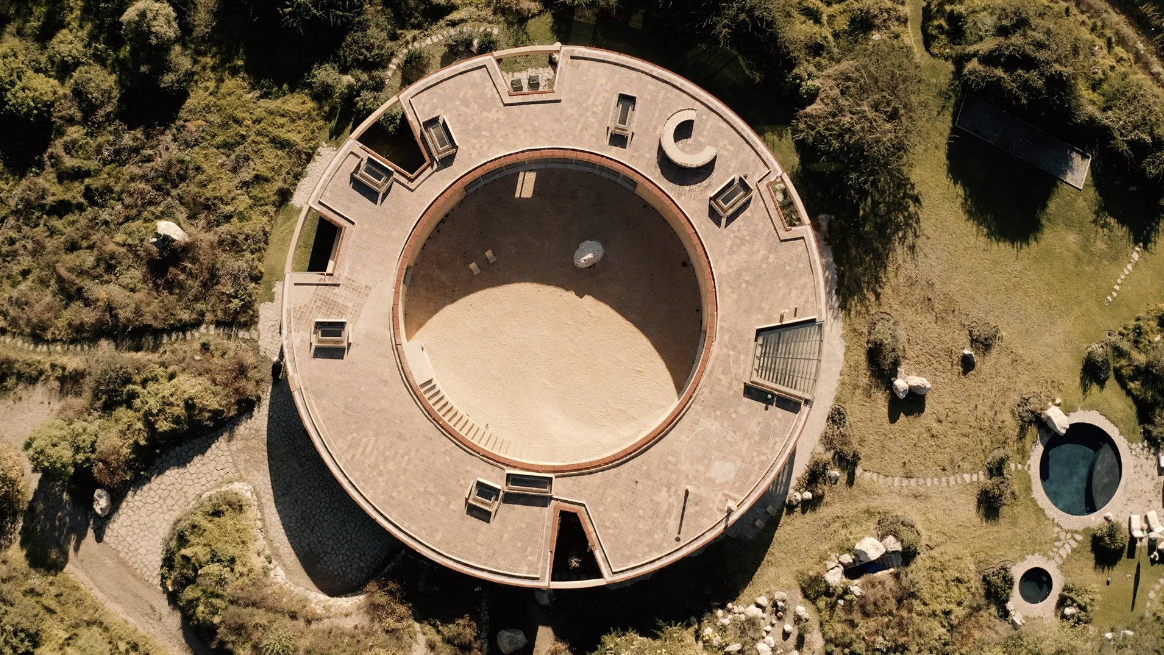 Tour the wonderful homes of ‘Casa Mexicana’, an ode to residential architecture in Mexico
‘Casa Mexicana’ is a new book celebrating the country’s residential architecture, highlighting its influence across the world
By Ellie Stathaki
-
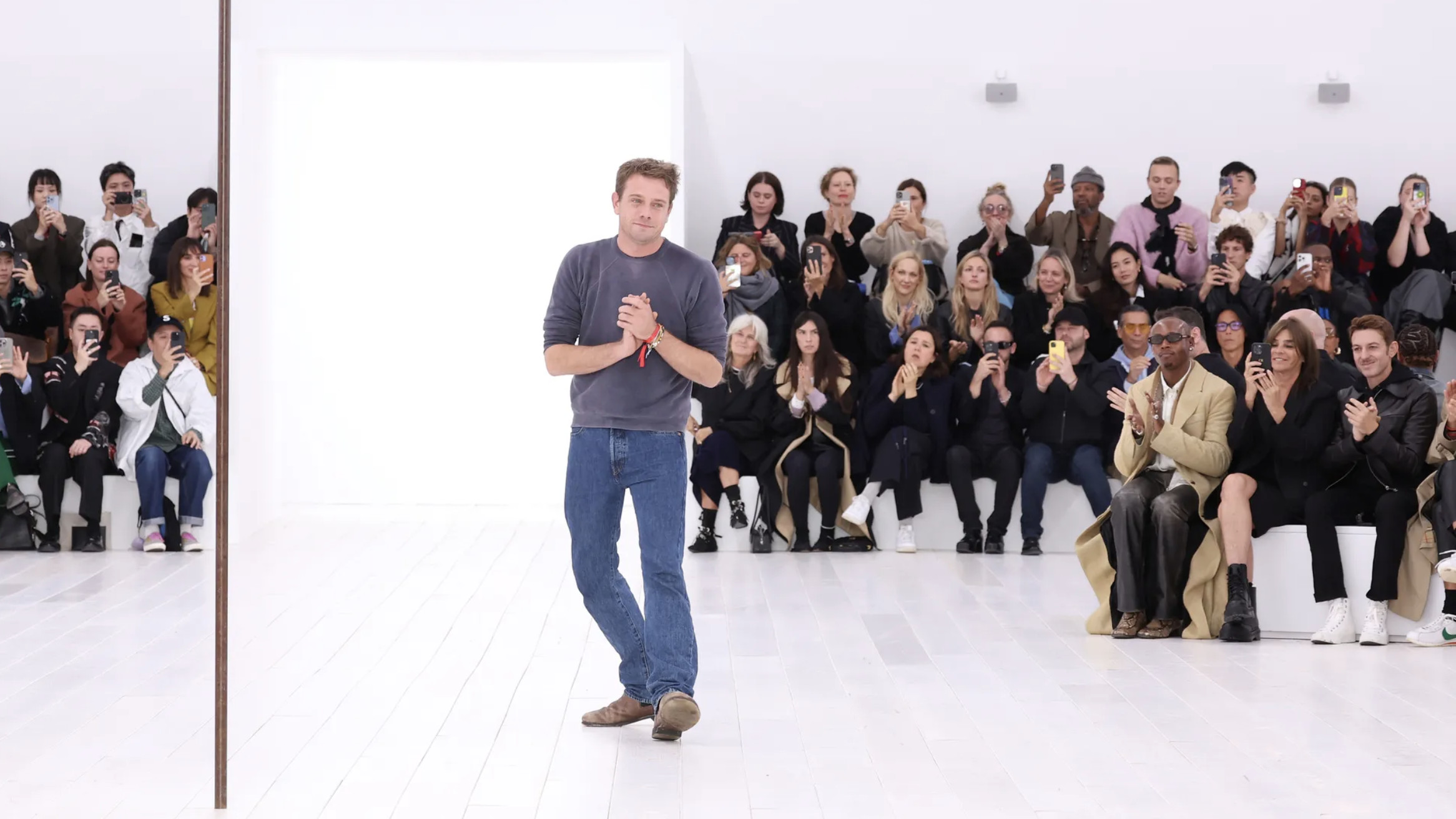 Jonathan Anderson is heading to Dior Men
After months of speculation, it has been confirmed this morning that Jonathan Anderson, who left Loewe earlier this year, is the successor to Kim Jones at Dior Men
By Jack Moss