Stairways to retail heaven: the best treads in-store
In luxury boutiques around the world, staircase design is seriously on the up. Staircases constructed from intricate jigsaw pieces of marble, graphic folds of burnished metal, or spiralling organic forms, are enticing customers to venture into the upper echelons of a store. Here, we present the highest climbers in retail staircase design. Hold onto your handrail…
Receive our daily digest of inspiration, escapism and design stories from around the world direct to your inbox.
You are now subscribed
Your newsletter sign-up was successful
Want to add more newsletters?

‘We wanted this staircase to be considered the sole sculptural object within the space, perfectly balancing beauty and physics,’ says Axel Arigato’s co-founder and creative director Max Svärdh, of the monumental raw concrete design which sits in the centre of its recently opened Copenhagen flagship. The label considers staircase design of the upmost importance in its stores, using the structure not just as a practical device, but as a space for displaying merchandise and hanging out. ‘We want people to sit on these steps and be part of the store’s atmosphere,’ adds Svärdh. The label worked with regular collaborators Halleröd on its retail design. The Scandinavian design studio have also worked with Totême, Frame and Acne Studios on store concepts. ‘The inspiration came both from Italian architect Carlo Scarpa’s and the Japanese architect Kisho Kurokawa,’ Svärdh says. We can’t wait to hang out.
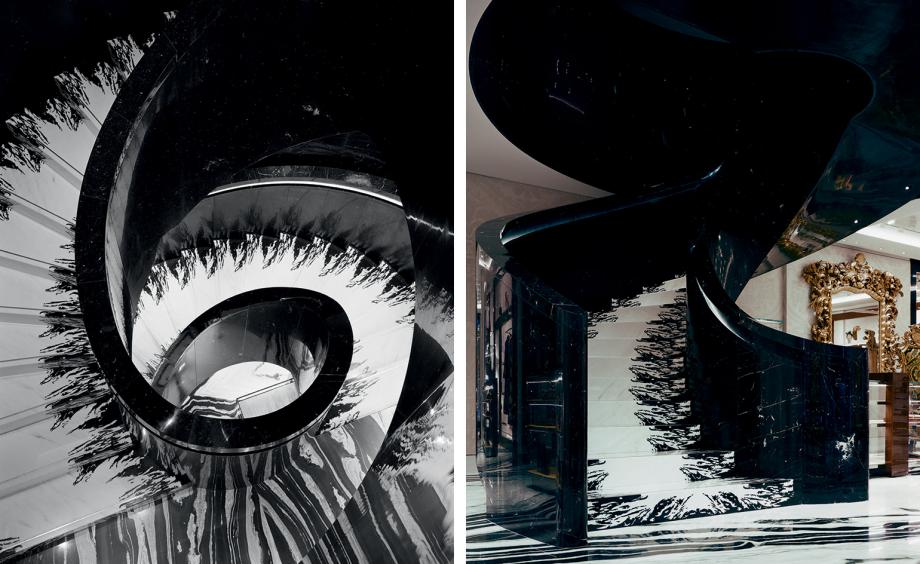
Gwenael Nicolas-designed staircase for Dolce & Gabbana’s Old Bond Street boutique
Dolce & Gabbana swept up the award for Best Ascent in the 2018 Wallpaper* Design Awards with a pair of spiral staircases in its Old Bond street boutique in London, by Gwenael Nicolas. The first connects the boutique’s sprawling six floors. Handrails and sides are constructed from Nero Marquina marble, and the steps appear to form a delicate lace ribbon in a combination of monochrome Bianco Laser and Nero Marquina marble.

Gwenael Nicolas-designed staircase for Dolce & Gabbana’s Old Bond Street boutique
The second of the Dolce & Gabbana staircases connects the top three floors of the brand’s private salon space, constructed from a monochrome patchwork of the marble and granite found throughout the boutique (Black Lightning; Nordic White; Copacabana; Nero Grand Baroque; and Panda White). The staircase is designed to look identical when viewed from above or below.
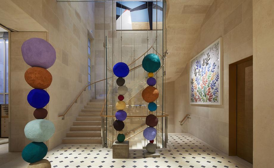
Louis Vuitton’s Peter Marino-designed Place Vendôme store
Peter Marino’s occupation of Place Vendôme has lead to some incredible interior architecture over the years. A particular highlight is the Louis Vuitton store, which features a staircase carved from 18th-century stone, complete with sleek glass balustrades, suspended by stainless steel cables. Additionally, it is lined with stacks of colourful spherical sculptures by Annie Morris.
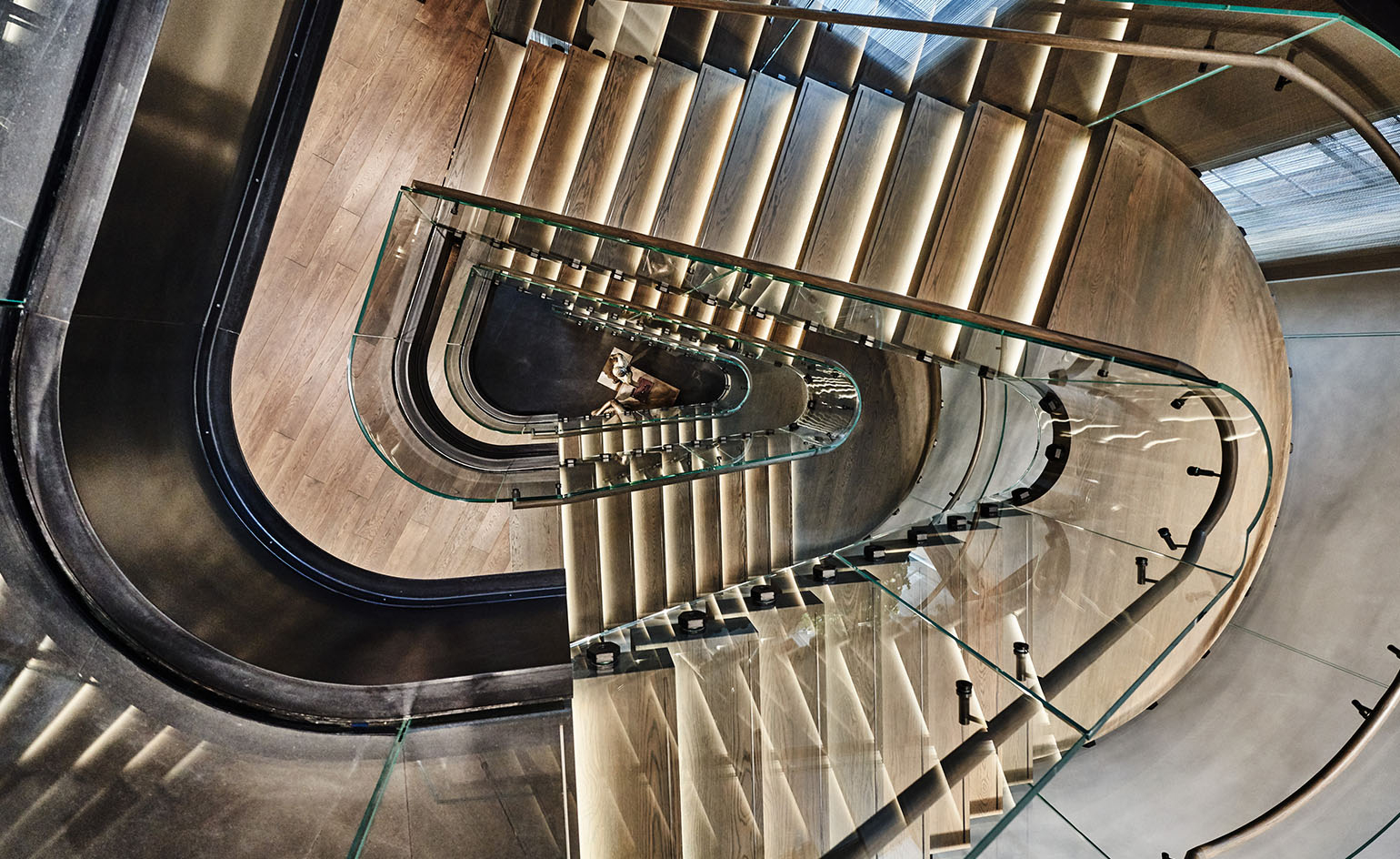
Bottega Veneta’s Manhattan boutique
Bottega Veneta’s latest flagship boutique in Manhattan is a five-story, 15,000 sq ft space that combines womenswear, menswear, accessories, watches, jewellery, fragrance, eyewear and homeware. Creative director Tomas Maier conceived the store’s design, looking to the city skyline for inspiration. An undulating glass staircase runs through the boutique, drawing in tones of grey, washed green and beige.
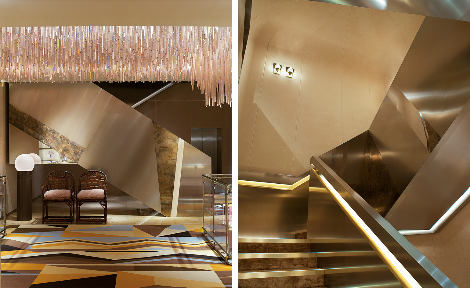
Fendi’s Sloane Street boutique, by Dimore Studio
Dimore Studio decked out Fendi’s Sloane Street outlet in a late 1960s and 70s aesthetic, creating a truly retro mood with velvet and mohair-lined walls, plush amber carpets and shimmering surfaces. The stores’s staircase connects the two floors, featuring bannisters lined with wedge-shaped panels made from various metals.
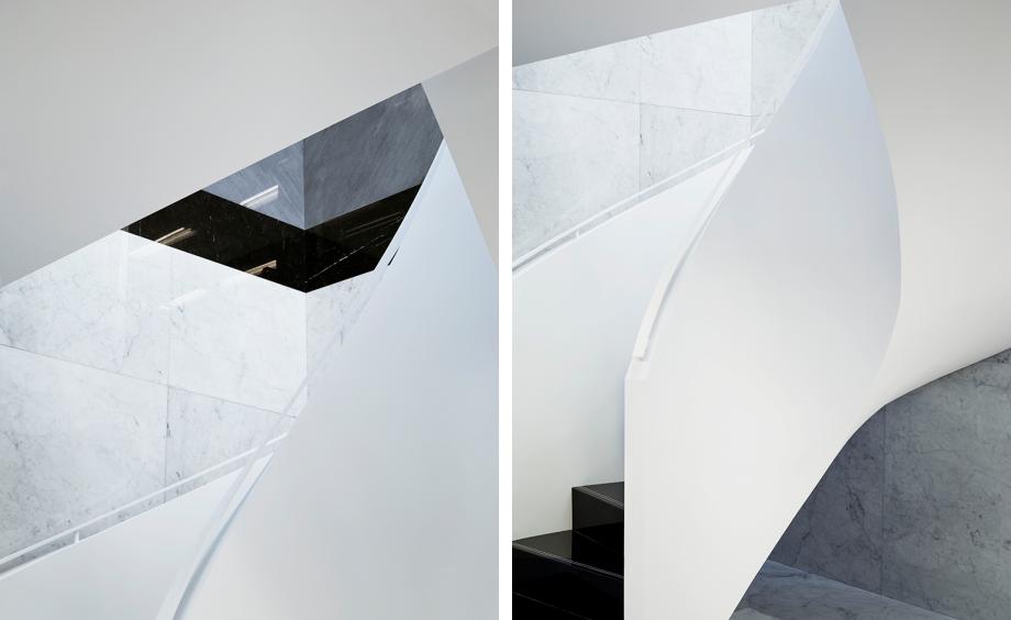
Thom Browne’s office-inspired London store
Thom Browne’s second freestanding European store arrived on London’s Albemarle Street in 2017, designed by longtime friend and architect Flavio Albanese. Drawing on the mid-century office-inspired style that’s become synonymous with Thom Browne stores, Albanese used a combination of Venetian slat blinds for the windows, rows of fluorescent tube lights on the ceilings and a refined palette of grey, black and white. A floating staircase connects the two floors, finished in a clean white.
Receive our daily digest of inspiration, escapism and design stories from around the world direct to your inbox.
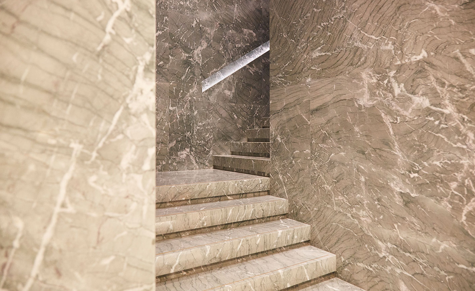
Dolce & Gabbana’s Palazzo Torres store
Eric Carlson’s Palazzo Torres store for Dolce & Gabbana marked a new entry onto the brand’s roster of unique, individually designed outlets. The boutique reflects the house’s multifaceted aesthetic, blending Sicilian baroque with flourishes of humour, cartoonish prints and sensual silhouettes. The entrance celebrates Venetian mercantile craftsmanship, paved in multi-coloured inlays of ancient marble, with walls adorned with wooden bas-reliefs depicting scenes of the city’s artisanal and commercial life during the late 19th century. A staircase of Venetian marble leads to formal and evening wear selections on the first floor.
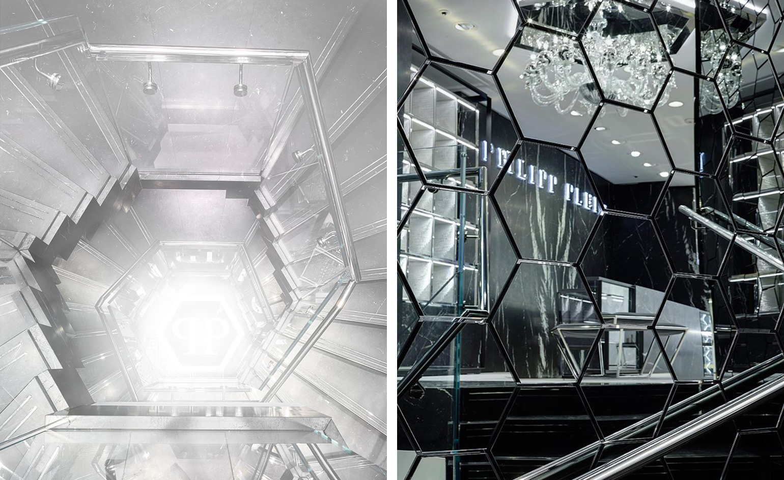
Philipp Plein’s gleaming Claudio Pironi-designed London flagship
December 2016 marked Philipp Plein’s UK debut with his first boutique on New Bond Street. Italian architect Claudio Pirono designed the limited 420 sq m space, which features black and white marble, glass and stainless steel. A hexagonal marble staircase (the shape being a Plein motif across his works) features cantilevered landings, impressively fitting into the space.
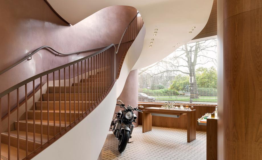
Hermès’ London store, by RDAI Architecture
Longtime Hermès collaborators RDAI Architecture realised its 2017 Sloane Street addition, an immactulately presented outpost awash in soft curves and warm metals. RDAI has created over 300 stores for Hermès over their 30-year relationship, imbuing each outpost with its own unique features and architectural elements. The RDAI team moved the existing oak wood staircase so that it faced the window, leading guests upward through the space with the aid of a handrail wrapped in Hermès Etoupe leather.
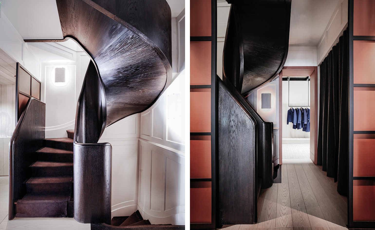
Connolly’s classical-contemporary design fusion in its Mayfair home
French architects Gilles & Boissier are renowned for their fusion of divergent elements, having produced interiors which are harmonious blends of the modern and classical, minimal and ornamental. British brand Connolly, originally founded in 1878, reopened its doors in a Georgian townhouse dating from 1719, designed by architect John Witt and one of the oldest to be found in Mayfair. Gilles & Boissier brought out the elegant beauty and home comforts of the townhouse with hand-crafted fixtures, featuring smooth wood pannelling, marble desk slabs and hornbeam cabinets. A winding, dark wood staircase wraps through the store’s levels.
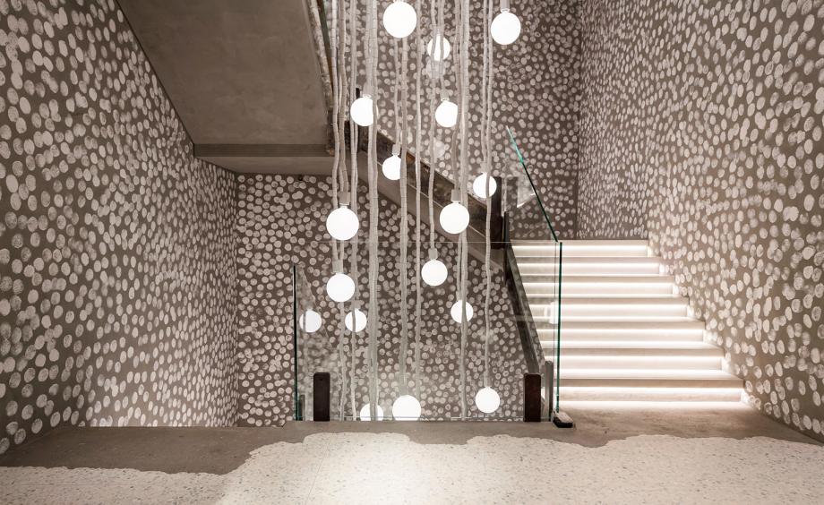
Paola Navone breathes new life into Hong Kong boutique Joyce
Chinese luxury retailer Joyce turned to Italian architect Paola Navone for the refurbishment of its Central branch in Hong Kong. Navone was spurred by the thought of transforming a familiar space, a point of reference, with a strong identity. Using her signature Tham ma da (Thai for ‘everyday’) technique, Navone connects the four floors using ordinary elements taken from the everyday, and elevating them to points of interest. A staircase featuring imperfectly hand-painted polka dot walls leads to a mezzanine exhibition space.
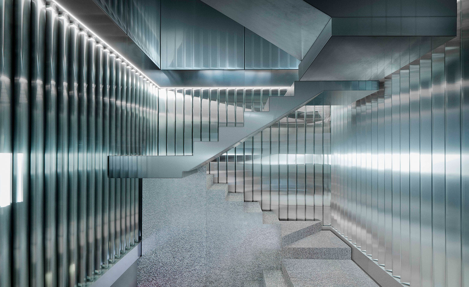
Repossi’s OMA-designed Place Vendôme store
A retail store like no other, jewellery maison Repossi’s Place Vendôme outlet, designed by OMA, combines linear display cases cut from reflective, rotating slats, salt and papper terrazzo floors (a mix of foaming aluminium and resin) and industrial metal. The store palette was designed by Ippolito Pestellini Laparelli, producing a brutalist, masculine identity that creates an androgynous space, very well reflected in the bold staircase connecting the three floors.
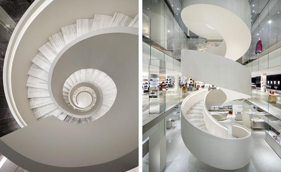
Barneys flagship store in downtown Manhattan
Barneys returned to New York in 2016 with a downtown flagship on 7th Avenue, the very Chelsea block where the company started in 1923. Local architecture firm Steven Harris Architects oversaw the design, producing a subtly luxurious space featuring mirrored vertical, horizontal and diagonal lines making up the abstract design of the atrium. A flowing white spiral staircase acts as the store centrepiece, connecting the foundation level to the third floor.
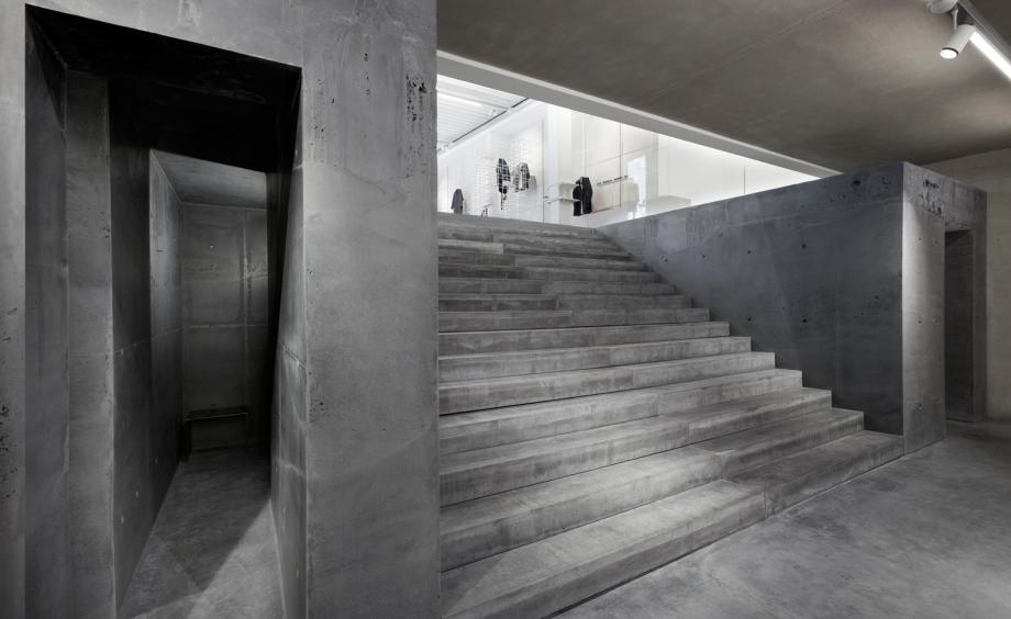
ETQ’s multi-brand store in Amsterdam
ETQ’s two-storey flagship in Amsterdam is minimal and essential, a simple brick and mortar affair. Designed by Jos Van Dijk, the interior architect converted the 3,450 sq ft space from a former classic menswear store into an engaging stage with a ‘Barragán’-esque appeal, featuring very little product per square metre. A heavy concrete design creates a very tempting appeal for the staircase, which pulls visitors down towards the basement level.
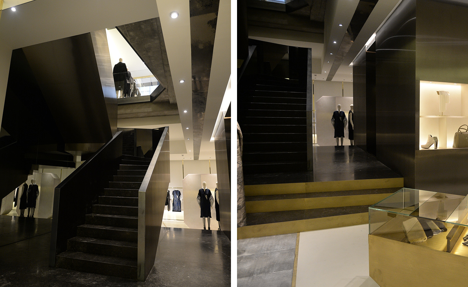
Krizia joins forces with Vincenzo De Cotiis for a stark store blueprint
Italian brand Krizia opened a slick shop along Milan’s Via della Spiga as part of a rebranding scheme, redesigned by Vincenzo De Cotiis. Distilled down to hard lines and pure geometry in a lofty, clean box, the space evokes an art gallery, featuring fibreglass shells repurposed from old ships, contrasting sleek onyx and reflective mirroring on warm, glowing walls. A staircase crafted from burnished steel and coloured glass brings customers from the ground floor to a sub-level, where an expanded offering of ready-to-wear and accessories can be found.
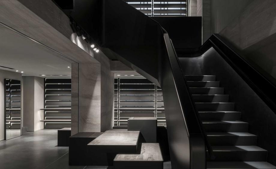
Vincent van Duysen transforms former post office into Alexander Wang’s London flagship
Belgian architect Vincent van Duysen transformed a former Post Office on Mayfair’s Albemarle Street into a freestanding flagship store for Alexander Wang. Natural stone and Travertine is incorporated into the design with distressed chrome, recycled rubber and industrial metal plate. The positioning of the staircase was a difficult decision, made a centrepiece with its sculptural dark grey concrete steps encased in black leather, with an embossed stingray leather handrail.
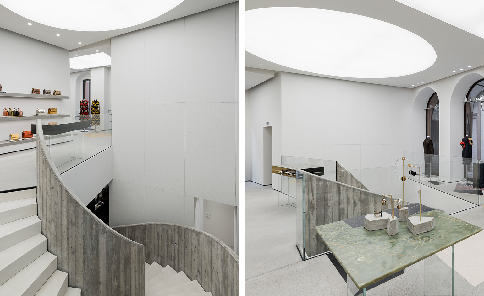
Marni’s Montenapoleone Milan store
Marni’s Milanese boutique architecturally mirrors its quirky, feminine identity by adopting a sober structure with eccentric accents. The store is infued with a dramatically austere yet whimsically playful charm, featuring a minimal spiral staircase with immaculate white walls interjected with coloured marble.
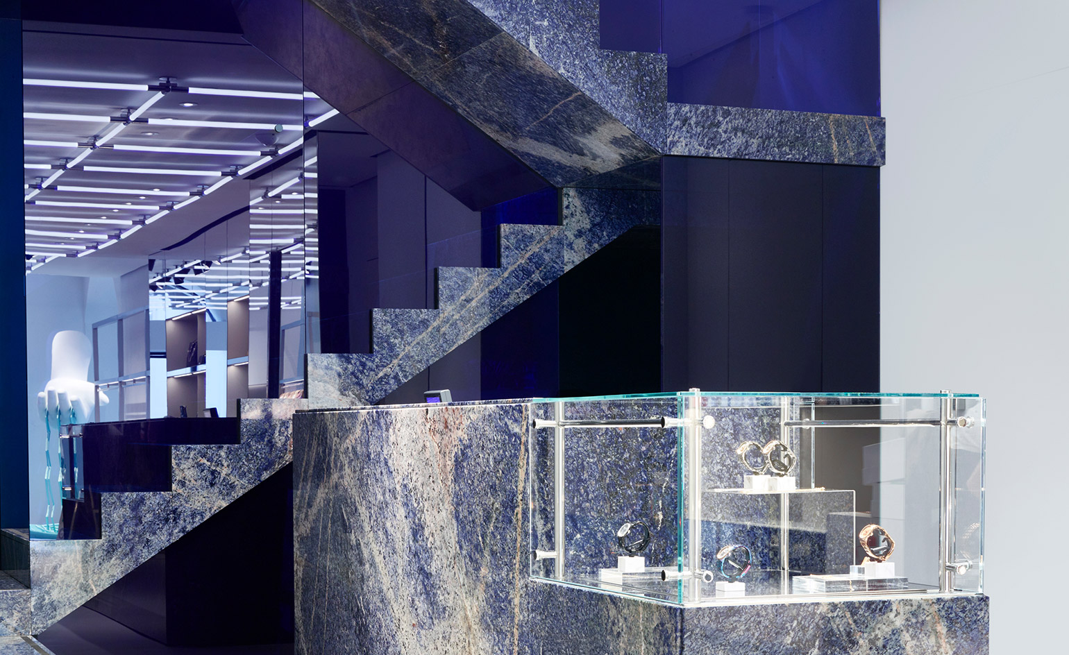
Kenzo’s talented in-house design team-revamped Milan store
Kenzo’s Milan store is a prime example of good design and practical functionality possessed by a talented in-house team. The 246 sq m space features different coloured zones (blues for boys and pinks and peaches for girls) with an ongoing marble theme, recreated on veiny carpets and tables. Most noticeably, the all-marble staircase is a compelling architectural component, that, alongside the adjoining cash/wrap desk, looks as if it was crafted from glowing blue lapis lazuli stone.
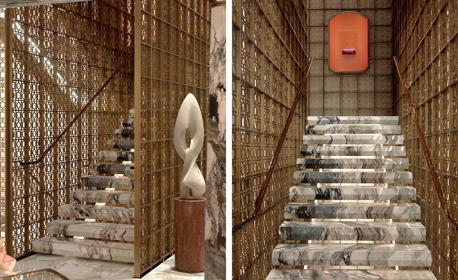
Bulgari’s Peter Marino-designed New Bond Street flagship
Marino used swathes of marble and travertine to evoke the Roman history of the house, even creating display cases which referenced the shape of Bulgari’s Via Condotti boutique. The store’s design crown is its faceted floating staircase, composed of geometric hexagonal steps, expertly laid so that the veins of marble correspond as the customer ascends. The design was inspired by Italian architect Carlo Scarpa’s Palazzo Abatellis, a palace in Palermo, Southern Sicily, and is surrounded by a ‘Pantheon’ mesh grid and lit from below, so that it radiates a warm glow.
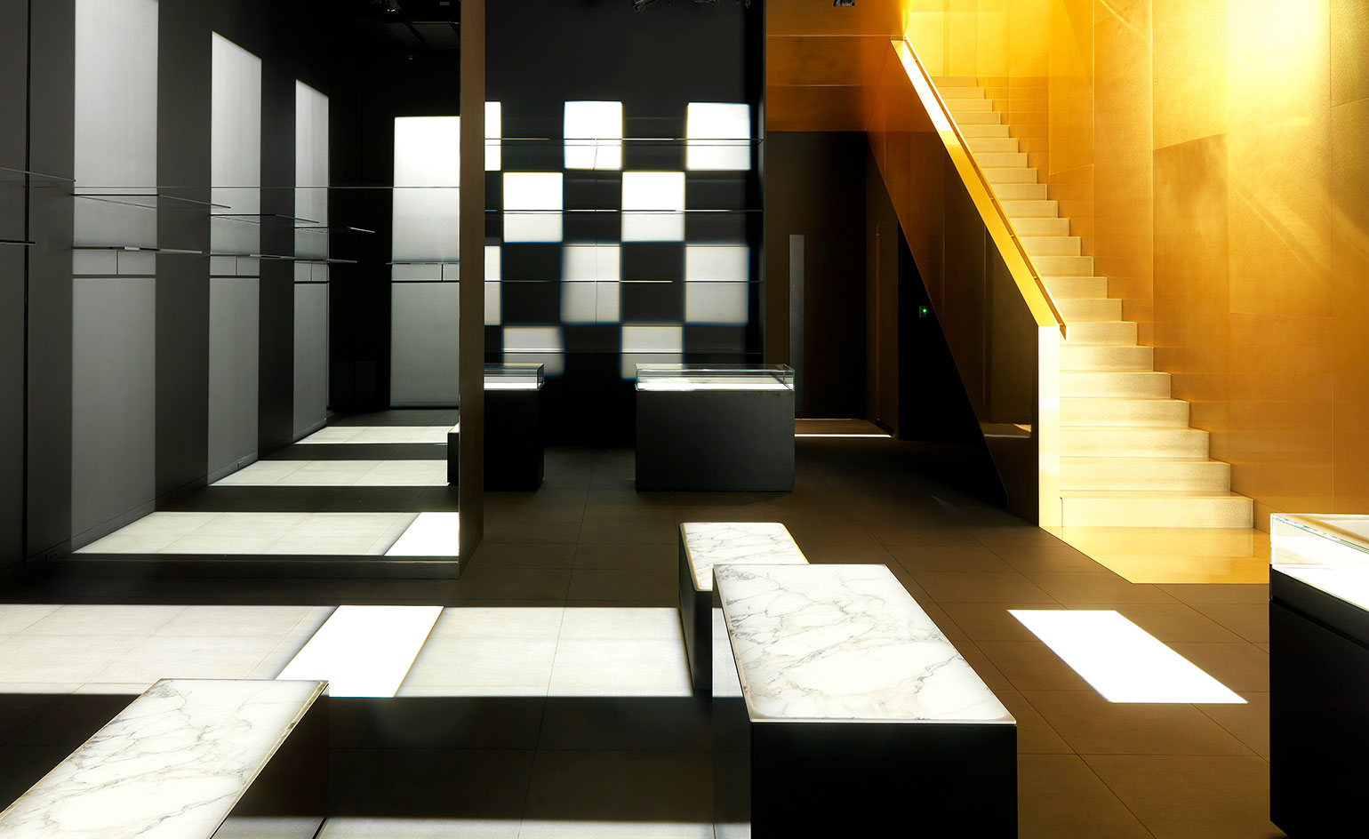
Gwenael Nicolas-designed staircase for Dolce & Gabbana’s Aoyama store
Going for gold is French-born Tokyo-based architect Gwenael Nicolas’s staircase design at Dolce & Gabbana’s Aoyama boutique. 'The brief came from the brand to '‘surprise’'', says Nicolas of the graphic golden staircase which evokes the baroque Sicilian splendour of Italy - a design signature of the house. It also resembles sunlight streaming into the 550 sq m space, bathing the black and white marble furnishings and fixtures of the boutique in a golden glow.
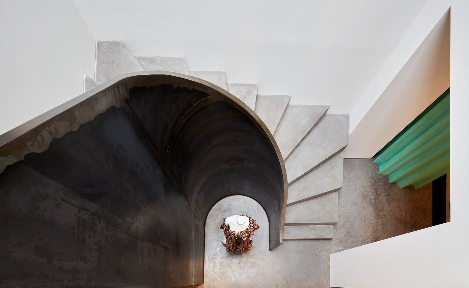
Don McQualter's steel staircase at Zimmerman's Mayfair boutique
Sisters Nicky and Simone Zimmermann, who founded their renowned womenswear label in Sydney in the early 1990s, strengthened their connection to London with the opening of their brand’s first European flagship in Mayfair last year. The two-storey space, designed by Australian architect, Don McQualter – a longtime collaborator of Zimmermann, boasts a steel staircase, which brings to mind the curving forms of Richard Serra’s sculptures and works in juxtaposition to the intricately detailed pieces on display.
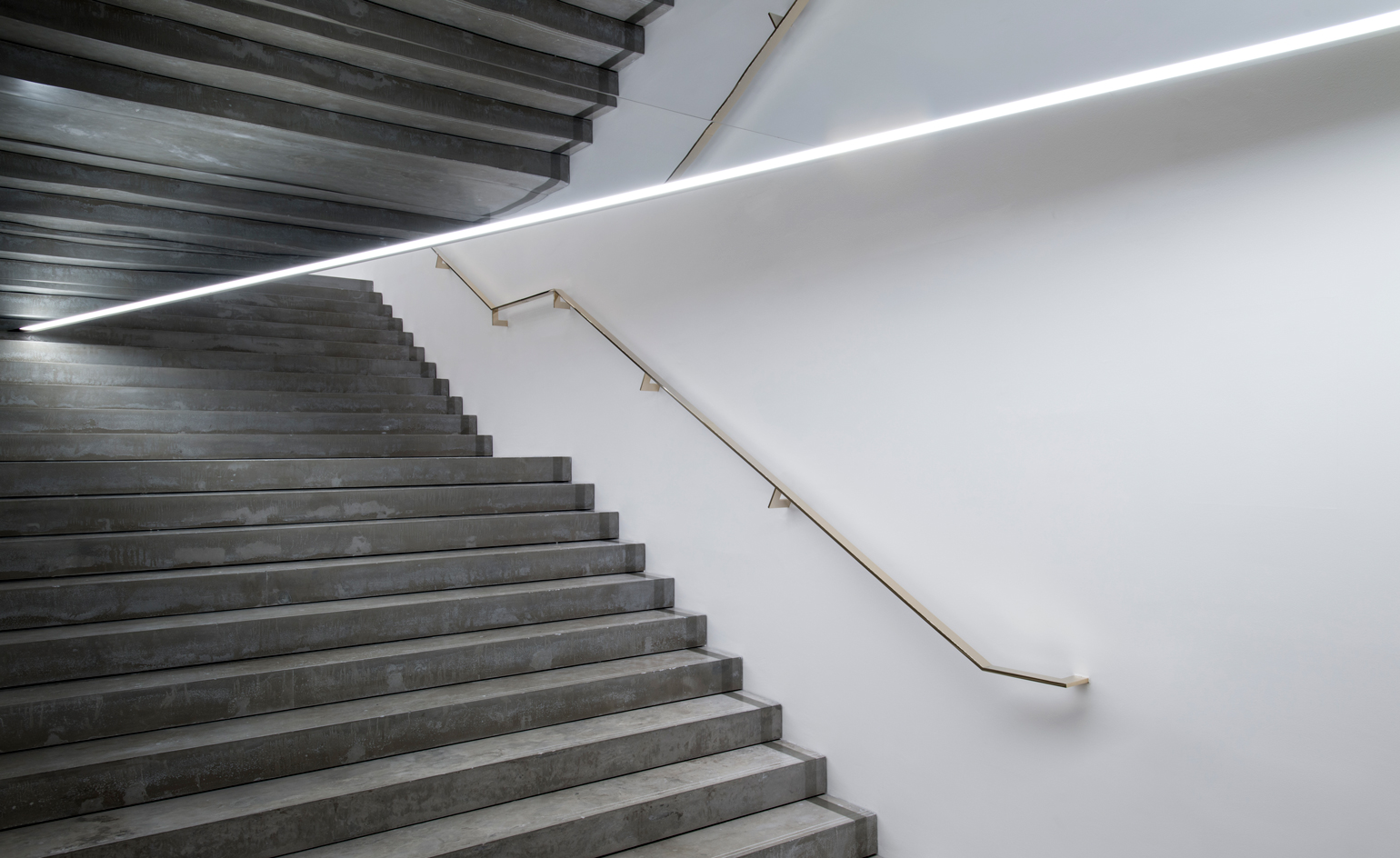
Victoria Beckham's polished concrete staircase at Dover Street
Located on London’s Dover Street lies Victoria Beckham’s 6,000-square-foot flagship store — the first retail space from Iranian architect Farshid Moussavi, who is more primarily known for her monumental museums such as Ohio’s Museum of Contemporary Art. Within the three-storey Georgian building, in the midst of jutting angular interiors, mirrored 3D grid ceilings and suspended objects — a four-meter-wide polished concrete staircase elevates the rear of the store, set against a flat white wall, used to project images from Beckham’s most recent runway collections.
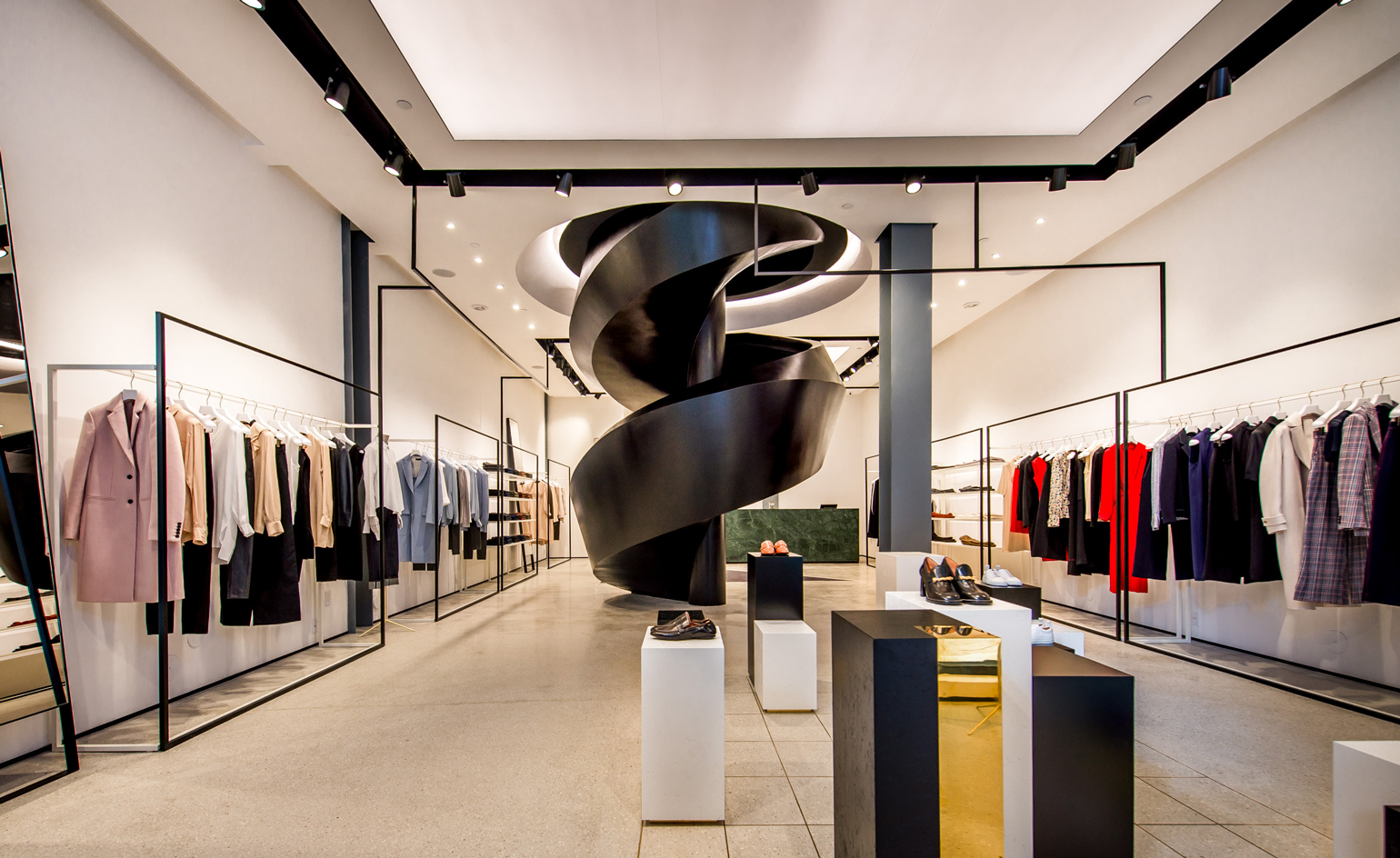
Joseph's corkscrew staircase in Miami's Design District
London-based architecture and design practice Sybarite have designed over fifty stores for Joseph, and its 285 sq m space in Miami's Design District features sleek geometric steelwork, brass fixtures and sumptuous velvet upholstery. In a nod to the visual aesthetic of Joseph’s boutiques, which incorporate a different marble into the design of each store, the space features an imposing corkscrew staircase made from white polished marble treads with a smoked black glass balustrade, inspired by the city’s architecture from the forties and fifties.

Maison Alaïa’s Kris Ruhs-designed spiral staircase in Mayfair
The 6000 sq ft boutique on London’s Bond Street boasts a range of design hits, from chrome prism screens, by Tokujin Yoshioka, to doughnut-like Pelota lamps by Marc Newson for Flos. Azzedine Alaïa was passionate about collaborating and working with a host of industrial and furniture design masterminds, and for Maison Alaïa’s London flagship, painter and sculptor Kris Ruhs provided both aluminium wall lights that ripple down the walls of the boutique, and designed a burnished metal and glass spiral staircase which swirls to connect the three floors of the space.
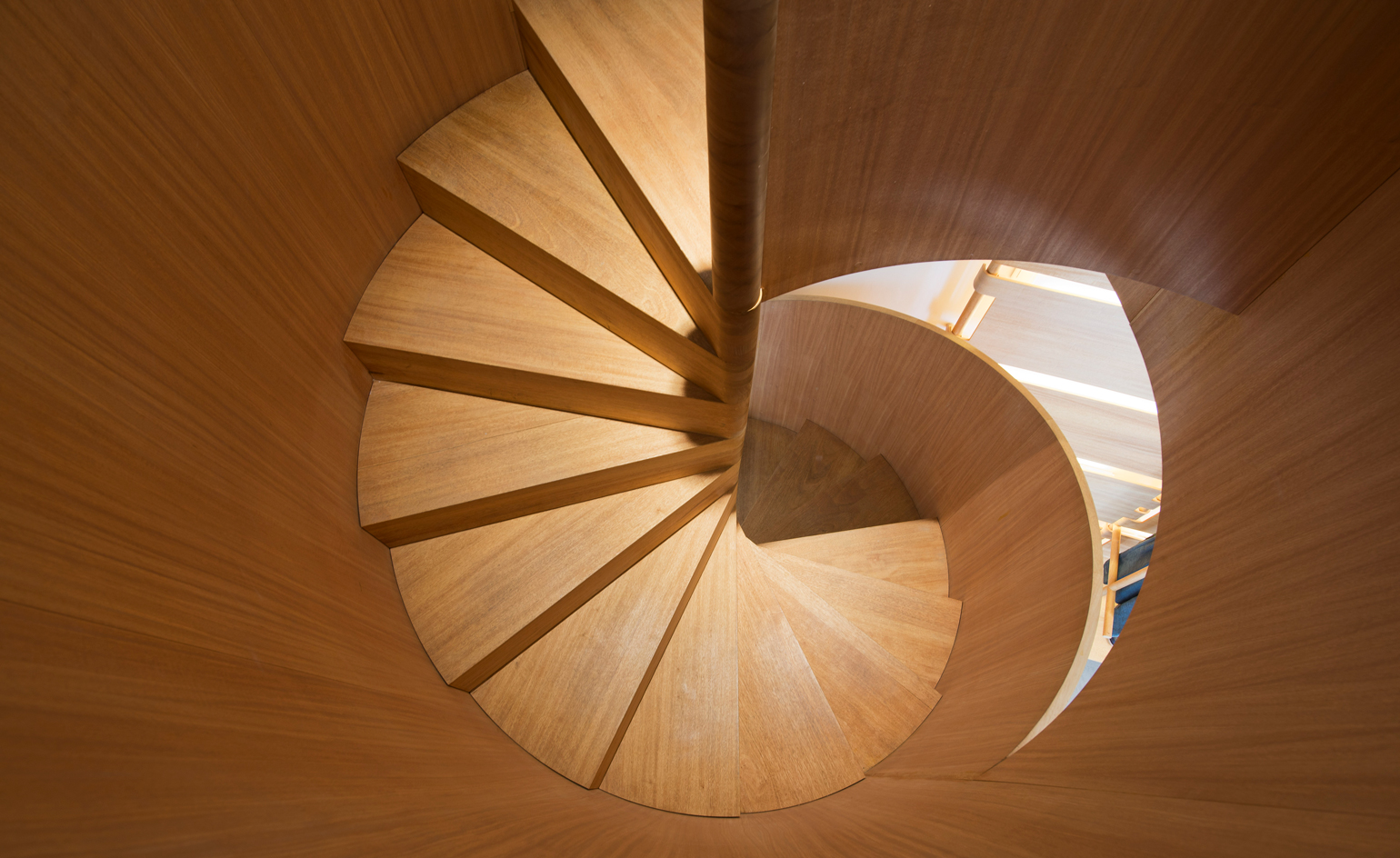
APC’s solid oak spiral staircase in Filles du Calvaire
Parisian brand APC’s aesthetics are inclined to minimal and understated designs, a visual narrative replicated in the interior of each of its stores across the globe — think pale oak wood floors, sleek and sparsely furnished interiors. APC’s founder and creative director, Jean Toutiou devised each and every store with French architect Laurent Deroo. Deroo’s balanced juxtapositions are staple to the design of APC’s stores, creating a dialogue between the industrial and natural. In particular, the Filles du Calvaire store in Paris boasts a monolithic Basaltina stone facade, whilst inside a solid oak corkscrew staircase winds to the second floor.
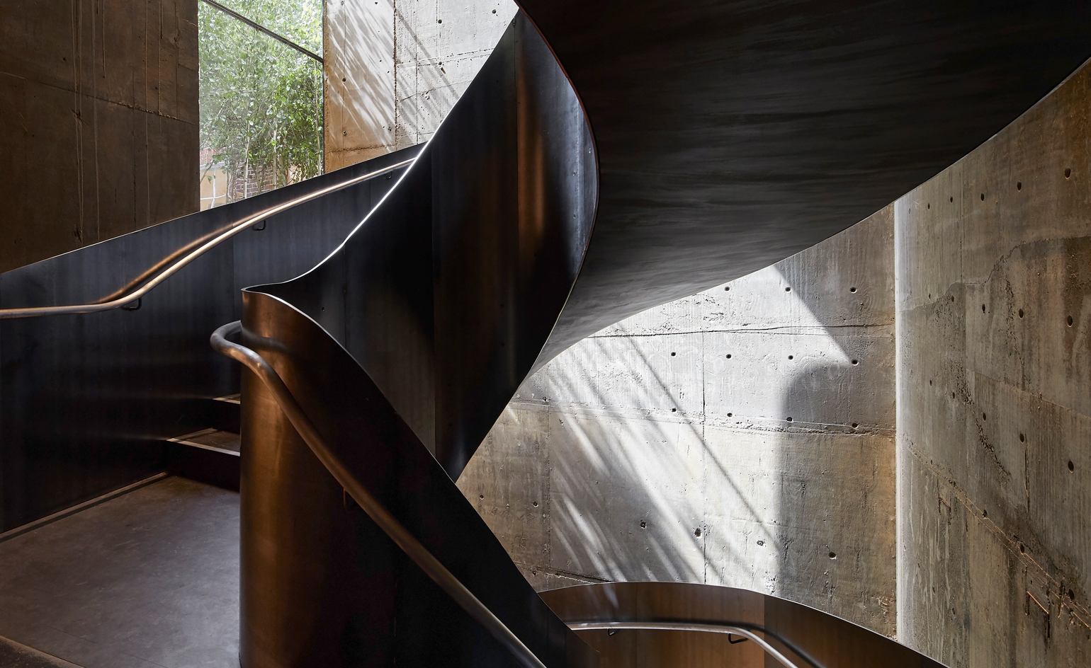
Stella McCartney's Old Bond Street flagship
Stella McCartney’s sustainability-focused flagship in an 18th Century Old Bond Street space in London, boasts displays of moss covered stones, found around her family’s farm in Mull of Kintre, and papier-mâché walls created from her London office’s wastepaper. Spreading over four storeys, a raw steel staircase anchors each floor. The impressive circling structure was constructed in a Treviso atelier, and its exposed design is stripped back to the simplest form — a fine complement to the boutique's organic fixtures.
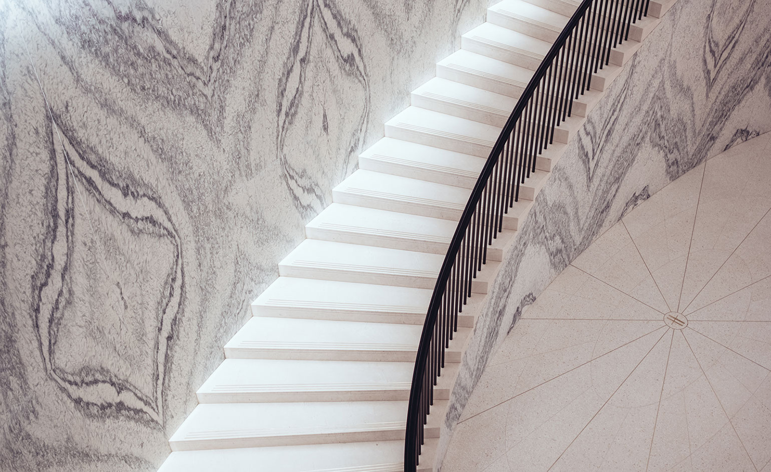
Harrods’ Rundell Associates-designed Fine Watches department
The London department store’s latest 1,667 sq m space comprises ten boutiques, VIP suites and an aftercare department, designed by architecture and design practice Rundell Associates. The two floor area is connected by a staircase with a back wall constructed from a single block of rare Cipollino Tirrenia marble, its homogenous veins creating a pattern akin to a what principal Mike Rundell describes as a ‘very grand wallpaper’. The rare marble was obtained directly from quarries near Forte dei Marmi, and reflects Rundell’s desire to create a space ‘where customers could delight in the look and feel of the materials.’
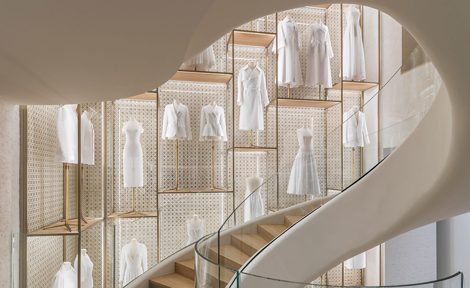
Dior’s toile-lined curving staircase, Champs- Elysées, Paris
One of the most striking exhibition design elements at the V&A’s ‘Christian Dior: Designer of Dreams' show (originally staged at the Musée des Arts Décoratifs in Paris) was a large-scale floor to ceiling installation of the couturier’s toiles, housed inside large glass vitrines. It’s this installation which has inspired the staircase of Dior’s latest Champs- Elysées boutique in Paris. The new store also boasts a facade which nods to the brand’s 30 Avenue Montaigne home and is swathed in toile de Jouy wallpaper, like the maison’s first boutique. The organic, swirling staircase, which unfolds in the store like a ribbon, reflects Monsieur Dior’s love of curves. Lined with white toiles, it evokes to the painstaking design process in creating clothing, which takes place behind closed doors.
Jack Moss is the Fashion & Beauty Features Director at Wallpaper*, having joined the team in 2022 as Fashion Features Editor. Previously the digital features editor at AnOther and digital editor at 10 Magazine, he has also contributed to numerous international publications and featured in ‘Dazed: 32 Years Confused: The Covers’, published by Rizzoli. He is particularly interested in the moments when fashion intersects with other creative disciplines – notably art and design – as well as championing a new generation of international talent and reporting from international fashion weeks. Across his career, he has interviewed the fashion industry’s leading figures, including Rick Owens, Pieter Mulier, Jonathan Anderson, Grace Wales Bonner, Christian Lacroix, Kate Moss and Manolo Blahnik.