Aesop stores: a visual history of interior architecture
Established in Melbourne in 1987, Aesop has become one of the most respected beauty brands in the world. Known for the quality of its products, as well as a love and support for the arts as an avenue through which to inspire, learn and communicate, Aesop has developed strong relationships with local architects and designers in the creation of its stores. From London to Singapore, New York to Kyoto, Aesop’s approach to retail design and architecture is unique and respectful of community, culture and history. In honour of these beautiful retail concepts, we've compiled a list of some of our favourite Aesop stores around the world.

Sea Point store in Cape Town, by Master Studio
At Aesop’s Cape Town outpost, (opened in 2018) Master Studio ‘integrates the architectural vernacular’ of the Sea Point suburb into its design. Drawing heavily on local art deco influences, Master Studio’s co-founder Yaniv Chen looked to ‘pay homage to the South African architects of the past’ with the sensitively rendered store. Curved forms and strong linear elements respect the suburb’s design history, wrapped up in a material palette that stays true to Aesop’s shared worldwide aesthetic. Products are displayed on plain vessels, and characterful warmth comes courtesy of Supawood, a hardy substrate made of compressed sawdust.
Writer: Elly Parsons
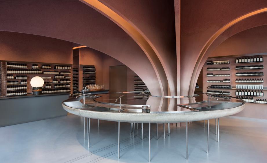
Sloane Square store in London, by Snøhetta
In 2017, Aesop’s 200th global store rung in the skincare stalwart’s achievement in quiet fashion. Snøhetta returned to its relationship with Aesop to choreograph light, warmth and scent within the 100 sq m space. A Devonshire clay-plaster clad column arches out of the floor space, spanning the ceiling like ‘an architectural tree’, according to senior Snøhetta architect Peter Girgis. The ‘trunk’ surrounds a 4.5 sq m ‘water table’, upon which a slim veil of water cascades into four tin bath-sized fibre glass sinks, used for skin consultations. Interiors were devised in collaboration with Aesop’s in-house architect Jean-Philippe Bonnefoi, who channelled a James Bond-esque influence.
Writer: Elly Parsons
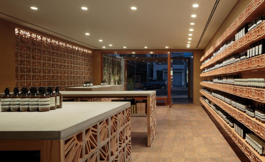
Vila Madalena store, by Fernando and Humberto Campana
Aesop tapped São Paulo design superstars Fernando and Humberto Campana to design its second location in the Brazilian metropolis, opened in 2016. The 112 sq m store is set back from the bustling Rua Harmonia, accessed via an aluminium gate on a courtyard, which flips to create a roof during the day. Timber benches, a washbasin and a pergola with climbing plants create a relaxing social space, encouraging customers to sit and stay a while. A material palette of sisal fibre, concrete and plywood and the humble cobogó brick form the fixtures and furniture, as well as the flooring, ceiling and an entire wall. ‘We developed a special floor made of cobogó brick filled with concrete; a fully experimental work that resulted in a beautiful pattern,’ explains Humberto Campana.
Writer: Ali Morris
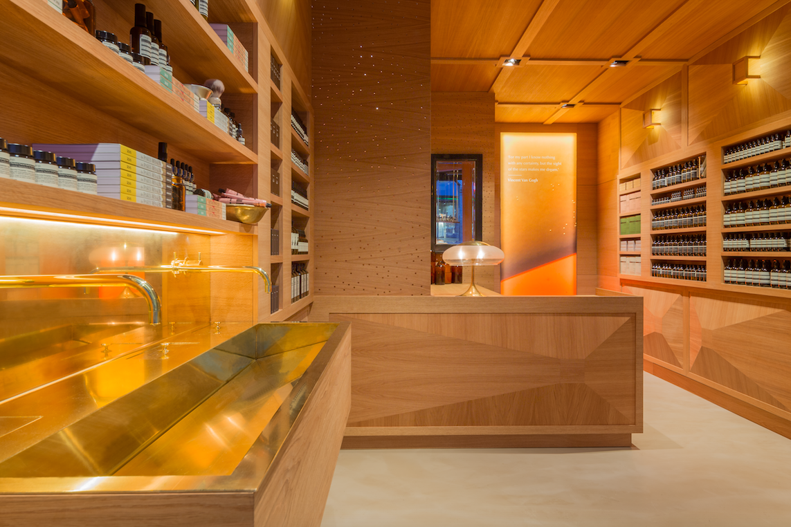
Homansbyen store in Oslo, by Snøhetta
On 21 June 2016, Aesop opened their second signature store in Oslo, created in collaboration with design studio Snøhetta. Hosted on the ground floor of a functional 1940s apartment, the 63 sq m interior has been entirely covered in oak wood panels and features custom designed wall lighting fixtures, producing a soft glow and enhancing the faceted panels.
Writer: Elissa Carassi
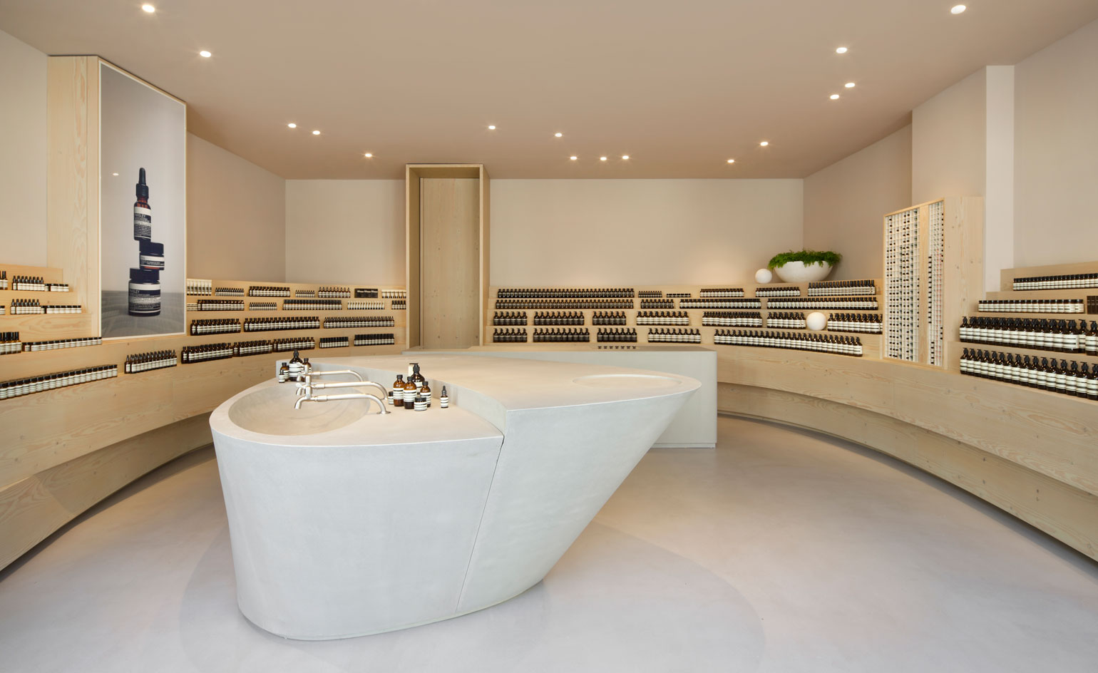
Düsseldorf store, by Snøhetta
Snøhetta also collaborated with Aesop on the design of one of their German stores, located on Düsseldorf’s Grabenstraße. The store, opened on 2 June 2016, is designed to be an implicit extension of the plaza outside, which is often host to a variety of markets and fairs. The minimal design of the retail space – typical of the brand's global vision – successfully highlights Aesop’s product range.
Writer: Elisa Carassai
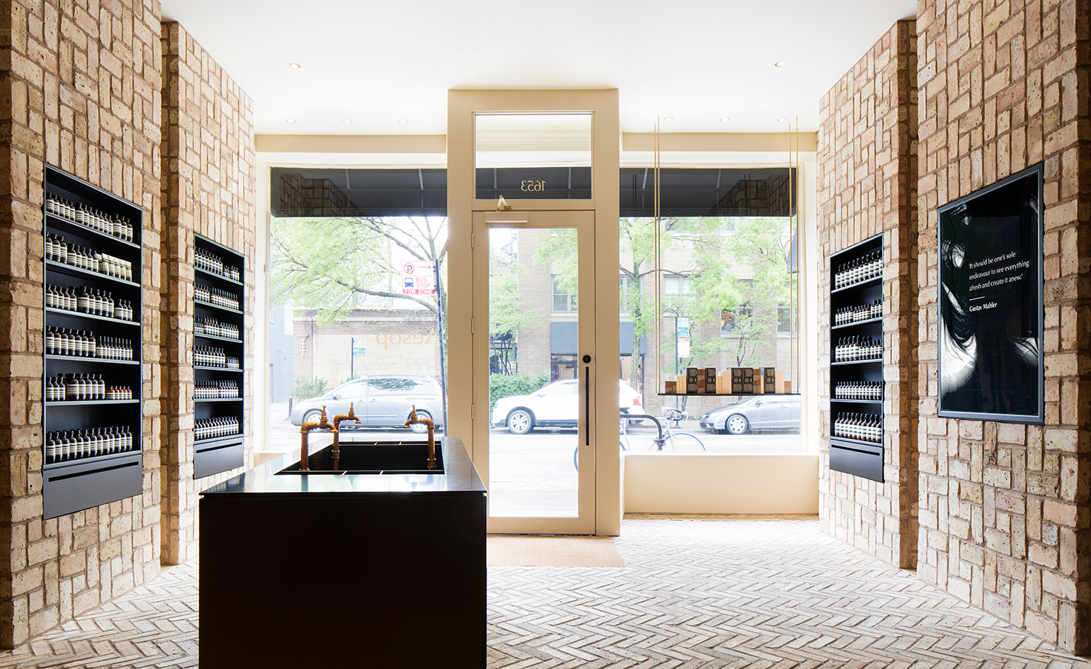
Chicago Bucktown store, by Norman Kelley
Launched in May 2016 and designed by Norman Kelley, an architecture and design collaborative based between New York and Chicago, the space is built upon an architectural grid motif, made up of Chicago common bricks that have been reclaimed for use.
Writer: Pei-Ruh Keh

Singapore ION store, by Snøhetta
Aesop ION, the brand's second designer boutique in Singapore, marks the fourth Snøhetta-designed Aesop store globally. Mace pink walls brighten up the space and complement the brass accents of the boutique, which include functional elements like a long sales counter and a trio of sinks, gleaming under the overhead lighting. The ceiling – covered in timber battens of different lengths, tones and materials – was described as ‘an upside-down forest’; hanging down to form walls that curve throughout the space like trunks in a grove.
Writer: Sam Rogers
Wallpaper* Newsletter
Receive our daily digest of inspiration, escapism and design stories from around the world direct to your inbox.
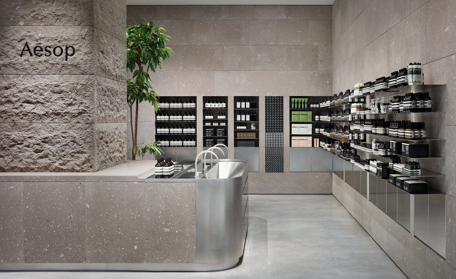
Sapporo store, by Case-Real
Launched in April 2016, the lofty design brief for Aesop's Sapporo store was keenly realised by Koichi Futatusmata and Ritsu Shibata of the Fukuoka-based design firm Case-Real – with lighting design by Branch's Tatsuki Nakamura. The light grey expanse is offset with shelves and fixtures in vibration-finish stainless steel.
Writer: Tom Howells
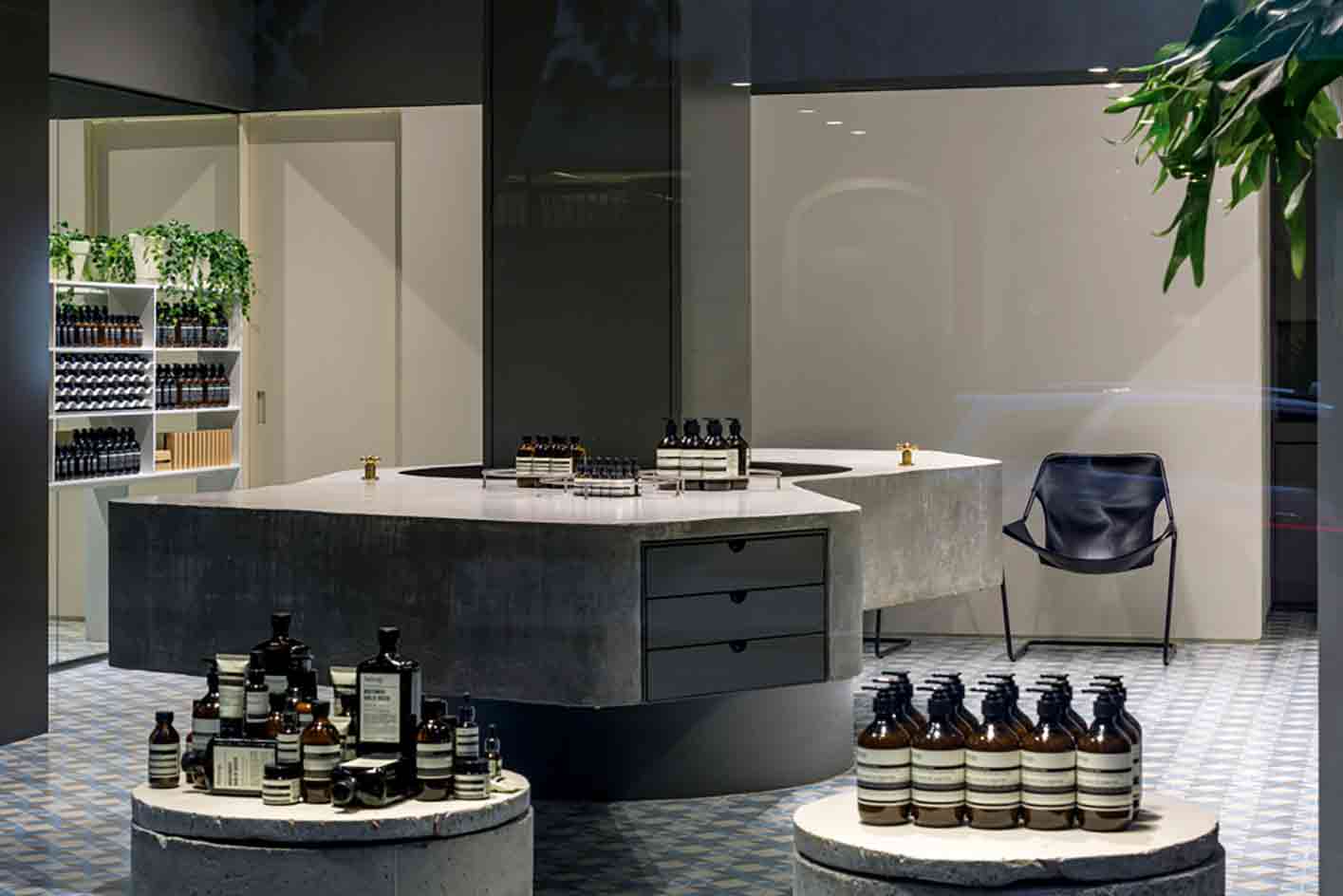
São Paulo store, by Paulo Mendes de Rocha in association with Metro Associated Architects
Launched in 2015, Aesop's São Paulo store was its first foray into the Latin American market. The premise of this latest project was a desire to create a seamless transition between the store and its surroundings, free of partitioning where possible and providing uninterrupted views of the interior from the street by way of vast glass panes. Utilising the kind of locally sourced, everyday materials – such as concrete, glass and paint – usually employed in civil construction, the team’s sensitive and imaginative approach has created a functional elegance with meticulous detailing and finish, the hardy materials offset by artisanal patterned cement tiles more commonly associated with residential properties.
Writer: Vanessa Bells

Frankfurt store, by Philipp Mainzer Office
For Aesop's Frankfurt store, the architects were inspired by the new location and decided to fill the store's scheme with well-crafted natural materials native to the region, including solid walnut, raw brass and matt finished grey floor tiles. The space successfully incorporates a local influence though its colour scheme; furniture and wares include pieces by the German designer Ferdinand Kramer.
Writer: Sam Rogers
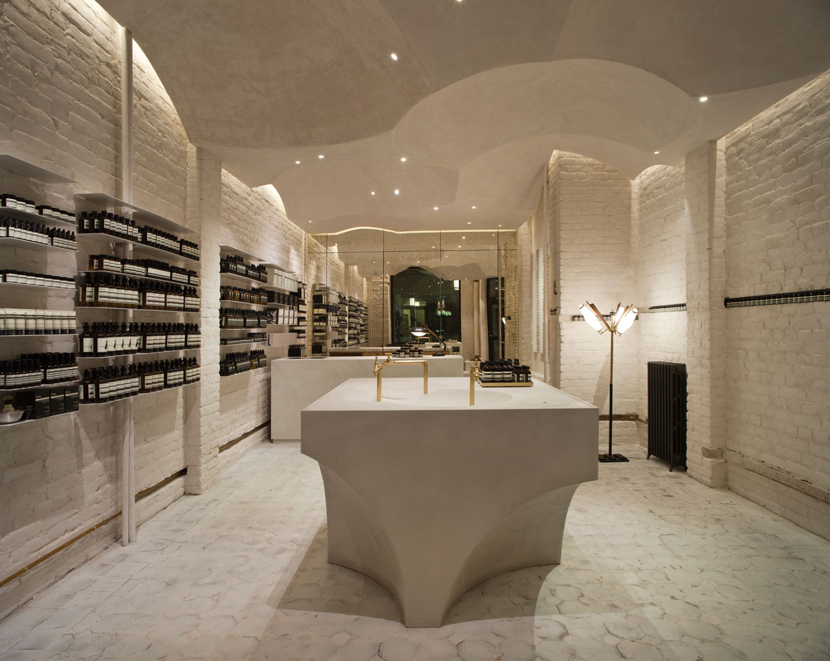
Prinsens gate store in Oslo, by Snøhetta
Launched in 2014, this 66 sq m store was Aesop's first in Norway, and was designed in collaboration with local architecture firm Snøhetta. It was the company's 100th store to be opened worldwide. Structured around a sanctified arrangement of nebulous curves and sparkling, niveous surfaces, Aesop Prinsens gate is a place that recalls the awe of nature and the spectacle of religious observance.
Writer: Dimity Noble

Mitte store, by Weiss-Heiten
2013 saw the launch of this interesting Aesop store in Berlin. Vibrant mint and emerald tiles line the walls and floors of the clinical Mitte outpost. Weiss-Heiten Design pays homage to the city's Bauhaus ties with feature lighting.
Writer: Dimity Noble
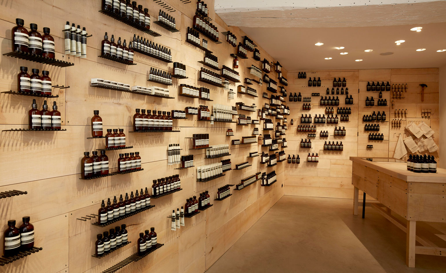
Rue Saint-Honoré Tiquetonne store, by Cigue
Opened in 2011, the Tiquetonne store on Rue Saint-Honoré was designed by Cigue, and is located in an original 18th century townhouse.
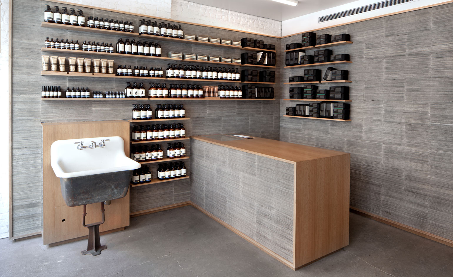
Nolita store, by Jeremy Barbour
Designed by New York-based architect Jeremy Barbour and launched in 2011, the Nolita store utilises 2,800 copies of the New York Times cut into strips then stacked and bound for wall cladding.
Writer: Dimity Noble

North Melbourne store, by March Studio
Launched in 2011, the North Melbourne store was the first collaboration between March Studio's Rodney Eggleston and Aesop. A Venetian theme unifies the offering, helped along by these three elegant fountains with brass garden taps – an ideal space for product demonstrations. The shop also boasts an archiving drawer for a grand counter, originally the property of the Gallery of New South Wales.
Writer: Dimity Noble

Kawaramachi store in Kyoto, by Shinichiro Ogata
Designed under the leadership of Shinichiro Ogata, this serene Kyoto store eloquently demonstrates the site-specific nature each store possesses. The stark black and white space draws inspiration from the simplistic design of 'Machiya' townhouses. A nuanced edification on cultural mores, Aesop Kyoto is a cerebral stimulation that provokes the senses and mind to wander into uncharted territory.
Writer: Dimity Noble
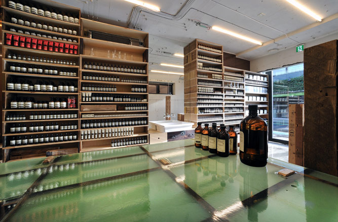
Minami Aoyama store in Tokyo, by Jo Nagasaka
Launched in 2011, Aesop's Tokyo outpost on the ground floor of the Asada building in Minami-Aoyama is a reincarnation of sorts. Jo Nagasaka of Schemata Architecture Office stumbled upon an abandoned house in Nakano-ku while researching the project, and decided to reuse its wooden boards and beams to create a new space that is raw, simple and warm. It continues Japan's long-established tradition of mixing modern with traditional. The designer pays homage to Japan's long-established tradition of fusing modern with traditional, while echoing Aesop's minimalistic packaging.
Writer: Malaika Byng
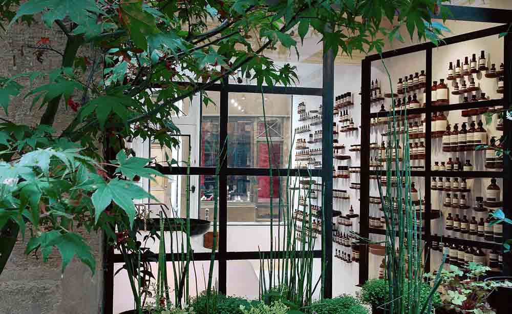
Le Marais store, by Ciguë
Aesop Le Marais, created by French designers Ciguë, exudes the understated chic of the french capital. Fronting Rue Vieielle du Temple, through an intelligent deployment of spatial and formal elements the store constructs a relationship with the physical and historic landscape of its neighbourhood. The interiors have been whitewashed from top to bottom – joinery, ceilings and floors – and are complemented by the sculptural white plaster counter that runs almost the length of the store, while the product shelvings and fixtures have been painted in black, providing a contrast to the minimalist palette.
Writer: Pei-Ru Keh
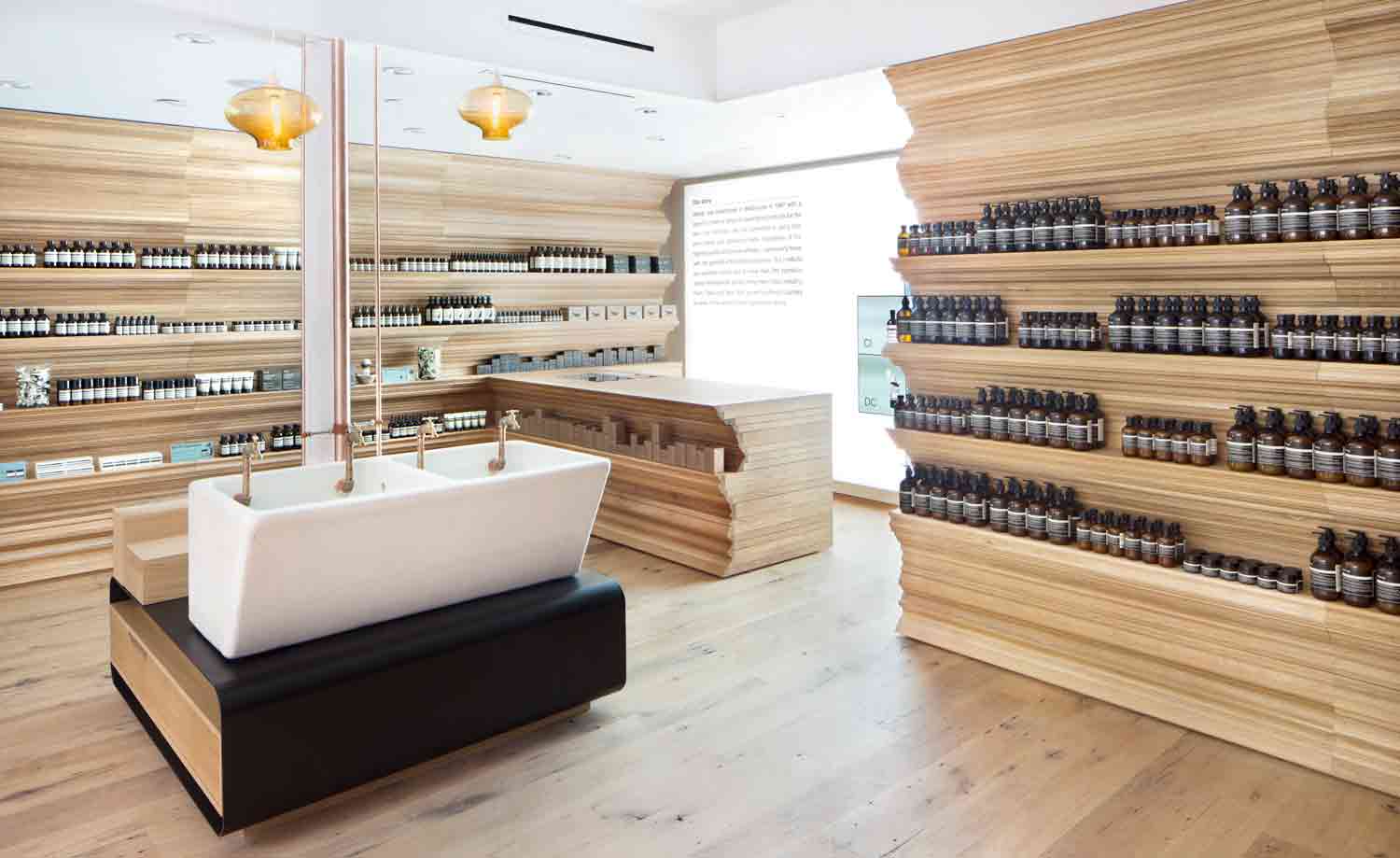
Newbury Street store in Boston, by William O' Brien Jr
The white oak-lined Newbury Street shop in Boston, designed by William O' Brien Jr, was inspired by the 19th century ornamental architecture that originated in Paris and is common in the neighbourhood.
Writer: Pei-Ru Keh
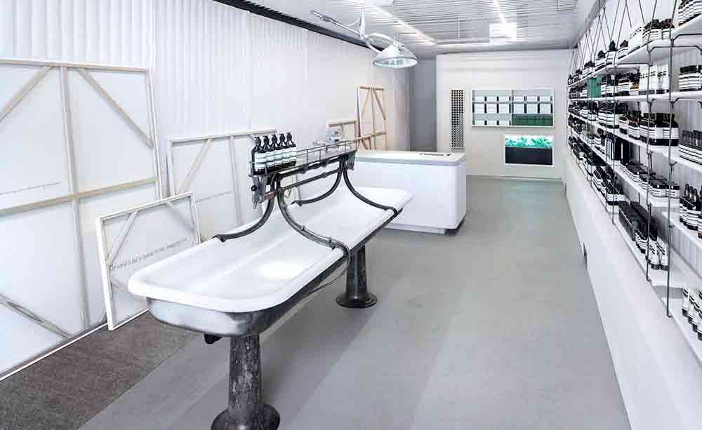
Portland store, by John Randolph
Portland posseses this industrial-tinged space, designed by John Randolph and sibling to Aesop West End. Remaining true to the Victorian heritage of its host building, the space conjures the hybrid spirit of traditional apothecary and general store.
Writer: Pei-Ru Keh
Jack Moss is the Fashion Features Editor at Wallpaper*, joining the team in 2022. Having previously been the digital features editor at AnOther and digital editor at 10 and 10 Men magazines, he has also contributed to titles including i-D, Dazed, 10 Magazine, Mr Porter’s The Journal and more, while also featuring in Dazed: 32 Years Confused: The Covers, published by Rizzoli. He is particularly interested in the moments when fashion intersects with other creative disciplines – notably art and design – as well as championing a new generation of international talent and reporting from international fashion weeks. Across his career, he has interviewed the fashion industry’s leading figures, including Rick Owens, Pieter Mulier, Jonathan Anderson, Grace Wales Bonner, Christian Lacroix, Kate Moss and Manolo Blahnik.
-
 Warp Records announces its first event in over a decade at the Barbican
‘A Warp Happening,' landing 14 June, is guaranteed to be an epic day out
By Tianna Williams
-
 Cure your ‘beauty burnout’ with Kindred Black’s artisanal glassware
Does a cure for ‘beauty burnout’ lie in bespoke design? The founders of Kindred Black think so. Here, they talk Wallpaper* through the brand’s latest made-to-order venture
By India Birgitta Jarvis
-
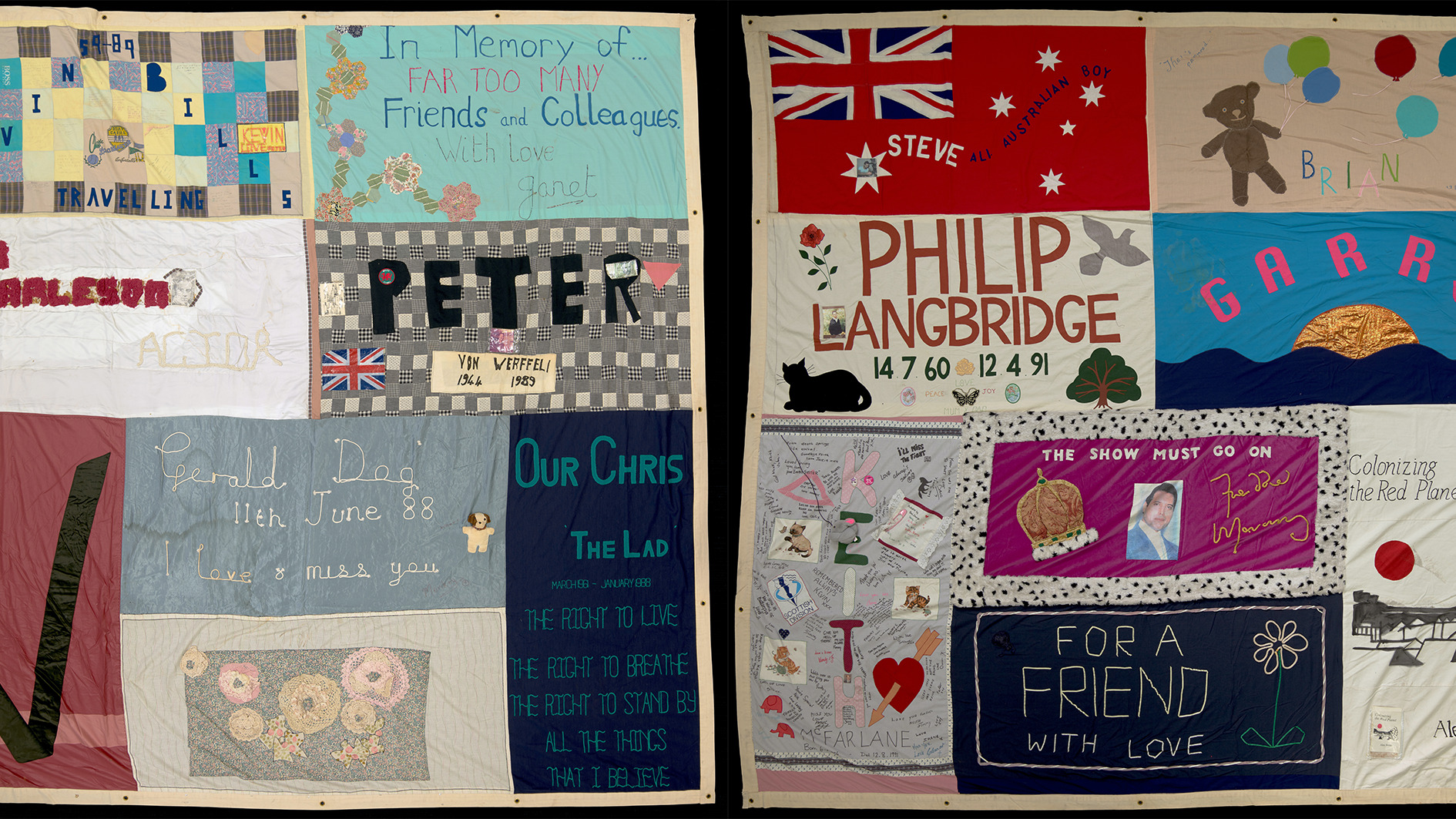 The UK AIDS Memorial Quilt will be shown at Tate Modern
The 42-panel quilt, which commemorates those affected by HIV and AIDS, will be displayed in Tate Modern’s Turbine Hall in June 2025
By Anna Solomon