Wallpaper* Handmade 2011: The Products
For our annual salute to craft and creativity, we bring together the best designers, artists, and manufacturers to make one-off wonders. Here, browse all the fruits of Handmade 2011
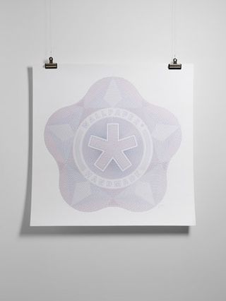
Wallpaper* Stitched, by Peter Crawley, Kam Tang and Wallzo
The new identity created for this year's Handmade exhibition graces our newsstand cover. This hand-sewn illustration of the Handmade seal was produced by piercing a one sq m piece of 420gsm white watercolour paper 12,000 times. It took illustrator Peter Crawley ten hours using a dressmaker's pin to make the holes. These were then stitched with five colours of Gütermann thread, matched by eye to the Pantone colours of the Wallpaper* logo. The stitching took 60 hours and used 250m of thread. In this version, our five-pointed glyph appears simple and flat from a distance, but up close reveals its complex and dense texture.
www.petercrawley.co.uk
www.kamtang.co.uk
www.wallzo.com
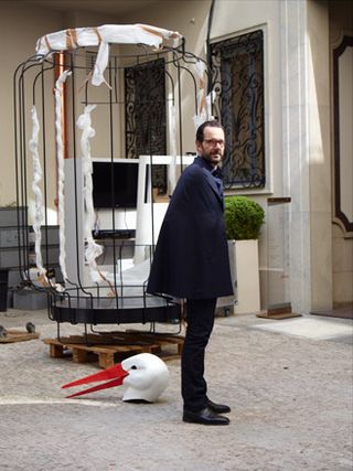
‘Cape' suit, by Konstantin Grcic and Brioni
Konstantin Grcic may be the pre-eminent, certainly the most prolific, industrial designer of the era. But what he is not - by his own admission - is a fashion designer. But when we approached Grcic to be part of this year's Handmade project - and of course we had to - working with a tailor was one of the first ideas he threw at us.
Initially, his idea was to come to London's Savile Row. But we thought it made far more sense to put Grcic together with Brioni, the standard bearer of bespoke Italian tailoring, and see if they could come up with a centrepiece for our Handmade exhibition in Milan.
If Grcic was going to take on tailoring, it wasn't going to be by reinventing the bespoke suit. Looking through some of the Brioni archive material, Grcic came across an image of a young man wearing a cape and fell in love with the idea of a suit that reworked that idea and offered the wearer something like a personal environment, a two-piece suit with domestic powers of comfort.
The challenge for Angelo Petrucci, Brioni's master tailor, and Grcic was to produce a suit that from the outside was all about an elegant drape, about fluidity and movement, but that from the inside had the reassuring architecture of a made-to-measure suit, the security of a proper fit.
www.brioni.com
www.konstantin-grcic.com
Wallpaper* Newsletter
Receive our daily digest of inspiration, escapism and design stories from around the world direct to your inbox.
Custom Covers app by Wallpaper* and Kin Design
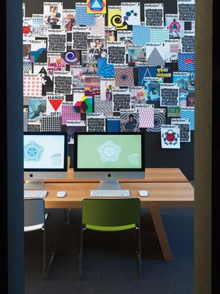
Perhaps our favourite collaboration for Handmade is the one where you, our readers, get to play art director and design your very own cover, with your masterpiece bound to this issue and delivered into your hands. This year, our award-winning Custom Covers application was bigger, better and even more fun, with new software tailored for us by research and interaction studio Kin. Missed your chance? Try out the application here or visit London's Design Museum, where our Custom Covers project is on show until 7 August as part of the Design Awards 2011 exhibition
Pictured is our Custom Covers hub designed by Piero Lissoni where visitors to our Handmade exhibition in Milan were invited to try out the application
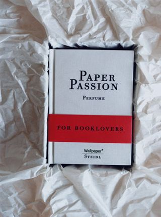
Paper Passion fragrance, by Geza Schoen, Gerhard Steidl and Wallpaper*, with packaging by Karl Lagerfeld and Steidl
For this project, we were inspired by a throwaway line from Gerhard Steidl in the film How to Make a Book With Steidl (watch the trailer here), which suggested that his favourite scent was that of a ‘freshly printed book'. So we asked him to work with avant-garde Berlin perfumer Geza Schoen to try to bottle that very scent. Into the mix came Steidl's friend and long-time collaborator Karl Lagerfeld, who wanted to design the package for the scent whose name he came up with, ‘Paper Passion'.
www.steidlville.com
www.escentric.com
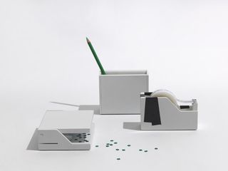
Hole punch, tape dispenser and pencil holder by APFEL and Emform
We asked graphic designers APFEL to team up with manufacturer Emform to sharpen up our desk essentials. Each design is inspired by the object's function, so the hole punch features cut circles, the pencil holder a scribble pattern inside, and the tape dispenser cut tape shapes, while its roll of tape bears the phrase ‘Daydreams on desktops and other rituals of everyday life'.
www.apracticeforeverydaylife.com
www.emform.de
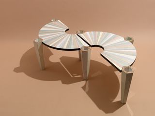
Coffee table, by Bethan Laura Wood and Abet Laminati
This two-part coffee table by Bethan Laura Wood (W*146) appeals to the slightly trashy glamour puss in us all here at Wallpaper*. Its pearlised, striped laminate surface, courtesy of Abet Laminati, is inspired by materials used in nail bars and beauty parlours -- an under-explored design aesthetic if you ask us. Wood, who has also designed fashion sets and created an installation at the Design Museum in London, began by defining the shape of the legs, which is based on an earlier bracelet design. The London-based designer has a thing for artificial surfaces, and has in the past experimented with faux marble and wood, created using laminates. The table, with its art-deco echo, certainly celebrates a very man-made feel. The flexible, modular pieces are also stackable, thanks to their powder-coated steel legs with birch ply interior. Cabinet maker Toby Liberman helped Wood, one of Wallpaper's Graduate Directory alumni, put them together.
www.woodlondon.co.uk
www.abetlaminati.com
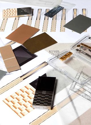
‘Ode to Copenhagen' phone by Æsir and Yves Béhar
Æsir created a one-off edition of its handcrafted Æ+Y phone by Yves Béhar. ‘Ode to Copenhagen' pays homage to one of our favourite cities with icons celebrating the Danish capital by artist/designer James Joyce engraved onto the keypad instead of numbers. Chosen by the Æsir team, the icons include the Little Mermaid statue, Danish hot dogs and Tivoli Gardens.
www.aesir-copenhagen.com
www.fuseproject.com
www.jamesjoyce.co.uk
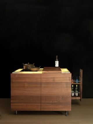
'La Cucinina' by Matteo Thun and Antonio Rodriguez, and Riva 1920 and AHEC
We approached Matteo Thun and Antonio Rodriguez to work again with Riva 1920 to create a kitchen on a very different scale to their recent grand project, La Cucina. They have conceived a compact model that would be perfect for the urban house -- technically innovative and made from American walnut with an onyx top. A cube on wheels, it can also incorporate a chopping board, an induction hob, a fridge and a pantry
www.matteothun.com
www.riva1920.it
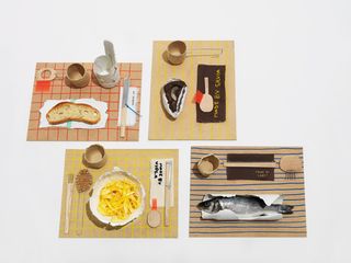
In-flight meal by Arabeschi di Latte and Bordbar
We approached food design collective Arabeschi di Latte to create our perfect in-flight meal. As well as determining that the menu needed to comprise simple dishes made out of wholesome ingredients, the collective took the notion of 'handmade' very seriously. It determined that each element of the in-flight meal should identify who had actually made it, by hand. We found the perfect foil for these handmade meals in Bordbar's airline trolley, which clients can customise according to their whim. Needless to say we gave ours the Wallpaper* treatment.
www.arabeschidilatte.org
www.bordbar.de
The Menu
Breakfast:
Fresh bread
Homemade jam (apple and red sicilian oranges)
Caffellatte
Freshly made lemonade
or
Zabaione/beaten egg with sugar
Brutti ma buoni biscuits (vanilla and hazelnut)
Freshly made lemonade
Caffellatte
Lunch:
Tagliolini with oil and parmesan
Poached eggs
Sicilian oranges
or
Gnocchi with butter and poppy seeds
Eggs a la coque
Apple
Dinner:
Gilthead bream
Lemon mash potato
Spinach
Homemade chocolate
Bread from Matera
Wine
or
Steamed vegetables
Boiled potatoes wtih chives
bread from Matera
Wine
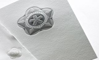
Wallpaper* Handmade invite printed by Baddeley Brothers on paper by GF Smith
Blind embossed and die-stamped, the invite to the Handmade exhibition in Milan - where we previewed many of the unique objects in this issue – was printed by Baddeley Brothers on Cranes Lettra, flourescent white, 600gsm paper by GF Smith
www.baddeleybrothers.com
www.gfsmith.com
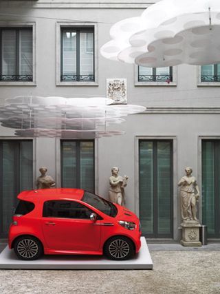
Clouds by Mario Bellini and Aston Martin Cygnet by Tom Dixon and Aston Martin
Invited to conceive an installation that would create a conceptual link between the different spaces of the Handmade exhibition at the Brioni palazzo, Mario Bellini came up with a series of suspended ‘clouds'. Slices of transparent plastic are layered together to give the impression of looking at a cross-section of a cloud. In the palazzo courtyard, projections give Bellini's clouds a sense of movement, while those inside the exhibition incorporate lighting.
www.bellini.it
Aston Martin's bespoke Cygnet city car is the ultimate urban runaround. Thanks to the company's extremely high levels of customisation and craft skills, each Cygnet is a unique stylistic statement tailored precisely to the owner's requirements. For Handmade, Aston Martin has worked closely with Tom Dixon, with every inch of the cabin lined and stitched to Dixon's specification, and emblazoning the Cygnet's compact bodywork with the designer's signature luminous orange.
www.tomdixon.net
www.astonmartin.com
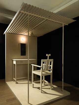
Street barbershop by Studio Mumbai Architects and Michael Anastassiades
This installation combines its creators' fascination with traditional crafts and materials, Wallpaper's commitment to grooming perfection, and a dash of Italian style. Regular collaborators, Studio Mumbai Architects and designer Michael Anastassiades share a passion for 'the informal architecture of India'. This and their constant search to define 'what we understand as design' has led them to collect a growing archive of 'fragments of cities' -- a large variety of found objects amassed during research trips around the Indian subcontinent. Based on an impromptu street barbershop in Jaipur, their installation consists of a 1:1 scale model reinterpretation of the scene, transferred to a Milanese context. Made out of cement boards and shipped from Mumbai, where it was created in Studio Mumbai's workshop, the barbershop comprises elements modelled from the team's collected finds
www.studiomumbai.com
www.michaelanastassiades.com
www.4thfloor.co.uk
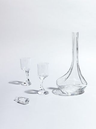
'Narcisse' decanter set by Yuri Masnyj and Baccarat
Customised for us by Yuri Masnyj, the 'Narcisse' decanter set was first created for Baccarat in 1971 by Boris Tabakoff. Made from blown-moulded and cut clear cystal, the form of the decanter is classic 1970s, with its massive foot, cut in pieces, with a slight gap in the cylindrical top of the glass. Tabakoff, who was born in Bulgaria, was a freelance artist who collaborated with Baccarat during the 1970s creating resolutely contemporary pieces.
www.metropicturesgallery.com
www.baccarat.com

Wallpaper* observation binoculars, by Based Upon and Mondrian SoHo, New York
Checking in at the top suite of a new hotel and discovering the room's various gadgets and hi-tech luxuries is always exciting, but the real highlight for us is stepping onto the roof terrace and discovering the views. Keen to make this little moment last longer, we came up with the idea of installing something rather special on the roof terrace of the Mondrian SoHo's penthouse, which boasts some of the best views over New York: a pair of Wallpaper* binoculars designed by twin brothers Ian and Richard Abell, of London artists' collective Based Upon. Not that we want to stalk our neighbours, but it's always interesting to take a closer look at nearby skyscrapers, say, or browse window displays without leaving our urban eyrie, or stargaze over cocktails. The Abell brothers encased our powerful Helios Quantum observation binoculars in a unique alloy that blends bronze, brass, copper and aluminium, engraving it with images of the city's landmark buildings and maps illustrating Manhattan's evolution over the last 400 years.
www.basedupon.com
www.mondriansoho.com
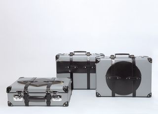
Flag bags by Big-Game and Globe-Trotter
Most suitcases are practical, if a little serious. Seeking something more fun, we charged Switzerland-based design trio Big-Game with creating a a space-saving piece of luggage we could proudly roll out during our fashion-week commute. Working with Globe-Trotter on its iconic vulcanised fibreboard cases, Big-Game devised three strap-on geometrical pockets that can be fastened externally or internally -- the bag's outline against the case forming a tongue-in-cheek representation of a national flag in the process (Japan, Brazil and The Netherlands are in the mix). The simple leather compartments, each with a half-zip detail, give great on-the-go access to travel documents.
www.big-game.ch
www.globe-trotterltd.com
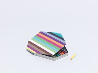
Coloured pencils and box by Johanna Grawunder, Prismacolor, and Bonetti Bolgan
We asked Johanna Grawunder to create a set of coloured pencils in a suitably fabulous tin. She chose her favourite artists' pencils, Prismacolor Soft Core, and designed a stainless steel box with a striped, enamelled top. The tin's shape is asymmetrical so the colours 'one should only use a little bit of' are shorter, then as you use up the pencils the tall refills go in the full-length middle section.
www.grawunder.com
www.prismacolor.com
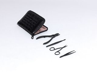
Manicure set by Bottega Veneta and Dovo
Compact, functional and satisfyingly masculine, this manicure set combines matt black stainless steel tools, crafted in Solingen, Germany, by experts Dovo, with a soft crocodile Bottega Veneta case, designed by Tomas Maier. Sitting snugly inside the ash suede lining are a cuticle pusher, nail nippers, nail knife, tweezers, nail scissors, cuticle scissors and a sapphire nail file -- clearly a cut above.
www.bottegaveneta.com
www.dovo.com
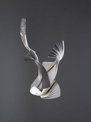
'Quatre in Motion' by Richard Sweeney and Boucheron
We don't always want to step out in our finest haute joaillerie, but we're also unwilling to compromise on quality. And so we came up with the idea of pairing the talents of paper engineer Richard Sweeney with the renowned jewellery house Boucheron, to create a seemingly 'low value' brooch that didn't scrimp on either design or beauty. For our exhibition Sweeney has produced a large sculpture inspired by Boucheron's iconic 'Quatre' collection, embossed and gilded to mimic the four 'textures' of the jewellery. Look out for the simplified (and smaller) self-assembly version to be bound into our August Handmade issue.
Watch the video to see how to make the Quatre in Motion
www.richardsweeney.co.uk
www.boucheron.com
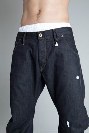
‘Arc Pant' jeans by Ryan Gander and G-Star Raw
Ryan Gander visited the G-Star atelier in Amsterdam to produce a small run of its twisted and tapered ‘Arc Pant' jeans. (Watch the making of the jeans). The design features a Japanese toy character wearing Le Corbusier-style glasses. The denim is embroidered with paint splashes and the little toy character is attached to the belt loop. A limited edition of 30 pieces will be distributed randomly around the world.
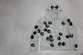
'1000m Goggle' jackety by Yoan Capote and CP Company
CP Company's iconic '1000m Goggle' jacket seems a natural choice for Cuban artist Yoan Capote's collaboration with the brand. Watch the making of the jacket. Conceived 20 years ago, it draws inspiration from race-car driving, the perfect example of the fast-paced high life that Capote explores. A homage to the historic Mille Miglia race, a 1,009-mile circuit from Brescia to Rome, the jacket comes with a pair of goggles incorporated into its hood to allow the drivers, who raced in roofless cars, to withstand a battering from snow, rain and mud. Capote's version sees goggles multiplying willy-nilly across the jacket like so many watching eyes or bullet marks. 'My work is usually inspired by the body and psychological issues,' says Capote. 'This jacket explores the theme of introspection, the idea of eyes that can look inside and beyond the surface.'
www.yoan-capote.com
www.cpcompany.co.uk
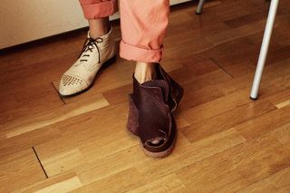
Shoe sculptures, by Tatiana Echeverri Fernandez and Camper
As an artist interested in putting fragments of production processes in the spotlight, sculptor Tatiana Echeverri Fernandez found a rich vein of material in Camper's fusion of traditional craft and new technology. Watch the making of the show sculptures. Exploring the shoemaker's art for Handmade, she transformed a Bernhard Willhelm design for Camper and a pair of the brand's mismatched 'TWS' (above), effectively turning each shoe inside out as she carefully unpicked stitching and uncovered the stages of its manufacture. 'The idea was that the inner sole, lining or glue marks become the aesthetic focus,' she explains. 'Hopefully it becomes more interesting to see the process behind the finished product.'
www.tatianaecheverrifernandez.de
www.camper.com

'Live/Work' dressing gown by Peter Saville and Carlo Brandelli
'A dressing gown is my regular attire during the day in my studio where I live and work,' says Peter Saville. 'This was very known to Tony Chambers at Wallpaper*, hence the commission. Given the opportunity to create a bespoke gown, I chose to work with my long-term collaborator Carlo Brandelli and specify the perfect version for my purpose.' Referencing the qualities and details of some of Saville's favourite dressing gowns, the pair have 'evolved a new hybrid'. The result so far -- the first draft -- is a 'work in progress' toile made from white Japanese satin. Suitable to wear in a studio space during the day, where an informal atmosphere is usually the norm, the 'Live/Work' dressing gown has the feeling of a lightweight 'working overcoat or uniform'; with the robe's defined shoulder line, a formal dressing gown is also referenced, as is a bespoke jacket.
www.carlobrandelli.com
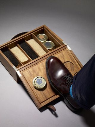
Shoe shine kit by Gareth Neal and Church's
Gareth Neal's special shoe shine kit for the great English shoemaker Church's is constructed so that the lid of the case converts into a platform for the shoe to be rested on while the shoe shine is conducted. Brushes, polishes and creams are kept in compartments in the main body of the case.
www.garethneal.co.uk
www.church-footwear.com
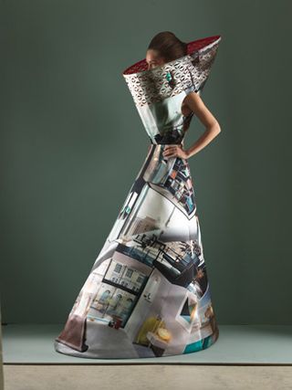
Dress by Mary Katrantzou and Matthew Donaldson
Katrantzou's dress is inspired by the interior of London's latest high-end apartment complex (and Wallpaper* neighbour) Neo Bankside and contemporary furniture pieces. The original photography is by Matthew Donaldson for a story that featured in the May issue of Wallpaper*, showcasing our new venture into the realm of interior décor.
www.marykatrantzou.com
www.matthewdonaldson.com
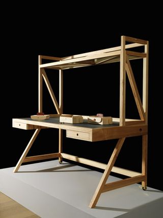
‘Jerome' workstation by David Kohn, Porro, and FLATCUT_
David Kohn's ‘Jerome' workstation, made by Porro, is named after the 15th century painting of St Jerome in his study by Antonello da Messina. The optional desktop space frame enables a suite of ‘Jeromes' to be arranged in a large, open-plan space, breaking up the office landscape while preserving privacy, functionalism and elegance. Brooklyn-based fabrication studio FLATCUT_ has wrought this detailed laser-cut model to illustrate how the desk carves out smaller ‘rooms' within a larger office.
www.davidkohn.co.uk
www.porro.com
flatcut.com
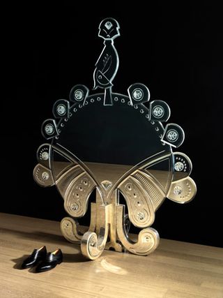
'Vanity Peacock Mirror' by Divya Thakur and Leandro Castelao
For her multidisciplinary design label, Design Temple, Divya Thakur has worked on a number of pieces inspired by sacred animals of India. For us, she extended the conceit to produce the 'Vanity Peacock Mirror'. In Indian mythology the peacock is the vehicle of Karthikeya, the god of conquering vices, including vanity. It seemed befitting to match the peacock to the narcissist's favourite tool, the mirror. Leandro Castelao provided the peacock illustration, Thakur adapted it, teaming up with Delhi-based craftsmen, working in the Calcutta school of cut mirror work. They carved out the design in blocks which were then assembled on a single piece of ply. The stand is made of hand-beaten silver, a traditional Indian finish.
www.designtemple.com
www.leandrocastelao.com.ar
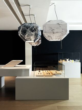
'Heavy Cotton' lamp by DWA and Servomuto
'Heavy Cotton' is a hanging lamp composed of a handmade metal frame covered in cotton jersey cloth, which can be changed and replaced with other coverings. Taking its name from the term for the weight of cotton used to manufacture T-shirts, here is it presented in three sizes (XL, M, S), with fabric printed with a pattern of three different types of marble.
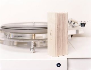
'Jambox' speaker by Jawbone
Yves Béhar's wireless 'Jambox' speaker and speakerphone for Jawbone ticked all our tech-spec boxes while juggling our demands for streamlined design. So when it came to choosing a player to grace our Handmade show in Milan, we knew where to turn. Jawbone handcrafted a customised 'Jambox' especially for us out of solid maple wood. 'It was the juxtaposition between the advanced technology of the 'Jambox' and wood, the traditional choice for musical instruments and speakers, that I found so appealing,' explains Béhar. But maintaining the high levels of sound in the wood proved difficult even for this ingenious San Francisco-based brand. A solution came in the form of thousands of small holes machined on to the surface. To showcase its talents, we looked to Wallpaper* Handmade's official DJ Michel Gaubert, who, in addition to providing the soundtrack for the whole exhibition (top), created a special sound for the 'Jambox'. 'We used Philip Glass' Music Box, which we overlaid on some beats that we made,' he says.
www.jawbone.com
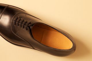
Men's shoes by E Tautz and John Lobb
We wanted to bring together John Lobb's exceptional craftsmanship, eye for quality and unsurpassable materials with E Tautz's love of simple English line and form. From a heritage last with the minimum of detailing, the two companies have created a fine cap-toe Oxford.
www.etautz.com
www.johnlobb.com

Moving wallpaper by ÉCAL, Hermès and Michel Gaubert
Two projects see students from ÉCAL's visual communications department bring life to Hermès' new wallpaper collection. One, 'Spot Light', uses an iPad app, an overhead projector and a wall covered with 'Fil d'Argent' wallpaper. By moving a finger on the iPad screen the user can move a spot of light over the wallpaper and project Hermès horses trotting within the spot to a soundtrack provided by DJ Michel Gaubert. In the other project, 'Pêle-Mêle', the students have created an equestrian parade-scene app for the iPad after the artwork of the eponymous Hermès motif. By moving the iPad the scene begins to move, with new backgrounds and characters appearing to trot along.
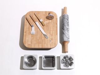
Pie kit by Kiwi & Pom
Inspired by the revival of sweet and savoury pies that have swept Brooklyn and Britain, we were inspired to commission our own kit of pie-making tools. Kiwi & Pom was our obvious pick thanks to a line of enamel pie tins it launched with Falcon Enamelware earlier this year. The kit includes individual pie moulds and pastry stamps with our asterisk logo, a deadly marble and wood rolling pin, a pastry cutter and brush, an enamel pie dish and a wooden pastry board. It looks good enough to eat.
Get the recipe for rhubarb and cardamom pie
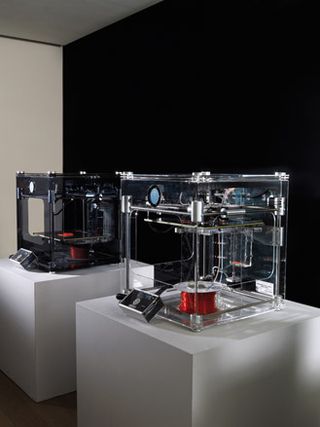
3D printing performance by Freedom of Creation
For this live 3D-printing performance, in which Dutch 3D-printing company Freedom of Creation (FOC) co-creates with the public, visitors can bring their own 3D files and get them printed on a 3D-printer. They can also customise small modules of a huge ‘Macedonia' space divider, which will grow in real time during the exhibition.
www.freedomofcreation.com
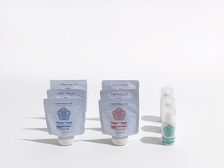
Seven-day survival kit by Functionalab
Our bodies are pushed to the max whenever Salone comes around, so what better way to combat fair fatigue while being the ever-social butterfly than with a survival kit of supplements by Canadian nutraceutical company, Functionalab? The kit contains an am and pm programme of pills and a mini tube of eye-contour serum to fight any prosecco-induced puffiness.
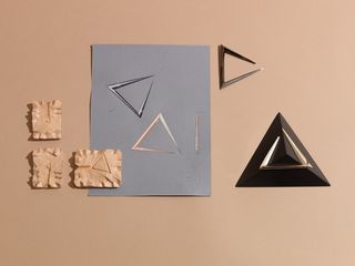
Letter opener by Hannah Martin
Contemporary jewellery designer Hannah Martin's sculptural letter opener for us is both modern and unexpected for such a traditional tool, and looks equally stunning on a desk as it does on these bespoke plinths crafted by DuPont Corian.
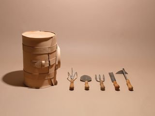
'S-tool' bag by Harri Koskinen and Sneeboer
Functionality is at the core of Finnish designer Harri Koskinen's creations so, when we charged him with creating a garden tool bag, we weren't surprised when he didn't stop there. The lightweight, hand-stitched leather design comes with a stainless steel frame so that it can be turned on its side and used as a stool -- an essential piece of kit for the more back-breaking tasks in the garden. To bring his idea to fruition, we teamed him up with Sneeboer, a Dutch company that has been hand-forging stainless steel garden tools for almost 100 years. It also supplied a set of its extremely durable hand trowels, a hoe, a cultivator and a fork.
www.harrikoskinen.com
www.sneeboer.com
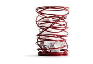
Waste paper bin by Hervé Van der Straeten and When Objects Work
At When Objects Work, Beatrice De Lafontaine produces some of the best tabletop items around, so we thought it would be fun to ask her to produce something for under the table instead. And since she generally works with architects, we decided to match her with Paris-based Hervé Van der Straeten, known for his design objects with a decorative-arts bent. To make things more fun, we asked the pair to get the product out for less than €200, in Belgium. They produced a waste paper bin in spring-coated steel sheet and lacquered steel wire.
www.vanderstraeten.fr
www.whenobjectswork.com
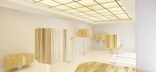
'In the Cloud' by Sou Fujimoto, AHEC, and Imola Legno
A functioning bar for the opening night of Wallpaper's 'Handmade' exhibition, and a dedicated resting spot throughout the show, Sou Fujimoto's installation 'In the Cloud' offers a new approach to the traditional, long-counter bar typology.
A series of irregular geometric American tulipwood 'clouds' are set at different heights on transparent Plexiglas legs. Relatively light and soft but strong, the versatile tulipwood was provided by Milanese timber distributor Imola Legno, with the support of the American Hardwood Export Council. Fujimoto's scale models of a chair to accompany the bar are also on display.
www.sou-fujimoto.net
www.americanhardwood.org
www.imolalegno.com
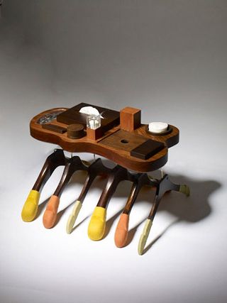
Amenity Tray by Isay Weinfeld and Clothes hangers by Kirby Allison's Hanger Project
Amid many dreams of global domination we at Wallpaper* have visions for the refurbishment of a relaxing spa and pool to our own exacting standards. A key to keeping stress levels minimal will be the provision of an amenity tray in the changing rooms. Something to hold cotton buds, cotton wool, shower caps, hairgrips, tissues and other geegaws would be good. We approached Isay Weinfeld because we love the way he mixes up beautiful Brazilian woods in his pieces. In this case the containers are made of pau-ferro wood and the containers from imbuia, cedro and ipe wood and acrylic.
In our constant quest for perfection, we thought a clothes hanger with the ideal ergonomics to preserve clothes while hung up would be an ideal addition to the Wallpaper* wardrobe. So we approached Kirby Allison, who had researched this very sector of design, and commissioned a range of hangers for different functions – shirts, trousers, jackets – in two precious woods, macassar ebony and wenge. The ends of the each hanger and the trouser bars are covered in different coloured suede according to their function.
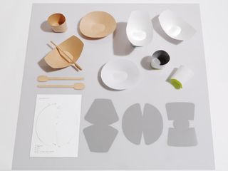
Office party kit by Isolation Unit
Thinking of equipment we would need for our dream office, we were quite certain it should include some disposable kit with which to eat birthday cake. Japanese design agency Isolation Unit seemed the natural choice for our commission, given Japan's traditional use of paper technology. The result is a set of paper tableware -- a cup, a deep plate, a low plate and a spoon -- that can be assembled from a flat sheet of A4 paper. All that is necessary is food-grade coated paper, starch glue, latex and a paper cutter. The pattern is cut out of the paper, folded and fixed with starch glue, then painted on the underside with latex to make the bottom joint waterproof.
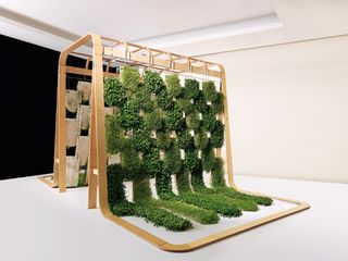
Shed by Patrick Nadeau, Jardins de Babylone and Tecomah
We asked Patrick Nadeau to create a space similar in feel to many of his architecture projects, where vegetation is the primary material making up the structure. Aided by Amaury Gallon at Jardins de Babylone and the Tecomah landscape school, Nadeau came up with a design that features two types of plant, to give contrasting colour and texture, growing up white textile tiles strung from a frame on stainless steel cables. It's called a shed, but really it's an installation for a garden or outside space that is considerably more conceptual then functional.
www.patricknadeau.com
www.jardinsdebabylone.fr
www.tecomah.fr
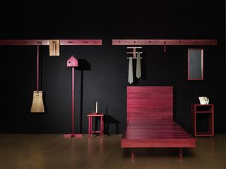
Shingle House objects by John Galvin and NORD Architecture
We asked John Galvin to design a set of wooden household objects and furniture for NORD Architecture's Shingle House in Dungeness, UK. The holiday home sits on a dramatic section of the Kent coastline that is also the location of Derek Jarman's former house and is similarly finished externally in tarred black shingles -- but with a contrasting palette of concrete and timber within.
Galvin produced handmade wooden coat pegs, tie racks, beds, picture frames and other objects to suit the house.
Tour the Shingle House with our interactive floor plan
www.johngalvindesign.co.uk
www.nordarchitecture.com
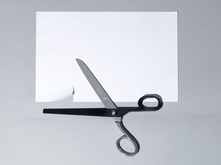
Wallpaper* scissors by Dentsu London, Ernest Wright and Son, Jamie McLellan
Inspired by the creative potential of bringing together age-old traditional handmade techniques with cutting-edge processes, Dentsu London has created a unique pair of Wallpaper* scissors. One side has been handmade by Ernest Wright and Son, one of the oldest and last specialist scissor manufacturer in the UK, while the other has been designed by Jamie McLellan and 3D-printed in black resin. Together, they work in perfect harmony to create a distinctly modern pair with a unique provenance.
www.dentsulondon.com
www.ernestwright.co.uk
www.jamiemclellan.com
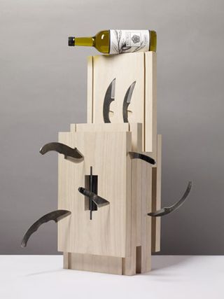
Kitchen knife kit box by Keiji Ashizawa and Hirosaki and Olive oil by Miller Harris
This is part of a series of 'kit boxes' we have had produced for Handmade to store specialised tools. To create a case for a range of blacksmith-forged craft knives from the Japanese city of Hirosaki we turned to Keiji Ashizawa, who designs beautiful things in wood. He chose paulownia wood, normally used in the soundboards of Japanese stringed instruments and known for its pale colour and straight grain, and used this for most of the case. Each knife has its own dedicated drawer with a black steel finger-handle. Apple wood was used in the drawer rails, referencing Hirosaki's fame throughout Japan for its apple orchards. Drawing on the skill of local artisans, the kit box comes with knivesby Hirosaki craftsman Toshihisa Yoshizawa, while the woodwork and lacquer work were completed by Takayuki Kimura and Masato Kimura respectively.
www.keijidesign.com
Perfumer Lyn Harris has blended this traditional Spanish extra virgin olive oil with a natural cucumber essence from France that works in harmony with the oil's inherent peppery character. Striking a perfect balance between flavour and aroma, the oil is delightfully fresh, with subtle green notes, and can be used to dress salads or pasta dishes or simply enjoyed with crusty bread.
www.millerharris.com
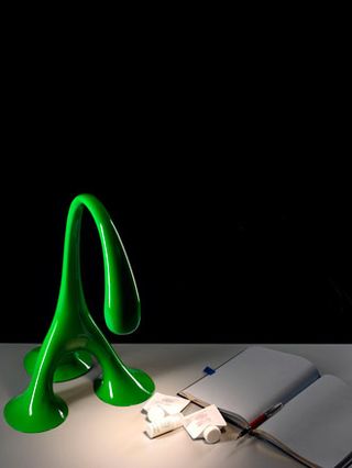
'Evolution' desk light by Chris Bosse and Philips
More akin to a blade of grass or a flower than a desk light, Chris Bosse's design is the latest in a series of his works that emulate nature. This time we tasked him to think on a smaller scale than he is used to, then turned to the experts at Philips to bring his challengingly curvaceous design to life. They 3D-printed the structure in ABS, then sanded and spray-painted it before fitting it with a Luxeon Rebel LED, part of the new generation of ultra-efficient Philips Lumileds. Though a desk light, it can be scaled up to floor lamp size - 'even to the height of a human,' says Bosse.
www.l-a-v-a.net
www.philips.com
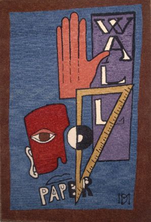
Rug by Maison Darré and Stepevi
We loved the idea of matchmaking the graphic designs of Vincent Darré, of Maison Darré, with one of the world's leading rug makers. Inspired by Cubist art collages and the metaphysical posters of Futurism from the art deco period, Darré created a composition of geometrically arranged objects. The end result looks rather like a sign advertising a 1920s Parisian nightclub, says Darré: ‘As if Wallpaper* was a club instead of a magazine, a new Boeuf sur le Toit.'
www.maisondarre.com
www.stepevi.com
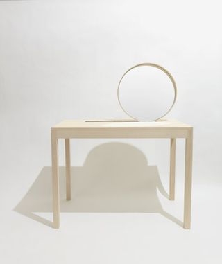
Dressing table by Martha Schwindling
Martha's technical artistry and eye for line featured in the furniture and product design category of Wallpaper's 2011 Graduate Directory (W*142). She had designed a desk that was beautifully made, although extremely simple, using just wood and rubber. It also featured unconventional opening mechanisms in the form of asymmetric movements. For Handmade, she has taken the purity of the earlier object and created a vanity table. It combines a mirror, table and product container.
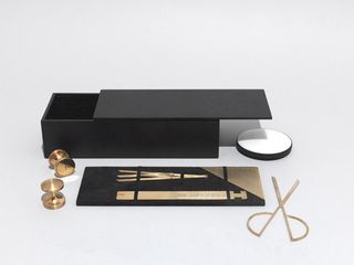
Geometry set by Michaël Verheyden
A luxurious box designed to provide everything a designer might need to complete a sketch or drawing, complete with secret compartments and a nubuck-covered divider, to which is attached a brass ruler, set square, scissors and ration gauge. Under the divider sits a stamp pad, a marble paperweight and tool to remove excess ink, and two or three wooden-handled brass stamps. The whole box is covered in oak veneer.
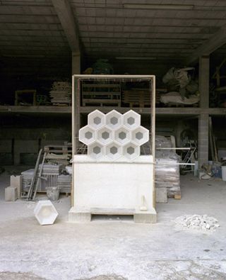
Modular masonry by Mike Rundell Associates and Sarl Rouvière
These modular masonry elements, made of precast white concrete with inset glass blocks, were developed to form large screen walls on the façades of a private villa in the Côte d'Azur. Now a standalone architectural element, for interior or exterior use, the product has been developed by Mike Rundell Associates and manufacturers Sarl Rouvière. Inspired by the ceilings of the Dolmabahce Palace in Istanbul, the hexagonal, honeycomb-like apertures are tapered to modulate and diffuse strong sunlight, animating internal spaces with shifting plays of light and shadow.
www.rundellassociates.com
www.rouviere-bat.com
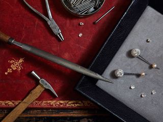
'Pendant Durian' earrings by Sotheby's Diamonds
We have been fans of Sotheby's Diamonds' innovative style since its inception in 2006. Known to incorporate diamonds with leather, steel and rubber, we insisted it make us a standout pair of earrings with its customary flair. And the result has turned our usual understanding of diamond jewellery upside down, literally, with a pair of diamonds over five carats in total, suspended from pearls and rods of steel, and entirely encased in reverse set diamonds. In each instance the diamond's table and crown are hidden from view, with the culet (that's the pointed underside to the uninitiated) sticking out to form a prickly 3-D drop. The sparkle is less intense than a conventional setting, but none the less beautiful for it.
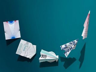
Film and paper planes by Studio Glithero and Baddeley Brothers
We asked Studio Glithero to make one of their beautiful films about the beautiful paper planes they designed for us as they were being made by the printers of our exhibition invites, Baddeley Brothers.
www.studioglithero.com
www.baddeleybrothers.com
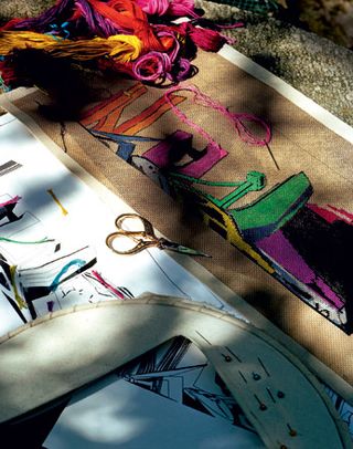
Landscape Tapestry by Tapisserie of London and Zaha Hadid Architects
Tapestry is not just for decorative, flowery patterns. To prove it, fine needlework experts Tapisserie of London paired up with Zaha Hadid Architects, never accused of being flowery, to create an utterly contemporary piece of tapestry
www.tapisserie.co.uk
www.zaha-hadid.com
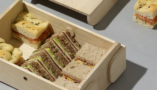
Office lunchbox by Tomas Kral
As part of the Handmade exhibition, we are having the essentials of office life perfected by craftsmen and designers. In the recessionary climate, as expense accounts feel the squeeze, little is more essential than a stylish lunch box, complete with a carry handle for a trip to the park, should your workload permit. Tomas Kral's design, inspired by the classic bento box, is made from light, natural wood with an anodised aluminium locking screw.
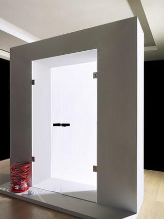
Perspex door by Tony Fretton and Tre-P & Tre-Più
When approached to design a door with Tre-P & Tre-Più, architect Tony Fretton looked back at the history of door-making for inspiration. Doors were made by hand using a long-established panelled pattern before 20th century mass production began turning out flat doors comprising thin panels over a core of wood or fibre. 'Both ways are practical, both anonymous, both embody the values of the society for which they were made. I do not want to intervene in this rich and opaque process. Instead, I want to have made, something that looks at being a door,' says Fretton. His discreet, simple but carefully designed transparent Perspex door features a visible metal lock and hinges, fitted with leather straps.
www.tonyfretton.com
www.trep-trepiu.com
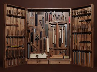
Tool box by WohnGeist, Wallpaper*
It takes quite a bit to convince us to embark on manual work ourselves, but when the tools are this beautiful, even we're not averse to a spot of home improvements. This one-off toolbox made especially for Wallpaper* took two craftsmen 15 days to complete. The box and handles are carved out of Swiss walnut wood, while the chisels are individually made from Swiss steel.
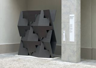
'Quadror' dividing screen by Studio Dror and Alpi
The 'Quadror' divider screen is made of interlocking pieces of a space truss geometry invented and patented by Dror Benshetrit. In addition to the divider wall created for us, Studio Dror believes the geometry has applications in product design, trestle structures, dwellings, dividing walls, sound barriers and more. You saw it here first. Wood for the project was supplied by timber producer Alpi.
www.studiodror.com
www.alpi.it
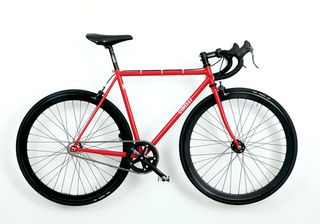
Wallpaper* bicycle by Cinelli and John Pawson, Max Lamb, Michael Marriott, Nina Tolstrup, Meirion Pritchard
Salone regulars know the best way to get around the city in the spring sunshine is on two wheels with a breeze in your hair, so we decided to join them with our own 40- bike ride-out starting from the Handmade exhibition at Brioni HQ arriving in time for lunch at Paul Smith's showroom. Being Wallpaper*, we weren't content with just any steel steed between our legs, so we borrowed a pile of minimal, eye-catching Gazetta steel track frames from Cinelli and sent them out to be customised by some of our friends.
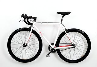
Wallpaper* bicycle by Cinelli and Nina Tolstrup
The designer behind Studiomama in London, Tolstrup trained as a designer at the Les Ateliers school of industrial design in Paris. She designs products for companies, as well as designing, manufacturing and selling her own ranges under the Studiomama name.
www.studiomama.com
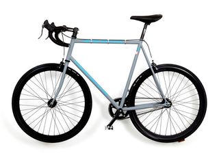
Wallpaper* bicycle by Cinelli and Michael Marriott
One of Britain's most important designers, Marriott's furniture and household objects for industrial production often incorporate everyday components, such as pegboards, wing nuts and plastic buckets, as well as banal materials like plywood.
www.michaelmarriott.com
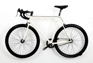
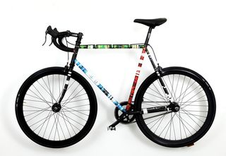
Wallpaper* bicycle by Cinelli and Meirion Pritchard
Welsh-born Pritchard is the art director of Wallpaper*
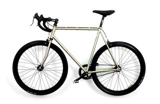
Wallpaper* bicycle by Cinelli and Max Lamb
After completing his master's degree in design products at the Royal College of Art, Lamb spent a year designing for Tom Dixon Studio before establishing his own practice, where he has developed a concise, process-driven approach to design.
www.maxlamb.org
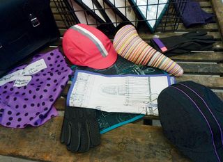
Wallpaper* bicycle gear by Rapha + Paul Smith
And, of course, we needed togs from the best, so we commissioned a special cycling kit from Rapha + Paul Smith
www.rapha.cc
www.paulsmith.co.uk
Rosa Bertoli was born in Udine, Italy, and now lives in London. Since 2014, she has been the Design Editor of Wallpaper*, where she oversees design content for the print and online editions, as well as special editorial projects. Through her role at Wallpaper*, she has written extensively about all areas of design. Rosa has been speaker and moderator for various design talks and conferences including London Craft Week, Maison & Objet, The Italian Cultural Institute (London), Clippings, Zaha Hadid Design, Kartell and Frieze Art Fair. Rosa has been on judging panels for the Chart Architecture Award, the Dutch Design Awards and the DesignGuild Marks. She has written for numerous English and Italian language publications, and worked as a content and communication consultant for fashion and design brands.
-
 ICON 4x4 goes EV, giving their classic Bronco-based restomod an electric twist
The EV Bronco is ICON 4x4’s first foray into electrifying its range of bespoke vintage off-roaders and SUVs
By Jonathan Bell Published
-
 ‘Dressed to Impress’ captures the vivid world of everyday fashion in the 1950s and 1960s
A new photography book from The Anonymous Project showcases its subjects when they’re dressed for best, posing for events and celebrations unknown
By Jonathan Bell Published
-
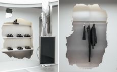 Inside Camperlab’s Harry Nuriev-designed Paris store, a dramatic exercise in contrast
The Crosby Studios founder tells Wallpaper* the story behind his new store design for Mallorcan shoe brand Camperlab, which centres on an interplay between ‘crushed concrete’ and gleaming industrial design
By Jack Moss Published