Marking time: Hermès’ new watch cuts a dash thanks to graphic designer Philippe Apeloig
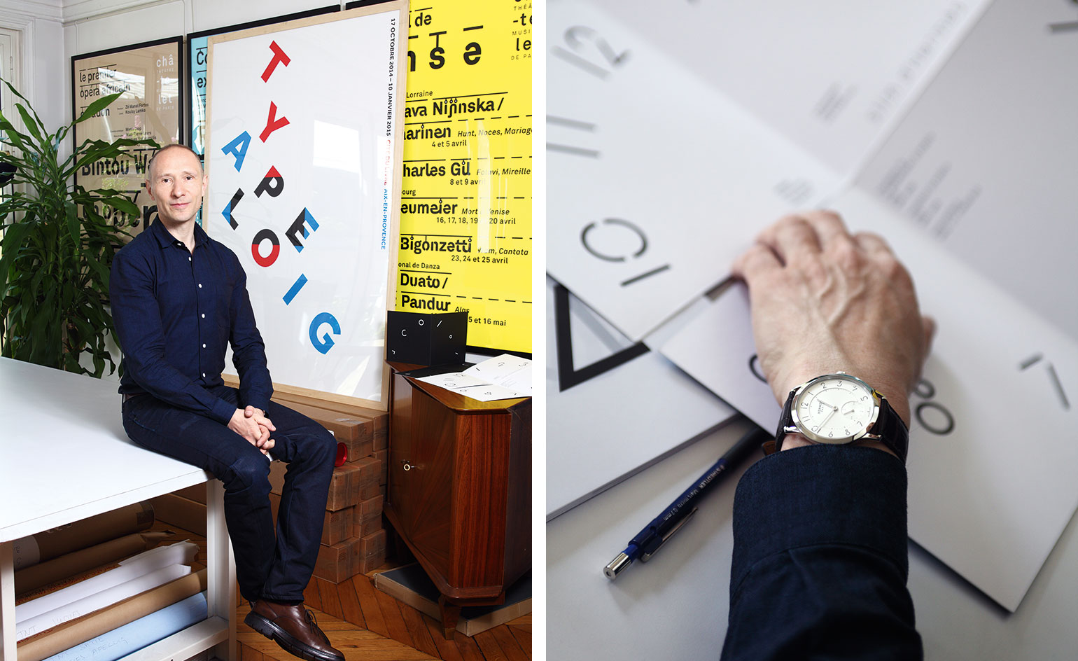
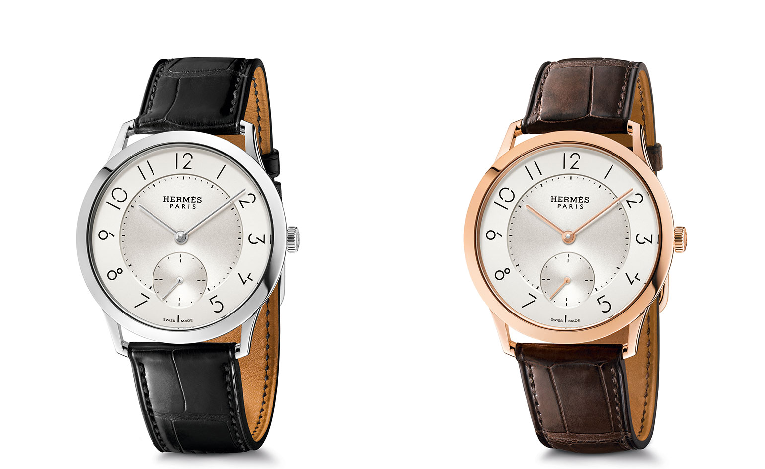
With its new Slim d'Hermés watch, Hermès has added a brilliant design tick: the hour markers have been designed by the French graphic designer Philippe Apeloig...
As originally featured in (W*196)
Hermès artistic director Pierre-Alexis Dumas approached Apeloig to create a new font having worked with the graphic designer on the identity redesign of Puiforcat - the Hermés owned silversmith
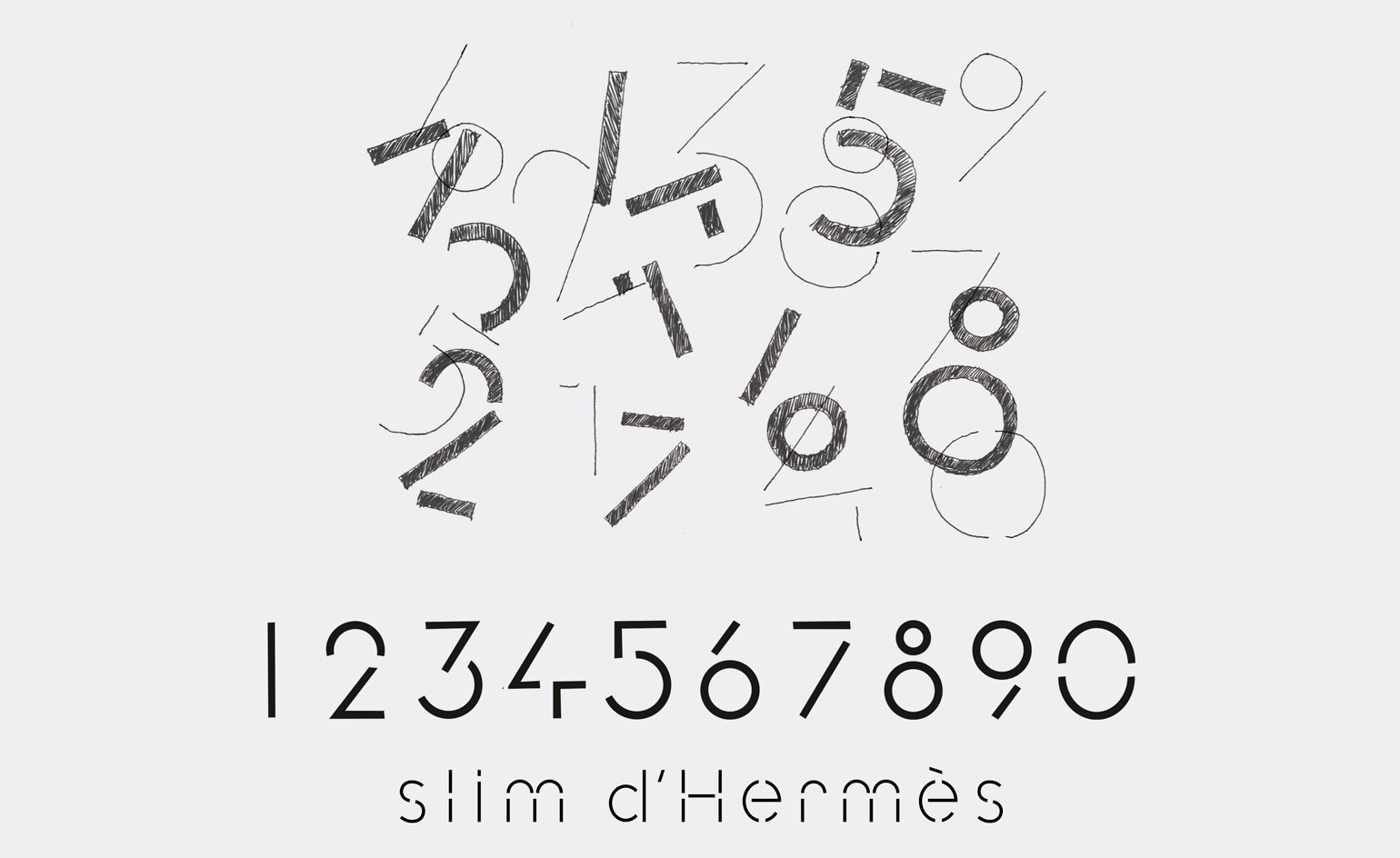
The fine breaks in the font not only define the watch's light character and the super-slim movement that powers the timepiece, but as with all La Montre Hermes' horological endeavours, there is a gentle humour ticking away

The physical design of the Slim d'Hermés watch is elegant, light and discreet, so there had to be a connection between the font and the movement
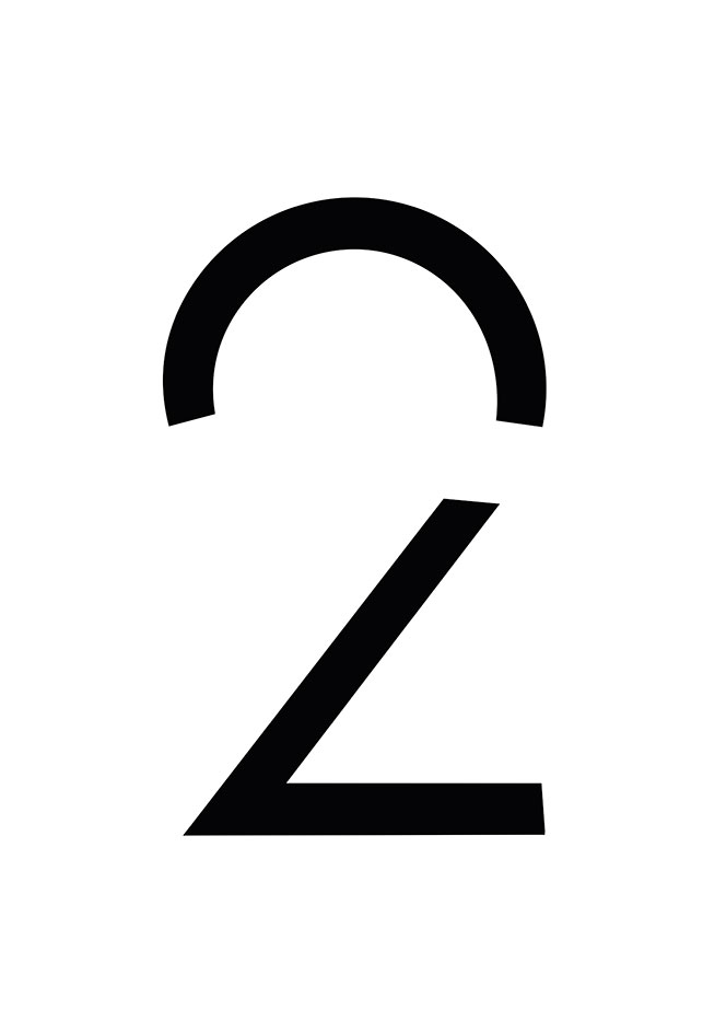
'The Slim d'Hermés font is very fine, a combination of straight and curved lines, a single line that is broken, with no difference in thickness. The font is simple, sober,' says Apeloig of the thinking behind his beautiful dial digits
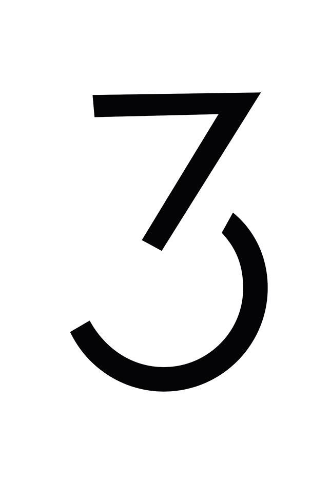
'The watch dial is very small and you have to think of the function, so the font has to create an interesting dialogue between the numbers and the shape. It should not be an effort to see the numbers when you glance at the watch,' says Apeloig of the design parameters of horological dial design
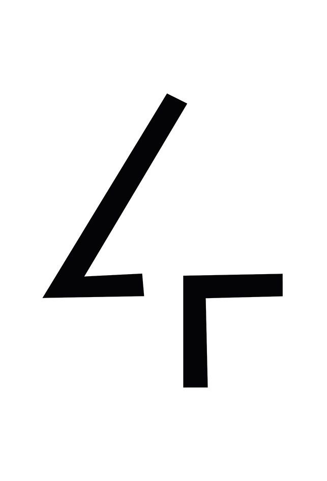
The fine breaks in the font convey a message: 'They represent the "start and stop" of time. The fact that they are not complete creates a kind of attraction, like a magnet that attracts the lines together but also the viewer to look,' explains Apeloig
Wallpaper* Newsletter
Receive our daily digest of inspiration, escapism and design stories from around the world direct to your inbox.

'Typography is a key part of Hermés,' says Hermès artistic director Pierre-Alexis Dumas. 'I am always impressed by Philippe's didactic style. His essential approach that says: "what can I take away until it doesn't say anymore?"

'The bezel is designed to give more space on the dial - it left a beautiful space for the typeface,' says Philippe Delhotal, creative director at La Montre Hermés. 'My obsession for 20 years at Hermés was to find a graphic designer who could work on the micro scale watch design demands'

Creativity and talent must come with a fresh eye: Delhotal redesigned Puiforcat brand identity and logo. 'I was very impressed by his didactic style - he decontructs the issues of the brief. That has to be resolved to reach a natural conclusion - a logic. His essential approach is, "What can I take away until it doesn't say anymore?" His is not a formal style - it is a Giacometti approach'
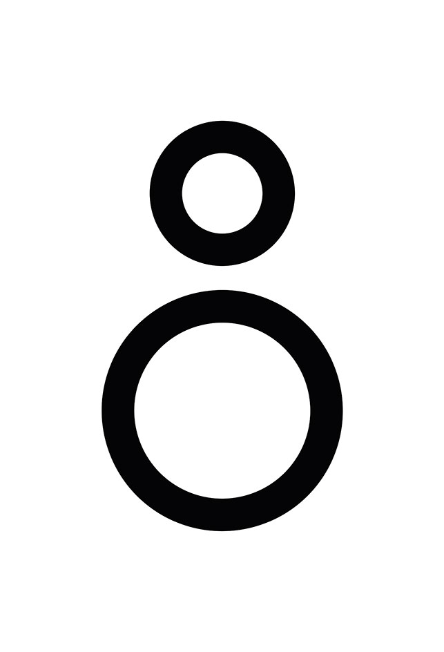
On switching from one design discipline to another, Apeloig says: 'Most of my work inolves type and letters that have to communicate a message - with a watch dial design, you have to invent something; the numbers already exist. Then it is about proportion'
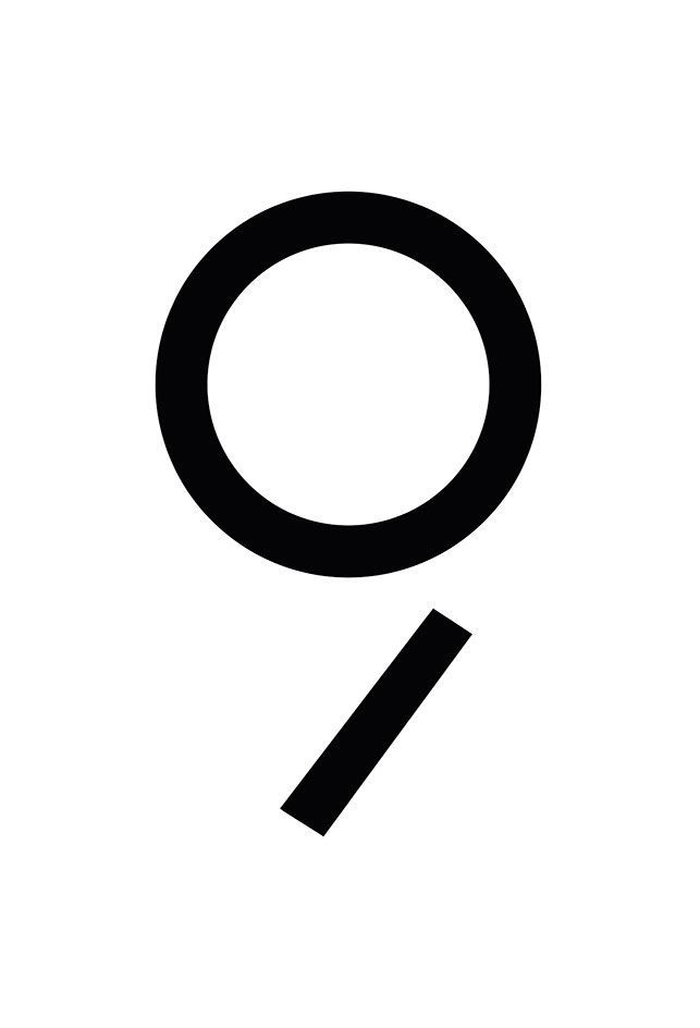
He adds, 'Typography is a balance between shape and emptiness. It has some power as you have to deal with space'

The elegant timepiece is available from Hermes.com in October
Caragh McKay is a contributing editor at Wallpaper* and was watches & jewellery director at the magazine between 2011 and 2019. Caragh’s current remit is cross-cultural and her recent stories include the curious tale of how Muhammad Ali met his poetic match in Robert Burns and how a Martin Scorsese Martin film revived a forgotten Osage art.
-
 All-In is the Paris-based label making full-force fashion for main character dressing
Part of our monthly Uprising series, Wallpaper* meets Benjamin Barron and Bror August Vestbø of All-In, the LVMH Prize-nominated label which bases its collections on a riotous cast of characters – real and imagined
By Orla Brennan
-
 Maserati joins forces with Giorgetti for a turbo-charged relationship
Announcing their marriage during Milan Design Week, the brands unveiled a collection, a car and a long term commitment
By Hugo Macdonald
-
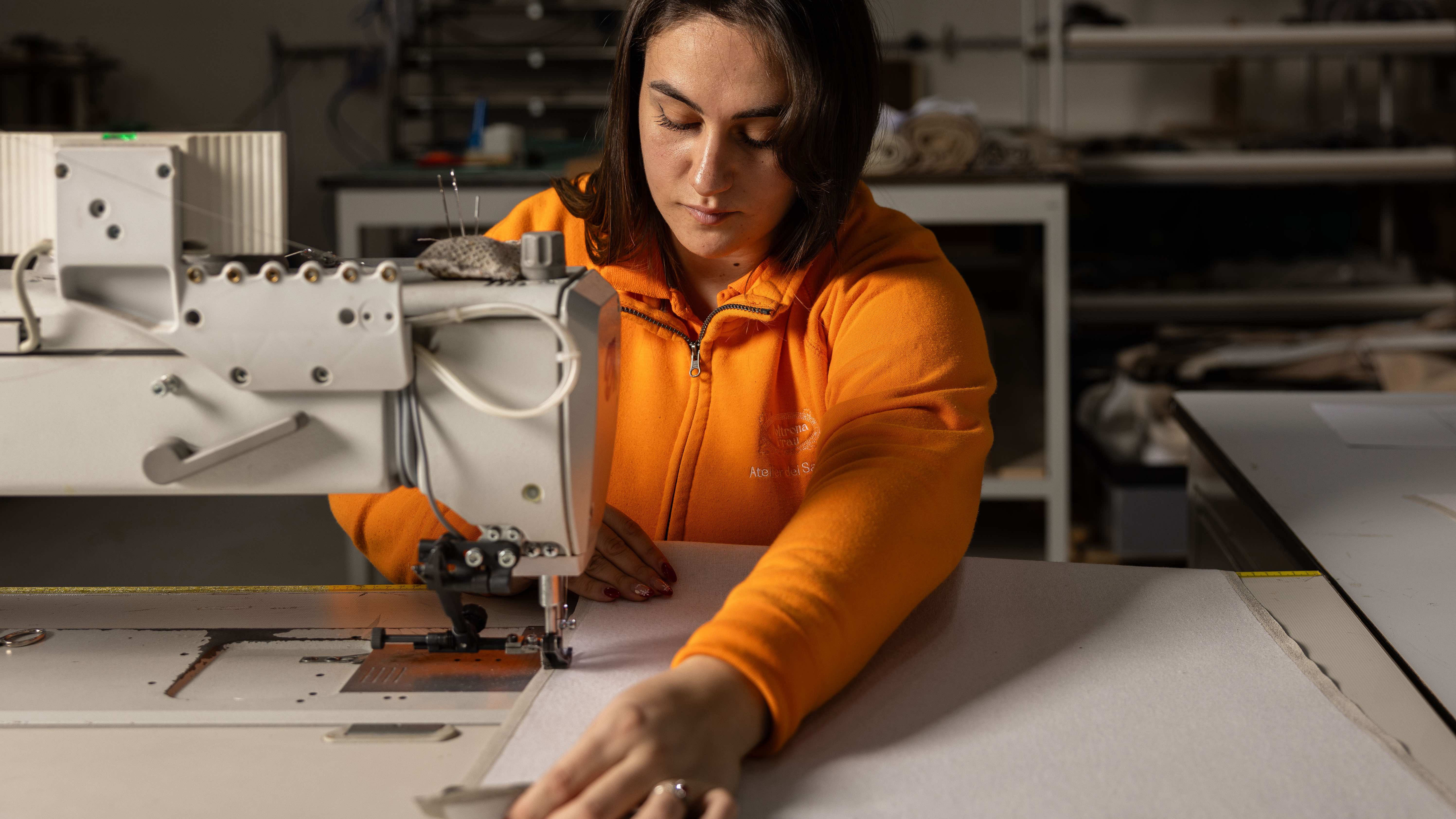 Through an innovative new training program, Poltrona Frau aims to safeguard Italian craft
The heritage furniture manufacturer is training a new generation of leather artisans
By Cristina Kiran Piotti
-
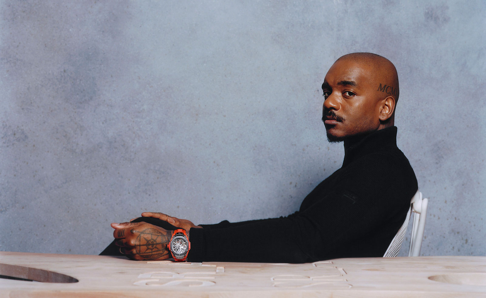 Samuel Ross unveils his Hublot Big Bang watch design
Samuel Ross brings a polished titanium case and orange rubber strap to the Hublot Big Bang watch
By Pei-Ru Keh
-
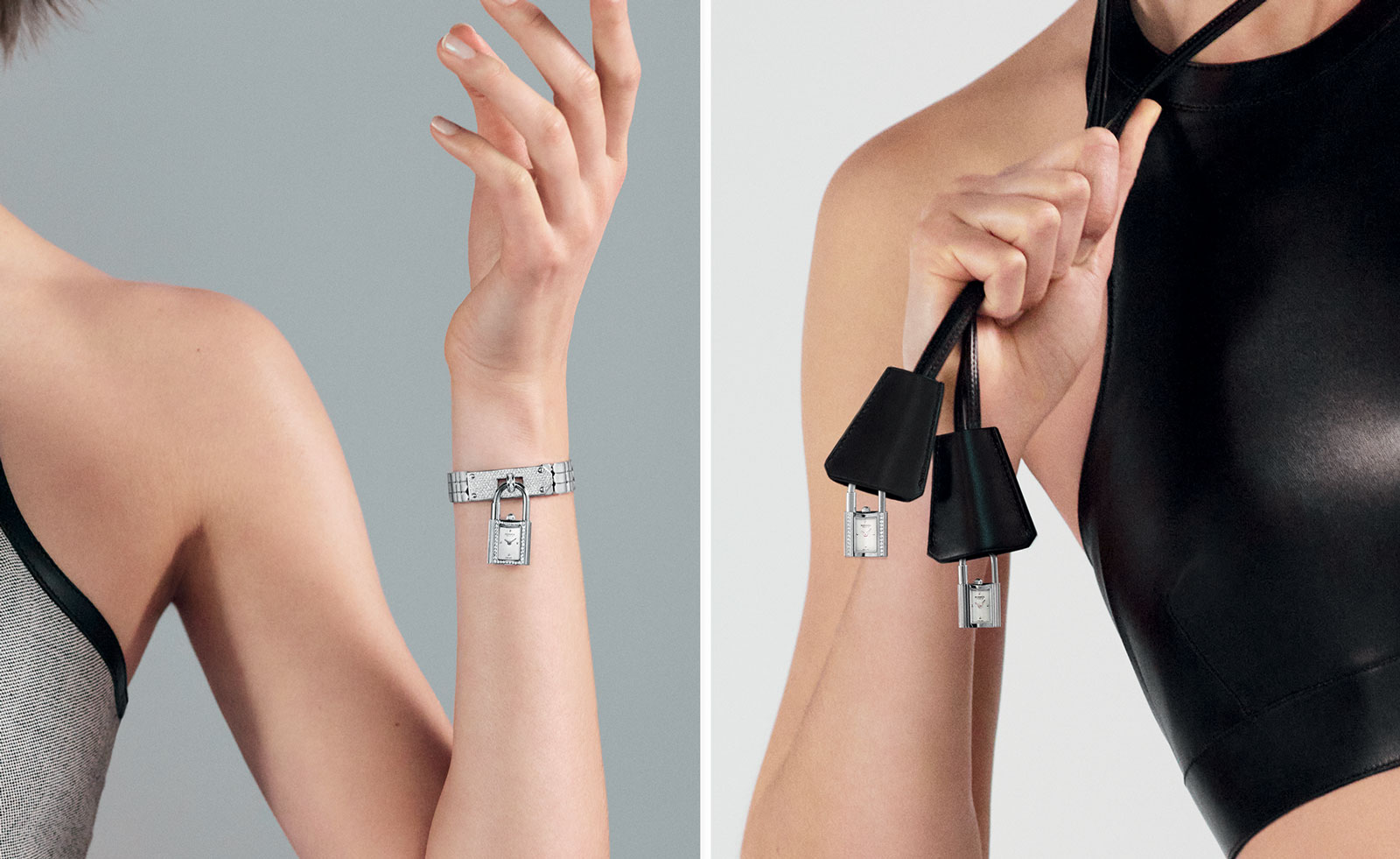 Playful design meets chic heritage in the Hermès Kelly watch
The new Kelly watch from Hermès rethinks the original 1975 timepiece
By Hannah Silver
-
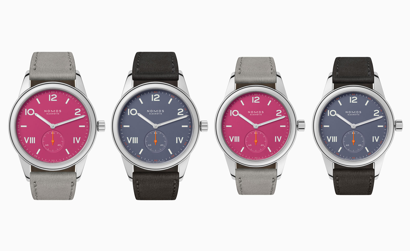 Discover the tonal new hues of the classic Nomos Club Campus watch
The Nomos classic wristwatch Club Campus now comes in two new collegiate colours. The perfect graduation gift from the Glashütte manufacture
By Hannah Silver
-
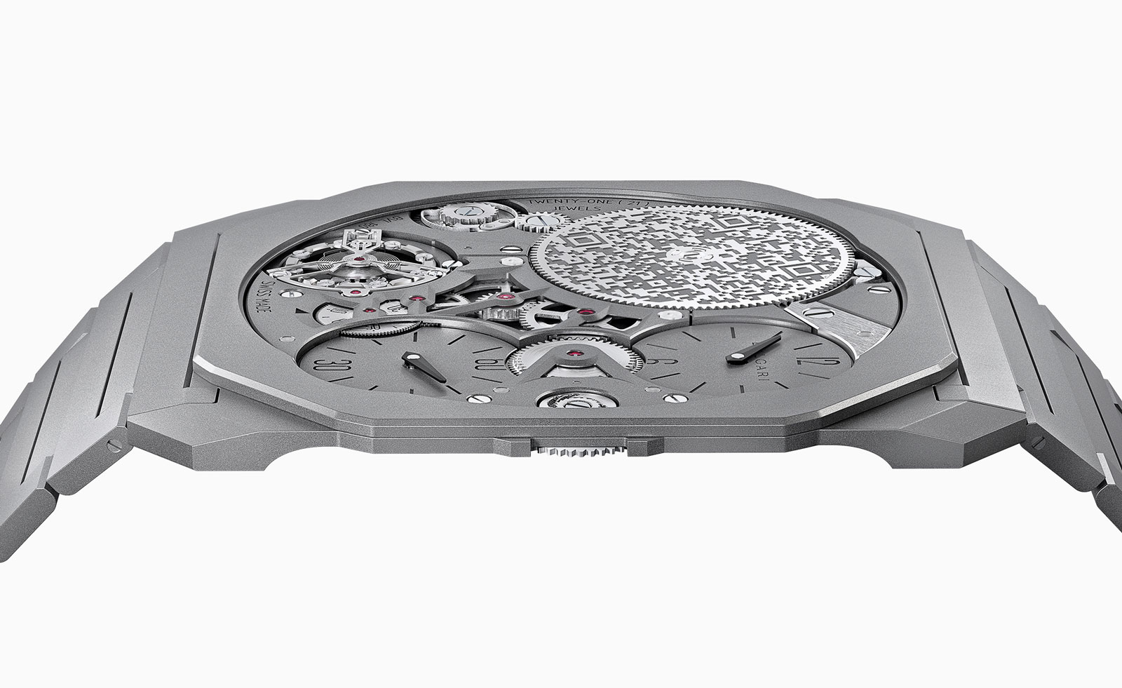 Bulgari unveils the thinnest mechanical watch in the world
The new Bulgari Octo Finissimo Ultra watch is a record-breaking feat of engineering
By Hannah Silver
-
 Breitling and Triumph unite on a racy new watch and motorcycle
1960s design codes are infused with a contemporary edge in the collaboration between Breitling and Triumph
By Hannah Silver
-
 Gerald Genta’s mischievous Mickey Mouse watch design is rethought for a new era
The Gerald Genta Retrograde with Smiling Disney Mickey Mouse watch pays tribute to Genta’s humorous design codes
By Hannah Silver
-
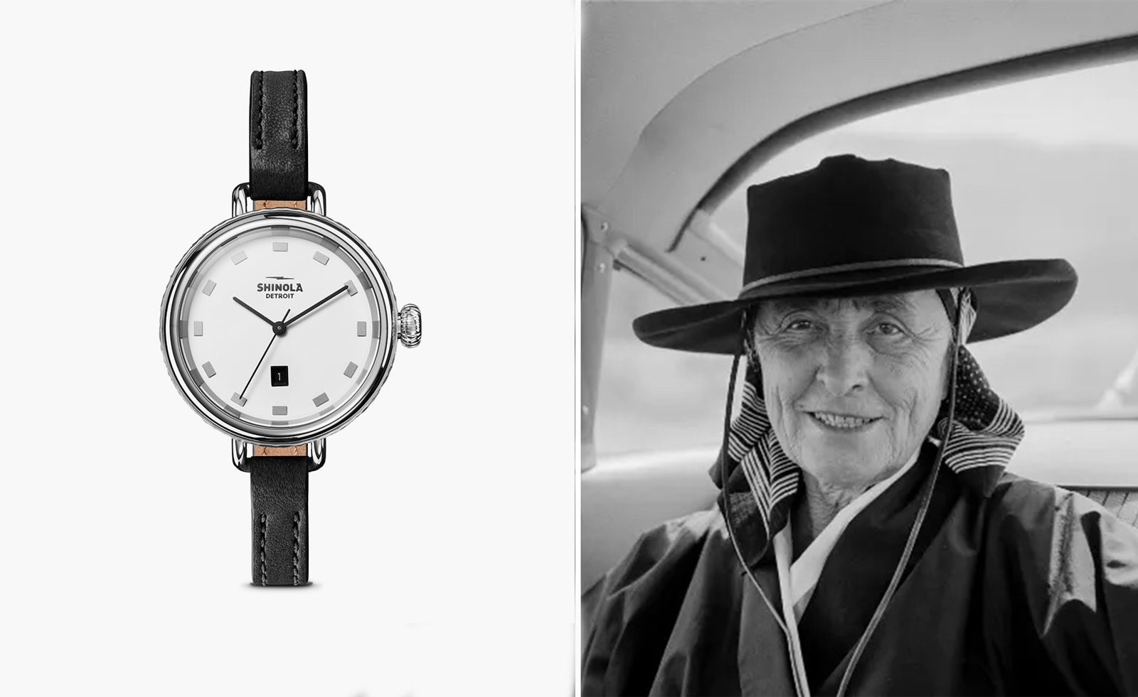 Shinola honours Georgia O’Keeffe with a new watch
Shinola Birdy watch stays faithful to the minimalist codes of Georgia O’Keeffe’s painting, My Last Door
By Hannah Silver
-
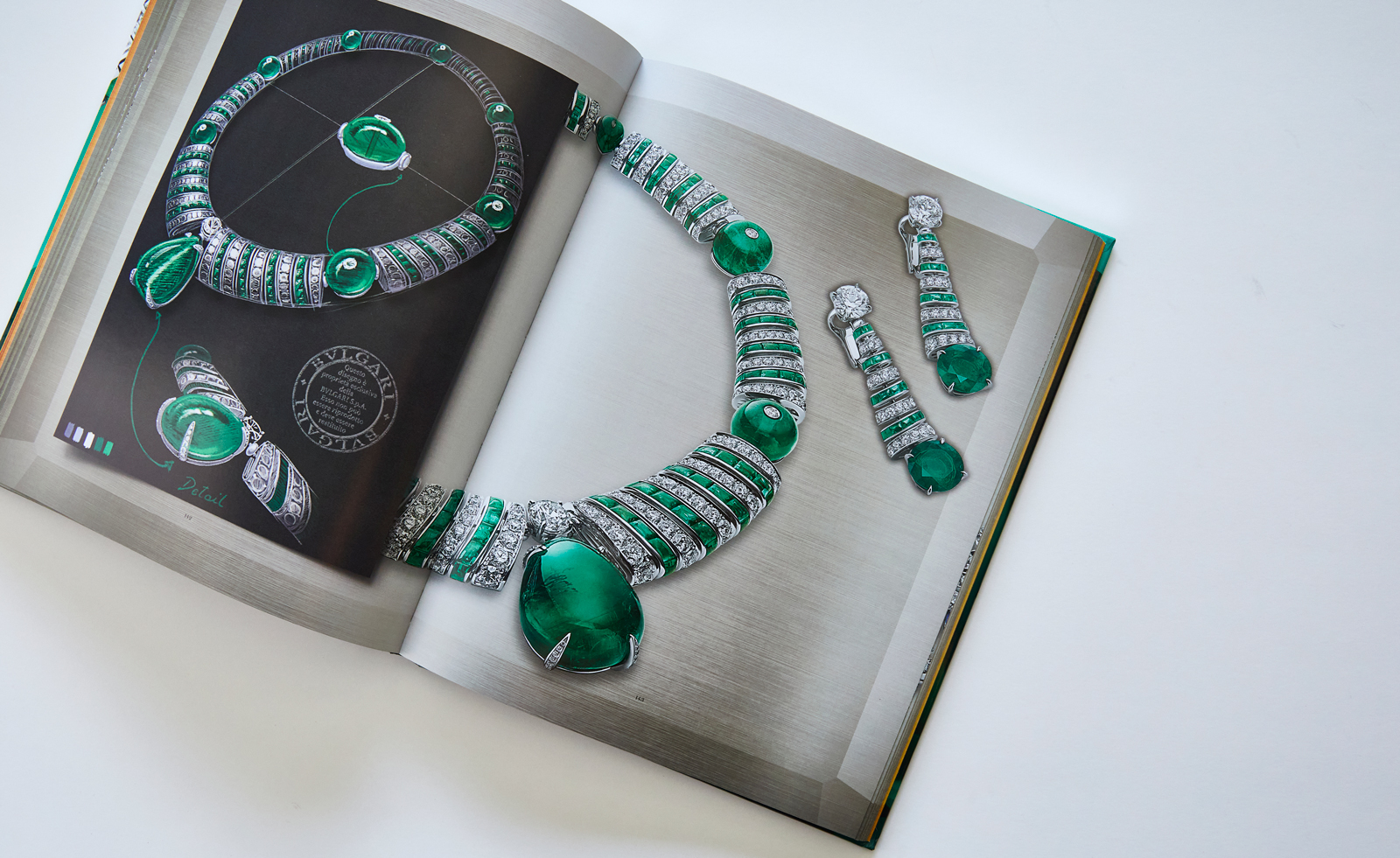 Bulgari’s new book celebrates women and high jewellery
Bulgari Magnifica: The Power Women Hold, published by Rizzoli New York, takes a closer look at the female muses who inspired the spectacular Magnifica high jewellery collection
By Hannah Silver