Visual Communication
From print to pixels, these visual designers, illustrators and typographers have each emerged with a strong and clear voice
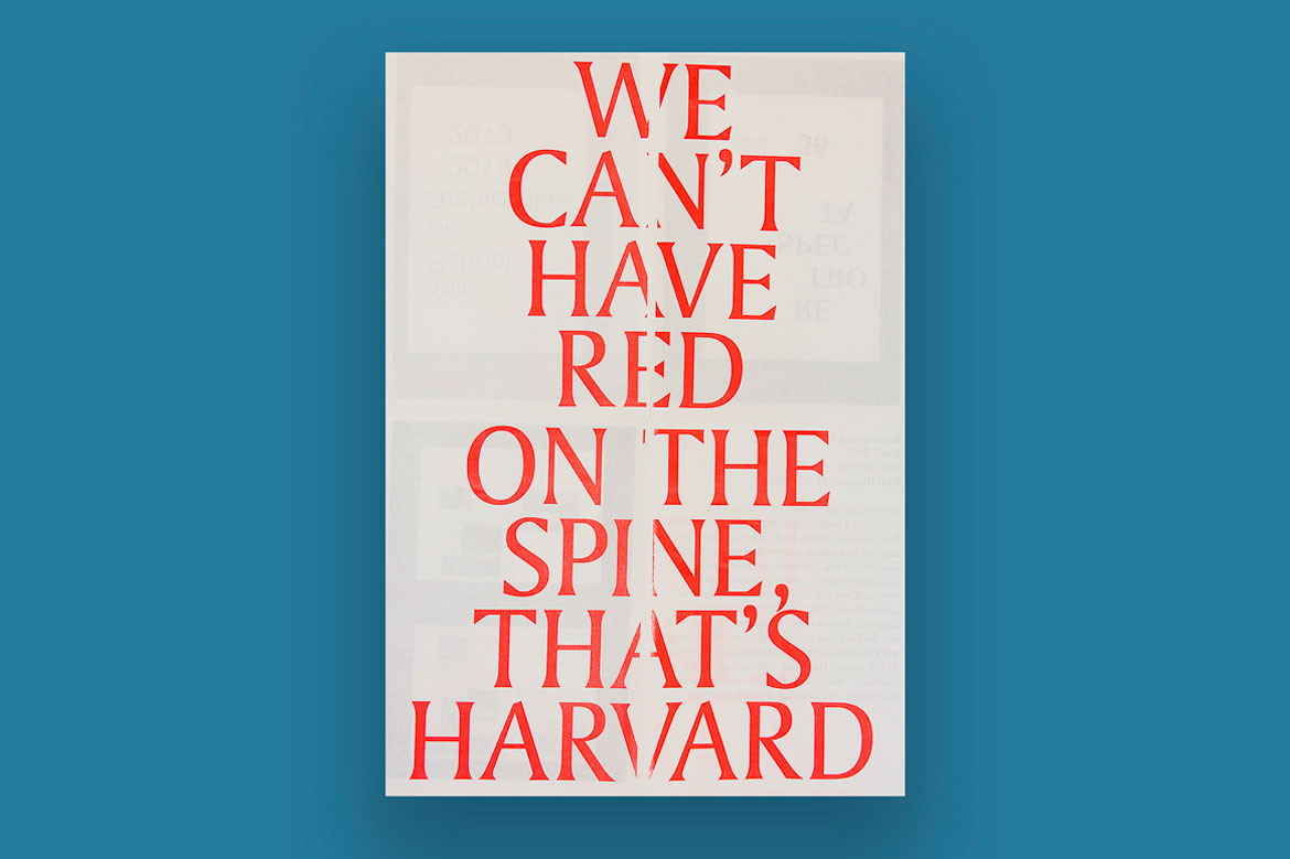
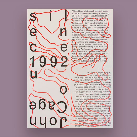
Sunny Park’s playful portfolio revelled in the display and concealment of information, experimenting with the risograph printer to develop posters that transcend its technical limitations. ‘The sense of not knowing the final output is something I tried to achieve throughout the program, and now,’ she says. Large-scale prints were achieved through folding paper and reprinting, while information is concealed within the folds of her densely layered posters.
Today's graphics graduates are faced with the daunting task of finding their feet in a field that has expanded way beyond the tactility of two-dimensional media into a digital realm of virtual space and interactivity.
Writer: Jonathan Bell

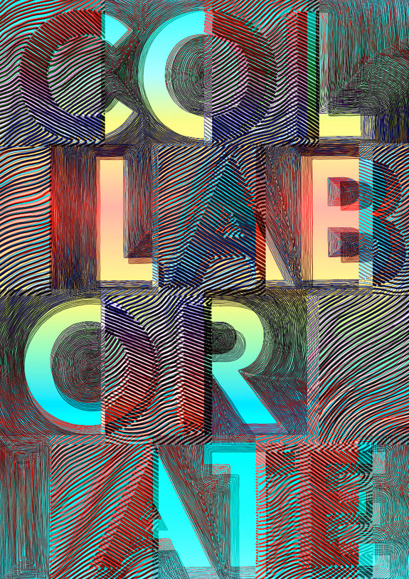
Working with fellow student Koos Breen, Suzanne Bakkum created a vibrant poster based on collaboration, rules and creative freedom. ‘It’s exciting to let the pattern overrule conventional rules of typography,’ she says.

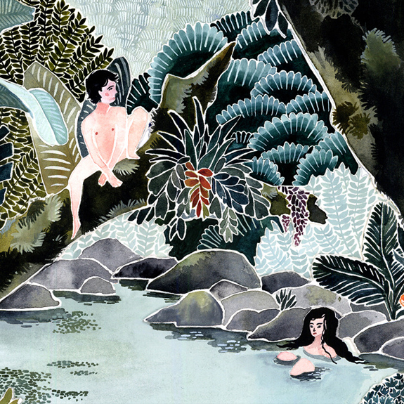
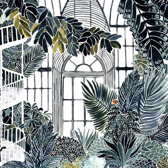
Angela Hadrill’s Vivarium is a self-published book on the theme of rich, all-enveloping nature and humankind’s imagined place within it. The illustrator’s technique combines watercolour and gouache, carefully layered to evoke lush landscapes. She’s currently working on more book illustrations for both children and adults.
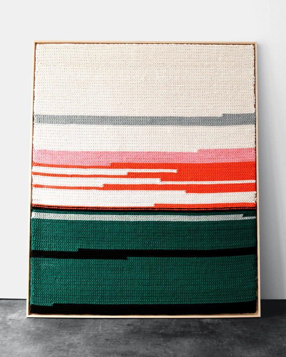
Filiation is a personal project about the designer’s late mother, comprising a knitted canvas that marks feelings and the passage of time. Victoire Coyon drew inspiration from Sheila Hicks, Sophie Calle and the simplicity of the Bauhaus and Swiss school.
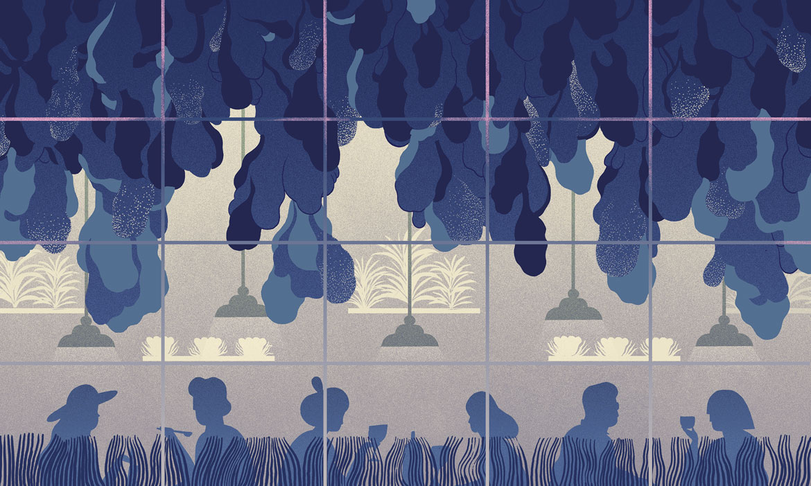
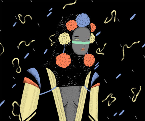
Marina Muun constructs richly atmospheric worlds with her simple, pared back illustrations. She also prints onto silk; these pieces feature geometric arrangements and abstracted colours. ‘Silk is a more tactile, less precious but still luxurious method of creating a print,’ she says.
Wallpaper* Newsletter
Receive our daily digest of inspiration, escapism and design stories from around the world direct to your inbox.
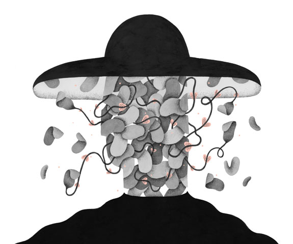
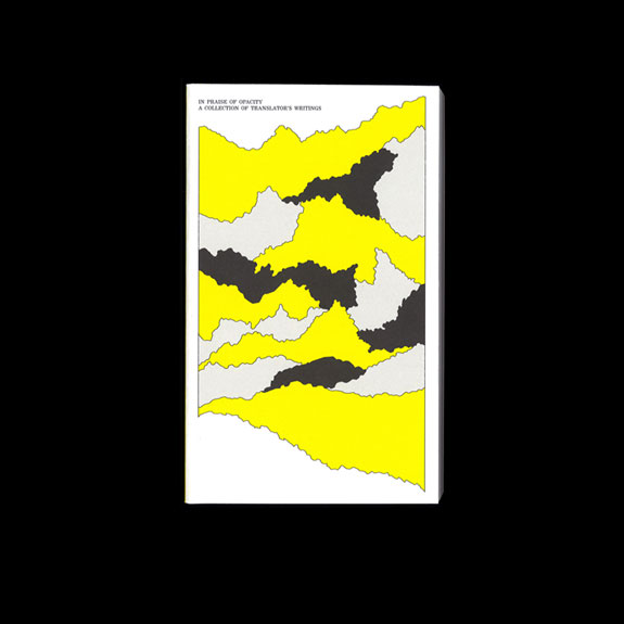
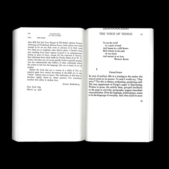
Daniel Frota’s In Praise Of Opacity is a detailed graphic treatment of the trials and quirks of translating texts. The language- obsessed designer likens his role to that of a translator seeking authorship.
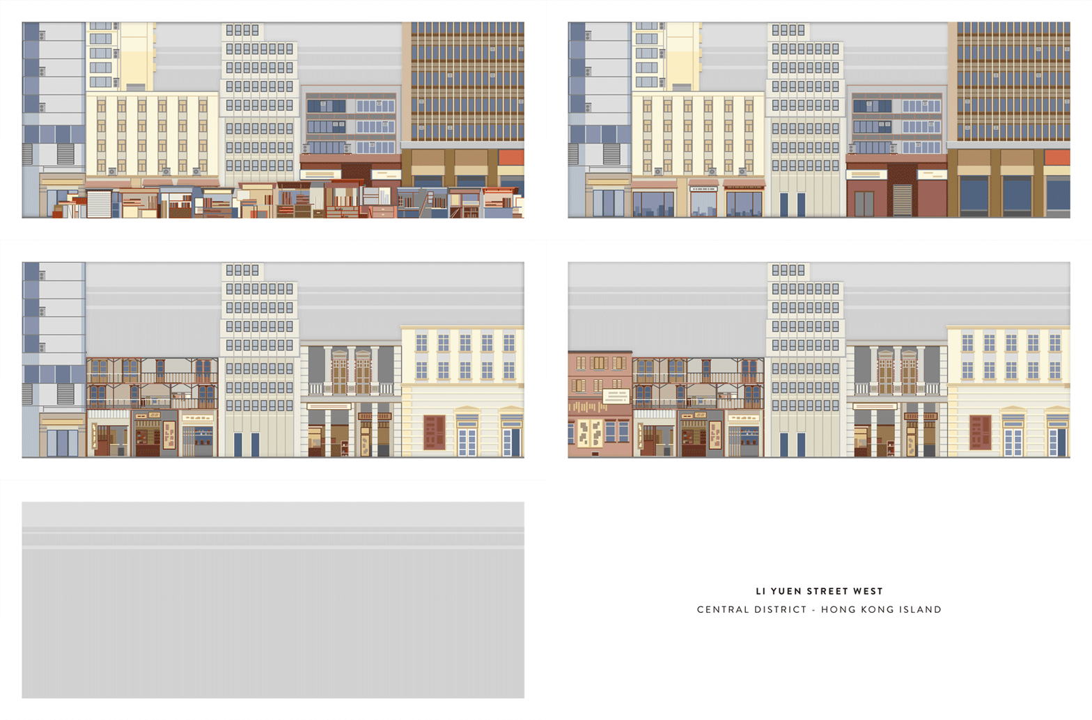
‘I’m influenced by the theme of the urban environment,’ says Brian Lo, whose detailed illustrations chronicle the intricacies and inconsistencies of the architecture that surrounds us. His technical style creates a tantalisingly precise vision of the world.
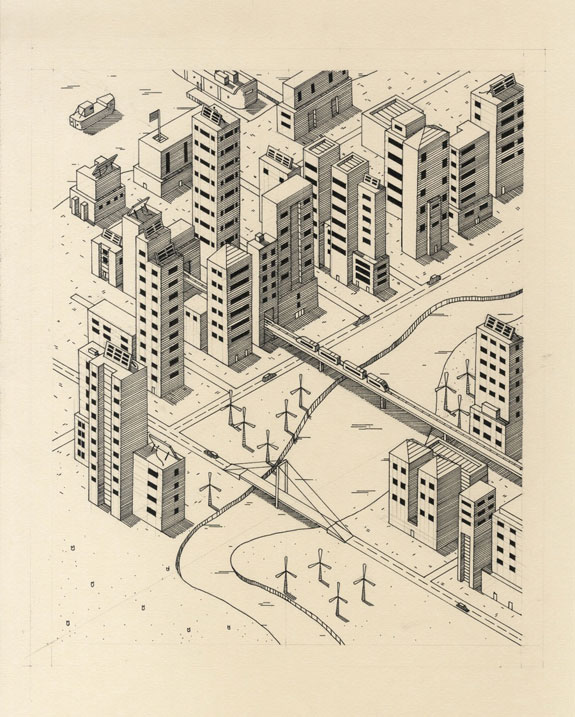
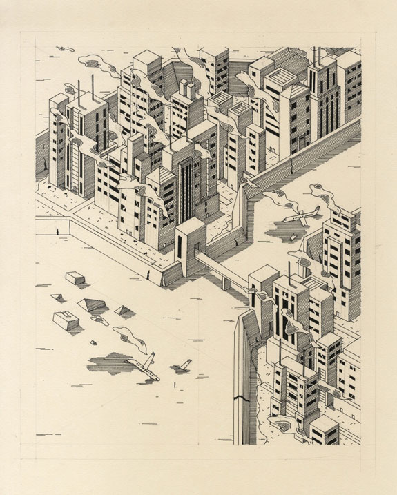
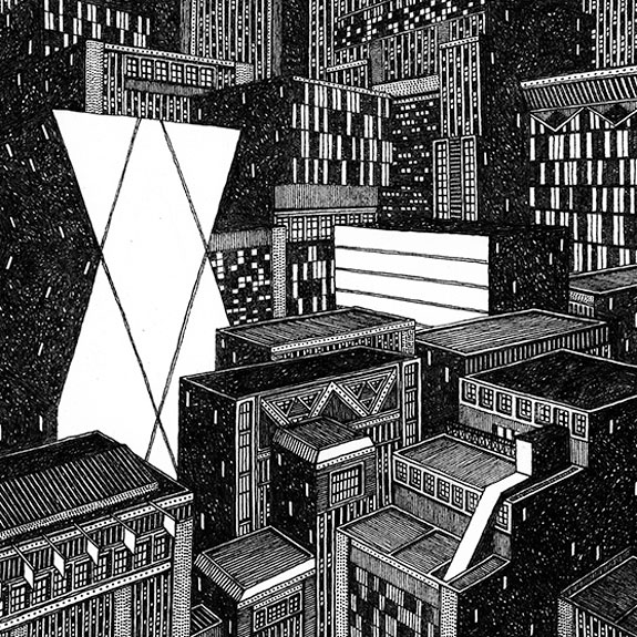
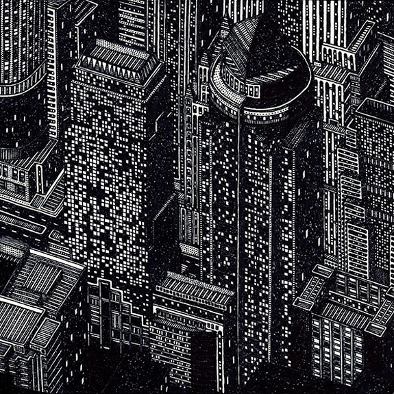
Inspired by authors such as Italo Calvino, Tom Radclyffe uses Sharpie pens on paper to assemble layered cityscapes. Of Blue Cities for Crystal Globes, he says ‘each drawing was produced organically with no plan, almost as if discovering the landscape.’
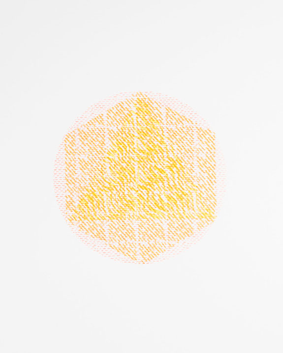
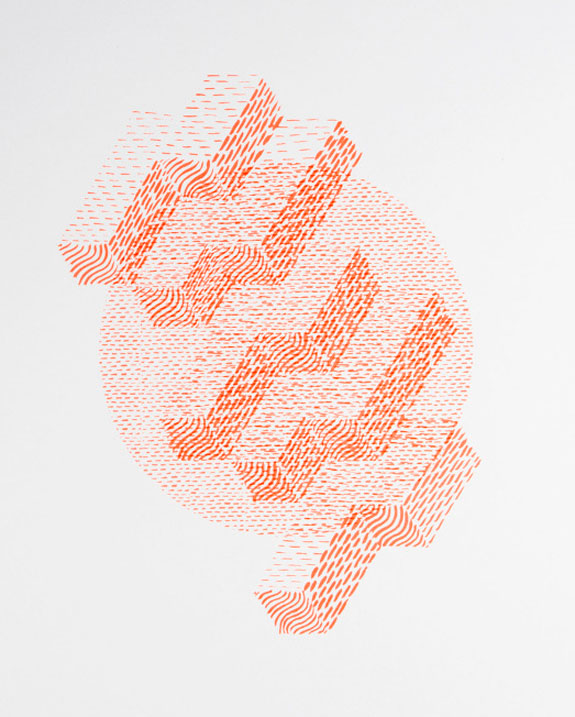
Jasper Fitzgerald’s woven print experiments draw on religious art and artefacts. ‘How can geometric form and repetitive pattern allude to something grandiose?’ he asks. The illustrator works with intricately cut paper, collages and 3D constructions.
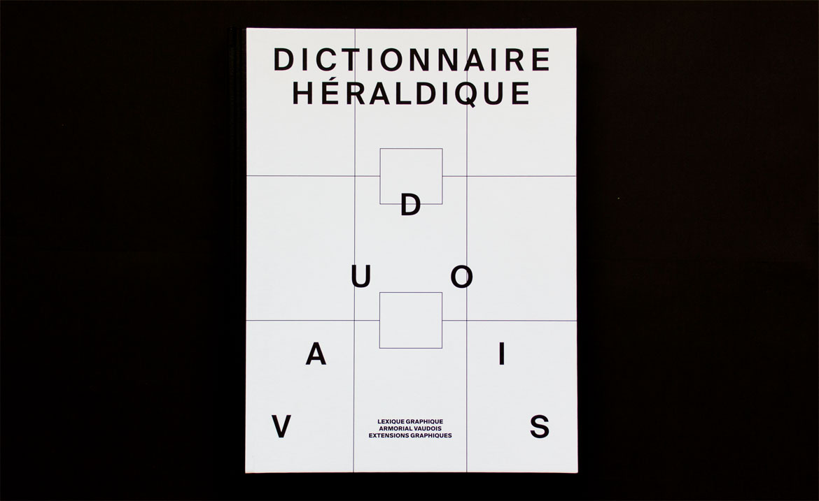
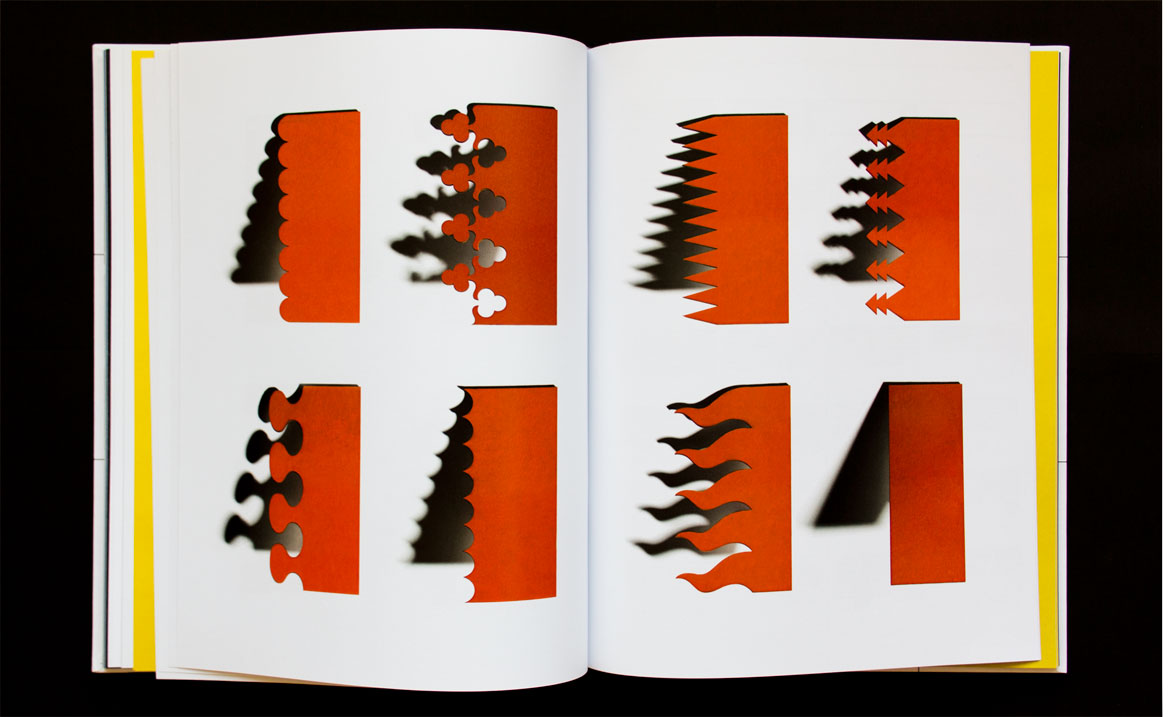
Designer/typographer Emilie Benvegnin explores the role of heraldry, focusing on symbols of Swiss Cantons. Her Dictionnaire Héraldique features coats of arms as still-life photographs, creating a publication that brings this ancient art up to date.
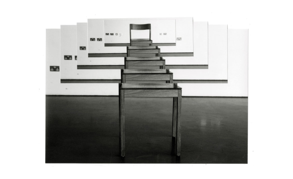
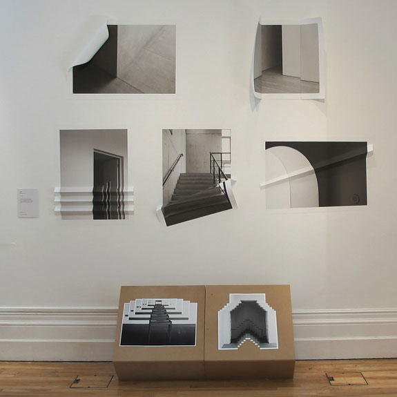
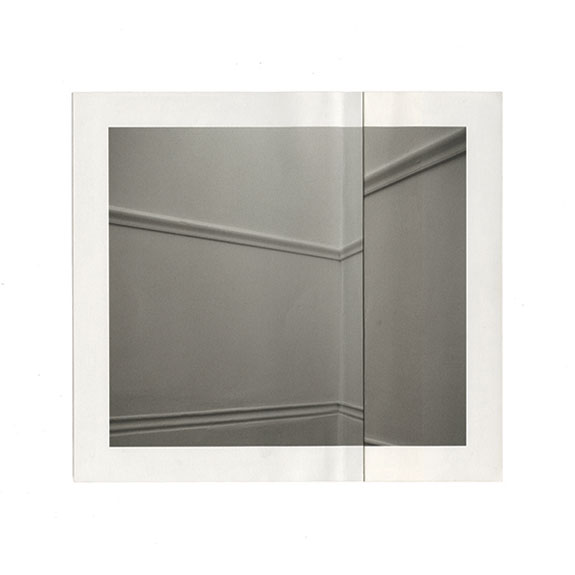
Jingjing Shen's work has already garnered acclaim - she won a 2014 Adobe Design Achievement Award. Working exclusively with photographic processes spliced with physical deconstruction of the image, she draws inspiration from 'artists who produce new visual experience and new forms of communication and interaction.' Her technique of folding, creasing and ripping her finished prints adds another layer of meaning and intrigue.
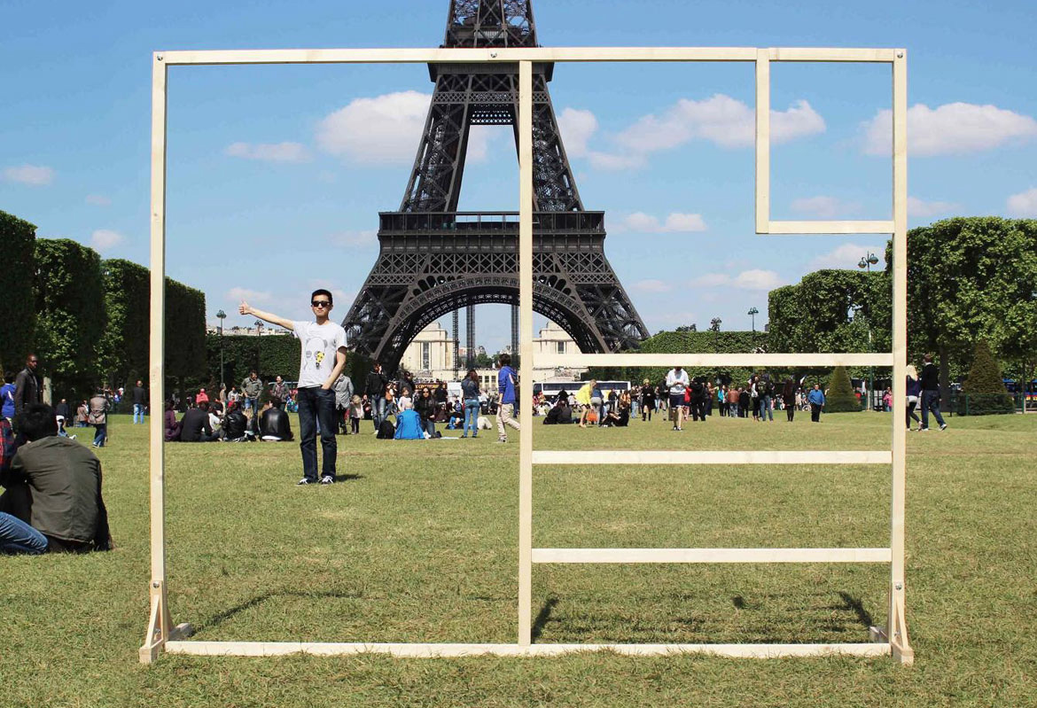
Maxime Ravisy’s Postcard series plays with a full deck of technology to reinvigorate this timeless form of communication. ‘The postcard is an emotional object, that tells us a story, is accessible and universal,’ he says. His research took her deep into the heart of cliché and immersion in tourist culture, but the end results play with postal art, interaction and satellite imagery. ‘I feel motivated to create useful and poetic things that connect people.’
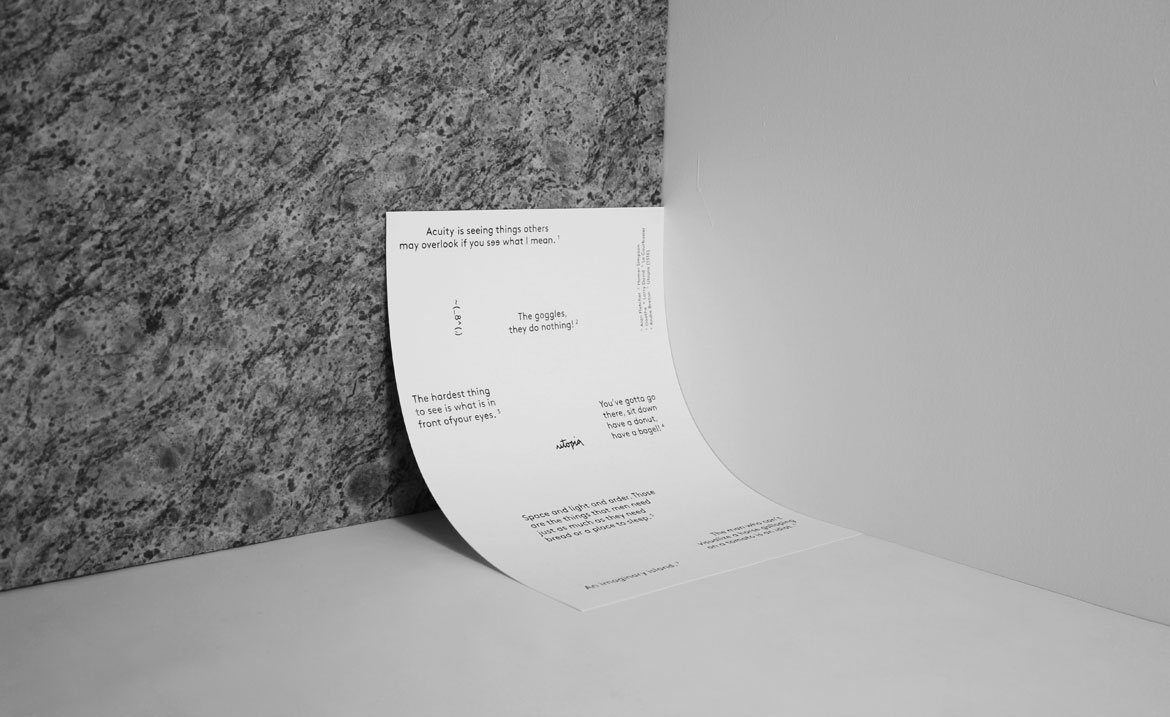
Arun Gogna’s Let the sample be your guide uses visual quotations to tell the story of (aural) sampling culture. ‘It plays with reproduction, repetition and the consequence of degraded imagery, turning the book into a visual interpretation of sampling and the processes within it,’ the designer explains, ‘the book is experimental and abstracted in design but structured and stripped down in content.’ Drawing inspiration from correlations between objects, places and stories, Gogna’s work takes a walk through modern visual culture.
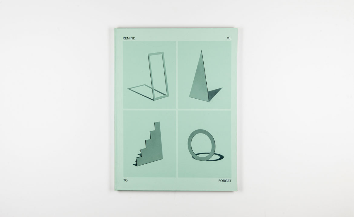
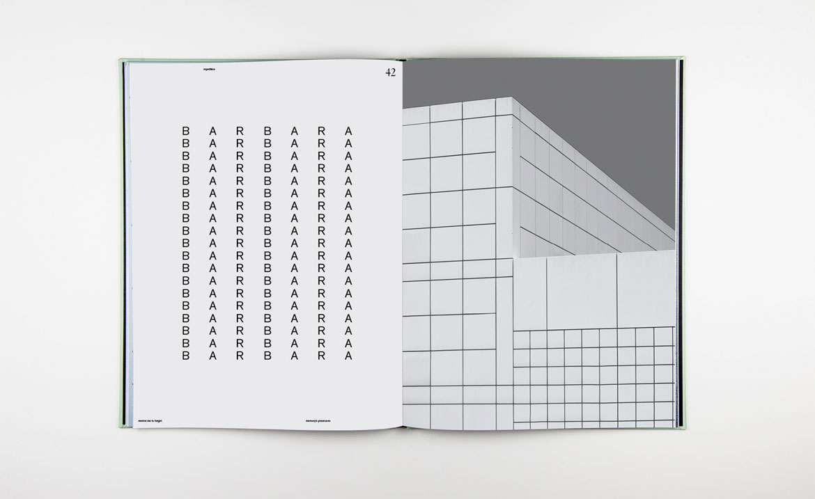
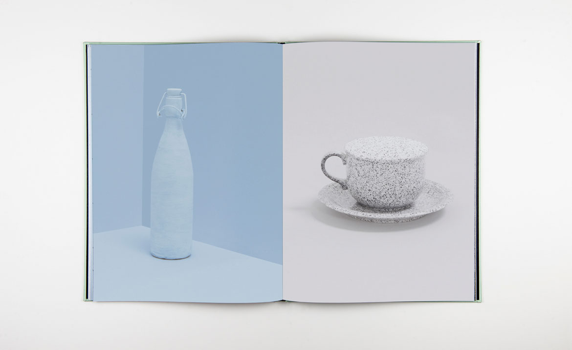
Remind me to forget is Johanne Roten’s visual essay on the process of remembering. The graphic design student has developed a sparse graphical style, full of geometric symbolism and bold blocks of colour. ‘I like a strange and Surrealist atmosphere,’ she says, citing Magritte and Miró as particular favourites.
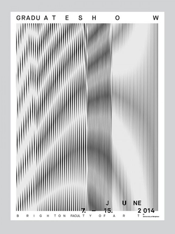
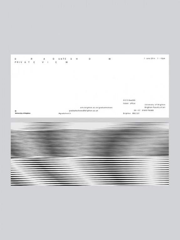
Together with Phaedra Longhurst, Robbie Blundell developed the branding for Brighton’s graduate shows, illustrating the sense of progression and evolution over the three-year course. ‘I’m interested in how design can concern itself with current socio-political issues and reflect these in an essential manner,’ he says, and projects like Under the Pavement are explicitly political in the way they present information (in this case the Snowden case) to a ‘largely apathetic audience.’ Big data, bad debts and the power of print come together.
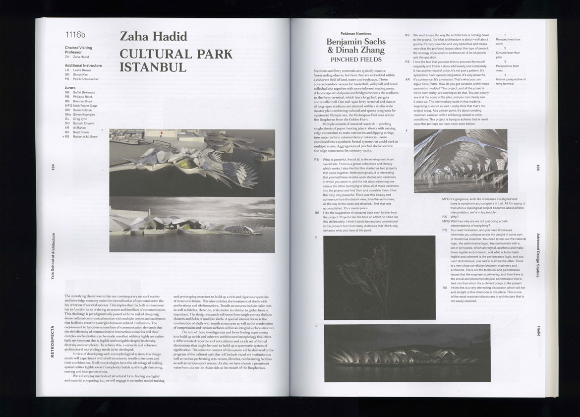
Houman Momtazian’s poster project was generated from a workshop by Urs Lehni and Lex Trüb and uses elements of the designers’ work. Each poster incorporates a name, printing using a risograph printer as a small-scale publishing venture. In the future, Momtazian hopes to blend graphic design with programming – ‘the ‘screen’ has become the default way in which we experience and perceive the world.’
Rosa Bertoli was born in Udine, Italy, and now lives in London. Since 2014, she has been the Design Editor of Wallpaper*, where she oversees design content for the print and online editions, as well as special editorial projects. Through her role at Wallpaper*, she has written extensively about all areas of design. Rosa has been speaker and moderator for various design talks and conferences including London Craft Week, Maison & Objet, The Italian Cultural Institute (London), Clippings, Zaha Hadid Design, Kartell and Frieze Art Fair. Rosa has been on judging panels for the Chart Architecture Award, the Dutch Design Awards and the DesignGuild Marks. She has written for numerous English and Italian language publications, and worked as a content and communication consultant for fashion and design brands.
-
 A Xingfa cement factory’s reimagining breathes new life into an abandoned industrial site
We tour the Xingfa cement factory in China, where a redesign by landscape specialist SWA Group completely transforms an old industrial site into a lush park
By Daven Wu
-
 Put these emerging artists on your radar
This crop of six new talents is poised to shake up the art world. Get to know them now
By Tianna Williams
-
 Dining at Pyrá feels like a Mediterranean kiss on both cheeks
Designed by House of Dré, this Lonsdale Road addition dishes up an enticing fusion of Greek and Spanish cooking
By Sofia de la Cruz
-
 Visual Communication
From typographic talents to virtual-reality virtuosos, the font of all knowledge is here
By Rosa Bertoli
-
 Visual Communication
From pixels to paint brushes, this visual vanguard has a promising future
By Rosa Bertoli
-
 Visual Communication
The designers, illustrators and typographers communicating in bold new ways
By Rosa Bertoli
-
 Visual Communication
From graphic design to illustration and typography, here's the who's who of the bright young things making shapes
By Rosa Bertoli