Acqua di Parma Colonia edition by Luca Scacchetti
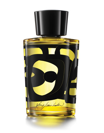
Two years ago Acqua di Parma asked Milanese architect and designer Luca Scacchetti to reinterpret the bottle for its iconic eau de cologne, Colonia. The resulting limited edition collector's piece will be launched at the end of September.
Scacchetti, who founded his own architecture studio in 1978, has turned his hand to most areas of design, including town planning, building and interior architecture, and product and furniture design for the likes of Poltrona Frau, but he had no experience in the world of perfume. This, however, was deemed an advantage by Acqua di Parma. But one limitation was set - he couldn't change the shape of the bottle.
The designer accepted the challenge with enthusiasm nevertheless and, as part of the project, produced a striking collection of watercolours illustrating his design. Here, we talk to Schacchetti to find out how the design was conceived.
Is this the first time you have worked with Acqua di Parma?
Yes. They told me that they had talked to several architects and designers but, from what I understand, they chose me because of my style. I'm more institutional than most, meaning not too avant garde, and not to conservative - it's what I call the Milan style. I'm one of the last architect-designers working in this way.
How do you define Milan style?
Milan style isn't a school or a group, but a community of individuals. It's about elegance and building a relationship between the traditional and the contemporary world. It's an ability to contain oneself and not to exaggerate. Vico Magistretti is a prime example. People say I am a younger Magistretti but we have little in common except an individual approach, and isolation from fashion trends.
Wallpaper* Newsletter
Receive our daily digest of inspiration, escapism and design stories from around the world direct to your inbox.
Why did you accept Acqua di Parma's challenge?
It was a unique opportunity. I've proved myself as a professor, architect and designer so it's good to do something new. Also it's Acqua di Parma - a good perfume brand that is very much about Italian quality, an interest we share. Another reason was that for a change I wouldn't be designing an armchair or building or something functional. I could free the imagination and express the feelings the perfume gave me without limitations or obligation. This is a great gift for an architect.
How did you develop your design for the bottle?
The first thing I thought is that when you open a bottle of Colonia, the scent expands to fill the room. When someone is wearing a powerful perfume, you are surrounded by its expanse. I have worked in Murano with the glass blowers before and their own notions of expansion struck a chord. I know it might sound crazy but that is how ideas are generated.
Another thing that came to mind was Dali's melting people. I thought of those Art Nouveau black figurines on a white ceramic background - images of elegant thin ladies - and I saw them melting like Dali's ladies. And I thought of the Greek urns with warriors and dancing women chasing around a vase. I saw these characters melting too.
How did you translate these ideas to the bottle?
Out of a combination of all these ideas, from figurines melting and dilating in space, came the concentric circles now on the bottle. I wanted to be faithful to the elegance and authority of Acqua di Parma, to respect its heritage and give it a contemporary edge to take it into the future. I would like the bottle to be recognisable as Acqua di Parma, but also feel new, as though it has always been there. I made the bottle a transparent yellow, because it is a trademark of the brand. Black is the colour that most emphasises yellow. The hanging, rotating circles shift as you look through the bottle - it's the first ever 3D bottle design.
Are you pleased with the final result?
It's perhaps another sign of my craziness but I feel that the perfume from this bottle expands more than that from any other Acqua di Parma bottle.
Do you always use watercolour to illustrate your designs?
Yes. Very few designers use watercolour as a medium now. Michele di Lucchi does - but there are few of us left. It's about illustrating by hand - now all is done with computers. I have worked with computers also but it creates a filter between the mind and the picture. There's a more direct flow of ideas between the mind and the hand. I've always used watercolour.
Is this your first illustrative design?
I've done wallpapers and fabrics for Jannelli & Volpi. But those designs bear no correlation to the design of this bottle. I don't want to have a signature - I hate it when an architect rigidly follows a theme. Each project is original.
You are a multi-disciplinary designer. What area of design gives you most pleasure?
My favourite thing is always the thing I haven't done yet. I've done lots of sofas and armchairs for Poltrona Frau, so that is a little boring now. I'd like to design a school for young children - I have never done this.
You have taught architecture and design at the Brera Academy and
http://www.english.polimi.it/" target="_blank" >Milan Polytechnic University for some time. Has the teaching of design changed much over the years?
I have to say I don't love the young students now. Things may be improving but in general if you compare the young students now with those 20 years ago, then they wanted to change the world. Now they are very spoilt.
I try to teach an analogical way of thinking. It means that your thinking can evolve and change continuously whatever you are designing - you can move from a chair to a tree. This is what design is all about and what multi-disciplinary really means.
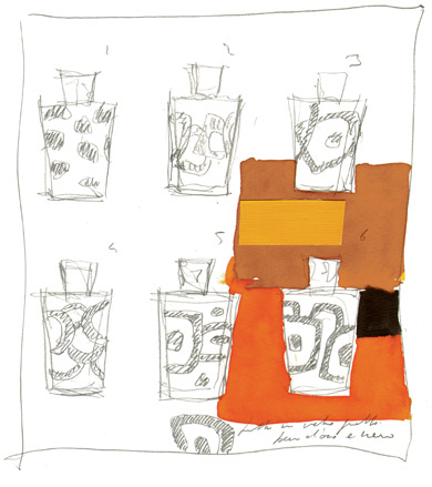
Scacchetti, who founded his own architecture studio in 1978, accepted the challenge with enthusiasm and, as part of the project, produced a striking collection of watercolours illustrating his design
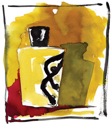
Scacchetti has turned his hand to most areas of design, including town planning, building and interior architecture, and product and furniture design for the likes of Poltrona Frau, but he had no experience in the world of perfume
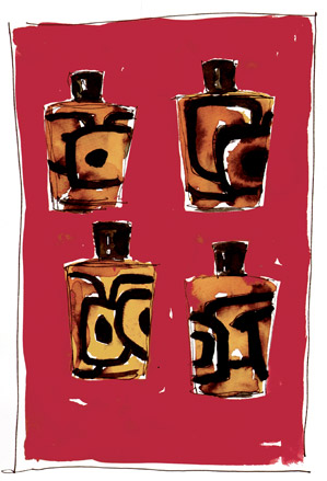
This, however, was deemed an advantage by Acqua di Parma. But one limitation was set - he couldn’t change the shape of the bottle
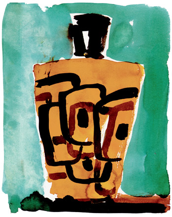
Scacchetti relished the chance to step outside his comfort zone. ’One of the reasons I accepted the challenge was that for a change I wouldn’t be designing an armchair or building or something functional,’ he explains. ’I could free the imagination and express the feelings the perfume gave me without limitations or obligation. This is a great gift for an architect’

The graphics on the bottle were inspired by Dali’s seemingly melting people...
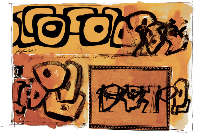
... as well as the figures that encircle Greek urns
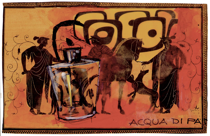
’Out of a combination of all these ideas came the concentric circles now on the bottle,’ says Scacchetti
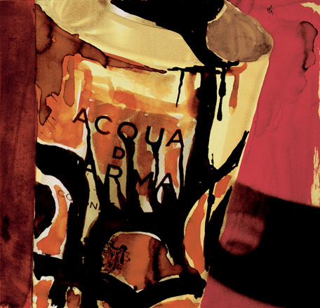
’I wanted to be faithful to the elegance and authority of Acqua di Parma, to respect its heritage and give it a contemporary edge to take it into the future,’ he continues
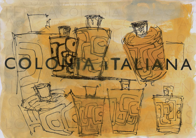
The bottle is in Acqua di Parma’s trademark yellow
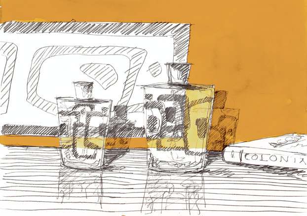
The hanging, rotating circles shift as you look through the bottle - making it the first ever Acqua di Parma 3D bottle design
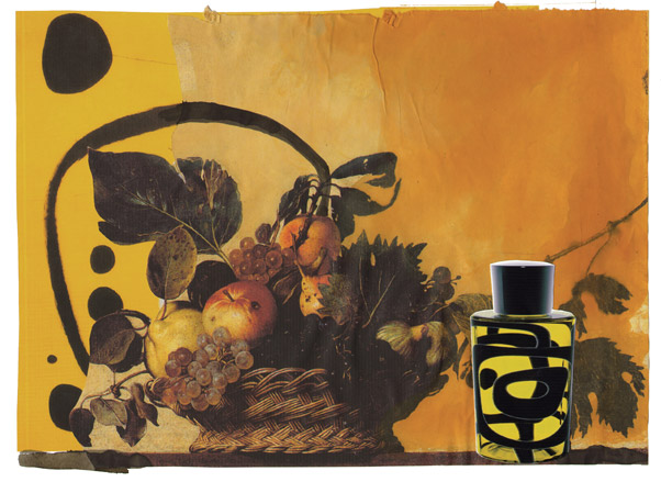
Scacchetti chose black to demarcate the circles because it is ’the colour that most emphasises yellow’
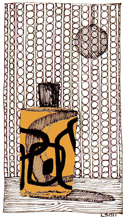
The designer does all his sketches for projects in watercolour
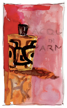
’I have worked with computers also but it creates a filter between the mind and the picture,’ he says...
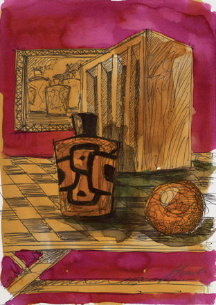
... ’There’s a more direct flow of ideas between the mind and the hand’
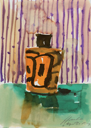
Scacchetti has done illustrative work for Jannelli & Volpi - in the form of a series of wallpapers and fabrics - but this project has taken him in a decidedly different direction
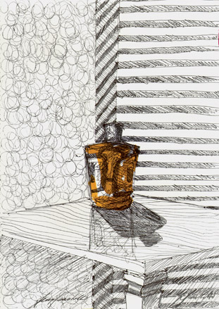
’I don’t want to have a signature - I hate it when an architect rigidly follows a theme,’ he says. ’Each project is original’
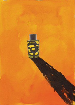
The Colonia Designer Edition by Scacchetti for Acqua di Parma will be available for £104 (180ml) from Harrods, London and selected stores worldwide, from the end of September
-
 Japan in Milan! See the highlights of Japanese design at Milan Design Week 2025
At Milan Design Week 2025 Japanese craftsmanship was a front runner with an array of projects in the spotlight. Here are some of our highlights
By Danielle Demetriou
-
 Tour the best contemporary tea houses around the world
Celebrate the world’s most unique tea houses, from Melbourne to Stockholm, with a new book by Wallpaper’s Léa Teuscher
By Léa Teuscher
-
 ‘Humour is foundational’: artist Ella Kruglyanskaya on painting as a ‘highly questionable’ pursuit
Ella Kruglyanskaya’s exhibition, ‘Shadows’ at Thomas Dane Gallery, is the first in a series of three this year, with openings in Basel and New York to follow
By Hannah Silver