Beauty and the book: Nendo designs concept store for Japanese cosmetics company Nature's Way
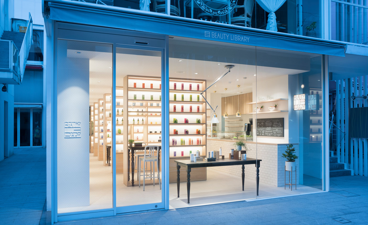
Multifaceted in design yet consistent in sentiment, Oki Sato successfully blends the unlikely commercial combo of organic cosmetics, library and cafe in 'Beauty Library', a minimalist concept store created for the Japanese cosmetics company Nature's Way.
The concept for the boutique – developed by Sato's lauded design studio, Nendo – was to explore organic cosmetics in a library-like setting, with neatly stacked shelves of beauty products rising up to the store's ceiling. The cafe – itself serving all-organic salads – sits along one side of the store, with an annexed seating area set across a small courtyard. The pairing isn't as disjointed as it might sound; Nendo's archival method of displaying the cosmetics encourages testing and browsing, to allow a customer to 'casually try out every single product in the store as if ordering a beverage.' (It's no coincidence that the shop's logo is also designed to look like a square bookshelf filled with letters.)
The library aspect is further embellished by the store's use of up-to-date digital technology – a nod to the the increasingly contemporary concerns of organic living. Each product has a dedicated QR code displayed alongside, enabling visitors to store corresponding information on their phones or tablets and make purchases at home.
Moreover, the didactic aspect of the concept is made more literal with the inclusion of an integrated study area, allowing customers to sit between the shelving systems and learn more about the qualities of healthy cosmetics.
The store is located on Aoyama Street in Tokyo – perhaps the city's most vibrant shopping area – and is surrounded by myriad upscale boutiques. A handful of these are equally striking in appearance – the Herzog and de Meuron-designed Prada and Miu Miu stores, and the Comme des Garçons store co-conceptualised by Takao Kawasaki, among them – though the 'Beauty Library' contains easily as much substance as it does style.
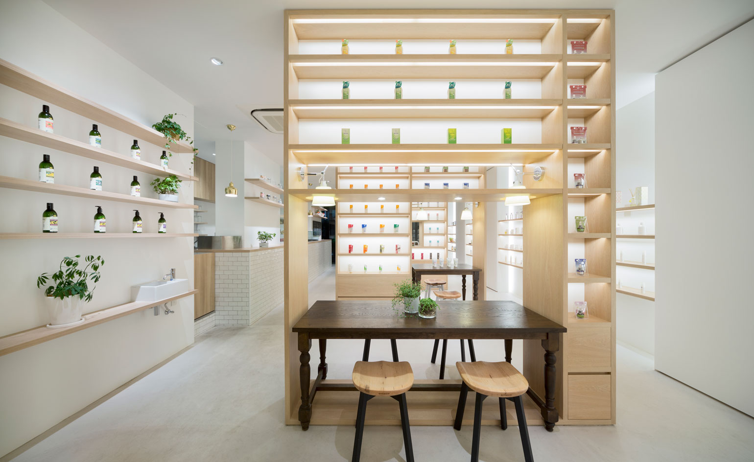
The concept for the boutique is to explore organic cosmetics in a library-like setting, with neatly stacked shelves of beauty products rising up to the store's ceiling
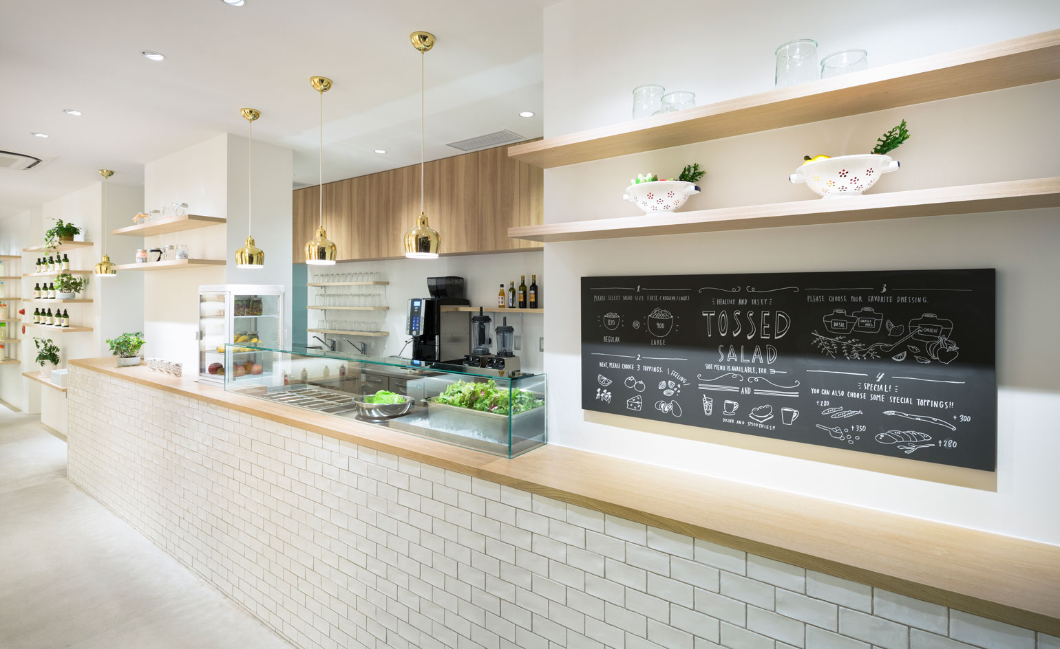
The store includes a cafe – itself serving all-organic salads
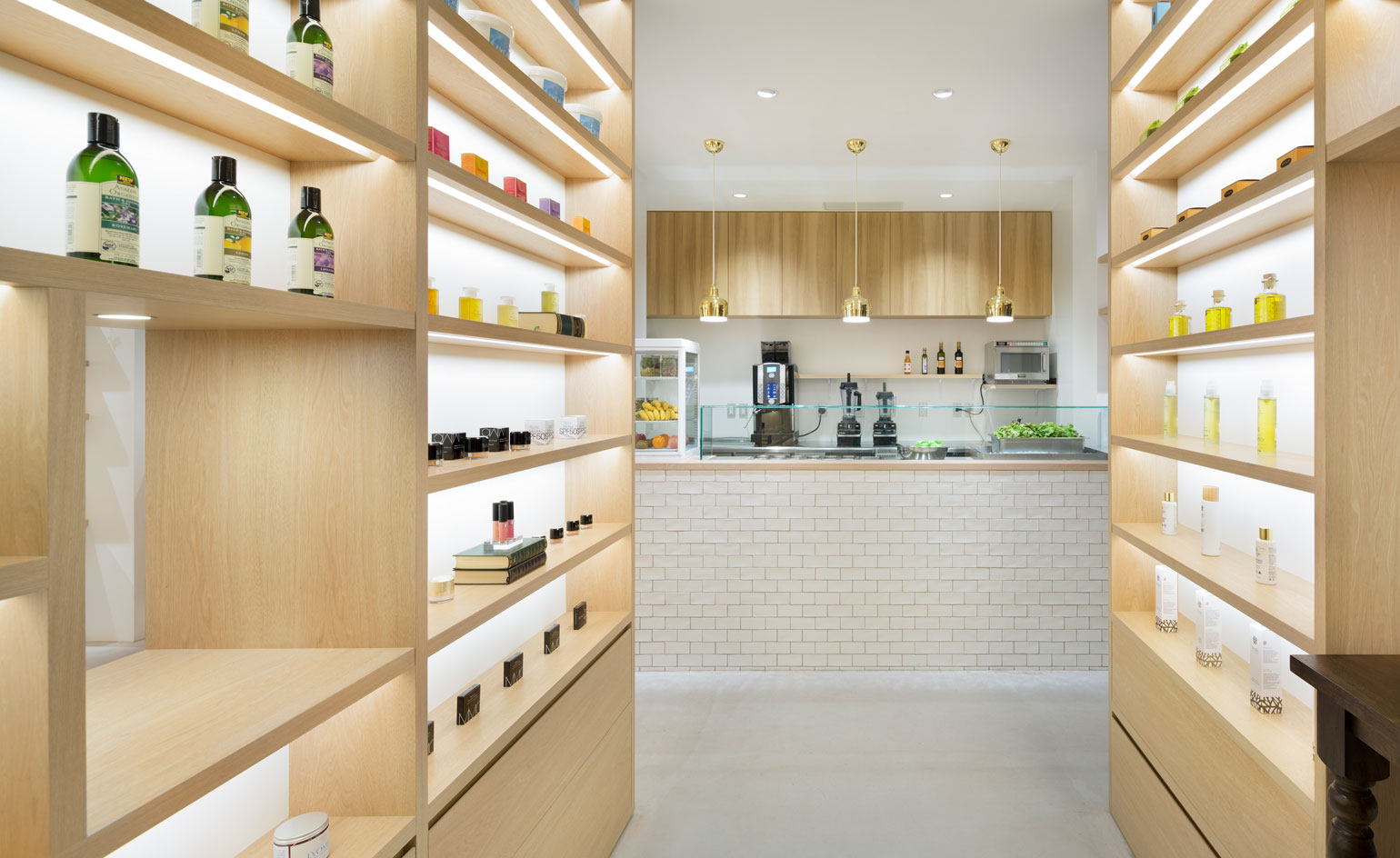
Nendo's archival method of displaying the cosmetics encourages testing and browsing. The space also includes a study area, allowing customers to sit between the shelving systems and learn more about the qualities of healthy cosmetics
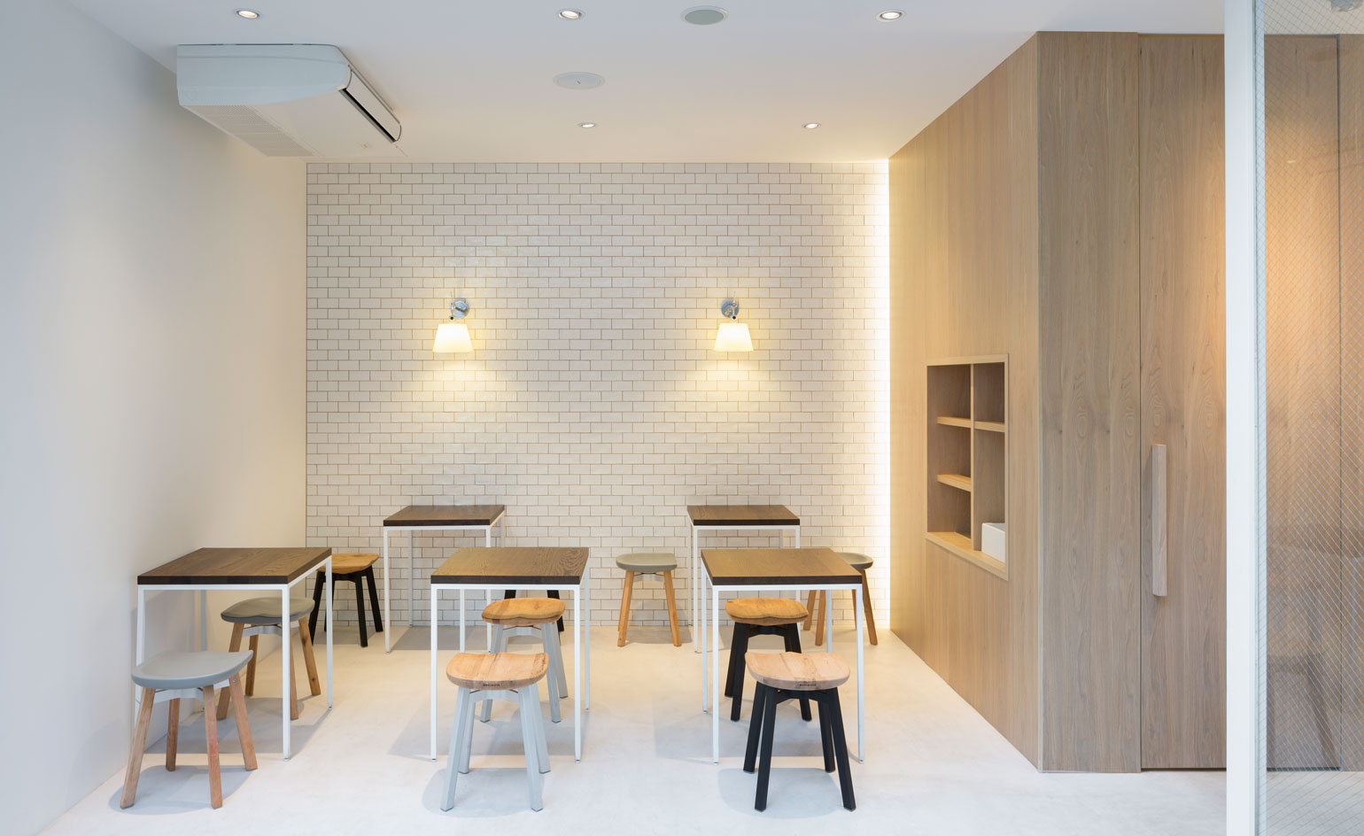
An annexed seating area is set across a small courtyard with Nendo's own designed chairs
ADDRESS
Beauty Library
3-12-12 Kita-Aoyama Minato-ku
Tokyo, Japan
Wallpaper* Newsletter
Receive our daily digest of inspiration, escapism and design stories from around the world direct to your inbox.
-
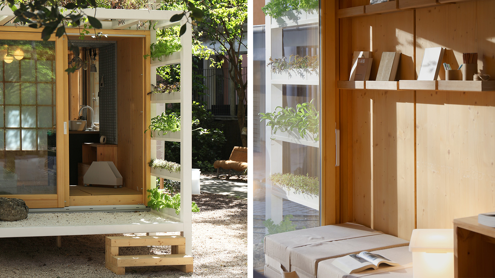 Japan in Milan! See the highlights of Japanese design at Milan Design Week 2025
At Milan Design Week 2025 Japanese craftsmanship was a front runner with an array of projects in the spotlight. Here are some of our highlights
By Danielle Demetriou
-
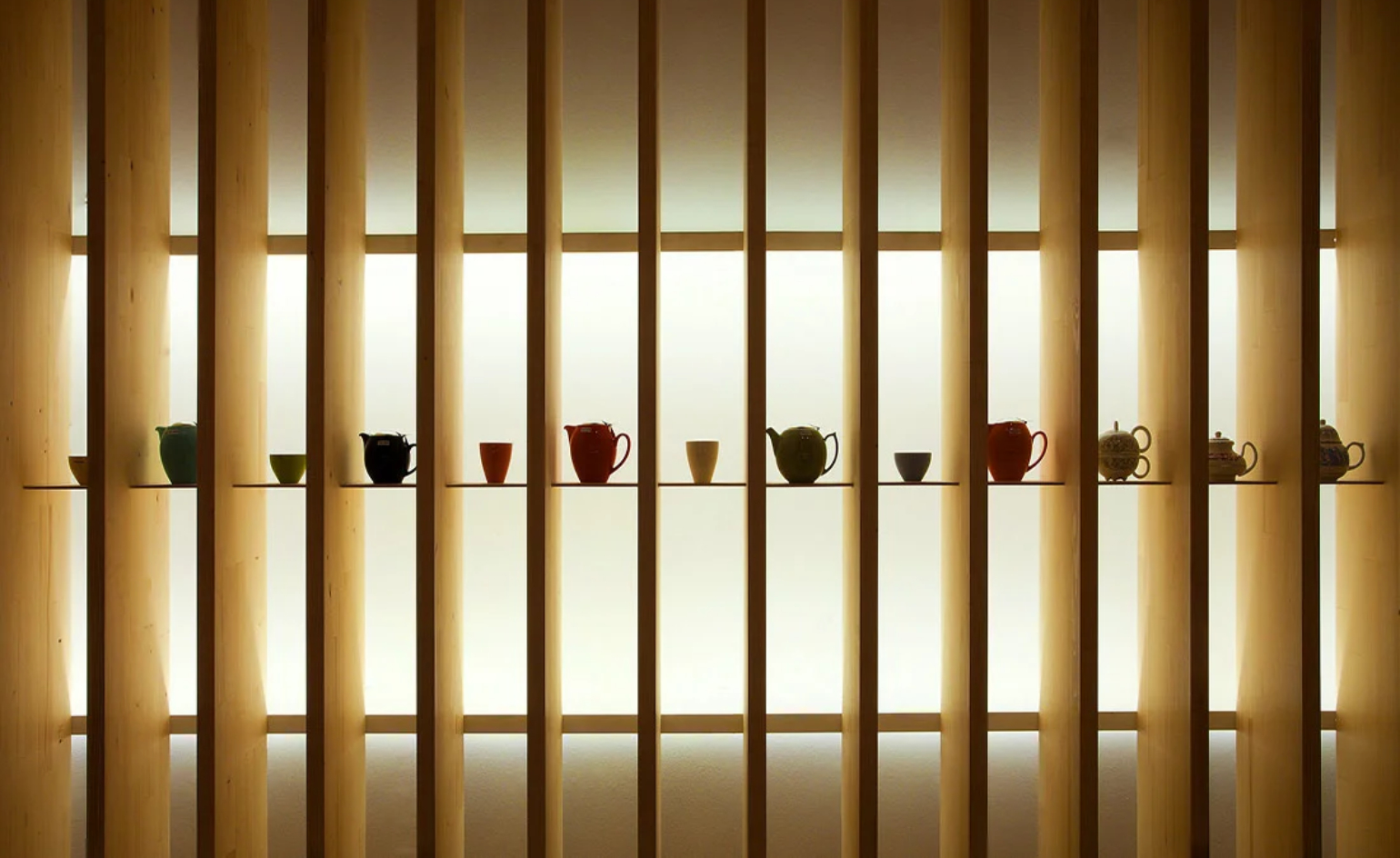 Tour the best contemporary tea houses around the world
Celebrate the world’s most unique tea houses, from Melbourne to Stockholm, with a new book by Wallpaper’s Léa Teuscher
By Léa Teuscher
-
 ‘Humour is foundational’: artist Ella Kruglyanskaya on painting as a ‘highly questionable’ pursuit
Ella Kruglyanskaya’s exhibition, ‘Shadows’ at Thomas Dane Gallery, is the first in a series of three this year, with openings in Basel and New York to follow
By Hannah Silver
