The best-looking new beauty spots from London to Los Angeles
Beauty stores are flipping the design script. Thanks to the rise of the three I’s – interactivity, installation and immersion – designers like Snøhetta and UXUS are putting artwork, interior architecture and customer interaction front and centre, making a trip to the drugstore a holistic, spa-like experience. Here’s our pick of the world’s most successful new beauty-spots that are pleasing (and cleansing) design doyennes everywhere...
Receive our daily digest of inspiration, escapism and design stories from around the world direct to your inbox.
You are now subscribed
Your newsletter sign-up was successful
Want to add more newsletters?
Zalando beauty station, by Batek Architects, Berlin
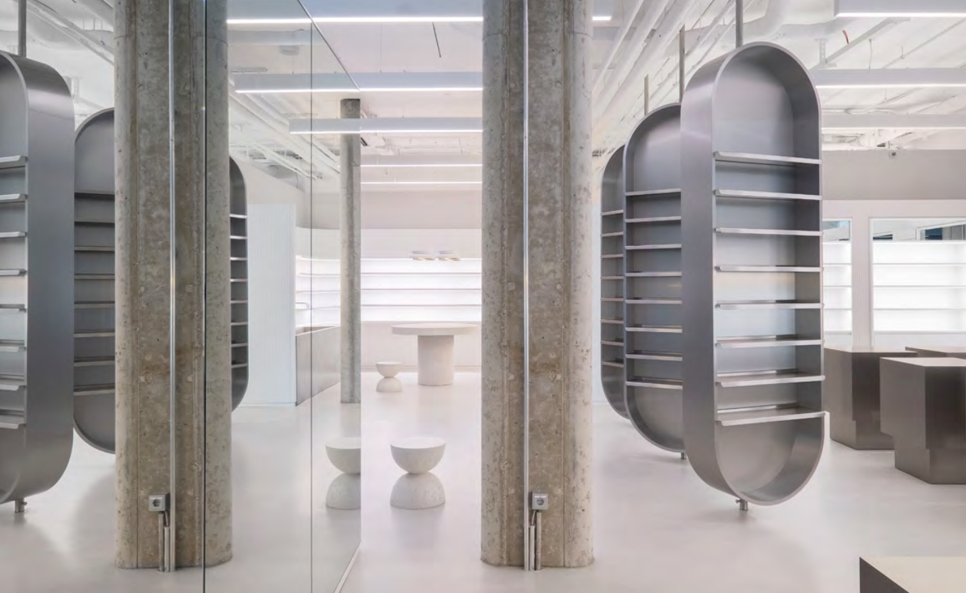
Zalando has typically concerned itself with footwear, fashion and sportswear over the years. Widening its horizons, the online fashion platform has now entered the world of beauty, and has celebrated the occasion by extending its lone Berlin retail outlet with a new beauty station. Designed by Batek Architects, the modular space is minimal, combining a colour palette of cream, light beige, grey and nude shades with freely placeable stainless steel cubes, a shelf made from recycled plastic cups, stainless steel floor-to-ceiling shelves, a solid concrete washbasin and a 4m long stainless steel beauty service table.
Zalando, Weinmeisterstraße 2, 10178 Berlin, Germany; www.zalando.com. Writer: Luke Halls
Clean Market, New York City
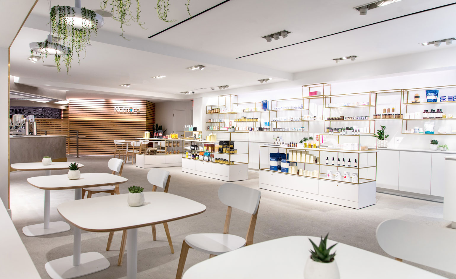
The holistically-charged Clean Market has hit the streets of Manhattan. The surgery-clean, all-white destination spins on the notion of a classic day spa, instead calling upon infrared saunas, IV drips and cryotherapy treatments. The on-site Nutridrip drip lounge provides wellness-enhanced vitamin supplements, perpetuating the Clean Market ethos of beauty originating within. Read more about Clean Market here.
240 East 54th Street, New York, NY 10022. www.cleanmarket.com
Hershesons, London
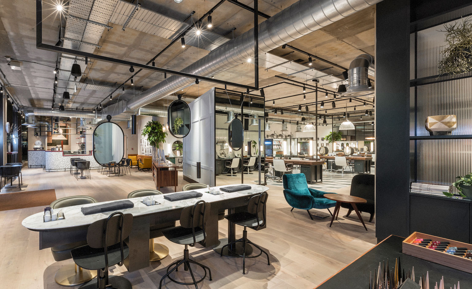
Hershesons has opened the doors to its newest one-stop beauty salon flagship in Fitzrovia, London. The 5,000 sq ft space on Berners Street rejects conventional ideas surrounding the traditional salon model, with an approach it hopes is more relevant to how we live our lives now, combining a beauty space, co-working space and social space, wrapped into one, multi-functional (and stylish) model. Since its 1992 beginnings, Hershesons has championed groundbreaking ideas in beauty. A true frontrunner in industry-wide innovation, it invented concepts such as the straightening iron and blow-dry bars. Now, it seems, it is championing the ‘customer is king’ model in a beauty and grooming context, where services (including third-party offerings) are built entirely around you, your schedule, and lifestyle.
29-32 Berners St, Fitzrovia, London W1T 3LR. www.hershesons.com
Aesop, by Snøhetta, London
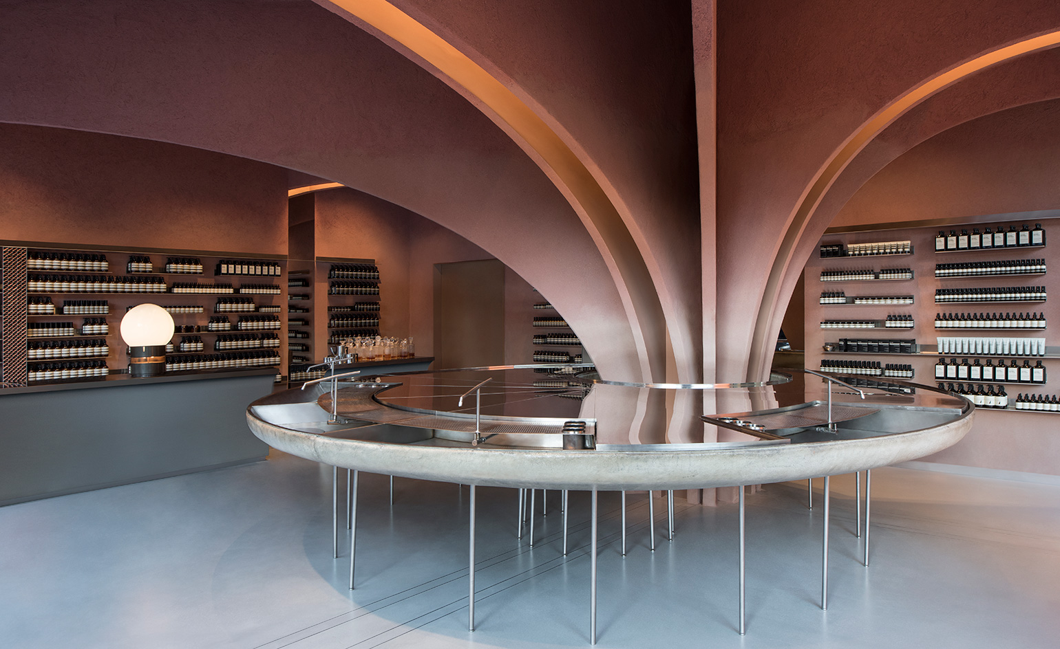
Designed by Norwegian interior architect and seven-time collaborator Snøhetta, Aesop’s 100 sq m Sloane Square flagship is a subtle choreography of light, warmth and scent. The minimalist beauty guru’s 200th location, pitched on the corner of Duke Square, and surrounded by a catalogue of elegant white-box stores, is rendered floor to ceiling in rust-red clay, inviting in passers-by from the Chelsea cold.
‘The idea of street presence was central for us,’ says senior architect Peter Girgis. ‘Originating and rising up from this large central element, we wanted warm-tones to beat out onto the street.’ A Devonshire clay-plaster column arches from the floor into what Girgis describes as ‘an architectural tree’. It spans the ceiling, covering it in a breathable, atmosphere-enhancing texture that will help to ventilate the lightly-scented space. The ‘trunk’ surrounds a 4.5 sq m ‘water table’ (pictured), upon which a slim veil of water cascades into four tin bath-sized fibre glass sinks, used for skin consultations.
Aesop, 22-24 Duke of York Square, London, England; www.aesop.com
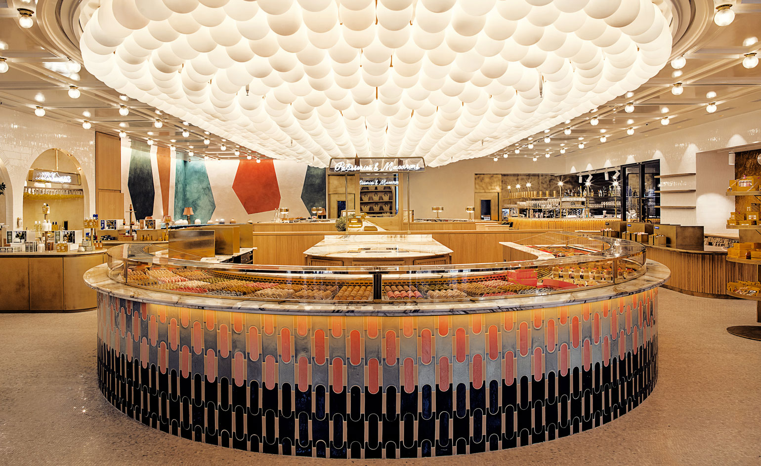
86 Champs, by Laura Gonzales, Paris
Perfumer L’Occitane and ‘Picasso of pastry’ Pierre Hermé have created a hybrid ‘store’ on the Champs Élysées, designed to test our senses, and our preconceptions of what a beauty boutique should be.
Stalwarts of their respective industries, the two brands are natural bedfellows, sharing a heritage, luxury leaning. Intended to celebrate the high quality ingredients behind both, 86 Champs is a heady, fourfold experiment, offering a dessert bar for initiating yourself in the art of pastry, a coffee station for discovering ‘coffee according to Pierre Hermé’, and a restaurant, for a savoury interlude between dessert courses. Adding an olfactory twist, L’Occitane presents an interactive, in-store perfumery and scent installation, where guests come nose-to-nose with raw L’Occitane ingredients and production methods. Interior designer Laura Gonzalez aimed to create ‘a welcoming and refined place where objects, scents or tastes express osmosis between the two Maisons’.
86 Avenue des Champs-Élysées, 75008 Paris, France; fr.loccitane.com
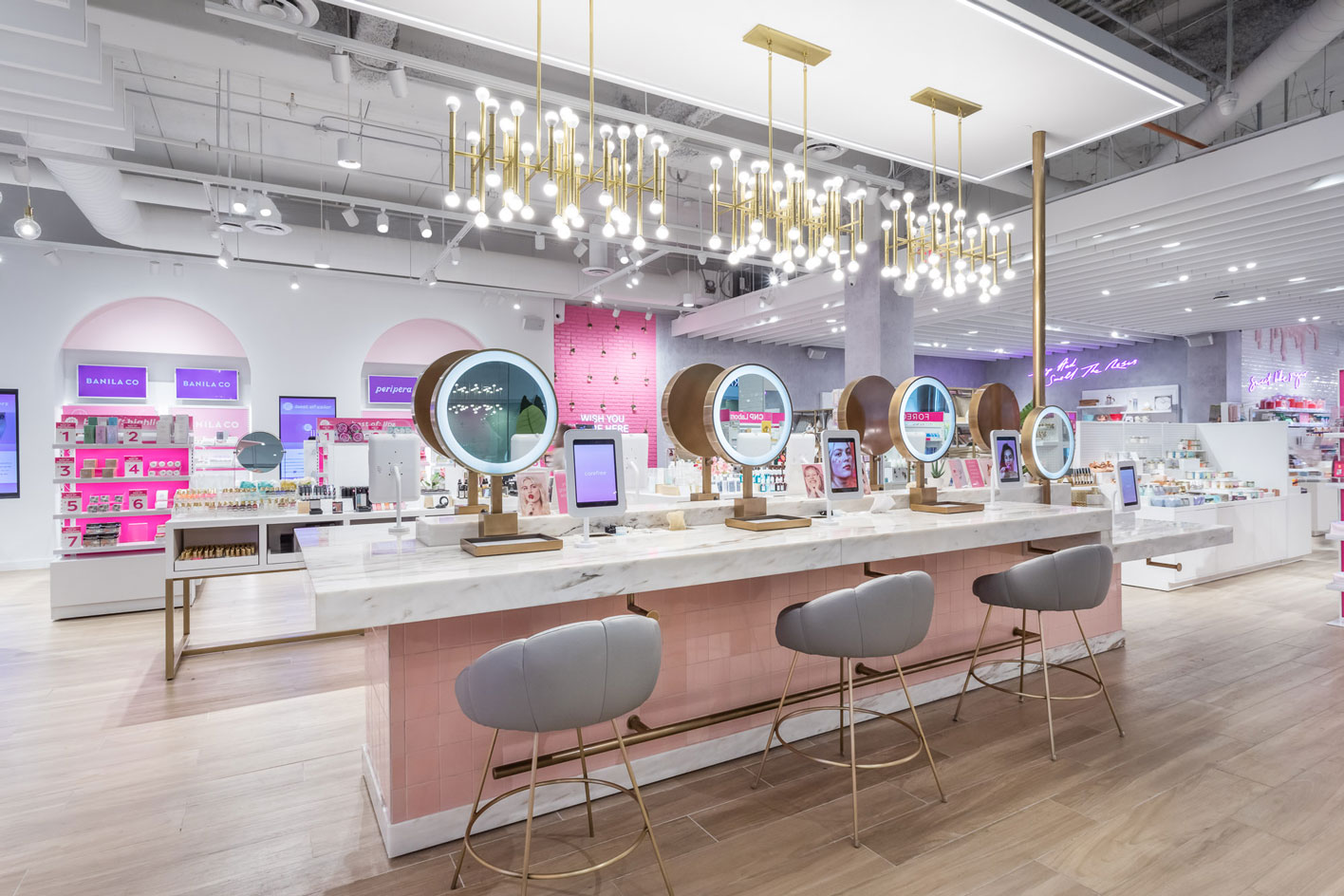
Riley Rose, by FutureBrand Uxus, Los Angeles
Millennial pink makes the girls and boys wink. At least that’s the thinking behind FutureBrand UXUS’s latest retail concept in Los Angeles. It's something a little different from the Amsterdam-based design studio, who are also behind Tate Modern’s innovative Switch House store. At Riley Rose, UXUS aims to ‘bring the social media experience to bricks and mortar’.
To do so, it has made the spaces wholly interactive, with product trial opportunities, so-called ‘shareable moments’, unique pop-ups and in-the-know staff on hand. A palate of blusher-pinks and smokey-eye greys complete the bubblegum-popping interiors, which despite their levity, are beautifully crafted and sensitively arranged in typical UXUS fashion.
Riley Rose, 2131 Galleria Way, Glendale, California 91210, USA; www.rileyrose.com
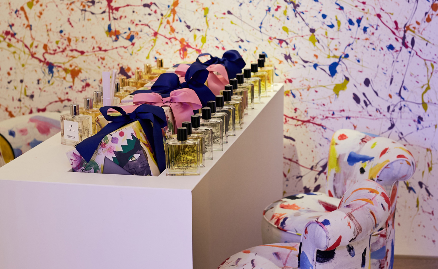
Miller Harris, by Fabled Studios, London
London-based perfume brand Miller Harris’ new flagship store surpasses fragrance shop expectations, transforming olfactory art into a multi-sensory ambush. Jackson Pollock-esque paint is artfully splattered across the walls, and a Tracey Emin-esque neon blinks on the wall.
Designed in collaboration with London’s Fabled Studio, the pocket-sized perfumery offers a colourful, exploratory haven in the midst of Canary Wharf’s bustling corporate rush. ‘We are giving the customer a full, 360-degree expression of each fragrance’, says Fabled’s co-founder Steven Saunders. Each scent has been married with a corresponding sound and texture, inviting visitors to not only smell but also ‘hear and feel’ their fragrance prior to making a selection. What’s more, a rotation of artists-in-residence will take over the space, bringing new meaning to the phrase ‘olfactory art’.
1 Cabot Square, Canary Wharf, London, England; www.millerharris.com
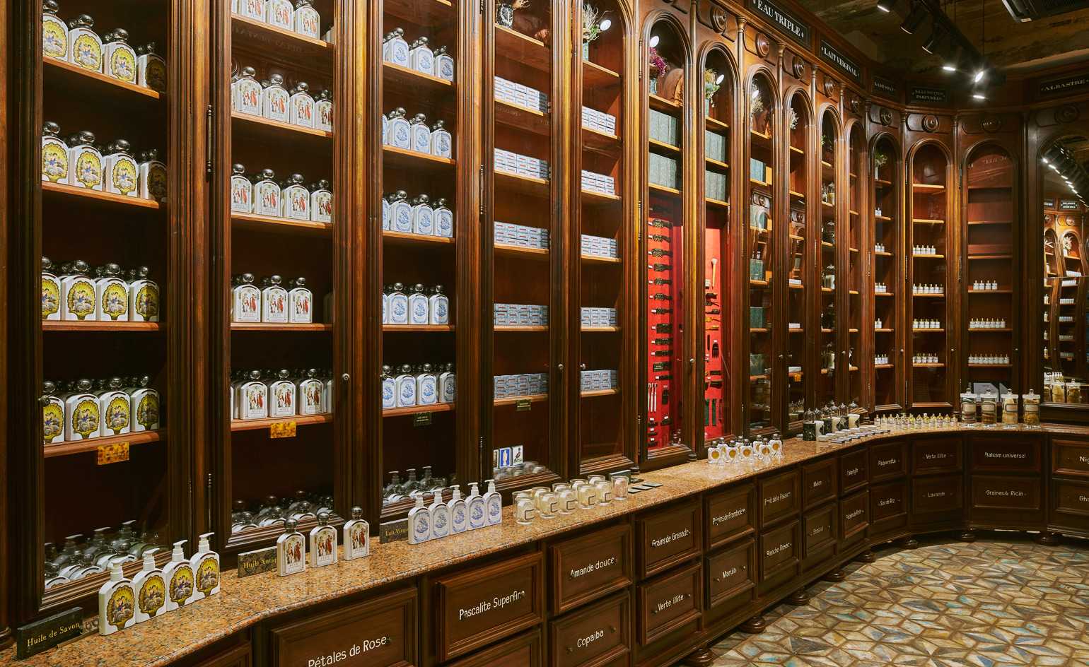
Buly 1803, by Arnault Castel, Hong Kong
Parisian apothecary Buly 1803 opened its first Hong Kong store recently in a snug new space on Wyndham Street. The brand, a revival of the historic perfume apothecary originally founded by Jean-Vincent Bully in 1803, (hence the name) was created in 2014 by Victoire de Taillac-Touhami and Ramdane Touhami who were inspired by 19th-century beauty secrets and ancient recipes.
Unlike many of the locations on our shortlist, which look ambitiously to the future, Buly 1802 looks ambitiously to the past. The couple’s local partner, Arnault Castel – founder of Kapok concept stores – was the first to spot the narrow 70 sq m location sporting unusual 5m high ceilings. ‘It is extremely small but our French carpenter hand-made floor-to-ceiling walnut cabinets to look just like they came from an ancient apothecary, so it feels like stepping into a small, historic chapel,’ Castel says. ‘We nicknamed it Charlotte because it reminds us of the French cake with “ladyfinger” biscuits.’
Buly 1803, 20 Wyndham St, Central, Hong Kong; www.buly1803.com
Tom Ford Beauty, London
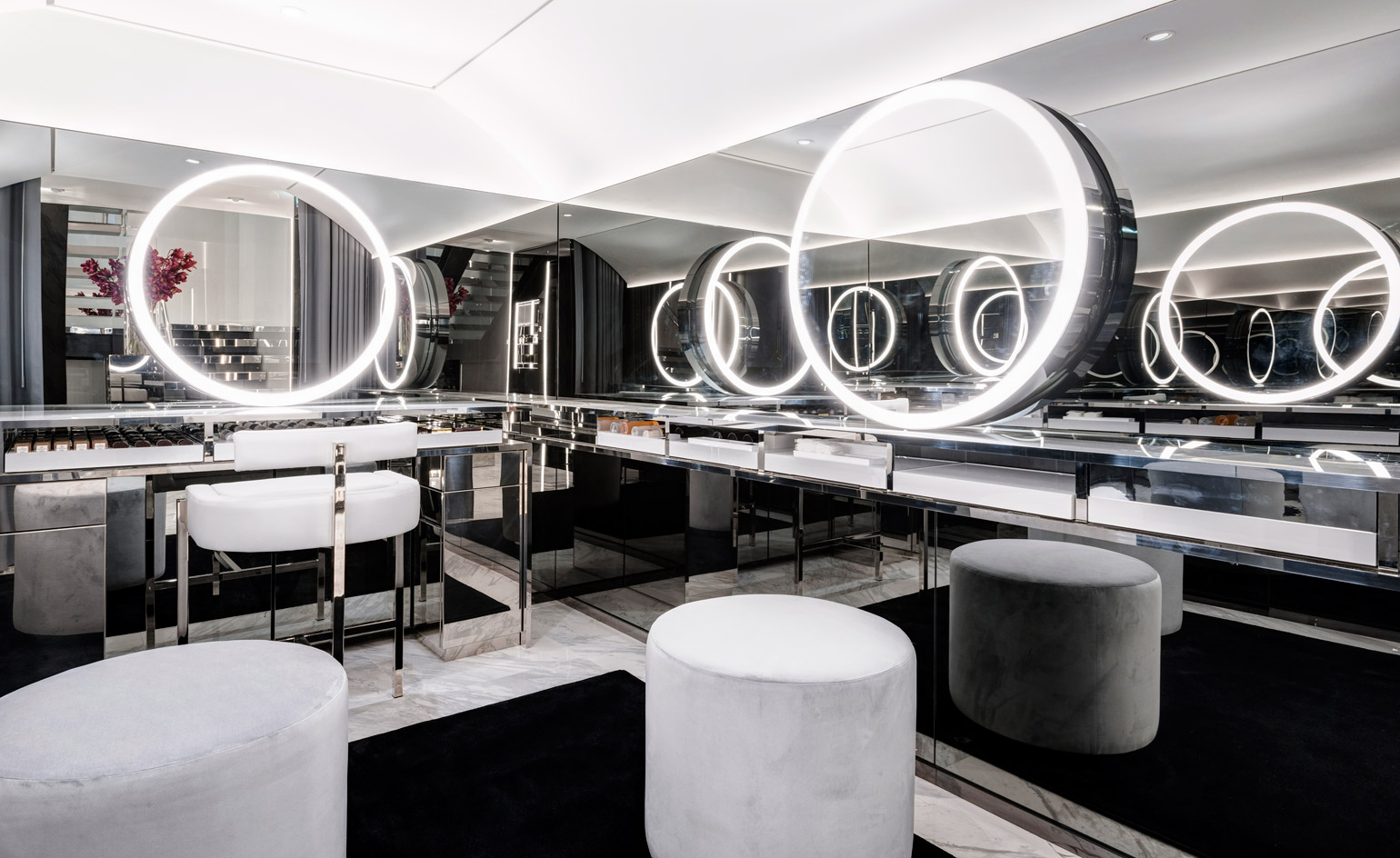
Bringing things bang up to date is Tom Ford Beauty, which, if you’re familiar with the multi-discipline mogul’s aesthetic, will come as no surprise. His first ever stand-alone beauty store not only sets a new benchmark in glamour, but inspires in the field of tech-first retail design.
Tucked between the columns of the historic Covent Garden piazza, Tom Ford Beauty is made up of six specialised rooms comprising grey glass, marble counters, reflective surfaces galore, and the high(est) tech possible. Mirrors that record your make-up tutorials and email them to you in chapters – check. Virtual lip-stick trialling – check. Interactive perfume counter with vast LED screens – check. Downstairs, there’s even an intimate, invitation only consultation room, where you can try on the hottest new launches (virtually, of course).
Tom Ford Beauty, 3 The Market Building, Covent Garden, London, England; www.tomford.com/beauty
Receive our daily digest of inspiration, escapism and design stories from around the world direct to your inbox.
Elly Parsons is the Digital Editor of Wallpaper*, where she oversees Wallpaper.com and its social platforms. She has been with the brand since 2015 in various roles, spending time as digital writer – specialising in art, technology and contemporary culture – and as deputy digital editor. She was shortlisted for a PPA Award in 2017, has written extensively for many publications, and has contributed to three books. She is a guest lecturer in digital journalism at Goldsmiths University, London, where she also holds a masters degree in creative writing. Now, her main areas of expertise include content strategy, audience engagement, and social media.