V&A Museum’s new map navigates seven miles of gallery space
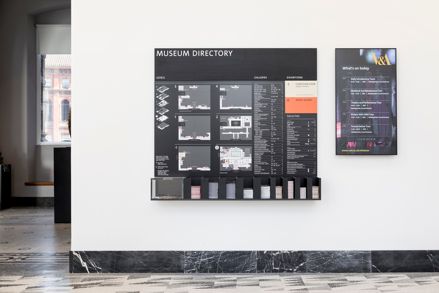
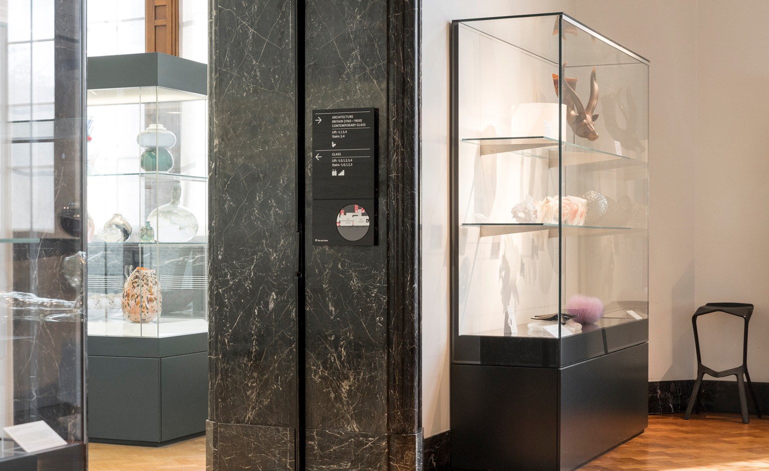
Anyone who has ever found themselves waylaid in the V&A will welcome the addition of a new map, and nearly 400 signs, comprising 60 totems, 130 hanging signs as well as an entirely new signage at gallery thresholds
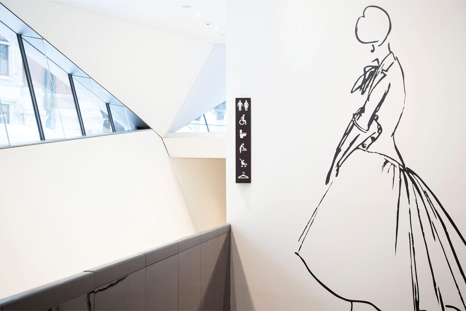
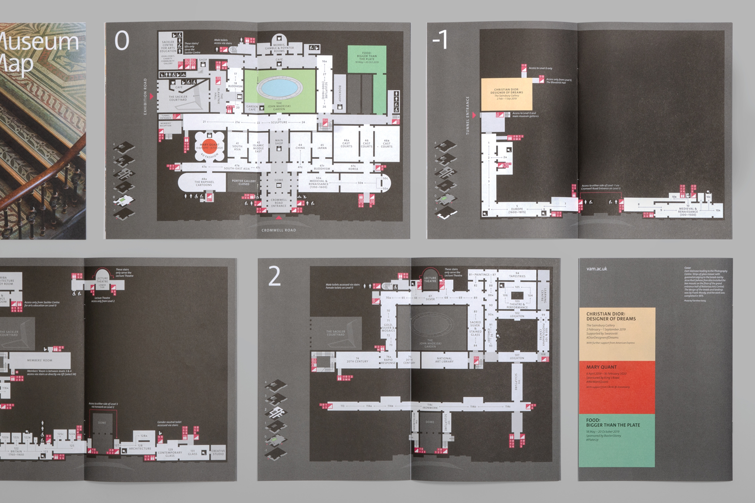
Brand and design consultancy dn&co has designed a new wayfinding system and map for London's V&A Museum. The design helps visitors navigate the maze-like site's seven miles of gallery space, and aims to tempt them to explore the lesser-known parts of the museum.
With seven floors across three interconnected historic buildings, five temporary exhibition spaces, four shops and three cafés, the wayfinding had to be varied, dynamic – and most of all clear. But as Philippa Simpson, the V&A's director of design, estate and futureplan explains, ‘this wasn’t just about getting people from A to B, but about nurturing and allowing for unpredictable behaviours.'
To achieve this, the map correlates both digitally and in print, with vertical circulation points that align across floors. Informed by archival research, the new dn&co design is more legible, compact and easier to carry around – with the hope that visitors will take the path less trodden, with the new benefit of a handy guide.
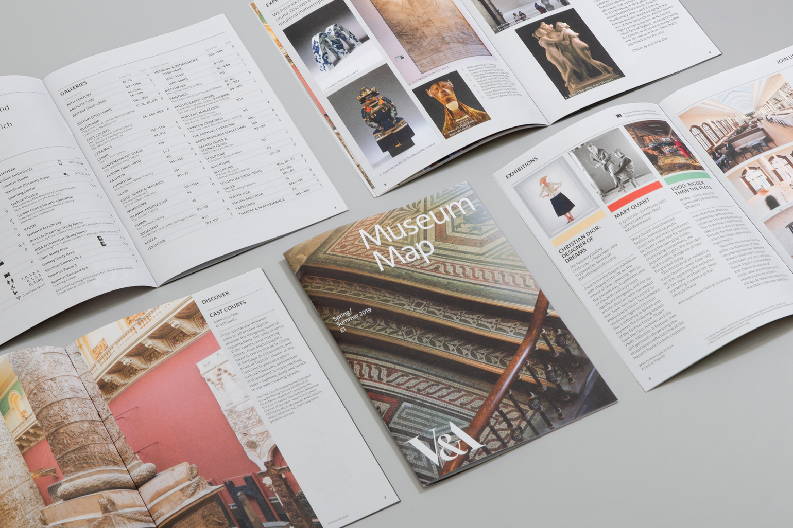
‘Wayfinding is not a static process, it’s a dynamic one,' explains creative director of dn&c, Patrick Eley. ‘It’s concerned with the way people move through spaces, and the cues they follow. Signs are one of those cues; architecture itself is another, as we are innately guided by it. And what architecture! The V&A is a monumental environment – airport-scale – but richly detailed with no one space the same as another. Our design had to live comfortably in this world-leading museum of art and design and to do so it treads a careful line.
RELATED STORY
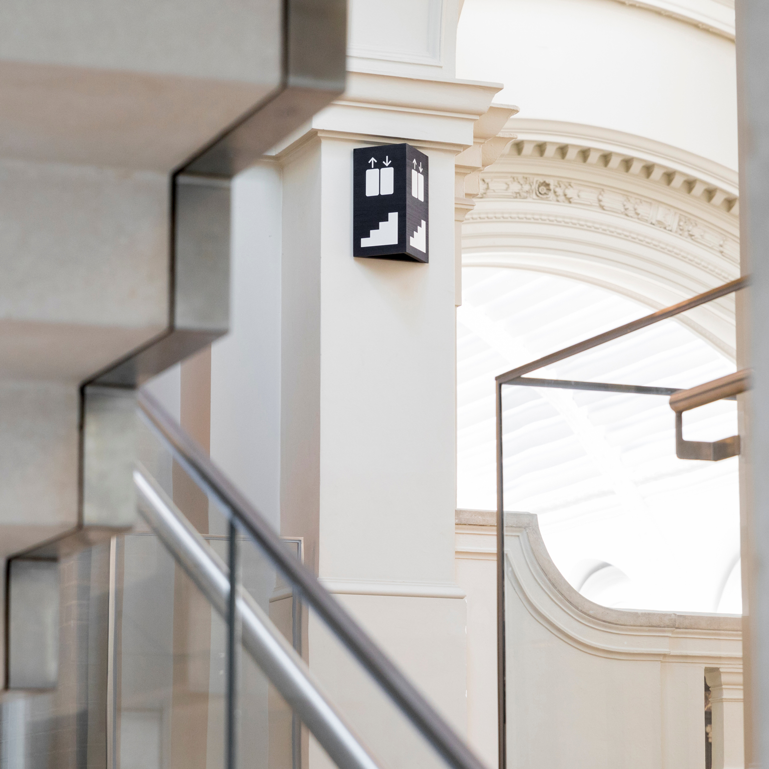
In a building characterised by its range of architectural finishes, quality of signage material was of the upmost importance. Made from tulipwood and dyed black, the signs convey a sense of quality and permanence. Small pops of colour act as beacons, drawing those visitors who have paid for an exhibition through the ground floor to their destination faster, with the intention of supporting revenue generating activities that help to keep the permanent galleries free to enter.
Another central theme will be invisible to all but regulars – the floors have been renumbered. Based on a more coherent sequence, the new numbering reinforces the perception of the museum as one building and aims to make it seem more manageable within a single visit.
But Eley is keen to point of the scheme's limitations. ‘We knew that no wayfinding solution could ever solve all the challenges on its own; not in a building of this scale. Our system is designed to work alongside the unsung heroes of any great museum — the gallery assistants, who are key when it comes to creating an outstanding visitor experience.'
INFORMATION
Wallpaper* Newsletter
Receive our daily digest of inspiration, escapism and design stories from around the world direct to your inbox.
Elly Parsons is the Digital Editor of Wallpaper*, where she oversees Wallpaper.com and its social platforms. She has been with the brand since 2015 in various roles, spending time as digital writer – specialising in art, technology and contemporary culture – and as deputy digital editor. She was shortlisted for a PPA Award in 2017, has written extensively for many publications, and has contributed to three books. She is a guest lecturer in digital journalism at Goldsmiths University, London, where she also holds a masters degree in creative writing. Now, her main areas of expertise include content strategy, audience engagement, and social media.
-
 The Subaru Forester is the definition of unpretentious automotive design
It’s not exactly king of the crossovers, but the Subaru Forester e-Boxer is reliable, practical and great for keeping a low profile
By Jonathan Bell
-
 Sotheby’s is auctioning a rare Frank Lloyd Wright lamp – and it could fetch $5 million
The architect's ‘Double-Pedestal’ lamp, which was designed for the Dana House in 1903, is hitting the auction block 13 May at Sotheby's.
By Anna Solomon
-
 Naoto Fukasawa sparks children’s imaginations with play sculptures
The Japanese designer creates an intuitive series of bold play sculptures, designed to spark children’s desire to play without thinking
By Danielle Demetriou
-
 Hooked on Broadway, David Rockwell's standout stage sets and intimate design ethos
David Rockwell has created a host of standout stage sets for Broadway shows, with London’s V&A recently acquiring four for its theatre and performance collections
By Diana Budds
-
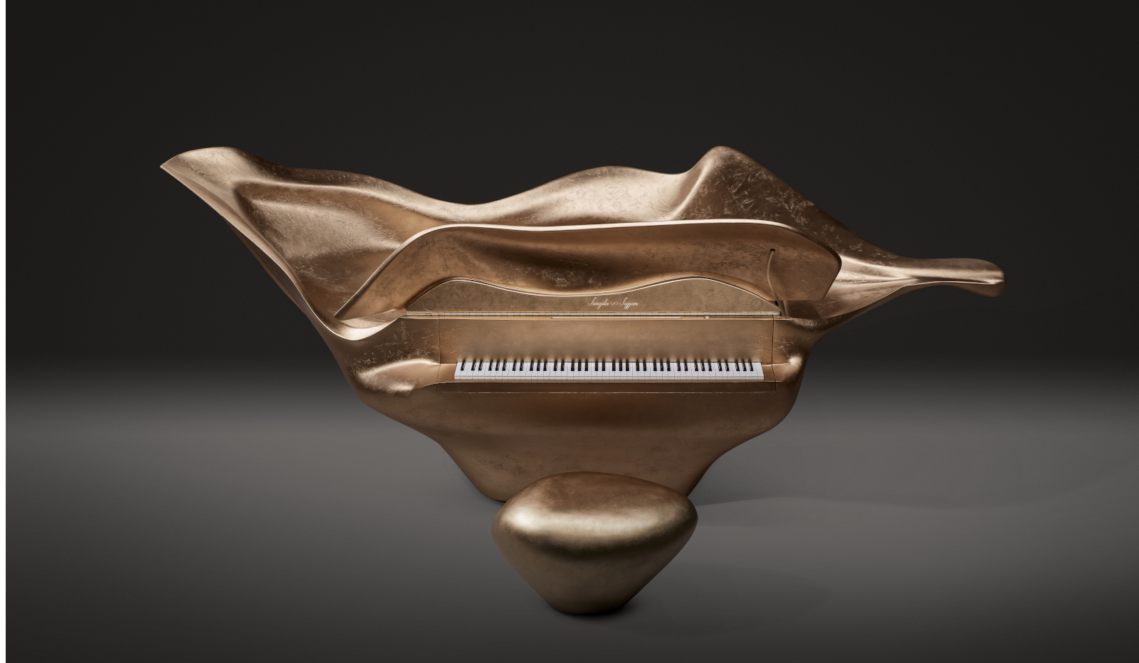 Ambika Hinduja collaborates with Edelweiss to create a baby grand piano inspired by autumn foliage
Ambika Hinduja’s ‘Harmony of Nature - A Concerto of Art’ has been unveiled at the Victoria and Albert Museum
By Tianna Williams
-
 SlowMo eases digital mental health therapy into daily life
SlowMo is a new mental health support app developed by design studio Special Projects and King’s College London that uses visual prompts to combat unhelpful thoughts
By Martha Elliott
-
 Mark Dalton on helping people navigate a pandemic through design
Design Emergency began as an Instagram Live series during the Covid-19 pandemic and is now becoming a wake-up call to the world, and compelling evidence of the power of design to effect radical and far-reaching change. Co-founders Paola Antonelli and Alice Rawsthorn took over the October 2020 issue of Wallpaper* – available to download free here – to present stories of design’s new purpose and promise. Here, Alice Rawsthorn talks to creative director Mark Dalton
By Alice Rawsthorn
-
 In memoriam: Wim Crouwel (1928-2019)
By Elly Parsons
-
 Nendo’s first graphic picture book depicts how design ideas are born
By Nurit Chinn
-
 Match maker: Yorgo & Co’s newest endeavour is a happy marriage of digital and print
By Rosa Bertoli
-
 Making paper: traditional Japanese gift wrapping gets a modern German twist
By Jessica-Christin Hametner