Fig Face shows its colours at facial cleansing studio in Vancouver

Fig Face is the new facial cleansing studio in Vancouver opened by partners Jessica Walsh and Anita Chan. Offering the highest quality treatments such as facials and injections with the help of technology, science and a passion for using clean ingredients sustainably, the space provides a welcome retreat from the pressures of everyday life, even if you’re only going for a thirty-minute treatment. Innovate in the way they have transformed a medical establishment which has a tendency to be sterile in appearance or too feminine, Fig is the perfect balance of elegant luxury with its soft lighting, being the world’s first skincare bar.
Inspired by the interior spaces of Milan where she was previously a fashion editor, Jessica created moodboards focusing on Milanese entry halls, as seen in the book Entry Halls of Milan by Taschen. To her, entry halls are ‘so functional’ but at the same time have an element of beauty. Drawing influence from her British background, European aesthetics and Scandi design, this multi-layered approach is what Fig incorporates into their facial treatments, focusing on the five senses.
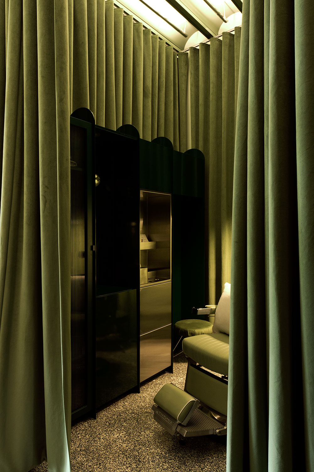
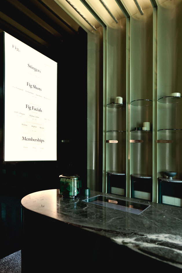
Scott & Scott Architects fit into Fig’s design direction with their unconventional ideas and use of natural and modest materials. Switching this up, Fig introduced other materials such as terrazzo, velvets, and curved perforated metal on the wall and marble and glass counters – areas where hygiene and cleanliness are crucial. One of the main features of the studio is the deep green floor to ceiling mirror which transformed the space from square room into a fascinating ‘multi-faceted’ space. ‘I always flip over design magazines and see what they are doing with the ceilings – if our guests were spending thirty minutes staring at the ceiling they had to be special.’
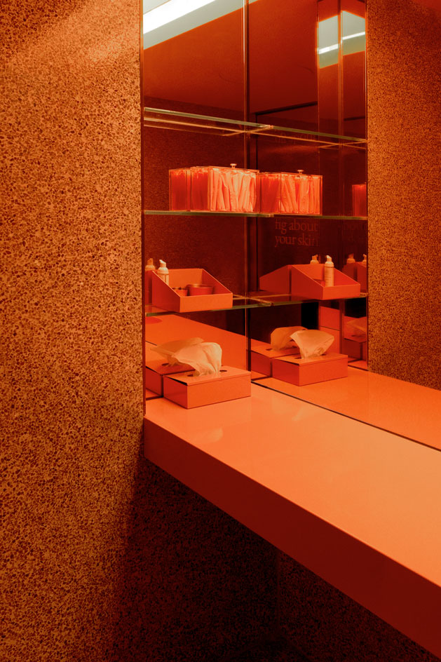
Like it’s namesake, the main interior’s colour scheme is green, (the outside of a fig), while the dark pink bathroom represents the insides. One of Fig’s business approaches is to look out for ‘small, awkward spaces in prime retail areas,’ resulting to lower rent costs which allows them to offer high-end treatments at affordable ‘luxury’ prices. As Fig Face grows their locations, they will collaborate with Scott & Scott Architects to create spaces that are all different in design – with longevity at the forefront, and evoke feelings of ‘excitement.’

INFORMATION
ADDRESS
2050 West 4th Avenue
Vancouver BC
V6J 1M9
Wallpaper* Newsletter
Receive our daily digest of inspiration, escapism and design stories from around the world direct to your inbox.
-
 Eight designers to know from Rossana Orlandi Gallery’s Milan Design Week 2025 exhibition
Wallpaper’s highlights from the mega-exhibition at Rossana Orlandi Gallery include some of the most compelling names in design today
By Anna Solomon
-
 Nikos Koulis brings a cool wearability to high jewellery
Nikos Koulis experiments with unusual diamond cuts and modern materials in a new collection, ‘Wish’
By Hannah Silver
-
 A Xingfa cement factory’s reimagining breathes new life into an abandoned industrial site
We tour the Xingfa cement factory in China, where a redesign by landscape specialist SWA Group completely transforms an old industrial site into a lush park
By Daven Wu