AIM designs steely cosmetics boutique in Hong Kong
Receive our daily digest of inspiration, escapism and design stories from around the world direct to your inbox.
You are now subscribed
Your newsletter sign-up was successful
Want to add more newsletters?
When there’s the option to satisfy retail urges using phones, tablets and computers in the comfort of our homes, during lunch breaks or while commuting, navigating through stores that are often disorganised and lack curation offers little appeal to modern day shoppers. To stay relevant, retailers are finding ever more creative ways to cater to the demands of consumers.
The cosmetics pharmacy HARMAY has recently taken up the challenge with a new store in Hong Kong. The online cosmetics retailer joined the physical retail world first when they opened their ‘bricks and mortar’ store in Shanghai– designed by AIM Architecture, in 2017. Its success has led to the design of a second location with AIM in Hong Kong that delves further into the relationship between its online and offline presence.
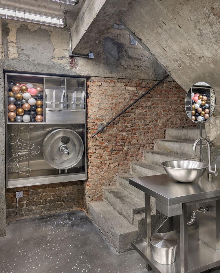
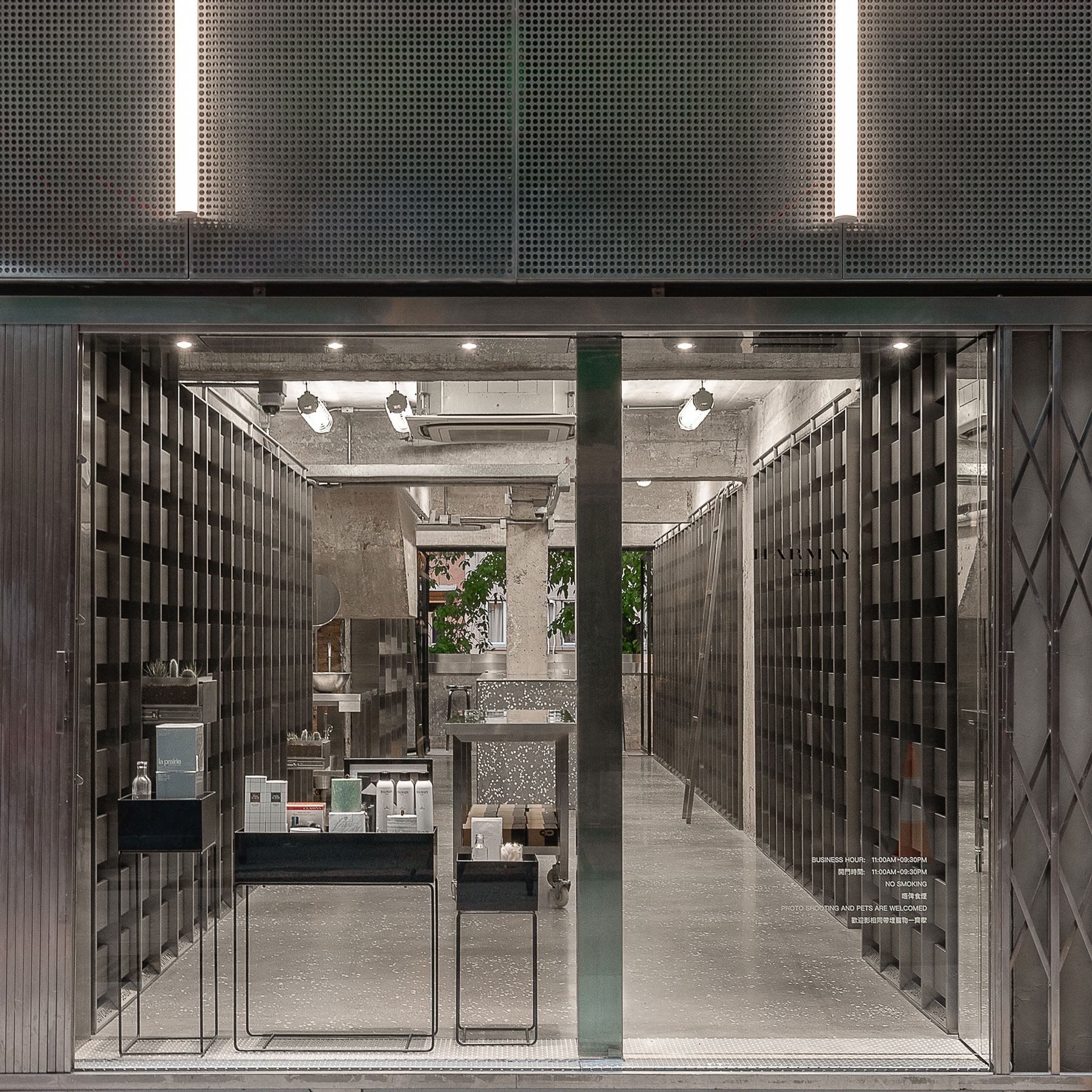
Quietly unassuming among the hustle and bustle of the narrow shopping street, upon closer inspection, the store’s steely metallic décor with LED lighting marks it out as something new for the neighbourhood.
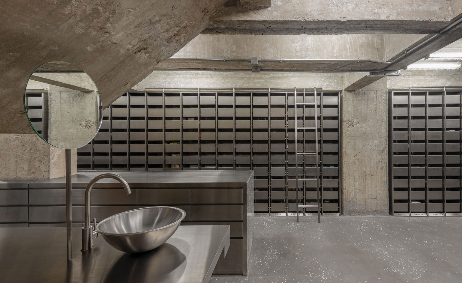
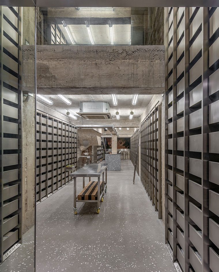
Drawing inspiration from old-school chemists, stainless steel drawers line the walls of the Hong Kong apothecary, making the space feel uncluttered, organised and calming. It is not designed to be about shopping activities, as you can do that online; it exists to provide a sensory experience that is all about ‘discovery’.
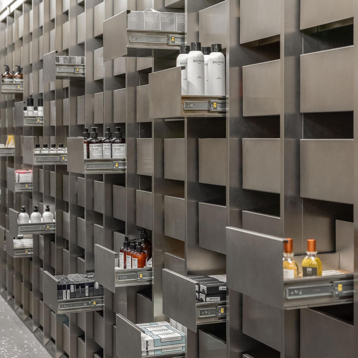
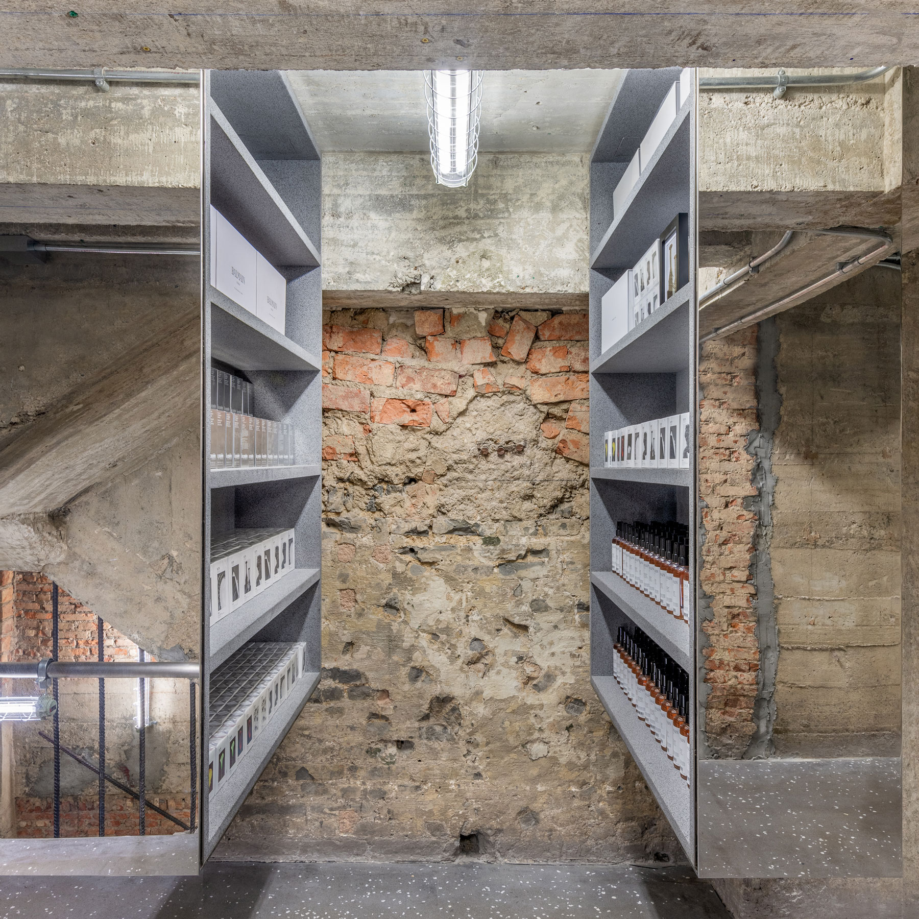
This smart approach to retail by HARMAY involves visitors being given subtle hints that encourage them to open the drawers and find the hidden product bringing a feeling of nostalgia from our childhood treasure hunting days and making the experience a memorable one. The second floor design meanwhile is more conventional ‘immersing you in the tactile experience of traditional shopping.’
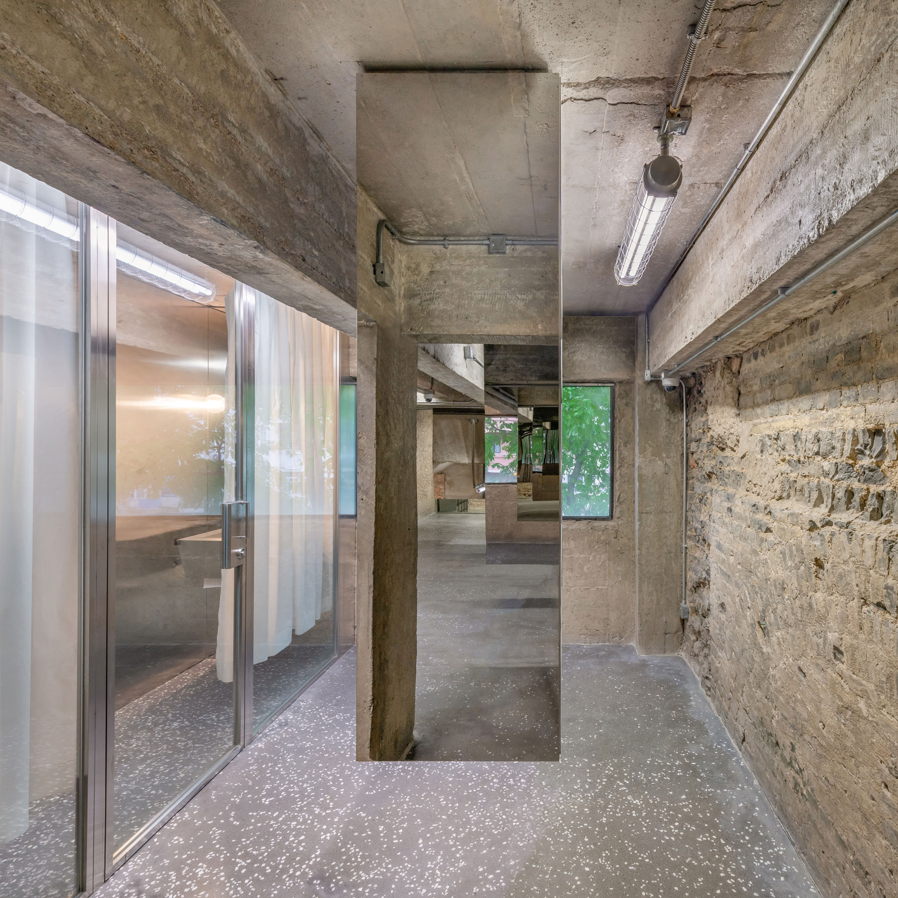
Hong Kong may be a notoriously cramped city but the apothecary offers a semblance of spaciousness on both floors. It is a draw for the ‘curious and engaged consumer’, and the passerby who walks in with an image of what to expect but discovers something else instead.

INFORMATION
For more information, visit the AIM Architecture website
Receive our daily digest of inspiration, escapism and design stories from around the world direct to your inbox.