Meet the designer-activists using graphics to fight supermarket plastics
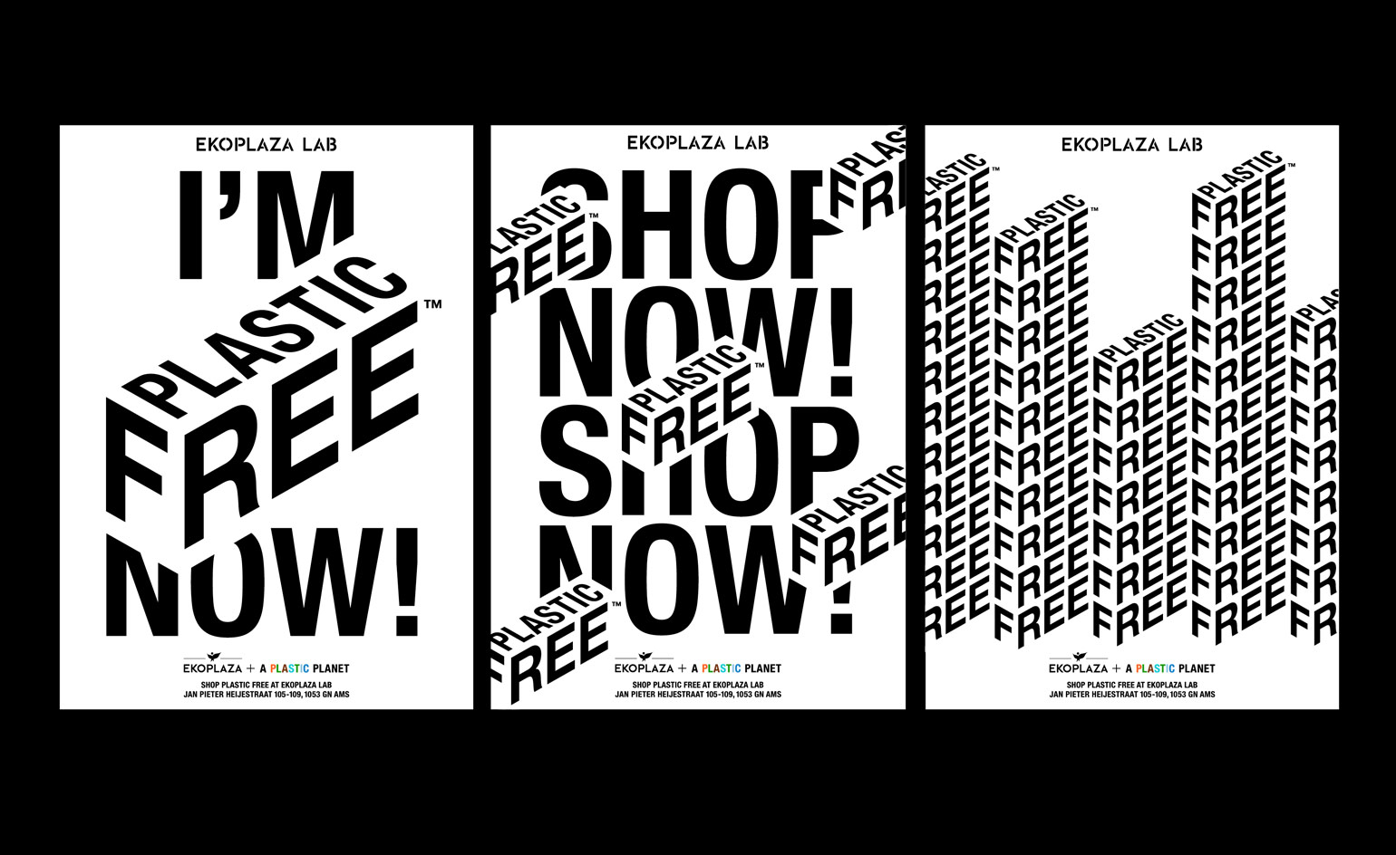
While nudges and sticks like the charge for carrier bags or a paid urban congestion zone are clearly useful tools, there’s also a case for consumerist carrots. The London-based design studio Made Thought clearly believes in the latter approach. In collaboration with lobbying group A Plastic Planet, Made Thought has shaped a simple graphic icon that it hopes will underpin a new approach to supermarket shopping.
Made Thought have created a ‘Plastic Free Mark’ to help consumers make informed choices about the packaging they buy. A simple graphic device that’s designed to work with any product, A Plastic Planet will debut the mark in the Dutch supermarket chain Ekoplaza with the launch of the world’s first Plastic Free Aisle, dubbed the Ekoplaza Lab. This pilot shopping project features 700 products that showcase natural bio-materials and other easily recyclable pieces of packaging.
We spoke to Made Thought’s founders Paul Austin and Ben Parker about their design and their hopes for its future use.
W*: What are your ambitions for the Plastic Free Mark?
Made Thought: The mark is the brainchild of grassroots organisation A Plastic Planet. The aim is to have an easy to identify mark that consumers can find so they know for certain that they’re buying a product that does not add to the flood of single-use plastic. As manufacturers react to the market demand for plastic-free items replacing packaging with bio materials, it will become increasingly important, so that convenience is not lost. The ambition is that the mark gets taken up by forward thinking producers around the world as a clear trust mark.
W*: Do you think other supermarkets around the world will take it up?
MT: A number of supermarkets and producers are in talks right now to take up the mark. What is clear is that people have really woken up to the damage plastic is having on our planet. By addressing single-use plastic in food packaging and giving choice to consumers, we can all make a difference everyday.
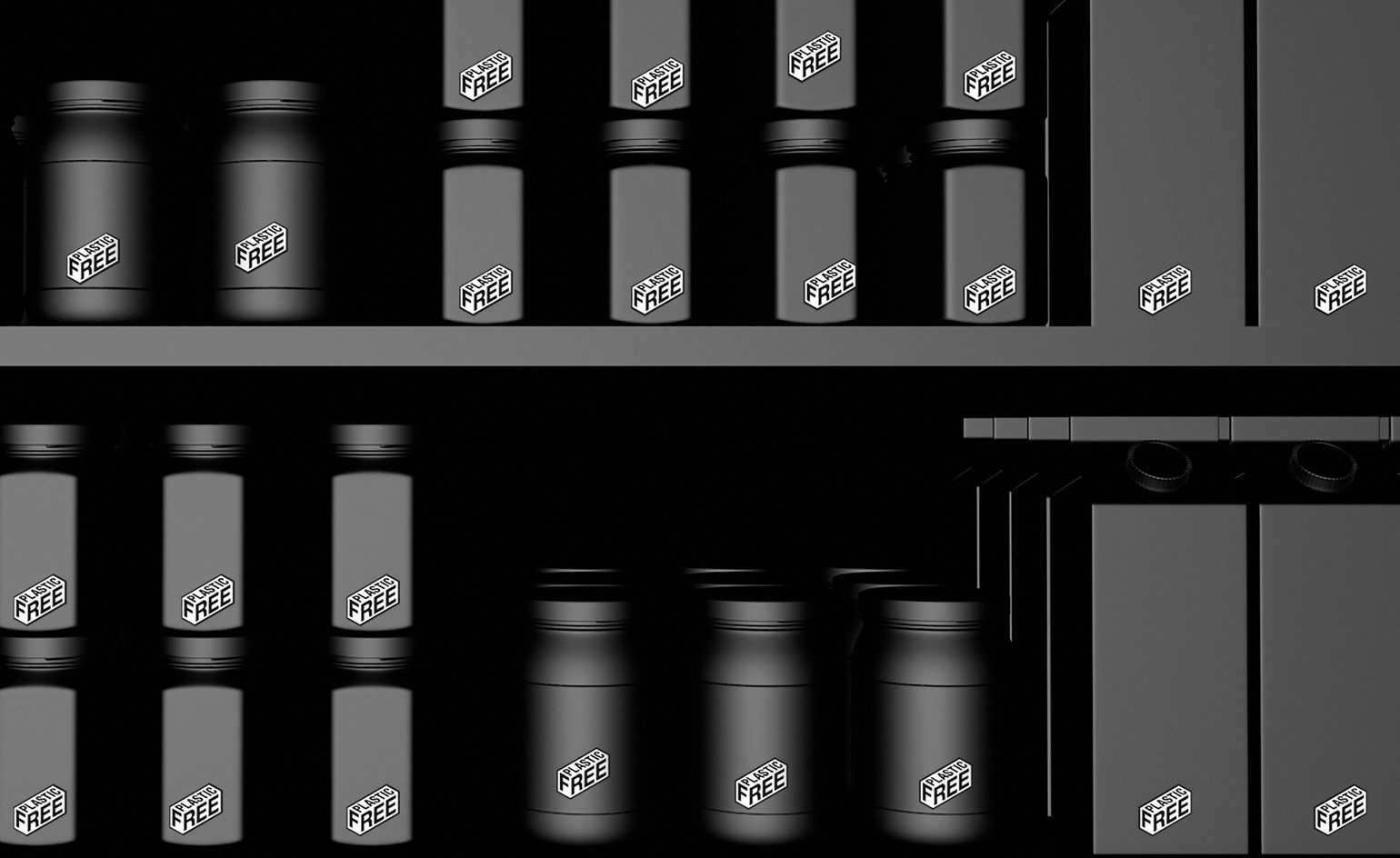
Plastic Free graphics
W*: What was the thought process behind the visual identity?
MT: We didn’t want to create another mark that needed explaining and demystifying. In a category full of confusing symbols our approach has been to disrupt and create cut-through by being remarkably simple. Our approach was to not add to this noise. The broader identity developed for Ekoplaza Lab also works on the same principle: concise, spelling out the problem (because we all know what it is) and simply signalling it is a lifestyle choice and just not an altruistic one. As a result, the identity adopted a slightly disruptive and propaganda style aesthetic – something that allowed clear stand-out and contrast to Ekoplaza’s established and premium aesthetic.
W*: How was the typography shaped and the form chosen?
MT: The mark depicts an archetype form of a box to represent packaging, while the type uses the advertising and announcement font Helvetica Neue Bold Condensed.
W*: How do you make the connection between ‘plastic free’ and increased recycling?
MT: Even after decades of European authorities collecting recycling, only nine per cent of our waste is recycled. It is clear that recycling does not go far enough: that is why A Plastic Planet is keen to turn off the plastic tap.
W*: Will Made Thought be involved in creating packaging as well?
MT: We are actively discussing using the mark in a number of high-end drinks and spirits brands that we have ongoing relationships with. More importantly, right now we are in conversation with a number of our clients across the skincare and hospitality industries about how we can become plastic free across their entire business operation. This degree of change is really exciting because we believe for design to be truly progressive it has to change behaviour at this level.
W*: How will use of the mark be monitored?
MT: Those who want to use the mark will have to apply to A Plastic Planet, which is working with industry to make sure products that carry the mark are completely free from plastic.
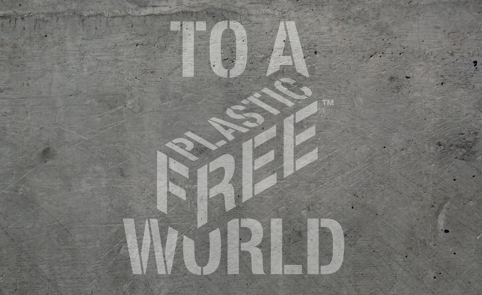
Ekoplaza ‘Clean Graffiti’ design, by Made Thought
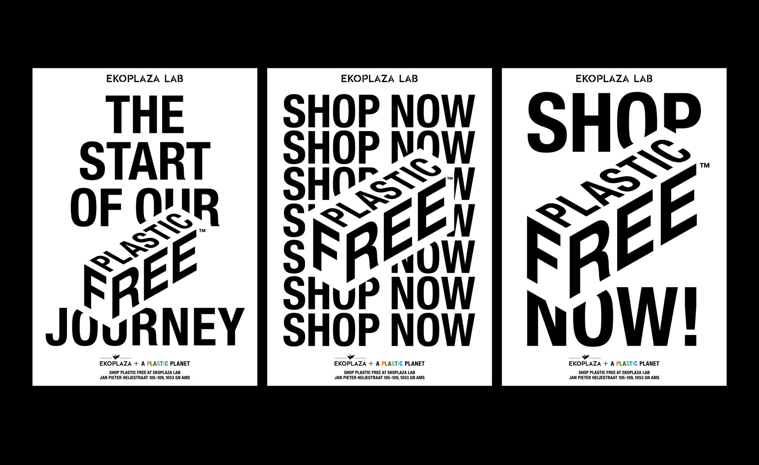
Ekoplaza fly posters, by Made Thought
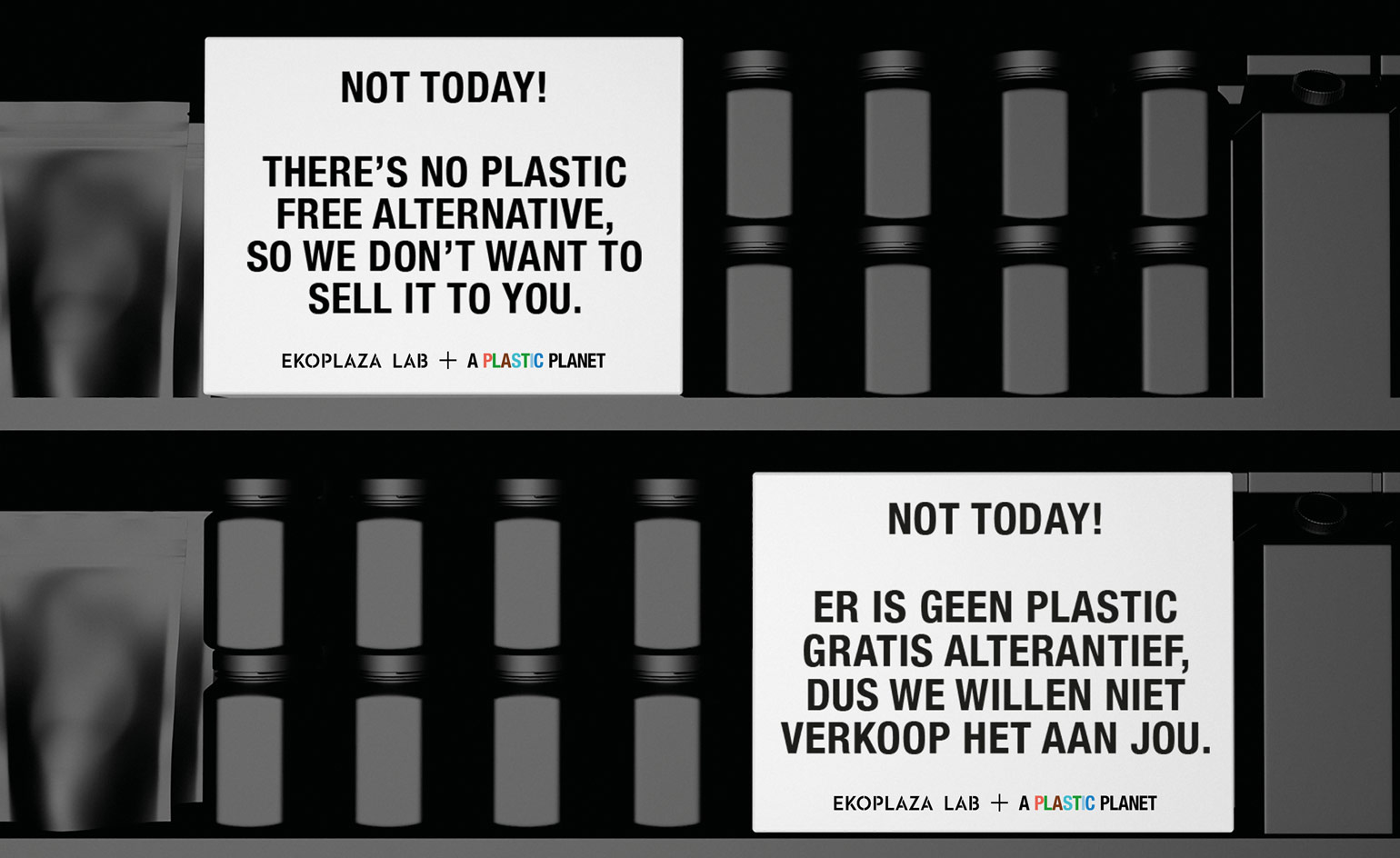
Ekoplaza ‘Shelf Talker’ design, by Made Thought
INFORMATION
For more information, visit the A Plastic Planet website, the Made Thought website and the Ekoplaza website
Wallpaper* Newsletter
Receive our daily digest of inspiration, escapism and design stories from around the world direct to your inbox.
Jonathan Bell has written for Wallpaper* magazine since 1999, covering everything from architecture and transport design to books, tech and graphic design. He is now the magazine’s Transport and Technology Editor. Jonathan has written and edited 15 books, including Concept Car Design, 21st Century House, and The New Modern House. He is also the host of Wallpaper’s first podcast.
-
 Dior holds an enchanting Kyoto show in the midst of cherry-blossom season
Maria Grazia Chiuri chose the grounds of Kyoto’s serene Tō-ji Temple to present a Fall 2025 collection that celebrated Dior’s longstanding links with Japan
By Jack Moss
-
 Giant rings! Timber futurism! It’s the Osaka Expo 2025
The Osaka Expo 2025 opens its microcosm of experimental architecture, futuristic innovations and optimistic spirit; welcome to our pick of the global event’s design trends and highlights
By Danielle Demetriou
-
 The new Polaroid Flip unfolds to bring you pin-sharp instant photography
Polaroid announces the Flip, an instant camera that blends its evergreen film technology with better results and more control
By Jonathan Bell
-
 Culinary power couple Margot and Fergus Henderson serve up fresh surprises
Margot and Fergus Henderson, British culinary legends, turn Wallpaper* guest editors. Here, they discuss new ventures, in Somerset and Marylebone, and reflect on their extraordinary careers as creators, respectively, of Rochelle Canteen and St John
By Caroline Roux
-
 Jon Gray judges Wallpaper* Design Awards 2022
Jon Gray, co-founder of Black culinary collective Ghetto Gastro, talks disruption, inclusion, shaking up Museum Mile, and his pick of the Wallpaper* Design Awards 2022
By Pei-Ru Keh
-
 David Carson’s experimental typographic collage for The Macallan whisky
American graphic designer, art director and surfer David Carson unveils striking hand-crafted collage design for The Macallan Concept No. 3 whisky
By Harriet Lloyd-Smith
-
 Luxury vodka brand X Muse: refined by art, aquifers and amethysts
Blended-barley vodka brand X Muse is an adventure with art and alchemy, created by Jupiter Artland co-founder Robert Wilson and alcohol expert Vadim Grigoryan, as featured in the October 2021 25th Anniversary Issue of Wallpaper*, on sale from 9 September
By Harriet Lloyd-Smith
-
 Fragile Self’s multi-platform debut album is a fervent fusion of sound and vision
The designer behind David Bowie's album covers has released a multimedia album exploring the history of psychology and the definition of ‘normality'
By Harriet Lloyd-Smith
-
 The inaugural Hieronymus Journal savours slow publishing in the digital age
By Elly Parsons
-
 London remembers the hazy days of 1960s alcohol advertising with Campari
By Elly Parsons
-
 A new Baldessari-inspired Mexico City restaurant tackles the ‘clean eating’ fad
By Elly Parsons