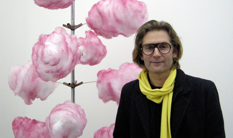
Mike Meire

We grabbed a few moments with the fast food fanatic at the opening of his Global Street Food exhibition.
How does Global Street Food relate to The Farm Project?
I think actually this should have been the first show and The Farm Project should have been the second one. The Farm Project was more of a personal statement for me, an antidote to the strict minimalism that has become what people expect in kitchen design. The kitchen is like a market place of the world’s culture and I love the potential for diversity. Though I like minimalism from an intellectual point of view, I felt it was important to embrace complexity in our kitchens. The impact of this exhibition would have made a great starting point for introducing this theme.
Aside from reintroducing complexity to the kitchen then, what does the project mean to you?
As Peter Saville said to me, ‘these days everything looks like art. I want to see more reality’. It’s true; I think we all need more reality in our lives. These units are so complex, they remind me of survival units. Many designers say to themselves today ‘be creative within your limits’, but I find this a bit indulgent. The people who made these units really have limits; they find what they have around them and they use it to the best of their means. I think we’ve become too septic – obsessed with cleanliness, both in hygienic and design terms – and hence I want to inject a bit of reality.
I’m struck by the simplicity but absolute refinement of each element. Over time and use, the people who sell food have learnt how each bit performs its function as best it can – it’s a very unselfconscious example of design at its best.
Exactly, look at the cart selling fruit salads: the umbrella and the paper advertisement – it’s so simple, we might say it’s ugly, but each element performs its function in the simplest, the best and the most necessary way.
Wallpaper* Newsletter
Receive our daily digest of inspiration, escapism and design stories from around the world direct to your inbox.
How does removing them from their cultural context affect the way people look at them?
I wanted to take away this preconception we all have about design, so taking these carts out of their context and placing them in a gallery makes us see them for what they are. What you said about every element performing its function you probably wouldn’t have noticed if you saw it in Thailand or Argentina.
Are they all original or have you assembled some makeshift copies?
Everything is original. They’ve each became like friends to me.
Was it a logistical nightmare shipping all these fragile street food carts from around the world?
In a word yes. All the pieces from Argentina arrived just five days ago. At one stage I thought we would only have enough to fill one room.
How long did it take to put together?
We’ve worked just a year to put it together. Dornbracht asked what we should do next after the farm. It struck me when I was in New York that there was a hotdog stand and all sorts of people were standing there indulging in a daily ritual. Then I thought what a universal, historical custom this is and so the idea was born.
What have you learnt from researching and studying them?
This piece with the lollipops, to me it looks like an Ettore Sottsass Memphis piece. When you see such likenesses it makes me question whether we really need new things designed when beautiful, natural designs are already part of our everyday life. This one is like a Marcel Duchamp, but it’s just a grill for goat meat. This one is from Sudan. It’s so visceral, people are literally sitting in the dirt, but here they create a sense of community, which is fundamental to their daily existence. The stools are like something by the Campana Brothers.
Is there a global message behind the collection – that different cultures have each created the same product, answers their own specific daily needs?
I like the idea of mobility. These people put these things together in different places around the world for the same reason – it brings me back to what we used to talk about in the 1990s – the idea of the global village. This gives everything a poetic view. In the gallery situation we focus on the components, the cultural identity of each piece, where it comes from and what it means. The idea behind the exhibition was really to be as demonstrative as possible and show what other people around the world are doing.
Is an exhibition of street food carts intended as conscious antidote to all the high-end expensive designer furniture on show at the same time?
I’m a bit tired of design and the lack of inspiration. Rather than simply putting new designs on a plinth year after year, I thought it might be nice to tell a story. We’re all beginning to understand that we’re entering a new era. I’m happy about this crisis – not literally of course – but on the effect it might have on creative people and our understandings of creativity. We’re coming from a time when we had too many opportunities and we didn’t use them properly. I think this realisation will help us to think a little more about what we do in the future, now those opportunities are dwindling.
What will happen to the carts after the exhibition?
We’ll keep them. I want this to travel, to Milan and maybe London. We paid for each of them. The expensive thing was shipping them to get them here. They were very happy to give their carts to us.
Do you have a favourite cart?
I find this one so charming. The guy found a trolley, an old white board and he placed a sheet on top of it. It’s the gesture of the sheet that’s so important. He’s made an effort to replicate the same thing we have when we see two restaurants, one with plain tables and one with tablecloths – we go for the tablecloth restaurant because we assume it has better food.
And a favourite type of street food?
I have to say I do like a hot dog.
Rosa Bertoli was born in Udine, Italy, and now lives in London. Since 2014, she has been the Design Editor of Wallpaper*, where she oversees design content for the print and online editions, as well as special editorial projects. Through her role at Wallpaper*, she has written extensively about all areas of design. Rosa has been speaker and moderator for various design talks and conferences including London Craft Week, Maison & Objet, The Italian Cultural Institute (London), Clippings, Zaha Hadid Design, Kartell and Frieze Art Fair. Rosa has been on judging panels for the Chart Architecture Award, the Dutch Design Awards and the DesignGuild Marks. She has written for numerous English and Italian language publications, and worked as a content and communication consultant for fashion and design brands.
-
 All-In is the Paris-based label making full-force fashion for main character dressing
Part of our monthly Uprising series, Wallpaper* meets Benjamin Barron and Bror August Vestbø of All-In, the LVMH Prize-nominated label which bases its collections on a riotous cast of characters – real and imagined
By Orla Brennan
-
 Maserati joins forces with Giorgetti for a turbo-charged relationship
Announcing their marriage during Milan Design Week, the brands unveiled a collection, a car and a long term commitment
By Hugo Macdonald
-
 Through an innovative new training program, Poltrona Frau aims to safeguard Italian craft
The heritage furniture manufacturer is training a new generation of leather artisans
By Cristina Kiran Piotti