Jony Ive goes behind the screen of the new Apple Watch with Tony Chambers
Tony Chambers started wearing an Apple Watch in 2015. Seduced, as many were, by its marriage of elegant form, function and fun – it was the Mickey Mouse face that gave it extra appeal. ‘It adds an element of irreverence, preventing all the other design perfection becoming too, well, perfect,’ Chambers told The Telegraph at the time. ‘Mickey takes the edge off.’
Chambers, creative consultant and Wallpaper* former editor-in-chief, has monitored the iteration-by-iteration evolution of the world's most popular timepiece with interest ever since. Impossibly, each new series seems to get better, through subtle design tweaks, and system upgrades (not to mention improved Mickey graphics). It was with great curiosity, then, that Chambers learnt that the new Apple Watch – alongside the three new iPhones that launched yesterday via livestream at Apple Park in California – applies a more significant redesign than ever.
The livestream, which fizzed across the fourth wall and onto Apple screens worldwide, revealed that the Apple Watch Series 4 features the greatest leaps forward, in both hardware and software terms, since Apple Time began. After the launch, Chambers called upon chief design officer Sir Jony Ive via phone to Apple HQ – resuming a conversation they began at London's Royal College of Art earlier this year – to discover just how profound these shifts are, and why they've happened to products that, at the time of launch, seem difficult to improve upon.
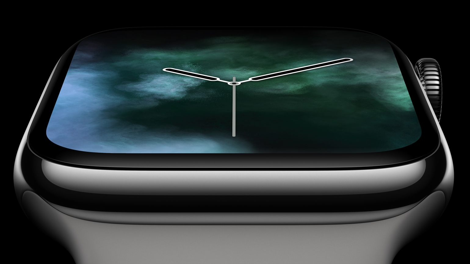
‘You’d be reckless to move away from the fundamental icon,' Ive says of the new Apple Watch, which, on first impression, maintains a similar footprint and profile as the Series 3 iteration. ‘Our aim was to develop it and evolve it as dramatically as possible.' The key visual difference is the 30 per cent greater display area, which seamlessly integrates into the thinner case, achieved by eradicating the void frame around the edge of the face (available in 40mm and 44mm). ‘When you see each watch series in isolation you can't comprehend how different they are. But when you look at them side by side, the change is extremely dramatic.’
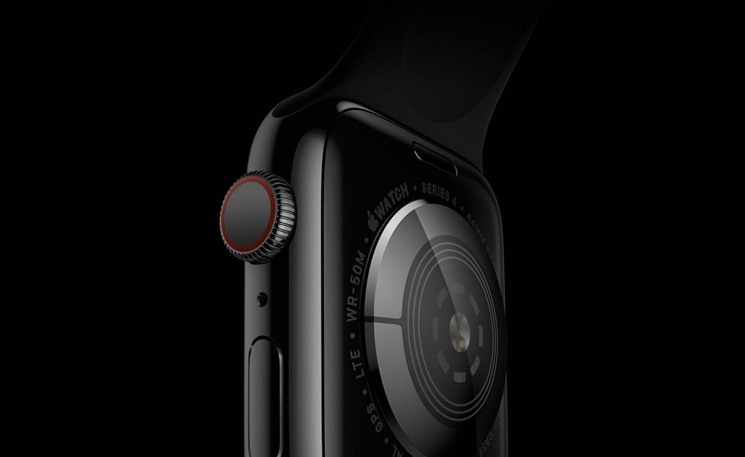
Back close-up, Apple Watch Series 4
Further crucial design advances come when you look behind the screen. A re-engineered interface ushers in easier to read, larger fonts; a watch-to-watch Walkie Talkie comms system (with watch0S5), 50 per cent louder speaker, and a more customisable homescreen, which you can even add a photo of your loved one's face to (if that's your thing).
The new health features boast some of the most compelling progressions, and, in Ive's words, are ‘absolutely insane'. Updates include a Fall Detector, which uses the Apple Watch's accelerometer and gyroscope to identify when a hard fall occurs, initiating a call to emergency services, then sending a message with your location to your emergency contacts (unless of course you confirm you're okay). Perhaps even more astounding, an FDA-approved electrocardiogram app can analyse your heart rate, alert you if it exceeds or falls below a specified threshold, and detect abnormalities like AFib, right from the wrist, via a new electrical heart rate sensor in the back crystal, built into the Digital Crown. ‘It's a real privilege to be part of a team developing products like this,' Ive impresses. ‘We’ve come to learn we’re able to get a sense of how the body is functioning in the broadest of contexts – not just in the doctor's office.'
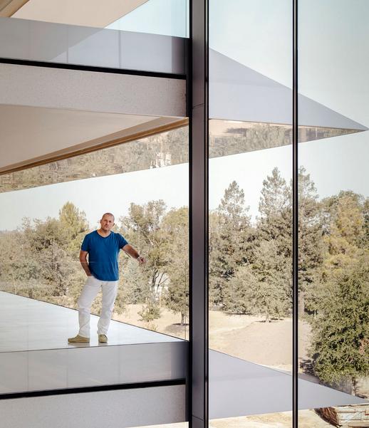
Jony Ive in the brand’s new HQ, with a glimpse of the 175-acre Apple Park in the background.
When we looked around Apple Park last year, Ive told us that his team's goal has been, ‘in some ways, to get design out of the way.’ He said, ‘We try to define a solution that seems so inevitable that it does recede.’ The new watch unifies each of its design elements in complete harmony, from the curved corners of the larger, all‑new display to the architecture of the S4 chip, every detail has been thoughtfully moulded. Ive puts some of these successes down to the design team working ‘under one roof'. ‘The same designers have been working on this product for a few years, but until we arrived in Apple Park earlier this year, we didn’t enjoy a singular studio.' Now, haptic designers, font designers, material designers, and interface designers work in close proximity; creating product in a way that Apple Park was built for: collaboratively. The result is, in Ive's eyes, the most beautiful Apple Watch yet.
The Hermès iteration of the Series 4 watch, designed by Ive and Hermès creative director Pierre-Alexis Dumas, continues their collaboration. Disparate design elements (form, function, finish) tick together in unison; a testament to the complementary working attitudes of the two individuals. ‘I’m really proud of what we’ve managed to achieve together,' says Ive, stressing the high regard to which he holds Dumas. ‘We both derive a tremendous satisfaction in our work together.' In the singularly beautiful Hermès edition, a two-tone strap is complemented by a gradient face design, which, like a digital sundial, changes colour with the passing of minutes, measuring the hours with meditative simplicity.
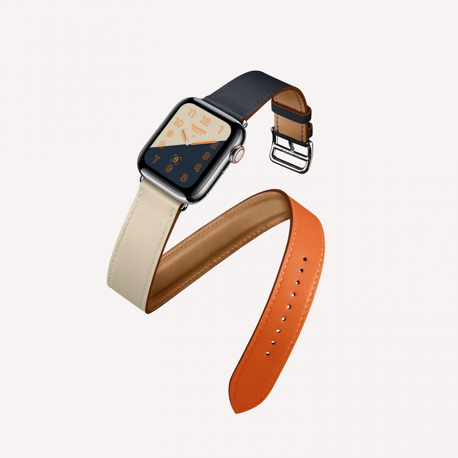
Apple Watch Series 4, by Hermès
Five years ago, Apple didn’t make watches. Today, the Apple Watch is the bestselling watch in the world. With such groundbreaking, and popular design – where can it go next? ‘I assume this is always a journey,' Ive explains. ‘Partly, it's because I’m working on the next thing – I’m always aware of the opportunities to do better.’
But a better object doesn't necessarily equate to a perfect object. Instead, it seems the Apple aim is to create a person object. An object with life, flexibility, relatability, personality. Something that works for you, and, as the voiceover said at the start of the livestream, an object that has ‘the ability to change your life everyday'. Just as the Mickey Mouse face on Tony Chambers' first Apple watch encouraged him to wear it daily, the watch's ability to reflect your personality is what makes it such a seamless addition to your arm. It might be Hermès' mindful sundial, or the reassurance you feel from knowing Fall Detector is running in the background, or perhaps by wearing your loved one's image on your wrist. Apple's real design success? Giving you the ability to find your Mickey.
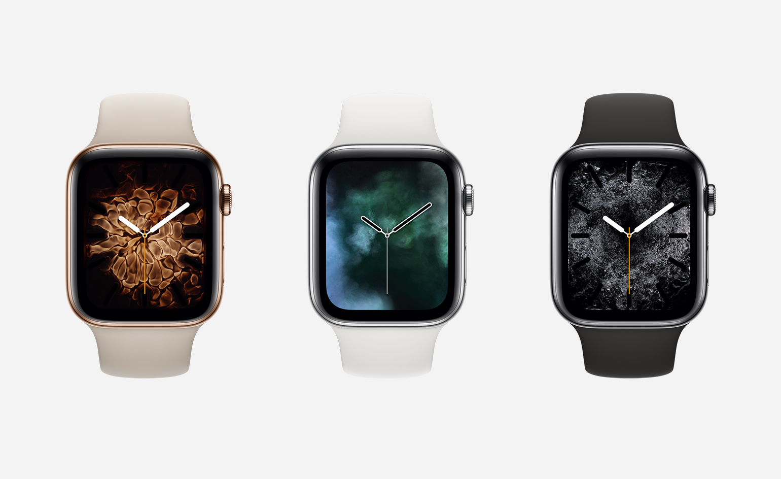
A new gold stainless steel case (left) joins existing silver and space black models
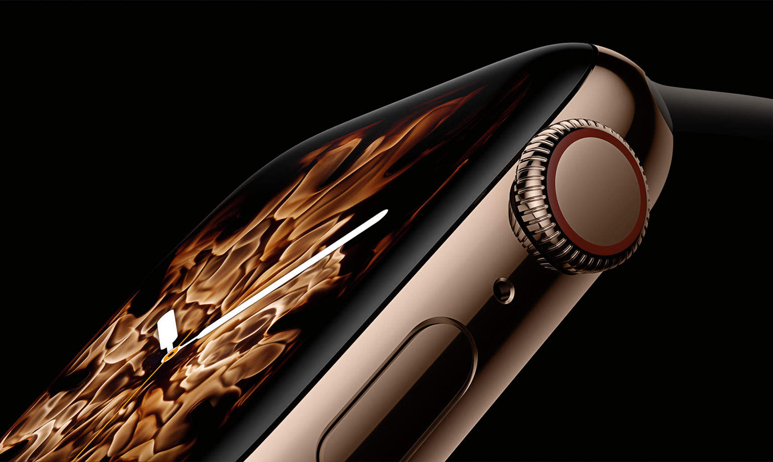
The new display is over 30 percent larger and seamlessly integrates into the thinner, smaller case, while the new interface provides more information with richer detail
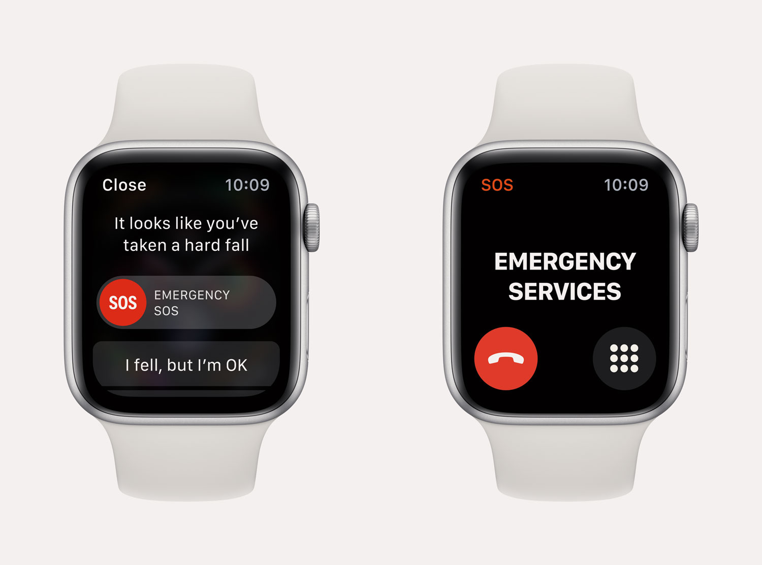
Fall detection
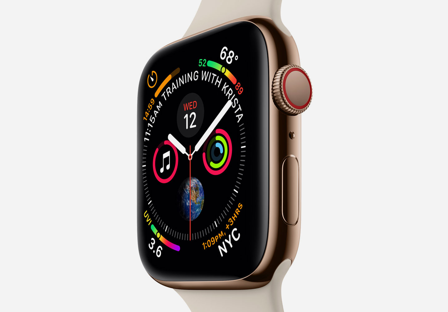
App icons, buttons and fonts are larger, more glanceable and tappable
INFORMATION
For more information, visit the Apple website
Wallpaper* Newsletter
Receive our daily digest of inspiration, escapism and design stories from around the world direct to your inbox.
Elly Parsons is the Digital Editor of Wallpaper*, where she oversees Wallpaper.com and its social platforms. She has been with the brand since 2015 in various roles, spending time as digital writer – specialising in art, technology and contemporary culture – and as deputy digital editor. She was shortlisted for a PPA Award in 2017, has written extensively for many publications, and has contributed to three books. She is a guest lecturer in digital journalism at Goldsmiths University, London, where she also holds a masters degree in creative writing. Now, her main areas of expertise include content strategy, audience engagement, and social media.
-
 Isolation to innovation: Inside Albania’s (figurative and literal) rise
Albania has undergone a remarkable transformation from global pariah to European darling, with tourists pouring in to enjoy its cheap sun. The country’s glow-up also includes a new look, as a who’s who of international architects mould it into a future-facing, ‘verticalising’ nation
By Anna Solomon
-
 The Lighthouse draws on Bauhaus principles to create a new-era workspace campus
The Lighthouse, a Los Angeles office space by Warkentin Associates, brings together Bauhaus, brutalism and contemporary workspace design trends
By Ellie Stathaki
-
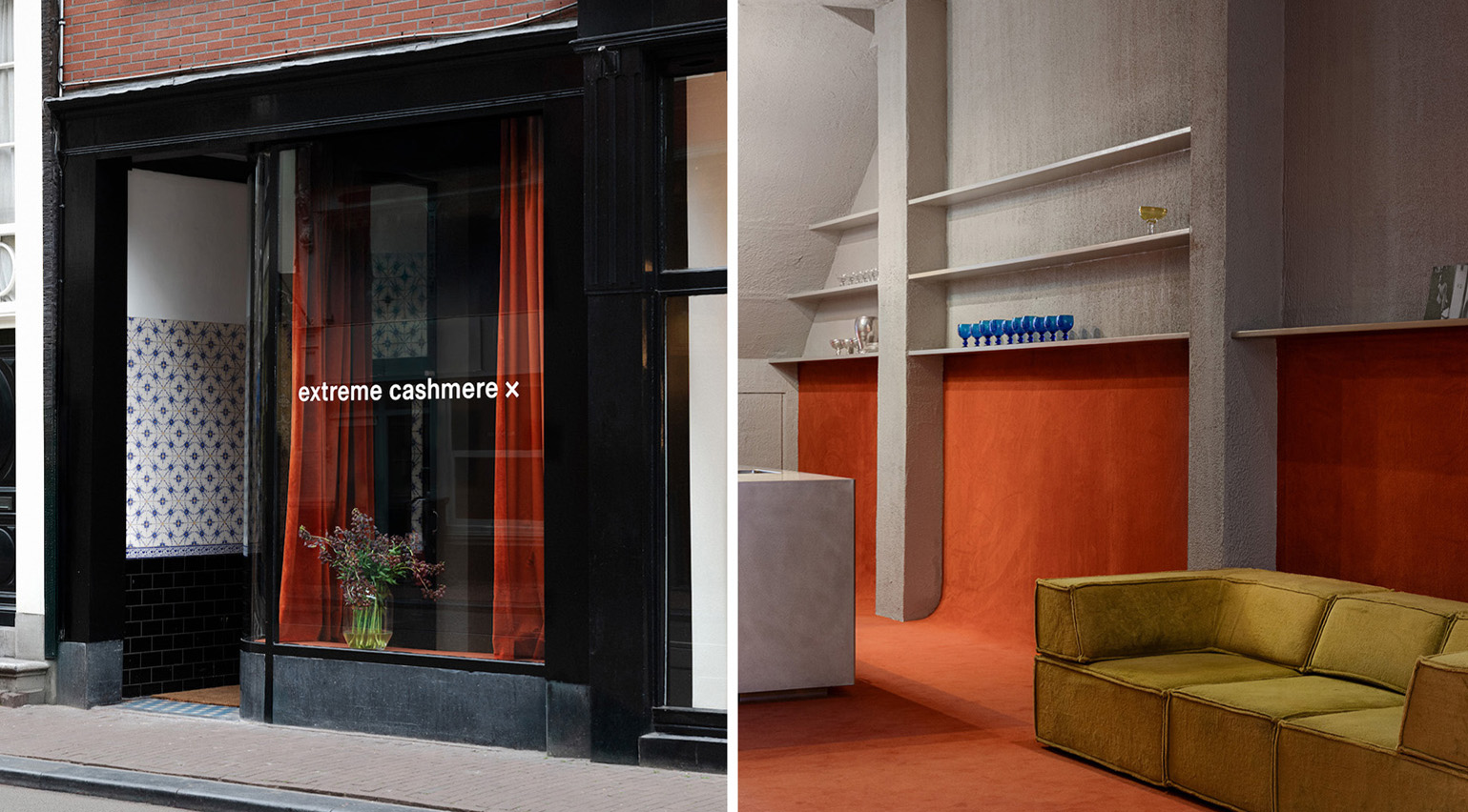 Extreme Cashmere reimagines retail with its new Amsterdam store: ‘You want to take your shoes off and stay’
Wallpaper* takes a tour of Extreme Cashmere’s new Amsterdam store, a space which reflects the label’s famed hospitality and unconventional approach to knitwear
By Jack Moss
-
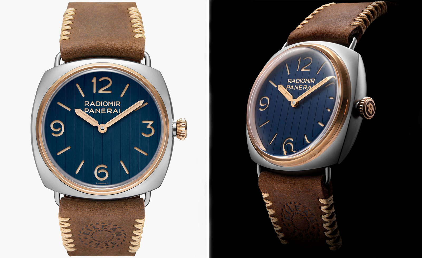 Panerai’s new watch is full of nautical nods
Panerai encapsulates the classic design of a yacht in the Radiomir Eilean Experience Edition watch, and plots a course into new, metaverse waters
By Hannah Silver
-
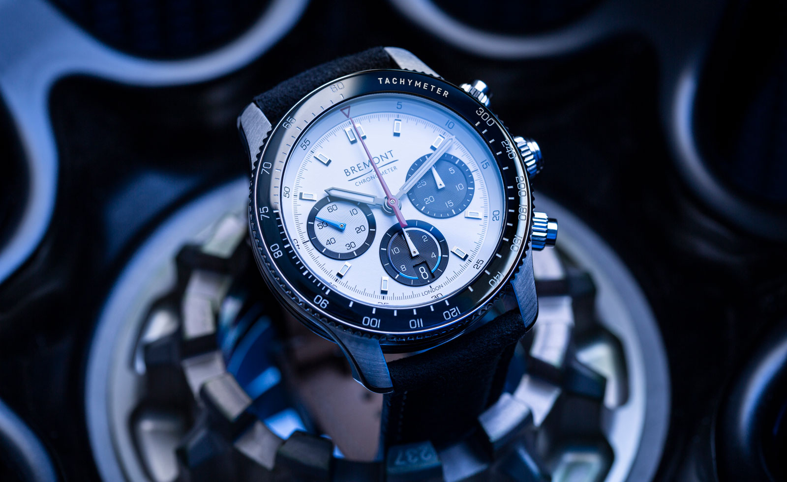 On your marks and get ready for Bremont and Williams Racing’s new watch
Bremont and Williams Racing have partnered on the Bremont WR-22 watch – and it's a sporting triumph
By Hannah Silver
-
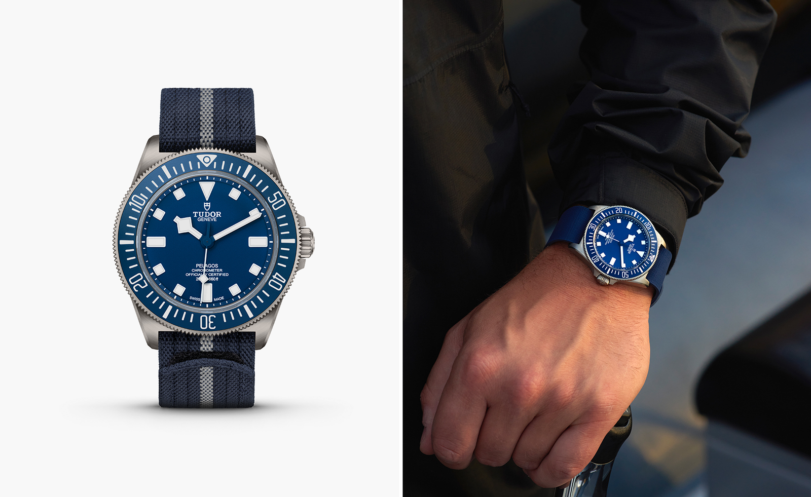 Tudor unveils new watch developed with French Navy
The new Tudor Pelagos FXD watch draws on the brand’s diving watch history and the needs of elite combat swimmers
By Hannah Silver
-
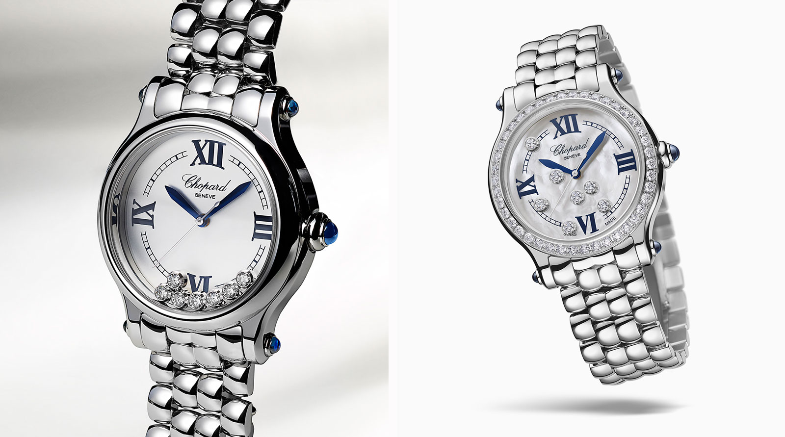 Chopard Happy Sport watch puts a playful spin on diamonds
Two new editions, titled Chopard Happy Sport The First, rethink the classic sports watch for women and tantalise with dancing diamonds
By Hannah Silver
-
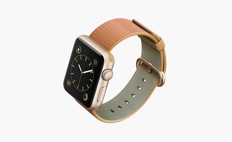 Tech tapestry: Apple unveils woven nylon straps for the Apple Watch
By Rosa Bertoli
-
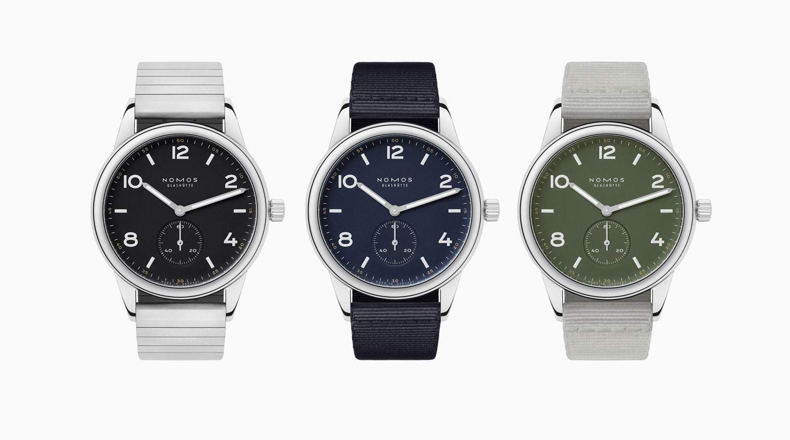 Nomos puts a sporty twist on a classic with the new Club watch
The limited edition Nomos Club pieces are available in three muted colours
By Hannah Silver
-
 Into the deep: Tudor’s new diving watch builds on a rich history
The Tudor Black Bay Fifty-Eight ‘Navy Blue’ is the latest sports watch from the Swiss watch brand
By Hannah Silver
-
 The best gear, gadgets and garments for your bicycle
By Hannah Silver