Harry’s new NYC office has an in-house design lab and cold brew on tap
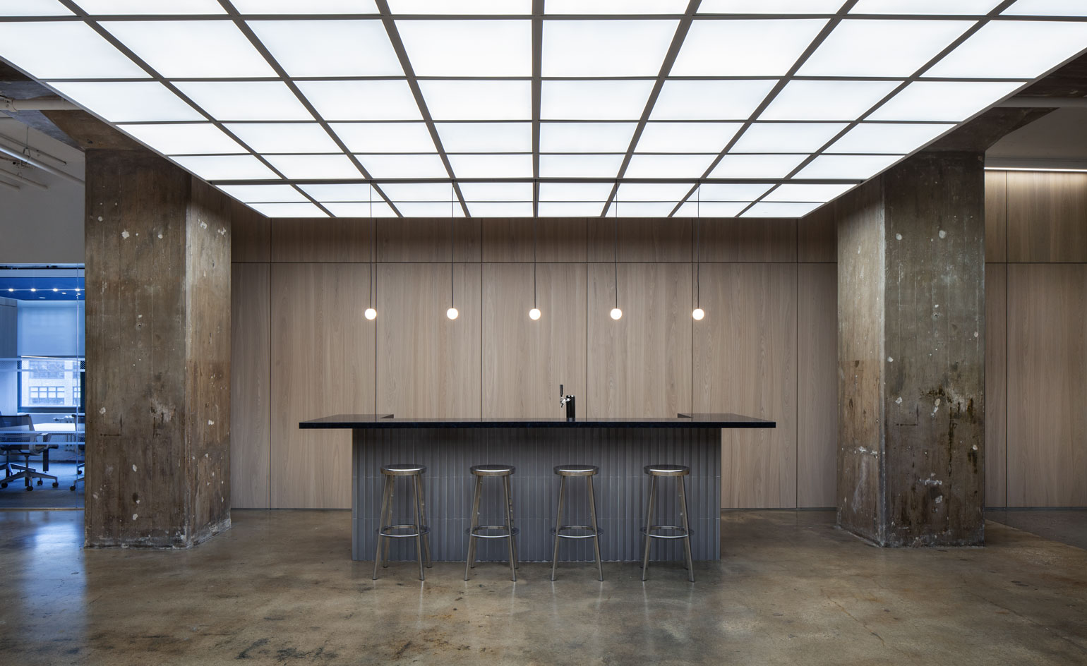
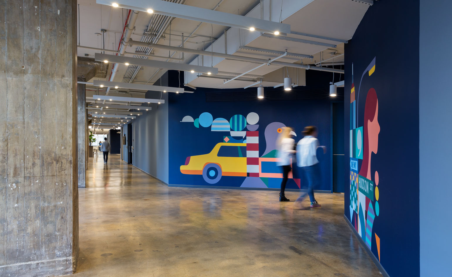
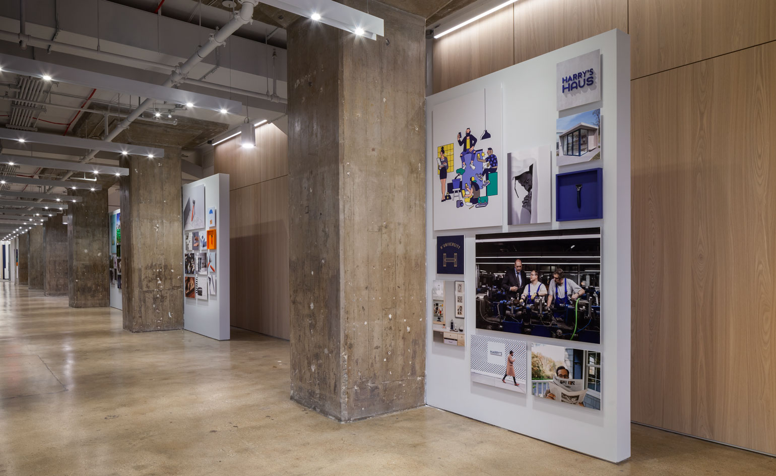
With its eye-catching branding and peppy approach, the New York-based men’s shaving and grooming brand Harry’s displays all the traits you would want to find in a forward thinking, direct-to-consumer label. The brand recently moved into a swanky new office space, located in the heart of Manhattan’s Soho district. Designed together with the architecture firm ARO, the workplace exhibits several new improvements that also allows it to fit in 200 more employees.
When it launched in 2013, Harry’s didn’t simply retool the conventions in men’s shaving, it bought its own razor blade factory in Germany in order to create its best product. Going against what it saw as generally overpriced and overdesigned men’s razors out there, Harry’s has now become known for high-quality, fairly priced blades that can be bought on a subscription basis. Its offering has since expanded into body care, facial care and accessories, thus catering to men’s most prominent grooming needs.
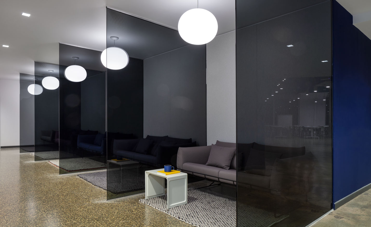
Harry’s office space in Soho.
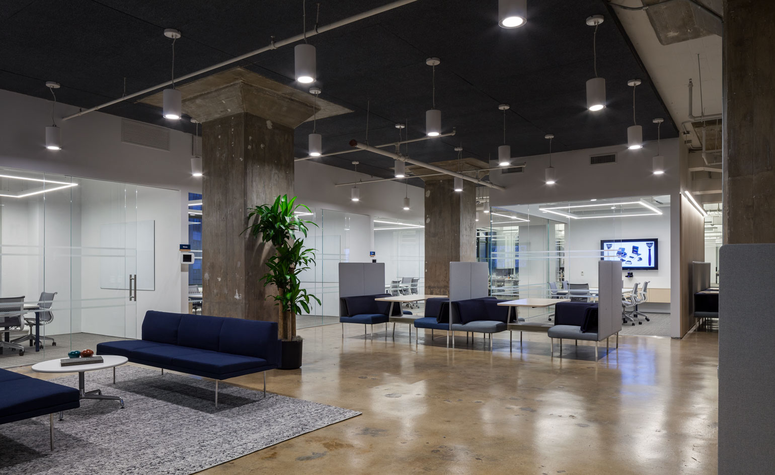
It should come as no surprise that the brand’s new offices have been intuitively designed to encourage productivity, collaboration and creativity. In addition to prioritising flexible workspaces, the headquarters also boasts a new in-house lab, where products can be developed and tested, be it formulations, retail fixtures or in an environmental chamber that mimics a shower setting. There’s also a new café that serves as a convivial spot, with cold brew coffee on tap, and murals and artwork by the illustrator Adrian Johnson.
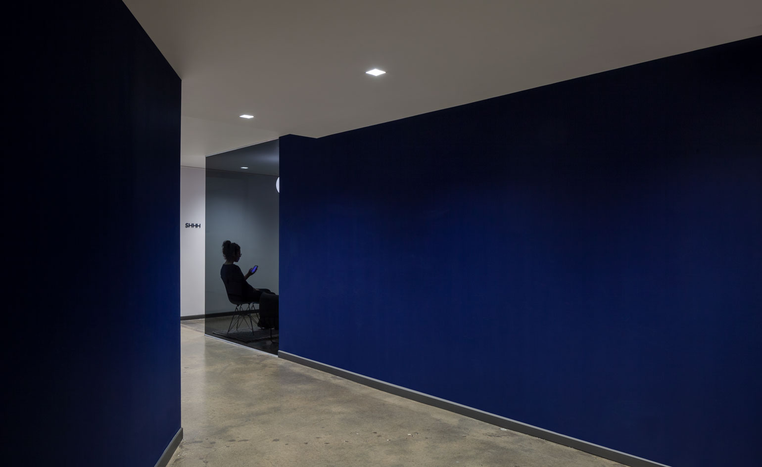
‘Harry's is growing and evolving, and needed a space that suited our lofty business goals and growing staff. This presented an opportunity to create unique and dynamic spaces that were missing in our old space, including in-house product labs, diversely sized conference rooms, private workspaces, and distinctive architectural elements,’ says the brand’s vice president of design, Scott Newlin. ‘We carried over the [previous office] space's colour palette – blues, olives, grays with pops of orange that are characteristic to us as a brand – and minimal, functional furniture. We've always valued flexible environments, a key feature in our last office, and made sure to bring that to the new space.’
In fact, the office’s airy, open spaces are inspired by hotel lobbies and restaurants. ‘Our team drew design inspiration from hospitality spaces because these are places where people go to get away and be inspired. We wanted a space for our employees that felt warm and inviting – the opposite of how many traditional offices function. Our office should be a place that our staff actively enjoys coming to everyday. Hospitality spaces are designed with this in mind, and we felt like we could create a headquarters that acted similarly,’ sums up Newlin.
INFORMATION
For more information, visit the Harry's website
Wallpaper* Newsletter
Receive our daily digest of inspiration, escapism and design stories from around the world direct to your inbox.
Pei-Ru Keh is a former US Editor at Wallpaper*. Born and raised in Singapore, she has been a New Yorker since 2013. Pei-Ru held various titles at Wallpaper* between 2007 and 2023. She reports on design, tech, art, architecture, fashion, beauty and lifestyle happenings in the United States, both in print and digitally. Pei-Ru took a key role in championing diversity and representation within Wallpaper's content pillars, actively seeking out stories that reflect a wide range of perspectives. She lives in Brooklyn with her husband and two children, and is currently learning how to drive.
-
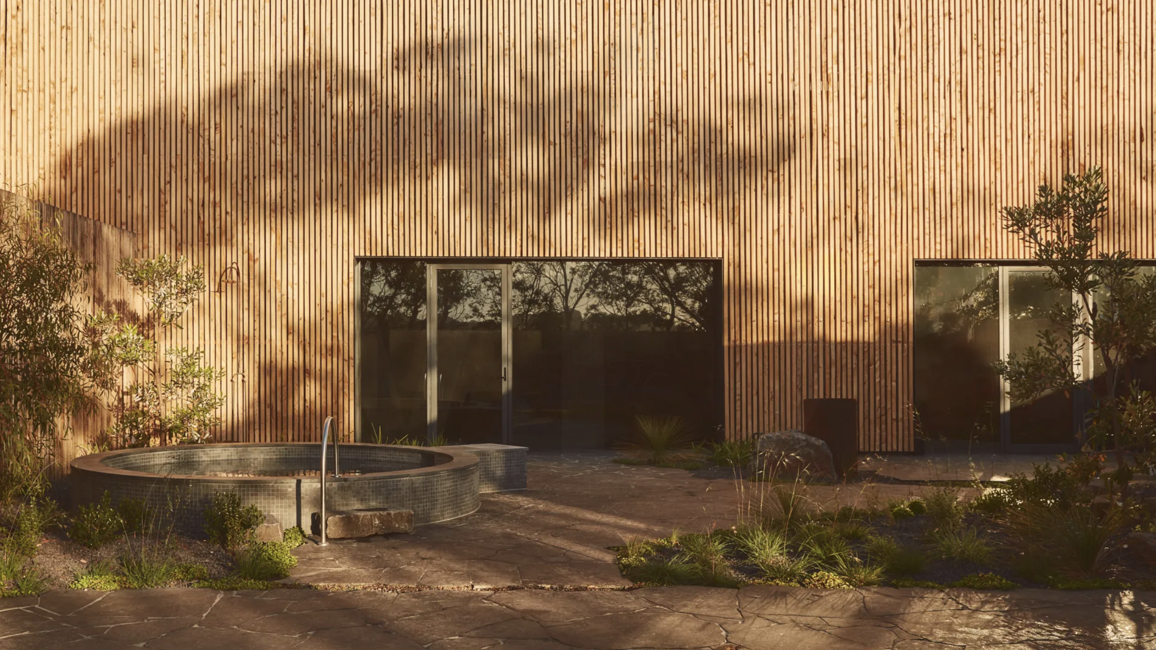 Australian bathhouse ‘About Time’ bridges softness and brutalism
‘About Time’, an Australian bathhouse designed by Goss Studio, balances brutalist architecture and the softness of natural patina in a Japanese-inspired wellness hub
By Ellie Stathaki
-
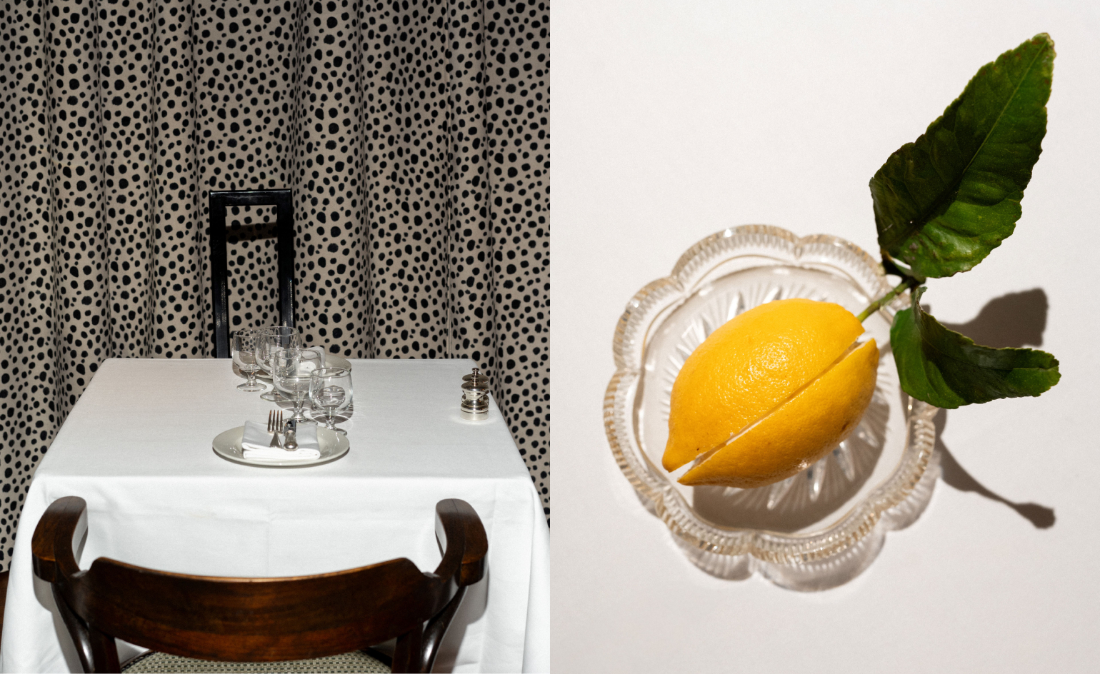 Marylebone restaurant Nina turns up the volume on Italian dining
At Nina, don’t expect a view of the Amalfi Coast. Do expect pasta, leopard print and industrial chic
By Sofia de la Cruz
-
 Tour the wonderful homes of ‘Casa Mexicana’, an ode to residential architecture in Mexico
‘Casa Mexicana’ is a new book celebrating the country’s residential architecture, highlighting its influence across the world
By Ellie Stathaki