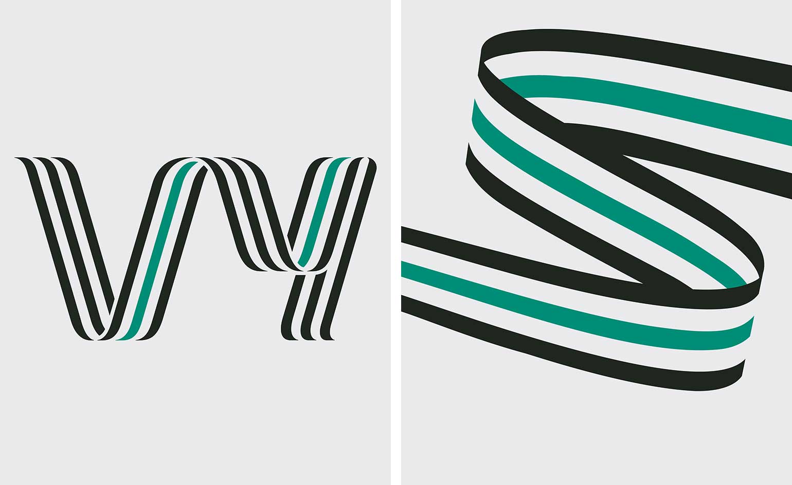
Snøhetta designs new visual identity for Norwegian State Railways

Norwegian design and architecture studio Snøhetta has designed the visual identity for one of the country's most important national transport services. The end-to-end redesign includes a dramatic name change – from Norwegian State Railways (NSB) to ‘Vy’ – reflecting recent, substantial changes to the company.
Founded in 1883, NSB was once responsible for the entire Norwegian railway operation. Today, it looks after travellers, but does not manage or own the rails, their systems, stations or trains. What's more, it oversees the nation's electric city cars (a popular mode of transport, particularly in Oslo); and its subsidiary, Nettbuss, is the largest bus operator in Norway and among the top bus operators in Sweden. The change to ‘Vy’ (which roughly translates from Norwegian as ‘perspective’ or ‘vision’) reflects the company's forward-looking, person-focussed outlook, as well as better referencing its role as an all-round transport provider, not just a rail system.

‘Vy is a real, Scandinavian word, which is distinctive in nature yet not widely used in modern language,' explains Kjetil Trædal Thorse, Snøhetta founder. ‘At the same time, it’s short and iconic, easy to remember and visually appealing'.
To embody to Vy ethos in logo form, Snøhetta drew from its Scandi roots. The palette – from pine greens to anthracite greys – is based on colours you might see when you move through cities, fjords and mountains of Norway and Sweden, from the vista of a train or bus window. The logo design comprises a single flowing line, connecting the ‘V’ and ‘Y’, rendered in a snaking, train track-like font. Adding to the sense of compositional movement, the bespoke type family (Vy Sans in three weights and Vy Display) was developed in collaboration with Göran Söderström, type designer at Letters from Sweden, with smooth, sloping edges, creating a sense of speed and efficiency.
This isn't the first time Snøhetta has tackled the visual identity of a well known national body. The Vy design follows the studio's hard-won redesign of Norwegian banknotes, first commissioned in 2014 and completed earlier this year, suggesting an ongoing emphasis on nationally important graphic design projects.
INFORMATION
For more information, visit the Snøhetta website
Wallpaper* Newsletter
Receive our daily digest of inspiration, escapism and design stories from around the world direct to your inbox.
Elly Parsons is the Digital Editor of Wallpaper*, where she oversees Wallpaper.com and its social platforms. She has been with the brand since 2015 in various roles, spending time as digital writer – specialising in art, technology and contemporary culture – and as deputy digital editor. She was shortlisted for a PPA Award in 2017, has written extensively for many publications, and has contributed to three books. She is a guest lecturer in digital journalism at Goldsmiths University, London, where she also holds a masters degree in creative writing. Now, her main areas of expertise include content strategy, audience engagement, and social media.
-
 A Xingfa cement factory’s reimagining breathes new life into an abandoned industrial site
We tour the Xingfa cement factory in China, where a redesign by landscape specialist SWA Group completely transforms an old industrial site into a lush park
By Daven Wu
-
 Put these emerging artists on your radar
This crop of six new talents is poised to shake up the art world. Get to know them now
By Tianna Williams
-
 Dining at Pyrá feels like a Mediterranean kiss on both cheeks
Designed by House of Dré, this Lonsdale Road addition dishes up an enticing fusion of Greek and Spanish cooking
By Sofia de la Cruz
-
 Studio Kippenberger goes graphic with Floridian ‘flat boat’
Supergraphics take a bite out of bay-boating
By Jonathan Bell
-
 Thinking small: tracing Volkswagen's rebellious streak
By Jonathan Bell