Fragrance bottles: a decade of design innovation
Contemporary fragrances have serious bottle. Over the last decade, olfactory genii have morphed into branding gurus, with fragrance houses employing a design-eye to complement their already experienced noses. From Comme des Garçons to Cire Trudon, what follows is your definitive glossary of the most beautifully designed, game-changing perfume bottles in recent heady memory...
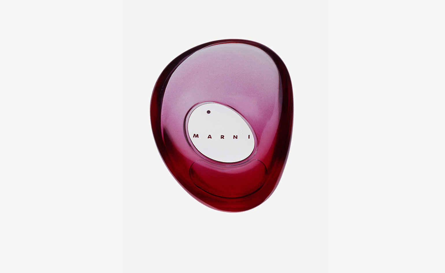
Bespoke bottle, by Sybarite, for Consuelo Castiglioni, undated
Sybarite – the studio behind Marni’s global retail identity between 2002 and 2015 – designed 250 stores worldwide, from Tokyo to Los Angeles. During that time, Sybarite founders Torquil McIntosh and Simon Mitchell also lent their design-eye to a fragrance bottle – but it never hit the shelves, as Marni founder Consuelo Castiglioni chose to keep it for her own private collection.
‘It nearly launched until Consuelo decided she loved it so much she didn’t want the public to have it,’ explains Mitchell. ‘We spent 18 months developing this beautiful bottle in various glass colours, which was refillable, and we worked with Consuela for the scent as well as the packaging, glass, everything.’
Never revealed, until now, the fragrance bottle is the ultimate in bespoke olfactory pursuit. ‘Its probably the smallest thing we’ve designed – and the most challenging,’ explains Macintosh. ‘Instead of squirting the bottle with your index finger, we decided it should be shaped more like a pebble. It’s more tactile and you have a thumb action instead, but to develop that was was an absolute mission.’
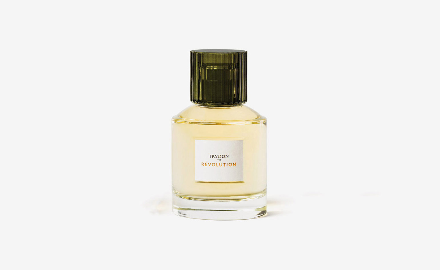
Pauline Deltour, for Cire Trudon, 2017
For its first foray into perfume, creative director of candle celebrant Cire Trudon, Julien Pruvost, wanted a fragrance bottle that ‘could have been here 400 years, but was actually made yesterday’. To tackle the brief, French industrial designer Pauline Deltour made a ‘giant mood board of historical and contemporary coloured glass references’, and presented prototypes to study groups. ‘We talked a lot about tiny details – something that doesn’t really happen in the glass bottle industry,’ she explains. ‘We thought of everything down to the kind of reflection the sticker would produce on the bottle’s reverse, and the texture of the screw-top.’
Rendered in the maison’s signature pine-green hue, the cap is finished in textural rippled-glass. The bottle underneath is daringly simple, resembling the silhouette of Cire Trudon’s classic scented candles. ‘Though it might not seem like it, this was a more complex design process than my two previous Cire Trudon projects,’ Deltour offers. ‘For me, creating a bottle is like designing a watch. Each moving part is essential to the overall feel. Everything from the weight [and] volume, to the transparency of a glass bottle should affect how you experience the fragrance inside.’
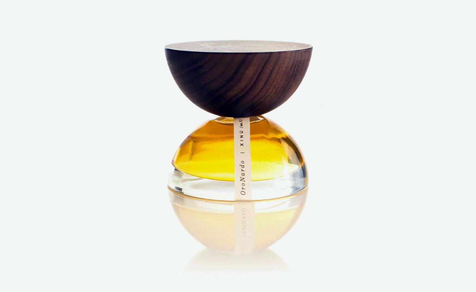
Xinu, by Esrawe Studio and Cadena & Asociados, 2017
Xinú (nose in Otomi) is the Mexican botanical niche line, which debuted in 2017 with three fragrances: Aguamadera, Copála and OroNardo. For each, the bottles were designed for easy repurposing. Two contrasting halves – one in glass, the other in wood – can be used seperately or in conjunction, as vases and incense holders. Developed by Mexico City-based Esrawe Studio and Cadena & Asociados, the receptacle forms two hemispheres of scent. A key intention of the design was for the containers to be reused once the perfume runs out. Each half can hold thin items, like plant stems or incense sticks, in their narrow openings.
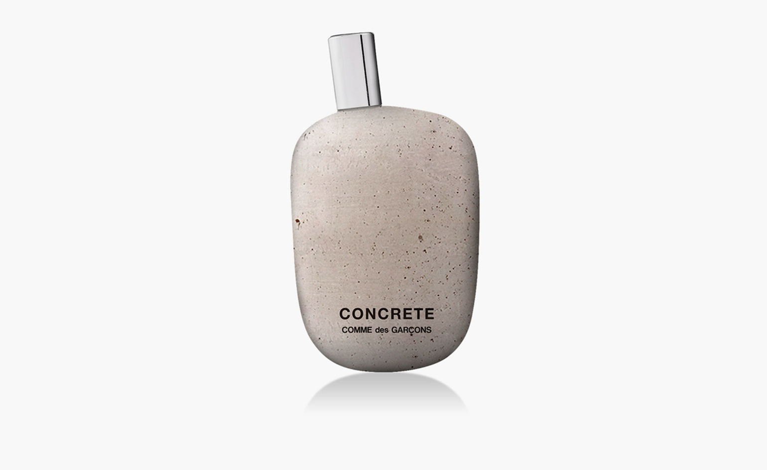
‘Concrete’, by Comme des Garçons, 2016
Rich, woody and a little unsettling, this enticing perfume is bottled in a concrete version of Comme des Garçons Parfums’ signature flacon. Each glass bottle is dipped in concrete by hand and exudes a porous, natural quality – quite the contrary of what the material is typically known for. The collision of all the juxtapositions; between the bottle and its material, the concept and the actual fragrance, represents Comme des Garçons’ spirit to a tee.
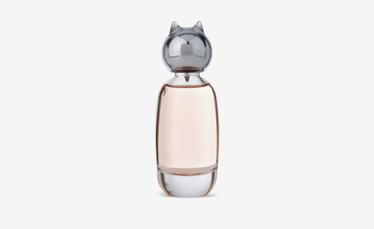
‘Grace by Grace Coddington’, for Comme des Garçons, 2016
Like its clothing, a Comme des Garçons perfume bears a distinctive signature – quirky, irreverent and surprising. Since launching its first fragrance in 1993, the avant-garde label has created 75 different scents. In April 2016, Comme des Garçons Parfums created this olfactory personification of the legendary fashion stylist, Grace Coddington. A heady bouquet of Moroccan rose, freesia and peach blossom, cut with hints of mint, basil and bergamot, ‘Grace
by Grace Coddington’ ends with notes of cashmere wood, white musk and amber.
Enclosed in a playful feline flacon (Coddington’s pet of choice), it is designed by Coddington, CEO Adrian Joffe and Fabien Baron. While the juice was inspired by Coddington’s love of English roses, the bottle reflects her love of cats. The stylist lives with two in New York – a ten-year old called Pumpkin and a one-year old named Blanket.
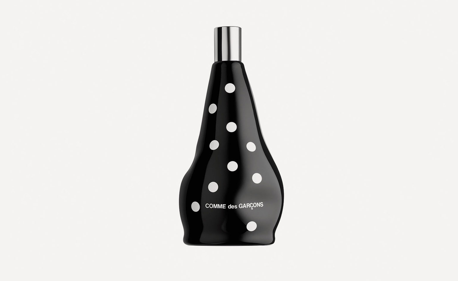
‘Dot’, by Comme des Garçons, 2016
‘Dot’ is inspired by one of Rei Kawakubo’s favourite scents: Japanese osmanthus, a small evergreen tree whose small white flowers have a wonderful peach-like aroma. It was created by Lucas Sieuzac – erstwhile senior perfumer at the German flavour and fragrance company Symrise – who used osmanthus absolute to recreate the smell of the flowers, with green notes and ambery woods to reference the leaves and bark of the tree, and touches of bitter orange, pepper and incense-like olibanum as well. The intentionally shelf-friendly black glass bottle neither stands nor sits, decorated with Kawakubo’s signature polka dots.
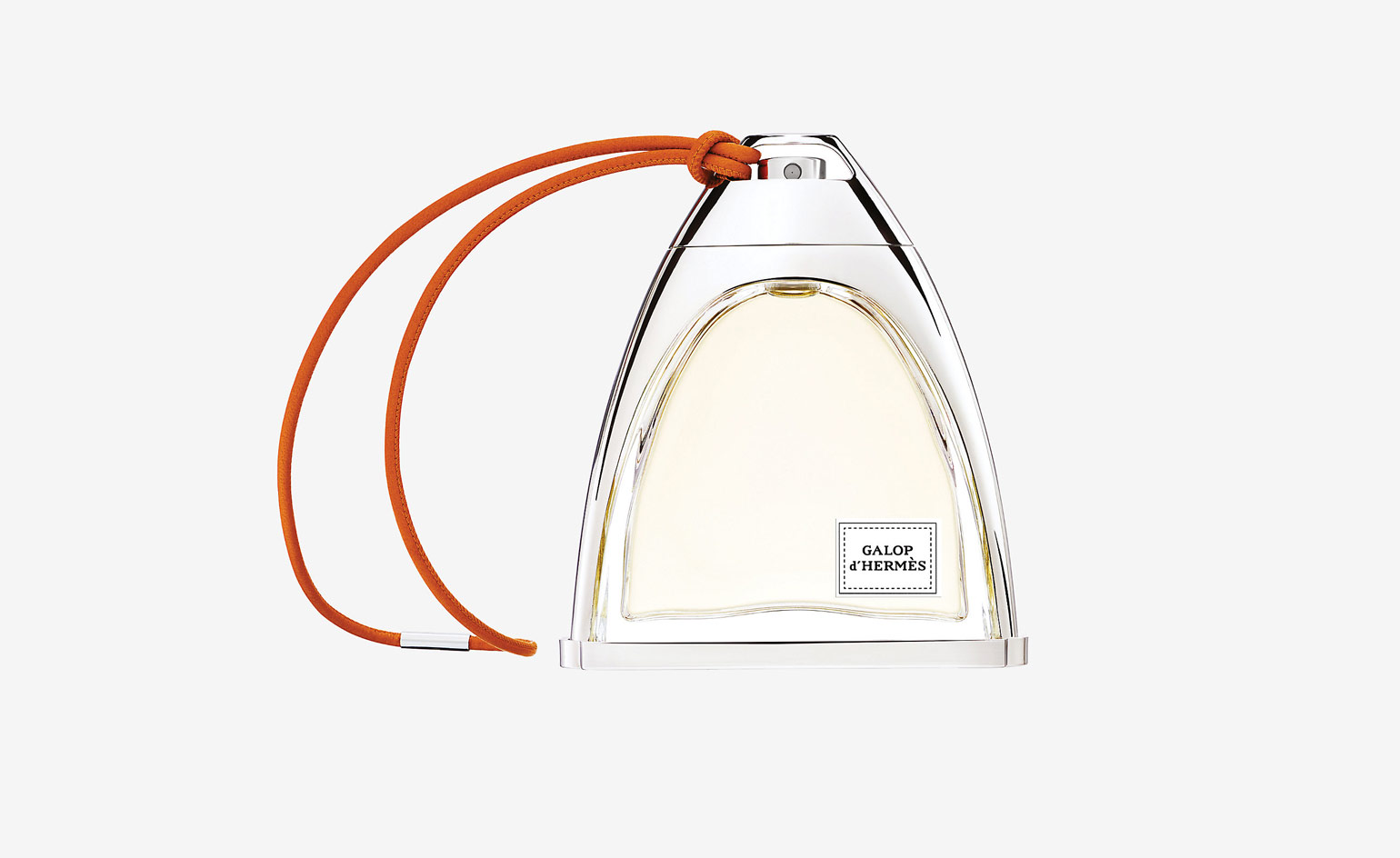
Galop d’Hermès Parfum, 2016
‘Galop d’Hermès’ was the second scent that perfumer Christine Nagel created since she took over as in-house Hermès ‘nose’ from the much-lauded Jean-Claude Ellena (her first was ‘Eau de Rhubarbe Ecarlate’, launched in February 2016), and it’s an attractive fragrance based on the unusual combination of leather, Damask rose and an ingredient not much used in perfumery – quince.
Hermès really pulled the stops out for the bottle: based on the shape of a rider’s stirrup, it’s inspired by archival bottles that were given out at the opening of the first Hermès store in New York in 1930. A heavy metal armature frames a glass container, with a chunky clip-on cap through which you can thread a braided Hermès-orange leather cord (in a nice touch, the cord comes in its own separate envelope). The bottle, the off-centre label (again, based on the 1930 design) and the cheerily coloured box are all carefully considered, and make a pleasing contrast to the often trashy packaging that all too many big brands are guilty of. A galloping success.
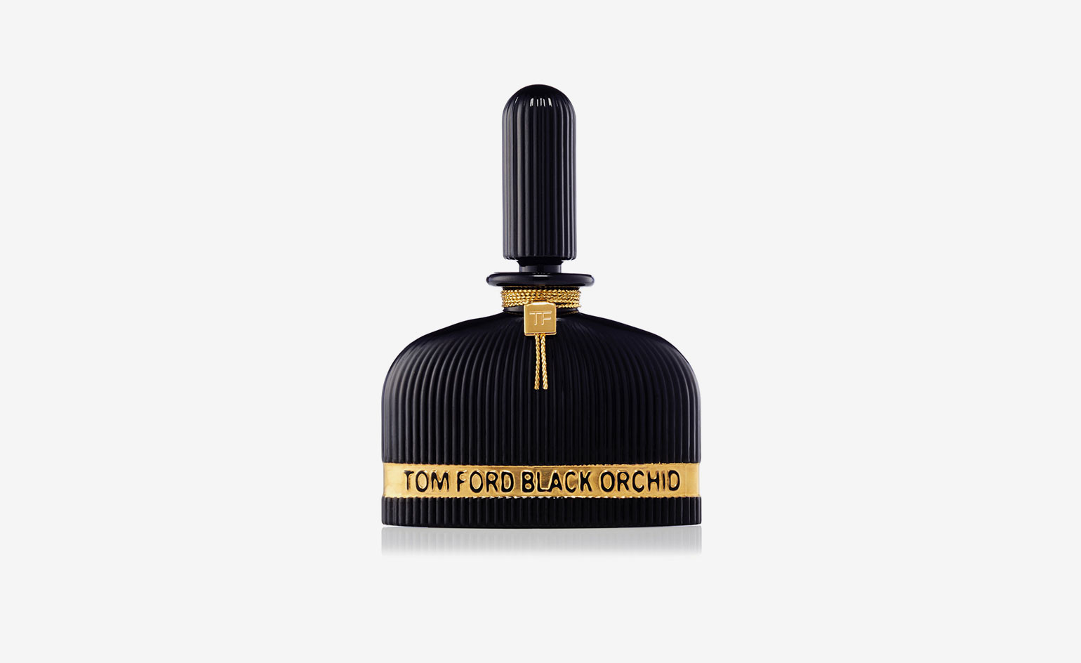
Black Orchid, by Tom Ford, Lalique Edition, 2016
Tom Ford’s iconic Black Orchid Perfume becomes one shade darker and more dramatic in the Lalique Edition. The highest concentration of the fragrance, captured in a finely fluted collector’s bottle by world-famous crystal purveyors, Lalique, this stunning interpretation of the sensuous scent is a rare treat.
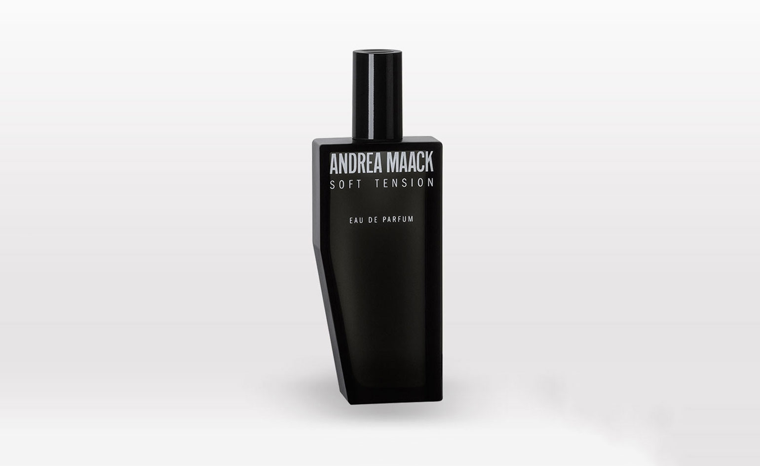
‘Soft Tension’ and ‘Dual’, by Andrea Maack, 2016
These two, punchy fragrances from Icelandic artist and eponymous fragrance house Andrea Maack are the product of her collaboration with IFF perfumer Alienor Massenet. The duo took inspiration from Maack’s upbringing and the barren Nordic landscape.
The vessels, designed by Maddalena Casadei for Studio Irvine, are comfortable to hold in the hand, dark purple in colour and sleek in design. Housed in boxes created by graphic designer and art director Tommaso Garne, who took Maack’s original paintings and translated them into the black and white exterior design, the fragrances are meant to be unisex. ‘I don’t like the idea that women and men should smell a certain way,’ says Maack. ‘You just never know what people will respond to when it comes to scent.’
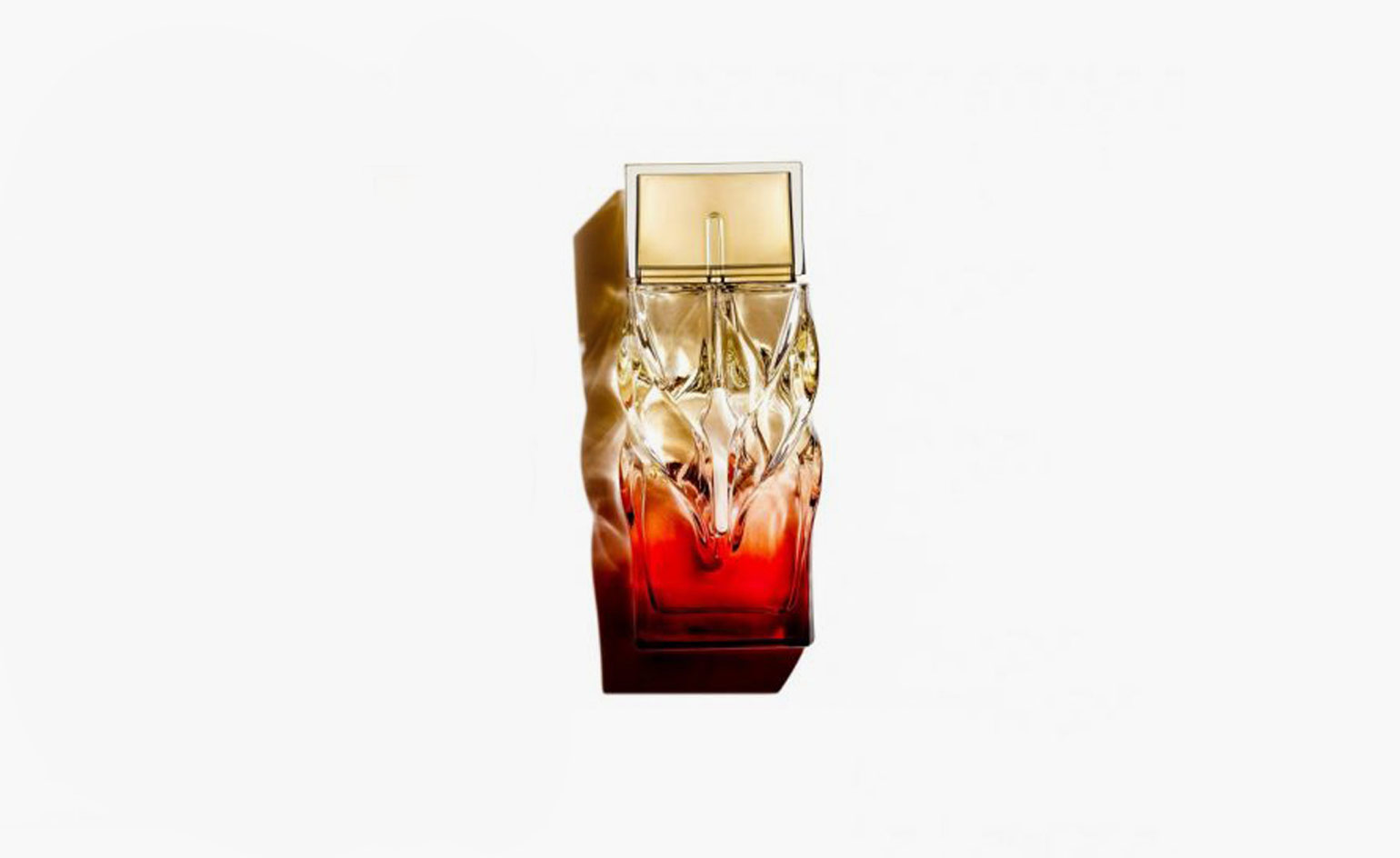
Thomas Heatherwick, for Louboutin, 2016
When it came to designing the packaging for his debut fragrance, Christian Louboutin admits that Thomas Heatherwick was not at the top of his list. ‘I have to be very honest, the first person I thought of was Oscar Niemeyer,’ Louboutin confessed at the time. ‘I had always admired his work but at that point he was 102 years old. So the second person was Thomas. His work fascinates me.’
The brief was simple: to create a striking and unique set of architectural vessels for the three fragrances that they encase. ‘I could never understand why beauty packaging was so ugly,’ lamented Louboutin. ‘For me, every corner of the object has to be taken in to consideration.’
‘Christian described the architectural way that he’d been thinking about nail varnish and the lipstick packaging and how he thought of all of these bottles like a city,’ recalled Heatherwick of the pair’s first meeting. ‘During our first discussions we were like children; it was like a game of table tennis in the way we were throwing ideas around. Christian was very open and generous to me and allowed me to play with the idea of fragrance and how it could be translated into an object.’
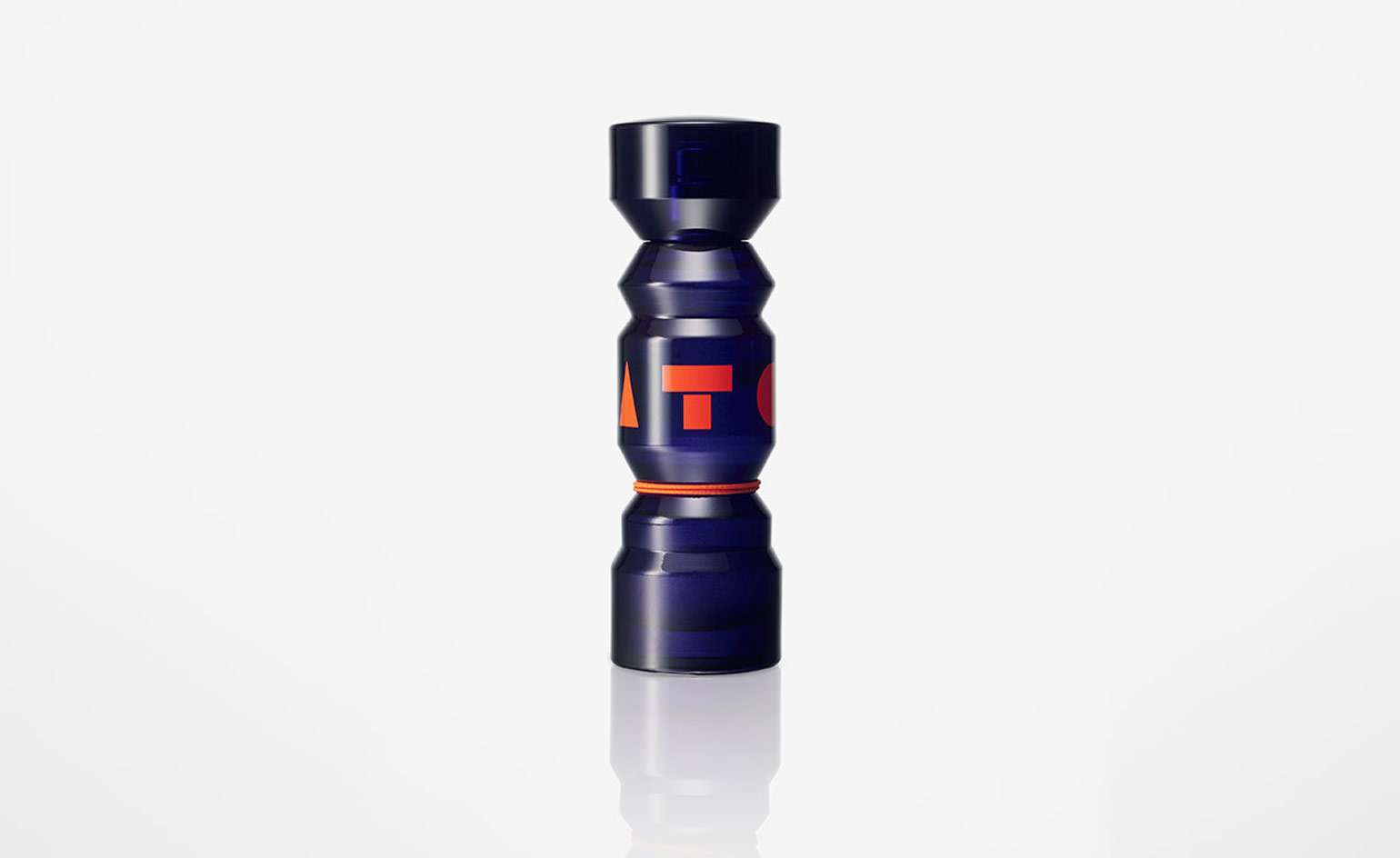
‘Totem’, by Nendo, for Kenzo, 2015
They say you should never judge a book by its cover – nor indeed a fragrance by its bottle – but sometimes the temptation is just too great. Having an equally beguiling bottle and scent helps avoid any bias. To that end, the Oki Sato-led Japanese studio Nendo has teamed up with Paris fashion house Kenzo to create the look – and logo – of the esteemed brand’s new unisex fragrance. A dark purple glass bottle in the shape of a tiny totem holds Kenzo’s three new scents, created for and inspired by a generation of globalisation. ‘Where previous generations have felt differences of nationality, language, and religion more acutely,’ explains Nendo, ‘the younger generation of today have comparatively fewer cultural divides to cross, enjoying a greater shared sense of identity.’
Described as ‘a new tribe’, the three unique colognes are modeled after the ancient totem poles of Native Americans; a simple structure which stands for an identity and has the power to gather people. Like the wooden monuments they were inspired by, the bottle is made of various segments of different shapes and sizes, stacked to create a solid and monolithic design.
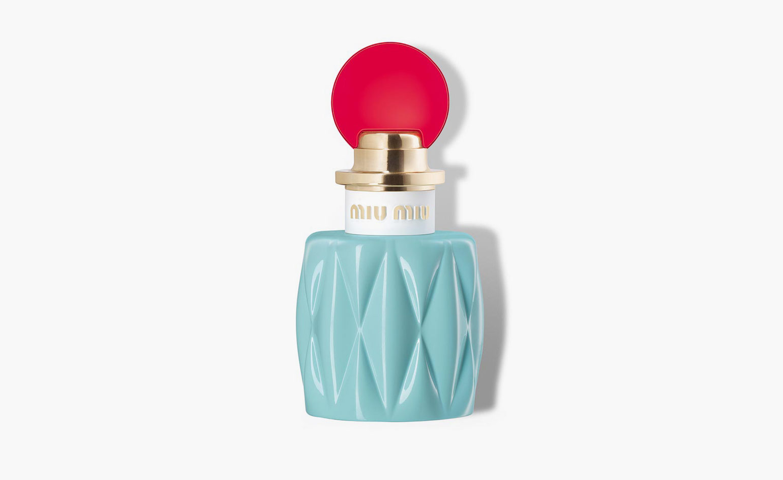
Miu Miu Eau de Parfum, 2015
Daniela Roche Andrier – the nose behind the floral scent – and Miuccia Prada created the latter’s first fragrance in 2015, (which has been subsequently followed by two iterations, L’Eau Bleue and L’Eau Rosee). The first evoked Miu Miu’s youthful feminine spirit. Andrier married floral notes of Lily of the Valley accord, jasmine, rose and green notes with akigalawood fractioned from patchouli oil to create a complex, alluring scent that opens with fresh, peppery hints, before slowly developing into something more sophisticated with the warmth of agarwood.
The rippling texture of the perfume’s bottle – strikingly rendered in a light azure and ruby red – subtly, but solidly, channels Miu Miu’s matelassé leather handbags. Accented by a translucent, bright red disk stopper, the flacon perfectly captures the maison’s exuberant image.
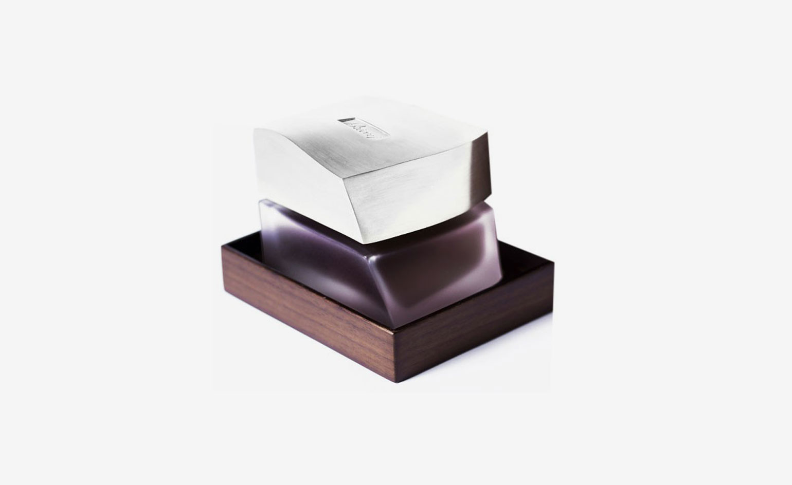
Brioni 70th Anniversary Extrait Intense, by Frederikson Stallard, 2015
In 2015, Italian menswear couture house Brioni celebrated its 70th anniversary with the launch of the Extrait Intense Cologne, a variation of its 2014 signature men’s fragrance. Released in a limited edition of 70, each bottle is individually numbered. The bottle is presented in a wooden display box, and takes a sophisticated, geometric form, handcrafted from frosted glass and solid silver by Fredrikson Stallard. The scent features a variety of accents ranging from French lavender and golden saffron to sandalwood and Tonka bean, and is stored in a walnut housing.
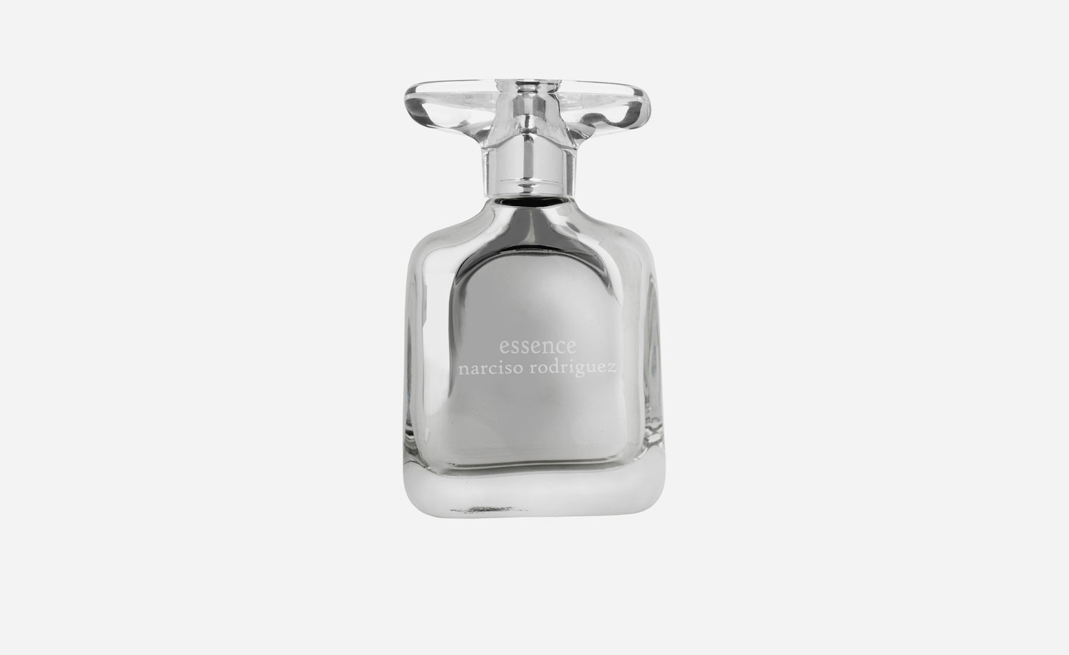
Essence, by Ross Lovegrove for Rodriguez, 2009
Essence, which launched in summer 2009, is a three artist performance – with Rodriguez wielding the baton. BPI, the fragrance manufactuers drove the business side, the respected master perfumer Alberto Morillas was appointed the nose, and Ross Lovegrove was commissioned to design the bottle.
‘It’s rare that two designers come together in this way,’ Lovegrove said at the launch of Essence in New York. ‘Usually the bottle is anonymous.’ He had never designed a perfume bottle before, and – busy as he was designing airline interiors, office systems, street lighting, watches, taps, and suitcases – might not have entertained the idea had Rodriguez not shown up in person at his studio in London. He explains: ‘As a designer I don’t approach anybody, I do what I do and hope that is what attracts people. I knew Narciso Rodriguez and his work and I find him creatively consistent and very interesting.’
Lovegrove mirrored the surface of the liquid scent from the inside, creating a finish he describes as the most neutral of all – it reflects its context. ‘This bottle has more than the value of itself – it has intellectual value. You can’t see the declining level of the perfume. It is the same at beginning as it is at the end. And at the end it can be still considered as an art piece.’
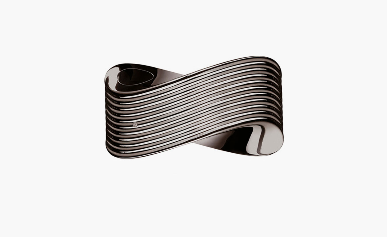
Ron Arad for Kenzo, 2009
Ron Arad’s mini work of art was launched the Museum of Modern Art as part of the retrospective exhibition for Ron Arad. Arad was commissioned by Kenzo to create a vehicle for fragrance that breaks with traditional industry codes and evokes sensuality when in contact with the skin. The result – a hand-polished bottle made of Zamac (metal alloy) with a completely internalised spray mechanism, released in a limited edition of 1000.
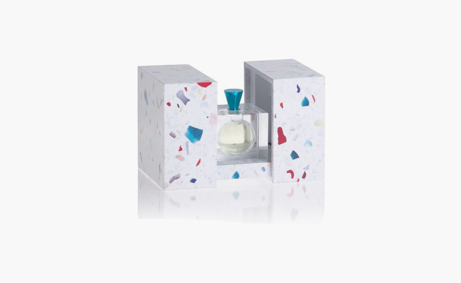
Shiro Kuramata and Issey Miyake, 2008
Apart from being a collaboration between two of Japan’s greatest creative minds, this limited edition, posthumous perfume bottle creation was, until 2008, technically too difficult to actually make. Miyake recalls, ‘Kuramata suggested an oversized drop of water and a condensed version of the earth with visions of flowers and dreams, light and wind, men and women dancing a rondo inside.’
Back in 1990, industrial techniques didn’t allow for a clean circle to be cut into a cube, let alone for a party to take place inside one. Almost 20 years on, though sadly after Kuramata’s death in 1991, 2,500 bottles were made. Thanks to the development of laser technology, a perfect sphere was cut into a cube of glass and polished, achieving the ‘absolute purity’ Kuramata intended with his original drawings.
A nod to the designer’s Memphis involvement comes in the turquoise blue cap and the box, which features the designer’s trademark ‘Star Piece Terrazzo’ pattern. The limited release of a design that could have been consigned to the history books without ever having been made is reason enough to raise its value. But given the technical precision of the design, Kuramata’s ‘ahead-of-his-time’ thinking and the timeless appeal of the object itself, we would recommend you keep the bottle long after the perfume’s finished.
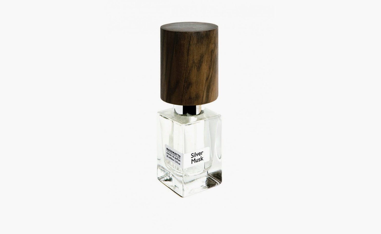
Nasomatto, 2007 - 2014
Italian for ‘crazy nose’, Nasomatto was a relatively short-lived, but punchy, experiment. Founded by Alessandro Gualtieri – erstwhile perfumer for Versace, Valentino, Helmut Lang and Fendi, (and a beauty cabinet of others) – casual cologne wearers need not apply. This is zesty men’s fragrance that knows what it is, and who it’s for.
The packaging and bottle reflects this no nonsense nose. Nasomatto maintained its signature shape throughout its reign as rebel olofactory master, categorised by its clear, angular bottle, and weighty top – a chunk of wood, variously sheened, charred and sculpted (depending on the iteration).
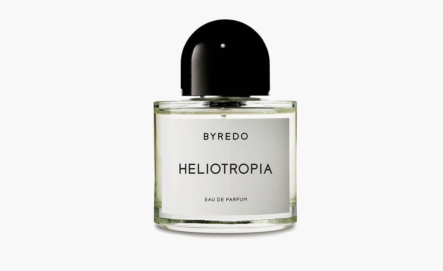
Byredo, 2006 - 2018
The classic Byredo bottle, with its signature domed top and squat glass bottle, was first developed in 2006. Everyone’s favourite Swedish fragrance brand, the packaging is cool, clean and minimalist – while the perfumes inside are always discreet and very wearable, with deceptively simple smells that take regular Byredo perfumer Jérôme Epinette ages to perfect.
Wallpaper* Newsletter
Receive our daily digest of inspiration, escapism and design stories from around the world direct to your inbox.
Mary Cleary is a writer based in London and New York. Previously beauty & grooming editor at Wallpaper*, she is now a contributing editor, alongside writing for various publications on all aspects of culture.
-
 Meet Lisbeth Sachs, the lesser known Swiss modernist architect
Pioneering Lisbeth Sachs is the Swiss architect behind the inspiration for creative collective Annexe’s reimagining of the Swiss pavilion for the Venice Architecture Biennale 2025
By Adam Štěch
-
 A stripped-back elegance defines these timeless watch designs
Watches from Cartier, Van Cleef & Arpels, Rolex and more speak to universal design codes
By Hannah Silver
-
 Postcard from Brussels: a maverick design scene has taken root in the Belgian capital
Brussels has emerged as one of the best places for creatives to live, operate and even sell. Wallpaper* paid a visit during the annual Collectible fair to see how it's coming into its own
By Adrian Madlener