The making of Wallpaper’s Handmade Party Kit by Isolation Unit
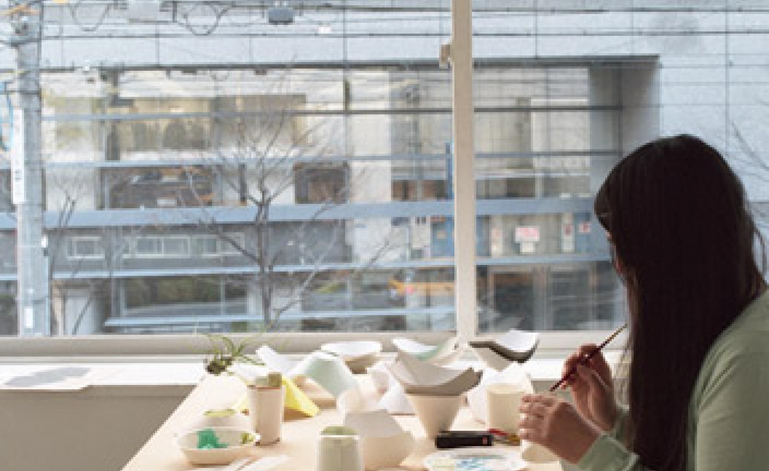
Last week it was a birthday or three; the week before a departure; the week before that another award on the magazine’s mantelpiece. We’re easily distracted here at Wallpaper HQ when there’s something to celebrate or commiserate, and the distraction often comes cake-shaped or fizzing. And until now has been marked by uncharacteristic make-do when it comes to presentation and the necessary accessories. It was the woeful lack of the receptacles required to eat and drink communally in the W* offices that led to the dream of a perfectly style-stacked collection of disposable tableware.
Though we didn’t mean necessarily to dictate the materials that would be used, our focus drifted to Japan, where paper technology is advanced and innovative design is in abundance, and the challenge landed on the youthful design agency, Isolation Unit, headed up by Teruhiro Yanagihara. Founded in Osaka in 2002, over the years Isolation Unit has been involved in interior and product design projects and art direction for national and international clients, such as Less is More, Karimoku, Mater and Pallucco. Meanwhile Yanagihara’s designs have been the subject of exhibitions in Japan and Europe and published in numerous books. Inventive and multi-disciplined, the agency was our ideal choice.
Yanagihara enthusiastically embraced the challenge and with co-designers David Glaettli and Shino Nakai dreamt up two different systems for our project’s cups plates and bowls. The first is a pre-assembled, ready-to-use kit which is stylish and meaningful at the same time.
With our commission falling in early March, around the time the fateful tsunami struck Japan, sustainable, socially responsible design was foremost in their minds. ’Our concept was to make a product that can be produced by hand by literally anyone and still have a perfect look,’ says Glaettli, ’We wanted a product that could be commercialised by anyone with the will to offer opportunity to people with few resources. The product costs a bit more, but it is not the design or a brand that you pay for, but the manual labour. This way, the act of throwing the product away after use becomes conscient, because you know that you are throwing something away that a person made by his own hand.’
Each item can be made from an A4 sheet of foodgrade coated paper, a paper cutter, starch glue - and latex. The natural latex is used to make it more stable and waterproof but also brings a splash of colour. ’It is a technique we spied in a traditional ceramics factory,’ explains Glaetti. ’They dip the pieces in latex where the material should stay white before putting it in a dye bath. Afterwards the latex is simply peeled off. However, we liked the look of the latex on the precious ceramics.’ For the paper the team turned to Tokyo-based Takeo, a paper producer founded in 1899, who offer 9,400 variations of paper, and put the environment central to new developments.
The second version of the party kit Yanighara devised is a do-it-yourself variation. The sheets come pre-cut and printed with a dry starch or rubber adhesive at the joints. To assemble them, you separate the plate from the sheet, dampen the marked areas, fold and join it together. In form, however, the two versions are similar, and respond to the familiar problem encountered when attempting to eat and drink while standing - namely the juggling of three or four items in just two hands. The plates are designed to stack onto the cup, and the cutlery on the plate, so you have a free hand to eat, greet, and serve your food. The formal basis of all the items is a stretched circle that is familiar, but unexpected at the same time and reveals some ergonomic advantages, in the hand and the mouth.
Plates and dishes alone were not going to cut it, however, when our office-snacking becomes more meal-shaped. A utensil was also on our list, and in this the designers also excelled, imagining the ’waribashi spoon’. ’The starting point on one hand was the wish to have only a single functional tool to handle when eating standing up, and on the other hand the dissatisfaction with hybrid tools like the fork/spoon that don’t really work either way. We also realised that everything that can be eaten with a fork, can also be eaten with chopsticks,’ says Glaettli.
Wallpaper* Newsletter
Receive our daily digest of inspiration, escapism and design stories from around the world direct to your inbox.
Waribashi are the chopsticks found in every japanese restaurant - the ones that come in one piece and are broken in half for use. The Waribashi spoon is an elongated spoon made from thin ’shitatake’ bamboo (white bamboo), grown in Kyoto. Ours was produced by 100 year old company, Takehei Inc. It can be used as a spoon (the slight curvature derives from the natural tubular shape of bamboo) or split along the central groove to be turned into chopsticks.
Office-celebrations are all set to become infinitely more polished occasions. It may have been a very consumer-minded us that called for cake plates in the first place, but thankfully we have found that our self-serving urges when combined with the Handmade* project are capable of producing thoroughly thoughtful design. It’s just a shame that these unique and fine-formed designs should ultimately be destined for the bin.
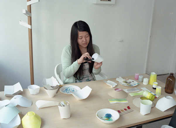
Each item can be made from an A4 sheet of foodgrade coated paper, a paper cutter, starch glue - and latex. Here Yanagihara works on some prototypes
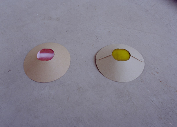
The natural latex is used to make it more stable and waterproof but also brings a splash of colour
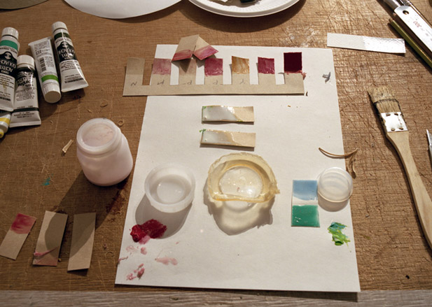
’It is a technique we spied in a traditional ceramics factory,’ explains Isolation Unit. ’They dip the pieces in latex where the material should stay white before putting it in a dye bath...’
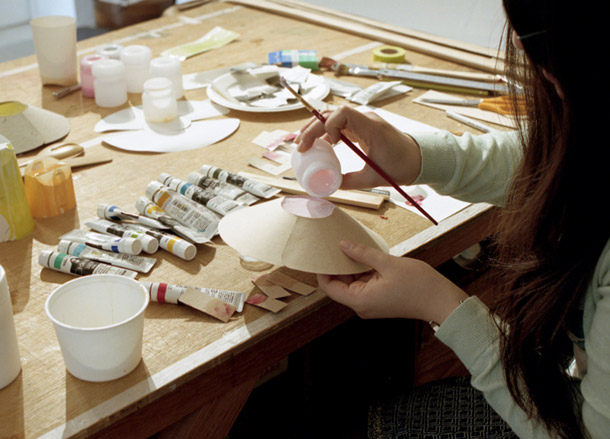
... ’Afterwards the latex is simply peeled off,’ they add, ’however, we liked the look of the latex on the precious ceramics’
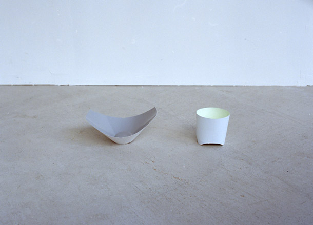
The DIY plate and cup
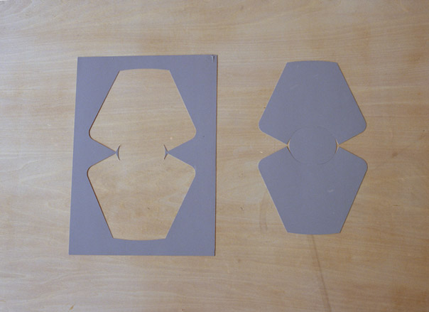
The plate features paper from Tokyo-based Takeo, a producer founded in 1899 that offers 9,400 variations of paper and puts the environment central to new developments
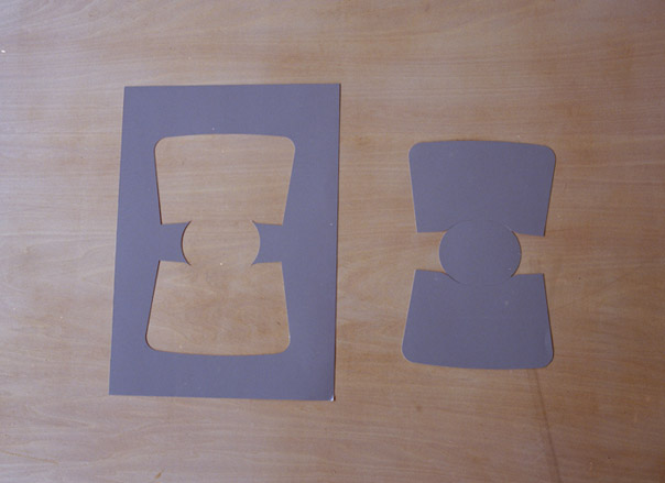
The template for the cup
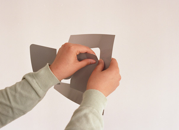
The sheets come pre-cut and printed with a dry starch or rubber adhesive at the joints. To assemble them, you separate the plate from the sheet, dampen the marked areas, fold and join it together
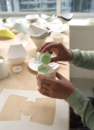
Pouring the latex onto the cup to ensure it is waterproof
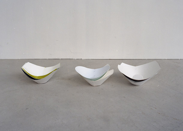
The formal basis of all the items is a stretched circle that is familiar but unexpected at the same time and reveals some ergonomic advantages, in the hand and the mouth
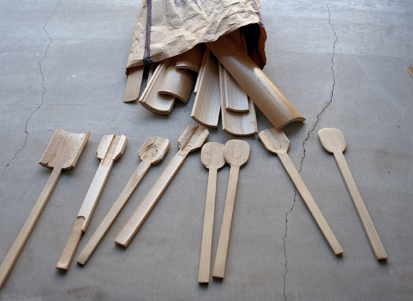
A utensil was also on our wish list, and in this the designers also excelled, imagining the ‘waribashi spoon’
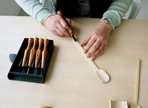
’Waribashi’ are the chopsticks found in every japanese restaurant – the ones that come in one piece and are broken in half for use
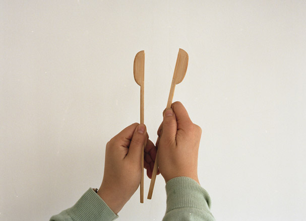
The Waribashi spoon is an elongated spoon made from thin ‘shitatake’ bamboo (white bamboo), grown in Kyoto
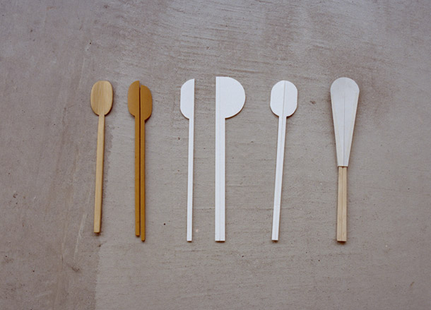
It can be used as a spoon (the slight curvature derives from the natural tubular shape of bamboo) or split along the central groove to be turned into chopsticks
-
 Mercedes-Benz previews its next-gen people mover with an ultra-luxury EV concept
The Mercedes-Benz Vision V Concept is an art deco picture palace on wheels, designed to immerse passengers in parallel worlds as they travel
By Jonathan Bell
-
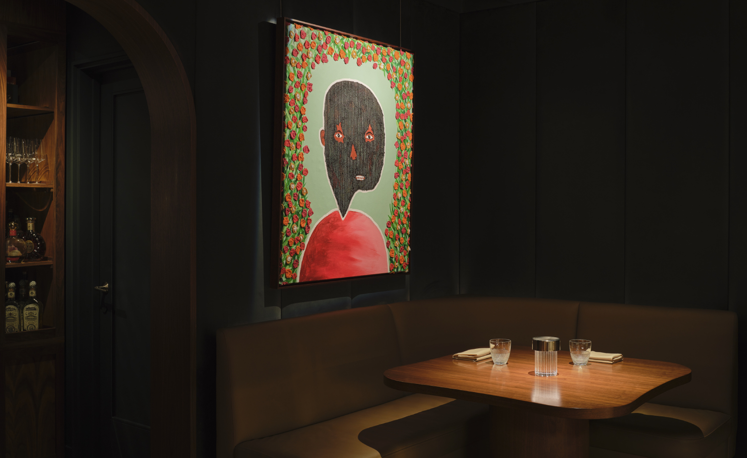 Visit this Michelin-star New York restaurant that doubles as an art gallery
Artist Mr.StarCity is exhibiting his emotionally charged yet optimistic ‘Bloomers’ portrait series at Frevo, a Greenwich Village hidden haunt
By Adrian Madlener
-
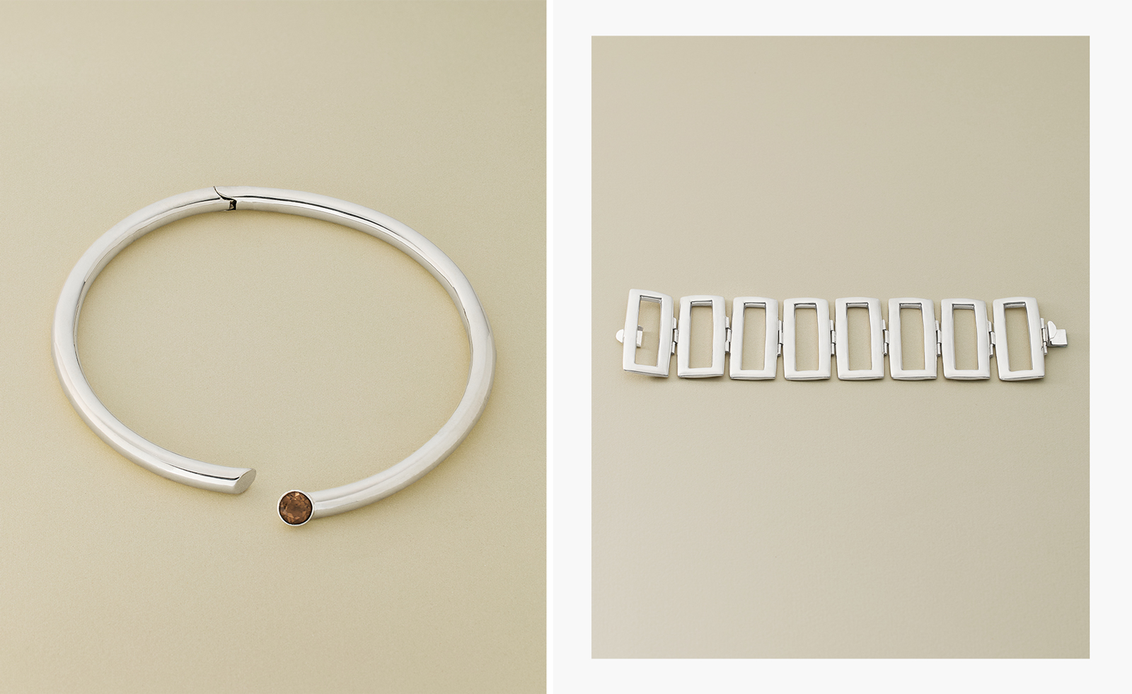 Nina Runsdorf brings classic jewellery back to life to mark 20 years
New York-based jewellery designer Nina Runsdorf celebrates her eponymous brand’s anniversary with a new jewellery collection, ‘Archive’
By Hannah Silver
-
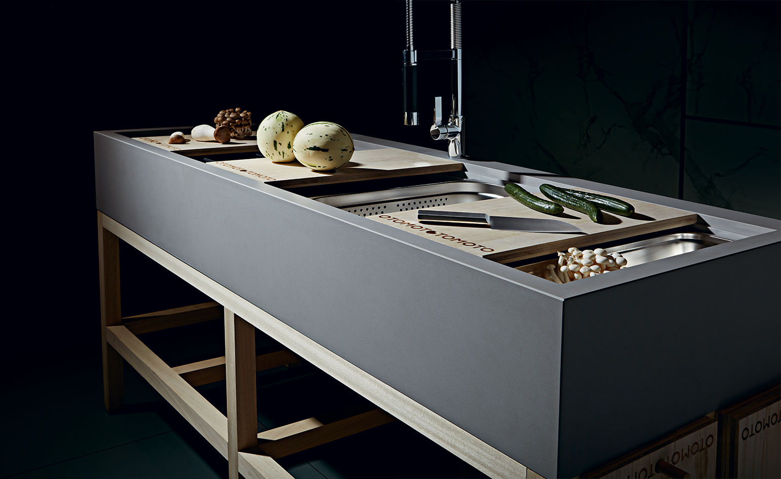 OTOMOTO rethinks the domestic kitchen
For Wallpaper* Handmade X, Ryan Gander and Tony Chambers joined forces with architects Matheson Whiteley and surface manufacturer Cosentino on a kitchen sink system
By Alyn Griffiths
-
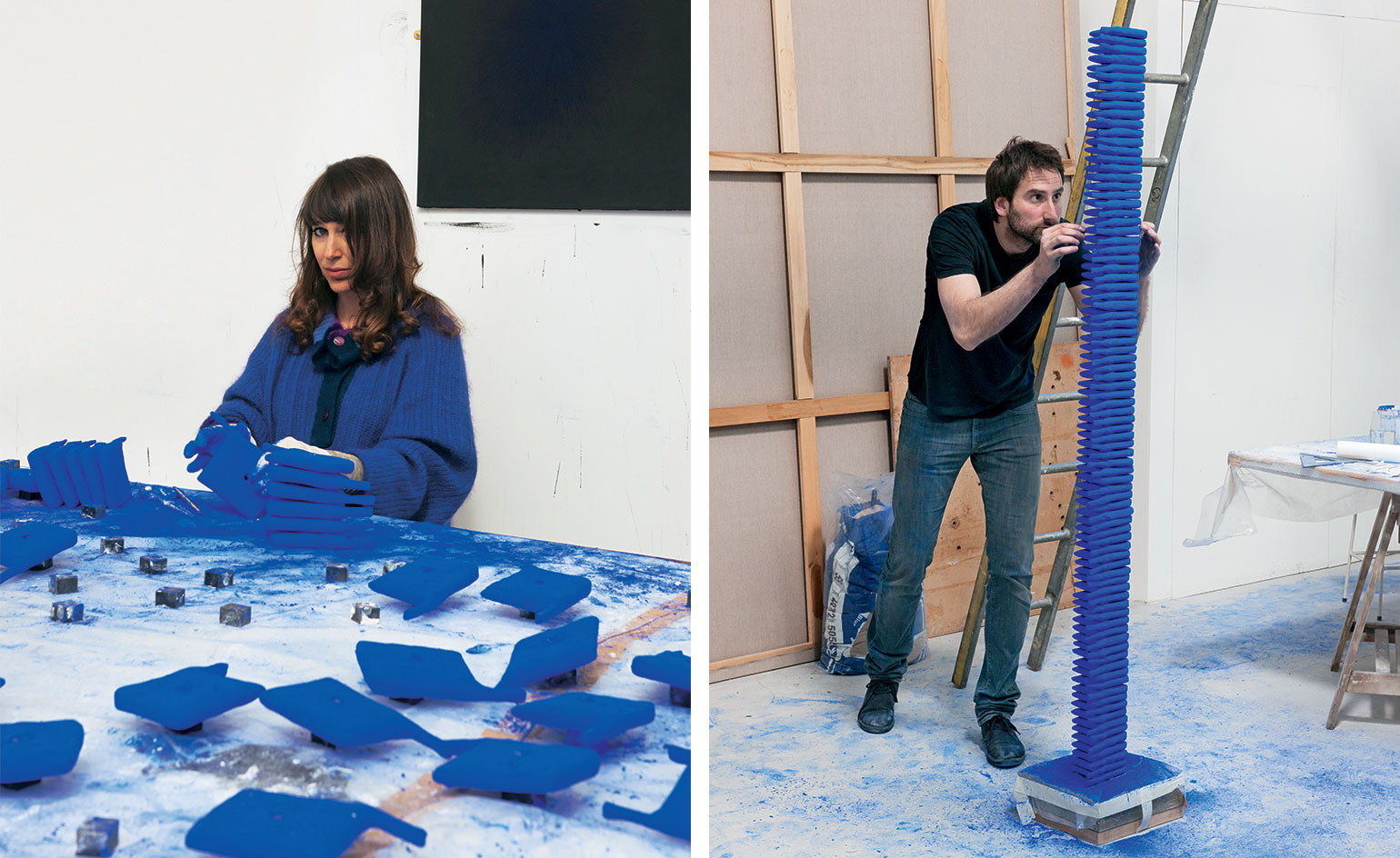 Idris Kahn, Annie Morris and Comme des Garçons create Yves Klein-inspired sculpture
By Glenn Waldron
-
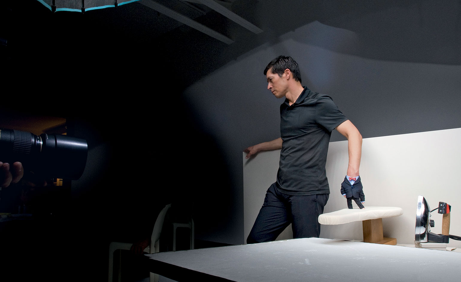 Handy man: film and suit, by Lernert & Sander and Brioni comes to life
By Joseph Sims
-
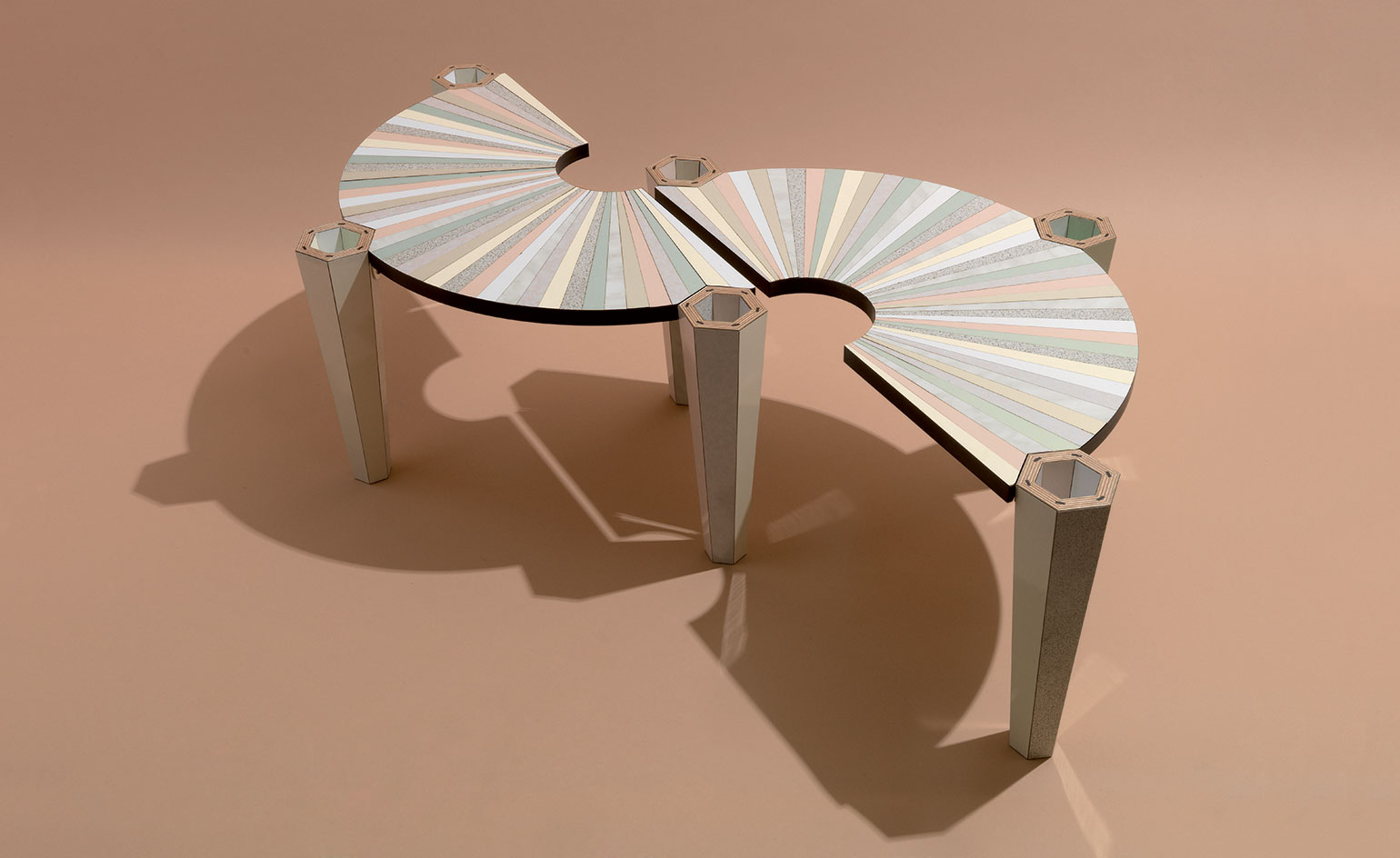 How Bethan Laura Wood and Abet Laminati created a two-part coffee table
By Paul McCann
-
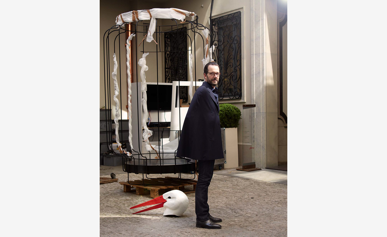 The making of ‘Cape’ suit, by Konstantin Grcic and Brioni
By Nick Compton
-
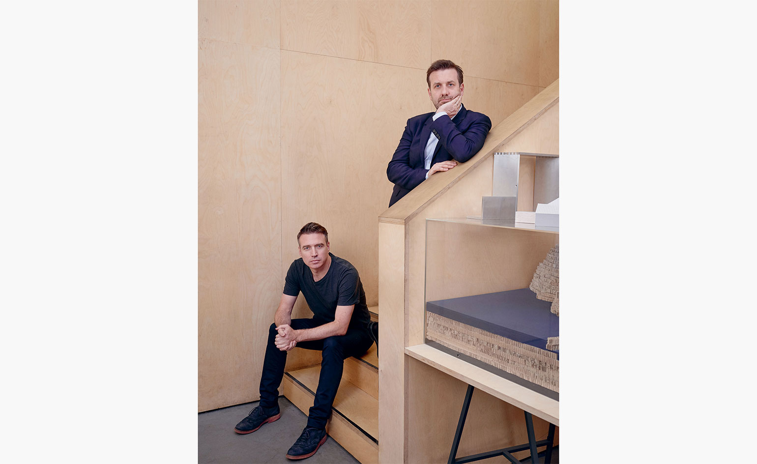 Spirit guides: Carmody Groarke and Elit’s vodka bar for Wallpaper* Handmade 2018
By Rosa Bertoli
-
 Handmade 2010: 12,000 stitches installation by Brioni and Carmody Groarke
By Daven Wu
-
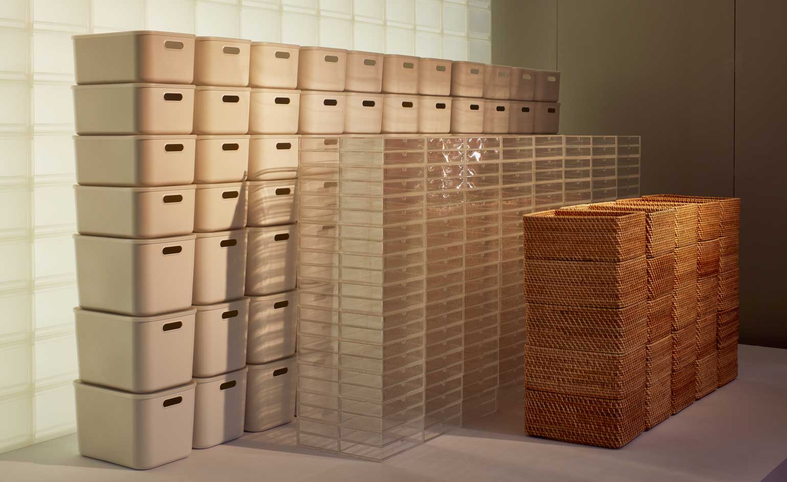 Modular innovation, savvy storage and more at Wallpaper* Handmade X
By Rosa Bertoli