'Since I was a child I've been interested in paper and notebooks,' says Amy Cooper-Wright. 'I started making books when I was little — I have a diary I made for a friend as a Christmas present when I was 14. It was typeset in Quark Express, printed in on an inkjet printer and wiro bound.'
Such was the (early) genesis of Mark + Fold, the ‘modern stationer’ that Cooper-Wright launched late last month with a small, elegant line of gender neutral exercise books, notebooks and type-inspired greetings cards, created in small batches as a reaction to the industry's penchant for mass production and shoddy production values.
There's a tendency, Cooper-Wright explains, 'to see stationery as throw-away, when in fact a notebook is for many people the one single object they carry with them all day – along with a phone perhaps. We feel that if you spend all day writing in your notebook, then it should be a good experience.' This ethos is realised both in form and function, as well as the factor of material provenance – so often a shorthand buzzword synonymous with ersatz authenticity, but here deeply considered and documented in detail.
'My parents are architects who use heavyweight, high quality materials,' she says, expanding on her inspiration for setting up Mark + Fold, 'and I think I have inherited some of their design philosophy; being inspired by the materials and making process, rather than designing something on paper and then asking "what shall we print it on?’"
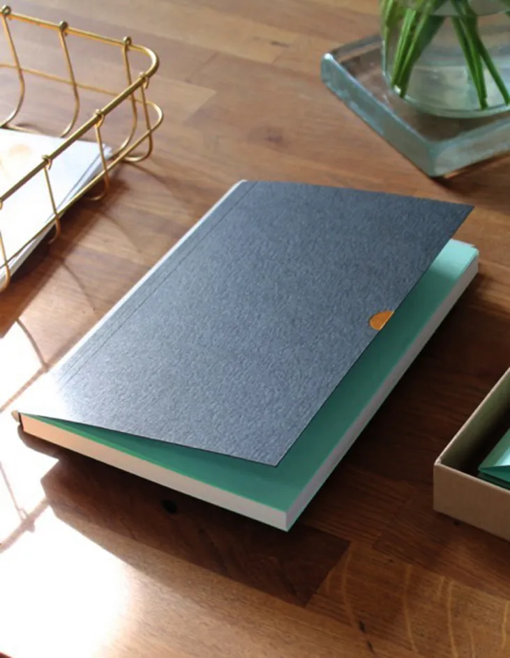
Take the signature 'Notebook Mark One'. An A5, 160-page, Ota-bound pad in an edition of 500, the notebook is designed to open flat without breaking the spine. Page paper (Naturalis Vanilla Smooth) is milled in Scotland on the banks of the Rever Leven, while Colorplan end papers are made in the Lake District, before being bound in Holland. There's even a copper foiled thumbcut, blind debosse branding and a cover factoring 35 per cent cotton fibre to afford an attractive patina with continued use.
This may sound fussy, but the finished product is a minimalist's dream – a piece of design as objectively gorgeous as it is utilitarian. 'We use really remarkable materials so that really they do all the work, and we just sort of curate them into functional things,' says Cooper-Wright. In addition, each batch and individual object is labeled, numbered and dated – 'so you know that this is notebook number 50 of a batch of 500, which were made in November 2015'.
Despite ambitions to eventually open a dedicated physical store and expand the range – 'some of the things we daydream about are weekly planners, travel itineraries, planning tools' – Cooper-Wright's ambitions are simple: 'I would like to establish Mark+Fold as a reliable source of great quality stationery. We could just get one design into production and make millions of them, but that would be boring, and wasteful. We would,' she concludes, 'rather create something that marks a point in time, and then move on.'

The company's products are a minimalist's dream – pieces of design as objectively gorgeous as they are utilitarian. Pictured: the 'Notebook Mark One', including a detail of the copper foiled thumbcut (right)

The 'Notebook Mark One' is an A5, 160-page, Ota-bound pad in an edition of 500, designed to open flat without breaking the spine

Each batch and individual object is labeled, numbered and dated – 'so you know that this is notebook number 50 of a batch of 500, which were made in November 2015'

The launch range also includes exercise books, and a line of type-inspired and seasonal greetings cards

'We use really remarkable materials so that really they do all the work, and we just sort of curate them into functional things,' says Cooper-Wright
INFORMATION
For more information, visit Mark + Fold's website